Abstract
The current study examines agreement among individuals with varying expertise in behavior analysis about the length of baseline when data were presented point by point. Participants were asked to respond to baseline data and to indicate when to terminate the baseline phase. When only minimal information was provided about the data set, experts and Board Certified Behavior Analyst participants generated baselines of similar lengths, whereas novices did not. Agreement was similar across participants when variability was low but deteriorated as variability in the data set increased. Participants generated shorter baselines when provided with information regarding the independent or dependent variable. Implications for training and the use of visual inspection are discussed.
Keywords: data analysis, reversal design, scientific behavior, visual inspection
Applied behavior analysis incorporates single-subject design and visual inspection as the primary means of identifying functional relations between independent and dependent variables. Applied behavior analysts are charged with producing meaningful and important changes in socially significant behavior in each individual they serve, and this task is facilitated by visual inspection of single-subject data (Baer, 1977; Skinner, 1956).
Despite the predominant use of visual inspection in behavior analysis, its reliability has been questioned by studies that have shown poor agreement between scientists. For example, DeProspero and Cohen (1979) constructed graphs that depicted ABAB reversal designs with data that reflected an “ideal” pattern, an “inconsistent treatment,” and an “irreversible effect.” Editors of the Journal of Applied Behavior Analysis (JABA) and the Journal of the Experimental Analysis of Behavior rated the demonstration of experimental control shown by each graph on a scale from 0 (low) to 100 (high), and poor agreement was obtained. The mean correlation between raters was .61, according to the Pearson product moment correlation. In addition, the programmed differences in the data patterns accounted for only a very small proportion of the variance in the ratings. Other studies using similar procedures also demonstrated low agreement between visual inspectors (Danov & Symons, 2008; Furlong & Wampold, 1982; Matyas & Greenwood, 1990; Park, Marascuilo, & Gaylord-Ross, 1990).
These studies question the utility of visual inspection as a reliable determinant of the effect of an independent variable. However, Kahng et al. (2010) systematically replicated DeProspero and Cohen (1979) and found much higher agreement for ratings made using the 100-point scale (.93 compared to .61 in DeProspero & Cohen). Two methodological differences between Kahng et al. and DeProspero and Cohen might be responsible for these discrepant results. First, Kahng et al. used the same 100-point scale as DeProspero and Cohen but also asked participants whether the graphs did (“yes”) or did not (“no”) demonstrate experimental control. Second, participants included only editors of JABA. Kahng et al. suggested that the increased agreement may be due partly to the standardized training for applied behavior analysts such as that recommended by the Behavior Analyst Certification Board (BACB). Replication of these results and analyses of the variables that influence agreement or disagreement among visual inspectors with different training histories are necessary to reconcile Kahng et al.'s recent findings with the many studies that have shown poor agreement. Participants in the current study included three groups (experts, Board Certified Behavior Analysts [BCBAs], and novices) with varying levels of expertise, allowing an examination of agreement within and across these groups.
The studies of agreement among scientists have focused on visual inspection of data sets with at least two complete phases and agreement of experimental control. However, the final data set is a result of many decisions regarding whether to continue or change phases, and these decisions often occur before experimental control is demonstrated. Point-by-point decisions are integral to deciding when to change phases, and small decisions may affect the demonstration of experimental control in the final graph. We identified only two studies that attempted to capture point-by-point data analysis.
Austin and Mawhinney (1999) and Mawhinney and Austin (1999) asked participants to respond to data presented point by point. Graphs were from currently or subsequently published data sets with phase lines removed. Across the two studies, participants were asked to make general comments about the data (Austin & Mawhinney), to characterize the data in terms of structured categories (e.g., stability and trend; Mawhinney & Austin), and to identify the point at which intervention was initiated. Compared with other research on visual inspection, these two studies presented data in a manner that was more similar to the daily decisions made during the research process. These studies also differed from previous research in that participants responded to published data sets, whereas most other studies (e.g., DeProspero & Cohen, 1979; Furlong & Wampold, 1982; Kahng et al., 2010; Matyas & Greenwood, 1990) presented computer-generated graphs that may not resemble data typically encountered by participants.
Like Austin and Mawhinney (1999) and Mawhinney and Austin (1999), we presented data point by point and used graphs that included data from published studies. However, participants in our study were asked to make decisions about whether or not to continue the baseline phase of the study and to provide comments about their decisions. In Study 1, we examined agreement regarding baseline length among participants with varying levels of expertise in behavior analysis. In Study 2, we evaluated the effects of providing additional information regarding the independent or dependent variable on the lengths of participant-generated baselines.
STUDY 1
The purpose of Study 1 was to describe and compare the length of baseline phases created by experts in applied behavior analysis, BCBAs, and novices in applied behavior analysis when data were presented point by point.
Method
Participants
Participants in the expert group had doctoral-level degrees in behavior analysis or a related field, had earned their BCBA (or Board Certified Behavior Analyst–Doctoral) certification, and were currently or previously Associate Editors or Editors for JABA. To recruit participants for this group, the authors contacted 13 experts via an e-mail with the experimental program attached. Ten experts completed the experimental program and sent the file containing their responses back to the authors.
The second group of participants did not meet the expert criteria but were BCBAs. (Board Certified Assistant Behavior Analysts or BCaBAs were excluded from this group.) BCBAs were recruited in two ways. First, we created a computerized spreadsheet from the certificant registry on the BACB Web site (http://www.bacb.com). The spreadsheet randomly selected 20 BCBAs at a time. We contacted these people via e-mail to request their participation in the study. After confirmation, participants were sent the experimental program. Four of the 77 people randomly selected from all of the BCBAs listed in the certificant registry responded to an initial e-mail and completed the experimental program. Due to the low response rate with the first method, we recruited additional participants by e-mailing a variety of schools and service agencies that employed BCBAs to ask if any of their employees would be interested in participating. Through this recruiting method, nine additional e-mails with the experimental program attached were sent, and six participants returned their responses. A total of 10 BCBAs completed the experimental program.
The third group of participants included novices in applied behavior analysis. All participants had been hired recently at a school for children and adults with intellectual disabilities and were enrolled in an introductory course in behavior analysis. These participants did not have previous training in the interpretation of graphs that depict single-subject experiments; however, they were learning about behavior-analytic topics relevant to providing services to children with intellectual disabilities. Just prior to participating in the study, the participants were assigned Chapter 6 on visual inspection from the introductory behavior analysis textbook by Cooper, Heron, and Heward (1987, pp. 130–141). Seventeen participants from this group completed the experimental program.
Procedure
Experimental program
A computer program was designed to present a graph, one data point at a time. The experimental program utilized the Visual Basic for Applications programming language available with Microsoft Windows versions of Excel 2003 and 2007. By using common spreadsheet software, we were able to send the experimental program in a small file attached to an e-mail. Participants' data were recorded directly into the experimental program file that was sent back to the experimenter.
After the experimental program began, participants were provided with informed consent followed by instructions for using the program. The instructions stated that
The goal for each graph is to continue adding data points to the baseline phase by clicking the “Continue Running Current Phase Button” until you have enough data points that you would begin the next phase (e.g., “treatment”) if this were an applied research project you were supervising or conducting.
Before each graph was presented, a message box displayed the x- and y-axis labels, a reminder that this was the baseline phase, and the expected change in behavior for the next phase. For example, the message box indicated that the target behavior was expected to decrease in the next phase if a reduction in behavior was expected in the phase after baseline (as in the case of a treatment for aggression). Participants could not view the graph until the “OK” button in the message box was selected.
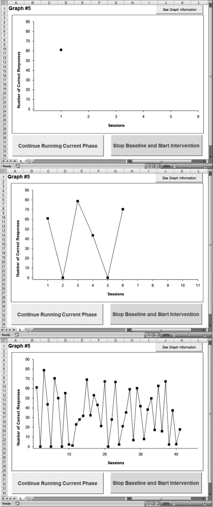
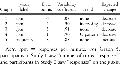
After clicking “OK,” the first graph was displayed with a single data point. An example of Graph 5 with one data point is displayed in the top panel of Figure 1. The graphs contained axis labels that matched those in the previous information message box. In Study 1, the y axis was labeled “responses per minute” or “number of correct responses,” and the topography of the response was not specified. Table 1 provides the specific labels used for each graph. The range of y-axis values was determined by the default settings in Microsoft Excel. The x-axis labels were always “sessions.” The x axis always had session numbers that corresponded to the data points plus five session numbers (without data) beyond the current data point. There were three buttons on the screen in addition to the graph. A button above the top right corner of the graph was labeled “see graph information” and displayed the message box with the basic information about the previously described graph when selected.
Figure 1.
Graph 5 before (top) and after (middle and bottom) data points were added.
Table 1.
Table 1 Graph Characteristics
Below the graph were buttons labeled “continue running current phase” and “stop baseline and start intervention.” Clicking on either of these two buttons presented a dialogue box that asked if the participant was sure about this decision. Selecting “no” would return the participant to the graph with no changes. If the participant selected “yes,” the graph disappeared from the screen and a dialogue box appeared. This box displayed two items with space to reply to each. The first item asked why the participant chose to continue or stop the current phase. The second item was a text box labeled “comments” in which the participant could type additional information about the last decision. At the bottom of the dialogue box was a button labeled “continue.” If the participant chose to continue with the current phase, clicking “continue” submitted the participant's responses, hid the dialogue box, and showed the graph with another data point added. Figure 1 (middle and bottom panels) displays Graph 5 with data points added as if the participant had clicked the “continue running current phase” button. If the participant chose to stop adding baseline sessions (i.e., the participant selected the “stop baseline and start intervention” button), the current graph ended and the experimental program proceeded to the basic information about the next graph. Each subsequent graph followed this same basic procedure.
When all of the graphs (five graphs for Study 1) had been presented, the experimental program ended by thanking the participant and providing instructions to send the completed file back to the experimenter as an e-mail attachment. Clicking the “complete” button at the bottom of this message saved the changes to the file and closed the program.
Selected published graphs
The graphs displayed by the experimental program contained data from studies previously published in JABA. First, graphs that met the following criteria from issues of JABA from 1998 to 2008 were entered into a database. Only graphs that depict an ABA or ABAB reversal design with a single data path were selected. Graphs could contain additional phases (e.g., ABAC reversal design); however, the reversal design could not be part of another experimental design (e.g., a reversal for Participant A in the top panel that was also part of a multiple baseline across Participants B and C). These criteria were developed to eliminate graphs that may have resulted from researcher responses to features of the data that were not presented to participants in our study.
From this database of graphs, we selected five graphs that differed in trend and degree of variability. The characteristics of each of graph are described in Table 1. The five graphs were presented to each participant in semirandom order. Five possible sequences of graph presentation were created before the program was sent to the participants. To create the sequences, each of the graphs was presented first across the five sequences, and the order of the remaining four graphs was randomized. Participants then were assigned randomly to receive one of the five sequences; however, each sequence was used once before a sequence was repeated.
Computer-generated data points
A potential limitation of using published data is that participants might choose to continue baseline beyond the number of data points available in the original graph. To address this problem, computer-generated data points were calculated using the mean, range, and standard deviation of the original baseline data. However, these calculations were not based on the entire graph. Instead, the graph was divided into two to four sections (consisting of at least three data points each) based on the number of data points, and the mean, range, and standard deviation were calculated for each section separately. To generate a data point, the program first semirandomly selected one of the sections, with the last section being selected more often than the other sections. Next, a number that fell between a range that was 20% larger than the original range was generated randomly. For example, if the original range was between 10 and 20, a data point between 8 and 22 could be generated. The slightly larger range was included because, visually, computer-generated data points in graphs created without this increase appeared at more predictable values and more often within a much smaller range than the original graphs. The computer program was designed to generate data points that would preserve the mean and standard deviation of the current graph. Using this type of calculation, the patterns apparent in the original graph were preserved as the graph continued past the data presented in the original published graph. Each graph was extended to 300 data points using the program described above and was pregenerated (instead of generated uniquely for each participant) so that each participant saw the exact same data and decisions between participants could be compared.
Prior to the start of the study, computer-generated graphs and the original graphs were presented to four doctoral-level behavior analysts who served as faculty for a PhD program in behavior analysis to determine whether the computer-generated graphs simulated typical data patterns. One person who rated these graphs also participated as an expert in Study 1 (Participant A-2). The other three did not participate in any other part of the study. The behavior analysts were provided with the five original graphs and the five computer-generated graphs presented in a random order. For each graph, the participant was asked whether the graph displayed published data or computer-generated data. A third option allowed the participant to respond that he or she did not know whether the data were obtained or computer generated. Three of the four participants responded that they did not know which data were published or computer generated. The fourth participant correctly identified only five of the 10 graphs, which was chance level responding. These results suggested that the computer-generated data could not be distinguished from the published data, increasing our confidence that the computer program generated data with patterns similar to data collected in the course of applied research.
Calibration and testing
Extensive testing and calibration occurred before the computer program was sent to the participants. The first author generated lists with the number of data points for each graph and responses to open-ended questions. Then, he created graphs within the program using those lists of data points and responses. The data recorded by the computer program and those from the lists were compared. Any calculations in the computer program were checked against calculations completed manually by the author. After this stage was completed, the authors sent the programs to colleagues with instructions to complete the program and provide comments about their user experience. These testers also were instructed to try to cause the program to fail. Information collected from the initial testers was used to improve the program and solve any problems the participants might experience. Finally, a second group of testers completed the updated program. The first author checked the data collected throughout the process to ensure that it was complete and calculations were accurate.
Data analysis
The two primary dependent measures were the number and range of data points added to each graph and the difference from the mean number of data points. Difference from the mean was calculated by subtracting the mean number of data points averaged across all participants for a graph from the number of data points generated by a single participant. Data points concentrated around zero indicate that most of the participants added a similar number of data points to the graph. More disagreement among participants is apparent when the data points vary further from zero. This analysis makes comparisons regarding agreement easier among graphs by providing a standard reference point from which to analyze the differences in agreement for each of the graphs. The number and range of data points are provided in some figures to show differences in the graphs created by different participant groups. Using difference from the mean in all graphs might show the level of agreement among groups but would not provide information about different baseline lengths created by the different participants.
Results and Discussion
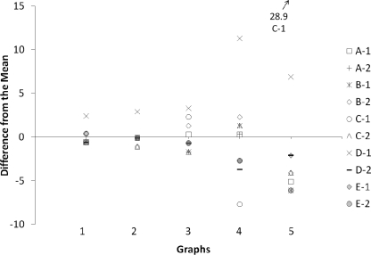
In Study 1, the decisions made in response to data presented point by point were described for three different participant groups. Figure 2 displays the results for the participants in the expert group. This graph presents the number of data points each participant generated for each graph as a difference from the mean. For Graphs 1 and 2, which contained data paths with little variability, the experts generated graphs with very similar numbers of data points. Nine of the 10 participants generated graphs within one data point of each other. Participant D-1 added approximately two more data points than most of the other participants for Graphs 1 and 2. Graph 1 contained a data path with no trend, whereas the data path in Graph 2 had a steadily increasing trend (Table 1). Disagreement among the expert participants increased as the variability in the graphs increased. Participants created graphs with a wider range in the number of data points for Graphs 3, 4, and 5. For Graph 5, Participant C-1 continued baseline until 41 data points were presented.
Figure 2.
Data from the expert participants in Study 1. The difference from the mean was calculated by subtracting the mean number of added points averaged for a graph from the number of data points generated by a single expert.
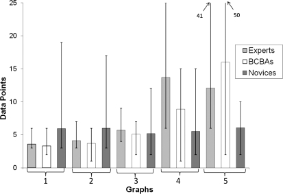
Similar results were obtained for the BCBA group; however, the results for the novices differed from those of the experts and BCBAs. The mean number of baseline data points for all graphs across the three participant groups is displayed in Figure 3. For Graphs 1, 2, and 3, the results obtained from the BCBA group closely matched those from the expert group. For Graphs 4 and 5, the mean number of data points in the BCBA graphs differed slightly from the experts, although the general pattern across graphs was similar (the variability and the mean number of data points in each graph increased as the variability in the data path increased). For novice participants, the mean number of data points remained approximately the same for each of the five graphs. In addition, the variability among participants decreased as the data paths in the graphs became more variable; an opposite relation was observed with experts and BCBAs. Based on these data, it appears that, in isolation, rules for visual inspection provided in textbooks may be insufficient to produce expert performance. It seems likely that additional experience with data-based decision making accounts for the differences among these groups.
Figure 3.
The mean number of data points for each graph from all groups in Study 1. The bars represent the minimum and maximum number of data points for each group.
To compare the current results with previous studies, a variability coefficient for each of the five graphs was calculated by dividing the standard deviation of a set of data by the mean (Kahng et al., 2010). The variability coefficient of the data presented to participants in previous studies varied from .1 to .25 (DeProspero & Cohen, 1979; Kahng et al., 2010). In the current study, the variability coefficient varied from .08 to .90. Participants created baselines of similar lengths for graphs with variability coefficients less than .25 in the current study. This supports the evidence that agreement among visual inspectors may be higher than previously reported when variability is within the ranges previously studied (Kahng et al., 2010). However, as variability in the data increased beyond .30, agreement began to decrease. The variability of Graphs 3, 4, and 5 was .51, .90, and .88, respectively. At this level of variability, there was a wider range of data points added to the graph before participants began the next phase.
Participants also provided an explanation for their decision. The two types of comments that occurred most often after participants were asked why they continued baseline was that either one data point was insufficient to change phases (six experts and nine BCBAs) or that three data points are required for a baseline (four experts and two BCBAs). Although some participants changed phases at three data points for graphs with stable data paths, some participants chose to exceed this minimum by one or two data points. We also provided the participants with the opportunity to provide any additional comments. In this section, three experts stated that their decisions might have been different if more information about the type of treatment that would follow was provided. These experts might have reduced the number of data points in baseline if the treatment was one that was likely to produce a strong effect. Three experts and three BCBAs commented that their decisions may have been affected by information about the topography of the response (e.g., severe self-injurious behavior). Although the response topography never was provided, one participant in the BCBA group stopped the graph after one data point and made comments suggesting that she would evaluate the safety of conducting sessions with such a high-rate behavior or attempt different analyses.
STUDY 2
Participants in Study 1 and in previous studies (Danov & Symons, 2008; DeProspero & Cohen, 1979; Kahng et al., 2010; Matyas & Greenwood, 1990) were asked to make decisions about data with minimal information. Comments collected from our participants suggested that their decisions about the length of baseline would be influenced by information about the type of treatment planned and the form or severity of the targeted behavior. In addition to these variables, studies have suggested that decisions might be influenced by research previously published in the area, the potential significance of the results (DeProspero & Cohen, 1979), or the characteristics of the participants (Kahng et al., 2010; Lerman et al., 2010).
The purpose of Study 2 was to evaluate the effects of information about the target behavior or the independent variable on the decisions of individual participants. We examined the effects of information about the form and severity of the problem behavior and the likely effects of the subsequent treatment. These two categories were selected due to comments from the participants in Study 1 and suggestions in previous research (e.g., DeProspero & Cohen, 1979; Kahng et al., 2010; Lerman et al., 2010). In addition, Cooper, Heron, and Heward (2007) specifically addressed these two situations as an exception to the “rule of the-more-data-points-the-better” (p. 150).
Method
Participants
The participants in Study 2 were students studying behavior analysis in doctoral programs across the United States. Students were contacted either directly via e-mail or through their academic advisers. The experimental program was sent to 19 students, and eight participants in this group completed both Sessions 1 and 2. Of the eight participants, four were BCBAs, one was a BCaBA, and three were not certified.
Procedure
The experimental program from Study 1 was used for Study 2 and functioned similarly, with a few exceptions. Only the two graphs with the highest variability coefficients were included (Graphs 4 and 5). These graphs were chosen because responses from Study 1 showed poor agreement with these graphs. The variability in responses in Study 1 suggested that these graphs would provide a baseline that might be sensitive to information manipulations. However, Graph 5 was modified slightly to prevent information in the graph from conflicting with the additional information provided. First, the y-axis label in Graph 5 was changed from “number of correct responses” to “responses.” Second, the expected change in direction was altered from “increase” to “decrease” because one type of information involved labeling the target response as severe self-injury. This modification seemed reasonable, given the relatively high level of behavior depicted in Graph 5 (see Figure 1).
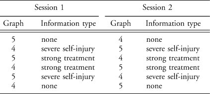
Participants completed two separate visual inspection sessions, with the experimental program for the second session sent to participants after submission of their responses from the first session. To create graphs for these two sessions, the data from Graphs 4 and 5 were used to generate 300 points per graph. Computer-generated Points 150 to 300 were presented as needed in Session 1; the published data and, if necessary, computer-generated Points 1 to 149 were presented in Session 2. Each of the two graphs was presented three times in a session (once for each of the three conditions), for a total of six graphs per session. Table 2 displays the order of graphs for each session. Similar to Study 1, the experimental program presented the basic information about each graph before it was presented; however, in Study 2, the message box also included fictitious client initials, and different information was provided according to the no-information, strong treatment, and severe self-injury conditions described below. The client initials were generated by selecting two consecutive letters of the alphabet randomly (e.g., PQ or LM) and were added to imply that each graph displayed a different set of data. The order of graphs and conditions varied across sessions, but all participants experienced the same sequence of graphs and conditions.
Table 2.
Table 2 Graph Order in Study 2
No information
The information presented to the participants was similar to that in Study 1, except that for Graph 5 the expected direction of change was “decrease” instead of “increase” and the y-axis label was “responses” instead of “number of correct responses.” The participant was informed of the participant's initials, the axis labels, and the expected direction of change.
Strong treatment
In addition to the basic information, an additional line in the message box stated that the treatment implemented after baseline was expected to have a strong effect on behavior. No definition of strong treatment was provided.
Severe self-injury
In addition to the basic information, an additional line in the message box stated that the target behavior was severe self-injury. No additional information about the form of behavior was provided.
Results and Discussion
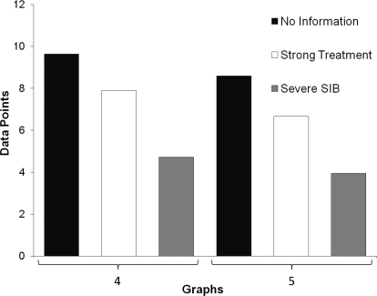
Figure 4 displays the main effects of Study 2. For both graphs, additional information resulted in a shorter baseline, on average, compared to no information. The average length of baseline across participants changed even with the addition of very minimal information. Although the baselines decreased in length and agreement increased slightly for the strong treatment condition, much greater and consistent decreases across participants occurred in the severe self-injury condition.
Figure 4.
Average number of data points added by participants across the three information conditions in Study 2.
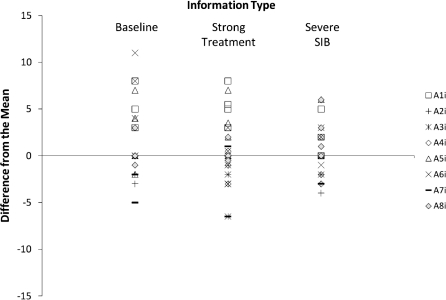
Figure 5 displays the data for all participants and graphs presented in Study 2. There are four data points for each participant per condition. This occurred because each of two graphs was presented twice for each condition, once in Session 1 and again in Session 2. Therefore, the four points per condition represent responses to two different graphs, with one repetition of each graph per condition. There was a slight decrease in the number of data points added by the participants in the strong treatment condition compared to the no-information condition. However, seven of the eight participants decreased the number of data points in their baseline for at least three of the four graphs with information stating that the behavior of interest was severe self-injury. The other participant decreased the number of data points in his baseline for two of the four graphs with information stating the behavior of interest was severe self-injury. In the severe self-injury condition, two participants reduced the length of their baseline to one data point.
Figure 5.
All responses for both sessions and for all graphs and conditions in Study 2. Data points are normalized by presenting data points as a difference from the mean for each graph.
As in Study 1, we reviewed participant comments associated with their decisions. When working with a graph presenting severe self-injury, six participants commented on the safety of the participant and suggested changes such as alternative assessments or safety equipment.
GENERAL DISCUSSION
This study examined the decisions made by participants using visual inspection when data were presented point by point. In Study 1, expert and BCBA participants agreed on the length of baseline when variability in the data was low (a variability coefficient less than .30); however, agreement about the length of the baseline phase decreased as variability in the data increased. In addition, experts and BCBAs often agreed, whereas novice participants created baseline phases that appeared to be insensitive to the variables that controlled the expert and BCBA performances. In Study 2, the length of the baseline phase created by participants decreased when information about the dependent or independent variable was provided; information stating the behavior represented severe self-injury reduced the length of baseline more than information that a strong treatment would be implemented in the next phase.
Along with Kahng et al. (2010), the current study provides support for the widely adopted practice of evaluating interventions through visual inspection of single-case data. Although previous studies (e.g., Danov & Symons, 2008; DeProspero & Cohen, 1979; Furlong & Wampold, 1982; Matyas & Greenwood, 1990; Park et al., 1990) have questioned the reliability of visual inspection, Kahng et al. and the current study suggest that this technique may be more reliable than previously suggested. It could be argued that increased agreement in our study was obtained under conditions that more closely simulated typical research conditions, in that data were presented point by point, graphs consisted of or were designed to simulate published data, and information was available regarding the circumstances surrounding the data set.
Applied researchers must balance participant safety and the goal of more immediate treatment with the need to demonstrate the efficacy of that treatment. Therefore, the current study examined the influence of additional clinical information on the decisions made with visual inspection. In one condition, participants were told that they were evaluating a strong treatment to determine whether decisions regarding length of baseline would be influenced by the likelihood of an immediate and large behavior change. When treatment produces an immediate and large effect, the efficacy of the intervention can be demonstrated with relatively brief exposure to baseline conditions. In another condition, participants were told that the target behavior was severe self-injury to determine whether the severity of the behavior would alter the length of baseline. Participants who responded to graphs in the current study made decisions that would minimize participant exposure to potentially risky assessment procedures, a decision that might jeopardize a demonstration of treatment efficacy. A limitation of this evaluation is that the minimal information provided allowed each participant to interpret the instructions based on his or her own history. Future research might examine if any additional changes in agreement among participants occur when more detailed information is provided. For example, participants may read a short vignette about a hypothetical client that contains specifics about the type of behavior measured and a description of all components of treatment that will be implemented in the next condition. Even with additional detail, responses would likely be influenced by participants' particular clinical and research histories and their contact with the treatment literature. Of course, the goal of this area of research should be to uncover variables that influence researchers' decisions despite diversity in history. Our data are promising, in that even minimal information improved agreement among participants with different academic, research, and clinical experiences.
Our study is limited because we evaluated point-by-point decisions regarding only baseline data. Of course, researchers who determine experimental control in single-subject data must use information from at least three phases and evaluate changes in level, trend, and variability of behavior. The current study assessed only one component of such complex performance. However, the procedure described in this study could be modified to evaluate point-by-point decision making across the entire single-subject analysis.
The generality of the findings is limited by our use of a convenience sample in both studies. That is, our participants may not have been representative of experts, BCBAs, novices, or doctoral students in the field of behavior analysis. However, the participants who completed the program were behavior analysts or behavior analysts in training and are part of the population of professionals who rely on point-by-point decision making based on visual inspection of data. In addition, including experts, BCBAs, novices, and doctoral students allows an assessment of the generality of our findings across participants who differ in amount and type of training.
In the current study, decisions by novices appeared to be insensitive to aspects of the data that altered the length of baseline created by experts and BCBAs. With some modification, the current procedure might be used to provide feedback to novice participants about their decisions. More seasoned researchers have experienced the consequences of their data decisions in the form of feedback provided by the local research community (e.g., research group) or through the peer review process. The feedback on point-by-point decisions experienced naturally by experts could be distilled in carefully designed computerized training and used to teach novice data analysts to make decisions similar to those made by experts.
Together with recent research that investigated features of the data that control visual inspection (Kahng et al., 2010) and instructions and consequences that control data collection (Lerman et al., 2010), this study contributes to a small but growing body of literature in behavior analysis aimed at understanding the behavior of the scientist. Analysis of scientific behavior is necessary to a comprehensive science of behavior and likely will inform training programs that are designed to teach these complex performances and bring them under appropriate sources of control.
REFERENCES
- Austin J, Mawhinney T.C. Using concurrent verbal reports to examine data analyst verbal behavior. Journal of Organizational Behavior Management. 1999;18:61–81. [Google Scholar]
- Baer D.M. Perhaps it would be better not to know everything. Journal of Applied Behavior Analysis. 1977;10:167–172. doi: 10.1901/jaba.1977.10-167. [DOI] [PMC free article] [PubMed] [Google Scholar]
- Cooper J.O, Heron T.E, Heward W.L. Applied behavior analysis. Upper Saddle River, NJ: Merrill; 1987. [Google Scholar]
- Cooper J.O, Heron T.E, Heward W.L. Applied behavior analysis (2nd ed.) Upper Saddle River, NJ: Pearson Education; 2007. [Google Scholar]
- Danov S.E, Symons F.J. A survey evaluation of the reliability of visual inspection and functional analysis graphs. Behavior Modification. 2008;32:828–839. doi: 10.1177/0145445508318606. [DOI] [PubMed] [Google Scholar]
- DeProspero A, Cohen S. Inconsistent visual analyses of intrasubject data. Journal of Applied Behavior Analysis. 1979;12:573–579. doi: 10.1901/jaba.1979.12-573. [DOI] [PMC free article] [PubMed] [Google Scholar]
- Furlong M.J, Wampold B.E. Intervention effects and relative variation as dimensions in experts' use of visual inference. Journal of Applied Behavior Analysis. 1982;15:415–421. doi: 10.1901/jaba.1982.15-415. [DOI] [PMC free article] [PubMed] [Google Scholar]
- Kahng S, Chung K, Gutshall K, Pitts S.C, Kao J, Girolami K. Consistent visual analyses of intrasubject data. Journal of Applied Behavior Analysis. 2010;43:35–45. doi: 10.1901/jaba.2010.43-35. [DOI] [PMC free article] [PubMed] [Google Scholar]
- Lerman D.C, Tetreault A, Hovanetz A, Bellaci E, Miller J, Karp H, et al. Applying signal-detection theory to the study of observer accuracy and bias in behavioral assessment. Journal of Applied Behavior Analysis. 2010;43:195–213. doi: 10.1901/jaba.2010.43-195. [DOI] [PMC free article] [PubMed] [Google Scholar]
- Matyas T.A, Greenwood K.M. Visual analysis of single-case time series: Effects of variability, serial dependence, and magnitude of intervention effects. Journal of Applied Behavior Analysis. 1990;23:341–351. doi: 10.1901/jaba.1990.23-341. [DOI] [PMC free article] [PubMed] [Google Scholar]
- Mawhinney T.C, Austin J. Speed and accuracy of data analysts' behavior using methods of equal interval graphic data charts, standard celeration charts, and statistical process control charts. Journal of Organizational Behavior Management. 1999;18:5–45. [Google Scholar]
- Park H, Marascuilo L, Gaylord-Ross R. Visual inspection and statistical analysis in single-case designs. Journal of Experimental Education. 1990;58:311–320. [Google Scholar]
- Skinner B.F. A case history in scientific method. American Psychologist. 1956;11:221–233. [Google Scholar]


