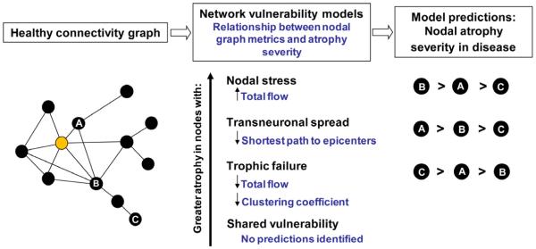
Figure 1. Predictions made by network-based degeneration models: effects of healthy intrinsic connectivity graph metrics on atrophy severity in disease.
A simplified healthy connectivity graph is shown (far left) for illustration purposes only; circles represent nodes (brain regions), lines represent edges (a connection between two nodes), and edge lengths represent the connectivity strength between nodes, with shorter edges representing stronger connections. The orange node represents an epicenter. Three nodes, labeled as ‘A’, ‘B’, and ‘C’, feature contrasting graph theoretical properties to illustrate predictions made by the network-based vulnerability models (far right). Listed in the center column are the relationships predicted by each model. For example, the transneuronal spread model predicts that nodes with shorter (↓) paths to the epicenter in health will be associated with greater (↑) atrophy severity in disease. Justification for each model’s prediction set is provided in the main text.

