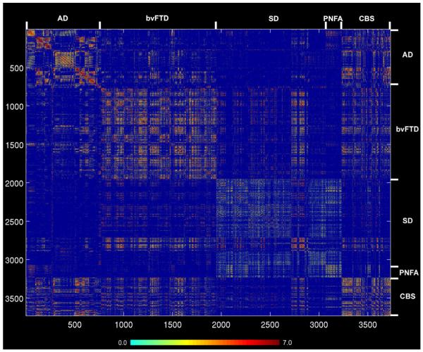
Figure 5. Healthy intrinsic connectivity matrix representing all ROI pairwise interactions across the five neurodegenerative syndrome atrophy patterns.
Matrices representing the group-level node pair-wise connectivity strengths were organized from left to right (and top to bottom) in the order of AD, bvFTD, SD, PNFA, and CBS regions. Ordering of regions within each disease pattern follows the scheme used in Figure 3. The blue-red color bar represents the intrinsic connectivity strength between each node pair, defined as the t-score from the thresholded group-level one-sample t-test (see Experimental Procedures).

