Abstract
Cell biologists have developed methods to label membrane proteins with gold nanoparticles and then extract spatial point patterns of the gold particles from transmission electron microscopy images using image processing software. Previously, the resulting patterns were analyzed using the Hopkins statistic, which distinguishes nonclustered from modestly and highly clustered distributions, but is not designed to quantify the number or sizes of the clusters. Clusters were defined by the partitional clustering approach which required the choice of a distance. Two points from a pattern were put in the same cluster if they were closer than this distance. In this study, we present a new methodology based on hierarchical clustering to quantify clustering. An intrinsic distance is computed, which is the distance that produces the maximum number of clusters in the biological data, eliminating the need to choose a distance. To quantify the extent of clustering, we compare the clustering distance between the experimental data being analyzed with that from simulated random data. Results are then expressed as a dimensionless number, the clustering ratio that facilitates the comparison of clustering between experiments. Replacing the chosen cluster distance by the intrinsic clustering distance emphasizes densely packed clusters that are likely more important to downstream signaling events.
We test our new clustering analysis approach against electron microscopy images from an experiment in which mast cells were exposed for 1 or 2 minutes to increasing concentrations of antigen that crosslink IgE bound to its high affinity receptor, FcεRI, then fixed and the FcεRI β subunit labeled with 5 nm gold particles. The clustering ratio analysis confirms the increase in clustering with increasing antigen dose predicted from visual analysis and from the Hopkins statistic. Access to a robust and sensitive tool to both observe and quantify clustering is a key step toward understanding the detailed fine scale structure of the membrane, and ultimately to determining the role of spatial organization in the regulation of transmembrane signaling.
Keywords: Dendrogram, Hierarchical cluster analysis, Dose response
1 Introduction
Cells communicate with the outside world through membrane receptors that recognize one of many possible stimuli (hormones, antibodies, peptides, other cells) in the extracellular environment and translate this information to intracellular responses. Changes in the organization and composition of the plasma membrane are critical to this process of transmembrane signal transduction (Lingwood and Simons 2010), so there is great interest in understanding the organization of membrane proteins in resting cells and in tracking their dynamic reorganization during signaling (Wilson et al. 2001, 2007 Oliver et al. 2004; Lagerholm et al. 2005; Xue et al. 2007; Andrews et al. 2008; Lingwood and Simons 2010).
In this laboratory, high resolution information about the spatial organization of membrane proteins is generated by transmission electron microscopy (TEM). We stimulate cells for selected times, then rapidly rip and fix membrane sheets, cytoplasmic face up. We then label the cytoplasmic tails of specific transmembrane proteins, as well as proteins that are recruited to membranes, using functionalized gold nanoparticles (Oliver et al. 2004; Wilson et al. 2007). Sometimes the stimuli are also tagged with electron-dense nanoprobes (nanogold, quantum dots) to identify activated receptors from the outside of the cell. After labeling, samples are processed for TEM and spatial point patterns of the centers of the gold nanoparticles are generated from the TEM images using image processing software (Baddeley and Turner 2006; Zhang et al. 2006).
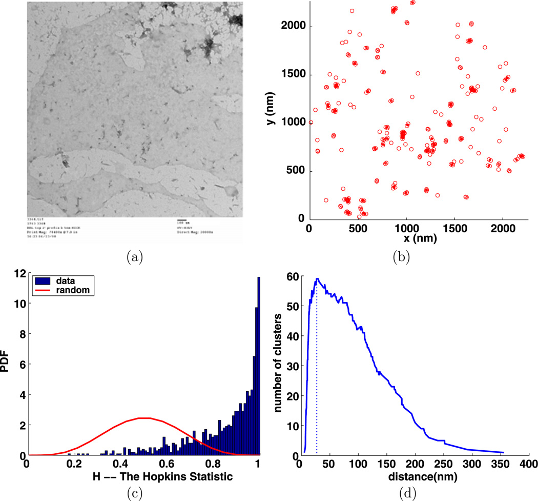
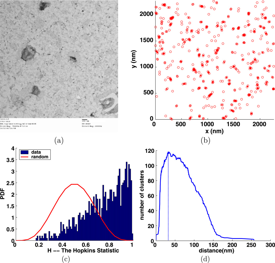
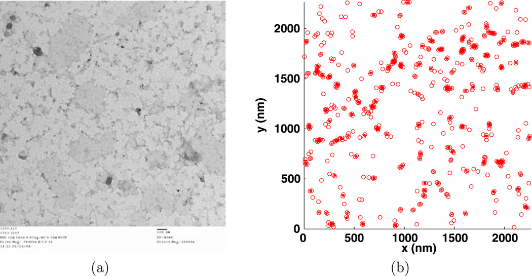
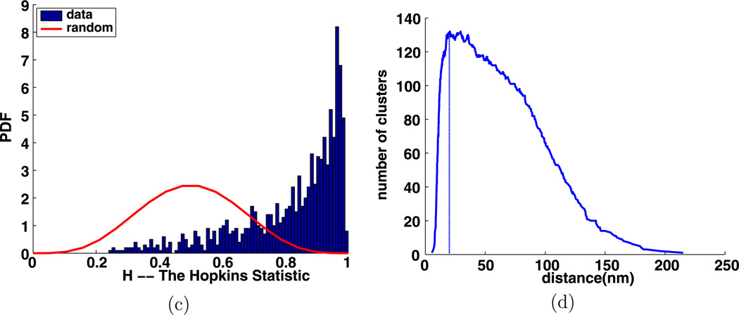
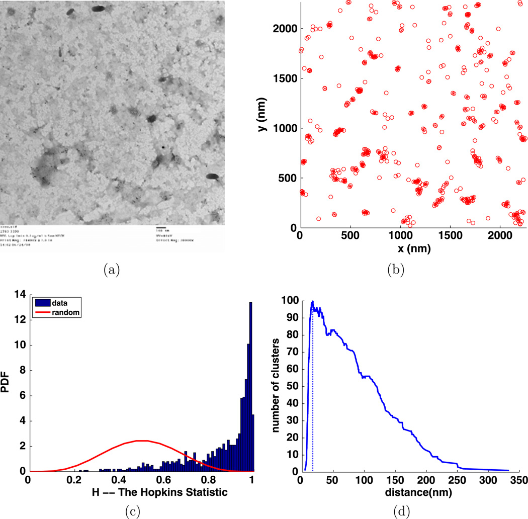
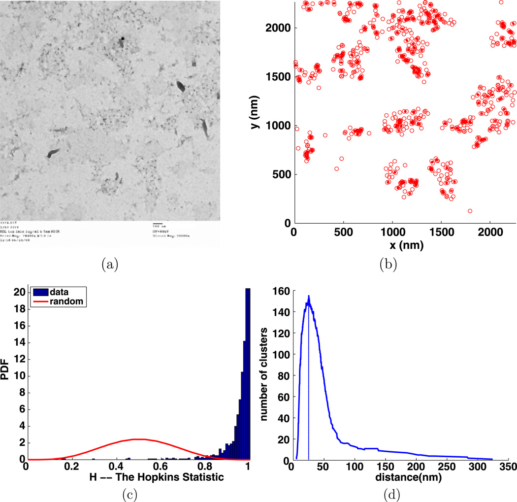
Previously, the Hopkins, and sometimes the Ripley, statistic (Zhang et al. 2006; Tan et al. 2006) were used to characterize the distributions of membrane proteins in resting and activated cells. These statistics are given by a plot of the statistic for simulated random data to be compared with a plot of the statistic computed from the experimental data (Oliver et al. 2004; Xue et al. 2007; Zhang et al. 2006). These methods can distinguish between more and less clustered data. However, they do not provide a straightforward quantitative measure of the extent of clustering. Many of our figures will contain a plot of the Hopkins statistic to illustrate its consistency with and difference from our new method. Examples of the biological data and the Hopkins statistic are given in Figs. 10, 11, 12, 13, and 14.
Fig. 10.
Experiment 3368, stimulus s = 0.000 µg/ml, time t = 1 min, number of particles M = 229, (a) TEM image, (b) clusters enclosed by their convex hulls at the intrinsic distance dI = 27 nm, (c) Hopkins test, (d) number of clusters
Fig. 11.
Experiment 3410, stimulus s = 0.001 µg/ml, time t = 1 min, number of particles M = 468, (a) TEM image (b) clusters enclosed by their convex hulls at the intrinsic distance dI = 32 nm, (c) Hopkins’s test, (d) number of clusters
Fig. 12.
Experiment 3397, stimulus s = 0.010 µg/ml, time t = 1 min, number of particles M = 575, (a) TEM image, (b) clusters enclosed by their convex hulls at the intrinsic distance dI = 20 nm, (c) Hopkins’s test, (d) number of clusters
Fig. 13.
Experiment 3390, stimulus s = 0.100 µg/ml, time t = 1 min, number of particles M = 453, (a) TEM image, (b) clusters enclosed by their convex hulls at the intrinsic distance dI = 17 nm, (c) Hopkins’s test, (d) number of clusters
Fig. 14.
Experiment 3374, stimulus s = 1.000 µg/ml, time t = 1 min, number of particles M = 654, (a) TEM image, (b) clusters enclosed by their convex hulls at the intrinsic distance dI = 25 nm, (c) Hopkins’s test, (d) number of clusters
For our biological data, the membrane proteins are receptors. To better understand the receptor biology, it is important to know how many receptors are physically close to other receptors. Consequently, we need to find clusters based on the geometric distance. Already, clusters have been determined by choosing a clustering distance d and putting two receptors in the same cluster if they are closer than d; see, e.g.,Andrews et al. (2009). The problem is that it is not clear how to choose a good clustering distance. In general, clustering approaches can be divided into two types: hierarchical and partitional (Jain et al. 1999). The hierarchical approach focuses on how the clusters vary with clustering distance, and thus provides an excellent foundation for us to build a method of computing an intrinsic clustering distance dI based on the data and then using this to quantify the clustering. The hierarchical approach can be divided into single, complete, average, centroid, median, and wards link methods. For this study, the single-link method best matches the biology. If we set the clustering distance to ε and connect all of the data points in each cluster, we obtain the ε-neighborhood graph (Cominetti et al. 2010; Schaeffer 2007). For more information about alternative clustering approaches, see Tan et al. (2007), Fan and Pardalos (2010). It may also be possible to use a partitional approach to accomplish the same tasks, but this seemed more difficult than using the hierarchical approach.
Here, we describe a method for computing a number that quantifies the amount of clustering and apply it to the biological data described below. This permits the easy comparison of the extent of clustering between experimental conditions. The method was implemented in MATLAB in the clustering quantification (CQ) program developed by the authors. This program uses the MATLAB dendrogram function to compute and display a hierarchy of clusters that depends on the clustering distance. The information about the hierarchy is then used to compute the intrinsic clustering distance dI that characterizes the distance between points in clusters. This distance characterizes the nanoscale structure of any clustering in the data.
We can also generate a hierarchy for simulated random data. The simulated data are typically much less clustered than our biological data and consequently d̃I for random data is larger than dI for the biological data. In both cases, the amount of clustering is strongly dependent on the number of particles in the image. For randomly generated data, we provide a simple formula for estimating d̃I as a function of the number of particles. To obtain a more intuitive and useful description of the clustering, we introduce the clustering ratio ρI that is the ratio of the intrinsic distance for simulated random data divided by the intrinsic distance for the experimental data. Importantly, ρI is a dimensionless number that tells us how much more clustered the biological data are in comparison with simulated random data.
Because there are a finite number of points in the image, the clusters only change at a finite number of values di which are all of the distances between pairs of points. The dendrogram displays this information. A minor complication is that for very small values of d, the dendrogram function considers all points as clusters. Because of the biological applications, we are only interested in nontrivial clusters that contain at least two points. For a set of data points, the CQ program returns a plot of the number of clusters as a function of the clustering distance d, a plot of the hierarchical clustering display by a dendrogram, and at the intrinsic clustering distance dI, a plot of the clusters enclosed by their convex hulls and information on number of clusters, number of points in clusters, and other details of the clustering. The CQ program is available at http://stmc.health.unm.edu/.
We begin our discussion in Sect. 2 by defining the distance functions needed for clustering analysis, then we give an overview of hierarchical clustering and dendrograms. An example is presented to illustrate these concepts.
In Sect. 3 we introduce a function C(d) that gives the number of clusters as a function of the clustering distance d. The intrinsic clustering distance dI is then defined to be the smallest distance for which there is a maximum number of clusters. A similar concept was introduced inCominetti et al. (2010). Clustering for simulated random data is studied and used to normalize the clustering distance for the biological data. The normalized clustering distance is a dimensionless number that we call the intrinsic clustering ratio ρI and that we use to quantify the clustering in the data.
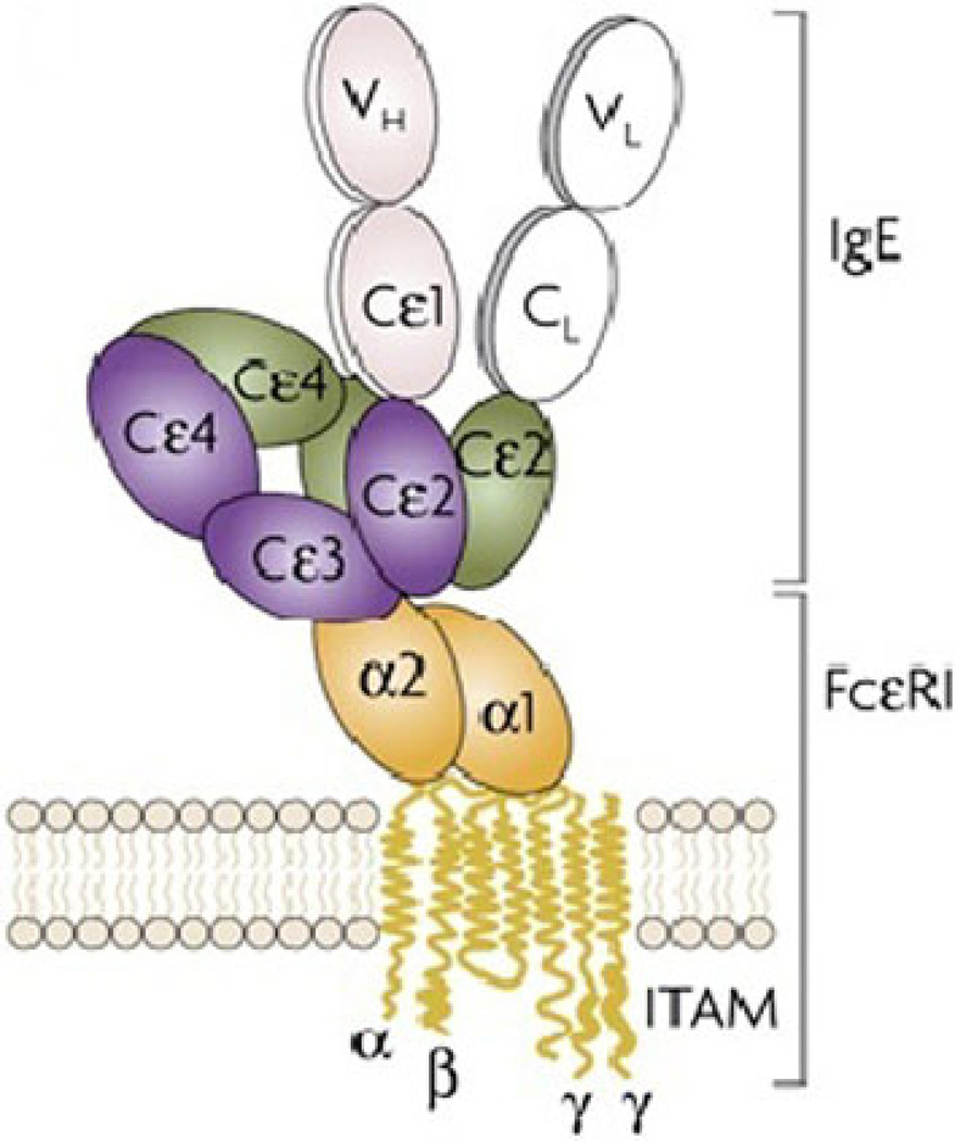
In Sect. 4, we use the intrinsic clustering distance and intrinsic clustering ratio to analyze electron microscopy images from experiments in which mast cells were exposed for 1 or 2 minutes to increasing concentrations of antigen targeting the IgE-FcεRI receptor complexes,then membranes were quickly ripped off the cell, fixed and labeled with gold particles targeting the FcεRI β subunit (see Fig. 1). As expected, the intrinsic clustering distance dI decreases with increasing stimulation and consequently the intrinsic clustering ratio increases with stimulation. Surprisingly, for the clustering in the data set analyzed here, the clustering is proportional to the logarithm of the stimulus concentration.
Fig. 1.
Cartoon of FcεRI primed with IgE. Image taken from Gould and Sutton (2008)
Section 5 contains a summary of what has been done. Appendix contains samples of the images we used to analyze the biological data along with the analysis of the clustering in the images.
1.1 The Biological Experiments and Data
The experiments focus on the RBL-2H3 mast cell line that expresses the high affinity IgE receptor, FcεRI (Kinet 1999). This receptor binds IgE with high affinity and with no apparent effect on receptor distribution or cellular activity. We know from previous work that IgE-FcεRI receptor complexes are distributed nonrandomly (in small and large clusters) over the cell surface in the absence of a stimulus (Oliver et al. 1988; Seagrave et al. 1991; Wilson et al. 2001). Cells are activated by the addition of multivalent antigen to physically crosslink the cell surface IgE-FcεRI receptor complexes. The minimal signaling unit is a receptor dimer. In general, multivalent ligand crosslinks multiple receptors. Multiple ligands and receptors can form chains, loops, and other complex structures. The large stable clusters of crosslinked receptors that form on antigen-activated cells, especially after prolonged incubation, are often called aggregates.
The particular data set used to establish the usefulness of the intrinsic clustering distance was previously analyzed using the Hopkins statistic and cluster counts in Andrews et al. (2009). In this experiment, mast cells were primed by incubation with IgE that recognizes dinitrophenol (anti-DNP-IgE) and were activated by incubation with increasing amounts of DNPn-BSA, where n = 25, which refers to the number of DNP molecules attached to a single molecule of bovine serum albumin. In this particular experiment, the activation period was short—only 1 or 2 minutes. The cells were then rapidly cooled, their upper cell membrane ripped off onto a TEM grid, and light fixative was added to limit further movement of membrane components. The membrane sheets were labeled for 20 minutes using 5 nm gold particles functionalized to recognize the cytoplasmic tails of the FcεRI β subunit. Labeling conditions were adjusted so that 70 to 90% of the receptors were labeled (Zhang et al. 2008; Zhang 2010). Specimens were subsequently strongly fixed, processed for TEM and digital images representing a 2266 nm by 2266 nm part of the membrane were collected using an Hitachi H7500 electron microscope.
The image processing software inZhang et al. (2006) was used to generate a list of the coordinates of the centers of the gold particles with an accuracy of under one nanometer. There are typically a few hundred particles in a data set. For reasonable estimates of the cell membrane area this is in agreement with papers (Faeder et al. 2003; Xue et al. 2007) that give the total number of FcεRI receptors on the cell membrane as between 2 × 10⁵ and 4 × 10⁵. We use the units nanometers (nm) to measure length and minutes to measure time. The stimulus is measured in micrograms per milliliter (µg/ml).
The number of particles in each image in the experimental data is displayed in Table 1. The data are dose-response where the dose is the amount of stimulus s used and the response is the amount of clustering, which will be described later. Because each micrograph is from a unique cell, each image represents a single experiment. In general, 10 images were collected for each stimulus concentration. The number of gold particles in each micrograph is shown in the columns labeled 1 through 11. A dash entry means that there was a technical problem (out of focus or rips or folds in the membrane) with the experiment. When discussing these data below, we will omit the file labels as they are the same as in this table.
Table 1.
Biological data sets: column 1 is the amount s of stimulus in µg/ml added, column 2 is time t in minutes at which the cells were fixed, columns labeled 1 through 11 give the number of particles in each data set. A dash indicates experiments where there was a technical problem or the experiment was not performed. The last column gives the names of the files containing the data
| s | t | 1 | 2 | 3 | 4 | 5 | 6 | 7 | 8 | 9 | 10 | 11 | Exp |
|---|---|---|---|---|---|---|---|---|---|---|---|---|---|
| 0.000 | 1 | 142 | 135 | 100 | 81 | 152 | 183 | 229 | 103 | 192 | 177 | – | 3362–3371 |
| 0.001 | 1 | 72 | 163 | 259 | 293 | 221 | 433 | 468 | 456 | 468 | 458 | – | 3404–3413 |
| 0.010 | 1 | 373 | 246 | 331 | 575 | 304 | 366 | 324 | 523 | 241 | 241 | – | 3394–3403 |
| 0.100 | 1 | 263 | 371 | 435 | 233 | – | 274 | 237 | 453 | 376 | 340 | 157 | 3383–3393 |
| 1.000 | 1 | 149 | 382 | 654 | 296 | – | 246 | 246 | 233 | 185 | 159 | 174 | 3372–3382 |
| 0.001 | 2 | 409 | 380 | – | – | – | – | – | – | – | – | – | 3360–3361 |
| 0.010 | 2 | 164 | 200 | 129 | 253 | 171 | 173 | 150 | 165 | 236 | 252 | – | 3350–3359 |
| 0.100 | 2 | 332 | 384 | 75 | 77 | 236 | 116 | 130 | 153 | 179 | 151 | – | 3340–3349 |
| 1.000 | 2 | 235 | 166 | 248 | 228 | 229 | 101 | 91 | 233 | 231 | 203 | – | 3330–3339 |
We need some quantitative information to analyze the biological data shown in Table 1. As noted above, the TEM images are squares 2266 nm on each side. The FcεRI are trans-membrane receptors that are approximately 10 nm in diameter (see Fig. 1). The gold particles can have some variation in size and shape, but they are all nearly spherical with a diameter of approximately 5 nm. The gold particles are coated with a thin biofilm. Consequently, the distance between the centers of any two gold particles should usually be greater than 5 nm. One complication is that the number of particles per TEM image varies between 72 and 654, which strongly impacts the clustering whatever the stimulus. Our new method of analysis will compensate for this.
2 Mathematical Background
The biological data consist of M > 0 particles which will be modeled as points in the Cartesian plane:
Clustering is defined in terms of two functions, the distance function and the linkage function. The distance function computes the distance between points and the linkage function computes the distance between clusters. Clustering results often vary based on the choice of these functions. The distance between points is defined by
which is the Euclidean distance. The clusters depend on the choice of a clustering distance d ≥ 0. Then, if two points satisfy φj,k ≤ d, they are in the same cluster.
Next, let A and B be two clusters containing points aα and bβ, then the distance between two clusters is defined by:
which is known as single-linkage merge criterion (Jain et al. 1999; Jain and Dubes 1988). If φ(A,B) ≤ d, then A and B are combined into a single cluster. These functions were chosen because it is reasonable to assume that two IgE-FcεRI receptors in the cell membrane are more likely to interact the physically closer they are to each other.
2.1 Hierarchical Clustering and Dendrograms
Our new method for clustering analysis is based on the hierarchical clustering approach. The dendrogram function from MATLAB is used to compute and display the hierarchy of clusters. Dendrograms are tree diagrams that are a graphical representation of a hierarchical clustering of a data set. They are often used in computational biology to illustrate the clustering of genes or samples. In our case, the hierarchy is parameterized by the clustering distance d and the dendrogram displays how the clusters change as d changes. For d sufficiently small, each cluster contains only one point. As d increases, pairs of clusters are merged into larger clusters. For sufficiently large d, there is only one cluster.
Because two IgE-FcεRI receptor complexes must dimerize to create a signal, we are only interested in nontrivial clusters that contain more than one point. For small d, there are only trivial clusters. For increasing d, the number of nontrivial clusters increases until a maximum value is reached. For larger d, the number of nontrivial clusters decreases until there is one large cluster left. The dendrogram function can display dendrograms for any number of points, however, the dendrograms of data sets with more than 30 points can be incomprehensible to read. In this situation, 30 nodes will be used to group these points in the display of the dendrograms. More details can be found in the CQ program.
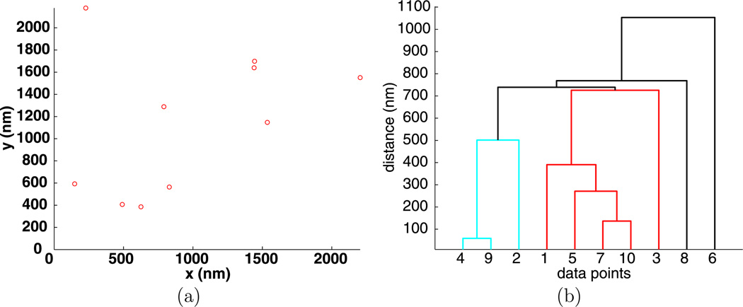
To illustrate hierarchical clustering, an example of 10 random points is given in Fig. 2(a) and its hierarchy of clusters visualized by a dendrogram is given in Fig. 2(b). The vertical axis on the dendrogram plot gives the clustering distance d, while the horizontal axis lists the individual points that are collected into clusters. For the data shown in Fig. 2(b), if d < 50 nm, there are only trivial clusters, while for d > 1100 nm all the points are in one large cluster.
Fig. 2.
Positions (a) and dendrogram (b) for 10 random points
To identify intermediate clusters in Fig. 2, consider a value of d between the smallest distance between any two particles and the distance where there is only one large cluster. If a horizontal line is drawn at height d, then the intersection of this line with the vertical lines of the dendrogram plot gives all of the clusters determined by the clustering distance d. The horizontal line connecting two clusters lies at a height d where two or more clusters merge into one. In Fig. 2, for d = 100 nm, there is one nontrivial cluster consisting of the points {4, 9}. For d = 200 nm, there are two clusters, the previous and {7, 10}. For d = 300 nm, there is cluster {4, 9} and point {5} joins cluster {7, 10} to form cluster {5, 7, 10}.
3 The Analysis Tools
The goal of this section is to describe the concept of the intrinsic clustering distance dI that will characterize the nanoscale distance between particles that are in clusters. This distance is computed by CQ, the clustering quantification program, which computes the clusters in the data as a function of the clustering distance d, and then computes the function C(d) ≥ 1 that gives the number of nontrivial clusters determined by the distance d. For very small values of d, every cluster given by the dendrogram function contains one particle and is thus trivial. For our data, there can only be one cluster for , because this is the length of the diagonal (maximum length) of the membrane imaged. Typically, there is only one cluster for d greater than a few hundred nanometers. We define the intrinsic clustering distance dI to be the smallest value of d for which there is a maximum number of clusters, that is, for all d, C(d) ≤ C(dI) and if C(d) = C(dI), then dI ≤ d.
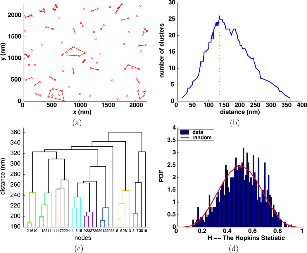
To illustrate our ideas and use of the CQ program, we generated a modest example with 100 random points in a region the same size as that in our biological data and plotted these points in Fig. 3(a). Typically, the images of biological data contain several hundred points, but some do contain fewer than 100 points. We then computed C(d) and plotted the result in Fig. 3(b). The maximum of C(d) is at d = 134 nm, so dI = 134 nm. Next, the clusters for d = 134 nm were computed, and then the MATLAB function convexHull was used to compute the convex hulls of the clusters, which were then plotted in Fig. 3(a).
Fig. 3.
Simulated random data with 100 points: (a) clusters enclosed by their convex hulls for dI = 134 nm; (b) number of clusters C(d) with a vertical line at dI; (c) dendrogram of 100 points using 30 nodes; (d) Hopkins clustering test
The dendrogram in Fig. 3(c) reduces the 100 points to 30 nodes. Figure 3(d) shows the Hopkins statistic (Zhang et al. 2006) which indicates a very small amount of clustering within the randomly generated data as the bar graph has moved slightly to the right of the expected curve for random data. The fact that dI is large indicates the data are random. It is clear that a more quantitative assessment of the clustering would really be helpful in assessing the clustering in data.
The function C(d) is noisy, as is indicated in Fig. 3(b) for random data and Figs. 10, 11, 12, 13, and 14 for biological data. We tried fitting parts of the C(d) curve with some smooth simple functions, and then computing the maximum of the smooth function. However, this made no significant improvement in our estimates, and thus is not used in the CQ program.
For the biological data, the average number of particles in an images is 252. The dendrogram function reduces this number of points to 30 nodes, as illustrated in Fig. 3(c). This emphasizes the large scale structure of the clustering, so is only of modest interest to the biologists. Consequently, we will emphasize dendrograms of small subsets of our data, as is done in Sect. 4.2.
What we need to know is how much more clustering is in the biological data than in the randomly generated data. Because the number of particles in a biological image is highly variable, we need to study the clustering in random data as a function of the number of points in an image. This can then be used to normalize the intrinsic clustering distance, producing a clustering ratio that we use to characterize the amount of clustering in biological data. Note that because the biological data are highly variable, we will need to compute averages over the data sets with the same stimulus to obtain reasonable results.
3.1 Simulated Random Data
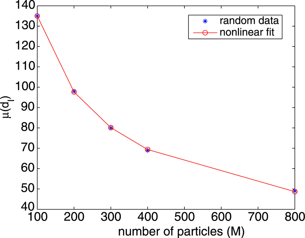
An important factor is that, for a fixed clustering distance d and a fixed region, the number of clusters in simulated random data increases as the number of particles M increases. To understand how this affects the biological data, using the function rand from MATLAB, we simulated a uniform distribution of M random particles 100 times and then computed the average µ(dI) and standard deviation σ(dI) of the intrinsic distances. These are tabulated in Table 2 for several values of M. An example of one of the simulations is shown in Fig. 3.
Table 2.
The mean and standard deviation of the intrinsic distance dI for 100 simulations using M particles
| M | µ(dI) | σ(dI) |
|---|---|---|
| 100 | 135 | 18 |
| 200 | 98 | 9 |
| 300 | 80 | 7 |
| 400 | 69 | 5 |
| 800 | 49 | 3 |
To compare the intrinsic distance for biological data to that for simulated random data, we will need the values of dI for many values of M other than those in Table 2. These values are plotted in Fig. 4 and look like the plot of the reciprocal of a polynomial. Consequently, we fit these values with a function d̃I(M) of the form
| (1) |
using the fminsearch function from MATLAB. This produces
| (2) |
that is also plotted in Fig. 4. The fit is excellent with a relative mean square error of 0.3%. Note that d̃I(M) very slowly goes to zero as M goes to infinity.
Fig. 4.
Nonlinear fit of the simulated random data from Table 2
It is typical for the number of particles in the images to be analyzed to vary substantially. To compensate for this, we introduce the clustering ratio
| (3) |
which measures how much more the biological data clusters as compared to simulated random data for the same number of particles. It is the clustering ratio that provides an intuitively reasonable measure of clustering. It is also reasonable to define the clustering ratio as the reciprocal of ρI, that is, as dI/d̃I. Our choice makes ρI increase with an increasing stimulus, and thus is more intuitive.
4 Analysis of Biological Data
For the biology, it is important to know when the FcεRI are interacting. These molecules are about 10 nm in diameter. So, it is unlikely that particles that are 50 nm apart are attached to receptors that will interact, while at 20 nm, it is far more likely that the receptors are interacting. The clustering distances dI that are given in Table 3 indicates that it is more likely that the receptors interact as the stimulus increases. At time t = 1 min, the trend is that dI decreases for increasing stimulus dose. At time t = 2 min, data were not taken for zero stimulus as this would be similar to the data at t = 1 min. For stimulus 0.001, only two data sets were taken. For t = 2 min, the remaining data show some decrease with increasing stimulus. For all of the data, in the t = 1 min case, the intrinsic distance varies from 140 nm down to 14 nm. By t = 2 min, the variation is smaller, 79 nm down to 12 nm.
Table 3.
The intrinsic distance for the biological data: column 1 is the amount of stimulus s added; column 2 is time t at which the cells were fixed and columns labeled 1 through 11 give the values of dI
| s | t | 1 | 2 | 3 | 4 | 5 | 6 | 7 | 8 | 9 | 10 | 11 |
|---|---|---|---|---|---|---|---|---|---|---|---|---|
| 0.000 | 1 | 78 | 80 | 140 | 75 | 23 | 72 | 27 | 96 | 38 | 20 | – |
| 0.001 | 1 | 68 | 31 | 66 | 23 | 82 | 37 | 32 | 32 | 27 | 53 | – |
| 0.010 | 1 | 45 | 17 | 20 | 20 | 23 | 29 | 36 | 24 | 43 | 35 | – |
| 0.100 | 1 | 20 | 16 | 16 | 48 | 24 | 16 | 17 | 17 | 23 | 21 | |
| 1.000 | 1 | 15 | 17 | 25 | 17 | 29 | 16 | 16 | 23 | 16 | 14 | |
| 0.001 | 2 | 24 | 36 | – | – | – | – | – | – | – | – | – |
| 0.010 | 2 | 19 | 79 | 65 | 41 | 37 | 34 | 22 | 30 | 33 | 35 | – |
| 0.100 | 2 | 21 | 16 | 20 | 14 | 21 | 20 | 16 | 17 | 16 | 23 | – |
| 1.000 | 2 | 30 | 26 | 21 | 12 | 25 | 32 | 24 | 22 | 22 | 23 | – |
The intrinsic clustering ratio for the biological data ρI is shown in Table 4. As for the clustering distance, the clustering ratio is noisy. However, there is a clear trend in the t = 1 min for the clustering ratio to increase with stimulus, especially for the three largest stimuli. For the t = 2 min, the clustering ratio for s = 0.100 is larger than for weaker or stronger stimuli. The laboratory has also generated dynamic data for the FcεRI receptor that indicates that, for the stronger stimuli, most of the clustering has been completed before t = 1 min, which could possibly explain this apparent lack of correlation between stimulus and clustering.
Table 4.
The clustering ratio: column 1 is the amount of stimulus added; column 2 is the time at which the cells were fixed; and columns labeled 1 through 11 give the values of the clustering ratio ρI
| s µg/ml |
Time min |
1 ρI |
2 ρI |
3 ρI |
4 ρI |
5 ρI |
6 ρI |
7 ρI |
8 ρI |
9 ρI |
10 ρI |
11 ρI |
|---|---|---|---|---|---|---|---|---|---|---|---|---|
| 0.000 | 1 | 1.47 | 1.47 | 0.96 | 1.98 | 4.84 | 1.42 | 3.39 | 1.39 | 2.62 | 5.18 | – |
| 0.001 | 1 | 2.30 | 3.47 | 1.31 | 3.52 | 1.13 | 1.80 | 2.00 | 2.03 | 2.37 | 1.22 | – |
| 0.010 | 1 | 1.60 | 5.20 | 3.82 | 2.89 | 3.46 | 2.50 | 2.14 | 2.52 | 2.08 | 2.55 | – |
| 0.100 | 1 | 4.27 | 4.51 | 4.16 | 1.89 | – | 3.49 | 5.62 | 3.83 | 4.21 | 3.27 | 5.22 |
| 1.000 | 1 | 7.49 | 4.18 | 2.16 | 4.74 | – | 3.05 | 5.52 | 5.67 | 4.41 | 6.81 | 7.46 |
| 0.001 | 2 | 2.86 | 1.98 | – | – | – | – | – | – | – | – | – |
| 0.010 | 2 | 5.65 | 1.24 | 1.85 | 2.13 | 2.84 | 3.08 | 5.09 | 3.57 | 2.73 | 2.49 | – |
| 0.100 | 2 | 3.63 | 4.43 | 7.67 | 10.83 | 4.29 | 6.31 | 7.48 | 6.53 | 6.44 | 4.85 | – |
| 1.000 | 2 | 3.01 | 4.11 | 4.19 | 7.64 | 3.66 | 4.20 | 5.87 | 4.12 | 4.14 | 4.22 | – |
Because of the noise in the clustering ratio, we computed the average and standard deviation of the clustering ratio of the data over all of the experiments with the same stimulus, and give the results in Table 5. We first observe that, for the unstimulated data, the clustering as measured by the ρI, is more than twice what is seen in simulated random data. Next, at t = 1 min, there is a clear trend for the clustering to increase as the stimulus increases. In fact, at t = 1 min, we see that increasing the stimulus by a factor of 10 increases the clustering ratio by approximately 1. More precisely
Table 5.
Stimulus s, time t, mean µ and standard deviation σ of the clustering ratio ρI from Table 4
| s | t | µ(ρI) | σ(ρI) |
|---|---|---|---|
| 0.000 | 1 | 2.47 | 1.51 |
| 0.001 | 1 | 2.12 | 0.85 |
| 0.010 | 1 | 2.87 | 1.04 |
| 0.100 | 1 | 4.07 | 1.04 |
| 1.000 | 1 | 5.15 | 1.79 |
| 0.001 | 2 | 2.42 | 0.62 |
| 0.010 | 2 | 3.07 | 1.38 |
| 0.100 | 2 | 6.25 | 2.12 |
| 1.000 | 2 | 4.52 | 1.31 |
At 2 min, the relationship between the stimulus is more complex but is larger for the strongly stimulated cells than for the unstimulated. It is also important to note that the standard deviation σ is quite large. This quantifies the amount of variation in the data, which is quite large, but does not increase as fast as the mean µ. For example, for 2 min with stimulus 0.100, µ is quite large, but so is the standard deviation. It is possible that running more experiments would reduce the standard deviation and produce values of µ in line with the t = 1 min data.
4.1 Additional Analysis Using the CQ Program
The clustering analysis program CQ computes many quantities other than the intrinsic distance dI and clustering ratio ρI. For example, it computes: the total number of clusters (tnc), the maximum cluster size (mcs), and the percentage of particles in clusters (ppc). Since the particles per TEM image vary between 72 and 654 (see Table 1), we present weighted averages of the these quantities in Table 6. The weighted average is computed as follows. Let ni, 1 ≤ i ≤ I be the number of points in the images in a data set; here I = 10. Then set
Table 6.
Column 1, stimulus s; column 2, time t; columns 3–9, weighted averages of the data sets, column 3, intrinsic distance dI; column 4, percentage of articles in clusters (ppc); column 5, total number of particles (tnp); column 6, total number of clusters (tnc); column 7, maximum cluster size (mcs) using dI; For comparison with previously published results (Andrews et al. 2009), columns 8–9 use a fixed cluster distance of 50 nm: column 8, percentage of particles in clusters (ppc); column 9, maximum cluster size (mcs)
| 1 s |
2 t |
3 dI |
4 ppc |
5 tnp |
6 tnc |
7 mcs |
8 ppc |
9 mcs |
|---|---|---|---|---|---|---|---|---|
| 0.000 | 1 | 57 | 72 | 149 | 40 | 8 | 65 | 10 |
| 0.001 | 1 | 41 | 73 | 329 | 93 | 11 | 75 | 14 |
| 0.010 | 1 | 28 | 72 | 352 | 91 | 10 | 81 | 16 |
| 0.100 | 1 | 21 | 71 | 314 | 77 | 11 | 87 | 34 |
| 1.000 | 1 | 20 | 68 | 272 | 82 | 9 | 92 | 33 |
| 0.001 | 2 | 30 | 76 | 395 | 97 | 9 | 86 | 15 |
| 0.010 | 2 | 39 | 70 | 189 | 49 | 10 | 71 | 12 |
| 0.100 | 2 | 19 | 68 | 183 | 55 | 10 | 90 | 36 |
| 1.000 | 2 | 23 | 70 | 197 | 48 | 11 | 89 | 57 |
If qi, 1 ≤ i ≤ I, are given data, then the weighted average of data is
Table 6 gives the weighted averages of several quantities related to the biological data. We include some results using a fixed cluster distance of 50 nm for comparison with the usual method of determining clusters using a fixed distance. For these data, we see:
column 3: For t = 1 min, dI decreases with increasing stimulus; for t = 2 min, dI is small and decreases a little.
column 4: The percentage of particles in clusters is essentially a constant, 70% for all the data. This is because dI decreases with increasing stimulus.
column 5: The total number of particles has substantial variation.
column 6: The total number of clusters has substantial variation, but is not strongly dependent on the stimulus concentration.
column 7: The maximum cluster size in this data set is essentially a constant 10 particles.
column 8: Using a fixed cluster distance of 50 nm, the percentage of particles in clusters for t = 1 min increases from about 65% to 92%. For t = 2 min and a strong stimulus, the percentage of particles in clusters is about 80% to 90%.
column 9: Again, using a cluster distance of 50 nm, the mean cluster size shows a strong increase with increasing stimulus.
Previous papers (Varma and Mayor 1998; Goswami et al. 2008) present experimental evidence that receptor clustering may be independent of receptor concentration and stimulus. We note that the percentage of particles in clusters, total number of clusters and maximum cluster size do not strongly depend on the stimulus; see columns 4, 6, and 7 from Table 6, which is in agreement with these papers.
4.2 Fine Scale Cluster Structure
To study the nanoscale structure of the membrane, we introduce the notion of a dense or compact cluster as a cluster determined using the distance dI. Previously, clusters were determined by a fixed distance, for example, 43 nm inAndrews et al. (2009). From Table 3, we see that dI is usually smaller than this distance, so the particles in clusters are typically closer together than when 43 nm is used. When dI ≤ 20 nm, the receptors must be nearly touching as they are about 10 nm in diameter.
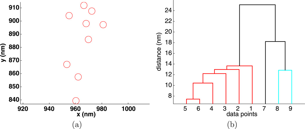
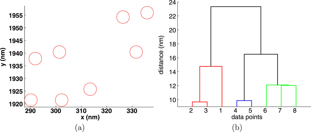
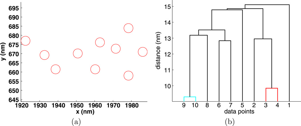
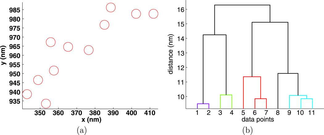
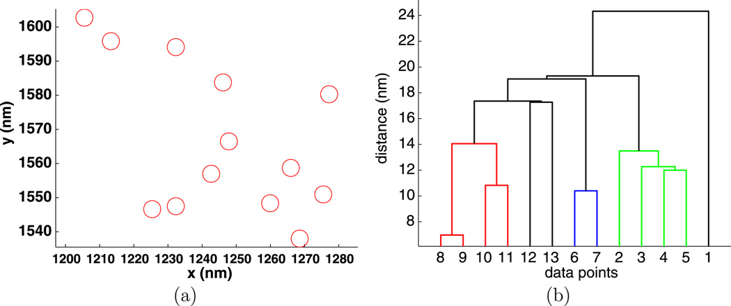
To illustrate how compact clusters can be used to understand membrane organization, we have included Figs. 5, 6, 7, 8, and 9. Note that because we are looking at a single image for each stimulus, the values of dI may not decrease with increasing stimulus. For each value of the stimulus and for t = 1min, we chose data from the experiment with the largest number of points M (see Table 7) and then found the largest compact cluster and plotted the cluster and its dendrogram. For these data, dI is small, between 17 nm and 32 nm so the clusters are compact. The gold particles are drawn to scale, that is with 5 nm circles. Note that the sizes of the gold particles may vary by as much as one nm.
Fig. 5.
Experiment 3368, stimulus s = 0.000 µg/ml, (a) positions and (b) dendrogram of the largest cluster at the intrinsic distance dI = 27 nm
Fig. 6.
Experiment 3410, stimulus s = 0.001 µg/ml, (a) positions and (b) dendrogram of the largest cluster at the intrinsic distance dI = 32 nm
Fig. 7.
Experiment 3397, stimulus s = 0.010 µg/ml, (a) positions and (b) dendrogram of the largest cluster at the intrinsic distance dI = 20 nm
Fig. 8.
Experiment 3390, stimulus s = 0.100 µg/ml, (a) positions and (b) dendrogram of the largest cluster at the intrinsic distance dI = 17 nm
Fig. 9.
Experiment 3374, stimulus s = 1.000 µg/ml, (a) positions and (b) dendrogram of the largest cluster at the intrinsic distance dI = 25 nm
Table 7.
The stimulus s, the intrinsic distance dI for the data sets with the largest number of particles M for each stimulus and t = 1 min
| s | dI | M | File |
|---|---|---|---|
| 0.000 | 27 | 229 | 3368 |
| 0.001 | 32 | 468 | 3410 |
| 0.010 | 20 | 575 | 3397 |
| 0.100 | 17 | 453 | 3390 |
| 1.000 | 25 | 654 | 3374 |
The dendrograms are quite useful in understanding the clusters. For example, in Fig. 5, we see that particles {1, 2, 3, 4, 5, 6} are a compact group, particles {7, 8, 9} form a less compact group, and these two groups are only about 25 nm apart. The cluster in Fig. 6 has a similar structure.
What is really apparent is that there is very little special structure in these clusters. This is probably due to the multivalent nature of the ligand. Currently, the laboratory is generating data using ligands with small valency. Here, we expect to see special cluster appearing, for example, linear chains of crosslinked receptors.
5 Discussion
It is well known that membrane proteins are distributed nonrandomly in the plasma membranes of animal cells. Evidence for this heterogeneity has been used to support the existence of a variety of membrane subdomains, including lipid rafts, protein islands and cytoskeletal corrals (Lingwood and Simons 2010; Oliver et al. 2004). It is also well known that protein distributions change when cells are stimulated. In the case of the high affinity IgE receptor, FcεRI, of mast cells, the change induced by the addition of multivalent antigen involves a reorganization of 5 nm gold particles marking receptors from singlets and small clusters to larger clusters, accompanied by biochemical and physiological responses by the activated cells. This ligand-driven redistribution of receptors has been observed by both scanning and transmission electron microscopy (Seagrave et al. 1991; Oliver et al. 2004) and has been confirmed using both the Hopkins and Ripley statistics (Zhang et al. 2006; Andrews et al. 2009). However, until now there has not been a good quantitative way to compare clustering between experimental conditions.
Here, we present a new method for clustering analysis based on the hierarchical clustering approach. Using the intrinsic clustering distance dI, we introduce a dimensionless number, the intrinsic clustering ratio ρI, that compares the amount of clustering of particles in a set of experimental images with the amount of clustering in simulated random data that contain the same number of particles. It is important that ρI is determined by an algorithm, and is independent of user input. Given a pattern of spatial points, the quantitative clustering program CQ is used to provide the intrinsic clustering distance dI that quantifies the density of the clustering in electron microscopy images. The dendrograms of the clusters provide a detailed summary of membrane receptor organization on the 10 nm scale and so should have important applications in understanding the molecular organization of membranes.
We apply the analysis to an experiment in which mast cells were activated for one or two minutes with increasing concentrations of multivalent antigen, then FcεRI receptors were tagged with gold nanoparticles and their distributions captured by electron microscopy and analyzed. Using ρI, our results confirm an increase in clustering with increasing stimulation already inferred from visual inspection of micrographs and from Hopkins and Ripley analysis. The analysis appears to be both robust and sensitive. In support of robustness, the change in the clustering ratio with increasing stimulation is readily detected even though the amount of clustering varies substantially between images from ten different cells exposed to the same experimental conditions. In support of sensitivity, the change in the clustering ratio with increasing stimulation is detected even though the particles are significantly clustered before the addition of stimulus. Remarkably, the clustering ratio is proportional to the logarithm of the stimulus concentration for the experiments analyzed here. Further analysis will determine if this is unique to the current data set.
The CQ program produces additional detailed information about the membrane organization, including the number of clusters, the three largest clusters, the total number, and percentage of particles in clusters. It also produces the following plots: the total number of clusters as a function of the distance d, the total number of particles in clusters as a function of the distance d, the clusters enclosed by their convex hulls, and the distribution of cluster sizes.
Acknowledgements
The authors would like to acknowledge Michael Wester for his assistance with the programming of the CQ program, reading of this manuscript and helpful suggestions. We thank the reviewers for their many useful comments that greatly improved this presentation.
This work was supported in part by the NIH grants P50GM085273, supporting the Center for Spatiotemporal Modeling of Cell Signaling and by the NIH grants R01GM49814 and R01AI051575.
Appendix: Largest Number of Particles Experiments
In Figs. 10–14, for each stimulus and t = 1 min, we chose the experiment with the largest number of particles and display the TEM image in (a). We also show a plot of the particle position with the clusters identified by CQ program enclosed by their convex hull in (b). The Hopkin’s test is displayed in (c) and the function C(d) that gives the number of nontrivial clusters as a function of the clustering distance d is displayed in (d). In postscript version of this paper, the plots can be magnified for better visibility.
Contributor Information
Flor A. Espinoza, Email: fespinoz@unm.edu, Department of Mathematics and Statistics, University of New Mexico, Albuquerque, NM 87131-1141, USA.
Janet M. Oliver, Department of Pathology, University of New Mexico, Albuquerque, NM 87131-1141, USA
Bridget S. Wilson, Department of Pathology, University of New Mexico, Albuquerque, NM 87131-1141, USA
Stanly L. Steinberg, Cancer Research and Treatment Center, Department of Mathematics and Statistics, University of New Mexico, Albuquerque, NM 87131-1141, USA
References
- Andrews NL, Lidke KA, Pfeiffer JR, Burns AR, Wilson BS, Oliver JM. Actin restricts FcεRI diffusion and facilitates antigen induced receptor immobilization. Nat. Cell Biol. 2008;10(8):955–962. doi: 10.1038/ncb1755. [DOI] [PMC free article] [PubMed] [Google Scholar]
- Andrews NL, Pfeiffer JR, Martinez AM, Haaland DM, Davis RW, Kawakami T, Oliver JM, Wilson BS, Lidke DS. Small, mobile FcεRI aggregates are signaling competent. Immunity. 2009;31(3):469–479. doi: 10.1016/j.immuni.2009.06.026. [DOI] [PMC free article] [PubMed] [Google Scholar]
- Baddeley A, Turner R. Lecture notes in statistics: Vol. 185. Case studies in spatial point pattern modelling. Berlin: Springer; 2006. Modelling spatial point patterns in R; pp. 23–74. [Google Scholar]
- Cominetti O, Matzavinos A, Samarasinghe S, Kulasiri D, Liu S, Maini PK, Erban R. DifFUZZY: a fuzzy clustering algorithm for complex data sets. IJCIBSB. 2010;1(4):402–417. [Google Scholar]
- Faeder JR, Hlavacek WS, Reischl I, Blinov ML, Metzger H, Redondo A, Wofsy C, Goldstein B. Investigation of early events in FcεRI mediated signaling using a detailed mathematical model. J. Immunol. 2003;170:3769–3781. doi: 10.4049/jimmunol.170.7.3769. [DOI] [PubMed] [Google Scholar]
- Fan N, Pardalos P. Linear and quadratic programming approaches for the general graph partitioning problem. J. Glob. Optim. 2010;48(1):57–71. [Google Scholar]
- Goswami D, Gowrishankar K, Bilgrami S, Ghosh S, Raghupathy R, Chadda R, Vishwakarma R, Rao M, Mayor S. Nanoclusters of GPI-anchored proteins are formed by cortical actindriven activity. Cell. 2008;135(6):1085–1097. doi: 10.1016/j.cell.2008.11.032. [DOI] [PMC free article] [PubMed] [Google Scholar]
- Gould HJ, Sutton BJ. IgE in allergy and asthma today. Nat. Rev. Immunol. 2008;8(3):205–217. doi: 10.1038/nri2273. [DOI] [PubMed] [Google Scholar]
- Jain AK, Dubes RC. Algorithms for clustering data. Upper Saddle River: Prentice-Hall; 1988. [Google Scholar]
- Jain AK, Murthy MN, Flynn PJ. Data clustering: a review. ACM Computing Reviews. 1999 [Google Scholar]
- Kinet J-P. The high-affinity IgE receptor FcεRI: From physiology to pathology. Annu. Rev. Immunol. 1999;17:931–972. doi: 10.1146/annurev.immunol.17.1.931. [DOI] [PubMed] [Google Scholar]
- Lagerholm BC, Weinreb GE, Jacobson K, Thompson NL. Detecting microdomains in intact cell membranes. Annu. Rev. Phys. Chem. 2005;56(1):309–336. doi: 10.1146/annurev.physchem.56.092503.141211. [DOI] [PubMed] [Google Scholar]
- Lingwood D, Simons K. Lipid rafts as a membrane-organizing principle. Science. 2010;327(5961):46–50. doi: 10.1126/science.1174621. [DOI] [PubMed] [Google Scholar]
- Oliver JM, Pfeiffer JR, Surviladze Z, Steinberg SL, Leiderman K, Sanders M, Wofsy C, Zhang J, Fan HY, Andrews N, Bunge S, Boyle TJ, Kotula P, Wilson BS. Membrane receptor mapping: the membrane topography of FcεRI signaling. In: Quinn PJ, editor. Subcellular biochemistry 37: membrane dynamics and domains. Dordrecht: Kluwer Academic/Plenum; 2004. pp. 3–34. [PubMed] [Google Scholar]
- Oliver JM, Seagrave JC, Stump RF, Pfeiffer JR, Deanin GG. Signal transduction and cellular response in RBL-2H3 mast cells. Prog. Allergy. 1988;42:185–245. [PubMed] [Google Scholar]
- Schaeffer SE. Graph clustering. Comput. Sci. Rev. 2007;1(1):27–64. [Google Scholar]
- Seagrave JC, Pfeiffer JR, Wofsy C, Oliver JM. The relationship of IgE receptor topography to secretion in RBL-2H3 mast cells. J. Cell. Physiol. 1991;148(1):139–151. doi: 10.1002/jcp.1041480117. [DOI] [PubMed] [Google Scholar]
- Tan M, Broach J, Floudas C. A novel clustering approach and prediction of optimal number of clusters: global optimum search with enhanced positioning. J. Glob. Optim. 2007;39:323–346. doi: 10.1142/s0219720007002941. [DOI] [PubMed] [Google Scholar]
- Tan P-N, Steinbach M, Kumar V. Introduction to data mining. Reading: Addison-Wesley; 2006. [Google Scholar]
- Varma R, Mayor S. GPI-anchored proteins are organized in submicron domains at the cell surface. Nature. 1998;394:798–801. doi: 10.1038/29563. [DOI] [PubMed] [Google Scholar]
- Wilson BS, Pfeiffer JR, Surviladzea Z, Gaudet EA, Oliver JM. High resolution mapping reveals distinct FcεRI and LAT domains in activated mast cells. J. Cell Biol. 2001;154(3):645–658. doi: 10.1083/jcb.200104049. [DOI] [PMC free article] [PubMed] [Google Scholar]
- Wilson BS, Pfeiffer JR, Raymond-Stintz MA, Lidke D, Andrews N, Zhang J, Yin W, Steinberg S, Oliver JM. Exploring membrane domains using native membrane sheets and transmission electron microscopy. Methods Mol. Biol. 2007;398 doi: 10.1007/978-1-59745-513-8_17. [DOI] [PubMed] [Google Scholar]
- Xue M, Hsieh G, Raymond-Stintz MA, Pfeiffer J, Roberts D, Steinberg SL, Oliver JM, Prossnitz ER, Lidke DS, Wilson BS. Activated N-formyl peptide receptor and highaffinity IgE receptor occupy common domains for signaling and internalization. Mol. Biol. Cell. 2007;18(4):1410–1420. doi: 10.1091/mbc.E05-11-1073. [DOI] [PMC free article] [PubMed] [Google Scholar]
- Zhang J. Markov random field modeling of the spatial distribution of proteins on cell membranes. Ph.D. thesis. Albuquerque, New Mexico: University of New Mexico; 2010. [DOI] [PubMed] [Google Scholar]
- Zhang J, Leiderman K, Pfeiffer JR, Wilson BS, Oliver JM, Steinberg SL. Characterizing the topography and interactions of membrane receptors and signaling molecules from spatial patterns obtained using nanometer-scale electron-dense probes and electron microscopy. Micron. 2006;37(1):14–34. doi: 10.1016/j.micron.2005.03.014. [DOI] [PubMed] [Google Scholar]
- Zhang J, Steinberg S, Wilson B, Oliver J, Williams L. Markov random field modeling of the spatial distribution of proteins on cell membranes. Bull. Math. Biol. 2008;70:297–321. doi: 10.1007/s11538-007-9259-0. [DOI] [PubMed] [Google Scholar]


