Humans are primarily visual creatures; we have evolved to perceive the world mainly through our eyes, and we usually trust our vision above all other senses. Little wonder, then, that the visual representation of scientific evidence is invaluable to our understanding of the world. From the early anatomical drawings of Leonardo da Vinci or illustrations from Andrea Vesalius's De Humani Corporis Fabrica, to modern figures in scientific papers and photographs of microscopic structures, scientific images have led to the progression of knowledge and understanding of scientific discoveries, even beyond the scientific community.
Science is becoming more visual, both in the manner that researchers interact with their data […] and in the way they communicate
Because modern advances in scientific imaging techniques and data presentation have become so complex, and because visualization is crucial for the progress of science, the visualization of science is becoming an important discipline in and of itself
Scientific images connect scientists and the general public to scientific ideas, fostering understanding and support. David Goodsell, a molecular biologist at The Scripps Research Institute, La Jolla, California, and the creator of vibrant biomolecular artwork such as that shown in his book, The Machinery of Life [1], or in the Protein Data Bank's Molecule of the Month (www.pdb.org), certainly takes this view. “Images are essential in science outreach for several reasons. First, images are a way to present a scientific result in a tangible, interpretable way. Images are often more intuitive than text descriptions, particularly for subjects like molecular structures where an actual 3D object is being depicted and described,” he said. “Also, images are an effective way to present the context of a particular topic, for instance, by showing a particular molecule in its cellular context, or the effect of a mutation in the context of the structure/function of an entire protein.”
Yet the visualization of scientific knowledge was not always de rigueur, as Oxford art historian Martin Kemp [2] has pointed out: “The conjunction of the rise of the printed book as a prime means of transmitting information and the Renaissance reformulation of the means of visual representation was clearly an integral part of what we call the Scientific Revolution”. There were also those who felt that narrative descriptions remained superior to pictures, prompting one of the fathers of modern botany and a pioneer of accurate representations of plants, Leonhard Fuchs, to write “who in his right mind would condemn pictures which can communicate information much more clearly than the words of even the most eloquent men?” in the introduction to his great herbal of 1542.
Today, visualization is accepted as integral to the communication of science, as scientific illustrator Graham Johnson, at the University of California, San Francisco, California, pointed out: “Science is becoming more visual, both in the manner that researchers interact with their data—visual analysis of results, visual interpretation of results, and hypothesis generation from visual results, models, and contextual visual ensembles—and in the way they communicate. This permits a deeper and broader understanding, but comes at a sizeable cost of complexity”.
…the real challenge—to visualize large data sets in an era of high-throughput experimentation and advanced imaging techniques—is becoming a discipline in itself
Johnson also thinks that the evolution of scientific visualization is intimately linked to the technical and artistic developments of the past centuries: “It seems this evolution, whether good or bad, towards imagery and experience and away from the written word, coincides with cultural trends and technological development,” he said.
The evolution of scientific visualization, from da Vinci's hand-drawn illustrations to modern computer graphics, has provided scientists and illustrators with an increasingly sophisticated palette of tools.
“At first, computer graphics were only available to experts, because of the expense of the hardware and the need to develop custom software, and scientists were actually one of the major groups of users that drove the development of hardware, with the military being the other main group,” Goodsell explained. “Today, computer graphics are ubiquitous, with affordable hardware and excellent free software, so researchers typically create their own visualizations, without the need to go to a graphics expert. Because of this, images are everywhere, from research publications to textbooks to the news media”.
Johnson agrees: “Not only can we reliably ‘see’ or model things that were formerly ‘less visible’, but the dissemination of such visualizations, once a costly pipeline, is practically free by comparison and available in a wider variety of media experiences”.
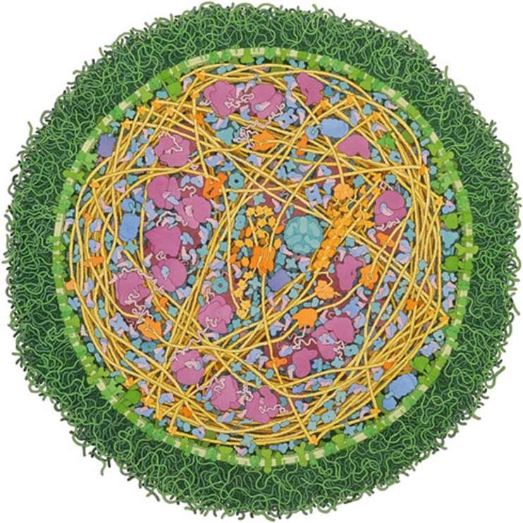
As the technology of visualization per se is no longer a problem, the real challenge—to visualize large data sets in an era of high-throughput experimentation and advanced imaging techniques—is becoming a discipline in itself. This is particularly true for things at the so-called ‘mesoscale’, an intermediate universe that remains vaguely represented compared to larger (cellular) and smaller (molecular) biological scales. “For the past 20 years or so, I have been working on a series of illustrations that show the molecular structure of living cells,” Goodsell said (Fig 1). “This is an exciting level of scale for study, since there aren't any good experimental methods for imaging the mesoscale directly: microscopy can image whole cells, but typically doesn't resolve individual molecules, and atomic methods like X-ray crystallography give atomic structures, but seen in isolation, away from their cellular context”. In his illustrations, Goodsell integrates information from microscopy, structural biology and biochemistry to simulate an image of the molecules inside a cell [3]. “When I started creating these illustrations in the early 1990's, finding the information to support them was the most difficult part of the process. Today, everything is much easier, as there is fast and easy access to information across disciplines and primary data on structure, sequence, genomes, proteomes, interactomes and more,” he explained.
Figure 1.
Mycoplasma mycoides. A watercolour painting of an entire Mycoplasma mycoides cell. The cell shown is about 250 nm in diameter, which is at the small end of the range of observed sizes. All of the macromolecules—including components of the protein synthesis machinery, enzymes for energy production and membrane proteins—have been included, at reasonable locations and concentrations, and with the actual shapes and sizes. Small molecules such as sugars, ATP and water are not shown. Credit: David Goodsell, The Scripps Research Institute, La Jolla, California. Reproduced with permission.
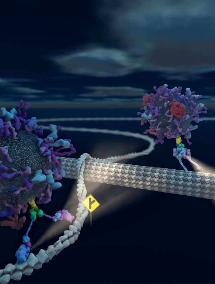
Johnson is similarly interested in finding ways to integrate and visualize vast amounts of data to aid understanding. “Many experiments produce massive multidimensional data sets that must be mined, filtered, processed, etc. to reduce them to a level and a representation that humans can digest,” he said. “A project I carry over from my thesis work at The Scripps Research Institute called autoFill, and a toolkit we have developed called autoCell, generate 3D models of complex biological environments, including whole cells, in molecular detail from multi-scale data inputs and a novel packing algorithm framework.” Johnson explained that whilst autoCell works hard to assemble data into unified models, a crucial aspect of its development involves inventing or recruiting techniques to filter, simplify or otherwise clarify the resulting models to achieve specific research or communication goals (Fig 2). “To diagram a molecular signalling pathway in the context of a whole cell modelled in molecular detail, for example, requires the overwhelming ancillary information—the other 99.9% of the incidentally participating molecules—to be visually subdued with any number of approaches whose principles date back centuries in the history of medical and scientific illustration. In many cases, we simply write algorithms to apply the approaches—for example, blending the ancillary molecules into the background,” Johnson said (Sidebar A).
Figure 2.
A switch in intracellular transport systems. The illustration portrays the transport of cargo vesicles along actin filaments and microtubules, with the intersection symbolizing the transition between cytoskeletal elements. The image was created by Graham Johnson, QB3 Fellow at the University of California, San Francisco (http://grahamj.com), using autoCell in combination with traditional 3D modelling and hand-painting in Photoshop. The illustration was made for Frank Heisler et al to use on the April 2011 cover of Neuron (Neuron 70: >66–81, 2011; http://www.cell.com/neuron/). Reproduced with permission.
Sidebar A | Irving Geis: a molecular visionary.
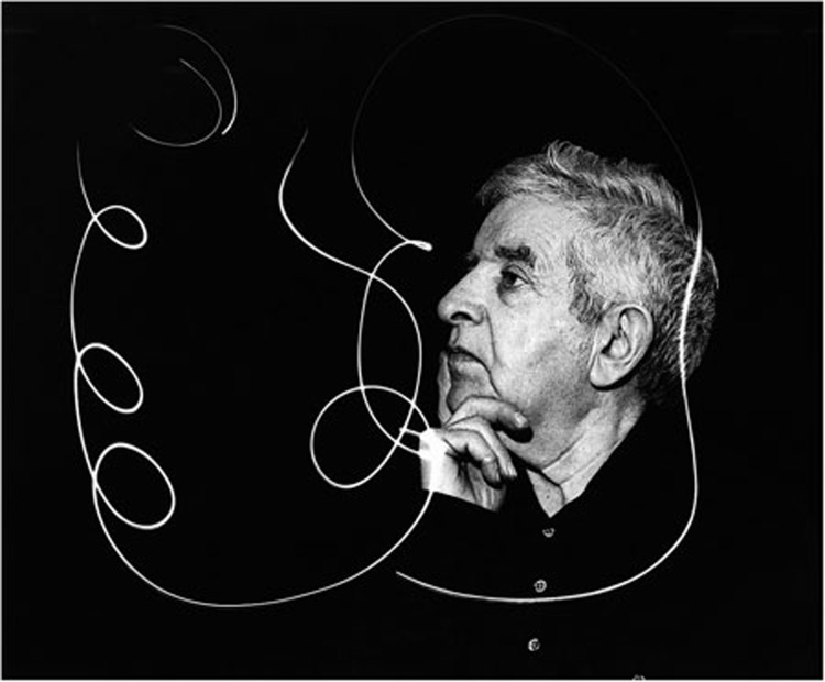
It is virtually impossible, if not simply unfair, to talk about the visual rendering of science without mentioning the molecular art of Irving Geis (1908–1997; see illustration). Generations of biochemistry and molecular biology students have learned to visualize macromolecules thanks to the pioneering drawings of this gifted illustrator (see illustration). As biochemist Richard Dickerson wrote in Geis's obituary: “Irv was very taken with the importance of using art to put across scientific concepts. On more than one occasion, he likened himself to Andreas Vesalius, whose informative and artistic engravings taught the Renaissance public about the new field of human anatomy. Irv thought of his own role as that of a molecular Vesalius, using art to teach the modern public about the equally new field of molecular anatomy” [6]. Geis believed that some ‘selective lying’ was necessary to make his illustrations understandable, a position that Goodsell and Johnson discussed in an article on the practice of distorting evidence to deliver more comprehensible scientific images and the acceptable limits of this ‘artistic license’. “Protein molecules are so complex that he [Geis] needed to rely on all of the tricks of the trade, including depth cuing and careful shading—methods that are completely true to the underlying structure,” they wrote. “But the pictures were still too confusing, due to unfortunate overlapping of portions of the structure, so he shifted portions in the front and rear slightly, resolving these overlaps and making the three-dimensional relationships more clear” [7].
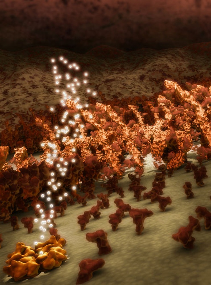
“The act of drawing, and of looking at the resulting images in order to understand—whether the images are conceptual and schematic, or ‘realistic’—is part of the scientific process for most scientists, and in this respect, the production of molecular visualization using the instruments of computer graphics is no exception,” said Monica Zoppè, from the Scientific Visualization Unit of the Institute of Clinical Physiology, CNR, Pisa, Italy (www.scivis.ifc.cnr.it). “In our experience, as we study the subject first, and then build the molecules and their activity in the 3D space, we realize a better understanding precisely in the act of producing the visualization, the computer graphics equivalent of drawing.” Although the molecules are built using PDB files, with precise atomic coordinates, there are still several elements—lighting, camera angle, speed, music and so on—that are left to the creativity of the producer, both in the case of still images (Fig 3) and in 3D animation. This artistic input, Zoppè says, is vital. “Visualizations such as ours, or those of our colleagues, bring the molecular world to the public; they can certainly be used in class, with teachers explaining details, or they can be shown at science museums and festivals.”
Figure 3.
Lipid raft. Membrane rafts are places of intense protein ‘social’ interaction. Here proteins meet, exchange information among themselves and organize the details to be transmitted to the interior of the cell. The image—obtained by using the software package BioBlender and a brand new visual property code—won the ‘Art of Science Image Contest’ at the Biophysical Society's 56th Annual Meeting in San Diego, February 2012. Credit: Monica Zoppè, Scientific Visualization Unit, Institute of Clinical Physiology, CNR, Pisa, Italy. Reproduced with permission.
In an attempt to glimpse the future of scientific visualization, the Visualizing Biological Data (VIZBI; http://vizbi.org/) international conference series was launched in 2010 with funding from the European Molecular Biology Organization (EMBO; Heidelberg, Germany) and the National Institutes of Health (NIH; Bethesda, Maryland, USA). By reviewing the state-of-the-art and by highlighting future challenges in the visualization of life science data, VIZBI aims to provide an overview of the present and future state of computer-based visualization. “Biology is so complex, so multifaceted, that almost every new experiment requires a new visual framework, a new visual space for representing the data in a way that provides insight. Thus, we require sustained creativity in how we analyse and visualize biological data,” commented VIZBI Chair, Seán O'Donoghue, a research scientist with Australia's national science agency, the Commonwealth Scientific and Industrial Research Organization (CSIRO). “This is a mistake sometimes made by computer scientists outside of biology; they think that general principles will solve all our problems in biology. This is not the case: the challenge is to adapt these principles to specific experimental situations—and this usually requires a lot of work.” O'Donoghue believes that we need to raise the bar of data visualization in biology if we are to understand and make sense of the modern flood of high-throughput data. “All of us involved—bioinformaticians, computational biologists and bench biologists—need to improve our visual literacy; that is, we need to improve how well we can create engaging visualizations of our data that provide insight into underlying biological processes and events,” he said.
For O'Donoghue the real challenge lies not in the volume of biological data, but rather in its complexity and interconnectedness. Addressing this, he argues, will require a different approach to simply scaling up computer graphics systems with more memory and faster processors. “As important as such scaling is, it does not address the core issue of complexity. This is addressed by the area of visualization research known as ‘visual analytics’, which aims to create systems that allow the effective combination of visualization and data analysis, wrapped with graphics user interfaces that together allow life scientists to effectively explore and draw conclusions from their data,” O'Donoghue explained.
Biology is so complex, so multifaceted, that almost every new experiment requires a new visual framework, a new visual space for representing the data in a way that provides insight
Much of the VIZBI mission is focused on the effective visualization of large-scale transcriptional data or network activity—that is, abstract information that is not directly amenable to 3D modelling. In genome research, for example, where data analysis has firmly replaced data generation as the rate-limiting step, researchers from different fields—that is, not only computational experts and bioinformaticians—face the increasing need to analyse, browse and compare a rapidly expanding number of genomes. Several visualization methods and tools exist, but these methods and tools struggle to keep pace with new sequencing technologies, and although much of their use is automated, they still rely on a degree of manual adjustment [4]. Similarly, the visualization of ‘omics’ data for systems biology is another area in which better integration between the methods and tools used to investigate and visualize protein–protein interactions, patterns of gene expression and metabolic profile data, is also badly needed [5].
What is emerging is an inextricable link between images and science, where scientific progress changes the way we ‘see’ things, and the information conveyed by images and pictures in turn influences how science progresses. Put this way, it becomes clear that language, mathematics and images merge into a unified scientific discourse. A form of communication in which aesthetics plays a greater role than you might think. “My personal interest is also in the simple beauty of the cellular world, as I have ‘seen’ it in my mind since I first studied it at university. As scientists, we have the privilege of knowing the details of the molecular world, and this allows us to picture some aspects of cellular life. Because the personal picture that I have in my mind is so beautiful, I feel an artistic urge to show it,” Zoppè explained. “If people see our visualizations and like them, this is good enough for me. Of course, if they then also appreciate the science, or are somehow inspired to understand and learn more, it's even better,” she added. Johnson agrees that aesthetics are crucial in the endurance of visualization: “Often, to an almost dangerous degree, an aesthetically pleasing image seems to lend credence to the validity of the subject it represents—as if time put into the illustration reflects the quality of the science.” However, aesthetics, especially in the form of composition, is also important to the interpretability of a visual. “Not only can techniques of arranging data or illustrative components guide a viewer to a more clear understanding, but an aesthetic visual experience can motivate one to study the content longer—in other words, taking a viewer from ‘what is it?’ to ‘why do I care?’ and perhaps a step further to ‘how can I find out more?’” Johnson explained.
Seeing really is believing, and the images and illustrations associated with science can sometimes become iconic, leaving indelible marks in our minds. “The sciences produce millions of images, but only a few become icons. These succeed in part thanks to their intrinsic strength and the prominence of the initial publication or display. But they depend for long-term survival on users' decisions to continue reproducing them, even as conditions change,” commented Nick Hopwood, an expert in visual representation in science at the University of Cambridge in the UK. “Scientific icons that reach far beyond science have attracted the most attention; the double helix is a prime example. More routinely important are those images that come to stand for a topic, experiment or theory, that become, as we call it, the ‘textbook’ illustration,” he said.
“A few visualizations, probably through a combination of luck, quality, and networking, become canonical,” Johnson agreed. “In many cases, however, the first visual representation of some new discovery becomes the historic icon and gets duplicated and propagated over and over.” Indeed, icons have proven powerful throughout history, and those of science have an impact on the way we think about research, either positively or negatively. “Unfortunately, the establishment of icons sometimes propagates errors or more ‘crude’ understandings even when far greater detail or resolution has been achieved,” Johnson said.
“Icons shape knowledge by providing memorable summaries of whole fields. They may act as powerful vehicles for new views, recruiting researchers and wider audiences, and directing attention to fresh problems,” Hopwood explained. “They may then survive for decades, with the risk that they tend to close off other avenues of inquiry, even as their assumptions become problematic. Or they may be open enough to allow creative reworking and renewal.”
Whatever the case, it is clear that scientific visualization is here to stay. Those visual sensibilities that humans evolved as hunter-gatherers, pursuing prey and avoiding predators on the plains of Africa, have been carefully turned to more cerebral tasks. Even so, science in the era of ‘big data’ is severely challenging our visual tools, so that evolution must continue to adapt to the new environment.
Irving Geis (1908–1997), in a photo taken by his daughter, Sandy. Credit: Sandy Geis. Reproduced with permission.
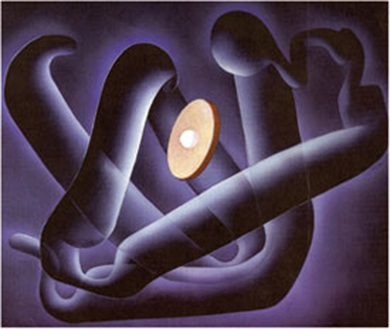
Irving Geis' Myoglobin Fold (1987). The α-helices form a watertight pocket for the haem (disc), in which oxygen is reversibly bound to the central iron atom. In 2000, the Howard Hughes Medical Institute (Chevy Chase, Maryland) purchased the Geis Archives, which comprise a collection of the artist's work and related scientific correspondence and library. Illustration by Irving Geis. Image from the Irving Geis Collection, Howard Hughes Medical Institute. Reproduced with permission.
Footnotes
The author declares that he has no conflict of interest.
References
- Goodsell DS (2009) The Machinery of Life, 2nd edn. New York, USA: Springer Science+Business Media [Google Scholar]
- Kemp M (1996) Temples of the body and temples of the cosmos: vision and visualisation in the Vesalian and Copernican revolutions. In Picturing Knowledge: Historical and Philosophical Problems Concerning the Use of Art in Science (ed. Baigrie B), pp 40–85. Toronto, Canada: University of Toronto Press [Google Scholar]
- Goodsell DS (2011) Eukaryotic cell panorama. Biochem Mol Biol Edu 39: 91–101 [DOI] [PubMed] [Google Scholar]
- Nielsen CB, Cantor M, Dubchak I, Gordon D, Wang T (2010) Visualizing genomes: techniques and challenges. Nat Methods 7: S5–S15 [DOI] [PubMed] [Google Scholar]
- Gehlenborg N et al. (2010) Visualization of omics data for systems biology. Nat Methods 7: S56–S68 [DOI] [PubMed] [Google Scholar]
- Dickerson RE (1997) Irving Geis, molecular artist, 1908–1997. Prot Sci 6: 2483–2484 [Google Scholar]
- Goodsell DS, Johnson GT (2007) Filling in the gaps: artistic license in education and outreach. PLoS Biol 5: e308. [DOI] [PMC free article] [PubMed] [Google Scholar]


