Abstract
The perception of an object's colour remains constant despite large variations in the chromaticity of the illumination—colour constancy. Hering suggested that memory colours, the typical colours of objects, could help in estimating the illuminant's colour and therefore be an important factor in establishing colour constancy. Here we test whether the presence of objects with diagnostical colours (fruits, vegetables, etc) within a scene influence colour constancy for unknown coloured objects in the scene. Subjects matched one of four Munsell papers placed in a scene illuminated under either a reddish or a greenish lamp with the Munsell book of colour illuminated by a neutral lamp. The Munsell papers were embedded in four different scenes—one scene containing diagnostically coloured objects, one scene containing incongruent coloured objects, a third scene with geometrical objects of the same colour as the diagnostically coloured objects, and one scene containing non-diagnostically coloured objects (eg, a yellow coffee mug). All objects were placed against a black background. Colour constancy was on average significantly higher for the scene containing the diagnostically coloured objects compared with the other scenes tested. We conclude that the colours of familiar objects help in obtaining colour constancy for unknown objects.
Keywords: Colour constancy, memory colours, object colour, colour appearance
1. Introduction
A ripe banana appears yellow whether you see it in the tungsten light of the kitchen or in sunlight outdoors. Under these two different illuminant conditions, the banana reflects very different light spectra to your eyes but still you perceive the inherently yellow colour of the banana, despite the changes in illumination.
The ability of our visual system to keep the colours of objects relatively stable despite variations in the wavelength distribution of the illumination is called colour constancy. Colour constancy is a great achievement for our visual system, as the light that reaches our eyes is the product of the spectral composition of the illumination and the spectral reflectance of a particular object. As we are mostly interested in the colour (spectral reflectance) of an object, the visual system must be able to discount the contribution of the illumination in the signal of the light reaching the eyes (Helmholtz 1867). What makes colour constancy so interesting is that there is no unique solution to obtain colour constancy, unless the visual system makes certain assumptions about the visual environment. A large body of research investigates the kind of information that the visual system uses in order to achieve colour constancy (for a recent overview see Smithson 2005). Measurements under very natural conditions both outside the laboratory (Granzier et al 2009a) and inside the laboratory (Granzier et al 2009b; Hansen et al 2007; for a recent overview see Foster 2011) show that colour constancy can be robust.
In most of the traditional colour constancy experiments, multi-coloured collages of flat, uniform patches (‘Mondrians’, named after the Dutch painter) are used. The abstract nature of these homogeneous coloured surfaces guarantees that memory does not play a role in obtaining colour constancy. However, in our daily lives, we are surrounded by familiar, textured, 3-D objects that we perceive under different illuminations instead of seeing flat, abstract, homogeneous surfaces. We see fruits, vegetables, but also handmade objects, that we are familiar with and of which we know the colour by memory—for example, your favourite clothes or the colour of your laptop.
Hering (1878) stated that object familiarity could have a potential role in achieving colour constancy. The memory of the colour of familiar objects (eg, a yellow banana, a red tomato etc) is traditionally defined as ‘memory colour’. If, for example, you see a banana, you can remember its typical yellow colour and use this particular colour as a reference point for dealing with the change in chromaticity of the illumination. For example, you could reason that this banana is less yellow than it ought to be, so your visual system could ‘reason’ that the illumination must be bluish. This estimate of the illuminant's colour can than be used to estimate the surface reflectance's for other objects present in the scene for which you do not know its colour, either as you have never seen this object before or the object could have any particular colour (eg, an unknown coloured coffee mug). Although Hering's hypothesis that memory colour could play a role in colour constancy is about 130 years old, we still do not understand if and under which conditions memory colour helps in obtaining colour constancy. The effect that shows that the familiar colour of a well-known object has an influence on how we perceive that object's colour is known as the ‘memory colour effect’. This effect requires that the object is strongly associated with a typical colour and that the beholder is highly familiar with the object. How strongly a particular object refers to a typical colour through memory colours is called colour diagnosticity (Biedermann and Ju 1988; Tanaka and Presnell 1999). Studies on memory colour indicate that the knowledge of an object's typical colour can indeed affect an object's perceived colour (Adams 1923; Bruner et al 1951; Delk and Fillenbaum 1965; Duncker 1939; Hansen et al 2006; Hurlbert and Ling 2005, but see Bolles et al 1959).
It is worth mentioning that the phenomenon of memory colour should not be confused with the concept of ‘colour memory’, which is the colour remembered from memory. Memory colour and colour memory are two related phenomena; when people have to memorize the colour of an object (colour memory), their memory is led by the object's typical colour (memory colour). Within the literature, the concept of memory colour and that of colour memory (and even colour preference) have been frequently equated, leading to a lot of confusion. For example, in most of the memory colour experiments, the subject has to keep the colour of the familiar object in memory during the colour matching (Adams 1923; Bolles et al 1959; Bruner et al 1951; Duncker 1939), which makes separating memory colour and colour memory impossible. We will not deal with the vast literature on colour memory, but we will here focus on the studies which have investigated memory colour.
Within the literature of memory colour, we have to further make a distinction between studies which have investigated memory colour effects across different illuminations (colour constancy) and those which have studied memory colour without changing the illumination. Recently, a study by Ling and Hurlbert (2008) investigated how colour memory affects successive colour constancy. They found that memory is a limiting factor on constancy and that, once memory was taken into account, colour constancy was nearly perfect. However, especially for the older literature, not all authors have mentioned whether their study dealt with colour constancy or whether they studied memory colour effects without changing the illumination.
The earliest studies (eg, Duncker 1939) investigating the role of memory colour used simple stimuli that were paper cut in the shape of that particular object and depicted in the representative or typical colour of that object (eg, a yellow paper cut in a long shape represents a banana). Colour matching experiments were performed, and these matches were compared for figures with or without characteristic colours. Some of these earlier experiments confirmed Hering's predictions in that the two identically coloured patches were perceived to differ in colour if they were shaped as a familiar object or as an unfamiliar object (Duncker 1939; Bruner et al 1951). Later experiments confirmed a strong memory colour effect (Delk and Fillenbaum 1965; Harper and College 1953), while others argued that the memory colour effect exists only when the stimulus information is much reduced or the task is very difficult (Bolles et al 1959; Bruner et al 1951).
As far as we can determine, none of the above mentioned findings, except those of Adams (1923), Duncker (1939), and Bruner et al (1951), demonstrate colour constancy effects and in general relate to highly artificial conditions. For example, Bruner et al (1951) let subjects make colour matches of eight patches cut from paper to represent items like a tomato, tangerine, a lemon, a lobster claw, etc. Subjects could match the papers' colours by using a colour wheel made up of yellow and red segments. The results show an inconsistent pattern of results neither confirming nor disapproving the memory colour effect and the memory colour effect depending on whether the stimulus itself was degraded or not.
One possible problem with some of these earlier experiments investigating memory colour is that subjects had to give a verbal response instead of that they could actually manipulate the colour of the object itself or that they had to match the colour of the object (Bruner et al 1951; Delk and Fillenbaum 1965). This could have introduced a bias in the results.
More recently, Gegenfurtner and colleagues (Hansen et al 2006; Olkkonen et al 2008) and Hurlbert and colleagues (Vurro et al 2007, 2009) have studied memory colour using well controlled stimuli. Hansen et al (2006) showed the effect of memory colour on the colour appearance of familiar objects. Fourteen subjects were asked to adjust the colour of photographs presented on a CRT of natural fruit objects until they appeared achromatic. Two control stimuli were used: a uniformly coloured disk and random noise disks resembling the chromatic characteristics of a banana. The main results of this study were that the photographs of the diagnostical objects (fruits) were perceived to be achromatic when their colour was shifted away from the observers' neutral point in a direction opposite to the typical colour of the fruit. These effects were not found for the control stimuli, leading the authors to conclude that there is a memory colour effect for the familiar objects. In a follow up article Olkkonen and colleagues (2008) asked subjects to perform a similar task using the same stimuli under various simulated illuminations. Two control conditions were used: Photographs of 3-D fruit shapes without texture and 2-D outline shapes. Subjects had to set the colour of the stimuli either to the achromatic point or to its typical colour. The results showed that the strength of the memory colour effect depends on how natural the stimuli were and that the memory colour effect was present and robust under all rendered illuminants tested. Olkkonen et al (2008) report that the memory colour effect is weak only when using simple outline shapes of familiar objects (as most of the older studies using outline shapes have shown). Thus, these authors show that the memory colour effect depends strongly on the relevant visual features of the familiar objects: the shape, shading, and the texture are all important. However, Witzel et al (2011) found memory colour effects that were independent of their perceptual complexity and the abstractness of their colour diagnostic characteristics (for example, they also used brand specific logos in their experiments).
Vurro et al (2007, 2009) investigated how certain cues to a familiar object's identity influence colour appearance by asking subjects to adjust a stimulus colour to its typical colour (eg, setting a banana 3-D shape to it's natural yellow colour). They found that memory colour is more accurate and more consistent for polychromatic stimuli (stimuli containing more reflectances) compared to homogenous stimuli and more accurate for diagnostic shapes (natural contour) than generic shapes and more accurate for 3-D than 2-D conditions. With respect to colour constancy, they found better colour constancy for textured stimuli than for uniform stimuli. However, Hurlbert et al (2007, 2009) did not find an effect of shape diagnosticity (eg, the natural outline of a banana) or better colour constancy for 3-D objects compared to 2-D objects. The findings from Vurro et al (2007, 2009) could suggest that perhaps more cues to the object identity and a more natural stimulus facilitates the observers in assessing their colour information from memory, in line with Olkkonen et al (2008).
Granzier et al (2009b) studied whether subjects are better able to directly estimate the colour of the illuminant itself when the illumination shines on a scene with diagnostical coloured objects compared to when the same lamps illuminate a scene with objects having no diagnostical colour. These authors were unable to find an effect of memory colour on estimates of the illuminants' chromaticity. In fact, subjects were overall poor in matching the colour of the illumination, while their amount of colour constancy was large (83%), leading the authors to conclude that the visual system does not use conscious estimates of the illuminant's chromaticity for obtaining colour constancy. The results of Granzier et al (2009b) do not show in themselves that memory colour does not play a role in colour constancy, but only that for consciously perceiving the illumination, memory colour does not significantly help.
To summarize, a lot of work has been done on the role of memory on object colour perception. Regrettably, most of these studies do not disentangle influences of memory colour and colour memory. Even fewer studies have studied the effect of memory colour on colour constancy. Thus, it is still unclear whether memory colour plays a role in achieving colour constancy and how large this effect could be. To study the effect of memory colour on colour constancy without having the added influence of colour memory, we undertook the following experiments.
1.1. Experiment 1: Memory colour effects in colour constancy
1.1.1. Procedure
The purpose of the first experiment was to determine to what extent observers use the diagnostical colours of familiar objects present in a scene for estimating the colour of an unknown object embedded in the same scene. In order to measure this we placed Munsell papers into a scene either containing familiar, diagnostical coloured objects (eg, fruits and vegetables), or in a scene containing incongruent coloured objects (diagostical objects painted in a different colour) or we placed the Munsell papers within a scene containing geometrical objects having similar colours as the diagnostical coloured objects. If there is a memory colour effect, colour constancy for the Munsell papers would be best when they are embedded in the scene with diagnostical coloured objects.
Subjects were tested for each of the three experimental scenes in separate sessions. The time interval between each of these sessions was at least a day. The presentation's order of each of the three scenes was randomized for each subject according to a Latin square design to control for any order effects.
We took precautions to avoid providing observers with any information about the illuminant other than that which could be gleaned viewing through the reduction tunnel (see below). First, observers were seated in front of a reduction tunnel, so that essentially no light from the experimental chamber scattered to their eyes from the walls or floor of the experimental room. Second, observers entered and left the experimental room under incandescent room illumination and with the experimental illuminants turned off. When the observers were first seated at the apparatus, a shutter prevented them from seeing the contents of the experimental chamber. After observers were seated, the room lights were turned off and one of the experimental illuminants was switched on. Only at this point was the shutter opened so that the observer could view the stimulus. Each observer was asked to adapt to the stimulus before beginning the first adjustment, but no fixed adaptation time was enforced.
Once the subject was seated, a lamp illuminating the Munsell book of colour (see Figure 1) was switched on so that the subject could adapt, during which instructions were given to them. The instructions took about 5 minutes. Please note that there were two illuminants switched on at a given time; the one illuminating the experimental scene and one lamp illuminating the Munsell Book. As the subject is moving his gaze back and forth between the experimental scene and the Munsell Book during the experiment, we did not have full control over the adaptation of the subject. The main reason why we had this particular set-up was that we wanted to create natural circumstances for performing the colour matching task. Also, as most adaptational processes are very fast (Rinner and Gegenfurtner 2000), we do not expect that moving the gaze back and forth between the experimental chamber and the Munsell Book had large effects on how subject's perceive the colours.
Figure 1.
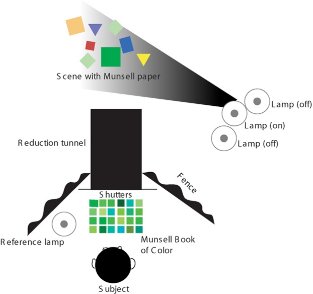
Schematic overview of the experimental set-up. Subjects selected the Munsell sample that best matched the colour of the Munsell paper placed into the centre of the scene.
Once the instructions were given and subjects were confident that they understood the task, one of the Munsell papers was placed in the middle of the scene by the experimenter. Subjects viewed the scene through a black reduction tunnel (see Figure 1). On the side of the subject there was a shutter built into the reduction tunnel. Once the experimenter had placed a Munsell paper into the scene and one of the lamps was switched on, subjects were instructed to raise the shutter and make their colour match. In subjects' first session they were encouraged to familiarize themselves with the contents of the Munsell book of colours. Subjects read out the Munsell number of the colour that they thought matched the colour of the Munsell paper in the scene. The experimenter confirmed whether this was indeed the colour that the subject intended. If this was the case the experimenter wrote down the number of the Munsell colour and the subject was instructed to lower the shutter. Shutters were lowered so that subjects were unable to use the colours of the clothing of the experimenter as a reference as he/she changed the Munsell paper in the experimental scene and to prevent subjects from seeing the chromaticity of the illumination changing and to use this information in obtaining colour constancy. Once the experimenter had changed the Munsell paper and had switched on a lamp, the subject could raise the shutters to make his/her next colour match. The order of the lamps and Munsell papers was randomized. Subjects could take as long as they wanted to make the colour mach. Each session took about 90 minutes for each subject.
1.1.2. Subjects
Nine subjects took part in the experiment. The data from one subject were excluded from the analysis because the amount of colour constancy for this observer was extremely low across the scenes tested. All subjects (four females and four males) were students of the University of Giessen. They had normal colour vision as tested with Ishihara colour plates (Ishihara 2004). The subjects were naïve as to the purpose of the experiment. Informed consent was given by all subjects according to the Declaration of Helsinki (World Medical Association 2004). Methods and procedures were approved by the local ethics committee of the Department of Psychology of the Justus-Liebig-University.
1.1.3. The lamps
We used normal, regular light bulbs (Philips Classictone series, 60 watt) to illuminate the scenes. A Lee filter (http://www.leefilters.com) was put in front of two of these lamps to change its chromaticity. One filter was light Pink (Lee Filter number 35), and the other filter was a pale green one (Lee filter number 138). One Lamp was identical to the lamp illuminating the Munsell book of colours and was a neutral coloured light bulb. The lamp illuminating the Munsell book of colours will be referred to as the “Reference lamp”. The 1931 CIExy coordinates of the light from the three lamps (as measured with a Photo Research PR-650 spectroradiometer) were (0.507, 0.387), (0.466, 0.415), and (0.499, 0.465), measured by taking the reflectance of a white reflectance standard in the middle of the experimental scene. The lamps were presented one at a time in random order. The luminance was 36 cdm−2 for lamp 1, 39.5 cdm−2 for lamp 2, and 36.0 cdm−2 for lamp 3 measured by taking the light reflected from a white reflectance standard at the center of the experimental scene. The subjects could not see the lamps and did not know how many lamps there were, or their colours. The lamps had fixed positions (see Figure 1). All lamps were to the right of the scene very close to each other. The scene was never illuminated by more than one of the three lamps. Measurements of the lamps were made (by measuring the reflected light from a reflection standard using the spectroradiometer) to ensure that the luminance or the chromaticity of the lamps did not change over time. This was not the case.
1.1.4. The scenes
We used 3-D objects and real lamps to create optimal circumstances for estimating the illuminant's colour (see Figure 2). The use of real objects and illuminants have been preferred to the use of rendering packages and computer displays, as the latter have technical limitations that can lead to experimental artifacts in colour experiments (Ruppertsberg and Bloj 2006, 2008). Moreover, it is still unclear whether subjects treat colours presented as emitted light on a computer monitor the same as the reflectance of a real surface (Granzier et al 2009c). Finally, it has been recently shown that colour constancy improves when using 3-D objects compared to when using 2-D objects (Hedrich et al 2009). For the reasons mentioned above, we used real 3-D objects in our experiments, although this meant that we had less experimental control compared to when using virtual scenes.
Figure 2.
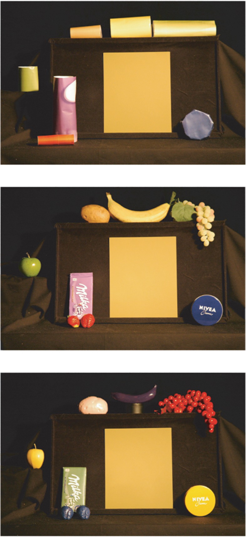
The photographs give an impression of what the subjects saw when looking through the reduction tunnel when observing the geometrical figures scene, the colour diagnostical scene and the colour incongruent scene (from top to bottom).
The scene was in front of the subjects, at a distance of 300 cm and was seen through an opening in a black reduction tunnel (see Figure 1). The scene had a width of 80 cm. The walls of the room were covered with a black veil. The reason for using a black background was that we hypothesized that the effect of memory colour on colour constancy would be weak and would be overridden by other potential cues present in the scene (eg, colour contrast or the average colour of the scene). We measured colour constancy in scenes where reasonably the most important cue for estimating the illuminant's colour would be the objects surrounding the Munsell papers while other important cues for obtaining colour constancy were mostly silenced. However, we were unable to completely eliminate all other potential cues to the illumination. For example, although we used a black veil for the background, the background still reflected part of the illumination and thereby showing a gradient of illumination across the background.
In order to determine whether the presence of objects of which the reflectance is known helps in estimating the illuminant's colour, we used three scenes each containing seven objects (the object's location in all three scenes was fixed within an experiment and across experiments); one scene with objects of which the colours are known (objects with object specific or brand specific colours). We will refer to this scene as the ‘colour diagnostical’ scene. For the diagnostical scene we used the following objects: a Nivea box, two strawberries, a Milka chocolate bar, an apple, a potato, a banana, and grapes (see middle photograph of Figure 2). As most of the studies investigating memory colour used highly artificial stimuli, we wanted to use colour diagnostical stimuli that were perceived as real as possible. The vegetables and fruits were all made of plastic (bought at a specialized shop which supplies decorative fruits and vegetables) to guarantee that the colours of the objects would not change over the course of days or weeks. Subjects did not realize that the fruits and vegetables were not real when explicitly asked and the plastic fruits and vegetables were chosen by their natural appearance. The fruits and vegetables were textured like their real counterparts. The Nivea box and the Milka bar were bought in a regular supermarket. We have chosen to use these particular items as both Witzel et al (2011) and Olkkonen et al (2008) found that the memory colour effects were strongest for photos of these objects. The 1931 CIExy coordinates of these colour diagnostical objects illuminated under the neutral illumination are: (0.460, 0.334) for the Milka bar, (0.391, 0.347) for the Nivea box, (0.479, 0.482) for the apple, (0.536, 0,410) for the potato, (0.526, 0.431) for the banana, (0.493, 0.441) for the grapes, and (0.626, 0.350) for the two strawberries (see Figure 7 for chromaticities of the objects under the other two illuminants).
Figure 7.
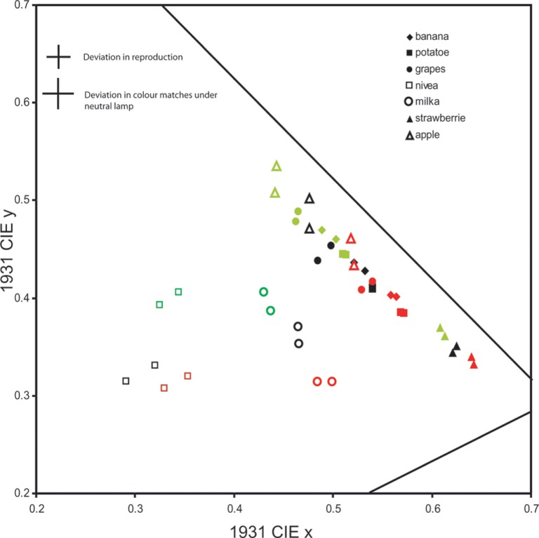
Plotted are the CIE colour coordinates of the colour diagnostical objects and the geometrical figures. Different pairs of symbols indicate different objects. Each symbol is used twice, once for the colour diagnostical objects and once the geometrical figures. Green symbols indicate the chromaticities of the objects under a green illumination, red symbols under a red illumination and black symbols under the neutral illumination. Note that the data for the Milka bar and the Nivea box (‘open circles’ and ‘open squares’) show larger deviations in chromaticity. Both of these objects were rather glossy and therefore reflected more of the illumination. This made it difficult to measure the reflectance of these objects. In the top left corner the deviations are plotted with respect to differences in colour reproduction between the colour diagnostical objects and the geometrical figures (‘deviation in reproduction’). Also plotted at the top left corner are the deviations of subject's colour matches from perfect colour matches when the Munsell papers were illuminated by neutral lamp.
We also used a scene containing the objects with a diagnostical colour, but now these objects were painted in an incongruent colour (eg, a purple banana; see bottom photo of Figure 2). We will refer to this scene as the ‘colour incongruent’ scene. We used this scene to investigate whether it is the colour of the colour diagnostical object that is crucial for the memory colour effect or whether the shape of that particular object can play a role as well. This condition also introduces a cue conflict for the subjects. The change in colour percept of a familiar object could be the result of a bias in chromaticity of the illumination or due to the fact that the object itself has changed its surface reflectance (eg, is painted). For the subject to be able to estimate the chromaticity of the Munsell paper embedded in this scene, the subject must be able to disentangle influences from illumination from changes in surface reflectance. We spray painted the diagnostical coloured objects by using lacquer paint (‘Trendy Colourline’ lacquer). For the Milka bar, we scanned its wrapper (using a HP Scanjet G3010) and by using Photoshop (Adobe Systems Incorporated) we changed the wrapper's colour into ‘green’ instead of ‘purple’). We then printed the green wrapper by using a Dell printer, type 5110CN.
Finally, we used a scene containing coloured papers having highly similar colours as the colour diagnostical objects but now shaped as geometrical figures (top photo of Figure 2). We will refer to this scene as the ‘geometrical figures’ scene. The geometrical objects were made by printing A4 sized coloured papers in similar colours of their corresponding colour diagnostical objects (using the same Dell printer). Adobe Illustrator version 10 was used for adjusting the colours of the printed papers. Once a match was found between the colour of the diagnostical object and the printed paper, the paper was measured using the spectrometer to make sure that the 1931 CIE colour coordinates of the colour neutral papers and the colour diagnostical objects were similar. Subsequently, geometrical 3-D objects were made out of these printed coloured papers with about the same size as the colour diagnostical objects. The 1931 CIExy coordinates of these colour neutral objects illuminated under the neutral illumination are: (0.473, 0.339) for the Milka, (0.372, 0.340) for the Nivea box, (0.476, 0.471) for the apple, (0.54, 0.411) for the potato, (0. 526, 0.434) for the banana, (0.495, 0.449) for the grapes, and (0.634, 0.347) for the strawberries. Comparison with the CIExy coordinates of the colour diagnostical objects shows that the CIExy coordinates of the geometrical figures could not precisely be matched because of restrictions of the colour gamut of the printer. Figure 7 shows a direct comparison of the 1931 CIE coordinates for both the colour diagnostical objects and their matched counterparts (the geometrical figures). Green symbols indicate the chromaticity of the objects under the green lamp, red symbols show the colour coordinates of the same objects under the red lamp, while black symbols show the chromaticity of the objects under the reference lamp. To have an indication of how well the geometrical object was matched with the colour diagnostical object, identical symbols of the same colour have to be compared. These results indicate that the diagnostical colour objects and the geometrical objects had highly similar chromaticities under all illuminants tested. Exceptions were the Nivea and the Milka bar, which are very glossy and reflect more of the illumination than the geometrical objects. The large cross in the top corner of Figure 7 (‘deviation in reproduction’) shows the average deviation in chromaticities (in both the CIEx and CIE y coordinates) between the colour diagnostical objects and the geometrical figures.
To have a reference point for indicating whether these errors in reproduction are to be considered large or not we also show (in the top left corner of Figure 7; ‘Deviation in colour matches under neutral lamp’) the deviations of subjects' colour matches from a perfect colour match (averaged across subjects and Munsell papers) under the neutral illumination. Obviously subjects' colour matches were not perfect even when the illumination between the experimental scene and the lamp illuminating the Munsell book was identical. Comparison of the deviations in colour matches for the neutral lamp with the colour reproduction errors (compare the size of both crosses) show that the reproduction errors are of a smaller magnitude than the noise in subjects' colour matches. Thus, it is unlikely that the errors in reproduction of the geometrical figures were a big artefact in our experimental design, as the noise in subjects' colour matches overrule the reproduction errors of the geometrical objects. A final point of this graph is that this figure shows an objective measure of the size of the chromaticity shift imposed by the three illuminations (compare the different colours of identical symbols). These data show that the illuminants did not cause a big shift in reflected light (as intended), as we did not want to use extreme illuminations for our experiment. The difference in luminance between the colour diagnostical objects and the geometrical figures across all three lamps was small and unsystematic. The average difference was less than 1cdm−2, or about 6%.
1.1.5. Colour matching
Subjects selected the sample of the Munsell book of colour (Matte collection) that best matched the surface of one of four matte Munsell papers (the number of Munsell papers was unknown to the subjects and only one was visible at a time; see Figure 2). The whole Munsell colour space was available for the subject to choose from. Observers could take as long as they wanted to make their colour match, and they were not explicitly instructed how they should make their colour match or which strategy would be good for them to use. No feedback was given with respect to the quality of their colour matches.
1.1.6. The Munsell papers
We used four differently coloured (Matte) Munsell papers (21,5cm × 27,5cm). The Munsell names of these four Munsell papers were: 2.5p 5/4 (‘purple’), 2.5y 5/4 (‘yellow’), 2.5b 5/4 (‘blue’), and 2.5gy 5/4 (‘green/yellow’). The Munsell book of colour is considered representative for all natural and artificial surfaces (Maloney 1986). We have chosen to use these particular Munsell papers as these papers have very unsaturated colours which would introduce the largest shifts in colour appearance of the Munsell papers by changing illuminants' colour. Subjects did not know how many Munsell papers were presented to them. The 1931 CIExy colour coordinates of the light reflected by the four Munsell papers under the reference lamp (the one illuminating the Munsell book of colours) are: (0.459, 0.383), (0.513, 0.432), (0.390, 0.426), and (0.486, 0.451) for the purple, yellow, blue, and green/yellow Munsell paper, respectively. Thus, for perfect colour constancy subjects should select the sample that reflects light with these coordinates. The Munsell paper was placed in the middle of the scene, always at the same location and with the same orientation with respect to the observer. The Munsell papers were placed into a holder to guarantee identical location and orientation with respect to the subject (see Figure 2).
The matte Munsell papers were each illuminated by each of the three lamps, giving a total of 12 combinations of surface and illumination. Each combination was presented three times, in random order, leading to a total of 36 matches for each subject.
1.1.7. Analysis
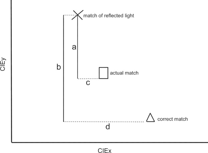
The first step was to measure the 1931 CIExy colour coordinates of each of the chosen Munsell samples when illuminated by the reference lamp. We will call these values subjects' ‘actual matches’. A total absence of colour constancy would mean that subjects match the light that is reflected from the Munsell paper illuminated by the experimental lamp. We will refer to such a match as a ‘match of reflected light’. Perfect colour constancy would be achieved if subjects totally discounted the colour of the illuminant so that their matches are independent of the experimental lamps. We considered the 1931 Ciexy coordinates of the Munsell paper under the lamp illuminating the Munsell book of colour as a ‘correct match’. This value was determined by measuring the light reflected by the Munsell paper under the lamp that illuminated the Munsell book of colour during the experiment (the reference lamp). Note that perfect colour matches are to be expected when the Munsell papers are illuminated by the neutral lamp illuminating the scene, as this lamp is identical to the reference lamp. As we are interested only in the colour settings that subjects made, we do not discuss brightness. We calculated a colour constancy-index (see Figure 3 for a detailed explanation) that calculates the amount that subjects choose a colour match that is in the direction of the correct match (ie, discounting the illuminant) in proportion of the colour matches that subjects would make if they only matched the light reaching their eyes, taking into account the amount of the illuminant change. Thus, the colour constancy-index is the ratio of the distance (in 1931 CIE colour space) between the actual matches that subjects made and the matches of reflected light and the distance within this colour space between the correct match (perfect colour constancy) and the match of reflected light (ie, the amount of the illuminant change). The end product of the formula was multiplied by a hundred to get percentages. Indices close to 100% indicate a high degree of colour constancy, and indices close to zero indicate poor (or an absence) amounts of colour constancy.
Figure 3.
Repeated-measures analyses of variance were used to evaluate the influence of the factor ‘scene’ (containing 3 levels; colour diagnostical scene, colour incongruent scene, geometrical figures scene), the factor ‘paper’ (having four levels; Munsell paper 1–4), and the factor ‘lamp (consisting of two levels; lamp 1 and lamp 3) on the amount of colour constancy. Paired samples t-tests were used to determine whether the subjects’ amount of colour constancy was significantly different in the colour diagnostical scene compared to the other two scenes.
1.2. Results
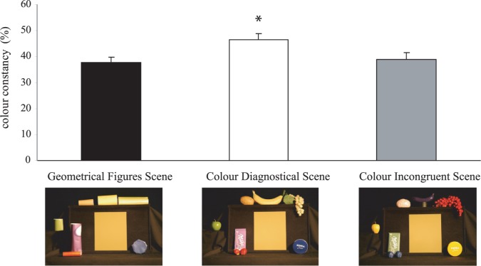
Figure 4 shows the average amounts of colour constancy (with standard errors) for the three different scenes tested. From this figure we can observe that the average amount of colour constancy is larger for the colour diagnostical scene compared to the colour incongruent scene and the geometrical figures scene. The average amount of colour constancy for the colour diagnostical scene was 46.7% compared to 39% for the colour incongruent scene and 37.6% for the geometrical figures scene. Repeated measures analysis of variance revealed that there was a significant effect of the factor Scene (F2, 183 = 12.576, p ≤ .001) showing that there is a statistical difference between the three conditions in the amount of colour constancy obtained. Paired samples (two-tailed) t-tests showed that colour constancy was significantly higher (t191 = 4.261, p ≤ .01) for the colour diagnostical scene compared to the Geometrical figures scene and also significantly higher for the colour diagnostical scene compared to the colour incongruent scene (t191 = 3.55, p ≤ .01). No significant difference could be detected between the geometrical figures scene and the colour incongruent scene (t191 = −0.652, p = ns).
Figure 4.
Results of Experiment 1. Shown are the average percentages of colour constancy (and their SE) for the 3 scenes. Colour constancy is significantly higher for the colour diagnostical scene than for the other 2 scenes.
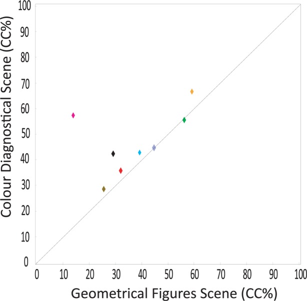
A Fisher's least significant difference (LSD) post-hoc test showed significant differences between subjects in the amounts of colour constancy that they reached. This is also shown in Figure 5. Figure 5 shows the amount of colour constancy plotted for each subject for the colour diagnostical scene (y-axis) plotted against their colour constancy performance for the geometrical figures scene (x-axis). Six out of the eight subjects show the memory colour effect; their colour constancy performance lie above the unity line. Figure 5 also shows that some subjects show a stronger memory colour effect than others. For example, one subject (purple symbol in Figure 5) reaches a colour constancy percentage of almost 60% for the Colour Diagnostical Scene while his performance for the Geometrical Figures Scene is only about 15%. However, for most of the other subjects, the advantage when tested in the colour diagnostical scene is much smaller.
Figure 5.
Results of Experiment 1. Shown are the average colour constancy indices (in percentages) for each individual subject (represented as a symbol), plotted for the colour diagnostical scene (y-axis) and the geometrical figures scene (x-axis). Six of the eight symbols are above the unity line indicating that subjects were quite consistent in obtaining better colour constancy when tested in the colour diagnostical scene compared to when measured in the geometrical figures scene.
Matches were made by selecting paper samples. There were obviously a limited number of such samples. That this did not limit subjects substantially is evident from the fact that each subject chose several samples as matches for each Munsell paper. The mean number of different Munsell samples that were selected for a given Munsell paper for the three different scenes (averaged among subjects) was 6.6 different Munsell samples, where 9 is the maximum of different Munsell samples to be selected (3 lamps × 3 replications). This is in line with subjects' remarks stating that there should at least in total be 15 different Munsell papers that they had to match. Thus, subjects did not choose the same Munsell sample each time the same Munsell paper was presented.
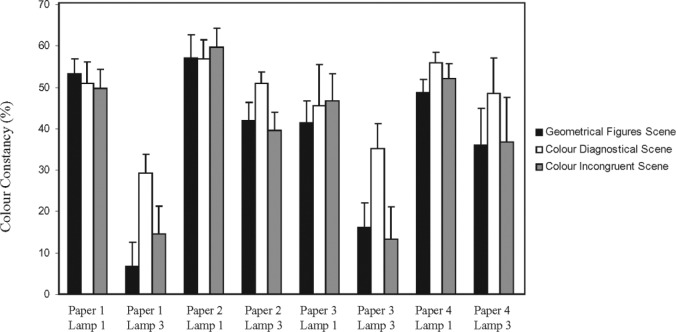
Figure 6 shows the overall colour constancy percentages for each of the three scenes tested, plotted for each combination of Munsell paper and lamp. From this figure we can conclude that subjects' overall colour constancy performance is much influenced by which combination of Munsell paper and lamp the subjects are tested. Indeed, repeated measures analysis of variance revealed a significant interaction between the factors ‘scene’ and ‘lamp’ (F2, 127 = 14.969, p ≤ .001). Inspection of Figure 6 shows that colour constancy is higher for the colour diagnostical scene, but only for lamp 3. No interaction between the factor scene and paper (F6, 256 = 0.693, p = ns) and no interaction between the factors scene, paper, and lamp could be detected F6, 256 = 1.657, p = ns).
Figure 6.
Results of Experiment1. Shown are the colour constancy indices (in percentages with their SE) for each combination of Munsell paper and lamp. Results for the geometrical figures scene (black bars), colour diagnostical scene (white bars), and those for the colour incongruent scene (grey bars) are separately plotted. Note the distinct advantage in colour constancy for the colour diagnostical scene when the scenes are illuminated by lamp 3.
One can ask the question whether subjects who show the best colour constancy performance in our set-up are also the ones who show the largest memory colour effect. To test this we calculated a Pearson correlation (two-tailed) coefficient calculating the correlation between subjects' memory colour effect (calculated as the difference in colour constancy performance in the colour diagnostical scene-colour constancy in the geometrical figures scene) and subjects' colour constancy performance averaged across the three scenes. No significant correlation was obtained showing that subjects who show a strong memory colour effect are not necessarily the subjects who overall also show the best colour constancy performance.
Finally, one could argue that objects that lack colour diagnostical information (ie, geometrical objects) can nevertheless improve colour constancy in a sense that subjects might be able to extract information from multiple views of the same scene over trials. Thus the first observation of a colour neutral object cannot give information about the illumination. However, if it is known that the same objects within a scene are viewed from trial to trial than perhaps even non-colour diagnostical objects (geometrical objects) can provide as a reference. In order to test whether this is indeed the case, we analyzed the amount of colour constancy for both the colour diagnostical scene and for the geometrical scene as a function of the trials. From this analysis we can conclude that subjects are not ‘learning’ or extracting new information by seeing the same objects within a scene over and over again. Moreover, the memory colour effect also does not improve as the subject has seen the scenes more often.
1.3. Discussion
From the data of Experiment 1 we can conclude that we were able to detect a memory colour effect, as the amount of colour constancy was significantly higher (47% versus 39%) for the Munsell papers placed into the colour diagnostical scene compared to the other two scenes. This advantage in colour matching when tested in a scene with familiar objects was more pronounced when the scene was illuminated by a greenish lamp (lamp 3). This lamp was indicated by the subjects to lead to the most biases in the colour percept of the Munsell papers. For subjects to depend more on the familiar objects in the scene when the ambiguity is largest is a sensible strategy to use.
Two things stand out with respect to the data of this experiment. First, the memory colour effect is quite weak. We designed scenes in which most of the information that could be used for obtaining colour constancy was removed (although we still had a gradient of illumination in the background as not all of the light was absorbed by the black cloth). Thus, subjects had to rely on the objects present in the scene to be able to infer what the Munsell paper's colour should be. Under these quite optimal conditions for testing the memory colour effect, the advantage of the presence of diagnostical coloured objects was still small (47% instead of 39%).
Second, not all subjects showed the memory colour effect, and subjects who did show this effect did not all have the same magnitude in the effect (see Figure 5). One of the more straightforward explanations for this difference between subjects could be that there is a large between-subjects variability in their viewing behavior. For example, if some subjects look more often (or longer) at the objects placed in the scene when making their colour matches, while others do not, it could be reasoned that the former subjects are better able to make more precise colour matches compared to those who only look briefly at the objects.
On average, we obtained colour constancy indices of about 40% (when averaged across scenes) which is about half the amount that is normally found when using real lamps and real surfaces (de Almeida et al 2004; Granzier et al 2009b; Kuriki and Uchikawa 1996; Kraft and Brainard 1999). This is not surprising, considering the fact that we silenced most of the cues that seem to be important for obtaining colour constancy, like local colour contrast. Still, we obtained colour constancy indices which are considerably larger than those often found when studying colour constancy using a computer monitor (Arend and Reeves 1986; Tiplitz-Blackwell and Buchsbaum 1988a, 1988b; Cornelissen and Brenner 1995; Bauml 1999). Therefore, our results lie well within the range of colour constancy results reported earlier for similar conditions.
1.4. Experiment 2: The influence of objects in the scene
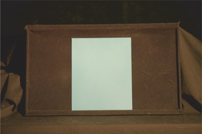
The main aim of the second experiment was to study the effect of the presence of the objects. To do that, we used a scene with only a black background without placing the objects into the scene. We will call this scene the ‘black background’ scene (see Figure 8). Thus, for the ‘black background’ scene, only one of the Munsell papers was placed against a black background. By comparing the results of the geometrical objects scene of Experiment 1 (containing objects) with the ‘black background’ scene of Experiment 2, we can measure the influence of the presence of the objects in the scene. The reason for comparing the results of the black background scene to the geometrical object scene was that we reasoned that the latter scene is the most neutral scene of the three scenes tested in Experiment 1. The procedure was identical to that of Experiment 1. We used the same lamps and the same Munsell papers as in Experiment 1.
Figure 8.
The scene used in Experiment 2. Subjects viewed a Munsell paper with a black background. No other objects were present in the scene. The effect of the presence of objects was tested in this condition. Shown is the Munsell paper with value 2.5B 5/4.
1.4.1. Subjects
Eleven subjects participated in this experiment; 2 males and 9 females. Four subjects also participated in Experiment 1. All subjects were students of Giessen University and all were naïve as to the purpose of the experiment. All had normal colour vision as tested with Ishihara colour plates.
1.5. Results
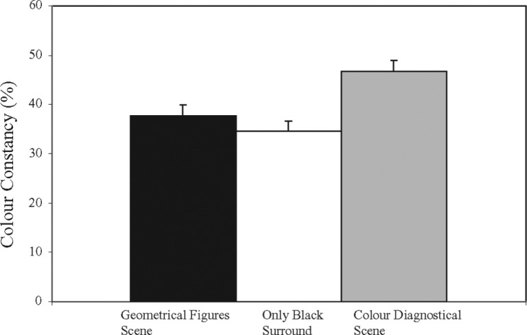
The analysis was identical to that of the first experiment. The average amount of colour constancy for the black background scene was 34.6% compared to 37.7% for the geometrical figures scene (see Figure 9). These data show that the presence of the geometrical objects did not have a large effect (on average a 3% difference). However, inspection of the data shows large variation in the amount of colour constancy between subjects, ranging from 12% to 57%. That some subjects are still able to obtain such high amounts of colour constancy is remarkable considering the fact that most of the cues for disentangling reflectance from illumination have been removed. However, looking at Figure 8, it can be seen that not all light is being absorbed by the black veil and some light is still reflected. Subjects could have used this subtle information when confronted with the task. No trend could be detected between subjects who already participated in the first experiment and those who had not, which makes it unlikely that subjects have used their knowledge obtained from participating in Experiment 1 in dealing with the task of Experiment 2.
Figure 9.
Results of Experiment 2. Shown are the average colour constancy indices (in %) with their standard errors for the Only Black surround condition. Also shown are the average colour constancy indices for the Geometrical Figures Scene and the Colour Diagnostical scene for comparison.
1.6. Discussion
A major finding of Experiment 2 is that the amount of colour constancy for the ‘black background scene’ was about as large as it was for the ‘geometrical object’ scene of Experiment 1. This seems to suggest that the geometrical objects placed against the black background did not contribute significantly to the amount of colour constancy obtained. This comes as a surprise, as one would hypothesize that adding more objects to the scene would enhance the number of colour references that subjects could have used and therefore increase the subjects' amounts of colour constancy. This is not what we found. From these data we can hypothesize two alternative theories.
First, we could reason that subjects simply did not look at the geometrical figures because they already had enough information to disentangle influences from the illumination from the influences of reflection. This is not very plausible, as subjects' amount of colour constancy was about 40%, which shows that it was hard for them to estimate the colour of the Munsell papers under different illuminants. We can therefore safely rule out the possibility that subjects did not need to take into account the object's colours present in the scene as this extra information was redundant to perform the task.
An alternative hypothesis could be that subjects did look at the geometrical figures but that this extra information did not help them very much.
To see what the influence of colour contrast on subjects colour constancy performance is, we did another experiment (n = 6) in which we placed the Munsell papers against a grey background, without placing any of the objects in the scene. Colour constancy was on average 56%. From these results we conclude that colour contrast can significantly increase the amount of colour constancy in our set-up, as is no surprise although the black background that were used for our earlier experiments did not absorb all of the light (it reflected 3% of the light) and can therefore not be truly considered as being completely black.
1.7. Experiment 3: The effect of local colour contrast
The rationale of the third experiment was to study the effect of local colour contrast between the Munsell paper and one of the objects placed into the scene. We did this by placing one object in front of the Munsell paper so that the object would be in direct vicinity of the Munsell paper. The same lamps and Munsell papers were used as in the previous two experiments.
1.7.1. Scenes
For the scenes we again used black backgrounds. Three objects were chosen that were placed in front of the Munsell papers; the Milka bar, the Nivea box and the grapes. We also used the three corresponding objects from the colour incongruent scene and 3 objects from the geometrical figures scene. Thus we used nine objects in total for this experiment. For example, with respect to the Milka chocolate bar we also used the incongruent coloured Milka bar and a geometrical colour matched (purple) object. The objects were always placed in the same location and orientation in front of the Munsell papers (see Figure 10). The objects were placed in a manner that not too much of the surface area of the Munsell papers was occluded. The procedure was identical to the previous experiments.
Figure 10.
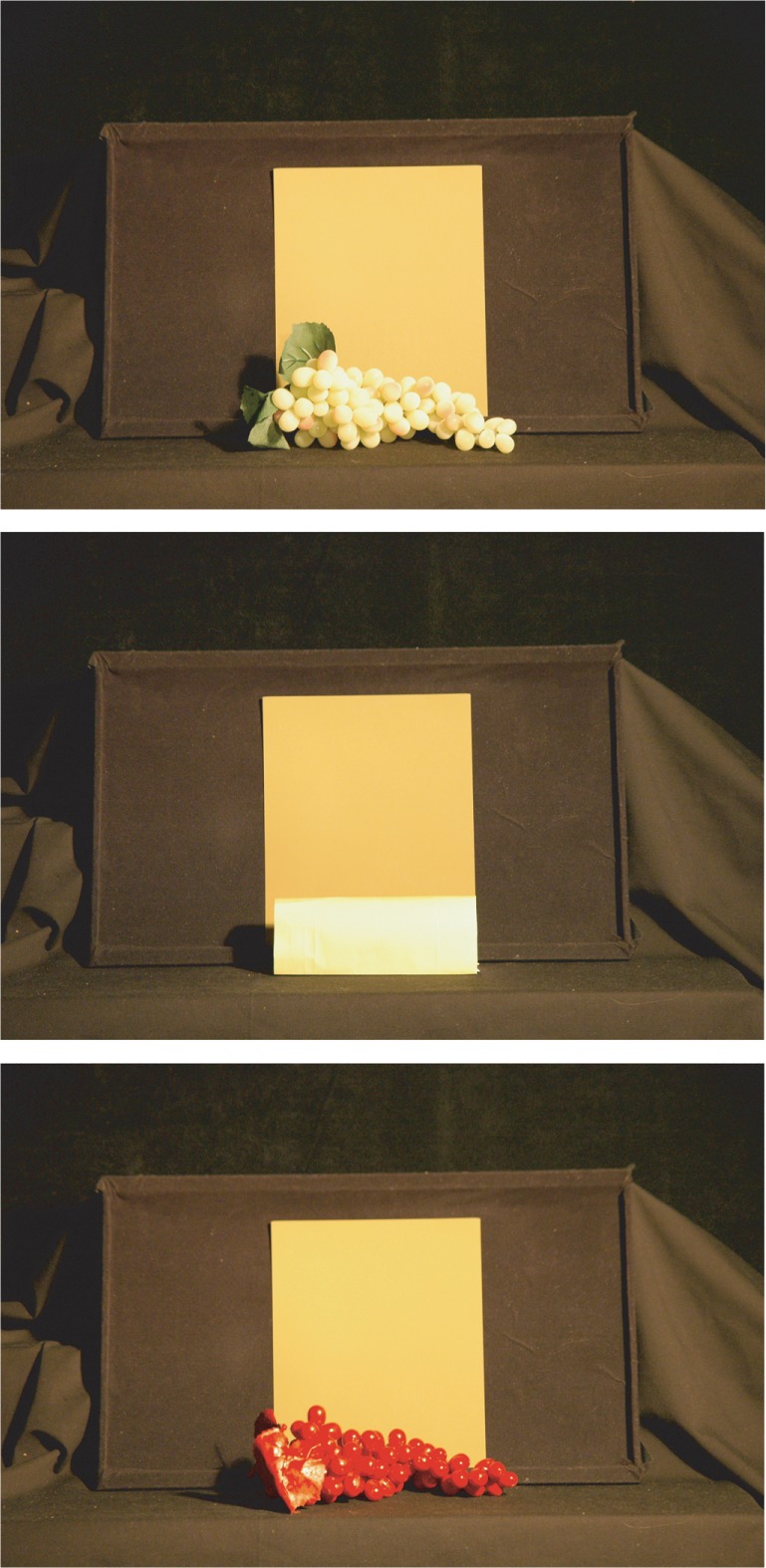
The three scenes as used in Experiment 3, seen from subjects' vantage point. Shown is one of the three objects chosen to be placed in front of the Munsell paper. Depicted are ‘the colour diagnostical’ scene, the ‘geometrical figures’ scene and the ‘colour incongruent’ scene (from top to bottom). The objects were always placed at the same location and with the same orientation. The other 2 objects that were used for this experiment were a Nivea can and a Milka chocolate bar.
1.7.2. Subjects
Six subjects participated in the third experiment. The data of one subject were excluded as a result of extremely low amounts of colour constancy across the scenes tested. Two of the five subjects also participated in the first experiment. All subjects were naïve as to the purpose of the experiment and all had normal colour vision as tested with Ishihara colour plates.
1.8. Results
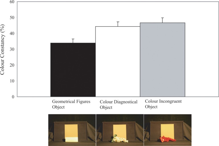
The analysis was identical to the one in the previous experiments. Figure 11 shows the mean colour constancy indices for the three scenes tested. Inspection of this figure shows remarkably that the amount of colour constancy is now suddenly the highest when the colour incongruent object is placed in front of the Munsell paper. The average amount of colour constancy obtained for this condition is 46.6%. This amount is higher than the amounts found for the colour incongruent scene as measured in Experiment 1; a mean difference of 7%. The average amount of colour constancy for the Colour diagnostical scene is 44.4%, while an average colour constancy index of only 33.8% was obtained for the Geometrical figures scene. Repeated measures analyses of variance showed that there was a main effect of the factor Scene (F2, 114 = 13.135, p ≤ .001). Paired samples t-tests revealed that colour constancy was significantly higher when colour incongruent objects were placed in front of the Munsell papers compared to when Geometrical Figures were placed (t119 = −3.924, p ≤.01). Also, colour constancy was shown to be significantly higher when colour diagnostical objects were placed in front of the Munsell papers compared to when geometrical figures were placed (t119 = 4.734, p ≤ .01). However, no significant difference in the amount of the colour constancy could be observed between placing either the colour diagnostical objects or placing the colour incongruent objects in front of the Munsell papers (t119 = −.748, p = ns).
Figure 11.
Results of Experiment 3. Shown are the average colour constancy indices (in %) with their standard errors for the three conditions tested. Placing an incongruent coloured object in front of the Munsell paper had the largest effect on colour constancy, probably because of the enhanced colour contrast between the painted object and the Munsell paper (see photo on the right).
1.9. Discussion
The most important finding of this experiment is that putting the objects directly in front of the Munsell papers did not enhance their colour constancy performance. However, colour constancy performance was now suddenly better when placing a colour incongruent object in front of the Munsell papers, although this result did not prove to be significant compared to when placing colour diagnostical objects in front of the Munsell papers. Two different hypotheses could explain this result. One reason could be that the colour incongruent objects had a glossy surface because of the paint that we used. This could have introduced highlights and gradients, which are known to enhance colour constancy (Lee 1986; D'Zmura and Lennie 1986). However, this explanation is unlikely as subjects could also have used these types of information in Experiment 1, in which no enhanced colour constancy performance was measured compared to the other two scenes tested.
Another explanation for the better performance when the incongruent objects were placed in front of the Munsell paper could be that the saturation of the painted objects was higher (see Figure 10) leading to a higher colour contrast between the Munsell paper's colour and the colour of the incongruent object, which could have increased the amounts of colour constancy for this scene. We cannot rule out this possibility. The lack of effect of removing the objects from the scene (Experiment 2) on the amounts of colour constancy achieved could be explained by the lack of extra information that the Geometrical figures scene adds to estimating the illuminant's chromaticity. These results could suggest that the objects used for the Geometrical objects scene were perceived as being artificial in the sense that subjects did not gain extra information by looking at them. This makes us wonder whether the memory colour effect found in Experiment 1 was a result from using the wrong stimuli as a comparison for studying the effects of the colour diagnostical scene. To investigate whether this hypothesis is true, we performed a final experiment.
1.10. Experiment 4: The influence of non-diagnostical coloured objects
This experiment studied whether the memory colour effect still holds when we compare colour diagnostical objects with objects that do not have a diagnostical colour, like a coffee mug, which come in all sorts of colours. The reason for using non-diagnostical objects was to have a different comparison group to study the memory colour effect. For reasons explained above, we had indications that the printed papers used in the previous experiments (the geometrical figures) were probably not good comparison stimuli as the amount of colour constancy with or without these objects hardly changed. Obviously, by using non-diagnostical coloured objects the chromaticity of these objects will be different compared to the diagnostical coloured objects. However, the point of this comparison is to have a second baseline to investigate the magnitude of the memory colour effect. The use of non-diagnostical coloured objects to test the magnitude of the memory colour effect has been used extensively (see, for example, Witzel et al 2011; Granzier et al 2009b).
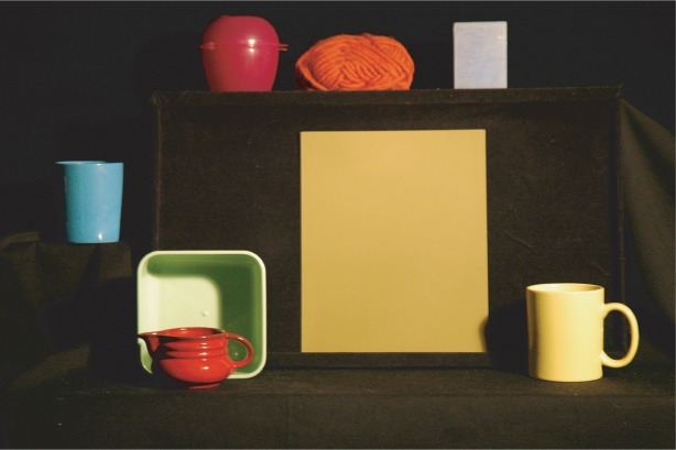
We used the same diagnostical objects as in Experiment 1. For a second condition we used seven objects that could have any colour (see Figure 12). We will call this latter condition the ‘non-diagnostical colour’ scene. For this latter condition we used the following items: a yellow coffee mug, a blue coffee mug, a blue candle, brown wool, a green sandwich can, a red can and a purple box. The objects were roughly matched with respect to the colour of the diagnostical objects only to guarantee that the average chromaticity within the scene is roughly the same.
Figure 12.
The non-diagnostical colour scene used for Experiment 4.
The CIExy coordinates of the objects used for the ‘non-diagnostical colour’ scene illuminated by the neutral lamp are: (0.516, 0.446) for the yellow coffee mug, (0.350, 0.392) for the blue coffee mug, (0.407, 0.387) for the blue candle, (0.624, 0.355) for the brown wool, (0.456, 0.461) for the green sandwich can, (0.629, 0.347) for the red can, and (0.623, 0.313) for the purple box.
In order to test whether the superior results in colour constancy found in Experiment 1 were the result of comparing heterogeneous coloured objects (diagnostical coloured objects) with homogeneous coloured objects (‘geometrical figures’ scene) some of the objects (wool, candle, the red mug) used for the non-diagnostical colour' scene were heterogeneously coloured. It is certainly the case that the non-diagnostical objects are more uniform in hue than the fruits and vegetables with typical colours. However, for both types of objects the variability is rather small and in our opinion negligible. Previous research has shown (see, for example, Hurlbert and Ling 2005, Hansen et al 2006; Witzel et al 2011; Granzier et al 2009b) that for the effects mediated by memory colour the natural objects behave as if they were completely uniform in hue, as long as luminance variations are present.
1.10.1. Subjects
Thirteen subjects participated in this experiment. Seven subjects also participated in the first experiment. All subjects were naïve as to the purpose of the experiment and all subjects had normal colour vision (tested with Ishihara colour plates). The procedure was identical to that in the previous experiments. The same Munsell papers and lamps were used. The same analysis was used as in the previous experiments.
1.11. Results
On average, subjects obtained a colour constancy index of 39.1% when tested in the Colour diagnostical scene and an average colour constancy index of 34.9% when tested in the non-diagnostical colour scene. Repeated measures of analysis showed that there was a main effect of the factor scene (F1, 299 = 12.280, p ≤ .001). A paired t-test showed that the amount of colour constancy was significantly higher for the colour diagnostical scene compared to the non-diagnostical colour scene (t311 = 3.469, p ≤ .01). No interaction-effect could be detected between the factors Scene and Lamp (F1, 297 = 0.239, p = ns) and no interaction could be found for the factors Scene and Paper (F1, 297 = 1.353, p = ns).
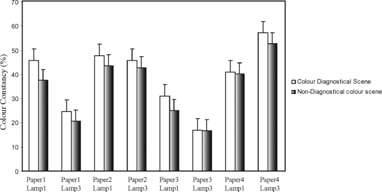
Figure 13 shows the amounts of colour constancy plotted for each subject for the colour diagnostical scene (y-axis) and the Non-Diagnostical colour Scene (x-axis). Ten of the thirteen subjects show higher colour constancy performance when tested in the colour diagnostical scene. Note once again the large inter-individual differences in the amount of colour constancy obtained. Figure 14 shows the amounts of colour constancy plotted for each Munsell paper and lamp combination, split for the two scenes tested. From this figure we can conclude that there are once again large differences in the amount of colour constancy obtained, depending on the combination of Munsell paper and lamp being tested. However, t-tests (as explained above) did not show a significant difference overall between both scenes in the amount of colour constancy between the different combinations of papers and lamps tested. Comparing Figure 14 with Figure 6, we can see that the same combination of Munsell paper illuminated by a certain lamp does not give rise to the same amounts of colour constancy between Experiment 1 and Experiment 4. For example, if we focus on the amount of colour constancy obtained for the colour diagnostical scene we can see the following; an overall colour constancy index of 41% was obtained during Experiment 4 for the Munsell paper 4 illuminated by lamp 1, while on average a colour constancy index of about 56% was obtained during Experiment 1. The same holds for Munsell paper 3 illuminated by lamp 3; On average only 17% of colour constancy was obtained for Experiment 4 compared to 35% for Experiment 1. However, please note that only seven of the thirteen subjects participated in both Experiments 1 and 4, so from these data we can not conclude that the memory colour effect is not stable across time. To see whether similar results in colour constancy are obtained within the same subjects, we calculated a correlation coeeficient for the seven subjects who both performed in Experiment 1 and Experiment 4. A Pearson correlation of 0.62, (p ≤ .01) was obtained between the colour constancy results for the colour diagnostical scene of Experiment 1 and Experiment 4 for these subjects. Thus, although this is not a perfect correlation, this result does show that subjects are quite constant when tested in time. Therefore, the lack of agreement in results between Experiment 1 and Experiment 4, as discussed above, can be explained by adding the data of new subjects.
Figure 13.
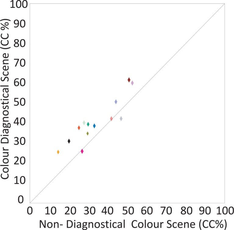
Results of Experiment 4. Shown are the average colour constancy indices (in %) for each individual subject (represented as a symbol), plotted for the colour diagnostical scene (y-axis) and the non-diagnostical colour scene (x-axis). Ten of the thirteen symbols are above the unity line indicating that on average subjects obtained better colour constancy when tested in the colour diagnostical scene compared to when measured in the non-diagnostical colour scene.
Figure 14.
Results of Experiment 4. Shown are the colour constancy indices (in percentages with their SE) for each combination of Munsell paper and lamp. Results for the colour diagnostical scene (black bars) and those for the non-diagnostical colour scene (white bars) are separately plotted.
Thus although there is some variability between subjects in the memory colour effect, the data within each subject is quite consistent.
1.12. Discussion
The most important result of Experiment 4 is that the memory colour effect still holds when compared to a scene of real hand-made objects which lack colour diagnostical information. However, the memory colour effect is now halved. These results are in line with our hypothesis that the comparison stimuli used in our experiment (the geometrical figures) were perceived as being artificial which made it hard for the subject to disentangle influences of illumination and influences of reflectance. By using real objects as comparison for the colour diagnostical objects, the advantage of when tested in the colour diagnostical scene is much reduced.
2. General conclusions
To the best of our knowledge, this is the first published study which investigated whether the colour of familiar objects help in disentangle influences of illumination and influences of reflectance properties for unknown objects present in the same scene.
Probably the most important finding of our current investigation is that the memory colour effect is weak, probably much weaker than some of us would have thought. This fact is stressed by looking at the influence of adding local colour contrast between the Munsell paper and its immediate background (Experiment 2). Here we found an increase in colour constancy of 16% by adding colour contrast, which is significantly higher than the increase of 4% with respect to the memory colour effect found in Experiment 4. Thus, while memory colour does not seem to significantly improve how good we are in estimating the illuminant's chromaticity (Granzier et al 2009b) we did find evidence for the hypothesis that memory colour helps in estimating the surface reflectance for an unknown coloured object to a small degree.
It is still unclear why some subjects do show a memory colour effect while other subjects do not. That there are individual differences in the susceptibility to memory colour phenomena have been reported before (eg, Duncker 1939) and also large individual differences in colour constancy have been found before (eg, Kraft et al 1999; Granzier et al 2009a). Little is known about why people vary in these abilities. Recently, it has been postulated (Allen et al 2011) that individual differences in subjects' working memory can explain differences in colour constancy as measured using a successive colour constancy task. In this task, subjects see a test patch under one illuminant and then after a time interval they have to match the test patch colour from memory under a different illuminant. These authors show that successive colour constancy was better for subjects having a better working memory than for individuals having lower scores on a working memory task, especially when the stimulus does not contain a lot of information concerning the illuminant (as is the case in our experiments). However, it is still unclear whether the same results will also apply to a simultaneous colour constancy task as used in our current investigation. Besides, we used a methodology that was set-up to disentangle influences from memory colour from influences of colour memory, as subjects in our design did not have to keep the colours of the objects in memory as these objects were constantly present in the scene. Moreover, if there is an association between subjects' working memory and their colour constancy performance, we should have found the best colour constancy performance for subjects who also showed the highest memory colour effect. This is not what we have found.
A different hypothesis for explaining large inter-individual differences in colour constancy could be that some subjects attend to a more variety of cues concerning the illuminant or that some subjects know better which cues give the most reliable information with respect to the illuminant's colour and add more weight to these cues. If this is true, the subjects' viewing behaviour can reveal to what part of the visual scene the subject is paying attention and can possibly reveal the information that the subject is using to obtain colour constancy (but see Granzier et al 2012). Moreover, as explained above, we did not have control over the time subjects spent looking either at the experimental scene or at the Munsell Book (as intended). Subjects could differ in the amount of time they spent looking at the experimental scene (and thus adapt more to the experimental illumination). This could also have introduced variability between subjects in the amount of colour constancy. Also, our scenes were designed to lack an abundance of information concerning the illumination, as we reasoned that these cues could disguise a possible memory colour effect. By looking at the size of the memory colour effect that we found, we were right in this assertion. Thus, from our data we could reason that because the memory colour effect on colour constancy in our set-up is so small, under normal viewing conditions (when an abundance of visual cues to obtain colour constancy are normally present) the colours of familiar objects have a to be neglected effect on colour constancy. That the visual system does not seem to use this straightforward cue to obtain colour constancy is remarkable.
Our results suggest that one can reliably measure the influence of memory colour on the amount of colour constancy within subjects, but that the size of this effect strongly depends on the visual circumstances on how this effect is studied. A lot remains unknown about the object characteristics of colour diagnostical objects which seem to be used for their effect on colour constancy. As Bruner et al (1951) have suggested, future work should look into the question under what conditions of stimulus information the memory colour effect occurs and by what improvement in stimulus information can it be destroyed.
In conclusion, we agree with Hering (1878). Although postulating an influence of experience on colour perception, we as much as Hering assign a much larger role for low-level factors, such as cone adaptation and colour contrast for explaining colour constancy.
Acknowledgments
The authors thank Christoph Witzel for helpful discussions. This research was supported by grant number DFG GE879/9.
Biography
 Jeroen Granzier received his Masters degree in Psychology in 2001 from the University of Maastricht (The Netherlands) and in 2007 his doctoral degree at the University of Amsterdam. Currently he is a postdoc at the Department of Psychology at the University of Giessen.
 Karl Gegenfurtner studied psychology in Regensburg (Germany) and then did a PhD in Experimental Psychology at New York University. After spending time as a PostDoc in New York and Tübingen, he became Professor of Psychology in Magdeburg. Since 2001 he has been at Giessen University (http://www.allpsych.uni-giessen.de/karl/).
Contributor Information
Jeroen J M Granzier, Department of Psychology, University of Giessen, Otto-Behaghel-Straße 10F, 35394 Giessen, Germany; e-mail: Jeroen.Granzier@psychol.uni-giessen.de.
Karl R Gegenfurtner, Department of Psychology, University of Giessen, Otto-Behaghel-Straße 10F, 35394 Giessen, Germany; e-mail: gegenfurtner@psychol.uni-giessen.de.
References
- Adams G K. An Experimental Study of Memory Colour and Related Phenomena. The American Journal of Psychology. 1923;34:359–407. [Google Scholar]
- Allen E C. Beilock S L. Shevell S K. Working memory is related to perceptual processing: a case from color perception. Journal of Experimental Psychology: Learning, Memory, and Cognition. 2011;37:1014–1021. doi: 10.1037/a0023257. [DOI] [PMC free article] [PubMed] [Google Scholar]
- Arend L. Reeves A. Simultaneous colour constancy. Journal of the Optical Society of America A. 1986;3:1743–1751. doi: 10.1364/JOSAA.3.001743. [DOI] [PubMed] [Google Scholar]
- Bauml K H. Simultaneous colour constancy: how surface colour perception varies with the illuminant. Vision Research. 1999;39:1531–1550. doi: 10.1016/S0042-6989(98)00192-8. [DOI] [PubMed] [Google Scholar]
- Biedermann I. Ju G. Surface versus edge-based determinants of visual recognition. Cognitive Psychology. 1988;20:38–64. doi: 10.1016/0010-0285(88)90024-2. [DOI] [PubMed] [Google Scholar]
- Bolles R C. Hulicka I M. Hanly B. Colour judgment as a function of stimulus conditions and memory colour. Canadian Journal of Psychology/Revue canadienne de psychologie. 1959;13:175–185. doi: 10.1037/h0083774. [DOI] [PubMed] [Google Scholar]
- Bruner J S. Postman L. Rodrigues J. Expectation and the perception of colour. The American Journal of Psychology. 1951;64:216–227. doi: 10.2307/1418668. [DOI] [PubMed] [Google Scholar]
- Cornelissen F W. Brenner E. Simultaneous colour constancy revisited: An analysis of viewing strategies. Vision Research. 1995;35:2431–2488. [PubMed] [Google Scholar]
- De Almeida V M N. Fiadeiro P T. Nascimento S M C. Colour constancy by asymmetric colour matching with real objects in three-dimensional scenes. Visual Neuroscience. 2004;21:341–345. doi: 10.1017/S0952523804213074. [DOI] [PubMed] [Google Scholar]
- Delk J. Fillenbaum S. Differences in perceived colour as a function of characteristic colour. The American Journal of Psychology. 1965;78:290–293. doi: 10.2307/1420503. [DOI] [PubMed] [Google Scholar]
- Duncker K. The Influence of Past Experience upon Perceptual Properties. The American Journal of Psychology. 1939;52:255–265. doi: 10.2307/1416111. [DOI] [Google Scholar]
- D'Zmura M. Lennie P. Mechanism of colour constancy. Journal of the Optical Society of America A: Optics and Image Science, and Vision. 1986;10:1662–1672. doi: 10.1364/josaa.3.001662. [DOI] [PubMed] [Google Scholar]
- Foster D H. Colour constancy. Vision Research. 2011;51:674–700. doi: 10.1016/j.visres.2010.09.006. [DOI] [PubMed] [Google Scholar]
- Granzier J J M. Brenner E. Smeets J B J. Reliable identification by colour under natural conditions. Journal of Vision. 2009a;9:1–8. doi: 10.1167/9.1.39. [DOI] [PubMed] [Google Scholar]
- Granzier J J M. Brenner E. Smeets J B J. Can illumination estimates provide the basis for colour constancy? Journal of Vision. 2009b;9:1–11. doi: 10.1167/9.3.18. [DOI] [PubMed] [Google Scholar]
- Granzier J J M. Brenner E. Smeets J B J. Do people match surface reflectance fundamentally differently than they match emitted light? Vision Research. 2009c;49:702–707. doi: 10.1016/j.visres.2009.-01.004. [DOI] [PubMed] [Google Scholar]
- Granzier J J M. Toscani M. Gegenfurtner K R. Role of eye movements in chromatic induction. Journal of the Optical Society of America A: Optics and Image Science, and Vision. 2012;29:353–365. doi: 10.1364/JOSAA.29.00A353. [DOI] [PubMed] [Google Scholar]
- Hansen T. Olkkonen M. Walter S. Gegenfurtner K R. Memory modulates colour appearance. Nature Neuroscience. 2006;9:1367–1368. doi: 10.1038/nn1794. [DOI] [PubMed] [Google Scholar]
- Hansen T. Walter S. Gegenfurtner K R. Effects of spatial and temporal context on colour categories and colour constancy. Journal of Vision. 2007;7:1–15. doi: 10.1167/7.4.2. [DOI] [PubMed] [Google Scholar]
- Harper R. College K. The perceptual modification of coloured figures. American journal of Psychology. 1953;30:216–227. [PubMed] [Google Scholar]
- Hedrich M. Bloj M. Ruppertsberg A I. Colour constancy improves for real 3-D objects. Journal of Vision. 2009;9:1–16. doi: 10.1167/9.4.16. [DOI] [PubMed] [Google Scholar]
- Helmholtz H L F. Handbuch der physiologischen Optik first edition. Leipzig: Leopold Voss; 1867. [Google Scholar]
- Hering E. Grundzüge der Lehre vom Lichtsinn. Berlin: Springer; 1878. [Google Scholar]
- Hurlbert A C. Ling Y. If it's a banana, it must be yellow: The role of memory colours in colour constancy. Journal of Vision. 2005;5:787–787. doi: 10.1167/5.8.787. [DOI] [Google Scholar]
- Ishihara S. Ishihara's Tests for Colour Deficiency. Tokyo, Japan: Kanehara Trading Inc; 2004. [Google Scholar]
- Jameson D. Opponent-colour theory in light of physiological finding. In: Ottoson D, editor; Zeki S, editor. Central and Peripheral Mechanisms of Colour Vision. New York: Macmillan; 1985. [Google Scholar]
- Kraft J M, editor; Brainard D H, editor. Mechanisms of colour constancy under nearly natural viewing. Proceedings of the National Academy of Sciences. 1999;96:307–312. doi: 10.1073/pnas.96.1.307. [DOI] [PMC free article] [PubMed] [Google Scholar]
- Kuriki I. Uchikawa K. Limitations of surface-colour and apparent-colour constancy. Journal of the Optical Society of America A. 1996;13:1622–1636. doi: 10.1364/JOSAA.13.001622. [DOI] [PubMed] [Google Scholar]
- Lee HC. Method for computing the scene-illuminant chromaticity from specular highlights. Journal of the Optical Society of America A: Optics and Image Science, and Vision. 1986;10:1649–1699. doi: 10.1364/josaa.3.001694. [DOI] [PubMed] [Google Scholar]
- Ling Y. Hurlbert A. Role of colour memory in successive colour constancy. Journal of the Optical Society of America A. 2008;25:1215–1226. doi: 10.1364/JOSAA.25.001215. [DOI] [PubMed] [Google Scholar]
- Maloney L T. Evaluation of linear model of surface spectral reflectance with small number of parameters. Journal of the Optical Society of America A. 1986;3:1673–1683. doi: 10.1364/JOSAA.3.001673. [DOI] [PubMed] [Google Scholar]
- Olkkonen M. Hansen T. Gegenfurtner KR. Colour appearance of familiar objects: Effects of object shape, texture, and illumination changes. Journal of Vision. 2008;8:1–16. doi: 10.1167/8.5.13. [DOI] [PubMed] [Google Scholar]
- Rinner O. Gegenfurtner K R. Time course of chromatic adaptation for colour appearance and discrimination. 2000. Vision Research 40 (14) 1813-1826. [DOI] [PubMed]
- Ruppertsberg A. Bloj M. Rendering complex scenes for psychophysics using radiance: how accurate can you get? Journal of the Optical Society of America A. 2006;23:759–768. doi: 10.1364/JOSAA.23-.000759. [DOI] [PubMed] [Google Scholar]
- Ruppertsberg A. Bloj M. Creating physically accurate visual stimuli for free: spectral rendering with radiance. Behavior Research Methods. 2008;40:304–308. doi: 10.3758/BRM.40.1.304. [DOI] [PubMed] [Google Scholar]
- Smithson H E. Sensory, computational and cognitive components of human colour constancy. Philosophical Transactions of the Royal Society B: Biological Sciences. 2005;360:1329–1346. doi: 10.1098/rstb.2005.1633. [DOI] [PMC free article] [PubMed] [Google Scholar]
- Tanaka J. Presnell L M. Colour diagnosticity in object recognition. Perception & Psychophysics. 1999;61:1140–1153. doi: 10.3758/BF03207619. [DOI] [PubMed] [Google Scholar]
- Tiplitz-Blackwell K. Buchsbaum G. The effect of spatial and chromatic parameters on chromatic induction. Color Research & Application. 1988a;13:166–173. doi: 10.1002/col.5080130309. [DOI] [Google Scholar]
- Tiplitz-Blackwell K. Buchsbaum G. Quantitative studies of colour constancy. Journal of the Optical Society of America A. 1988b;5:1772–1780. doi: 10.1364/JOSAA.5.001772. [DOI] [PubMed] [Google Scholar]
- Vurro M. Ling Y. Hurlbert A. “The effect of shape on memory colour and colour constancy” Perception 36 ECVP Abstract. 2007.
- Vurro M. Ling Y. Hurlbert A. Memory colours of polychromatic objects. Journal of Vision. 2009;9:333–333. doi: 10.1167/9.8.333. [DOI] [Google Scholar]
- Witzel C. Valkova H. Hansen T. Gegenfurtner K R. Object knowledge modulates colour appearance. i-Perception. 2011;2:13–49. doi: 10.1068/i0396. [DOI] [PMC free article] [PubMed] [Google Scholar]
- World Medical Association. Ethical principles for medical research involving human subjects. 2004. http://www.wma.net/e/policy/b3.htm.


