Abstract
Two paintings, O1 and O2, were split into their luminance (grayscale) components L1, L2 and their color components C1, C2. The two color components, C1, C2, were transparently superimposed. Adding the grayscale of the first painting (= C1 + C2 + L1) looked like the original O1, while adding the grayscale of the second painting (= C1 + C2 + L2) looked like the original O2. Conclusion: the luminance contours selected or gated the congruent color contours and ignored non-congruent colors from the other painting.
Keywords: color vision, contour perception, filling-in
This note describes how colored borders that are barely visible can be made prominent by adding congruent luminance edges. Luminance perception is sharp, but color perception is fuzzier owing to different receptive field sizes for neurons coding for luminance and color, respectively (Wandell, 1995). Although usually colored borders coincide with luminance edges, various studies have reported a loss of color-form coherence. For example, when images are retinally stabilized, colors can lose their alignment with the contours of the shapes (Gerrits, de Haan, & Vendrik, 1966). Color–shape decouplings have also been observed in brain damaged patients (e.g., Critchley, 1965). Additionally, colors can jump over luminance gaps filling into disconnected regions of the stimulus (Kanai, Wu, Verstraten, & Shimojo, 2006). Luminance difference seems crucial for efficient shape perception. A nice interactive demonstration of the effect of isoluminance on the cohesion of the colored parts in Matisse's “Nu Blue II” can be found on Michael Bach's website http://www.michaelbach.de/ot/col_isoluNuBleu/index.html. For example, Gregory (1977) showed that Gestalt perception may break down under isoluminance and that depth perception is reduced. Illusions like the café wall illusion may even disappear under isoluminance (see also Livingstone & Hubel, 1987). However, for other illusions this turns out not to be the case (Hamburger, Hansen, & Gegenfurtner, 2007). The Boynton illusion is another clear example of the dominant role luminance plays in shape perception. If a luminance border overlaying a colored surface does not match the contours of the colored surface, the shape of the luminance border can define the shape of the colored surface we perceive (see Stockman & Brainard, 2009). Chromatic sensitivity clearly differs from luminance sensitivity, for example, sensitivity for red/green chromatic gratings peaks at lower spatial frequency than for luminance gratings (Granger & Heurtley, 1973).
Colored afterimages are fuzzy, even more so than real colors, and they can be constrained by sharp luminance contours. Daw (1962) found that colored afterimages were much more visible if they had a black contour around them, and Sadowski used this to develop his well-known ‘Spanish castle illusion’ on the Web. Van Lier, Vergeer, and Anstis (2009) and Anstis, Vergeer, and van Lier (in press) showed that one and the same adapting colored pattern could generate differently colored afterimages according to the layout of black test contours. For instance, an adapting plaid was made of a blue/yellow vertical grating transparently superimposed on a red/green horizontal grating. After adaptation to this pattern, a white test field contained vertical or horizontal black test lines, congruent with either the vertical or horizontal adapting gratings. The vertical and horizontal test patterns yielded an afterimage consisting of a yellow/blue and pink/green grating, respectively. These findings suggest that afterimage colors are spatially averaged between, but not across, achromatic test contours. In line with this suggestion, it has been shown that findings like these can be predicted by a model relying on the capture of afterimage filling-in by contours (Kim & Francis, 2011). Anstis, Vergeer, and van Lier (in press) and also Feitosa-Santana, D'Antona, and Shevell (2011) examined how contours could bound the reach of real colors.
Here is a new demonstration showing how a grayscale picture can gate or select a fuzzy chromatic picture in the presence of noise. We chose two well-known paintings: The Blue Boy (1770), by Thomas Gainsborough (1727–1788) Huntington Art Gallery, San Marino, California; La Source (1856), by Jean-Auguste-Dominique Ingres (1780–1867) Musee d'Orsay Paris. Each of these paintings is a full-length portrait of roughly the same size and shape but of very different colorings. The Blue Boy is in cool bluish tones while La Source is infused with warm flesh tones. We split a reproduction of each painting into its luminance (grayscale) component and its chrominance (color) component and saved each component as a separate file. (John Sadowksi has published a tutorial on how to do this at: http://www.johnsadowski.com/color_illusion_tutorial.html).
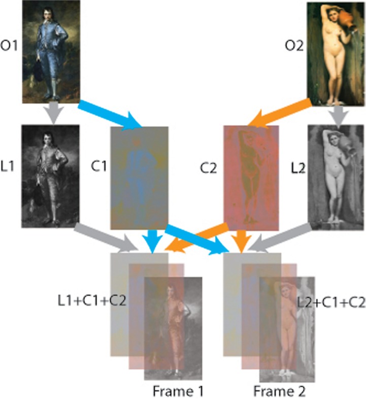
Of course, simply superimposing the luminance and chrominance components of a single painting would restore the original. But instead, Figure 1 shows how we superimposed just the color components of both paintings. On its own, this looked like a fuzzy mess. But we made two copies of this double-chromatic mess. On one we transparently superimposed the luminance component of the Blue Boy, and on the other, the luminance component of La Source.
Figure 1.
The two original paintings, the Blue Boy (O1) and La Source (O2), were split into their luminance components (L1, L2) and their color components (C1, C2; second row). These were recombined, and transparently superimposed, into two frames (third row). Frame 1 contained both color pictures plus L1, and frame 2 contained both color pictures plus L2. Result: The luminance pictures dominated and gated the colors, so Frame 1 looked like the Blue Boy, while Frame 2 looked like La Source (see Figure 2).
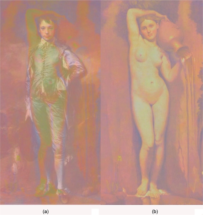
These are shown side-by-side in Figure 2. Each picture is a triple-layer sandwich of two chromatic pictures (same in both frames) and one luminance picture (different in each). Although each picture in Figure 2 is somewhat desaturated by a veil of color, the Blue Boy luminance picture makes the whole image look like the original Blue Boy painting, with La Source virtually invisible (Figure 2a). Conversely, the original La Source is perceived when the triple layer sandwich contains the La Source luminance picture, with the Blue Boy nowhere to be seen (Figure 2b). Supplementary Movie S1 also shows the two superimposed color components, with each luminance component in turn sliding over them into superimposition.
Figure 2.
(a) contains C1 + C2 + L1 and looks like O1 (the Blue Boy). (b) contains C1 + C2 + L2 and looks like O2 (La Source). Conventions same as for Figure 1.
So, each grayscale picture perceptually amplified the colors that were congruent with it, and de-emphasized the noncongruent colors. This is like a visual analogue of the auditory cocktail party problem. It is as though the luminance contours pick out the colors that coincide with them but ignore noncoincident colors. Color filling-in phenomena like these are thought to occur by means of a contour-based filling-in mechanism (Grossberg, 2003). Thus, luminance perception dominates and guides color perception.
Acknowledgments
S. Anstis is grateful for a grant from the Psychology Dept, UCSD, a Visiting Fellowship from Pembroke College, Oxford, and a Humboldt Fellowship. The authors thank Sean Deering, Neal Dykman, Doreen Hsu, Katherine Hsueh, and Esther Strom for their assistance.
Biography
 Stuart Anstis took his Ph.D. in experimental psychology at the University of Cambridge under Richard Gregory. He then taught at the University of Bristol, then at York University in Toronto, Canada. For the last 20 years he has taught at UC San Diego. For more information visit http://psy2.ucsd.edu/~sanstis/Stuart_Anstis/Welcome.html.
 Mark Vergeer took his Ph.D. in neuroscience at Radboud University in Nijmegen under Rob van Lier and Charles de Weert. After finishing his Ph.D. he started working as a postdoc in the laboratory of psychophysics led by Michael Herzog at EPFL, Lausanne. For more information please visit http://lpsy.epfl.ch/people/vergeer/
 Rob van Lier took his PhD in Experimental Psychology at the Radboud University Nijmegen and after that he spent a few postdoc years at the University of Leuven. Currently he is an associate professor and principal investigator at the Donders Institute for Brain, Cognition and Behaviour. For more information visit: http://www.robvanlier.nl (or http://www.socsci.ru.nl/~robvl/)
Contributor Information
Stuart Anstis, Department of Psychology, UC San Diego, 9500 Gilman Drive, La Jolla, CA, 92093, USA; e-mail: sanstis@ucsd.edu.
Mark Vergeer, Laboratory of Psychophysics, Brain Mind Institute, Ecole Polytechnique Fédérale de Lausanne (EPFL), Switzerland; e-mail: mark.vergeer@epfl.ch.
Rob Van Lier, Radboud University Nijmegen, Donders Institute for Brain, Cognition and Behaviour, Nijmegen, The Netherlands; e-mail: r.vanlier@donders.ru.nl.
References
- Anstis S. Vergeer M., Van Lier R. Luminance contours can gate afterimage colors and ‘real’ colors. Journal of Vision. (in press) [DOI] [PubMed]
- Critchley M. Acquired anomalies of color perception of central origin. Brain. 1965. pp. 711–724. [DOI] [PubMed]
- Daw N. W. Why after-images are not seen in normal circumstances. Nature. 1962;196:1143–1145. doi: 10.1038/1961143a0. [DOI] [PubMed] [Google Scholar]
- Feitosa-Santana C. D-Antona A. D., Shevell S. K. What kinds of contours bound the reach of filled-in color? Journal of Vision. 11(2):1–11. doi: 10.1167/11.2.2. [DOI] [PMC free article] [PubMed] [Google Scholar]
- Gerrits H. De Haan B., Vendrik A. Experiments with retinal stabilized images. Relations between the observations and neural data. Vision Research. 1966;6:427–440. doi: 10.1016/0042-6989(66)90051-4. [DOI] [PubMed] [Google Scholar]
- Granger E. M., Heurtley J. C. Letters to the editor: Visual chromaticity-modulation transfer function. Journal of the Optical Society of America. 1973;63:1173–1174. doi: 10.1364/JOSA.63.001173. [DOI] [PubMed] [Google Scholar]
- Gregory R. L. Vision with isoluminant color contrast: 1. A projection technique and observations. Perception. 1977;6:113–119. doi: 10.1068/p060113. [DOI] [PubMed] [Google Scholar]
- Grossberg S. Filling-in the forms: Surface and boundary interactions in visual cortex. In: Pessoa L., de Weerd P., editors. Filling-in: From perceptual completion to cortical reorganization. Oxford, England: Oxford University Press; 2003. pp. 13–37. [DOI] [Google Scholar]
- Hamburger K. Hansen T., Gegenfurtner K. Geometric-optical illusions at isoluminance. Vision Research. 2007;47:3276–3285. doi: 10.1016/j.visres.2007.09.004. [DOI] [PubMed] [Google Scholar]
- Kanai R. Wu D. A. Verstraten F. A., Shimojo S. Discrete color filling beyond luminance gaps along perceptual surfaces. Journal of Vision. 2006;6:1380–1395. doi: 10.1167/6.12.4. [DOI] [PubMed] [Google Scholar]
- Kim J., Francis G. Color selection, color capture, and afterimage filling-in. Journal of Vision. 2011;11:1–18. doi: 10.1167/11.3.23. [DOI] [PubMed] [Google Scholar]
- Lee B. Gegenfurtner K. R., Sharpe L. T., editors. Receptor inputs to primate ganglion cells. Color vision: From genes to perception. 1999. pp. 203–217.
- Livingstone M., Hubel D. Psychophysical evidence for separate channels for the perception of form, color, movement, and depth. Journal of Neuroscience. 1987;7:3416–3468. doi: 10.1523/JNEUROSCI.07-11-03416.1987. [DOI] [PMC free article] [PubMed] [Google Scholar]
- Stockman A., Brainard D. H. Color vision mechanisms. In: Bass M., editor; DeCusatis C., editor; Enoch J., editor; Lakshminarayanan V., editor; Li G., editor; Macdonald C., editor; Mahajan V., van Stryland E., editors. The Optical Society of America Handbook of Optics. 3rd ed. Volume III: Vision and Vision Optics. New York, NY: McGraw Hill; 2009. [Google Scholar]
- Van Lier R. Vergeer M., Anstis S. Filling-in afterimage colors between the lines. Current Biology. 2009;1:R323–R324. doi: 10.1016/j.cub.2009.03.010. [DOI] [PubMed] [Google Scholar]
- Wandell B. A. Foundations of vision. Sunderland, MA: Sinauer Associates; 1995. [Google Scholar]


