

Abstract
Advances in surveillance science have supported public health agencies in tracking and responding to disease outbreaks. Increasingly, epidemiologists have been tasked with interpreting multiple streams of heterogeneous data arising from varied surveillance systems. As a result public health personnel have experienced an overload of plots and charts as information visualization techniques have not kept pace with the rapid expansion in data availability. This study sought to advance the science of public health surveillance data visualization by conceptualizing a visual paradigm that provides an ‘epidemiological canvas’ for detection, monitoring, exploration and discovery of regional infectious disease activity and developing a software prototype of an ‘infectious disease weather map'. Design objectives were elucidated and the conceptual model was developed using cognitive task analysis with public health epidemiologists. The software prototype was pilot tested using retrospective data from a large, regional pediatric hospital, and gastrointestinal and respiratory disease outbreaks were re-created as a proof of concept.
Keywords: Biosurveillance, correlation of data, data display, detecting disease outbreaks and biological threats, developing/using clinical decision support (other than diagnostic) and guideline systems, discovery, human–computer interaction and human-centered computing, improving healthcare workflow and process efficiency, infectious disease outbreaks, measuring/improving outcomes in specific conditions and patient subgroups, methods for integration of information from disparate sources, modeling physiological and disease processes, other methods of information extraction, public health surveillance, simulation of complex systems (at all levels: molecules to work groups to organizations), statistical data analysis, systems to support and improve diagnostic accuracy, text and data mining methods, visualization of data and knowledge
Dramatic changes in human behavior and broader social, economic and technological developments in the past several decades have created favorable environments and increased potential for the occurrence and rapid spread of infectious disease.1 Massive amounts of electronic data in healthcare and other domains give us the technical potential to detect, track and respond to such outbreaks. A sense of urgency after the anthrax attacks of 2001 spurred intense development of systems designed to collect, aggregate, analyze and display multiple data sources relevant to monitoring public health.2–7 Systems, some pioneered in Utah, tracking a wide variety of data ranging from web queries, prescription and over-the-counter medication sales, patient chief complaints, clinician diagnoses and the results of laboratory and radiological diagnostic testing, are now commonly found in the surveillance arsenal of public health agencies.8 As a result, modern-day public health personnel are finding themselves awash with data coming from a number of new surveillance systems: data that need to be turned into actionable information and ultimately knowledge to protect the public's health. An urgent need exists to develop public health surveillance systems that are user centric, based on sound principles of data visualization, incorporate intelligent interactive features and offer public health professionals a satisfying and action-oriented view of infectious diseases in their jurisdiction.9
We sought to address some of the challenges facing the visualization and visual correlation of multidimensional epidemiological data, aiming to create a visual paradigm to serve as an infectious disease weather map for public health surveillance and provide an interactive canvas—EpiCanvas—for real-time detection, monitoring, exploration and discovery of regional infectious disease epidemiology. We present the conceptual model that led to the final design and a functional analysis of the final software prototype. We discuss the designs in the context of usability by public health professionals and draw conclusions regarding application to real-world situations, including gastrointestinal and respiratory disease outbreaks, and potential application of our model to other domains.
Methods
Conceptual model development
With an emphasis on data visualization and interrogation, author YL used contextual interviews to understand how users interact with surveillance systems currently used in the State of Utah. Contextual interviewing, a method of cognitive task analysis, involves direct observation and questioning of users while they are using and explaining how they use tools to complete a cognitive task (eg, influenza surveillance). Drawing on the public health surveillance expertise of authors AVG and PHG and a practising public health epidemiologist from the Salt Lake Valley Health Department (SLVHD), author YL examined the capabilities of Utah's syndromic (EpiCenter), pathogen-specific (GermWatch) and reportable disease (Utah National Electronic Disease Surveillance System) surveillance systems. Ten serial interviews were conducted with AVG and PHG and three interviews with the SLVHD epidemiologist.
We used the observations derived from our interviews to derive a set of design objectives and develop a representation of an epidemiologist's ‘mental model’ of situational awareness and the data visualization(s) needed to support it. We then used the design objectives and ‘mental model’ representation to develop a conceptual model, which served as the basis for our software prototype development.
Software prototype development
To develop our software prototype, we used a 1-year extract of emergency department (ED) visit data from a regional, specialty children's hospital in Utah that serves as the main pediatric hospital for Salt Lake County. Routine demographic data, syndromically coded chief complaints10 and results of routine clinical microbiological diagnostic testing for 10 respiratory and seven gastrointestinal pathogens7 were available for 44 848 ED visits between 30 June 2007 and 30 June 2008. During this period, outbreaks of common communicable infectious diseases occurred in the Salt Lake Valley that were evident in our dataset: three gastrointestinal pathogens—cryptosporidium,11 enterovirus, and rotavirus7—and several respiratory viruses including respiratory syncytial virus (RSV), influenza A and B, parainfluenza types 2 and 3, adenovirus, human metapneumovirus, and human enterovirus.7
Individual ED encounters were tagged with an age group, zip code, city, syndrome(s), symptom(s) and pathogen(s). The minimum number of tags per case was one, the maximum was eight, and the average number of tags per case was four. There was a total of 1659 unique tags and 184 549 case:tag combinations in our final dataset.
Usability/usefulness evaluation
We performed usability sessions with five epidemiologists from Utah State (n=3) and SLVHD (n=2), and five informatics programme managers from the fields of epidemiology, psychology and public health. Following a 10–15 min introduction to the software, the participants were allowed and encouraged to interact with the software, explore various time periods, control settings and tools available in the display. Following this session, the participants completed a survey about their experience. We developed our survey based on the unified theory of acceptance and use of technology model,12 which employs validated scales to measure three direct determinants of intention to use (performance expectancy, effort expectancy and social influence) and two direct determinants of usage behavior (use intent, facilitating conditions), as well as scales to measure anxiety and attitude towards using technology. Unified theory of acceptance and use of technology scales were adapted to capture the concept of an epidemiologist's utilization of EpiCanvas to perform public health surveillance. The survey consisted of 44 individual questions: 16 assessing general usability of the software and its various features, and 28 questions assessing performance expectancy, effort expectancy, facilitating conditions, attitude towards using technology and anxiety associated with its use. The social influence determinant was not evaluated and none of the evaluators participated in the design of the system. (see online supplementary material Appendix A).
The institutional review boards of the University of Utah and Intermountain Healthcare approved the study protocol.
Results
Our results include a set of design objectives, the development of a conceptual model, programming of a software prototype, creation of illustrative examples of how a pilot test of the visualization could be applied to infectious disease outbreaks, and results of the usability studies.
Based on our interviews and observations, we formulated a set of design objectives:
Representing data from disparate sources (ie, syndromic and reportable diseases) on one screen.
Visualizing changes over time and space for key variables.
Visualizing existing relationships between data elements, without providing redundant information when implicit knowledge already exists (eg, knowing that influenza typically presents with fever and cough).
Exploring temporal relationships between data that would normally not be inferred.
Drilling down, in an investigative and exploratory mode, on the data to obtain a more granular level of detail (eg, which specific school is most affected by absenteeism).
Adding data exploration tasks including a more systematic analysis of individual cases.
Emphasizing relative importance and possible correlation between cases.
Conceptual model
Figure 1 (left) depicts a whiteboard representation of a mental model we derived from interviews with a prototypic epidemiologist that exhibits several themes. The epidemiologist's initial statements are very broad and general (figure 1), followed by descriptions of overall trends and some references to specific locations. The epidemiologist assumes the audience (in this case, the group of interviewers) has a priori knowledge of the meaning and implications of these observed trends. The number of hospitalized cases and general locations were important, but whether the 12 cases represent a high or low number was ignored—again relying on the audience's previous knowledge. From the epidemiologist's perspective, only key indicators are captured and details that can be easily derived again later are ignored. The analyst tends to note (either mentally or on paper) when patterns seem to emerge or strong correlations between concepts are identified. Although the initial layout is generally random, additional items tend to be clustered based on relevance, geography and importance. This analysis emphasized the need for a visualization tool that provides a common workspace where disparate concepts, ideas, data types, locations and other meta-information—that we collectively refer to as tags—can be organized in meaningful ways.
Figure 1.
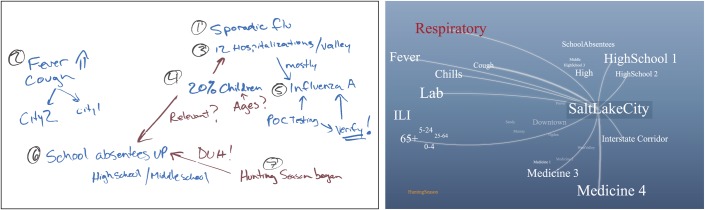
Whiteboard illustration (left) of a prototypic public health epidemiologist's heuristic mental model map of influenza activity derived from these quotes: ‘There is sporadic flu in the valley…’, ‘Fever and coughs are rising in…’, ‘12 people hospitalized in the valley…’, ‘20% of them are children…’, ‘Based on point-of-care testing, most are influenza A…’, ‘School absenteeism is high in middle/high schools…’. Conceptual mock-up (right) of tag cloud-based representation and interaction.
From an information visualization perspective, the whiteboard illustration can be viewed as a collection of graphs with ‘concepts’ as graph nodes and ‘remarks’ as links. This representation shares many similarities with an information visualization paradigm known as tag clouds.13 14 In web computing, a ‘tag’ is defined as a keyword or term associated with URL or a document. A tag, for our purposes and in its simplest form, is a single word that provides a semantic relationship to the raw data item. The tags can represent a wide range of concepts, such as age groups, symptoms, syndromes, pathogens, geographical locations and alerts.
Figure 1 (right) is an initial conceptual model mock-up of a tag cloud-based visualization founded on this whiteboard representation. The conceptual model is based on an abstract representation of the raw data using meta-data tags. For example, a reported case may be associated with the tags ‘cough’, ‘fever’, ‘infant’, and ‘Salt Lake City’. The ‘cough’ tag, in turn, may also be associated with other reported cases, alerts, or other data items. Examples of tags include specific pathogen tags (‘RSV’, ‘cryptosporidium’), syndromes (‘gastrointestinal’), age groups (‘infants’, ‘teens’) and specific locations (‘Salt Lake City’). In our model, tags have no restrictions on the number, type or scope.
The model includes a knowledge base of all the tags in the domain. The knowledge base is defined and maintained independently of the raw data and can represent additional domain-specific knowledge, semantic details for each tag, and conceptual relationships between tags. In our implementation, for example, we associated each tag with a group: age group, syndrome, symptom, pathogen and location. A separate tagging process (es) associates a collection of tags with each raw data item, and these associations are added to the model. The model does not include the actual raw data; rather, it employs a unique identifier for each data item to distinguish between them. For example, a table row id would be sufficient if the raw data are stored in a single table. A more general identifier such as a unique resource identifier can be used for disparate data in multiple remote databases.
Software prototype
Figure 2 depicts a screenshot of the EpiCanvas user interface showing 4 weeks of data spanning the winter peak of RSV activity. Table 1 provides detailed descriptions of the system features, functionalities, and user interactions.
Figure 2.

Screen shot of the EpiCanvas infectious disease weather map interface showing various components of the system. Left panel: date and time interval selection, configuration options for GIS map, correlation lines, tag size, selected cases, and layout methods. Center panel: a tag cloud with ‘infant’ and ‘respiratory syncytial virus’ tags selected. The tag color differentiates between tag groups (ie, symptoms:green, syndromes:brown, age group:black, pathogen:pink). Right panel: GIS map with choropleth map symbolized based on incidence (more red = higher incidence) and showing zip codes where both ‘infant’ and ‘respiratory syncytial virus’ tags are active. Not shown are list of active tags, tag groups, selected tags, related cases line list and related cases time series graph depicting the counts of selected tags (both individual and shared) over time.
Table 1.
Functionality and associated user interactions of the EpiCanvas prototype
| Feature | Functionality | User interaction |
| Tag knowledge database | Provides a semantic relationship to the raw data item. For example, a reported case may be associated with the tags ‘cough’, ‘fever’, ‘infant’, and ‘Salt Lake City’. The ‘cough’ tag, in turn, may also be associated with other reported cases, alerts, or other data items. |
|
| Tag formatting |
|
Relative scaling: size of a tag is relative to all tags or to tags of the same group.Number of cases threshold: hide tags that are associated with only a small number of data items. |
| Tag layout |
|
|
| Tag interactions | The mouse pointer and a few clicks facilitate interactive drilldown investigation and the ability to navigate quickly through various levels of detail. The user can highlight a tag or select a group of tags to see additional information related to the underlying data and temporal correlation between the tags. |
|
| Correlation lines | Shown between tags that exhibit temporal correlation calculated using various algorithms (Pearson moment, geometric, centered geometric) based on the number of data items that are tagged by both tags. |
|
| Line list and time series graph | Cases associated with selected tags are shown in a line list and a time-series graph in a side panel. | Hovering over or selecting single or multiple tags automatically updates the map, line list, and time-series graphs. |
| GIS map | Dynamic updating of a zip code-level choropleth map based on the data associated with the selected tags. Shading is based on incidence of cases with the selected tags. | Can optionally display background map and school district, health district, and county boundaries. |
The display provides an overall view of the current health status for this given period of time. The various tags represent all the meta-information relating to the given time period. The size of each tag provides a qualitative indication of the current prevalence or importance of the concept the tag represents, for example, the number of reported cases associated with RSV. Quantitative information is provided via additional controls on either side of the display. In this view, the user has selected two tags of interest, ‘RSV’ and ‘infants’. The user gains quick assessment of the overall current situation based on which tags are shown and their relative size to each other. The initial display conveys information at a glance through the layout: correlated tags are arrayed based on the strength of the correlation, and individual tags are dynamically sized based on their relationships relative to all tags or tags of the same type. Hovering over a tag or selecting it with a mouse click reveals correlation between the tags and any other visible tags using lines. (see online supplementary material Appendices B and C).
Illustrative outbreaks
Figure 3 depicts the EpiCanvas interface over the course of a gastrointestinal outbreak (panel A) and an example of an interactive drilldown during respiratory viral outbreaks (panel B).
Figure 3.

Two panels depicting gastrointestinal and respiratory outbreaks. (A) Temporal, by week, snapshots of the EpiCanvas interface between 1 July 2007 and 2 September 2007 (top panels) with the matching epidemic curve showing weekly counts of positive cryptosporidium laboratory tests (lower panel). Top left: the first laboratory-confirmed cryptosporidium case (pink pathogen tag) clustering with the tags ‘abdominal pain’, ‘vomiting’ and ‘gastrointestinal’; a number of respiratory pathogens clustering with ‘fever,‘ ‘constitutional’ and ‘respiratory’. Top center: increasing size of ‘cryptosporidium’ tag with the tags ‘preschool’ and ‘children’ clustered nearby. Right panel: outbreak peaking. (B) EpiCanvas interface during the week of 12 January 2008 when respiratory syncytial virus was peaking and influenza activity was moderate. Left panel: the ‘respiratory syncytial virus’ tag dominates clustering with ‘respiratory distress’, ‘cough’ symptom tags and the ‘respiratory’ syndrome tag; the ‘influenza’ tag is also noted clustering with ‘preschool’, ‘vomiting’, ‘Salt Lake City’ and ‘fever’. Middle panel: clicking on the ‘influenza’ tag reveals details including the associated spark line indicating 12 cases in the past week and the correlation lines with ‘infants’, ‘fever’ and ‘respiratory’. Right panel: further selecting ‘fever’ reveals that 10/12 laboratory-confirmed infections presented with fever and reveals the correlation between ‘fever’ and ‘infants’ and ‘fever’ and ‘Salt Lake City’. Had the user selected ‘influenza’ and ‘infants’, they would discover that 11 of the 12 laboratory-confirmed influenza infections were in infants.
Usability/usefulness evaluation
Performance expectancy
One hundred per cent of respondents agreed that they would find EpiCanvas useful for performing disease outbreak surveillance and investigating outbreaks of specific infectious diseases in certain groups, such as infants, or in specific cities. A lesser majority agreed that EpiCanvas would enable them to accomplish surveillance tasks more quickly (90%) and allow them to spend less time on routine surveillance activities (80%).
Effort expectancy
One hundred per cent of respondents agreed that they understand how EpiCanvas could be applied to public health surveillance, their interaction with EpiCanvas was clear and understandable, learning to operate EpiCanvas was easy for them and that it would be easy for them to become skillful at using EpiCanvas. Sixty per cent strongly agreed with the latter statement.
Facilitating conditions
Eighty per cent of respondents agreed that they have the knowledge of infectious disease necessary to use EpiCanvas, the EpiCanvas approach is compatible with the other systems they use and that the data required to use EpiCanvas are available in existing systems. One hundred per cent agreed that they would expect EpiCanvas to make it easier to collaborate with other epidemiologists in their own and other public health agencies.
Anxiety
One hundred per cent of respondents did not agree that they felt apprehensive about using EpiCanvas and that EpiCanvas is somewhat intimidating to them. A lesser majority did not agree that they were worried they might draw incorrect conclusions by using EpiCanvas (90%), that the number of tags is overwhelming, making the display useless (80%), and the layout of the EpiCanvas user interface was confusing (80%).
Attitude towards using technology
One hundred per cent of respondents agreed that EpiCanvas could make their work more interesting and they liked working with EpiCanvas. One hundred per cent did not agree that using EpiCanvas was a bad idea.
Specific features
One hundred per cent of respondents agreed that they found the interaction with the tag cloud, including highlighting and selecting of various tags was intuitive and the ability to query the data by dynamically selecting and unselecting tags would be useful. A lesser majority agreed that they found the correlation lines helpful for understanding the relationships between items (90%) and they found the dynamically updated map useful (88%). (see online supplementary material Appendix A).
Discussion
Public health surveillance has evolved to include multiple, disparate and heterogeneous surveillance data streams and systems that attempt to integrate and present large amounts of data. These systems have been loosely integrated, and the data have been poorly displayed. As a result, many system users have developed workarounds and creative approaches for combining data from several different systems to develop a cohesive mental model of regional infectious disease activity. The EpiCanvas approach is informed by an analysis of mental models of practising public health epidemiologists in gathering, noting and correlating epidemiological data. This approach is well suited for the task of integrating and displaying data and supports situational awareness via a dynamic display of current events. The approach provides a platform for interactive data interrogation and exploration that can help the user ‘detect the expected and discover the unexpected’15 in the context of an infectious disease weather map.
The proposed approach presents several novel ideas. The depiction of the current situation at a higher level of cognitive abstraction fits better with the mental model of the system end-user. This can potentially reduce the cognitive effort needed to transform the displayed visual data into the user's own mental model. The user is able to adjust correlation parameters quickly to hide or reveal the lines indicating the relationship, if any, between various tags and to identify cases sharing similar tags. Conditional formatting of a tag's representation at the level of tag groups (eg, pathogens) and specific tags (eg, reportable diseases) can be implemented to add emphasis to items of particular interest.
A fundamental principle in the theory of visual analysis is separation of visual representation from incidental organization of raw data. The use of tags as meta-data facilitates the separation of our system from existing data sources and thus the integration of heterogeneous data from disparate sources under the same framework. The tags only augment existing data sources and do not impose or require any changes to existing systems. The meta-data can be stored and visualized independently of the data sources. This design could greatly simplify integration of data from current public health surveillance systems. This feature has the potential to confer generalizability and scalability to this approach along with the advantage of making our system ‘grid ready’ and useful for federated data across multiple healthcare systems and public health jurisdictions. This generalization and scaling would entail addressing the challenging issues of terminology mapping and tag standardization such that the tagging of the source data is semantically consistent across these dimensions. The EpiCanvas approach lends itself well to the addition of ontologies or pre-established semantic relationships based on domain knowledge, which can be incorporated and displayed based on user preference.
There are several limitations to be noted. Discussions with a wider cross-section of epidemiologists may yield further insights, although it is unlikely that the basic premise of the mental model would be dramatically different. The illustrative outbreak examples we provide are biased in that they were known outbreaks visible in the somewhat unique pathogen-specific data from GermWatch,16 which may not be available in other settings. The utility and usability of the system was tested in pilot studies with a convenient sample of regional epidemiologists and informatics colleagues in controlled settings using retrospective data from a single hospital in an exploratory investigative manner. Our study, therefore, did not address potential risks to patient safety resulting from the system being used prospectively in actual public health practice. These risks include potential patient harm resulting from actions or inactions by investigators based on improper conclusions being drawn, relationships being overlooked, or resources being expended based on potentially biased data. The ability of this approach to support public health surveillance while mitigating potential patient safety risks needs to be robustly measured and evaluated in prospective studies with different datasets of a larger size and complexity before the broader informatics community can go on to adopt these tools.
Conclusions
EpiCanvas provides a novel visualization that facilitates situational awareness. Based on heuristic mental models of end-users, this display encourages visual correlation, data interrogation, exploration and discovery. The prototype also provides the first iteration of an integrated infectious disease weather map for public health professionals. Future work involves extensive field testing, further iteration of displays and interactive features and ultimate deployment in a real-world setting. The principles underlying EpiCanvas are translatable to other domains such as hospital-acquired infections, foodborne illness and adverse events.
Supplementary Material
Acknowledgments
The authors deeply appreciate the enthusiasm, interest and feedback from their colleagues at the Salt Lake Valley Health Department (Mary Hill, Jenny Robertson, Andrea Price, Ilene Risk), Utah Department of Health (David Jackson, Rachel Herlihy, Robert Rolfs), Division of Epidemiology, Department of Internal Medicine (Warren Pettey, Jose Benuzillo) and Department of Psychology (Frank Drews), University of Utah School of Medicine. Finally, this project owes a debt of gratitude to Mary Kratz for encouraging and supporting the formation of this interdisciplinary team and giving the authors her first vision of an infectious disease weather map. A demonstration version of the EpiCanvas software prototype is available upon request.
Footnotes
Contributors: PHG was responsible for conception, design, analysis and interpretation of data, writing the article and revising it critically for important intellectual content and final approval of the version to be published. YL was responsible for conception, design, and development of the software, drafting the article or revising it critically for important intellectual content and final approval of the version to be published. NG was responsible for conception and artistic design of the user interface, revising the article critically for important intellectual content and final approval of the version to be published. MHS participated in the conception and design of the visualization paradigm, design of the usability, revising the article critically for important intellectual content and final approval of the version to be published. AVG was responsible for obtaining funding, conception and design of the interface, conduct of the usability analysis and interpretation of data, writing the article and revising it critically for important intellectual content and final approval of the version to be published.
Funding: Primary funding was provided by: US Army Medical Research and Materiel Command, Telemedicine and Advanced Technology Research Center (TATRC, project #W81XWH0710699, PI: AVG). Secondary funding was provided by: CDC Rocky Mountain Center for Translational Research in Public Health Informatics Grant (CDC #5P01HK000069, PI: MHS). PHG was partly supported by a career development grant from the Agency for Healthcare Research and Quality (#K08HS018538, PI: PHG).
Competing interests: None.
Ethics approval: Ethics approval was provided by institutional review boards of Intermountain Healthcare and University of Utah.
Provenance and peer review: Not commissioned; externally peer reviewed. The original version of this manuscript was awarded the Homer R. Warner Award at the AMIA 2011 Annual Symposium and was referred to JAMIA for publication. (See online supplementary material Appendix D).
Data sharing statement: The authors cannot share the raw data they used because it contains protected health information that cannot be shared without executing data sharing agreements.
References
- 1. Gannon J. The Global Infectious Disease Threat and its Implications for the United States. Washington, DC: National Intelligence Council, 2000. http://www.dni.gov/nic/special_globalinfectious.html (accessed 22 Aug 2011). [Google Scholar]
- 2. Gesteland PH, Gardner RM, Tsui FC, et al. Automated syndromic surveillance for the 2002 Winter Olympics. J Am Med Inform Assoc 2003;10:547–54 [DOI] [PMC free article] [PubMed] [Google Scholar]
- 3. Gundlapalli AV, Olson J, Smith SP, et al. Hospital electronic medical record-based public health surveillance system deployed during the 2002 Winter Olympic Games. Am J Infect Control 2007;35:163–71 [DOI] [PubMed] [Google Scholar]
- 4. Lombardo J, Burkom H, Elbert E, et al. A systems overview of the electronic surveillance system for the early notification of community-based epidemics (ESSENCE II). J Urban health 2003;80(2 Suppl 1):I32–42 [DOI] [PMC free article] [PubMed] [Google Scholar]
- 5. Tsui FC, Espino JU, Dato VM, et al. Technical description of RODS: a real-time public health surveillance system. J Am Med Inform Assoc 2003;10:399–408 [DOI] [PMC free article] [PubMed] [Google Scholar]
- 6. Wagner MM, Robinson JM, Tsui FC, et al. Design of a national retail data monitor for public health surveillance. J Am Med Inform Assoc 2003;10:409–18 [DOI] [PMC free article] [PubMed] [Google Scholar]
- 7. Intermountain Physician.org GermWatch. 2011. http://www.intermountainphysician.org/gw (accessed 22 Aug 2011). [Google Scholar]
- 8. Buehler J, Sonricker A, Paladini M, et al. Syndromic surveillance practice in the United States: findings from a survey of state, territorial, and selected local health departments. Adv Dis Surveill 2008;6:1–20 http://www.isdsjournal.org/articles/2618.pdf (accessed 22 Aug 2011). [Google Scholar]
- 9. Rolka H, Burkom H, Cooper GF, et al. Issues in applied statistics for public health bioterrorism surveillance using multiple data streams: research needs. Stat Med 2007;26:1834–56 [DOI] [PubMed] [Google Scholar]
- 10. Health Monitoring Systems EpiCenter. 2011. http://www.hmsinc.com/service/epicenter.html (accessed 22 Aug 2011). [Google Scholar]
- 11. Centers for Disease Control and Prevention (CDC) Communitywide cryptosporidiosis outbreak – Utah, 2007. MMWR Surveill Summ 2008;57:989–93 [PubMed] [Google Scholar]
- 12. Venkatesh V, Morris MG, Davis FD. User acceptance of information technology: toward a unified view. MIS Q 2003;27:425–78 [Google Scholar]
- 13. Begelman G, Keller P, Smadja F. Automated Tag Clustering: Improving Search and Exploration in the Tag Space. Collaborative Web Tagging Workshop; In WWW2006 (22–26 May 2006). 2006. http://www.pui.ch/phred/automated_tag_clustering/ (accessed 22 Aug 2011). [Google Scholar]
- 14. Rivadeneira AW, Gruen DM, Muller MJ, et al. Getting our head in the clouds: toward evaluation studies of tagclouds. In: Proceedings of the SIGCHI Conference on Human Factors in Computing Systems (CHI '07). New York, USA: ACM, 2007:995–8 [Google Scholar]
- 15. Thomas JJ, Cook KA. Illuminating the path: the research and development agenda for visual analytics. IEEE Comput Soc 2005:105 http://nvac.pnl.gov/agenda.stm (accessed 22 Aug 2011). [Google Scholar]
- 16. Gesteland PH, Samore MH, Pavia AT, et al. Informing the front line about common respiratory viral epidemics. AMIA Annu Symp Proc 2007;11:274–8 [PMC free article] [PubMed] [Google Scholar]
Associated Data
This section collects any data citations, data availability statements, or supplementary materials included in this article.