

Abstract
Background
Online tools such as Adjuvant! provide tailored estimates of the possible outcomes of adjuvant therapy options available to breast cancer patients. The graphical format typically displays four outcomes simultaneously: survival, mortality due to cancer, other cause mortality, and incremental survival due to adjuvant treatment.
Objective
To test whether simpler formats that only present baseline and incremental survival would improve comprehension of the relevant risk statistics and/or affect treatment intentions.
Design
Randomized experimental manipulation of risk graphics shown included in Internet-administered survey vignettes about adjuvant therapy decisions for breast cancer patients with ER+ tumors.
Participants
Demographically diverse, stratified random samples of women ages 40–74 recruited from an Internet research panel.
Intervention
Participants were randomized to view either pictographs (icon arrays) that displayed all four possible outcomes or pictographs that showed only survival outcomes.
Measurements
Comprehension of key statistics, task completion times, graph evaluation ratings, and perceived interest in adjuvant chemotherapy.
Results
In the primary study (N=832), participants who viewed survival-only pictographs had better accuracy when reporting the total chance of survival with both chemotherapy and hormonal therapy (63% vs. 50%, p<0.001; higher graph evaluation ratings (M=7.98 vs. 7.67, p=0.04), and less interest in adding chemotherapy to hormonal therapy (43% vs. 50%, p=0.04; adjusted OR=0.68, p=0.008). A replication study (N=714) confirmed that participants who viewed survival-only graphs had higher graph evaluation ratings (M=8.06 vs. 7.72, p=0.04) and reduced interest in chemotherapy (OR=0.67, p=0.03).
Limitations
Studies used general public samples; actual patients may process risk information differently.
Conclusions
Taking a “less is more” approach by omitting redundant mortality outcome statistics can be an effective method of risk communication and may be preferable when using visual formats such as pictographs.
Keywords: decision aids, risk, patient education as topic, audiovisual aids
INTRODUCTION
Post-operative breast cancer patients often face the difficult decision of whether, and in what form, to undergo adjuvant therapy to reduce the likelihood of cancer recurrence. Options may include chemotherapy, hormonal therapy, or a combination of the two. While tumor and patient characteristics may determine the extent of risk reduction achievable via adjuvant therapies, which choice is optimal is largely dependent on patients’ preferences, specifically the relative value each patient places on reducing the risk of recurrence versus experiencing the complications of the treatments chosen.(1–3)
When discussing such decisions with patients, many clinicians use online tools to calculate tailored estimates of the mortality risks, recurrence risks, and potential benefits of different adjuvant therapy option. These tools often use visual graphics to communicate the relevant risk statistics. For example, one of the most commonly used tools, Adjuvant! Version 8 (www.adjuvantonline.com),(2–4) presents this information to clinicians (and to patients via printable handouts) by displaying four horizontal bars to represent outcomes for each of four possible options: no adjuvant therapy, hormonal therapy only, chemotherapy only, and both chemotherapy and hormonal therapy.
In a recent paper, we demonstrated that the currently used graphical format inhibits women’s ability to comprehend the marginal benefit of adding chemotherapy to hormonal therapy.(5) Using a vignette about an ER+ patient, we contrasted the knowledge and reactions of women presented with a 4-bar format analogous to that used by Adjuvant! versus those who saw simpler graphical formats. Graphs that removed extraneous information about the no treatment and hormonal therapy only options (as hormonal therapy is generally seen as standard for ER+ tumors) resulted in better comprehension than the Adjvuant! format. Furthermore, displaying the information about the remaining two options using a pictograph (icon array) format (Figure 1) previously shown to improve risk communications(6–10) resulted in even better understanding. Despite an unintentional error in the legend (the legend says that 23 women die from cancer instead of 16), women who received the 2-pictograph graphic were able to complete risk comprehension tasks in less time, rated it as more effective, and, most importantly, understood the risk information better than all other formats.(5) Our findings therefore provided empirical support for previous anecdotal assertions that the Adjuvant! format is too complicated and confusing.(11)
Figure 1.
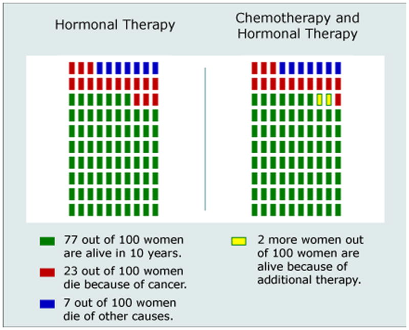
Multi–outcome pictographs from primary study showing both survival and mortality risks
While our study demonstrated the significant advantages of a 2-pictograph format as compared to the standard graph, even our “simpler” graph is potentially confusing. For example, it reports both survival and mortality statistics for each treatment option. The hormonal therapy only pictograph (Figure 1, left) describes how many out of 100 women would be alive (green section), dead due to breast cancer (red section), or dead due to other causes (blue section) in 10 years. The second pictograph (Figure 1, right) repeats this information but also show how the number of women alive would increase due to adding chemotherapy to hormonal therapy in yellow. While doing so provides each patient with a complete accounting of the possible outcomes that she might experience, it requires readers to identify, measure, and interpret either three or four distinctly colored areas each time they view the graph. Yet, some of this information is redundant, since the total mortality risk is simply the complement (100%-X%) of the survival risk. Independently representing both survival and mortality risk (and especially distinguishing between different types of mortality risk) increases the cognitive effort required to interpret the graph, which may therefore result in reduced understanding (12–14) or even decision withdrawal,(15) especially when patients are cognitively or emotionally taxed by other circumstances (e.g., the stress of being newly diagnosed with cancer).(16, 17)
An alternate approach would be to use a graphical format that only presented survival information while omitting mortality risk statistics. While doing so might increase understanding of survival probabilities, it also makes it much more difficult for readers to think in mortality terms, since they must do mental math to calculate the complement of the chance of survival. As a result, such minimalist graphs could be perceived as less clear or effective by readers than more complete graphics are, an impression that might inhibit readers’ willingness to attend to the risk information contained therein.
To test whether minimalist graphics that only presented survival information would be at least as effective as more complete graphs and whether they would be evaluated favorably by women, we collected additional data, again using a randomized experimental design, from a separate group of women who were contacted at the same time as our previous study(5) but viewed graphs that only presented survival information. By comparing the understanding and reactions of these women to those of the participants in our original study, we directly assess in our primary analyses whether graphics that only present survival information result in better, worse, or similar comprehension of risk statistics as graphics which independently represent both survival and mortality risks. In addition, we conducted a brief replication study to ensure that the findings from our primary study cannot be explained away as artifacts of the graph legend error noted above.
PRIMARY STUDY: MATERIALS AND METHODS
Overview of Study Design
All participants in this study viewed a vignette (described in more detail in our previous study[5] and available as an online Appendix) that asked them to imagine being diagnosed with breast cancer, having surgery, and then discussing subsequent adjuvant therapy options with their doctor. We randomly assigned half of the subjects to view associated risk information in risk graphics that displayed both survival and mortality information (per the Adjuvant! format), while the remaining participants viewed graphics which only showed survival statistics. We then assessed participants’ knowledge of the risk statistics, the time it took them to complete a knowledge task, their preference ratings for the graph type shown, and their treatment intentions. This design received Institutional Review Board exempt status approval as anonymous survey research.
Participants
Study participants were women 40–74 years old (the age range of most breast cancer patients) and were drawn from a panel of Internet users administered by Survey Sampling International (SSI). Email invitations were sent to a stratified random sample of panel members with the goal of approximating the U.S. census on education level, race, and income in the final subject pool. To ensure at least moderate demographic diversity (but not representativeness) and offset large expected variations in response rates (especially for African-Americans and Hispanic-Americans), we established target response levels roughly matching the prevalence of these racial/ethnic groups in the U. S. population. We also drew three distinct age samples within each race (one-third each ages 40–49, 50–59, and 60–74) to offset differential response rates across age groups. The number of email invitations in each demographic sub-sample was dynamically adjusted until all quotas were achieved, such as requiring approximately 12% of completed surveys to come from each of the African-American and Hispanic-American subgroups. Upon completion, participants were entered into both an instant-win contest and a monthly drawing administered by SSI for modest cash prizes.
The Hypothetical Clinical Vignette
In our scenario, the respondent was asked to imagine going for a routine mammogram, finding a lump, having a biopsy, and being diagnosed with breast cancer. Respondents were then told that the tumor was removed by surgery and told that the tumor tested as ER positive (but no other tumor characteristics). The scenario then described the doctor as making a strong recommendation that the patient take hormonal therapy but leaving the question of whether to also take chemotherapy up to the patient. Respondents then viewed the target graphic along with explanatory text.
To create the graphs, we used mortality risk statistics derived from Adjuvant! for a 59 year old patient in good health with a 2.5cm Grade 3 ER+ tumor but no lymph nodes involved. All study participants received identical risk information. The risk graphic used to display this information was randomly varied among two possible choices.
Risk Graphics
Multi-Outcome Pictograph
The multi-outcome pictograph (Figure 1, above) used 10 × 10 matrices of small rectangles to represent both survival and mortality statistics for both the hormonal therapy only and the chemotherapy plus hormonal therapy treatment options. This four-color graphic displayed all possible outcomes (survival, incremental survival due to chemotherapy, mortality due to cancer, and other cause mortality). We showed previously that this format resulted in improved comprehension as compared to the even more complex Adjuvant! format.(5)
Survival-Only Pictograph
The survival-only graphic (Figure 2) was identical to the multi-outcome graphic but removed the two colors used to show mortality due to cancer and mortality due to other causes. Doing so removes information (since readers do not know what exactly happens to the women who do not survive) but reduces the number of color associations and graphical areas that the reader must identify and interpret.(12, 13) Consistent with standard practice for pictographs, the area previously colored in was replaced by grey squares so that the full 10 × 10 matrix remained discernable.
Figure 2.
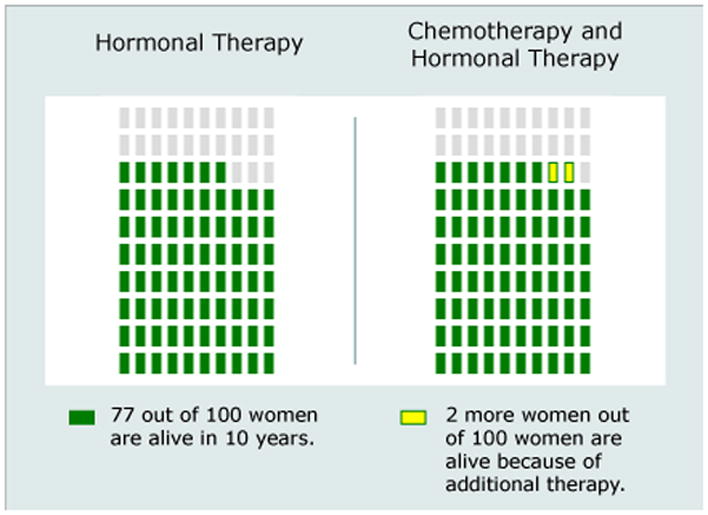
Survival-only pictographs from primary study
Outcome Measures
Comprehension
We measured comprehension using three questions that assessed respondents’ ability to accurately report key statistics relevant to the adjuvant chemotherapy decision: (1) the chance that the respondent would be alive in 10 years with hormonal therapy only, (2) the chance they would be alive with both chemotherapy and hormonal therapy, and (3) how many fewer women out of 100 would die from cancer if they took both chemotherapy and hormonal therapy instead of hormonal therapy only. Since exact numerical information sufficient to calculate these answers was provided in the graph legends, responses were only coded as accurate if exactly correct. We note that the unintentional legend error included in the multi-outcome pictograph involved a statistic (the number of women who would die from cancer) not directly involved with any of these questions.
Cognitive Effort
As a measure of the cognitive information processing (“effort”) required to interpret the graphs,(18) we electronically recorded the number of seconds that the respondent took to answer the risk difference question, which was on a separate page from all other questions.
Treatment Intentions
We assessed treatment intentions using a single question that asked “At this point, how likely do you think you would be to take both chemotherapy and hormonal therapy?” on a 10 point scale with endpoints labeled as “Extremely Likely NOT To Take Chemotherapy” and “Extremely Likely To TAKE Chemotherapy.” Responses were then collapsed at the midpoint into a binary measure that represents whether or not the respondent would prefer to take chemotherapy in addition to hormonal therapy in this situation.
Graph Evaluation Ratings
Respondents answered three graph evaluation questions, rating: 1) how well the graph described the benefits of different additional treatments, 2) whether the respondent would prefer to see risk information in this type of graph, and 3) how clearly the graphs represented the increase in the chance of being alive. Respondents answered each question using a 10 point scale.
Covariates
Because individuals vary in their numeracy (i.e., their facility and comfort with quantitative health information such as risk statistics), all study participants completed the Subjective Numeracy Scale (SNS),(19, 20) a validated measure of quantitative ability and of preferences for receiving information in numerical form. The SNS is comprised of 8 questions, four assessing perceived numerical ability (e.g., “How good are you at calculating a 15% tip?”) and four assessing preferences for quantitative information (e.g., “How often do you find numerical information to be useful?”). SNS scores range from 1 (least numerate) to 6 (most numerate). The SNS has previously been shown to correlate with the ability to recall and comprehend both textual and graphical risk communications (20) and was shown in our earlier analyses to be associated with risk comprehension in this task.(5) We also assessed participants’ level of education, which we model for analysis purposes as a three level variable: High School or less, some post-HS education but no Bachelor’s degree, and Bachelor’s degree or more.
Hypotheses
Because graphs that display only survival information and omit mortality statistics have fewer elements that readers must identify and interpret,(12, 13) we hypothesized that survival-only graphics would make it easier for readers to focus on the size of the incremental benefit of adding chemotherapy to hormonal therapy. Thus, we predicted that women who were shown risk information in this format would (a) have increased comprehension, (b) be quicker to complete the accuracy tasks, and (c) like the graphs more than the women who were shown graphs with both survival and mortality risks. Because the incremental benefit of adding chemotherapy to hormonal therapy in our scenario is small enough (2 additional women out of 100 survive) that many women perceive it as insufficient to justify adjuvant chemotherapy.(21, 22), we also hypothesized that the increased focus provided by survival-only graphs would lead women to be less interested in chemotherapy.
Statistical Analysis
We utilized chi-square tests of proportions to test whether graph type affected comprehension of risk statistics and perceived interest in adding adjuvant chemotherapy to hormonal therapy, t-tests to compare graph evaluation ratings, and Wilcoxon rank-sum tests (to compensate for highly skewed distributions) to compare the distributions of time spent answering the knowledge question regarding the marginal benefit of treatment. We also used a logistic regression analysis to assess whether participants’ comprehension of different graphs was moderated by numeracy and linear regression analysis to examine factors influencing graph evaluation ratings. All analyses were performed using STATA 10,(23) and all tests of significance were two-sided and used alpha = 0.05.
PRIMARY STUDY: RESULTS
A total of 1,110 individuals reached the survey website and viewed the first content page. Of these, 253 (23%) failed to complete the survey. In addition, 3 were excluded for completing the survey too quickly to have paid attention, 8 were male and hence excluded, and 8 were excluded for reporting ages outside of the requested sample range. (See Figure 3 for details of participant flow through the survey instrument.) Completion rates did not differ significantly across the two arms of our RCT design. Our analyses focus on the remaining 838 participants.
Figure 3.

Flow diagram for the primary study
Sample demographic characteristics are described in Table 1. We observed a wide range of educational achievement, with 29% having completed a Bachelor’s or higher college degree but also 24% with only a High School education or less. While 26% of respondents reported having had a prior breast biopsy, 5% had a prior diagnosis of breast cancer, and 20% reported having a first-degree relative with a prior diagnosis of breast cancer, a sensitivity analysis showed that exclusion of these groups did not qualitatively change the results reported below (except for reduced statistical power). The SNS numeracy measure showed high scale reliability (Cronbach’s alpha = 0.87) and substantial variability within our sample (sd=1.11 on a 6 point scale). As expected given our experimental design, there were no significant variations in sample demographics across the experimental conditions.
Table 1.
Sample characteristics in primary study
| Characteristic (continuous) | Mean (Std. Dev.)/Median |
|---|---|
| Age (range: 40–74) | 54.7 (8.7)/54 |
| Subjective Numeracy Score (range: 1–6) | 4.22 (1.11)/4.38 |
| Characteristic (binary) | N (%) |
| Race: | |
| Caucasian | 676 (80.7%) |
| African-American | 98 (11.7%) |
| Other/mixed race | 162 (19.4%) |
| Hispanic ethnicity (any race) | 91 (10.9%) |
| Education: | |
| HS diploma or less | 205 (24.5%) |
| Some college | 392 (46.8%) |
| Bachelor’s degree or more | 240 (28.7%) |
| Prior breast cancer experience: | |
| Prior breast biopsy | 220 (26.4%) |
| Prior breast cancer diagnosis | 48 (5.7%) |
| First-degree relative with breast cancer | 167 (20.1%) |
Comprehension of Risk Statistics
As shown in Table 2, women presented with the simpler survival-only graphics had comprehension that was as good as and sometimes better than women who viewed the more complicated multi-outcome graphic. Compared to the multi-outcome graph, the survival-only graph elicited significantly better comprehension of the total number of women alive with combined therapy (63% vs. 50%, p<0.001). The survival-only graph also elicited marginally better comprehension of the total number of women alive with hormonal therapy only, but it did not improve comprehension of the incremental survival.
Table 2.
Proportion of respondents correctly answering knowledge questions in the primary study, by graph type
| Question | Multi-Outcome Graph | Survival-Only Graph |
|---|---|---|
| Total # Alive with Hormonal Therapy Only | 234/364 (64.3%) | 308/436 (70.6%) |
| – | χ2=3.67, p=0.06 | |
| Total # Alive with Combined Therapy | 188/378 (49.7%) | 281/448 (62.7%) |
| – | χ2=14.09, p<0.001 | |
| Incremental # Alive by Adding Chemotherapy to Hormonal Therapy | 294/381 (77.2%) | 355/450 (78.9%) |
| – | χ2=0.36, p=0.55 |
We next conducted a series of logistic regression analyses examining whether use of the survival-only format interacted with either participant numeracy or education. While we replicated the strong numeracy and weaker education main effects on risk comprehension that had been identified previously,(5) all interaction terms were non-significant. We have omitted the detailed results for brevity.
Cognitive Effort
As in our previous study, we used the time spent completing the risk difference question (which was asked on a separate web page from the rest of the survey) as a key measure of the amount of cognitive effort required to interpret the risk graphics. A pairwise Wilcoxon rank-sum test comparing how long participants viewing survival-only graphs took to answer this question, as compared to those viewing multi-outcome graphs, were non-significant.
Treatment Intentions
When we examined study participants’ responses to our question about treatment intentions (Figure 4), we did find that graph format affected participants’ desire for chemotherapy. Participants who viewed the survival-only graphic were significantly less likely to say that they preferred adding chemotherapy to hormonal therapy (p=0.04). In the multivariate logistic regressions, the odds ratio for viewing survival-only graphs reached statistical significance (OR=0.68, p=0.008). The multivariate analysis also identified a significant main effect of numeracy in which more numerate individuals were less likely to select chemotherapy (OR=0.87, p=0.04), but we found no significant interactions between survival-only format and either respondent numeracy or education.
Figure 4.

Proportion of respondents choosing chemotherapy and hormonal therapy versus hormonal therapy only in the primary study, by graph type
Ratings of Different Formats
Participants’ ratings on the three graph evaluation questions were highly correlated (pairwise r’s: 0.76–0.79), so we combined all three questions into a single scale with high reliability (alpha=0.89). Survival-only pictographs were rated significantly better than multi-outcome pictographs (which themselves were the highest rated format in our previous study(5)): Mean (sd) rating: 7.98 (2.34) vs. 7.68 (2.08), t=2.01, p=0.04. In linear regression analysis, we observed not only a significant main effect of numeracy on graph evaluation ratings but also a significant interaction with the survival-only graph format. To illustrate the effect, we split the sample by median numeracy score (4.38) and tested the effect of graph type within each sub-sample. While graph type had little effect on graph evaluations among the less numerate (Mean (sd): 7.22 (2.13) vs. 7.15 (2.49), t=0.32, p=0.75), it had a large effect among the more numerate participants (Mean (sd): 8.84 (1.65) vs. 8.20, t=3.47, p<0.001). Education was not significantly associated with evaluation ratings
REPLICATION STUDY
As we noted in the introduction, an unintentional error existed in the legend of the multi-outcome pictograph images in our study. We collected additional data as part of another different study that used a very similar scenario and graphics (but with correct legends) to confirm that our findings were not the result of the error.
The vignette for the replication study used virtually identical language but asked participants to make a decision about hormonal therapy (vs. no adjuvant therapy at all) prior to considering adjuvant chemotherapy. For this analysis, we only include those participants who chose hormonal therapy and who were therefore considering the hormonal therapy only versus chemotherapy plus hormonal therapy decision examined in the primary study. The case scenario (and hence the risk numbers displayed in the graphs) were somewhat different: we used mortality statistics for a 62 year old breast cancer patient with a Grade 2 tumor but 1–3 lymph nodes involved (67 alive with hormonal therapy only, and 68 alive with both chemotherapy and hormonal therapy), which implied only a 1% incremental increase in survival from chemotherapy added to hormonal therapy.
Methods
Participants were recruited using identical methods as in the primary study. Accuracy and graph evaluation outcome measures, as well as numeracy and demographics questions, were also identical across studies. In the replication study, however, we assessed treatment intentions by simply asking the binary question, “At this point, would you want to take both chemotherapy and hormonal therapy or hormonal therapy only?”
Results
A total of 1308 individuals reached the survey website. Of these, 384 (29%) failed to complete the survey, 196 chose not to take hormonal therapy at all (hence avoiding the target decision about adding chemotherapy to hormonal therapy), 1 was excluded for completing the survey too quickly, 6 were male and excluded, and 7 were excluded based on their reported age. Our analyses focus on the remaining 714 participants, whose demographics (omitted for brevity) mirrored very closely those of the primary study sample.
Consistent with the finding in our primary study, more participants who viewed the survival-only graph had better comprehension of the total number of women alive with combined therapy than participants who viewed multi-outcome graphs, although the difference did not reach statistical significance (survival-only: 64% vs. multi-outcome: 58%, p=0.13). However, as in the primary study, intentions to take chemotherapy were lower in the survival-only group (21% vs. 27%, p=0.06 in bivariate analysis; OR=0.67, p=0.03 in multivariate logistic regression). The regression analysis also confirmed that respondents with higher numeracy scores chose chemotherapy less often (OR=0.69, p<0.001). Participants again provided higher graph evaluation ratings for survival-only graphs than for multi-outcome graphs (Mean (sd) rating: 8.06 (2.21) vs. 7.72 (2.32), t=2.05, p=0.04).
DISCUSSION
In our randomized experiments, women who viewed risk graphics that only displayed survival information comprehended these graphs at least as well, and sometimes better, than women who viewed analogous graphics that displayed both mortality and survival statistics. Instead of being upset by the lack of mortality information, women who viewed survival-only graphs provided significantly higher graph evaluation ratings than women who saw multi-outcome graphs.
One potential concern about the use of survival-only graphs is the possibility that removal of the mortality statistics might obscure the fact that treatment is not fully effective and thus many women will die even with intensive treatments. Such a bias would tend to increase women’s interest in taking both chemotherapy and hormonal therapy. However, we instead found the opposite pattern. Participants who viewed survival-only graphs were less likely to add chemotherapy to hormonal therapy in a hypothetical adjuvant therapy decision scenario than women who viewed multi-outcome graphs. A mediation analysis (omitted for brevity) showed that this effect was essentially unaffected in both the primary and replication studies by controlling for the impact of graph format on risk comprehension, suggesting that the main impact of graph type is to change people’s gist impression of the size of the treatment benefit rather than affecting their specific comprehension of the statistics.
The findings reported here extend our previous work and are consistent with previous research that has argued that simpler information displays can make it easier for decision makers to use information in their decision making.(16) They are also consistent with the growing evidence that “less is more” in many decision contexts.(15, 24) For example, Peters et al. showed that removing information about non-critical dimensions and highlighting essential information resulted in significant improvements in people’s ability to identify the best hospital out of a set.(25) Contrary to the Peters et al. study, we did not find interactions of simpler information presentation formats with individual numeracy as predictive of either comprehension or treatment intentions. Numeracy did moderate the effect of format on graph evaluation ratings, however, with more numerate participants much more likely to prefer the survival-only graphs.
Our participants’ preferences for survival-only graphics are also consistent with research that shows that people tend to avoid medical treatments that include small risks of unpleasant complications, even when doing so implies choosing a treatment option with a lower overall chance of survival.(26) In that research, the presence of information about multiple possible outcomes steered people away from choosing the survival-maximizing option, whereas the therapeutic option that only had a binary cure vs. death outcome (but had decreased overall survival rates) seemed less threatening.
In the particular case scenarios used to create the risk statistics for our vignettes, adding chemotherapy to hormonal therapy only results in 1–2 additional women out of 100 being alive after 10 years. While individual preferences and values mean that we cannot define a “correct” choice for any particular woman, this incremental benefit is small enough that many women perceive it as insufficient to justify adjuvant chemotherapy.(21, 22) In this study, the contrast between the small increment in survival and the large total survival rate may have been heightened among viewers of survival-only graphs, thereby explaining their reduced interest in chemotherapy. Although we did not substantially vary the risk statistics in our research to test this proposition, we speculate that survival-only graphs may have different effects in situations where the baseline survival rate is relatively low. In such situations, the (newly heightened) contrast between incremental and total survival would make even a small increase in survival seem more valuable, a finding that would be consistent with prior research that shows that people attend more to the relative magnitude of change than to absolute differences.(27, 28)
Our research has several limitations. First, we used a hypothetical scenario administered to a general public sample rather than an actual cancer patient population. This approach enabled us both to control the risk statistics presented and also to recruit a sample large enough to compare people’s reactions to these different graphs. However, it is possible that mortality risk information would be more salient to actual cancer patients or be perceived as more critical by them than by our respondents. Patients may also place particular value on knowing what proportion of mortality risk is due to cancer versus other causes, a fact that is omitted in survival-only graphs. We also focused exclusively on survival risk information; actual patients may expect or require risk communications to address the likelihood of cancer recurrence.
Second, we reiterate that we made an error in the legend of our multi-outcome pictograph in the primary study-- the legend reported the wrong number of women who would die from cancer (the graphic itself was correct). Although none of the comprehension questions were directly related to this number (they all asked about the number of women alive – statistics which were accurately reported in the legend), the difference in knowledge accuracy rates did not fully replicate in our follow-up study and thus needs to be interpreted with caution. This error did not, however, affect participants’ significantly higher graph evaluation ratings for survival-only graphs and cannot explain why use of the survival-only graph tended to reduce participants’ interest in chemotherapy (because the mediation analysis showed that the effect of graph format on comprehension had no substantial mediational relationship to the larger impact on treatment intentions). Lastly, of course, we note that the findings of primary study were replicated in direction, if not to equal levels significance, in our replication study, which supports our belief that survival-only risk presentations are certainly no worse than multi-outcome presentations and may often be better.
Third, we experienced a moderate degree of survey discontinuation and dropout. Since individuals who failed to complete the survey did not provide any demographic information, we cannot assess whether these individuals had systematically different backgrounds than our final participant pool. Members of Internet survey panels such as the one we used are also non-representative in their demonstrated preference for taking surveys and may differ in other ways as well. Nevertheless, our randomized experimental design ensured internal study validity, and our previous research using this panel has found close correspondence between Internet survey responses and those of representative samples.(29)
Adjuvant! and other online risk calculators provide individually tailored estimates of prognosis statistics, information that is essential to informed decision making about adjuvant therapy options, and it is clear that such decision support tools can facilitate better decision making by both clinicians and patients. (2–4) Yet, our results suggest that even the information provided by Adjuvant! may be more than many patients can effectively absorb and process.(11) By using a “less is more” approach and stripping the risk graphics shown to our participants down to the bare minimum, the chance of survival, we increased participants’ satisfaction with the materials while simultaneously supporting risk comprehension that was at least as good as that achieved with more complex graphics. While effective decision making about medical treatments often requires consideration of multiple possible outcomes simultaneously, many risk communications do incorporate redundant information such as separate presentations of mortality and survival risks. Further research is clearly needed in actual patient populations to assess whether removal of duplicate information may enable patients to focus on the likelihood of a single critical outcome (either mortality or survival) and potentially therefore be more cognizant of the relationship between their choice of treatment option and their health outcomes.
Supplementary Material
Acknowledgments
Financial support for this research was provided by the National Institutes for Health (R01 CA87595 and P50 CA101451). Dr. Zikmund-Fisher is supported by a career development award from the American Cancer Society (MRSG-06-130-01-CPPB) and Dr. Fagerlin was supported by an MREP early career award from the Department of Veterans Affairs. The funding agreements ensured the authors’ independence in designing the study, interpreting the data, and publishing the report.
The authors would like to acknowledge Ellen Peters, Isaac Lipkus and Mick Couper for helpful discussions and comments that led to this research, Rosemarie Pitsch and Nicole Exe for their project management, Bob Burbach, Aaron Pearlman, and Mark Dickson for creating the risk graphics and for programming, testing and implementing the surveys, two anonymous reviewers for their helpful comments, and the Editor and two Associate Editors for working with us to revise the paper after discovery of the error in the primary study materials.
Footnotes
Portions of this research were presented to the Annual Meeting of the Society for Medical Decision Making, Philadelphia, PA, October 20, 2008.
The authors have no conflicts of interest to report.
The views expressed in this article are those of the authors and do not necessarily reflect the position or policy of the Department of Veterans Affairs.
References
- 1.O’Connor AM, Stacey D, Entwistle SD, Llewellyn-Thomas H, Rovner D, Holmes-Rovner M, et al. Decision aids for people facing health treatment or screening decisions. Cochrane Database Syst Rev. 2003:CD001431. doi: 10.1002/14651858.CD001431. [DOI] [PubMed] [Google Scholar]
- 2.Peele PB, Siminoff LA, Xu Y, Ravdin PM. Decreased use of adjuvant breast cancer therapy in a randomized controlled trial of a decision aid with individualized risk information. Med Decis Making. 2005;25:301–7. doi: 10.1177/0272989X05276851. [DOI] [PubMed] [Google Scholar]
- 3.Siminoff LA, Gordon NH, Silverman P, Budd T, Ravdin PM. A decision aid to assist in adjuvant therapy choices for breast cancer. Psychooncology. 2006;15:1001–0103. doi: 10.1002/pon.1040. [DOI] [PubMed] [Google Scholar]
- 4.Ravdin PM, Siminoff LA, Davis GJ, Mercer MB, Hewlett J, Gerson N, et al. Computer program to assist in making decisions about adjuvant therapy for women with early breast cancer. J Clin Oncol. 2001;19(4):980–91. doi: 10.1200/JCO.2001.19.4.980. [DOI] [PubMed] [Google Scholar]
- 5.Zikmund-Fisher BJ, Fagerlin A, Ubel PA. Improving understanding of adjuvant therapy options by using simpler risk graphics. Cancer. 2008;113(12):3382–90. doi: 10.1002/cncr.23959. [DOI] [PMC free article] [PubMed] [Google Scholar]
- 6.Fagerlin A, Wang C, Ubel PA. Reducing the influence of anectodal reasoning on people’s health care decisions: Is a picture worth a thousand statistics? Med Decis Making. 2005;25(4):398–405. doi: 10.1177/0272989X05278931. [DOI] [PubMed] [Google Scholar]
- 7.Zikmund-Fisher B, Fagerlin A, Roberts TR, Derry HA, Ubel PA. Alternate methods of framing information about medication side effects: Incremental risk versus total risk occurence. J Health Commun. 2008;13(2):107–24. doi: 10.1080/10810730701854011. [DOI] [PubMed] [Google Scholar]
- 8.Feldman-Stewart D, Brundage MD, Zotov V. Further insight into the percetption of quantitative information: Judgments of gist in treatment decisions. Med Decis Making. 2007;27:34–43. doi: 10.1177/0272989X06297101. [DOI] [PubMed] [Google Scholar]
- 9.Waters EA, Weinstein ND, Colditz GA, Emmons KM. Reducing aversion to side effects in preventive medical treatment decisions. J Exp Psychol Appl. 2007;13(1):11–21. doi: 10.1037/1076-898X.13.1.11. [DOI] [PubMed] [Google Scholar]
- 10.Price M, Cameron R, Butow P. Communicating risk information: The influence of graphical display format on quantitative information perception - accuracy, comprehension and preferences. Patient Educ Couns. 2007;69:121–8. doi: 10.1016/j.pec.2007.08.006. [DOI] [PubMed] [Google Scholar]
- 11.Belkora J, Rugo HS, Moore DH, Hutton D, Esserman L. Risk communication with patients with breast cancer: cautionary notes about printing Adjuvant! estimates. Lancet Oncol. 2008;9:602–3. doi: 10.1016/S1470-2045(08)70158-X. [DOI] [PubMed] [Google Scholar]
- 12.Kosslyn SM. Understanding charts and graphs. Appl Cogn Psychol. 1989;3:185–226. [Google Scholar]
- 13.Tufte ER. The Visual Display of Quantitative Information. 2. Cheshire, CT: Graphics Press; 2001. [Google Scholar]
- 14.Kosslyn SM. Graph Design for the Eye and Mind. New York: Oxford University Press; 2006. [Google Scholar]
- 15.Iyengar SS, Lepper MR. When choice is demotivating: Can one desire too much of a good thing? J Pers Soc Psychol. 2000;79(6):995–1006. doi: 10.1037//0022-3514.79.6.995. [DOI] [PubMed] [Google Scholar]
- 16.Payne JW, Bettman JR, Johnson EJ. The adaptive decision maker: Effort and accuracy in choice. In: Hogarth RM, editor. Insights in Decision Making: A Tribute to Hillel J Einhorn. Chicago, IL: University of Chicago Press; 1990. pp. 129–53. [Google Scholar]
- 17.Luce MF, Bettman JR, Payne JW. Choice processing in emotionally difficult decisions. J Exp Psychol Learn Mem Cogn. 1997;23(2):384–405. doi: 10.1037//0278-7393.23.2.384. [DOI] [PubMed] [Google Scholar]
- 18.Bassili JN, Scott BS. Response latency as a signal to question problems in survey research. Public Opin Q. 1996;60(3):390–9. [Google Scholar]
- 19.Fagerlin A, Zikmund-Fisher BJ, Ubel PA, Jankovic A, Derry H, Smith DM. Measuring numeracy without a math test: Development of the subjective numeracy scale (SNS) Med Decis Making. 2007;27(5):672–80. doi: 10.1177/0272989X07304449. [DOI] [PubMed] [Google Scholar]
- 20.Zikmund-Fisher BJ, Smith DM, Ubel PA, Fagerlin A. Validation of the subjective numeracy scale (SNS): Effects of low numeracy on comprehension of risk communications and utility elicitations. Med Decis Making. 2007;27(5):663–71. doi: 10.1177/0272989X07303824. [DOI] [PubMed] [Google Scholar]
- 21.Duric VM, Stockler MR, Heritier S, Boyle F, Beith J, Sullivan A, et al. Patients’ preferences for adjuvant chemotherapy in breast cancer: what makes AC and CMF worthwhile now? Ann Oncol. 2005;16:1786–94. doi: 10.1093/annonc/mdi370. [DOI] [PubMed] [Google Scholar]
- 22.Jansen SJT, Kievit J, Nooij MA, de Haes JCJM, Overpelt IME, van Slooten H, et al. Patients’ preferences for adjuvant chemotherapy in early-stage breast cancer: is treatment worthwhile? Br J Oncol. 2001;84(12):1577–85. doi: 10.1054/bjoc.2001.1836. [DOI] [PMC free article] [PubMed] [Google Scholar]
- 23.Stata Statistical Software. 10. College Station, Texas: Stata Corporation; 2007. [Google Scholar]
- 24.Schwartz B. The Paradox of Choice: Why More is Less. 1. New York: Harper Collins; 2004. [Google Scholar]
- 25.Peters E, Dieckmann N, Dixon A, Hibbard JH, Mertz CK. Less is more in presenting quality information to consumers. Med Care Res Rev. 2007;64(2):169–90. doi: 10.1177/10775587070640020301. [DOI] [PubMed] [Google Scholar]
- 26.Amsterlaw J, Zikmund-Fisher BJ, Fagerlin A, Ubel PA. Can avoidance of complications lead to biased healthcare decisions? Judgment and Decision Making. 2006;1(1):64–75. [Google Scholar]
- 27.Baron J. Confusion of relative and absolute risk in valuation. J Risk Uncertain. 1997;14:301–9. [Google Scholar]
- 28.Fetherstonhaugh D, Slovic P, Jonhnson SM, Friedrich J. Insensitivity to the value of human life: A study of psychological numbing. J Risk Uncertain. 1997;14:283–300. [Google Scholar]
- 29.Lacey HP, Smith DM, Ubel PA. Hope I die before I get old: Mispredicting happiness across the lifespan. J Happiness Stud. 2006;7(2):167–82. [Google Scholar]
Associated Data
This section collects any data citations, data availability statements, or supplementary materials included in this article.