

Key points
Good experiments should be planned in advance.
-
Planning includes
Generating a firm plausible testable hypothesis.
Avoiding confounding factors and other forms of bias.
Understanding the ‘experimental unit’.
Understanding the principles of the test you use.
Presenting convincing positive and negative results.
It helps to have some idea of what the data will be like.
If you can first imagine the results, you can then plan the analysis.
Above all, show the data: as clearly and simply as possible.
Describe the experiment in sufficient detail for others to replicate.
This final article in our series draws together some of the ideas we have addressed, and suggests important ingredients that make a paper palatable to the reviewer and the reader.
Describe the methods
Imagine that you are starting an experiment, which involves a method that is new to your team. You have found a paper describing an experiment that is broadly similar to what you want to do, but when you start, you find that the description of the methods is unclear and insufficient. How frustrating that you cannot replicate the method! When you write up your own experiment, you will now have the insight to consider your own readers with more respect: they are going to want to know exactly how you tackled the experiment. Without details of what materials were used, how they were handled, what control steps were needed, etc., how can others apply the method? Consider another scene: you read a paper that uses a method that you know inside out. You know well that there can be problems with this method. You look carefully at this report to see if the authors have anticipated and dealt with these problems adequately. You could indeed be reviewing a paper, and would then reasonably insist that those details are presented, and be suspicious if they are glossed over.
Plan the analysis
Experimental methods are fundamentally important. Scientists can spend years devising, developing and refining them, justifiably proud of the new insights into biology that they provide. Indeed, Nobel prizes are won when a photon can be studied between two supercooled mirrors. No scientist would feel confident if they had to return to old, inefficient, unreliable, insensitive and clumsy ways. However ‘methods’ are only one element in the experimental process. The design of a study and analysis of the data are equally important. Equal attention should be paid to how these are chosen and described. It should be clear precisely how the experiment is carried out, and exactly how the data are derived, standardized and transformed (if necessary), and analysed. If the analysis is complex, a plan or diagram will help explain the process, just as a ‘CONSORT’ diagram is now almost standard to describe clinical studies (http://www.consort-statement.org). The details should include the computer program or statistical package used for the analysis; in some cases, you could go as far as to provide the script that was used to do the analysis. A reader is entitled to look for any flaws in your experiment that will dent the credibility of your result, including the experimental design and analysis. The reagents or the process used are only part of the picture. Just as you would not consider using substandard materials, you should not countenance using a poor study design, or an archaic or inappropriate method of data analysis. If the analysis is criticized, you may be able to go back and recalculate your results, but mistakes at the design stage may be irreparable. Adequate study design, to address the questions that you want to ask, unambiguously and efficiently, is even more important than having a good assay. Unfortunately, many biological studies are not naturally amenable to simple questions, and biologists are less inclined to think through the steps in the study design than they are to get down to the challenging bit on the lab bench. After the results are obtained, the data are often subjected to the ‘same old same old’ display and analysis. If you would not consider using laboratory methods that are 30 years old, why continue to use a statistical test that is archaic, maybe inappropriate, and gives the wrong result? A problem is that without more thought and understanding, some of these design and analysis elements are not recognized. Just as with a complex assay, the investigator should grasp the principles of design, and data display and analysis. The good ingredients of the experiment include more than bench-top methods.
The Minimum Information for Biological and Biomedical Investigations project is an international systematic project to specify the information required for research papers that use a variety of different technologies. It is supported by the Natural Environment Research Council and the Biotechnology and Biological Sciences Research Council in the UK. The project coordinates the development of checklists to suggest the minimum information needed from a paper utilizing a particular technology. Before writing a paper, you should check the minimum standard for your particular technology. Details are available at http://mibbi.sourceforge.net/portal.shtml.
Design the study
A helpful step in study design is to imagine what the perfect set of results would look like. If you can sketch a little dot plot, do so, and then imagine what could be the worst set of results! You may like to take things a step further, and imagine how you could conceal these dire results. You now have some insight into how to analyse and present your data truthfully. Wandering into an experiment and analysing the results along the way is very likely to give false positive results: the study design is almost inevitably modified to steer the outcome to yield a particular result (Simmons et al., 2011). If, as sometimes happens, the abstract, the introduction and the summary of the findings seem to present the experiment and its conclusion in different ways, then the reader will sense confusion in the authors' intentions or even suspect manipulation of the logic of the results that have been presented.
Avoid confounding
In experimental design, well-known factors that cause bias are often ignored; these include confounding, incorrect choice of experimental unit, non-blinding, inadequate sample size and incorrect controls. When describing your experiment, you should explain how you have avoided these common problems. For example, confounding occurs where you cannot differentiate the effect under consideration from the effect of some other condition.
In a previous article (Drummond and Tom, 2011), we measured the distance jumped by frogs collected from two counties, Abilene and Calaveras. We first collected a sample of frogs in Abilene, and measured how far they could jump. We then moved on to Calaveras, collected another sample of frogs and measured how far they could jump. Our question was ‘is there a difference in jump distances between frogs from Abilene and Calaveras counties?’ A t-test on our measurements suggests that Abilene frogs jump further than Calaveras frogs – an interesting finding as it is the opposite to what would be expected from previous studies. When the paper is submitted, we are asked to provide further details of the experiment, so we elaborate. The Abilene frogs were measured first thing on a chilly wet morning. The Calaveras frogs were measured in the afternoon on a hot sunny day. The conditions were by no means comparable. We cannot separate the effects of time of day, and ambient temperature, from the effect of county of collection, our main interest. Time and temperature are confounded with county. Perhaps the performance of the Calaveras frogs was below par because they wanted a post-lunch siesta on the hot sunny day and did not really feel like jumping? Although the jumps may be more related to temperature and siesta than county, we have no way of knowing this. This may sound far-fetched, but how many lab studies have been started in wild-type animals and then extended to a knockout group when they became available? The animal group is then confounded with time effects, such as the accumulated skill and expertise of the lab workers.
In an ideal experiment, all experimental factors should remain the same between our groups, except the factor that is under investigation in the study. The most important safeguard is random sampling, and this is also a fundamental assumption of basic statistical analysis. Although these tests are used even when samples are not truly random, particular care is needed to be able to claim that the conditions were ‘as if the samples were the same in all other respects’. Consider the following (non-randomized) experiment to detect differences in gene expression between a wild-type and a knockout cell line. Two groups of cells, wild type and knockout, are grown and measured. We then repeat this process twice more, to obtain three replicates per group, and compare gene expression between wild-type and knockout lines. We find no differences between the two groups – even for the gene that was knocked out. How could this happen? Unfortunately, the three replicates were not subject to exactly the same experimental conditions. Replicate 1 was seeded at low density and grown for 5 days, replicate 2 was grown for 4 days but seeded at higher density, and replicate 3 was seeded at a higher density but only grown over the weekend. All cells reached the 80% confluency required for harvesting at the same time. However, the differences caused by these varied conditions exceeded the variation introduced by the knockout, and concealed evidence of differences between the cell lines. When the experiment was repeated with each replicate subjected to exactly the same experimental conditions, many more differences between the cell lines became apparent.
Use the correct experimental unit
An experimental unit is what a treatment is applied to, and is the unit of analysis. Many experiments fail to have the correct choice of experimental unit. One of our previous examples was of animals being fed a rubidium-enriched or a control diet (Drummond and Vowler, 2012). When we presented this example, we assumed that the experimental unit was the individual animal. Often in experiments such as this, each animal is not housed alone. If several animals are housed within a cage and the treatment is dietary, then the entire cage is subjected to the treatment and thus the cage is the experimental unit, not the individual animal. In the worst-case scenario in our example, all five animals given the rubidium-enriched diet are housed in one cage and all five animals fed the control diet are housed in another. Now, rather than having five replicates per group, we only have one. This is because animals within the same cage will be more similar than animals in different cages. The two cages in this experiment are unlikely to be treated in exactly the same way, apart from the feed. Imagine two cages in an animal house. Those animals in a cage near a wall, at the bottom of the rack, have a different environment to those in a cage at the top of the rack at the end of a row. The first cage might be colder, darker and quieter, and the second cage warmer, lighter and exposed to the hustle and bustle of the lab where everyone who walks down that row of cages goes past that cage. This is an example where the effect of the diet (experimental treatment) has been confounded by the environment. Since the treatment is the diet that the animals are fed, the same food will be given to each animal in a cage, and therefore, the experimental unit is the cage of animals. Therefore, cages should be the unit of both randomization and analysis.
Another example where the experimental unit is not the individual animal is an experiment with a litter of animals where the treatment is given to the mother. Animals from the same litter will be more alike than animals from different litters. If the treatment has been applied to the mother, the litter must be the unit of analysis and not the individual animal. If the animals within a litter have been individually randomized to treatment, the individual animal is then analysed but the litter effect must still be taken account of in the analysis. Similarly, if you treat an animal with more than one treatment, for example in a crossover design, where an animal might receive an oral control treatment for a period, followed by a period with an active treatment, or if a topical treatment is applied to two different patches of skin on an individual animal, then at the analysis stage, it is important to take account of the repeated measurements made on the same animal.
Study design is a vital preliminary: stop, think and plan before leaping to measure (Festing, 2003). Having some idea of where you are going to land is an essential preliminary to a successful experiment, just as for a successful jump! Equally important is knowing how you intend to manage the data once they are acquired.
Present the data properly
Data presentation is often considered a chore that comes at the end of a study: badly done, using a routine formulaic approach. This is a bit like a bad meal: tasteless and boring. In contrast, in our paper, we want to present the reader with a feast of flavours of what the data are really like. Good presentation is not ‘spin’, it is presenting the data in an attractive, palatable, digestible way. For continuous data, the appropriate choice of summary statistic depends on the distribution of the data. For symmetrically distributed data, the mean and standard deviation are appropriate summary statistics. Many experiments yield skewed or non-symmetric distributions or data containing outlying values. This is often the case when the data are ‘% control’ or ‘fold change’. To present such data, use the median and interquartile range. Where an estimate such as a mean, or a mean difference, is presented, the estimate should be given with a confidence interval. The ± symbol is ambiguous, as it is unclear what it indicates: a standard deviation, standard error or a confidence interval. Summary statistics are useful to give a flavour of the data, but they are not always appropriate. When the sample size is small, it is better to present the raw data rather than summary statistics, particularly if there are only two or three observations. There is no point in reporting more summary statistics than the number of observations that you have.
Graphical methods can show exactly what the data are like, and can show patterns, groupings or trends. Plotting the data should be the first step in any analysis. However, careful consideration should be given to the type of plot used and what it is showing. Some plots mislead. Professor E. R. Tufte has championed better visual presentation for more than 30 years. He argued that a lack of visual clarity caused the Challenger disaster: ‘Had the correct scatterplot … been constructed, no one would have dared to risk the Challenger in such cold weather’ (Tufte, 1997). Although this book has stimulated many to reappraise present conventions, it is very tempting just to go along with the same type of plot that is always used and not consider if there is a better way to visualize your data. Figure 1 shows a good display of some experimental results in the top panels. The same data are represented in the bottom panels, but it is difficult to see what the data actually show, and difficult to tell the difference between plots where one is significant and one is not.
Figure 1.
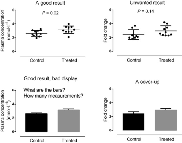
The ‘good result’ has data from a normal distribution; the unwanted data have the same means but a skewed distribution (inappropriate for a t-test). Each lower panel shows the same data as in the panel above, but badly displayed: it is difficult to understand why the data can be significantly different in one case and not in the other.
Generally, plots are used to give the reader an impression of the nature of the data. A picture paints a thousand words, and this can be the case with a good graph that clearly depicts the data. Clarity is vital: clearly label both axes and include the units of measurement. If a particular feature of the graph is not obvious or the graph is of an unusual type, then an explanation should be given. A key or legend may help. Where possible, confidence intervals should be included in the plot, although they may be difficult to calculate and, depending on the plot, they can obscure features of the data. Confidence intervals should only be included if they add value to the plot. To help see trends in the data, it is useful to link paired or repeated measures data. If the sample size is small, the raw data should be displayed, as summary statistics can be misleading. The use of stars to indicate significance between groups should be avoided, as they can be confused with other features of the graph, such as extreme values in box plots.
For example, you might submit a paper including Figure 2, and state that using an unpaired t-test, there is a highly significant difference in jumping distance between trained and untrained frogs. The comment back from the reviewer says that the untrained group contains three extreme values. Therefore, the use of the t-test is inappropriate and the Mann–Whitney U-test should have been used instead. You re-analyse your data using the Mann–Whitney U-test as the reviewer suggested and the highly significant result that your paper hinged upon disappears. This is because the three stars in your figure were taken by the reviewer to indicate extreme values (you had neglected to mention that *** meant a highly significant result, P < 0.0001).
Figure 2.
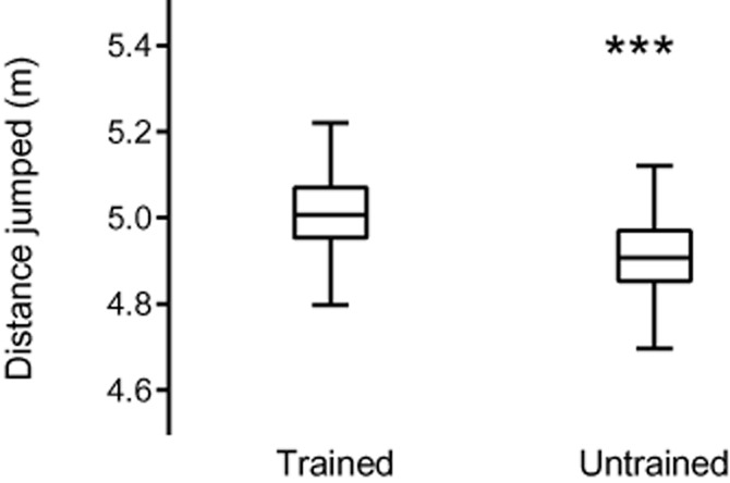
A poor plot. The axes are labelled, but the meaning of the stars is unclear. Are these extreme values, or do they indicate some level of significance?
The reader should know what has been plotted, why and what message is intended, unlike in Figure 3. There should be no ambiguity in features of the graph. Every plot should have a purpose. How many times have we read a paper, only to wonder if a plot was included just so there were plots in the paper? Or you were uncertain exactly what the plot was trying to show? We should adhere to Tufte's principle: above all else show the data.
Figure 3.
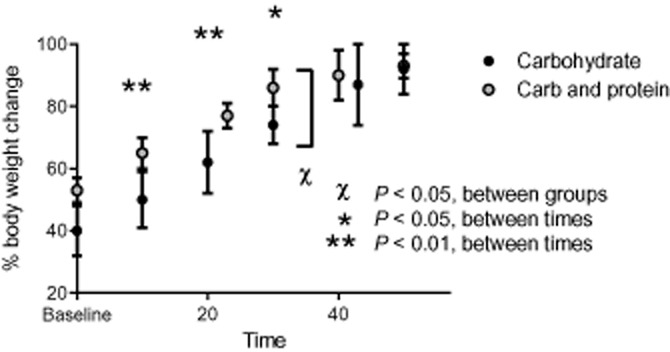
A poor figure. It is unclear if the x-axis is linear, the axis label is ambiguous, the graphics overlap with each other and the y-axis, the compared values seem to have different levels of variability, it is unclear which measure of variability is used and there are multiple comparisons between and within groups, with no evidence of correction for multiple comparison. A simple comparison between two lines (if appropriate) would be preferable.
As we have said previously, we should be sure that our sample size is appropriate, preferably by calculating the sample size needed, before starting the study. If we fail to see a significant difference, we should conclude there is no evidence of a difference, rather than stating that no difference is seen. If we aim to show that two groups are the same (equivalent) we need to do a formal equivalence test to show this, as ‘no evidence of a significant difference’ is not enough to conclude that the two groups are equivalent.
Conclusion
Our hypothetical ‘perfect paper’ will give the reader sufficient information to be able to replicate our experiment and its analysis without ambiguity. It will be clear that the correct choice of experimental unit has been used and that confounding and other forms of bias have been avoided. The figures will clearly illustrate the data without ambiguity or concealment. The ‘story’ will be consistent in each section of the paper. In short, a reviewer's idea of heaven!
References
- Drummond GB, Tom BDM. How can we tell if frogs jump further? Br J Pharmacol. 2011;164:209–212. doi: 10.1111/j.1476-5381.2011.01493.x. [DOI] [PMC free article] [PubMed] [Google Scholar]
- Drummond GB, Vowler SL. Different tests for a difference: how do we do research? Br J Pharmacol. 2012;165:1217–1222. doi: 10.1111/j.1476-5381.2011.01809.x. [DOI] [PMC free article] [PubMed] [Google Scholar]
- Festing MF. Principles: the need for better experimental design. Trends Pharmacol Sci. 2003;24:341–345. doi: 10.1016/S0165-6147(03)00159-7. [DOI] [PubMed] [Google Scholar]
- Simmons JP, Nelson LD, Simonsohn U. False-positive psychology. Psychol Sci. 2011;22:1359–1366. doi: 10.1177/0956797611417632. [DOI] [PubMed] [Google Scholar]
- Tufte ER. Visual Explanations. Cheshire, CT: Graphics Press; 1997. [Google Scholar]