

Abstract
The purpose of this study was to evaluate information visualization of publicly-reported central line-associated blood stream infection (CLABSI) outcome data for decision making by diverse target audiences – health care consumers and practitioners. We describe the challenges in publicly reporting of healthcare-associated infections (HAIs) data and the interpretation of an evaluation metric. Several options for visualization of CLABSI data were designed and evaluated employing exploratory working group, two confirmatory focus groups’ observations, and experts’ committee validation of the final designs. Survey-data collection and evaluation criteria results, collected from the two focus groups, are presented and are used to develop the final recommendations for how to visualize publicly-reported CLABSI data from Maryland acute care hospitals. Both health care consumer and practitioner’s perspectives are highlighted and categorized based on the visualizations’ dimensions framework. Finally, a recommended format for visualizing CLABSI outcome data based on the evaluation study is summarized.
Key Words: Usability of Health Information, Public Health Informatics, Information Graphics, Information Visualization, Sense Making, Visual Communication
Keywords: MeSH Headings: Catheter-Related Infections; Cross Infection; Blood-Borne Pathogens; Infectious Disease Transmission, Professional-to-Patient; Infection Control; Public Health Practice
Introduction
In 2002, the Centers for Disease Control and Prevention (CDC) released a public report estimating that 1.7 million healthcare-associated infections (HAIs) result in 99,000 deaths annually within hospitals across the United States. Over the past decade a number of states, including Maryland, to drive improvement and increase transparency have enacted legislation that requires hospitals to publicly report HAIs. Central Line-Associated Blood Stream Infections (CLABSIs) are one of the more common HAIs that result in substantial morbidity and mortality as well as increased medical costs. As such, the HAI Advisory Committee of the Maryland Health Care Commission, (MHCC), an “independent regulatory agency whose mission is to increase accountability and promote informed decision-making,” chose CLABSIs in Intensive Care Units (ICUs) as the first HAI outcome measure to be reported in Maryland [1].
In determining how best to publicly report CLABSI outcome data, MHCC considered the goals and challenges of public reporting. The goals of public reporting are to inform the public about hospital performance, to increase transparency and trust between hospitals and consumers, and to drive best practices and improvement to eliminate healthcare-associated infections [2,3]. The purpose of this study was to help MHCC in choosing the best way of communicating these data that would address needs and concerns of consumers, hospitals, and the State.
Challenges in Public Reporting of HAI Data
There are a number of challenges that must be faced when deciding how to publicly report HAI or CLABSI data. First, one must consider the audience viewing the data. Each individual viewing the data may have different objectives and goals ranging from a patient trying to choose a hospital for a procedure to hospital administration utilizing it for performance improvement. Guidance in the medical and public health literature related to public reporting of health care-associated infections data is currently limited and there are no articles directly pertaining to how to effectively present HAI data to consumers. Extrapolating from literature on public reporting of other measures, however, several major principles are apparent. To make informed choices and navigate the health care system, consumers need to have easily available, accurate, understandable, and timely information. Consumers likely represent a range of perspectives because they have varying levels of education, different backgrounds and different needs with regards to the data presented. For example, only about 50% of Americans have the minimal mathematical skills necessary to understand numbers presented in printed materials [4]. The primary challenge in designing a system for public reporting of health quality data is that quality measures are often difficult to understand or are not meaningful to consumers. Cognitive interviews of health care consumers have revealed that consumers prefer information that can be reviewed quickly and that is clear at first review. Participants in these interviews frequently felt inundated by the amount of information listed [5,6]. The data must be framed clearly to a broad audience providing neither too much nor too little information [7,8].
The Agency for Healthcare Research and Quality (AHRQ) recommends that information should be made relevant to what consumers care about, that metrics should be consistent, and that data on sponsors and methods should be included to help legitimize the data for consumers [9,10]. More importantly, however, to ensure that the broadest possible audience utilizes and understands the publicly-reported data, the information presented should be summarized and interpreted for consumers to the greatest extent possible. Simple language should be used and guidance on how to read graphs and understand measures should be provided. Familiarity with health vocabulary by the public is an important factor in consumer understanding of health related reporting [11]. Employing consumers’ vocabulary, in health literacy, can reduce the gap between a vocabulary that is used by health care professionals and the consumers’ understandings [12]. Visual communication using visualization of the information can improve learning and communication [13].
Strategies that narrow options and highlight differences are the most useful to consumers [14,15]. Display strategies that seem to be particularly effective include rank ordering providers by performance, labeling performance (i.e., excellent, fair, poor or above average, average or below average), or using symbols (i.e., stars or symbols that incorporate the interpretive label as part of the symbol) [16,17]. AHRQ recommends against presenting Confidence Interval (CI) when presenting comparative performance data given that consumers often don’t understand statistics and that research has shown that consumers tend to discount information when the report suggests uncertainty regarding the data [18].
The primary objective of our study was to determine the most effective manner to publicly report hospital CLABSI data to both consumers and professionals, based on current standards of data presentation.
Methods
The study method, governance framework, had three phases—exploratory, confirmatory, and validation [19].
Exploratory Phase
The purpose of this phase was to perform four activities: 1) Thorough Literature Review, 2) Panel Study, 3) Experts’ Evaluation, and 4) Iterative Information Visualization Design.
The exploratory working group that participated in the panel study of the exploratory phase included five (5) health care professionals: 1) the director of Center for Hospital Services at the Maryland Health Care Commission, 2) the Chief of Hospital Quality Initiatives at the Maryland Health Care Commission, 3) an assistant professor and hospital epidemiologist at the Johns Hopkins Bayview Hospital, 4) a program manager at the Center for Innovation in Quality Patient Care of Johns Hopkins University, and 5) a postdoctoral research fellow of the National Library of Medicine (NLM) in the Division of Health Sciences Informatics at the Johns Hopkins University School of Medicine. Three (3) experts that were solicited for their expertise and evaluation included: 1) hospital epidemiologist – and professor of epidemiology, medicine, and pathology, 2) anesthesiologist and critical-care specialist, and 3) professor of pediatrics, health policy and management, and health sciences informatics. Thirteen (13) members of the MHCC HAI Advisory Committee were solicited for their expertise prior to health care consumers and practitioners’ focus groups. The expert-opinion solicitation employed recurring brainstorm and interview sessions and the HAI Advisory Committee solicitation employed two panel discussion and collection of word-type data that were analyzed for identifying themes.
Confirmatory Phase
In order to garner perceptions, on the proposed display formats during the confirmatory phase from both of the intended audience groups, a structured interview tool was developed. The purpose was to capture participants’ opinions and attitudes on the various information visualization alternatives. The structured interview was administered to consumer and health care professional, with expertise in hospital epidemiology and infection control, focus groups to test the usability and understanding of the alternative display presentations. The focus-groups-based study included structured elicitation of responses of custom-built alternative display formats. Volunteer participants in the focus groups, listed in Table 1, were identified and recruited to provide feedback on the alternative displays.
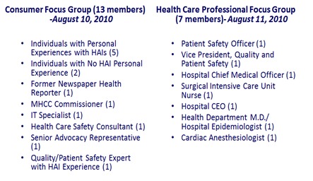
Table 1: Focus Groups Composition
Thirteen (13) study subjects were included in the health care consumer focus group based on chain-referral sampling. The chain-referral sampling was initiated from the exploratory working group members with the aim to recruit study subjects with personal HAIs’ experience, study subjects with no personal HAIs’ experience, and representatives from the community and other health care domains. Health care practitioners were excluded from participation in the health care consumer focus group. Seven (7) study subjects were included in the health care professional focus group, including one (1) hospital’s Chief Executive Officer (CEO), based on a chain-referral sampling. The chain-referral sampling was initiated from members of the exploratory working group and the Maryland HAI Advisory Committee with the aim to recruit study subjects that were certify as a health care practitioner. Members of the exploratory working group and Maryland HAI Advisory Committee were excluded from participation in either group.
Validation Phase
Summarization of the focus groups comments and the evaluation survey regarding alternative formats were captured and submitted to the HAI Advisory Committee, during the validation phase. Following review by the Commission staff, the alternative displays for reporting CLABSI data for consumer and professional audiences were presented to the HAI Advisory Committee, Maryland's panel of hospital epidemiology and infection control subject matter experts, who selected the final format. Subsequently, a webinar was held for Maryland hospital Infection Preventionists, performance-improvement, quality -measure, and public-relations staff on the format of public reporting of central line-associated blood stream infection (CLABSI) data in ICUs. Capturing consumers and practitioner’s perspective was an important and critical aspect of recruiting diverse composition of participants.
Data Collection
We captured participants’ comments during all the phases on the various information visualization alternatives. To provide the focus groups with simulated data formats, we presented mocked-up representations of how the data would be visualized. We used the custom-built structured interview tool on four dimensions, see Figure 1. At the end of each focus-group discussion the consumer and professional audiences were provided a paper-based custom survey that asked them to rate each display format in terms of four criteria, depicted in Table 2, to consider when visualizing complex medical information [20].
Figure 1.
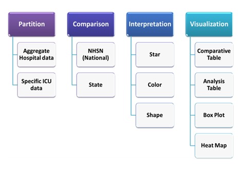
Evaluation of Reporting Dimensions
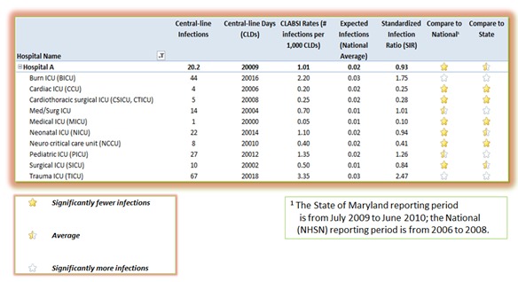
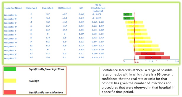
Figure 2.
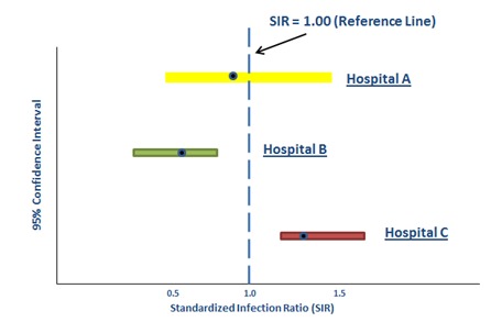
Visualization of Standardized Infection Ratio (SIR)
Clarity – Is the information provided in a clear and understandable format?
Functionality – Does this visualization provide the information and data elements you are looking for?
Usefulness – Is this visualization useful? (i.e., does this visualization help you make a decision?)
Effectiveness – To what extent does the visualization portray the intended information? (i.e., are you able to tell which hospitals perform better or worse easily with this visualization?)
Evaluation criteria and scale used a Likert scale of 1 (very poor) to 5 (very good) to select the evaluation level. Participants ranked their top three visualization options according to their overall preference. Furthermore, the survey included additional overall ranking of visualization symbols and options, the quality interpretations of the Standardized Infection Ratio (SIR) using different symbols, such as stars (full, half, empty), colors, and shapes.
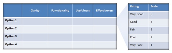
Table 2: Evaluation Criteria and Scale
Consistent Metric
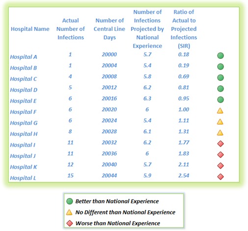
The Standardized Infection Ratio (SIR) is a summary measure used to compare the infection rate of one group of patients to that of a standard population [21]. It is the observed number of infections divided by the predicted number of infections. The predicted infection rate is the number of infections that we would expect if the hospital had the same infection rate as a comparison group, in this case the national average [22].
A SIR of 1 means the hospital infection rate and that of the comparison group are the same. A SIR > 1 means the hospital has a higher rate (i.e., more infections) than the comparison group. A SIR < 1 means that the hospital has a lower infection rate (i.e., fewer infections) than the comparison group. Figure 2 illustrates an example of estimated SIR for three hospitals. For example, if a hospital’s medical intensive care unit (MICU) has five (5) bloodstream infections and based on the national average for that type of ICU one would expect only four (4) infections the SIR would equal 5/4 = 1.25 (e.g., Hospital C).
Information Visualization Mockups and Options Presented to Focus Groups
During the exploration phase six (6) distinct visualization mockups were developed, illustrated in Figures 3a to 3f. These six (6) mockups were based on the following information visualizations techniques.
Figure 3a.
Option 1 (Comparative Table)
Figure 3f.
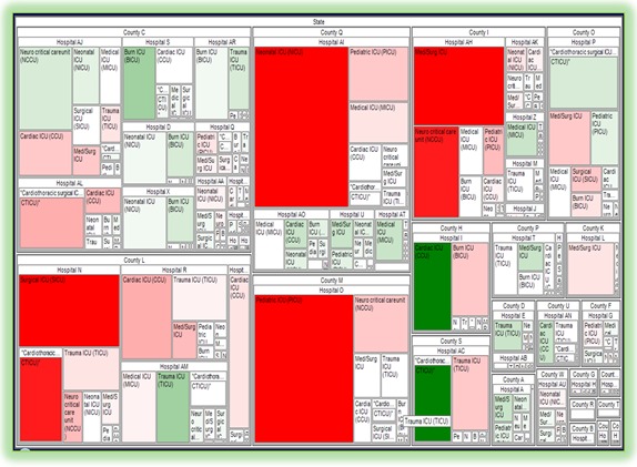
Option 6 (Tree Map)
Comparative Table
Box Plot
Quality Graph
Analysis Table
Heat Map
Tree Map
After an initial evaluation of the six (6) mockups with the Commission, based on their clarity, functionality, usefulness, and effectiveness, the Commission requested that only four (4) options be presented to the focus groups for discussion, as depicted in Figures 3a to 3d.
Figure 3d.
Option 4 (Heat Map)
Figure 3b.
Option 2 (Analysis Table)
Figure 3c.
Option 3 (Box Plot)
Figure 3e.
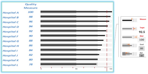
Option 5 (Quality Graph)
During the focus groups study, the four (4) selected visualizations were labeled as options 1 to 4 without specifying the visualization technique. The intention was to reduce selection bias, which might have been influenced by a preconception of a visualization category. The information visualization layouts included a combination of standards information graphics used in public health and public-oriented visualization.
Differences in preferences across groups were analyzed by Kruskal–Wallis non-parametric tests, appropriate for the ordinal data we collected.
Results
The focus group evaluation results, as summarized in Table 3, were collected from the Maryland Health Care Commission, Public Reporting of Maryland HAI Outcome Data, Consumer and Health Care Professional Focus Groups, which were conducted on August 10-11, 2010.
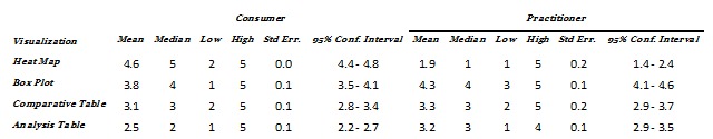
Table 3: Survey Statistics Results Summary
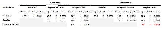
Table 4: Kruskal-Wallis equality-of-populations rank test (with ties) within a group
Within each group, the evaluation ratings indicate varied preferences of the ratings for each visualization and criteria as depicted in Figure 4. Testing for Kruskal-Wallis equality-of-populations rank [23] (with ties), which indicates the degree of dispersion (spread) in the data within a group, in Table 4, shows that there are statistically significant differences within the groups. The consumers’ group had a statistically significant difference for ratings across visualization methods. The practitioners’ group had statistically significant difference for most of the ratings across visualization methods except between “Analysis Table” and “Comparative Table.” Between Consumers and Practitioners there were differences in the favorites’ ranking with no consensus on most of the visualization ranking, as depicted in Figure 5. Overall, Consumers preferred the “Heat Map” and the Practitioners preferred “Box Plot,” as indicated in Figure 6.
Figure 4.
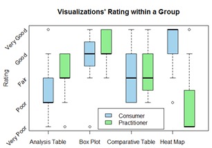
Visualizations’ Evaluation Rating
Figure 5.
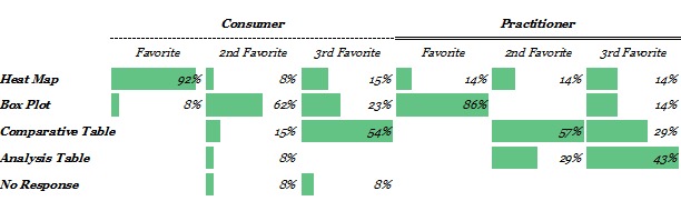
Overall Opinion of Visualization Option
Figure 6.
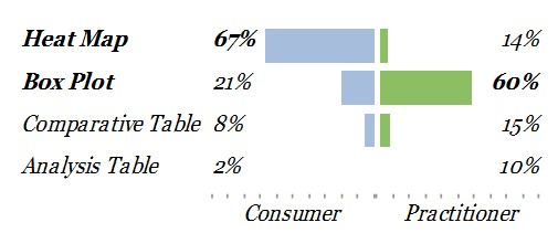
Weighted Opinion of Visualization Options
Although Consumers preferred the “Heat Map” and Practitioners preferred “Box Plot”, there was also a statistically significant difference of preferences between the two groups for the “Analysis Table,” as indicated in Table 5. In contrast, there was no difference of preferences between the two groups for “Comparative Table.”
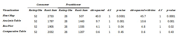
Table 5: Kruskal-Wallis equality-of-populations rank test between groups
In evaluating the overall opinion of Consumers and Practitioners on the use of visualization symbols (Stars, Colors, or Shapes), Consumers and Practitioners ranked them at the same order, as depicted in Figure 7, and selected colors as the overall preferred symbols, as depicted in Figure 8, which indicates a consensus among the groups.
Figure 7.
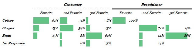
Overall Opinion of Visualization Symbols
Figure 8.
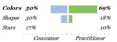
Weighted Opinion of Visualization Symbols
Consumer and Health Care Professional Survey Sentiments
Consumers indicated a preference to obtain one overall aggregated CLABSI measure supplemented with a symbol for quality interpretation, to make a decision and drive improvement, and then to have an overall hospital CLABSI rate by specific units. The consumers group discussed the meaning of the term “Expected” and “Significantly”. The consumers preferred to view hospitals overall quality and then to drill down to the details.
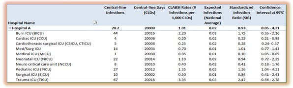
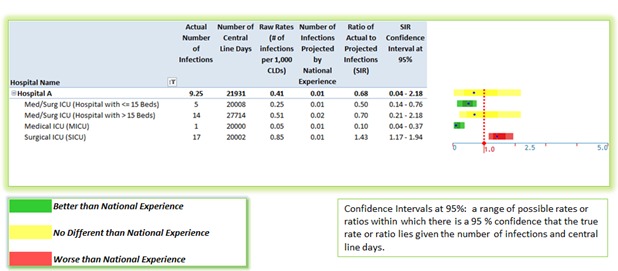
Practitioners indicated to see an overall CLABSI performance, number of infections, number of central line days, and SIR confidence interval at 95 percent without any additional interpretation symbols.
Conclusions
From this rigorous elicitation of data-visualization preferences for a key State and national measures, our data suggest that Consumers prefer “Heat Map” and that it was desired by them to focus on a meaningful level of aggregation beneath total overall and to employ colors for quality interpretation and grouping.
On the other hand, our data suggest that Practitioners prefer “Box Plot” augmented with numerical data. One interpretation of these preferences is that it was desired by the Practitioners to focus on the details and relative comparison.
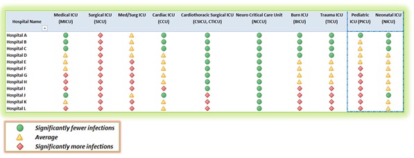
One of the methods used to address both groups’ preferences for aggregation and interpretation is by constructing three ordinal categories of performance and by combining symbols and colors that indicate “Better than National Experience” as green circle, “No Different than National Experience” as a yellow triangle, and “Worse than National Experience” as a red Diamond.
The visual display of quantitative information clarifies data [24] for consumers and practitioners for making decision. The objective of visual design, to organize the data for communicating a message effectively, can be accomplished by prioritizing, grouping, and sequencing the data correctly [25]. But the long-term challenge, in the evaluation of visual communication, is its demonstration of adaptation and utility [26].
Hence, the robust triangulation of mixed study methods, as in our study, is necessary because it uses theoretical and applied constructs of usability studies and controlled experiments in all its phases—exploratory, confirmatory, and validation. The deployment and usage of our final formats, on the MHCC website [27,28], are the demonstration of their adaptation and utility.
Discussion
Based on the comments and data analysis of the focus groups, two formats were selected for presentation on the MHCC website. These displays are depicted in Figure 9 and Figure 10.
Figure 9.
Post Focus Group – Consumers’ Visualization Recommendation
Figure 10.
Post Focus Group - Health Care Practitioners’ Visualization Recommendation
These displays had been designed based on Consumers and health care Practitioners’ perspectives and the focus groups analysis results. Additionally, they encompassed standard information visualization techniques that were employed in multi-dimensional case studies [29]. Subsequently, they were validated by subject matter experts. Improvement in quality and safety performance over time is important to consider (i.e., what is the current performance and what is the goal in three years). As we demonstrated in our results, in the visualization’s evaluation rating of the “Analysis Table”, SIR and CI were difficult concepts to explain to Consumers.
However, they were also more interested in seeing the absolute number of infections. It was challenging to explain to Consumers the meaning of large confidence intervals as it was related to small number of cases. Moreover, combining data was difficult and may result in reaching the wrong conclusions, which is ultimately unfair to patients.
Overall, operationally, hospitals focus on zero harm to patients (i.e., no infections). The goal is to create meaningful data aggregation (e.g., overall adult, overall pediatric, and specialized units). Avoiding priority ranking is important to prevent the unintended consequence of hospitals avoiding high risk patients. Thus, we chose to group hospitals alphabetically within the broad categories. As well, we chose to comment that within the broad categories all hospitals have approximately equivalent performance.
Limitations
Compared with population surveys, our sample size, based on number of focus group participants, was small. However, these numbers are in line with what is required for assessing user-interface preferences [30]. Furthermore, we used multiple formative methods with multiple groups to confirm the preferences that we did elicit of the participants, and we employed a broad cross section of the targeted user populations.
Future Directions
Visual communication can provide effective evidenced-based information to consumers for decision making and to practitioners for improving patient safety outcomes and processes. Additional HAIs outcomes can be presented and evaluated for Surgical Site Infections (SSI), nosocomial transmission of multi-drug resistant organisms (e.g., MRSA and VRE), Ventilator-Associated Pneumonia (VAP) and nosocomial Respiratory Syncytial Virus (RSV). Process oriented measurements can also be presented for surgical antimicrobial prophylaxis, hand hygiene compliance, health care worker influenza, and compliance with active surveillance testing for MRSA in ICUs.
Moreover, public reporting should focus on reporting: 1) the overall picture, 2) where individual hospitals are, 3) where hospitals should be, and 4) the direction of change toward a target improvement goal. To address these temporal and multivariate dimensions in pre- and post- intervention evaluation, outcomes can be displayed in a run chart, a trend graph, or a statistical process control diagram. Visualization capabilities can be employed for understanding an intervention efficacy, providing insight on trends improvement, and acting as a public social influencer. Providing those tools for comparing and monitoring performance should influence consumers’ decision, assist practitioners in improving patient safety, and inform policy makers. As a result of our study, the validated visualizations were approved and publicly deployed for consumers [27] and practitioners [28] in Maryland.
Acknowledgments
We appreciate the effort of both the consumers and practitioners’ focus groups volunteers from the community and acknowledge their genuine passion to contribute to the effort of patient safety improvement. We also thank the Maryland Health Care Commission (MHCC) HAI Advisory Committee members for their dedication to patient safety and the goal to eliminate HAIs within Maryland’s hospitals. Thanks to Dr. Anthony Harris for reviewing a prior draft. Dr. Rajwan was funded by the MHCC and NLM T15LM007452.
References
- 1.Technical Advisory Committee on Healthcare-Associated Infections. Developing a System for Collecting and Publicly Reporting Data on Healthcare-Associated Infections in Maryland [Internet]. Maryland Health Care Commission; 2008 p. 79. Available from: http://mhcc.maryland.gov/healthcare_associated_infections/hai_report_jan2008/hai_cover.html
- 2.Pronovost P, Holzmueller CG, Needham DM, Sexton JB, Miller M, et al. 2006. How will we know patients are safer? An organization-wide approach to measuring and improving safety. Crit Care Med. 34(7), 1988-95 10.1097/01.CCM.0000226412.12612.B6 [DOI] [PubMed] [Google Scholar]
- 3.Berenholtz SM, Pronovost PJ, Lipsett PA, Hobson D, Earsing K, et al. 2004. Eliminating catheter-related bloodstream infections in the intensive care unit. Crit Care Med. 32(10), 2014-20 10.1097/01.CCM.0000142399.70913.2F [DOI] [PubMed] [Google Scholar]
- 4.Kirsch IS, Jungeblut A, Jenkins L, Kolstad A. Adult Literacy in America: A First Look at the Results of the National Adult Literacy Survey. [Internet]. U.S. Government Printing Office, Superintendent of Documents, Washington, DC 20402 (Stock No. 065-000-00588-3).; 1993. Available from: http://www.eric.ed.gov/ERICWebPortal/contentdelivery/servlet/ERICServlet?accno=ED358375
- 5.Damman OC, Hendriks M, Rademakers J, Delnoij DM, Groenewegen PP. 2009. How do healthcare consumers process and evaluate comparative healthcare information? A qualitative study using cognitive interviews. BMC Public Health. 9(423). [DOI] [PMC free article] [PubMed] [Google Scholar]
- 6.Peters E, Dieckmann N, Dixon A, Hibbard JH, Mertz CK. 2007. Less Is More in Presenting Quality Information to Consumers. Med Care Res Rev. 64(2), 169-90 10.1177/10775587070640020301 [DOI] [PubMed] [Google Scholar]
- 7.Rajwan YG, Kim GR. Framing Effective Patient-Oriented Information Visualization. Human-Computer Interaction Lab, 27th Annual Symposium [Internet]. University of Maryland College Park, MD; 2010 [cited 2010 May 28]. Available from: http://terpconnect.umd.edu/~boxie/Consumer_Health_Informatics_HCIL2010_Workshop.pdf
- 8.Rajwan YG. A Case for Medical Information Visualization Conceptual Model to Reduce the Impact of Medical Information Overload (MIO) Consequences. JHU Postdoctoral Association, 2nd Annual Poster Symposium. Johns Hopkins University, JH Medicine, Baltimore, MD; 2010. [Google Scholar]
- 9.Hibbard J, Sofaer S. Best Practices in Public Reporting No. 1: How To Effectively Present Health Care Performance Data To Consumers [Internet]. AHRQ Publication No. 10-0082-EF. Rockville, MD: Agency for Healthcare Research and Quality; 2010. Available from: http://www.ahrq.gov/qual/pubrptguide1.pdf
- 10.Sofaer S, Hibbard J. Best Practices in Public Reporting No. 2 - Maximizing Consumer Understanding of Public Comparative Quality Reports: Effective Use of Explanatory Information [Internet]. AHRQ Publication No. 10-0082-1-EF. Rockville, MD: Agency for Healthcare Research and Quality; 2010. Available from: http://www.ahrq.gov/qual/pubrptguide3.pdf
- 11.Keselman A, Tse T, Crowell J, Browne A, Ngo L, et al. 2007. Assessing Consumer Health Vocabulary Familiarity: An Exploratory Study. J Med Internet Res. 9(1), e5 10.2196/jmir.9.1.e5 [DOI] [PMC free article] [PubMed] [Google Scholar]
- 12.Zielstorff RD. 2003. Controlled vocabularies for consumer health. J Biomed Inform. 36(4-5), 326-33 10.1016/j.jbi.2003.09.015 [DOI] [PubMed] [Google Scholar]
- 13.Rajwan YG, Kim GR. Visualization to improve patient learning and communication. SPIE Newsroom [Internet]. 2011 Feb 28; Available from: http://spie.org/x44477.xml?ArticleID=x44477
- 14.Carman K, McGee J, Hibbard JH. Improving quality information in a consumer driven era. Baltimore, Maryland; 2006. [Google Scholar]
- 15.Hibbard JH, Peters E. 2003. Supporting informed consumer health care decisions: Data presentation approaches that facilitate the use of information in choice. Annu Rev Public Health. 24(1), 413-33 10.1146/annurev.publhealth.24.100901.141005 [DOI] [PubMed] [Google Scholar]
- 16.Hibbard JH, Peters E, Slovic P, Finucane ML, Tusler M. 2001. Making health care quality reports easier to use [PubMed] Jt Comm J Qual Improv. 27(11), 591-604 [DOI] [PubMed] [Google Scholar]
- 17.Hibbard JH, Slovic P, Peters E, Finucane ML. 2002. Strategies for Reporting Health Plan Performance Information to Consumers: Evidence from Controlled Studies. Health Serv Res. 37(2), 291-313 10.1111/1475-6773.024 [DOI] [PMC free article] [PubMed] [Google Scholar]
- 18.Schapira MM, Nattinger AB, McHorney CA. 2001. Frequency or Probability? A Qualitative Study of Risk Communication Formats Used in Health Care [PubMed] Med Decis Making. 21(6), 459-67 [DOI] [PubMed] [Google Scholar]
- 19.Rajwan YG. Visualization of central line-associated blood stream infections outcome data to health care consumers and practitioners for decision making and guide public reporting – evaluation study [Master thesis in Health Sciences Informatics.]. [Baltimore, Maryland]: The Johns Hopkins University; 2012. [Google Scholar]
- 20.Rajwan YG, Kim GR. Medical Information Visualization Conceptual Model for Patient-Physician Health Communication. 1st ACM International Health Informatics Symposium. Arlington, VA: ACM Press; 2010. [Google Scholar]
- 21.CDC - Newsletters - NHSN. Your Guide to the Standardized Infection Ratio (SIR) [Internet]. CDC - Newsletters - NHSN. 2010 [cited 2011 Mar 27]. Available from: http://www.cdc.gov/nhsn/newletters.html
- 22.Edwards JR, Peterson KD, Mu Y, Banerjee S, Allen-Bridson K, et al. 2009. National Healthcare Safety Network (NHSN) report: Data summary for 2006 through 2008, issued December 2009. Am J Infect Control. 37(10), 783-805 10.1016/j.ajic.2009.10.001 [DOI] [PubMed] [Google Scholar]
- 23.Kruskal WH, Wallis WA. 1952. Use of Ranks in One-Criterion Variance Analysis. J Am Stat Assoc. 47(260), 583-621. . 10.1080/01621459.1952.10483441 [DOI] [Google Scholar]
- 24.Tufte ER. The Visual Display of Quantitative Information, 2nd edition. 2nd ed. Graphics Press; 2001. [Google Scholar]
- 25.Few S. Show Me the Numbers: Designing Tables and Graphs to Enlighten. Analytics Press; 2004. [Google Scholar]
- 26.Plaisant C. The challenge of information visualization evaluation. Proceedings of the working conference on Advanced visual interfaces [Internet]. New York, NY, USA: ACM; 2004 [cited 2013 Feb 6]. p. 109–16. Available from: http://doi.acm.org/10.1145/989863.989880
- 27.MHCC. Maryland Hospital Performance Evaluation Guide Web site. Quality of Care - Hospital Guide - Patient Guide [Internet]. 2011 [cited 2011 Mar 9]. Available from: http://mhcc.maryland.gov/consumerinfo/hospitalguide/hospital_guide/reports/healthcare_associated_infections/clabsi_quality_detail.asp
- 28.MHCC. Maryland Hospital Performance Evaluation Guide Web site. Adult and Pediatric Intensive Care Units - Central Line-Associated Bloodstream Infection (CLABSI) All AdPed Units [Internet]. 2011 [cited 2011 Mar 9]. Available from: http://mhcc.maryland.gov/consumerinfo/hospitalguide/hospital_guide/reports/healthcare_associated_infections/clabsi_quality_detail.asp?EntryPoint=Pr
- 29.Shneiderman B, Plaisant C. Strategies for evaluating information visualization tools. Proceedings of the 2006 AVI workshop on BEyond time and errors novel evaluation methods for information visualization - BELIV ’06 [Internet]. Venice, Italy; 2006. p. 1. Available from: http://portal.acm.org/citation.cm?doid=1168149.1168158
- 30.Krueger RA, Casey MA. Focus Groups: A Practical Guide for Applied Research. 4th ed. SAGE Publications, Inc; 2008. [Google Scholar]