Abstract
Self-monitoring of blood glucose provides information about blood glucose control. The data become useful information and knowledge through careful analysis for patterns that are appropriate or can be corrected. Some analyses can be performed on newer blood glucose meters, but most often, this needs to be done on a computer, tablet, or smartphone. There are a few established methods of presenting the data that make analysis easier. In this article, we discuss four types of data presentations and the methods for utilizing them.
Keywords: analysis, carbohydrate-to-insulin ratio, computer, diabetes, glucose, insulin sensitivity factor, self-monitoring of blood glucose software
Introduction
Most people with diabetes monitor their blood glucose, bringing their meter and their logbook or a print-out of their data to their health care professional.1 Many will have hundreds of new values for the health care professional to use in evaluating their diabetes control. They have routinely collected this data, assuming that all of it will be used to improve their diabetes care.2 Most of them will be disappointed.
Evaluating the 300–400 values brought by the patient in the memory of a meter or in a logbook can be a daunting task, but there is software to help. In this review, we will discuss how blood glucose monitoring information is used, how self-monitoring of blood glucose (SMBG) software can save time and organize the data in a useful form, and some innovative methods for getting even more out of the data.
Overview of the Uses of Self-Monitoring of Blood Glucose Data
The data acquired from SMBG is used by different groups of people, who each extract the parts most useful to them. The groups who use the data include people with diabetes, health care workers, payers, and diabetes researchers.
People with diabetes are usually the ones who collect the data and the ones with the most invested in the proper use of the information. They use the values to make immediate decisions about insulin, food, exercise, and, sometimes, medications. They use the data to:
make immediate decisions about insulin, food, and exercise, including checking for hypoglycemia;
establish patterns of abnormal glucose in order to do “pattern control” of their diabetes; and
understand how well or how poorly they are doing by using the 3-day, weekly, or monthly averages provided by the meter.3
Health care workers also use the data from SMBG. They may just glance at the data to establish an overall level of control to help them make changes to oral medications. They may also study the data more carefully to establish patterns of abnormal glucose in order to make changes to insulin, other medications, a meal plan, or exercise.4
Payers may use the data for
disease state management (managing the disease by case workers to improve control),
supply chain management (managing the cost and availability of supplies), and
establishing health care trends and quality assessment of medical care.
Diabetes researchers are accumulating the data to better understand the care of diabetes.5
Self-Monitoring of Blood Glucose versus Continuous Glucose Monitoring Systems
Patients now have a choice between standard blood glucose monitors (SMBG) or continuous glucose monitoring systems (CGMSs; actually frequently sampled). Continuous glucose monitoring systems have been available for a few years and have gained widespread acceptance. They offer the advantage of frequent sampling (as often as every minute), provide trends (i.e., whether the glucose level is rising or falling and how fast), and provide patterns of control, often demonstrating elevations or depressions of glucose that were unknown with SMBG. However, CGMSs have some disadvantages, including lower accuracy than SMBG (14–20% inaccuracy for a CGMS versus 5–8% for SMBG), lag times of 10–30 min compared with blood values, hysteresis (the lag is often different when glucose is rising compared with when falling), and a dearth of appropriate algorithms for the use of CGMSs in changing therapy. All current CGMSs are considered “adjunctive” by the Food and Drug Administration, meaning they can be used to determine patterns, but the individual values may not be used to change therapy. Indeed, with a 20% inaccuracy, the 95% confidence limit of the glucose value is ~50%. Many patients find that when they try to use the values from the CGMS to make insulin decisions, they wind up in trouble with hypoglycemia or hyperglycemia.6
Self-monitoring of blood glucose has the advantage of being more accurate (5–8% inaccuracy), being less expensive, and having availability of good algorithms to change therapy. However, SMBG is messy and often not timely, and individual values are not predictive of future blood glucose values.
Use of Self-Monitoring of Blood Glucose by Patients and Health Care Professionals
Patients have always been the leaders in blood glucose monitoring. From its origins in the 1960s and 1970s, blood glucose monitoring was driven by the need of patients for more data about their condition. It was only after the results of the Diabetes Control and Complications Trial that health care professionals became the driving force in promoting glucose monitoring. The most important need of people with diabetes has always been data about hypoglycemia. Indeed, the need for reliable data about low blood glucose values may be the most important factor in the need for greater accuracy of glucose monitoring systems.7,8 The use of SMBG to determine current or impending hypoglycemia remains a major use. This is of particular importance for patients with hypoglycemia unawareness.9
Most patients with type 1 diabetes and many with type 2 diabetes on insulin adjust their insulin doses before each meal, and their current blood glucose value is often a major component of the decision. Some use a qualitative approach, judging their meal size and taking into account their current glucose value. Many, however, use a quantitative approach, using a bolus calculation that may be on the bolus calculator of an insulin pump or glucose meter, a smartphone application, or an electronic calculator.10,11 The equation used by most bolus calculators to determine the dose of short- or rapid-acting insulin is
| (1) |
where carbs is the total carbohydrate of the meal, CIR is the carbohydrate-to-insulin ratio (the amount of carbohydrate that requires 1 U of insulin to match), BG is the current blood glucose, target is the blood glucose target, ISF is the insulin sensitivity factor (the amount that 1 U of short- or rapid-acting insulin will lower the blood glucose, also called the correction factor), and IOB is insulin on board (the amount of unused insulin remaining from the last infusion). The insulin sensitivity factor (ISF) should use the same units (mg/dl or mmol/liter) as the blood glucose. The CIR and ISF are initially determined from empiric factors, but updating them will be discussed later in the article.12 The use of IOB is often limited to calculators on insulin pumps.
Some patients also use the patterns of blood glucose values to help them with empowered decisions about insulin, food, and exercise. A pattern of routinely elevated prelunch values may lead a patient to increase their prebreakfast rapid-acting insulin, decrease their food at breakfast, or exercise during the morning. They may also utilize all their glucose to determine how well their current therapy is working and if it needs to be changed. Later sections will discuss the use of glucose monitoring software to help with these decisions.
Health care professionals will often review glucose data, checking to see if the patient has been making appropriate changes at meals, and some will use the data to evaluate the constants used by patients in bolus calculations. They may review how well the patient is doing overall or look for patterns of abnormal blood glucose to determine appropriate corrections to medications or the need for changes in patient behavior. Blood glucose monitoring software can often help with these determinations.
Analyzing Blood Glucose Values
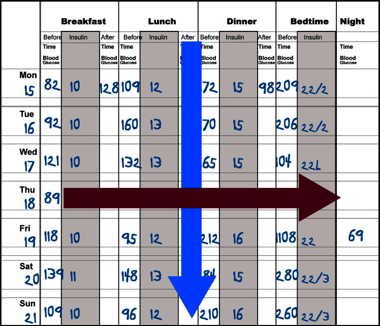
The classical method of analyzing blood glucose values is through the use of the logbook as shown in Figure 1. Patients use this to report their blood glucose values, sometimes with insulin, food, and exercise data. Although the logbook has been demonstrated to be a very inaccurate representation of the actual blood glucose values of the patient, it is often the only tool available for data analysis.13 The most common method of analysis is called the columnar method, in which the analyst looks down each column, trying to get an estimate of the average blood glucose and the variability of the column (Figure 1, blue arrow). For a patient who is seen every 3 months and checks his/her blood glucose four times per day, there are more than 350 values to analyze. Frequently, health care professionals look only at the last week or so to find patterns and then quickly scan the remaining 11 weeks to see if the patterns fit all the data. During this type of analysis, the extremes of data tend to be exaggerated in importance. Of the 90 lunchtime values, 85 may be in the range of 80–170 mg/dl, but the analyst’s eyes may hone in on the two low values of 45 mg/dl and 50 mg/dl and the three high values of 225, 275, and 325 mg/dl, concluding that the patient is “all over the place.” Many to most extreme values are explained by changes in patient behavior, and it is important to concentrate on the majority of values, not the few outliers. Glucose monitoring software simplifies this task.
Figure 1.
A typical logbook containing blood glucose and insulin values. This can be analyzed by looking down the columns (a columnar analysis, shown in blue) or across the rows (a time-series analysis, shown in crimson)
Sometimes it is important to focus on individual high and low values, especially the sequence of events that happened just before and just after the abnormal value. This time series analysis (Figure 1, crimson arrow) is not available in all glucose monitoring software, but many of the programs have screens to simplify this effort.14
Using Software
Blood glucose monitoring software helps in the analysis of large amounts of patient data. Almost all screens can be filtered by date, allowing you to study a defined time period. Common filters are the last week, last month, last 3 months, or any time period you want to set. Some systems also allow setting weekday, weekend, or other filters. Although these latter time filters may be time consuming, they are often very useful in picking out patterns of abnormal glucose values.
The screens of computer software for glucose analysis generally fall into four types:
Basic data
“How am I doing?”
Statistics
Graphics
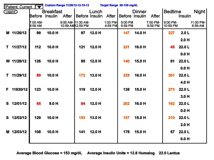
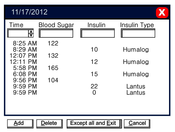
Basic data screens contain the raw data, usually with little manipulation. They include the data list, which is just a listing of all of the data that the computer has for the patient (Figure 2), and the logbook, which is the data listed as they would be in a logbook (Figure 3).
Figure 2.
The data list.
Figure 3.
The logbook screen.
The data screen has little value in exploring patterns of blood glucose and, generally, should be reserved for the end of the analysis. Often it allows you to see if blood glucose values were done by the patient and then deleted from the analysis or not done by the patient and added.
The logbook contains a great deal of information but is very time consuming to use and has little added value compared with a written logbook. One exception is that you can be certain of the validity of the blood glucose values. A few years ago, I did a personal, unscientific poll of professional users of SMBG software and was surprised that most used the logbook as their main analytic screen. A more recent similar poll showed that most users are now more sophisticated and use the statistics or graphics pages as their main analytic tools.
The “How am I doing?” charts include the trend chart, pie charts, and histograms. The most common of these, and the most useful, is the trend chart. Although it contains too much data that is organized only by date and time, it gives a clear picture of the level of control and the variability over time (Figure 4). The chart shown here depicts the blood glucose values over approximately 10 weeks and includes a rolling average (white curve). Although there is not an independent indication of variability, the height of the lines is an indication. You can quickly see that the mean glucose has gone from ~200 mg/dl to ~140 mg/dlduring this time, and the variability has gone from moderate to small. This patient and his/her health care team have done an excellent job over these 10 weeks. Using this chart, it is easy to point out to the patient how much better he/she is doing.
Figure 4.
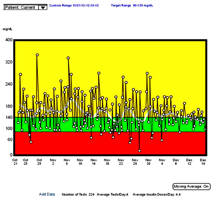
The trend chart for blood glucose. This chart shows all data plotted along a time axis. The white curve shows a running average.
This chart can be used for time series analysis because it displays the glucose values over time. Some programs allow you to magnify a section and show any additional data, such as insulin, food, or exercise and to analyze the values that are exceptionally high or low. It may be easier to do this, however, on a modern standard day chart, such as that described later.
The statistics page is the most useful page for pattern analysis for numbers-oriented people. Graphics-oriented people will find the standard day chart (discussed later) to be most useful. The statistics page is shown in Figure 5.
Figure 5.
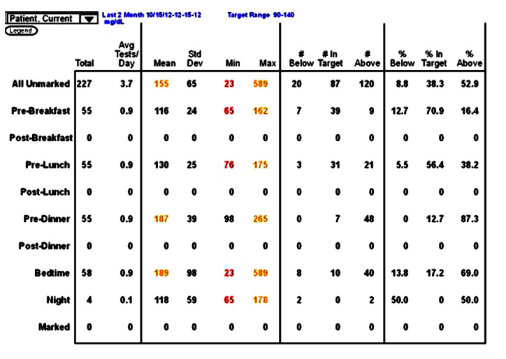
A statistics page.
The most important figures are the premeal average values. Elevated premeal values, such as those shown in Figure 5 for predinner and bedtime, suggest an imbalance with too little insulin or too much food. Average values that are too low would suggest too much insulin, too little food, or too much exercise. For the elevated values, the next numbers to focus on are the standard deviations. These should be considered as a percentage of the average value, also called the coefficient of variation. If the standard deviation is less than 50% of the premeal value, it is probably safe to increase insulin to lower this value. If it is less than 30%, it is generally safe to make a change. For example, in Figure 5, the predinner standard deviation value of 39 is only approximately 20% of the premeal average of 187 mg/dl. This patient is on basal– bolus therapy, so it would be safe to increase the prelunch rapid-acting insulin by 1 U and perhaps by 2 U. In contrast, the bedtime standard deviation of 98 is more than 50% of the bedtime average of 189 mg/dl. It is not safe to make a change to the predinner rapid-acting insulin. In this case, the patient was exercising irregularly after dinner. Moving the exercise to regular exercise during the afternoon increased the bedtime average but decreased the standard deviation, and additional predinner insulin brought the bedtime average to 116 mg/dl. When using the statistics page for decision making, you should be sure you are looking only at the most recent values (in this case, the last 2 months). For stability, you should have more than 25 values, but they should all be after the last major insulin change. You can always change the reporting period, although how you do this varies from program to program.
The statistics page also indicates the frequency of testing at each time, the range of values (minimum and maximum), and the percentage of values below the target range, in target range, and above target range. The statistics page provides a lot of information for columnar analysis but is of no use in time series analysis.
The primary graphics page for analysis is the modal or standard day, initially proposed by Zimmet and coauthors.15 This graphic is available in all glucose monitoring software, although its actual format is highly variable. The standard day is most useful for finding patterns of abnormal glucose and making changes to correct them. An example of a standard day is shown in Figure 6. It is the same data shown in statistical form in Figure 5.
Figure 6.
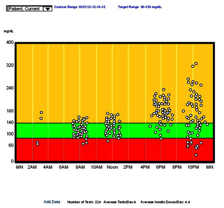
A standard day for blood glucose.
In a standard day, all glucose values are plotted as if they all occurred on a single day. The x axis is clock time, and the y axis is the measured glucose value. Plotting all values this way often demonstrates patterns that might be hard to visualize in other formats. For example, looking at Figure 6, note
The prebreakfast values are basically normal, with a normal average and reasonable standard deviation;
The prelunch values are slightly higher but other-wise similar to breakfast;
The predinner is elevated with a reasonable standard deviation (you might want to check the statistics page for the exact standard deviation);
The prebed time values are highly variable, but the average is elevated;
There are only four overnight values, but two are low; and
There are no postprandial values.
Making clinical decisions from these data is straight-forward for a patient on basal–bolus therapy. You start by looking at the time period with the highest value. In this case, the bedtime values. These are high but also very variable, with significant hypoglycemia. Increasing the dinner rapid-acting insulin to lower the bedtime values would only lead to more hypoglycemia. Instead, seek patterns of behavior that lead to the variability, most likely, variability in dinner carbohydrates or in exercise. If there is significant variability in all meals, check for poor insulin injection technique.16 In this case, the patient had variable exercise after dinner. Regularizing the exercise (and reducing it somewhat) led to a higher average value, but with significantly less variability.
The second highest average value is at dinner. Here the variability is small, so it can be corrected by reducing the carbohydrates at lunch or increasing the lunchtime rapid-acting insulin. We did the latter, and the average value fell from 187 to 139 mg/dl. The breakfast and lunch values are acceptable, and no changes need to be made.
There are some variations of the standard day that are of significant help in planning changes in therapy. These are not found in all programs, and some are unusual. The first is an ability to do time series analysis from the standard day. Clicking on any data point (usually one that is too high or too low) opens a small window that shows the data point and the preceding and subsequent reading. If insulin, food, or exercise data have been entered, it will usually contain these as well. By looking at these values before and after, you can sometimes gain a greater understanding of what is happening. The second variation changes the time scale. Instead of going from midnight to midnight, it goes from noon to noon, making the overnight values contiguous. This screen is most useful when there is great variability at bedtime and before breakfast. By connecting the overnight points, which some programs will allow (as in Figure 7), you will generally see one of two patterns: either with the lines horizontal or with the lines in an “X” pattern. In the first, the horizontal pattern, overnight insulinization is proper, and the team should attempt to decrease the variability of the bedtime values. In the second, the “X” pattern, there is often overinsulinization, with overnight hypoglycemia and a rebound hyperglycemia in the morning. This can be checked with a more frequent testing at 3:00 am or a CGMS and the overnight insulin levels lowered appropriately.
Figure 7.
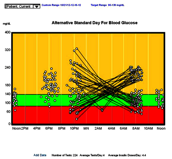
An alternative standard day for blood glucose extension from noon to noon, with the overnight values connected.
Graphics can also be used to help determine the constants used in insulin dosing, and the CIR and the ISF (also call correction factor) seen in Equation (1). By isolating or focusing on a single pair of meals over the last week or two, it may become apparent that one or another of the constants needs to be altered. Figure 8 focuses on the ISF, which is used to correct inappropriately high or low blood glucose. The graph shows the preprandial and postprandial glucose values for a specific meal (i.e., breakfast). The preprandial of the next meal (i.e., prelunch) can be used instead.
Figure 8.
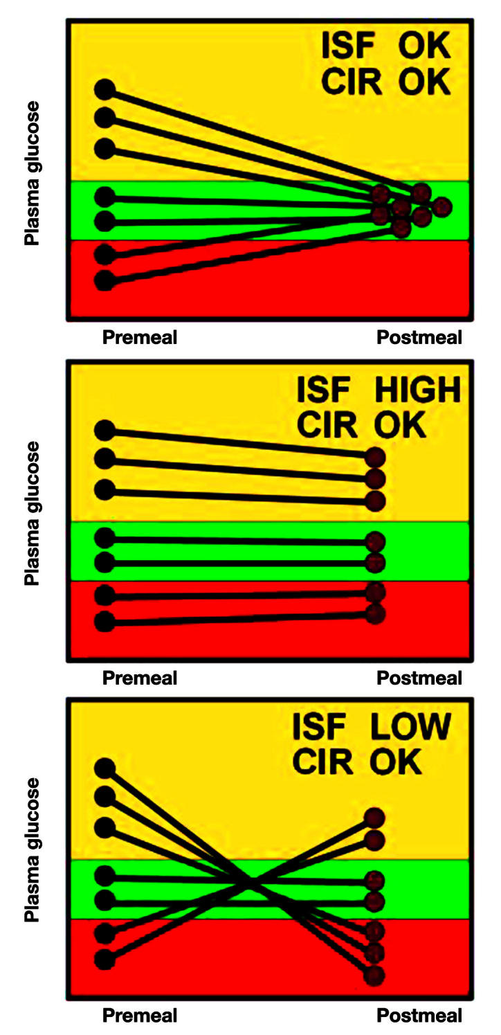
Using graphics to determine changes to the ISF.
The top chart shows what the data would look like if both the CIR and the ISF are correct. When the preprandial blood glucose is high, the extra insulin calculated using the ISF brings the glucose back to normal. If the preprandial glucose is already normal, the CIR suggests the proper insulin for the meal. If the preprandial is low, the reduction in insulin brings the glucose back to normal as well. There are no data on exactly how many pairs of glucose data are needed to see the pattern. The greater the need for change, the more obvious the pattern, but generally, I like to see at least 5–8 pairs.
The middle panel shows an appropriate CIR but an ISF that is too high. Since the change in insulin is determined by dividing by the ISF, an ISF that is too high will result in changes in insulin that are too small. Thus, if the preprandial blood glucose is too high, it remains high because not enough extra insulin is given. If it is too low, it remains low because not enough insulin is subtracted. But since the CIR is correct, when the blood glucose starts normal, it stays normal.
The bottom panel shows what happens when the ISF is too low but with a normal CIR. Because the ISF is low, the change in insulin will be too large. Thus, if the preprandial glucose starts high, it will go low since too much extra insulin will be given. If the preprandial glucose starts low, it will go too high because too much insulin will be subtracted. If the glucose starts in the normal range, ISF does not play a role and the glucose remains normal.
Figure 9 shows the patterns for inappropriate CIR. Unless the CIR is close to correct, it is hard to determine the ISF on the same graph because the inappropriate CIR will often overwhelm any ISF effect.
Figure 9.
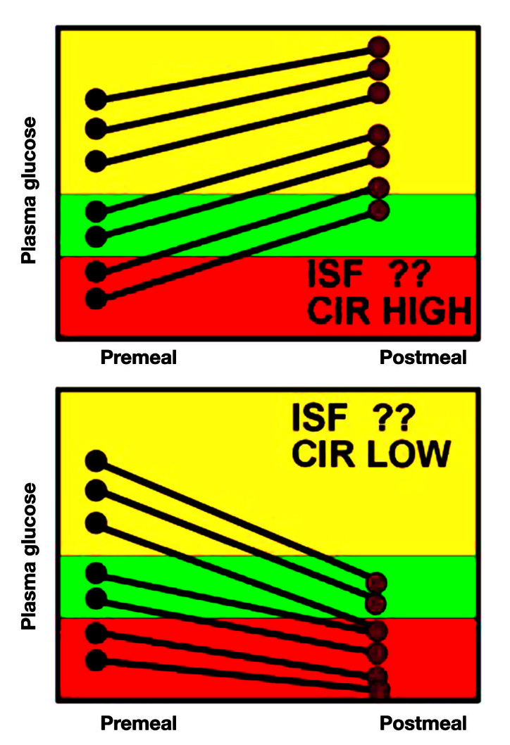
Using glucose data to determine changes to CIR.
In the top panel, it is clear that no matter where the preprandial glucose starts, it rises by the next meal, suggesting an insufficiency of insulin. Since this occurs even when the glucose starts in the normal range (where ISF is not used), the CIR is too high, leading, at least in part, to the inadequate insulin dose.
In the lower panel, the insulin falls, independent of where the preprandial glucose started. This overinsulinization is thus due to a CIR that is too low.
Although most patients have a single set of CIR and ISF values, patients often do better with at least two sets (one for breakfast, the other for the rest of the day), some need a different set for each meal, and some women need different sets for follicular and luteal phases of the menstrual cycle.
Conclusions
Analyzing blood glucose data in a systematic method on a computer may reveal patterns that are not obvious from a logbook. The process allows the inclusion of large amounts of data that would be difficult to analyze manually. It is becoming more widespread, and some programs will help identify patterns of abnormal glucose. Some newer smartphone systems allow data analysis and communication.
Glossary
- (CGMS)
continuous glucose monitoring system
- (CIR)
carbohydrate-to-insulin ratio
- (ISF)
insulin sensitivity factor
- (SMBG)
self-monitoring of blood glucose
References
- 1.Karter AJ, Ackerson LM, Darbinian JA, D’Agostino RB, Jr, Ferrara A, Liu J, Selby JV. Self-monitoring of blood glucose levels and glycemic control: the Northern California Kaiser Permanente Diabetes registry. Am J Med. 2001;111(1):1–9. doi: 10.1016/s0002-9343(01)00742-2. [DOI] [PubMed] [Google Scholar]
- 2.Bartol T. Motivating patients to behavior change: tools and techniques for patients with diabetes. http://www.webnponline.com/articles/article_details/motivating-patients-to-behavior-change-tools-and-techniques-for-patients-wi/. Accessed April 21, 2012.
- 3.Austin MM, Endocine Today Empower patients to use SMBG results to move HbA1c to target: good pharmacotherapy and lifestyle decisions and utilizing SMBG benefits patients and practitioners. http://www.healio.com/Endocrinology/news/print/endocrine-today/%7BA09BD193-9F58-4730-B0CE-E3FECC132A6E%7D/Empower-patients-to-use-SMBG-results-to-move-HbA1c-to-target. Accessed April 21, 2012.
- 4.Mazze RS. Making sense of glucose monitoring technologies: from SMBG to CGM. Diabetes Technol Ther. 2005;7(5):784–7. doi: 10.1089/dia.2005.7.784. [DOI] [PubMed] [Google Scholar]
- 5.The Type 1 Diabetes Exchange. http://www.t1dexchange.org/t1d-exchange/helmsley-foundation/. Accessed April 21, 2012.
- 6.Kramer Z. Med student with diabetes cautions against unrealistic expectations for CGMs. http://www.diabeteshealth.com/read/2008/05/22/5757/med-student-with-diabetes-cautions-against-unrealistic-expectations-for-cgms/. Accessed June 14, 2012.
- 7.Ginsberg BH. Factors affecting blood glucose monitoring: sources of errors in measurement. J Diabetes Sci Technol. 2009;3(4):903–13. doi: 10.1177/193229680900300438. [DOI] [PMC free article] [PubMed] [Google Scholar]
- 8.Breton MD, Kovatchev BP. Impact of blood glucose self-monitoring errors on glucose variability, risk for hypoglycemia, and average glucose control in type 1 diabetes: an in silico study. J Diabetes Sci Technol. 2010;4(3):562–70. doi: 10.1177/193229681000400309. [DOI] [PMC free article] [PubMed] [Google Scholar]
- 9.Cryer PE, Davis SN, Shamoon H. Hypoglycemia in diabetes. Diabetes Care. 2003;26(6):1902–12. doi: 10.2337/diacare.26.6.1902. [DOI] [PubMed] [Google Scholar]
- 10.Gross TM, Kayne D, King A, Rother C, Juth S. A bolus calculator is an effective means of controlling postprandial glycemia in patients on insulin pump therapy. Diabetes Technol Ther. 2003;5(3):365–9. doi: 10.1089/152091503765691848. [DOI] [PubMed] [Google Scholar]
- 11.Zisser H, Robinson L, Bevier W, Dassau E, Ellingsen C, Doyle FJ, Jovanovic L. Bolus calculator: a review of four “smart” insulin pumps. Diabetes Technol Ther. 2008;10(6):441–4. doi: 10.1089/dia.2007.0284. [DOI] [PubMed] [Google Scholar]
- 12.Davidson PC, Hebblewhite HR, Steed RD, Bode BW. Analysis of guidelines for basal-bolus insulin dosing: basal insulin, correction factor, and carbohydrate-to-insulin ratio. Endocr Pract. 2008;14(9):1095–101. doi: 10.4158/EP.14.9.1095. [DOI] [PubMed] [Google Scholar]
- 13.Mazze RS, Shamoon H, Pasmantier R, Lucido D, Murphy J, Hartmann K, Kuykendall V, Lopatin W. Reliability of blood glucose monitoring by patients with diabetes mellitus. Am J Med. 1984;77(2):211–7. doi: 10.1016/0002-9343(84)90693-4. [DOI] [PubMed] [Google Scholar]
- 14.Deutsch T, Lehmann ED, Carson ER, Roudsari AV, Hopkins KD, Sönksen PH. Time series analysis and control of blood glucose levels in diabetic patients. Comput Methods Programs Biomed. 1994;41(3-4):167–82. doi: 10.1016/0169-2607(94)90053-1. [DOI] [PubMed] [Google Scholar]
- 15.Zimmet P, Lang A, Mazze RS, Endersbee R. Computer-based patient monitoring systems. Use in research and clinical practice. Diabetes Care. 1988;11(Suppl 1):62–6. [PubMed] [Google Scholar]
- 16.Down S, Kirkland F. Injection technique in insulin therapy. Nurs Times. 2012;108(10):18, 20–1. [PubMed] [Google Scholar]


