

Abstract
Background
Electronic personal health records offer a promising way to communicate medical test results to patients. We compared the usability of tables and horizontal bar graphs for presenting medical test results electronically.
Methods
We conducted experiments with a convenience sample of 106 community-dwelling adults. In the first experiment, participants viewed either table or bar graph formats (between subjects) that presented medical test results with normal and abnormal findings. In a second experiment, participants viewed table and bar graph formats (within subjects) that presented test results with normal, borderline, and abnormal findings.
Results
Participants required less viewing time when using bar graphs rather than tables. This overall difference was due to superior performance of bar graphs in vignettes with many test results. Bar graphs and tables performed equally well with regard to recall accuracy and understanding. In terms of ease of use, participants did not prefer bar graphs to tables when they viewed only one format. When participants viewed both formats, those with experience with bar graphs preferred bar graphs, and those with experience with tables found bar graphs equally easy to use. Preference for bar graphs was strongest when viewing tests with borderline results.
Conclusions
Compared to horizontal bar graphs, tables required more time and experience to achieve the same results, suggesting that tables can be a more burdensome format to use. The current practice of presenting medical test results in a tabular format merits reconsideration.
Keywords: electronic personal health record, medical test results, format, usability
Two significant trends will drive greater consumer involvement in health care through the use of electronic personal health records. The first of these is a strategic movement by the US Department of Health and Human Services to bring most patients’ medical records into an electronic context by 2014.1 Goals of this effort include prevention of medical errors,2 management of chronic disease,3,4 and use of evidence-based preventive programs.5 Providing clinicians with better access to patient data is a prerequisite to improving the quality of medical decisions.
The second trend is the use of Internet-based health information by consumers. Early adopters of the Internet quickly began to use electronic resources to research topics related to their own health care and the care of their loved ones. By 2003, a majority of US consumers reported using online resources to research questions about health before seeing their physicians,6 and these numbers continue to rise.7
As these 2 trends converge, the inevitable result will be a movement to provide patients with more direct access to data from their own medical records.8 Executed correctly, this movement could empower consumers, encourage a greater focus on prevention and early detection, and drive down costs for health care visits.8 Executed incorrectly, the movement could leave patients awash in data with little guidance for how to incorporate a bewildering array of numbers into a holistic understanding of their health.9 Cognitive research is needed now, early in the diffusion process, to identify the appropriate building blocks for communicating laboratory values and other types of personal medical data directly to consumers.10
In this article, we consider one aspect of how best to communicate health information in personal health records by comparing the usability of 2 formats, tables and bar graphs, for presenting medical test results. Usability is a multidimensional concept that refers to a communication strategy’s accessibility, effectiveness, and acceptability.11 Previous research in this area guided us to 3 widely used usability metrics: accuracy of recall, time to task completion, and satisfaction. In terms of accuracy of recall, previous studies have found that tables are better for precise computations or retrieval of specific information,12 while bar graph formats are better for holistic evaluations, evaluating one-time or nonserial data, and evaluating time-line data.12–15 By contrast, other studies have found that bar graphs and tables yield comparable accuracy of recall16 or that bar graphs result in greater accuracy.17 However, many of these studies have had the limitation that the bar graph format did not indicate the precise value in question, and such a design has been shown to confound format with numerical presentation of exact results.15
A second metric is time to task completion. Research indicates that people more quickly interpret bar graphs and numerical presentations when compared to more burdensome formats such as pie charts.12 Some studies report that people more quickly use data presented in bar graphs than data viewed in tables.12 However, others have found no differences12,18 or that bar graphs took longer to use.14 One possibility is that locating a single datum may be faster when viewing tables, but interpreting more complex data may be faster with a bar graph format.14,19 The type of bar graph in question may further complicate assessments of time to task completion, with one study indicating that vertical bar graphs are slightly faster to use than horizontal bar graphs.15
A last metric is satisfaction. Qualitative studies commonly use satisfaction as an outcome measure.20–22 Quantitative studies have also assessed satisfaction, finding that people prefer using vertical12 or horizontal23 bar graphs to numeric formats. However, preferences do not always correlate with performance; one study found that doctors performed best with the format they strongly disliked and performed worst with the format they preferred most.18 Another study reports a similar pattern of findings that were not statistically significant.12 Satisfaction, therefore, is best interpreted alongside other measures of usability.
To compare the relative usability of tables and horizontal bar graphs for consumers viewing medical information online, we examined the impact of viewing test information in these 2 formats in a mock electronic personal health record. We also examined the effects of presenting few versus many test results simultaneously as well as the type of results presented: normal, borderline, or abnormal results. We expected that bar graphs would be easier to use than tables. However, we hypothesized that, unless participants saw both formats, usability would be similar between the formats because participants would not have a point of reference to draw their attention to the benefits of the bar format. We expected that viewing many test results at one time would decrease usability relative to viewing few test results. We expected that borderline test results would negatively impact usability because they may be more confusing than definitively normal or abnormal results.
METHODS
Two experiments examined whether tables or horizontal bar graphs resulted in better usability as measured by viewing time, recall of results, understanding, and perceived ease of use. The first experiment varied the presentation format of tables or bar graphs between subjects, and the second experiment varied it within subjects.
Participants
Participants were a convenience sample of administrative staff members from the University of North Carolina at Chapel Hill recruited through e-mail and fliers in April and May 2006. Of 152 people who responded to our advertisements, we recruited 110 participants, and each participant received $25. Data for 4 participants were unusable because of a server malfunction. The remaining subjects (N = 106) were 22 men and 84 women whose ages ranged from 30 to 83 years (mean = 46 years). The majority was white (82%) and of non-Hispanic ethnicity (95%). All participants held at least a high school degree, roughly one third had a college degree (38%), and one third had an advanced degree (35%). The median income was $42,500. Participants had substantial experience using the Internet: 84% had Internet access at home, and 96% used the Internet 5 days a week at the workplace.
Procedure
Seated at individual computer workstations, participants viewed a series of vignettes that presented medical test results for a hypothetical patient described as a 40-year-old nonsmoking male with no chronic illnesses or family history of heart disease. The medical tests selected for this experiment assessed common risk factors for heart disease: body mass index (BMI), blood pressure, and cholesterol. We focused on heart disease because it is a leading killer of Americans.24
Before beginning the experiments, participants viewed 2 orientation screens. The first described the clinical interpretation of each test. (A handout with this information was available throughout the study.) The next screen showed an example of a test result in both table and bar graph formats accompanied by a sentence interpreting the results. Following this orientation, participants went on to complete experiment 1, in which they viewed only one format, followed by experiment 2, in which they viewed both formats. The institutional review board of the University of North Carolina approved the study protocol and materials.
Experiment 1
Experiment 1 employed a 2 × 2 design that varied test result format (table or horizontal bar graph, between subjects) and normality (normal or abnormal test results, partially within subjects). Participants viewed 5 vignettes. The first screen of each vignette showed one or more test results (see Figures 1 and 2 for screen captures). The next 2 screens assessed usability.
Figure 1.

Screen shot of table format (experiment 1).
Note: Ranges for tests were current as of 2006 but may differ from current guidelines.
Figure 2.
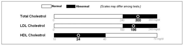
Screen shot of bar graph format (experiment 1).
Format
We randomly assigned participants to view medical tests in either a table or horizontal bar graph format. Analyses indicated that the study groups were equivalent with respect to the 16 demographic variables we assessed with the exception of sex; slightly more women were in the table than bar graph groups (69% v. 88%; P < 0.05). The table format was similar to one in use at a local hospital. Tables included the test name, date, exact result, unit of measure (e.g., mg/dL), and normal range with a column flagging abnormal results (Figure 1). The bar format showed the test name, unit of measure, and a horizontal bar separated into the normal range in white and the abnormal range in black (Figure 2). A circle designated where on the bar the test result fell, and numbers under the circle indicated the exact test result. We used horizontal rather than vertical bar graphs, as is common for displaying individual test results. We deliberately chose to have the bar graph format indicate the precise value in question, learning from previous studies’ confounding of format and exact numerical presentation.
Number of results
Participants viewed 5 vignettes in a random order (Appendix). Vignette A presented one BMI result. Vignette B presented 2 blood pressure test results: systolic and diastolic. Vignette C presented 3 cholesterol test results: total, low-density lipoprotein (LDL), and high-density lipoprotein (HDL). Vignettes D and E each presented 12 test results: one BMI result, 2 blood pressure results, and 3 cholesterol results as well as another 6 “filler” test results (glucose, creatinine, sodium, white blood cell count, hemoglobin, and platelets) that participants did not need to recall at any point. Vignettes A to C had “few” (n = 1, 2, or 3) results from a single type of test, and vignettes D and E had “many” (n = 12) results from multiple types of tests. Tests of the same type always appeared together as a block and in the same order within that block (e.g., total cholesterol presented first, LDL second, HDL third). The blocks were randomly ordered in the “many” vignettes that presented 12 results (see “block” variable in the second column of the Appendix).
Normality
Half of focal test results (i.e., results that were not fillers) were normal and the other half abnormal (Appendix). All test results within a block were normal or abnormal; thus, for example, if one cholesterol test result was abnormal, so were the other two. All filler test results were normal.
Experiment 2
Experiment 2 employed a 2 × 3 within-subjects design. The formats were the same two previously used, tables and horizontal bar graphs. This experiment, however, differed in the presentation of test result normality and number. In addition to the 2 categories used in experiment 1 (normal or abnormal), some test results were borderline. Normal and abnormal results were depicted as in experiment 1. In addition, a new column in the table format listed the borderline range, and borderline test results had a mark distinct from the one used to flag abnormal results. In the bar graph format, the borderline range appeared in gray (Figure 3). Participants saw test results in 6 vignettes, with 2 formats in 3 levels of normality each. Vignettes presented 2 blood pressure results (systolic and diastolic) that were always the same level of normality. As in experiment 1, vignettes appeared in a random order.
Figure 3.
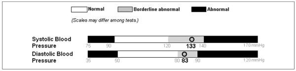
Screen shot of bar graph format (experiment 2).
Measures
Vignettes in experiment 1 assessed 4 measures that we identified in the usability literature: viewing time, recall, understanding, and perceived ease of use. Vignettes in experiment 2 assessed perceived ease of use, as we designed the experiment to address only this outcome.
Viewing time was the number of seconds that participants took to view the vignette for the first time. Participants received no instructions on how fast to respond, nor were they told that we tracked response times because we were interested in relatively naturalistic responses. “Gist” recall assessed whether participants could remember if a test presented on the previous page had normal or abnormal results.25 “Verbatim” recall assessed whether participants could remember the exact numerical result. We coded both responses for accuracy, with the verbatim answers within 5% of the actual result considered accurate.
We averaged 3 items to create an ease of use score (α = 0.94): how satisfied participants were with the presentation of the results, how easy the presentation was to understand, and how confusing the presentation was (reverse scored). The accompanying 5-point response scale ranged from “not at all” (coded as 1) to “extremely” (coded as 5). We assessed participants’ age, sex, income, race (coded white or nonwhite), Hispanic ethnicity, and numeracy26 as well as whether they had Internet access at home and at work.
Data Analyses
We analyzed data using generalized estimable models in SAS using PROC GENMOD (SAS Institute Inc., Cary, NC) that yielded a test statistic Z that follows a Z distribution. Predictor variables were format, normality, number of test results, and serial position of the vignette (e.g., presented second). Analyses modeled all main effects and interactions of these variables; we dropped predictor variables that were not statistically significant and reran the analyses. Analyses controlled for age, sex, income, white ethnicity, Hispanic ethnicity, Internet access at home and at work, and numeracy. Because preliminary analyses found no interactions with numeracy, the measure is a covariate in the data analyses, but we do not discuss it further. Analyses of viewing time used a natural log transform because the measure was positively skewed, as is common in such measures. Analyses of the viewing time and perceived ease of use data modeled a normal distribution, an assumption met by the data. Analyses of the accuracy data assumed a binary distribution. All analyses controlled for the within-subjects correlation of responses. Statistical tests were 2-tailed with a critical α of 0.05.
RESULTS
Experiment 1
Viewing Time
Time needed to view test results varied with format (horizontal bar graph v. table) and number of test results (few v. many). Participants required less viewing time for bar graphs as compared to tables. On average, participants took 31 seconds to view bar graphs, while those viewing tables took 40 seconds (Z = 3.05; P < 0.005). Participants were much faster viewing few test results rather than many (22 seconds v. 58 seconds) (Z = 2.13; P < 0.001). We found no main effect of serial position (i.e., whether the vignette was one of the earlier or later ones presented) or normality (i.e., whether the test results presented were normal or abnormal).
A 3-way interaction of format, number of tests viewed at one time, and serial position qualified these findings (Z = 2.08; P < 0.05) (Figure 4). We pursued the interaction by stratifying by number of tests. When participants viewed few test results, participants were faster on later vignettes (Z = −7.92; P < 0.001), regardless of format. Participants viewing many test results answered more slowly when viewing tables rather than bar graphs (Z = 3.16; P < 0.005), regardless of serial position.
Figure 4.
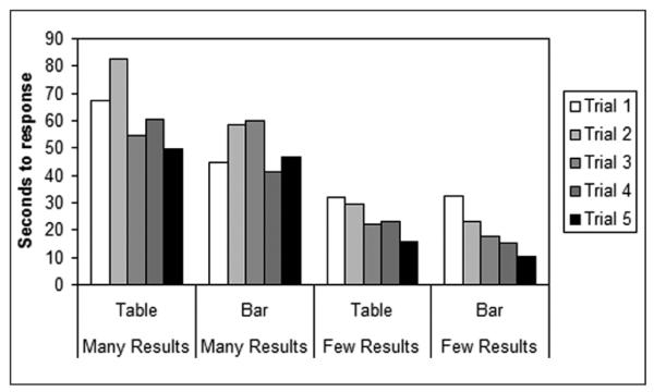
Time spent viewing vignettes (experiment 1).
Recall
Tables and bar graphs performed equally well in terms of participants’ ability to recall test results. The first “gist” recall test indicated that participants understood the overall meaning of the medical test results. Overall, 95% of participants correctly recalled whether a particular test result was normal or abnormal. Gist recall was not associated with any of our independent variables.
Tables and bar graphs also led to equivalent levels of accuracy with regard to verbatim recall. Compared to gist recall, participants performed less well overall in recalling the exact test result, with 71% giving an accurate verbatim answer across both formats. Respondents were more likely to accurately recall results presented in later vignettes (Z = 3.03; P < 0.005). This result was qualified by an interaction with number of tests (Z = −2.05; P < 0.05). Additional analyses showed that accuracy improved when people viewed vignettes with few test results later (Z = 3.16; P < 0.005), with the percentage of accurate responses increasing from 64% to 92% between the first and fifth vignettes. Vignettes showing many test results elicited equivalent accuracy when viewed earlier and later.
Ease of Use
Perceived ease of use was not associated with format, number of results, normality, or serial position. Because research suggests that people are more satisfied with bar graphs than with tables, we return to this issue in our second experiment.
Experiment 2
We hypothesized that seeing bar graphs and tables in close temporal proximity to one another is necessary to fully appreciate their differences.
Ease of Use
In contrast to findings from the previous experiment, experiment 2 elicited greater perceived ease of use for test results presented in bar graphs (M = 3.91) as compared to tables (M = 3.54) (Z = 4.50; P < 0.001) (Figure 5). Overall, borderline results received lower ease of use ratings compared to normal or abnormal results. For each category of normality, bar graphs received more favorable ease of use ratings than tables. The increase in perceived ease of use gained by using a bar graph instead of a table was larger for borderline results than for normal results (Z = 3.56; P < 0.001) or for abnormal results (Z = 3.15; P < 0.005).
Figure 5.
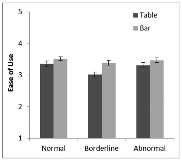
Perceived ease of use of test result format (experiment 2). Error bars show standard errors.
We speculated that comparing tables and bar graphs led to the difference in perceived ease of use. To test this possibility, we restricted analyses to the first vignette seen in experiment 2, and we added the experiment 1 format to the statistical model, which allowed us to isolate people who saw the same, or different, formats across the experiments. This analysis revealed the expected interaction of format considered in experiments 1 and 2 (Z = 2.35; P < 0.05). Participants who had become accustomed to tables in experiment 1 found bar graphs equally easy to use when they received this new format in experiment 2 (Figure 6). By contrast, those who had learned to use our bar graph format in experiment 1 rated tables markedly less easy to use when presented with tables in experiment 2.
Figure 6.
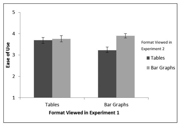
Perceived ease of use of test result format first viewed in experiment 2 (within subjects) according to format viewed in experiment 1 (between subjects). Error bars show standard errors.
DISCUSSION
When we compared the usability of 2 formats for electronically communicating medical test results, horizontal bar graphs were always at least as user friendly as tables. In the case of viewing time and ease of use, bar graphs were sometimes more usable. Participants required less viewing time when using bar graphs rather than tables, and this advantage was due to the superior performance of bar graphs in vignettes displaying many test results simultaneously. Furthermore, perceived ease of use was higher for bar graphs when participants compared them to tables. Preference for bar graphs was most pronounced when participants viewed borderline test results as opposed to normal or abnormal results.
The current practice of presenting test results in a tabular format merits reconsideration. Particularly given that our respondents viewed bar graphs in three quarters of the time they required for tables, our findings suggest that using bar graphs may help to improve usability. The ease of use for interpreting borderline results is another compelling reason to use bar graphs because monitoring borderline results has now become a routine part of the prevention and treatment of many cardiovascular risk factors.27–29 Our findings suggest that people prefer bar graphs for this kind of presentation, although additional research is needed to determine how visually defining the minimum and maximum test values affects consumers’ interpretation of those results. Providing an exact numeric test result as part of the bar graph presentation, as our study did, may be particularly important for maximizing the usability of this format.
People preferred our bar graph format to tables when shown the two together but not when they saw only one format. We suspect that seeing the 2 formats together triggers a process of comparison,30,31 allowing the viewer to identify the ways that bar graphs can be easier to use. Our data support this hypothesis insofar as participants who switched from viewing bar graphs to tables rated bar graphs more highly. However, those who switched from viewing tables to bar graphs rated the formats equally, indicating an asymmetry in the comparison process. After working with 5 tables in experiment 1, participants may have learned to overcome initial difficulties related to that format, thereby reducing the perceived contrast between tables and horizontal bar graphs. In this way, our results indicate that tables are the more burdensome format and require a period of learning that bar graphs do not.
These differences in the results of experiments 1 and 2 suggest caution for interpreting findings from between-subjects usability studies. If participants view only 1 of 2 formats, differences between formats may be difficult to assess because participants are unaware of other alternatives. A side-by-side comparison allows participants to make a more informed appraisal of the relative merits of each format, although prior experience with a format may influence this process.
While our experiments yielded useful findings, they have several potential limitations. First, while the controlled laboratory settings offered experimental control, they did not fully mimic actual use of personal medical records. For example, participants viewed the test results of a hypothetical patient rather than their own test results, and this approach may have limited the ecological validity of our findings. Similarly, test results were readily available and did not entail the data entry required for some personal health records. Second, participants were technologically savvy adults with relatively high levels of education and functioning. Studies with ill patients, those with cognitive deficits, or people with less experience with computers may yield different results.
Third, the generalizability of our findings remains to be established. Important distinctions may include potential differences between horizontal and vertical bar graphs,12,15 between bar graphs and other formats such as pictograms,23,32 and between printed rather than electronically presented test results. Furthermore, while both formats were highly effective at eliciting gist recall of whether a particular test result was normal or abnormal, other situations that yielded lower understanding might find some differences between the formats. Our conclusions about the impact of multiple test results should be viewed as tentative, as experiment 1 vignettes with multiple results were from multiple unrelated tests, while vignettes with few results were about the same topic (e.g., blood pressure). Finally, we did not measure viewing time or recall in our second experiment, from which we draw conclusions about borderline results. Measurement of these variables might lead us to different conclusions. Future research should consider other important outcomes, including affect and cognitions.33
To achieve maximum utility and impact, users must be able to quickly interpret and remember information they obtain from their records and to communicate with their clinicians about that information.25 They must also like the format of the personal health record enough to continue using it. Our experimental findings suggest that bar graphs offer advantages in usability that make them preferable to tables. Because most medical test result reports are computer generated, changing the presentation of test results offers a relatively easy way to improve patients’ experience of personal health records and to encourage their participation as partners in their own care.
Supplementary Material
ACKNOWLEDGMENTS
We thank the UNC Personal Health Records Usability Working Group for their help conceptualizing and planning the study. We especially thank Yan Zhang for adept programming that made the experiments possible. Lastly, we thank Barbara K. Rimer for convening the Working Group. We presented portions of these data at the 2007 meeting of the Society for Behavioral Medicine.
Funding for the study was provided by NCI grant CA105786 and ACS grant MSRG-06-259-01-CPPB. Revision accepted for publication 17 December 2011.
REFERENCES
- 1.US Department of Health and Human Services . The ONC-Coordinated Federal Health IT Strategic Plan: 2008-2012. US Department of Health and Human Services; Washington, DC: 2008. [Google Scholar]
- 2.Institute of Medicine . Crossing the Quality Chasm: A New Health System for the 21st Century. National Academies Press; Washington, DC: 2001. [PubMed] [Google Scholar]
- 3.Hesse BW, Arora NK, Beckjord EB, Finney Rutten LJ. Information support for cancer survivors. Cancer. 2008;112(Suppl 11):S2529–40. doi: 10.1002/cncr.23445. [DOI] [PubMed] [Google Scholar]
- 4.Institute of Medicine . From Cancer Patient to Cancer Survivor: Lost in Transition. National Academies Press; Washington, DC: 2006. [Google Scholar]
- 5.Institute of Medicine . Knowing What Works in Health Care: A Roadmap for the Nation. National Academies Press; Washington, DC: 2008. [Google Scholar]
- 6.Hesse BW, Nelson DE, Kreps GL, et al. Trust and sources of health information: the impact of the Internet and its implications for health care providers. Findings from the first Health Information National Trends Survey. Arch Intern Med. 2005;165(22):2618–24. doi: 10.1001/archinte.165.22.2618. [DOI] [PubMed] [Google Scholar]
- 7.Beckjord EB, Finney Rutten LJ, Squiers L, et al. Use of the Internet to communicate with health care providers in the United States: estimates from the 2003 and 2005 Health Information National Trends Surveys (HINTS) J Med Internet Res. 2007;9(3):e20. doi: 10.2196/jmir.9.3.e20. [DOI] [PMC free article] [PubMed] [Google Scholar]
- 8.Cayton H. The flat-pack patient? Creating health together. Patient Educ Couns. 2006;62(3):288–90. doi: 10.1016/j.pec.2006.06.016. [DOI] [PubMed] [Google Scholar]
- 9.Arora NK, Hesse BW, Rimer BK, Viswanath K, Clayman ML, Croyle RT. Frustrated and confused: the American public rates its cancer-related information-seeking experiences. J Gen Intern Med. 2008;23(3):223–8. doi: 10.1007/s11606-007-0406-y. [DOI] [PMC free article] [PubMed] [Google Scholar]
- 10.Hesse BW, Shneiderman B. eHealth research from the user’s perspective. Am J Prev Med. 2007;32(Suppl 5):S97–103. doi: 10.1016/j.amepre.2007.01.019. [DOI] [PMC free article] [PubMed] [Google Scholar]
- 11.US Department of Health and Human Services . Research-Based Web Design & Usability Guidelines. US Department of Health and Human Services; Washington, DC: 2006. [Google Scholar]
- 12.Feldman-Stewart D, Kocovsky N, McConnell BA, Brundage MD, Mackillop WJ. Perception of quantitative information for treatment decisions. Med Decis Making. 2000;20:228–38. doi: 10.1177/0272989X0002000208. [DOI] [PubMed] [Google Scholar]
- 13.Benbasat I, Dexter AS, Todd P. An experimental program investigating color-enhanced and graphical information presentation: an integration of the findings. Commun ACM. 1986;29:1094–105. [Google Scholar]
- 14.Coll RA, Coll JH, Thakur G. Graphs and tables: a four-factor experiment. Commun ACM. 1994;37(4):76–86. [Google Scholar]
- 15.Feldman-Stewart D, Brundage MD, Zotov V. Further insight into the perception of quantitative information: judgments of gist in treatment decisions. Med Decis Making. 2007;27(1):34–43. doi: 10.1177/0272989X06297101. [DOI] [PubMed] [Google Scholar]
- 16.Hawley ST, Zikmund-Fisher B, Ubel P, Jancovic A, Lucas T, Fagerlin A. The impact of the format of graphical presentation on health-related knowledge and treatment choices. Patient Educ Couns. 2008;73(3):448–55. doi: 10.1016/j.pec.2008.07.023. [DOI] [PubMed] [Google Scholar]
- 17.Smerecnik CMR, Mesters I, Kessels LTE, Ruiter RAC, de Vries NK, de Vries H. Understanding the positive effects of graphical risk information on comprehension: measuring attention directed to written, tabular, and graphical risk information. Risk Anal. 2010;30(9):1387–98. doi: 10.1111/j.1539-6924.2010.01435.x. [DOI] [PubMed] [Google Scholar]
- 18.Elting LS, Martin CG, Cantor SB, Rubenstein EB. Influence of data display formats on physician investigator’s decisions to stop clinical trials. BMJ. 1999;318:1527–31. doi: 10.1136/bmj.318.7197.1527. [DOI] [PMC free article] [PubMed] [Google Scholar]
- 19.LaLomia MJ, Coovert MD. A comparison of tabular and graphical displays in four problem-solving domains. ACM SIGCHI Bull. 1987;19(2):49–54. [Google Scholar]
- 20.Schapira MM, Nattinger AB, McHorney CA. Frequency or probability? A qualitative study of risk communication formats used in health care. Med Decis Making. 2001;21:459–67. doi: 10.1177/0272989X0102100604. [DOI] [PubMed] [Google Scholar]
- 21.Fortin J, Hirota L, Bond B, O’Connor A, Col N. Identifying patient preferences for communicating risk estimates: a descriptive pilot study. BMC Med Inform Decis Making. 2001;1:2. doi: 10.1186/1472-6947-1-2. [DOI] [PMC free article] [PubMed] [Google Scholar]
- 22.Royak-Schaler R, Blocker D, Yali A, Bynoe M, Briant K, Smith S. Breast and colorectal cancer risk communication approaches with low-income African-American and Hispanic women: implications for healthcare providers. J Nat Med Assoc. 2004;96(5):598–608. [PMC free article] [PubMed] [Google Scholar]
- 23.Brewer NT, Richman AR, DeFrank JT, Reyna VF, Carey LA. Improving communication of breast cancer recurrence risk. Breast Cancer Res Treat. doi: 10.1007/s10549-011-1791-9. Epub 2011 Oct 1. [DOI] [PMC free article] [PubMed] [Google Scholar]
- 24.Kochanek KD, Xu J, Murphy SL, Minino AM, Kung HC. Deaths: preliminary data for 2009. Natl Vital Stat Rep. 2011;59(4):1–51. [PubMed] [Google Scholar]
- 25.Reyna VF, Brainerd CJ. Fuzzy-trace theory: an interim synthesis. Learn Individ Differ. 2005;7:1–75. [Google Scholar]
- 26.Schwartz LM, Woloshin S, Black WC, Welch HG. The role of numeracy in understanding the benefit of screening mammography. Ann Intern Med. 1997;127(11):966–72. doi: 10.7326/0003-4819-127-11-199712010-00003. [DOI] [PubMed] [Google Scholar]
- 27.Chobanian AV, Bakris GL, Black HR, et al. Seventh report of the Joint National Committee on Prevention, Detection, Evaluation, and Treatment of High Blood Pressure. Hypertension. 2003;42:1206–52. doi: 10.1161/01.HYP.0000107251.49515.c2. [DOI] [PubMed] [Google Scholar]
- 28.Third Report of the National Cholesterol Education Program (NCEP): Final Report. National Institutes of Health; Bethesda, MD: 2002. Expert Panel on Detection, Evaluation, and Treatment of High Blood Cholesterol. Report no. 02-5215. [PubMed] [Google Scholar]
- 29.Expert Committee on the Diagnosis and Classification of Diabetes Mellitus. American Diabetes Association: clinical practice recommendations 2002. Diabetes Care. 2002;25(Suppl 1):S1–147. doi: 10.2337/diacare.25.2007.s1. [DOI] [PubMed] [Google Scholar]
- 30.Ford TE, Thompson EP. Preconscious and postconscious processes underlying construct accessibility effects: an extended search model. Pers Soc Psychol Rev. 2000;4:317–36. [Google Scholar]
- 31.Mussweiler T, Rüter K, Epstude K. The ups and downs of social comparison: mechanisms of assimilation and contrast. J Pers Soc Psychol. 2004;87:832–44. doi: 10.1037/0022-3514.87.6.832. [DOI] [PubMed] [Google Scholar]
- 32.Zikmund-Fisher BJ, Fagerlin A, Ubel PA. Improving understanding of adjuvant therapy options via simpler risk graphics. Cancer. 2008;113(12):3382–90. doi: 10.1002/cncr.23959. [DOI] [PMC free article] [PubMed] [Google Scholar]
- 33.Lipkus IM. Numeric, verbal, and visual formats of conveying health risks: suggested best practices and future recommendations. Med Decis Making. 2007;2:696–713. doi: 10.1177/0272989X07307271. [DOI] [PubMed] [Google Scholar]
Associated Data
This section collects any data citations, data availability statements, or supplementary materials included in this article.