Abstract
Medical errors are an enormous problem in the health care industry. With the growing prominence of electronic medical records, new tools are becoming available to reduce the risk of errors. A clinical dashboard is one tool that is being employed in health systems to reduce medical error and improve clinician communication. The aim of this paper is to review how a clinical dashboard tool has been implemented at Virginia Commonwealth University Health System (VCUHS ) with the intention of reducing preventable medical errors.
Introduction
VCUHS is a Level 1 Trauma Center located in Richmond, VA, with a metro-regional population of 1.2 million. It is the only Level 1 Trauma Center located in the Central Virginia region as well as a regional referral center for the state. In 2010, VCUHS had 779 licensed beds, 55,616 adjusted discharges, 84,990 Emergency Department visits, 534,126 outpatient clinic visits, and 19,727 surgeries.
The mission of the Nursing Informatics department at VCUHS is “to improve quality, safety and effectiveness of patient care through the early adoption of advancing technologies and the development of tools that will facilitate the simultaneous transformation of clinical practice and research.”1 It is through this mission that new tools are created and employed. One such tool is the clinical patient Safety Dashboard.
Background
The hospital grading organization HealthGrades found nearly one million patient safety lapses among Medicare patients between the years 2006–8 that resulted in nearly 100,000 deaths and excess costs resulting from these errors were $8.9 billion.2 If the Center for Disease Control (CDC) were to include preventable medical errors as a category, they would have been the sixth leading cause of death in America in 2005.3 The leadership at VCUHS decided to improve practice to reduce their risk of harmful events occurring at VCU because of these findings in addition to several high profile safety events with negative outcomes in other hospitals.
In 2010, the Chief Executive Officer (CEO) of VCUHS, John Duval, announced VCU’s safety vision: to be “the safest health system in America.” He set the ambitious goal of having zero events of preventable harm to patients, employees and visitors. The Institute of Medicine stated “preventing errors and improving safety for patients require a systems approach in order to modify the conditions that contribute to errors. People working in health care are among the most educated and dedicated workforce in any industry. The problem is not bad people; the problem is that the system needs to be made safer.”4
VCUHS has used the Cerner Electronic Medical Record (EMR) since 2005. It began as a hybrid system of combining the EMR with paper records; now, it is almost entirely paperless. Like its paper counterpart, the EMR keeps important data elements regarding the patient in various views and access points, so critical components are often written on paper then passed verbally to other staff. Verbal handoff retains few facts after several cycles.5 Also, the literature cites many examples of cases where poor communication had serious consequences for patients, therefore accurate relay of clinical information is of great importance to patient safety.5
There is limited research for the use of a clinical dashboard tool, as it is a relatively new tool for EMRs. However, several studies demonstrated that use of clinical dashboard improved decision making.6 Handoff network communication patterns are strongly influenced by the information needs of the providers accepting responsibility for the patient.7 To make EMRs less cumbersome and more useful, the field is moving toward horizontal integration of patient data.8 Good workflow design has significant impacts on care delivery9; unfortunately, few workflow designs have been studied. The clinical dashboard tool follows the recommendations set forth by the Agency for Healthcare and Research Quality (AHRQ)10 as to how improved workflow design improves care delivery. It operates by reducing dependency on memory, increasing access to information, and increasing compliance with best practice.
The dashboard is one mechanism that is being used to provide data in a more useful format for busy clinicians while fulfilling executive strategic initiatives. Multiple hospitals have begun to successfully employ dashboards with positive results, including the hospitals in the National Health Service of the United Kingdom,11 University of Pennsylvania Health System,12 University of Colorado Hospital, Denver; George Washington University Hospital in Washington D. C., and University of Alabama at Birmingham Health System.13
Given the growing interest of health care facilities using dashboards, VCUHS decided to explore the development of a clinical dashboard that would provide instant access to patient safety indicators on each inpatient unit.
Development
The dashboard was developed using a multidisciplinary approach. Contributors included Senior Leadership, CLiX council, made up primarily of physicians and nurses, but also included ancillary staff such as pharmacists, physical therapists, and occupational therapists; Nursing Documentation Council; and a Physician Leadership Group. Both national and local initiatives contributed to the content of the dashboard.
National priorities included reduction of falls recommended by The Joint Commission (TJC),14 the reduced use of restraints by the Center for Medicare Services (CMS),15 and recommendations for reduction of Hospital Acquired Infections by AHRQ.16 Local initiatives were derived from current issues with practice. VCUHS clinicians wanted to increase documentation of adult vaccine administration. Nursing Documentation Council looked at staff workflow and decided to suggest the development of a tool to facilitate decision making. They wanted a quick visualization with real time data to prioritize care and facilitate the decision making process.
In order to ensure enhanced workflow, it is important to design a tool that enhances the decision making process. Industry provides the best practices for design of a dashboard tool. There are six practices to best enhance a dashboard’s usability and likelihood of displaying meaningful data.17 First, use visualization. It is well known that most people process information better when it is displayed visually. Using charts, graphs, and images is an effective way to present diverse information in a meaningful way, and to do it with limited space. Not all pictures convey data equally. Displays should utilize the most effective visualization object. Second is Key Metrics, which entails presenting information that matters with sufficient but not excessive detail. Third, show direction of change; fourth, show degree of change. Fifth, show comparisons. Comparisons provide a powerful way to furnish insight by displaying comparative metrics on a side-by-side basis. The previous three practices give more context and meaning to key metric values and trends for the viewer. Sixth, provide a data source. Knowing data ranges and sources will help the viewer reconcile differences between expectations and values represented if the data initially appear unbelievable.
Uses
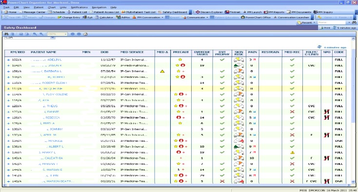
The clinical dashboard tool at VCUHS went live in December, 2010 and employs each of these practices (Figure 1).
Figure 1.
First generation quick view.
The skin speedometer graphic is a good representation of a visual aid. Key Metrics, direction and degree of change can be seen in the pain scale. Comparisons can be seen with different patients on the unit. The data source can be found in the detailed view, other parts of the chart of reference text for evidence based guidelines.
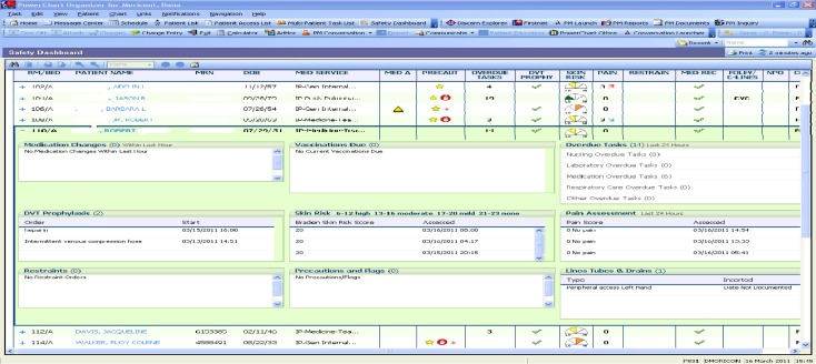
The CLiX council, was tasked with determining how to effectively use limited visual space. They designed the initial quick view (Figure 1) to show the big picture of a group of patients that can either be customized by floor or patients assigned to a particular provider. Clicking on the plus (+) sign next to the patient room number takes the user to the detailed view (Figure 2).
Figure 2.
First generation detailed view.
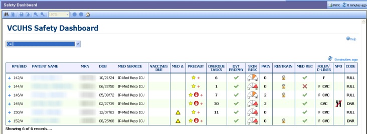
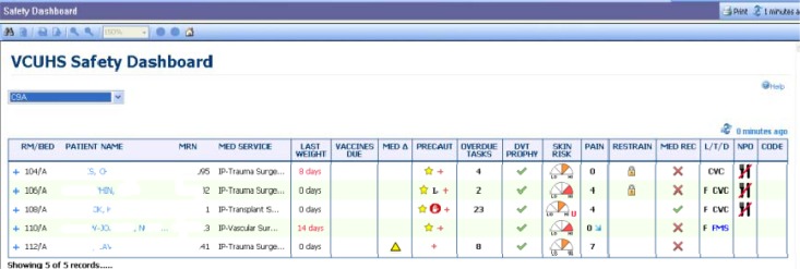
After deciding vaccine administration needed a more prominent display, the CliX council elected to move the vaccines up to the quick view in the second generation of the tool (Figure 3), and weights were added to the third iteration (Figure 4).
Figure 3.
Second generation quick view.
Figure 4.
Third generation quick view
The clinical dashboard has been used by multiple levels of providers simultaneously throughout the institution, from care partners (nurse assistants), through physicians, all the way up to senior management. For a care partner, the dashboard tool offers a good place to see one’s relevant patient information all in the same view. It can facilitate compliance with patient diet orders, such that one does not inadvertently give food or drink to patients with ordered diet restrictions. Seeing the presence of a central line will let a care partner know not to draw labs using a peripheral stick. A care partner can also use the dashboard tool to monitor patients needing more frequent turning or repositioning.
There are also several features used by nurses. In addition to customizing the view based on a shift assignment, a nurse can use the dashboard to monitor dates and advocate to the provider if there is lack of necessity of invasive tubes, lines and drains. Dates of insertion as well as reference text for recommended length of dates for invasive lines can be found on the tool. A nurse can see medication changes and reminders for vaccines to be administered. It is also a way to monitor high risk patients, such as those with high fall risk, skin integrity concerns, or patients in restraints.
Clinical coordinators (CCs) or charge nurses can use the dashboard as an aid during shift report, as it is very similar to a paper format currently used in many units. CCs can monitor changes in patient condition, such as pain, as well as staff workload with the number of overdue tasks. Patient census can also be monitored from the floor view. A new addition to the tool is the color change of a patient name when a discharge or transfer order has been placed.
Nurse Managers can get a quick update on unit census and patient needs. They can also with CCs use the dashboard for the newly recommended Safety Huddle. Performance Improvement (PI) has recommended a safety meeting at every shift with either the CC or nurse manager and 75% of nursing staff on shift to meet and discuss safety issues for their patients. Nurse Managers employ “rounding to influence” to encourage staff to use the tool. A nurse manager can use the dashboard as an aid to audit information including vaccines, falls, central lines, et al. Providers including physicians, nurse practitioners, and physician assistants can use the dashboard during rounds to ensure patients have all required orders in place. More commonly missed orders include reconciliation of home medications with inpatient medications or code status. Senior Leadership can view real-time information for patients on any unit at any time.
Usage has increased dramatically since the initial go-live a year ago, indicating that many staff find the dashboard useful and helpful. Unit secretaries, medical students and charge clerks have begun to use the dashboard regularly. Interviews with staff have confirmed that the dashboard is a beneficial tool that is utilized in the workflow. They have suggested improvements such as unit customization and better accessibility to enhance usage.
Conclusion
VCUHS clinical dashboard has the potential for improving patient safety and reducing risk of never events. This tool will contribute toward meeting the VCUHS CEO’s goal of having zero events of preventable harm to patients, employees, and visitors. It does this by reducing dependence on memory by providing much information in limited visual real estate; increasing access to information by pulling in the most recent patient data; and increasing compliance with best practice by applying industry best practice standards.17 Adoption has been most successful with nurses, care partners and early adopting physicians. Data show that vaccine administration, documentation of code status and medication reconciliation have improved in the past year. Line infections, use of restraints, and falls have all decreased. Patient satisfaction scores of pain management have remained high. VCUHS needs to put a plan in place to increase use hospital wide, and then a team should evaluate dashboard elements and consider revisions as necessary during the evaluation phase.
References
- 1. VCU Health System retrieved April 9, 2011 from www.vcuhealth.org.
- 2.HealthGrades Seventh Annual Patient Safety in American Hopsitals Study 2010. Retrieved May 3 from http://www.healthgrades.com/media/DMS/pdf/PatientSafetyInAmericanHospitalsStudy2010.pdf.
- 3.Centers for Disease Control Deaths/Mortality National Center for Health Care Statistics at the Centers for Disease Control. 2005. Retrieved May 9, 2011 from http://www.cdc.gov/nchs/fastats/deaths.htm.
- 4.Institute of Medicine . The National Academies. 2000. To Err Is Human: Building a Safer Health System; p. 49. [PubMed] [Google Scholar]
- 5.Bhabra G, Mackeith S, Montiero P, Pothier D. An Experimental Comparison of Handover Methods. Annals of the Royal College of Surgeons of England. 2007 Apr;89(3):298–300. doi: 10.1308/003588407X168352. [DOI] [PMC free article] [PubMed] [Google Scholar]
- 6.Effken J, Loeb R, Kang Y, Lin Z. Clinical information displays to improve ICU outcomes. International Journal of Medical Informatics. 2008 Nov;77(11):765–777. doi: 10.1016/j.ijmedinf.2008.05.004. [DOI] [PubMed] [Google Scholar]
- 7.Benham-Hutchins M, Effken J. Multi-professional patterns and methods of communication during patient handoffs. International Journal of Medical Informatics. 2010 Apr;79(4):252–67. doi: 10.1016/j.ijmedinf.2009.12.005. [DOI] [PubMed] [Google Scholar]
- 8.Egan M. Clinical dashboards: impact on workflow, care quality, and patient safety. Critical Care Nursing Quarterly. 2006;29(4):354–361. doi: 10.1097/00002727-200610000-00008. Retrieved Mar 3 from journals.lww.com. [DOI] [PubMed] [Google Scholar]
- 9.Cain C. Organizational Workflow and Its Impact on Work Quality. 2008. Retrieved Mar 3, 2011 from www.ahrq.gov. [PubMed]
- 10.Effken J, McEwen M, Vincent D, Shea K, Garcia-Smith D, Youngmi K. Application and Evaluation of the Ecological Psychology Approach to Instructional Design (EPAID) Journal of Asynchronous Learning Networks. 2009 Dec;13(4):41–56. [Google Scholar]
- 11.Khemani S, Patel P, Singh A, Kalan A, Cumberworth V. Clinical dashboards in otolaryngology. Clinical Otolaryngology. 2010 Jun;35(3):251–253. doi: 10.1111/j.1749-4486.2010.02143.x. [DOI] [PubMed] [Google Scholar]
- 12.Wells B. Clinical Dashboard: CEOs see quality data as critical part of reviewing personnel, hospital performance. Computerworld. 2009;43(19):28–31. [Google Scholar]
- 13.Bannon E. Clinical Dashboard: CEOs see quality data as critical part of reviewing personnel, hospital performance. H&HN Hospitals & Health Networks. 2005 Oct;v79(i10) p16(2) [Google Scholar]
- 14. The Joint Commission retrieved April 9, 2011 from http://www.guideline.gov/content.aspx?id=16005&search=fall+prevention.
- 15. CMS (retrieved April 9, 2011 from http://www.cms.gov/surveycertificationgeninfo/pmsr/itemdetail.asp?itemid=CMS1209698)
- 16. AHRQ (retrieved April 9, 2011 from http://www.ahrq.gov/qual/haiflyer.htm)
- 17.Eman Dashboard Display: 6 Best Practices. Sep, 2010. Retrieved Feb 27, 2011 from http://data-to-dashboard.com/marketing-dashboards/dashboard-display-6-best-practices.


