Abstract
Most techniques for relating textual information rely on intellectually created links such as author-chosen keywords and titles, authority indexing terms, or bibliographic citations. Similarity of the semantic content of whole documents, rather than just titles, abstracts, or overlap of keywords, offers an attractive alternative. Latent semantic analysis provides an effective dimension reduction method for the purpose that reflects synonymy and the sense of arbitrary word combinations. However, latent semantic analysis correlations with human text-to-text similarity judgments are often empirically highest at ≈300 dimensions. Thus, two- or three-dimensional visualizations are severely limited in what they can show, and the first and/or second automatically discovered principal component, or any three such for that matter, rarely capture all of the relations that might be of interest. It is our conjecture that linguistic meaning is intrinsically and irreducibly very high dimensional. Thus, some method to explore a high dimensional similarity space is needed. But the 2.7 × 10⁷ projections and infinite rotations of, for example, a 300-dimensional pattern are impossible to examine. We suggest, however, that the use of a high dimensional dynamic viewer with an effective projection pursuit routine and user control, coupled with the exquisite abilities of the human visual system to extract information about objects and from moving patterns, can often succeed in discovering multiple revealing views that are missed by current computational algorithms. We show some examples of the use of latent semantic analysis to support such visualizations and offer views on future needs.
Most techniques for relating textual information rely on intellectually created links such as author-chosen keywords and titles, authority indexing terms, or bibliographic citations (1). Similarity of the semantic content of whole documents, rather than just titles, abstracts, or an overlap of keywords, offers an attractive alternative. Latent semantic analysis (LSA) provides an effective dimension reduction method for the purpose that reflects synonymy and the sense of arbitrary word combinations (2, 3).
Latent Semantic Analysis
LSA is one of a growing number of corpus-based techniques that employ statistical machine learning in text analysis. Other techniques include the generative models of Griffiths and Steyvers (4) and Erosheva et al. (5), and the string-edit-based method of S. Dennis (6) and several new computational realizations of LSA. Unfortunately, to date none of the other methods scales to text databases of the size often desired for visualization of domain knowledge. The linear singular value decomposition (SVD) technique described here has been applied to collections of as many as a half billion documents containing 750,000 unique word types, all of which are used in measuring the similarity of two documents. LSA presumes that the overall semantic content of a passage, such as a paragraph, abstract, or full coherent document, can be usefully approximated as a sum of the meaning of its words, as follows: meaning of paragraph ≈ meaning of word1 + meaning of word2 +... + meaning of wordn.
Mutually consistent meaning representations for words and passages can thus be derived from a large text corpus by treating each passage as a linear equation and the corpus as a system of simultaneous equations. In standard LSA, the solution of such a system is accomplished by SVD (3). SVD is defined as X = WSP′. As SVD is applied to a text corpus for LSA, X is a matrix of words by paragraphs, with cells containing the log of the frequency of a word in a paragraph weighted inversely with the entropy of the word across all paragraphs. The matrix is decomposed by an iterative sparse-matrix SVD program (3) into three matrices, two with orthonormal singular vectors, W and P, standing for words and paragraphs, respectively, and a diagonal S matrix of singular values (square roots of eigen values). SVD yields a solution that is unique up to linear transformation. For very large corpora, the methods find only approximate solutions in dimensionalities well below the rank of the matrix and, in practice, are usually limited to 200-400 dimensions, for reasons to be given shortly. Similarities between words or documents are usually measured by their cosines (cos) in the resulting high dimensional semantic space. Vectors for new paragraphs can be computed dynamically by simply adding the vectors of their words, although after large additions or changes in the domain, recomputing the semantic space may be necessary, a process that takes several hours to days depending on corpus size and computing power.
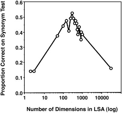
Even if mathematically provable, formal qualities such as resolution, compactness, and separation of clusters may not be what is most important for visualization (or other human uses such as information retrieval) unless they gave rise to useful human perceptions (or understandings). Therefore, we have tested the effectiveness of the underlying text analysis by simulating human judgments of the similarity of texts and comparing them with those of humans. This has been done in numerous ways with good results, agreement between machine and human being as good or almost as good as that between two humans. For example, after training on corpora from which humans learned or might have, LSA-based simulations have passed multiple choice vocabulary tests and textbook-based final exams at student levels (7). The frequently encountered effect of dimensionality and the existence of a high and strongly peaked optimum was dramatically shown by performance on multiple-choice items from the Test of English as a Foreign Language. LSA chose the most similar alternative word as that with the largest cos to the question word. Fig. 1 shows that its performance at 250-400 dimensions was very much better than at two or three, or at ones much higher than the optimum. At peak dimensionality, its score equaled that of successful applicants to U.S. colleges from non-English-speaking countries. In experiments simulating the amount and kind of reading of middle school students, LSA vocabulary growth equaled the average 10 per day increase for students (8). By matching documents with similar meanings but different words, LSA improved recall in information retrieval, usually achieving 10-30% better performance cetera paribus by standard metrics, again doing best with ≈300 dimensions (9). LSA has been found to measure coherence of text in such a way as to predict human comprehension as well as sophisticated psycholinguistic analysis, whereas measures of surface word overlap fail badly (10). By comparing contents, LSA predicted human ratings of the adequacy of content in expository test essays nearly as well as the scores of two human experts predicted each other, as measured by ≈90% as high mutual information between LSA and human scores as between two sets of human scores (7). The 300-dimension optimum is not a universal law, nor is there theory to explain it. The reason for finding it often (but not always) by empirical test is not known (note that result in scoring essays here relies exclusively on LSA as used in visualization and does not include other components used in automated essay scoring). To repeat, in our method, the measured relation between words is not the relative frequency with which they co-occur in the same documents, but the extent to which they have the same effect in the construction of total passage meanings. Nor is the relation between two paragraphs based on the literal words that they have in common, as in standard vector space information retrieval systems. Instead, it measures the extent to which the vectors of words they contain would add to form the same paragraph vectors independent of what sets of words went into the sum of either text. It is this property, and the empirical evidence that it produces representations that closely simulate human judgment, that is the basis of our belief that it offers important advantages for domain-knowledge representation. In particular, four relevant properties result for knowledge domain visualization purposes. (i) The method measures similarity of meaning of whole documents independent of the literal words used. For example, “the doctor operates on the patient” is highly similar to “the physician is in surgery” (cos = 0.86 ± 0.05; the standard deviation is based on random pairs from the same corpus) but considerably less similar to “a carpenter operates a saw patiently,” which shares keywords but carries a completely different meaning (cos = 0.02 ± 0.05). (ii) It is sensitive to all similarities and differences between documents that are carried by word combinations, not just those of special interest or notice to their authors, other authors, or bibliographers. (iii) It ignores word order within documents and measures pairs of antonyms as equally similar to each other as pairs of synonyms (although the patterns of relations to other words of antonyms and synonyms, respectively, are quite different). These are disadvantages in some applications because nonlinear intrasentence syntactic and grammatical effects on meaning, such as predication, attachment, negation, and propositional implication, are lost (”no large proteins contain few amino acids” is very nearly the same, cos = 0.99, as “all amino acids contain many small proteins”). However, for most information retrieval and mapping purposes, ignoring these phenomena is of little consequence, or even advantageous. This is first because over paragraph and longer texts, their effects seem to be small, and, second, because measuring documents as closely related that assert different things about the same matters is usually desirable. (It would, of course, be useful if systems could also automatically detect significant differences in results and claims, in addition to topical similarity or “aboutness,” but no general method by which this can be accomplished currently exists.) (iv) It is entirely automatic. It does not need human provision of key words or indexing, or even require that documents have been read, or aspects of their content noticed or appreciated by others. (Of course, citation offers additional information, for example, about influence, importance, and conceptual ancestry, but it is not always useful to confound these factors with content.)
Fig. 1.
LSA performance on the Test of English as a Foreign Language synonym test as a function of retained dimensions.
Visualization Demonstrations
To be effective, an LSA representation of documents must start by deriving a good high dimensional “semantic space” for the whole domain or domains of knowledge to which the documents in question belong. As a rule of thumb, to attain adequate results, training data must include at least thousands of general or domain-relevant coherent passages, for which 75- to 125-word paragraphs are, empirically again, usually optimal. In our experience, the larger the training corpus the better, although there is some dependence on the size and homogeneity of the field to be covered and the size and specificity of its vocabulary. To achieve results as good as those described above, at least 200 dimensions usually must be retained.
For visualization, finding good projections is also important; many may be useful, most may not. There is no guarantee that any particular projection, the first and second principal components, or the 57th and 293rd, or the dynamically rotating 54th, 129th, and 200th, will reveal something familiar or new to the human visual system, or be of particular interest to a human analyst. It is also sometimes useful to compute a lower dimensional subspace representation of the relations between a small set of documents. For example, to map relations among a particular group of drugs, one might apply multidimensional scaling to a submatrix of cos to emphasize relations specific to the subset.
For visualizations, we have used the GGobi (11) high dimensional data viewer (see www.ggobi.org for current system reference and software). This system displays data points and lines in any subset of three dimensions passed to it as appropriately formatted files. It can apply sophisticated projection-pursuit hill climbing and randomization algorithms to automatically find dimension triplets and rotations to maximize properties such as dispersion or grouping of points. These may, of course, be useful for some purposes even without being comprehensible to a human observer (i.e., for “machine visualization”; e.g., of an irregular 10-dimensional solid). But our goal is human visualization, and we know of no way to assure value for that without bringing human observers into the picture. Automatic projection pursuit goes some way toward helping a human locate views of interest; however, (i) the process is heuristic and weak against the complexity of the space, and (ii) it does not necessarily correspond to the interests of human searchers. Thus, we believe that providing a kind of human-computer symbiosis in which the user can guide and evaluate what the system displays can add significant value. Importantly, GGobi allows a great deal of user control. Users can choose starting dimensions and control direction and speed of rotation. They can also specify the color and shape of glyphs for subsets of points and connect them with lines. Clicking on points can bring up associated text.
For the examples given here, we created a 300-dimensional LSA space from the full title, abstract, and body text of all articles in PNAS volumes 94-99, some 16,169 articles with a total of 67,341,938 word tokens containing 240,718 unique term types (no stemming or stop-listing was applied). In an expediencedictated procedure differing from the optimal process described above, we first divided the corpus into 317,115 paragraph-like passages containing an average of 212 word tokens, and applied SVD to the resulting matrix of 240,718 terms by 317,115 passages. Having thus created a vector for each word type, we constructed vector representations of whole documents as the sum of their word vectors. (An alternative procedure would have been to construct article vectors from passage vectors, but that would have been inconsistent with the manner in which we added new documents not in the training corpus.)
We then used GGobi to search for revealing views. Data points for document sets of interest were visually identified by shape and/or coloring and are displayed in selected projections from among those examined. The views presented are ones we arrived at by the user-guided projection-pursuit methods described above, but for illustrative purposes restricted to dimensions 1-6. In the interest of consistency, comparison, and interpretability, in all of the views presented here we use the same generally good triple of dimensions, dimensions 3, 4, and 5 (which we found of greater interest than any other of the six-choose-three combinations, dimensions 1 and 2 in particular appearing to largely reflect word frequency, a dimension of little interest to us). It is worth noting that the “scree slope” in LSA decompositions is generally quite flat after the first two dimensions, each succeeding dimension contributing only a small and only slowly diminishing amount to the amount of total error reduction in the reconstructed X matrix. In each case, a combination of rapidly changing GGobi projection-pursuit views (which, of course, cannot be illustrated here) followed by more deliberate user control at interesting starting points was applied to find a better three-dimensional rotation, there being a virtually unlimited number. In every case, the selected rotation appeared more revealing to us than the initial one produced by the algorithm, the latter corresponding to the common use of two or three unrotated principal components.
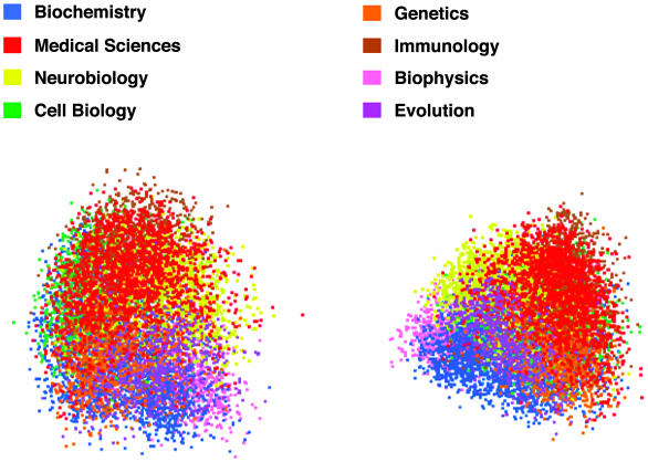
Example visualizations of relations among the PNAS articles are shown in Figs. 2, 3, 4, 5, 6. Fig. 2 shows all articles from eight biology subfield categories in PNAS in the initial algorithmically chosen view (Left) and in our selected view (Right). This kind of display might aid in understanding the relations among nominal fields of science, or help editors, program managers, research organizations, or institutions organize publications, requests for proposals, or departments into maximally distinct and internally cohesive units. Used to display patterns over successive years, it could aid analysis of the changing patterns of scientific effort. This case has special interest in that its value seems not to depend on identifying or characterizing individual documents.
Fig. 2.
PNAS articles colorized by biology subfield categories. The two-dimensional view on the three-dimensional space was selected algorithmically (Left) and by aided human selection (Right).
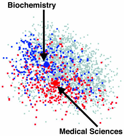
Fig. 3.
Overlap of articles in categories Biochemistry (blue) and Medicine (red). Centroids of all articles in categories shown as the larger labeled dots.
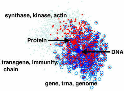
Fig. 4.
Overlap between articles similar at cos ≥ 0.7 to centroids of ones with MeSH terms DNA or protein. Note the groups of bull's-eyes, articles related to both topics according in the current view, and autogenerated key words.
Fig. 5.
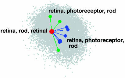
Connecting similar articles across years. Red, a single article from 1998; green, similar ones from 1997; and blue, similar ones from 1999, labeled by autogenerated key words.
Fig. 6.
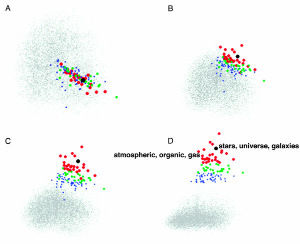
Rotation from knowledge map view A (SVD dimensions 3 and 4), through views B and C, to information retrieval view D (SVD dimension 3 and relevance to query). Query is marked as a black dot; significant results are marked in red, green, and blue (see text).
Fig. 3 shows views of the overlap between two of those categories, Biochemistry (blue) and Medicine (red), with all of the rest displayed as gray dots. Also shown are centroids (the 300-dimensional average) of all documents in these two categories, respectively (the larger dots), and the category titles.
Fig. 4 illustrates a way to use the technique to find articles that relate two or more topics of interest in a particular way within the same article. They display documents similar to ones labeled with specific Medical Subject Headings (MeSH) terms, but not necessarily so labeled in the PNAS database, and do it in such a way that ones containing components of content of both kinds, either because they are the self-same article or because they coincide as seen from some particular point of view, stand out as new perceptual wholes. For this display, we first found all 721 PNAS94 articles with MeSH term “DNA” and all 1,401 with MeSH term “protein.” For each set, we computed the centroid. We then found every article that had a cos ≥ 0.7 with each of the two centroids separately, that is, ones that contained a relatively high amount of relevant content. Those similar to the DNA centroid (but not necessarily so labeled in the PNAS database) are shown as open blue circles, and those similar to ones labeled “protein” are shown as orange dots. Ones ≥0.7 to both or coincident as seen from a particular viewpoint, appear as bull's-eyes of blue circles containing orange dots. Note that the blue and orange documents are not identified by MeSH terms but by their LSA similarities to the average content of articles with such terms. In fact, of the 397 with cos ≥ 0.7 to both DNA and protein centroids, fewer than half had both MeSH terms, and ones labeled with both did not appear as bull's-eyes in every view. The similarity threshold is continuously adjustable and need not be symmetrical. To us, moving the display through subsets of dimension triplets and rotating through three-dimensional viewing angles seems to have revealed patterns that are differentially interesting, whereas the first two principle components are less so. We hypothesize that for scientists expert in these overlapping fields, exploration of concentrated neighborhoods of bull's-eyes, clicking to see their titles or abstracts, or the less intrusive automatically generated keyword summaries, as shown here, could lead to useful information not as easily found by existing methods. Other variants are possible, for example precomputing bull's-eye documents and marking them so that they appear in every view. No discrete divisions or boundary planes, which are almost always artificial, are computed, and the natural fuzziness and intermingling is carried into the display. What is shown is a complete picture of how objects from different fuzzy classes are distributed with respect to themselves and each other from one perspective selected for its utility to the user with the help of the computational algorithm.
To compare this visualization to a completely verbal presentation of the same data, we computed joint topicality by multiplying the cos to the two centroids for each bull's-eye article. Table 1 shows the top two and the bottom two article titles in amount of overlap among the 397 articles, along with the product of the two cos.
Table 1. Top two and bottom two titles in the amount of topic overlap, as determined by cos product.
| Title | cos product |
|---|---|
| In vitro properties of the first ORF protein from mouse LINE-1 support its role in ribonucleoprotein particle formation during retrotransposition | 0.664 |
| Prospero is a panneural transcription factor that modulates homeodomain protein activity | 0.656 |
| Chondrocytes as a specific target of ectopic Fos expression in early development | 0.492 |
| c-Myc transactivation of LDH-A: Implications for tumor metabolism and growth | 0.490 |
Intuitively, it seems that the verbal presentation offers more precise information for choosing cases to examine, whereas the visual presentation offers a more flexible style of exploration that better shows multiple, fuzzy, and intermixed and complexly patterned relations among the documents. In addition, note that to explore the relations from a different perspective (similar to a different facet in information retrieval terminology), a whole new relevance ranked list would have to be produced and examined.
For Fig. 5, we started with one 1998 article and connected it to the most similar articles from 1997 and 1999. Investigations of this kind might help a researcher search for precedents, background work, or new related work before the sometimes considerable delay before indexing and citations provide good coverage. A historian might look for lines of progress, independent discoveries, or missed opportunities. The apparent advantage over corresponding lists would be the visualization of the mutual distributions (in multiple dimensions). A disadvantage, again, is in the more awkward identification of the actual articles.
Fig. 6 shows an application more similar to traditional querybased information retrieval. In Fig. 6A, the dispersion of all documents (full text of whole document) in 6 years of PNAS articles is shown in SVD dimensions 3 and 4. In all of these figures, the article title Primordial nucleosynthesis was used as the query (shown as the black circle).
Red, green, and blue circles, respectively, indicate the position of documents whose similarity to the query is more than four, three, and two standard deviations above the mean similarity of randomly chosen documents. Because human similarity judgments are monotonic with LSA cos, one can say that less than one in a thousand documents would be judged to be at least as similar in meaning to the query as the red documents.
An additional interesting feature of such views is the extent of mixture of relevant and nonrelevant articles and the differential patterning of closeness to the query in different directions. Such patterns also, of course, would vary with the choice of viewing plane. This illustrates well the loss of potentially interesting detail in standard ranked return lists (and purely algorithmic choice of view). In Figs. 6 B-D, closeness to the query is assigned to the dimension orthogonal to the plane of Fig. 6A, and the plane rotated by hand and eye to two particularly interesting views, one that stretches the orthogonal relevance view to emphasize the distribution of relevances, the other to spread the relevance peak to reveal qualitatively different ways in which similar relevances are attained. In the last frame, two articles from apparently different neighborhoods are automatically labeled to show that they indeed appear to be topically distinct; presumably, the user would choose to examine only articles in one of the neighborhoods. This kind of search has much the same goal as recent attempts to automatically cluster subsets of returns, but allows and relies on visual search by the user that can reveal patterns and shapes such as clouds, gradual intermixings, and scattered islands that hard-boundary clustering usually misses, but the human visual system has evolved to perform in still mysterious ways.
Of course, it might sometime be possible to find computational procedures to automatically find views optimized according to these or other objectives. If and when user control is better is an open question. Another open question is the extent to which such visual explorations are useful, given the greatly impoverished semantic information they carry; without the labels, the reader has no idea what the visualizations are about. Labels for more than a few of the dozens or hundreds of points obscure the rest. How much help are the clouds of unlabeled points and for what tasks? How much help are short labels? Would interpretability of dimensions help? LSA dimensions as extracted are fundamentally uninterpretable because of the indeterminacy of rotation. However, it should be possible to label them dynamically in the same rather minimal manner as we have labeled points.
Two More Examples of Potential Applications
There are a very large number of possible ways to use semantic content-based measures of similarity in visualization, most of which we have probably not yet imagined, and space prevents showing more of the ones we have. However, to suggest the possible range, here are just two more ideas. (i) One could display the multidimensional topical distribution of research proposals in one color and that of bibliographies from vitae of potential reviewers in another, and explore views to find a minimal set of reviewers whose expertise best covers the subjects of all of the proposals. (ii) One could plot each article from a large number of journals in two dimensions, differentially coloring them and labeling centroid points with, say, the number of citations to each weighted by the cos of citing to cited, as a third dimension. Narrow, coherent fields would stand out as high pointed peaks, related groups as ranges separated by valleys. This would be a semantic full-content version of something that has frequently been done with other kinds of linkages.
Comments on the Enterprise
First, we conjecture that verbal meaning is irreducibly high dimensional. Thus, the value of automatic reductions to two or three best dimensions may be inherently limited; although they may be valuable for some purposes, they must often provide only an impoverished and possibly misleading impression of the relations in a dataset. Different researchers and scholars are often interested in different aspects of articles, only some of which may have been indexed, key-worded, the object of citation, or shown in a particular view. The alternative we have explored here is a combination of measuring similarity of the entire content of articles with high dimensional visualizations that support search for projections that are of special interest to the user. Our goal in selecting examples has been to identify cases that exploit the putative advantages of these approaches. Unfortunately, we do not know whether we have succeeded because we have not yet tested typical users using the displays to perform either typical or novel tasks. This appears to be a widespread situation in research in information visualization. Seldom have new visual displays been empirically compared with best-of-class verbal methods for the same tasks. The consequence is that the majority of work in the field is, like ours, technology driven rather than user problem driven and user success tested.
Despite decades of highly creative and sophisticated innovation, and a plethora of claims for obvious superiority of the visualization approach, we do not see visual maps of verbal information in popular and effective use. It is, of course, possible that visualizing verbal information is in large part just an appealing bad idea. A more optimistic view is that the application of more user testing to understand what does and doesn't help people do what, will steer innovations in more effective directions. Precedent exists, for example in Bellcore's Super-Book, for turning novel information search devices from useless as first designed to order-of-magnitude more effective through iterative empirical usability analysis and redesign (12).
Acknowledgments
This work was supported by the National Science Foundation, Air Force Research Laboratories, U.S. Army Research Institute for the Behavioral and Social Sciences, and the Office of Naval Research.
This paper results from the Arthur M. Sackler Colloquium of the National Academy of Sciences, “Mapping Knowledge Domains,” held May 9-11, 2003, at the Arnold and Mabel Beckman Center of the National Academies of Sciences and Engineering in Irvine, CA.
Abbreviations: LSA, latent semantic analysis; SVD, singular value decomposition; MeSH, medical subject heading; cos, cosine.
References
- 1.Börner, K., Chen, C. & Boyack, K. W. (2003) Annu. Rev. Info. Sci. Technol. 37, 179-255. [Google Scholar]
- 2.Deerwester, S., Dumais, S. T., Furnas, G. W., Landauer, T. K. & Harshman, R. (1990) J. Am. Soc. Info. Sci. 41, 391-407. [Google Scholar]
- 3.Berry, M. W. (1992) Int. J. Supercomputer Appl. 6, 13-49. [Google Scholar]
- 4.Griffiths, T. L. & Steyvers, M. (2004) Proc. Natl. Acad. Sci. USA 101, 5228-5235. [DOI] [PMC free article] [PubMed] [Google Scholar]
- 5.Erosheva, E., Fienberg, S. & Lafferty, J. (2004) Proc. Natl. Acad. Sci. USA 101, 5220-5227. [DOI] [PMC free article] [PubMed] [Google Scholar]
- 6.Dennis, S. (2004) Proc. Natl. Acad. Sci. USA 101, 5206-5213. [DOI] [PMC free article] [PubMed] [Google Scholar]
- 7.Landauer, T. K., Foltz, P. & Laham, D. (1998) Discourse Processes 25, 259-284. [Google Scholar]
- 8.Landauer, T. K. & Dumais, S. T. (1997) Psychol. Rev. 104, 211-240. [Google Scholar]
- 9.Dumais, S. T. (1994) in The Second Text Retrieval Conference (TREC2), ed. Harman, D. (Natl. Inst. Stand. Technol., Gaithersburg, MD), pp. 105-116.
- 10.Landauer, T. K., Laham, D. & Foltz, P. W. (2003) in Automated Essay Scoring: A Cross-Disciplinary Perspective, eds. Shermis, M. D. & Burstein, J. (Lawrence Erlbaum Associates, Mahwah, NJ), pp. 87-112.
- 11.Swayne, D. F., Cook, D. & Buja, A. (1998) J. Comput. Graphical Stat. 7, 113-130. [Google Scholar]
- 12.Egan, D. E., Remde, J. R., Gomez, L. M., Landauer, T. K., Eberhart, J. & Lochbaum, C. C. (1989) ACM Trans. Info. Systems 7, 30-57. [Google Scholar]


