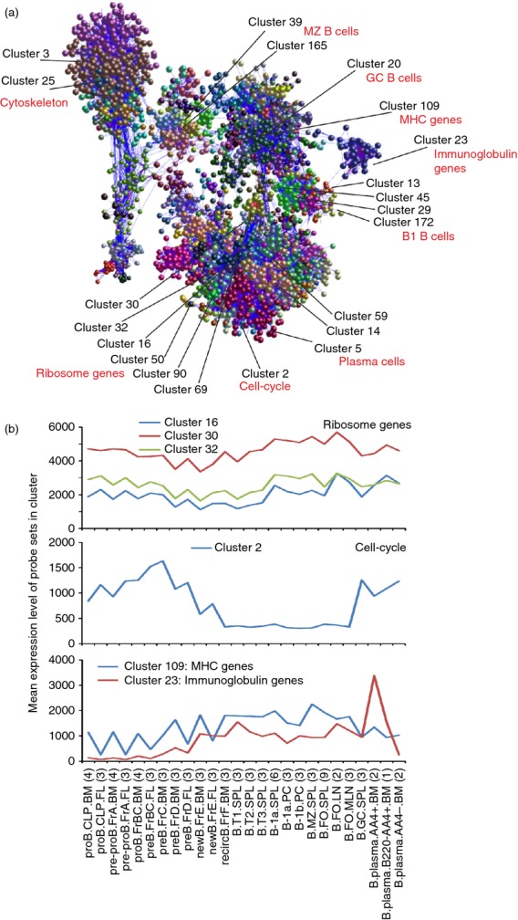
Figure 3.

Network analysis of mouse B-cell subset transcriptomics data. (a) Main component of the network graph derived from 84 micro-array data sets of distinct mouse B-cell subsets. Here, the nodes represent probe sets (genes) and the edges represent correlations between individual expression profiles above r ≥ 0·85. (b) The mean expression profiles of the genes in selected clusters across the 84 samples. x-axis shows the samples, grouped according to cell type (in order of presentation in Table S1). For each cell population mean expression levels are presented and the number of replicates indicated in parenthesis on the x-axis. y-axis shows the mean signal expression intensity for the cluster (probe set intensity).
