

Abstract
Medication reconciliation is an important and complex task for which careful user interface design has the potential to help reduce errors and improve quality of care. In this paper we focus on the hospital discharge scenario and first describe a novel interface called Twinlist. Twinlist illustrates the novel use of spatial layout combined with multi-step animation, to help medical providers see what is different and what is similar between the lists (e.g., intake list and hospital list), and rapidly choose the drugs they want to include in the reconciled list. We then describe a series of variant designs and discuss their comparative advantages and disadvantages. Finally we report on a pilot study that suggests that animation might help users learn new spatial layouts such as the one used in Twinlist.
Introduction
Medication reconciliation is a complex task1,2,3,4 for which careful user interface design has the potential to reduce errors and improve quality of care. The entire process of medication reconciliation is a collaborative process in which many things can go wrong: the patients may not recall what medications they are taking (or may be unable to communicate); the information may not be recorded properly and include a lot of unreported uncertainty (e.g., about dosage, name or indication); the record of past medication orders may be incomplete or inaccessible; not all sources of medication orders for the patient may be known (e.g., they may have consulted a specialist on their own), etc. Eventually the clinician is presented with lists of medications from different sources that need to be reconciled into a single complete and accurate list that will be signed and saved in the patient’s medical record. Our focus has been on the last step of the process: facilitating the task of reviewing and sorting the medications that need to be continued from those that need to be stopped, following a careful and often iterative decision making process. We focused on designing the user interface to provide cognitive support that improves the speed and accuracy of medication reconciliation. We will use a single clinical scenario in our examples: discharging a patient from the hospital (Figure 1). This involves comparing the two lists, determining what drugs are unique, identical or similar between the two lists, and making medical decisions about which ones to keep, which ones to discontinue, and which to add or modify.
Figure 1.
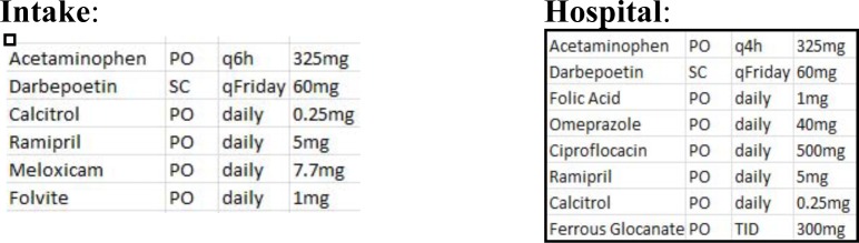
Discharging a patient from the hospital requires providers to compare the “intake list” (left) and the “hospital list” (right) and determining what drugs are identical, unique, or similar.
In this paper we describe Twinlist (Figure 2), an interface that uses spatial layout and multi-step animation to help providers better understand the similarity of the drugs included in the lists and rapidly choose the drugs to include in the reconciled list. We describe a series of variant designs, and discuss their comparative advantages and disadvantages. Finally we report on a pilot study that suggests that animation can help users learn new spatial layouts.
Figure 2.

Twinlist moves identical drugs to the middle column. Drugs unique to the intake list move to the left, drugs unique to the hospital list move to the right, and drugs that are similar are aligned below, with differences highlighted in yellow (e.g., q6h versus q4h for the acetaminophen). A click on Folvite (a brand name for Folic Acid) selected it – shown as green – and deselected the Folic acid (gray and stroked). The cursor is hovering on Omeprazole, revealing all details at the bottom of the screen.
Background and Related work
There has been much research highlighting the need for improved medication reconciliation2, 5–10. Duplicate/similar medications may result in overdoses and interactions, as well as non-continuation of important medications. These and other hazards are further complicated by patient misunderstanding or mistrust of new medications, lack of outpatient follow-up, changes in medications due to formularies and drug shortages among others. Trial implementations of medication reconciliation policies show significant improvements. In one study, 94% of patients had some medication errors, of which a medication reconciliation process eliminated nearly all3. There are three kinds of medication error outcomes: harmful (preventable adverse drug events, or PADEs), potentially harmful (near-misses, either intercepted or avoided by sheer luck), and harmless (the most common)9. Unfortunately, at least 1.5 million harmful errors occur every year10. Patients are particularly vulnerable to errors at care transitions11–12, where medication regimens frequently change. Properly reconciling medications at these points is crucial, but complete and accurate reconciliation is difficult, and thus often overlooked or simply not performed13; although this is changing rapidly to satisfy regulations now in place.
While many papers report and describe the severity of the problem, very few papers describe the user interfaces used in clinical settings. An exception is the Pre-Admission Medication List (PAML) Builder1. This interface, like contemporary reconciliation interfaces, presents all medications from all sources in one combined “superlist”, grouped alphabetically by generic name. Like many contemporary reconciliation interfaces, it exhibits a visual homogeneity that does little to help clinicians identify similar and unique medications. Furthermore, it is difficult to survey the interfaces of currently available commercial systems due to industry concerns around intellectual property. We found that in the least usable cases clinicians might see an intake list in one window, the hospital medication list in a second window and the final discharge list in yet another window. Some systems present a single merged list listing all drugs1, which at least brings close together the drugs with the same name and facilitates some level of comparisons based on drug names. Some algorithms have been proposed to automatically detect similarity between medications14,15. A review described different levels of drug equivalence and showed that revealing equivalent drugs can simplify reconciliation based on a detailed keystroke analysis. Recent research tries to augment the medication lists by linking prescribed medications with clinical problems or indications, either automatically16, or using crowdsourcing17, with some limited but promising success. The literature does not yet appear to include any description of reconciliation user interfaces using that information.
Overview of Twinlist User Interface
Twinlist’s user interface consists of three parts (Figure 2): the header (top), the list viewer (center), and the item detail (bottom). The list viewer is where users may interactively accept/keep or reject/discontinue medications. An early prototype18 led to a complete rewrite using JavaScript and HTML5. See www.cs.umd.edu/hcil/sharpc for videos.
Preprocessing:
A preprocessing phase is needed to identify similar drugs found in the two lists. This preprocessing phase can be accomplished using our algorithm14, available at https://github.com/jherskovic/MedRec) to find form equivalence (e.g., Tylenol is a brand name for the generic medication acetaminophen or paracetamol), or functional equivalence (Atenolol and propranolol are both beta blockers). The interface then uses three categories: drugs are considered “identical” when the same drug appears on both lists (with matching name, dosage, route and form), “unique” when they appear in one list only, and “similar” when the drugs are equivalent in form but vary in dosage or other attributes, e.g., acetaminophen 650mg vs. Tylenol 325mg. The class information is displayed, and can be used to group drugs as well (see later section of the paper).
Spatial groupings:
Twinlist places drugs on the screen using a multi-column spatial layout (see Figure 2, and a more complex example in Figure 4 and 5). We believe that spatial groupings help Twinlist provide an intuitive way for users to quickly differentiate items that are the same from those that differ (and highlight those differences) between the two lists. The left half of the screen is for the drugs of the intake list, and the right half is for the drugs taken at the hospital. In the center column we place the identical drugs (i.e., those present in both lists: Darbepoetin, Calcitriol and Ramipril). On the far left are listed the drugs unique to intake (here only Meloxicam), on the far right the drugs unique to the hospital. Below this set of three lists we place the drugs that are similar, aligned to facilitate comparison. For example, acetaminophen is present in both lists but the frequency of use is different (q6h instead of q4h) so both medications and their details are aligned in the same row, with the difference highlighted in yellow. Folvite is a brand name for folic acid so both drugs are also aligned on a common row, which helps the clinician pick which of the similar drugs is most appropriate. In addition, it is important to make the source (intake vs. hospital) of each list visible so that clinicians can make reconciliation decisions from the perspective of the patient, something that was highlighted during our more than 20 hours of interviews with clinicians, pharmacists etc.
Figure 4.

A complex example of congestive heart failure, with 11 drugs in the intake list and 12 in the hospital list. Here the cursor is on Hyzaar, so the details for that drug appear in the detail panel at the bottom (including drug class information), and the (similar) Losartan is aligned and also highlighted simultaneously. The dosage and frequency differences are highlighted in yellow.
Figure 5.

All drugs have been acted upon (bright green for “kept” or gray and striked for “rejected”). The Signoff button at the bottom right is now active.
Multi-step animation:
We use a multi-step animation to help users understand the groupings of drugs (Figure 3). When the lists are loaded in Twinlist, they are first listed side by side to show the two lists: intake on the left and hospital on the right. Options are available to change the speed of the animation or turn it off, especially once a user becomes more familiar with the interface. The animation steps are as follows (Figure 3):
Identical drugs move to the center column, in-between the original lists, and then merge, one pair at a time;
Unique drugs move away from the center to their respective side, first to the left for the drugs unique to the intake list, then to the right for the drugs unique to the hospital;
Similar drugs are aligned and golden-yellow highlights are added to indicate the differences between similar drugs;
Compaction of the display is performed to save vertical space by stacking identical and unique drugs at the top of their respective columns and sliding the rows of identical drugs together below.
Figure 3.

The 5 steps of the animation sequence used to explain the spatial groupings
See the VIDEO demonstration at www.cs.umd.edu/hcil/sharp OR search YouTube for “Twinlist demo”
Drug Selection:
Through the use of spatial groupings and highlighted drug differences, medical providers can rapidly make decisions to keep or discontinue drugs, one at a time or for entire columns at a time. A left-click accepts the drug, a right-click rejects it. When a drug is selected it appears green, e.g., Folvite was selected (Figure 1 or 3). Rejected drugs appear grayed out and with a strike thru the label e.g., Folic acid. Further clicking on a medication toggles through three states: accepted, rejected and undecided. Therefore making it easy to select the state with one click (left or right click, with a two click maximum when users are not aware of the right click to reject feature. When two drugs are similar (e.g., Folvite and folic acid) the initial selection of one of the drugs automatically deselects the other, speeding up the selection process (but it is still possible to reject both drugs if needed with subsequent clicks.) The detail panel at the bottom of the screen is helpful to get more information about the drug if needed and is available with mouse-over or drug selection. When a drug has a similar drug (i.e., brand name vs. generic, different dose/route/frequency) in the other list, then all similar drugs are also highlighted in dark gray to attract the user’s attention to that similarity. Since users always hover over the drug before selecting it, they are always made aware of the similarities (Figure 4). Explicit keep and reject buttons beneath column headers provide a convenient way to accept or reject entire columns when appropriate. We chose to err on the side of caution and only apply the command to the medications that remained “undecided”, to avoid overwriting previous decisions.
Signing-off:
Providers click on the Sign-off button at the bottom right of the screen when the reconciliation process is done. We chose to keep the sign-off button grayed out until every medication has been reviewed and acted upon (Figure 4 and 5) to reduce the chances of medication errors. The grayed out button indicates how many drugs are still “undecided”. The sign off button includes the name of the patient, which may reduce the chance of wrong patient errors.
Visual design
Line, color, texture, form, and space can make displays appear simple and understandable, or overly complex. In Twinlist particular attention was paid to visual design. Solid colors, used sparingly, define the interface: dark gray anchors the header to the top of the page (see Figure 4 for uncropped view of the interface); bright white creates spaciousness. Highlights provide richness: golden-yellow highlights important differences between related items; vibrant yellow-green lets users know which drugs have been selected at a glance and allows quick review of the final set. All click-able objects further provide feedback on mouse-over: the list viewer uses a slight “nudge to the right” effect to group related medications, exploiting the immediacy of motion and the Gestalt principle of common fate to guide visual exploration. Of course color schemes and interaction cues need to be consistent with those used in the “outer” application (e.g., EHR) in which the reconciliation interface is imbedded. While animation seems to be helpful in explaining the grouping and layout of the drugs, it cannot be used in isolation. The use of unifying background colors for different groups and of course informative labels complement and support the animation.
Dealing with complex cases with further grouping
Interviews with clinicians, pharmacists and quality assurance officers indicate that medication reconciliation errors - or less than optimal choices - are more likely to occur when clinicians are dealing with difficult cases and long medication lists (see Figure 4 for a case of congestive heart failure). Twinlist’s approach readily reveals the numerous cases of similarities and differences in name, dosage or frequency, and the final reconciled set of drugs is also very clear thanks to the bold green coloring (Figure 5).
Those interviews also suggest that different types of groupings (e.g., associated problem, clinical condition, diagnosis, drug class, etc.) would provide additional cognitive support for the medication reconciliation process. The current prototype allows medications to be tagged with such attributes. Those attributes can then be used to group the drugs on the display. In an ideal setting, individual medications would be linked to the patient’s problem list (demonstrating therapeutic intent), however many EHRs do not provide the ability to link the diagnosis to medication, or the function is not reliably used, limiting its current utility in the reconciliation process. There are several ongoing efforts to automatically provide linking information between drugs and the therapeutic intent in order to provide greater cognitive support to the clinician16,17. If available, this information could be shown in the detail panel, along with other medication details but it can also be used to further organize the drugs. Twinlist currently uses high level drug classifications to help users identify potential problems created by the patient’s transition from one healthcare environment to another. Using clinical condition may be even more useful. Figure 6 shows an example of grouping by primary drug class. The grouping reveals that this complex case includes a large number of anti-hypertensive medications, some of them less commonly used than others and therefore at higher risk for being misidentified.
Figure 6.

The same case as shown in Figure 5, but now the drugs have been grouped by (primary) drug class, revealing that this complex case includes a total of 5 different antihypertensive medications. Ambien and Lorazepam are also now grouped in the sedative section, even though there were originally further separated. While we use drug class here, the same interface could be used to group drugs by the patient’s diagnosis, if such linking information were available.
Unfortunately, only using the primary class may not be appropriate or sufficient because medications may be prescribed for other indications or even off-label reasons (acceptable but not FDA-recognized indications). This was a highly debated topic in our interviews, so we explored how the interface could show multiple (N) class affiliations. One method is to duplicate the drug N times on the screen; one for every class to which the drug belongs. To indicate that the additional drug labels are merely ghost copies (and not duplicate prescriptions) they are displayed in pale gray instead of black (see Figure 7). While this grouped-by-N-class display becomes more complex (more items on the screen, resulting in longer lists), some physicians reviewing this display have commented that the visual complexity represents the complex reality of the case. This option may not be the best to use as default but may be useful in the following scenarios: 1) during training; 2) to review decisions before sign-off in complex cases, and 3) for a subset of users that might prefer to see the drugs listed that way. Although an imperfect solution, grouping is likely to be more useful than the alphabetical order that is the de-facto grouping in most interfaces today, and can be made available as a display option, or an interface configuration component19.
Figure 7.

Grouped by ALL drug class. Each drug appears in each class to which it belongs. The primary is shown in bold, secondary copies appear as grayer shadows.
We now see that there are six antihypertensive drugs (Furosemide appears as a ghost copy of its main listing in diuretics).
Moving the cursor on Hyzaar reveals that it is also a diuretic.
Note that the list becomes longer and may require some scrolling to see all the classes.
Alternative design: Using only 2 columns and showing similarity by dynamic highlighting only
While we feel that the grouping by class is potentially useful, we also realize that the five columns of Twinlist create layouts where drugs become spread thinly over the entire screen, i.e., the layout loses a lot of its original compactness (e.g., comparing Figures 6 and 7 with Figure 4). This sparseness results from using two spatial grouping methods: grouping based on the comparison between the lists (i.e., identical, unique and similar, resulting in five columns) and then slicing by class, resulting in many small sets of drugs spread over the display. This led us to reconsider the original grouping in five columns. Our next alternative interface only uses two columns. We preserve the strong horizontal separation between intake (left) and hospital (right) but reserve the main vertical grouping for drug classes. The disadvantage is that similarity and differences between the lists is no longer shown spatially, but is instead revealed temporarily via highlighting when the cursor hovers over a drug (Figure 8). The only advantage is that the layout is more compact that the five columns with class grouping (it uses about the same screen space as the basic five column layout, but with a taller, narrower design). Another possible advantage of this design is that it can be extended to three or more lists that can be shown side by side. This might be useful when reconciliation needs to merge data coming from multiple sources (e.g., inpatient, outpatient and a pharmacy generated list). In comparison, with the 5-column design, our design would have to repeat the 2-list reconciliation multiple times.
Figure 8.

Two columns only (intake and hospital). Initially (left) the drugs are grouped by primary drug class, which naturally brings similar drugs close together, here showing the large group of antihypertensives. Highlighting reveals further similarities (e.g., when user points at Hyzaar they can see the similarity with Losartan). Optionally, we can show all classes, with additional ghost copies when drugs belong to more than one class. Scrolling may become more likely.
Alternative design: Single column merged list
For reference we also contrast the Twinlist interface designs with an earlier design15. In Figure 9 the (now different) drugs are shown in two stacked lists: the original un-reconciled list at the top, and the reconciled list below. The identical drugs (with white background) are moved to the reconciled list automatically. In the un-reconciled list the remaining drugs are listed according to their similarity status, and color coded accordingly. Unique drugs are dark orange. Similar drugs are grouped and pale orange, and drugs of form equivalence (brand vs. generic) are grouped with a white background. In such groups, whenever two drugs have the same dosage or other attribute the cells of the table are merged elements that are the same (e.g., 25mg dosage for Coreg and the similar Carvedilol) are merged. Drugs that are unique are given a bright orange color. The main disadvantage is that it is harder to tell to which list the drug belongs. Here the origin of the list is not used to separate the drugs spatially; instead a dedicated column provides that information. All the information about the drug is always visible in a wide row.
Figure 9:

Alternate design: 2 stacked lists, un-reconciled at the top, and reconciled at the bottom. Drugs are grouped by similarity. Color indicates the type of similarity. Dragging drugs from one list to the other indicates which drugs are to be kept. See video available at http://youtu.be/hXsEQdw4LKc
After reviewing the list users make decisions about what to continue or discontinue. To keep one of the drugs from the top un-reconciled list to the reconciled one, users drag the corresponding row down to the bottom list. They can change their mind and slide the row back to the original list. We found that this method was effective on touchscreen devices (e.g., tablets), as dragging is easier to perform on a touch surface than with a mouse, and touchscreen users are used to dragging gestures. Dragging with a mouse between the lists is much slower and error prone, and becomes more challenging when dealing with long lists, as the distance from the top row to the bottom list increases (on the other hand the overall display is more compact as there is no space in the vertical separation between the two original lists). Merging more than two lists is also possible, but it is not clear how to deal with multiple levels of similarity. For example a drug may be similar to another as brand name of a generic, but may be similar to another drug of the same class. Simply grouping all drugs together loses the details of the drug connections; and grouping by class or indication becomes difficult as groupings have to be repeated in both lists.
Additional design considerations
When to use animation?:
While animation has been shown to be compelling and helpful to reveal transformations of complex graphical representations such as trees or graphs, other studies have cast doubt on animation’s usefulness for learning20. To look at the specific benefit of animation in Twinlist a pilot user study was conducted with 20 participants comparing Twinlist with multistep animation versus a direct jump to the final layout21. The study found no significant difference in training times when comparing the two animations, but differences were observed in user comments and clarification questions. For example, only 3 of the 10 participants who learned with the multistep animation reported being initially confused about the five-column layout, compared to 9 of 10 for those who learned without animation. Fourteen out of 20 stated that they favored learning with the animation, citing its ability to “show you where everything goes” and how everything “connects”. A paired t-test for the related survey question also indicated that the full animation was considered more helpful for learning (p = 0.02). The full animation was preferred for initial learning in 70% (n=20) of participants and 90% stated they would prefer to go directly to the final layout for regular use (i.e., after learning).
The danger of scrolling:
In all designs, long lists may spill over the one-screen barrier and require scrolling. The main danger of scrolling is that providers may forget to take action on some of the drugs, which led to our decision to keep the sign-off button inactive until a decision has been made for all drugs. Another effect is that some information might be out of sight when highlighting multiple drugs at once is needed. In such cases we add a special popup at the edge of the screen. In Figure 10 a “More (1)” is added at the bottom to draw users’ attention to the fact that there is more information that will require scrolling. An alternative would be temporarily animate/move the related information closer to the cursor.
Figure 10.
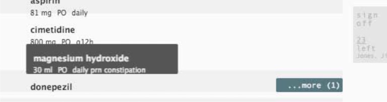
A box labeled “More (1)” bounces up from the bottom right when there is more information requiring scrolling. Here signaling that the drug magnesium hydroxide also appears in a different class below. The subtle use of animation draws users attention.
Options and user control:
The decision to group drugs by class or by diagnosis, or the decision to use animation or not can be left to the end-user by providing easily accessible controls. For example in Twinlist a single click on the top menu is needed to switch between grouping by class or not, allowing rapid switching between the two views. Keyboard shortcuts are also available (C for grouping by Class, M for multi-class, N for None). Similarly animation can be turned on and off. The naming of drugs can be changed from “as prescribed” to all brand name or all generic. Further testing - along with user preference and task - should decide the best default option, or even what options to offer. For example, the prototype allows users to remove/hide the medication from the list once a decision has been made. It makes progress visible as users can see the list shrink and also decreases the need for scrolling which is important with long lists and small screens, but users also need to be able to review their decisions or change their mind so it should be made easy to toggle this hide/show option and medications should not be hidden by default. Those decisions should also consider the interaction style used in the overall EHR interface.
Revealing similarities within the lists:
While the main role of preprocessing and spatial layout is to clearly indicate the similarity between lists, Twinlist can also show similarity within each list. If a drug has been prescribed twice, then the similar drugs within the list are also highlighted in dark grey on mouse-over.
Automatic reconciliation – or not?
One design question is whether it is a good idea to automatically reconcile some of the drugs in order to speed up the process. For example designers could choose to automatically reconcile: 1) all identical drugs, or 2) all unique intake drugs or 3) all intake drugs. All scenarios provide some modest gains in improving efficiency, but still require the review of the prescribing clinician and increase the likelihood of a patient being accidently placed on a medication that should be held due to changes in their clinical condition. Twinlist’s design assumes that users review lists by moving their cursor along the list, and that selecting or deselecting drugs is easy and quick to do, more easily that having to review and then possibly cancel automatic actions.
Discussion
Still many other designs are possible. For example Jeffrey Belden in his HIMSS 2013 talk suggested using a separate column for grouping by diagnosis, and then using highlighting to reveal linkages between drugs and diagnoses. Yet another option would be to reconcile drugs one group at a time, for example by drug class, starting with the large classes (e.g., all the antihypertensive medications in our earlier example). Faced with so many options, developers have to choose a design that matches the overall design philosophy of their EHR user interface. We hope that further research will quantify the benefits of individual design components (animation, groupings, etc.) and guide the development of other interfaces. Such studies will help designers make better decisions to enable healthcare workers to accomplish their task more safely and efficiently. Finally, our work demonstrates the importance and complexity of designing health IT user interfaces that seek to provide cognitive support to improve clinician performance in terms of both speed and accuracy. To gain the full benefits of health IT, such work must be extended and repeated for all clinical tasks supported by EHRs.
Conclusion
Based on the original Twinlist design we have described a family of design ideas that may inspire developers of electronic health systems. We have received positive feedback from two dozen clinicians but acknowledge the need for further evaluation. Comments suggest that the animation is helpful, and that the groupings are meaningful. This led to a quick pilot implementation in Microsoft Amalga, an adaptation to problem list reconciliation at Massachusetts General Hospital, and several ongoing projects that add Twinlist to existing EHR systems. A user study looking at possible improvements in terms of speed and errors between the basic Twinlist interface and a baseline is underway.
Acknowledgments
This work is supported in part by the Center for Clinical and Translational Sciences at the UT Health Science Center at Houston (NCATS UL1 TR000371) and Grant No. 10510592 for Patient-Centered Cognitive Support under the Strategic Health IT Advanced Research Projects Program (SHARP) from the Office of the National Coordinator for Health Information Technology.
References
- 1.Poon EG, Blumenfeld B, Hamann C. Design and implementation of an application and associated services to support interdisciplinary medication reconciliation efforts at an integrated healthcare delivery network,”. J Am Med Inform Assoc. 2006;13(6):581–592. doi: 10.1197/jamia.M2142. [DOI] [PMC free article] [PubMed] [Google Scholar]
- 2.Poon EG. Medication reconciliation: whose job is it? AORN J. 2009 Jun;89(6):1180–1122. doi: 10.1016/j.aorn.2009.05.003. [DOI] [PubMed] [Google Scholar]
- 3.Pronovost P. Medication reconciliation: a practical tool to reduce the risk of medication errors. J of Critical Care. 2003 Dec;18(4):201–205. doi: 10.1016/j.jcrc.2003.10.001. [DOI] [PubMed] [Google Scholar]
- 4.Cadwallader J, Spry K, Morea J, Russ AL, Duke J, Weiner M. Design of a Medication Reconciliation Application, Applied Clinical Informatics. 2013;4(1):1869–0327. doi: 10.4338/ACI-2012-12-RA-0057. [DOI] [PMC free article] [PubMed] [Google Scholar]
- 5.JCAHO: Joint commission on accreditation of healthcare organizations . Sentinel Event Alert. 2006. Jan, Using medication reconciliation to prevent errors; pp. 1–4. [PubMed] [Google Scholar]
- 6.Roughead EE, Semple SJ. Medication safety in acute care in Australia: where are we now? Part 1: a review of the extend and causes of medication problems. Aust New Zealand Health Policy. 2009;6:18. doi: 10.1186/1743-8462-6-18. [DOI] [PMC free article] [PubMed] [Google Scholar]
- 7.De Koning JS, Klazinga NS, Koudstaal PJ, Prins A, Dippel DW, Heerings J, et al. Quality of care in stroke prevention: results of an audit study among general practitioners. Prev Med. 2004;38:129–36. doi: 10.1016/j.ypmed.2003.09.018. [DOI] [PubMed] [Google Scholar]
- 8.Ellitt GR, Engblom E, Aslani P, Westerlund T, Chen TF. Drug related problems after discharge from a Australian teaching hospital. Pharm World Sci. 2010 doi: 10.1007/s11096-010-9406-9. [DOI] [PubMed] [Google Scholar]
- 9.Keohane CA, Bates DW. Medication safety, Obstetrics and Gynecology Clinics of North America. 2008 Mar;35(1):37–52. viii. doi: 10.1016/j.ogc.2007.12.002. [DOI] [PubMed] [Google Scholar]
- 10.CIPME: Committee on Identifying and Preventing Medication Errors (CIPME) Preventing medication errors. Washington, DC: National Academies Press; 2007. [Google Scholar]
- 11.Rozich J, Resar R. Medication safety: one organization’s approach to the challenge. J of Clinical Outcomes Management. 2001;8(10):27–34. [Google Scholar]
- 12.Forster AJ, Murff HJ, Peterson JF, Gandhi TK, Bates DW. The incidence and severity of adverse events affecting patients after discharge from the hospital. Annals of Internal Medicine. 2003 Feb;138(3):161–7. doi: 10.7326/0003-4819-138-3-200302040-00007. [DOI] [PubMed] [Google Scholar]
- 13.Rogers G, Alper E, Brunelle D, Federico F, Fenn CA, Leape LL, Kirle L, Ridley N, Clarridge BR, Bolcic-Jankovic D, Griswold P, Hanna D, Annas CL. Reconciling medications at admission: safe practice recommendations and implementation strategies. Jt Comm J Qual Patient Saf. 2006 Jan;32(1):37–50. doi: 10.1016/s1553-7250(06)32006-5. [DOI] [PubMed] [Google Scholar]
- 14.Bozzo Silva P, Bernstam E, Markowitz E, Johnson T, Zhang J, Herskovic J. Automated medication reconciliation and complexity of care transitions. AMIA Annual Symp Proc. 2011:252–1260. [PMC free article] [PubMed] [Google Scholar]
- 15.Markowitz E, Bernstam E, Herskovic J, Zhang J, Shneiderman B, Plaisant C, Johnson T. Medication Reconciliation: Work Domain Ontology, Prototype Development, and a Predictive Model. AMIA Annual Symp Proc. 2011:878–87. [PMC free article] [PubMed] [Google Scholar]
- 16.Burton M, Simonaitis L, Schadow G. Medication and Indication Linkage: A Practical Therapy for the Problem List? AMIA Annual Symp Proc. 2008:86–90. [PMC free article] [PubMed] [Google Scholar]
- 17.McCoy AB, Wright A, Laxmisan A, Ottosen MJ, McCoy JA, Butten D, Sittig DF. Development and evaluation of a crowdsourcing methodology for knowledge base construction: identifying relationships between clinical problems and medications. J Am Med Inform Assoc. 2012;19(5):713–8. doi: 10.1136/amiajnl-2012-000852. [DOI] [PMC free article] [PubMed] [Google Scholar]
- 18.Claudino L, Khamis S, Liu R, London B, Pujara J, Plaisant C, Shneiderman B. Facilitating Medication Reconciliation with Animation and Spatial layout. Proc. Workshop on Interactive Healthcare Systems (WISH2011) 2011:2–6. [Google Scholar]
- 19.Senathirajah Y, Bakken SH. MedWISE: a highly user-configurable ‘web 2.0’ EHR. Proc. ACM International Health Informatics Symposium (IHI ‘10) 2010:845–848. [Google Scholar]
- 20.Tversky B. Visualizing thought. Topics in Cognitive Science. 2011;3(3):499–535. doi: 10.1111/j.1756-8765.2010.01113.x. [DOI] [PubMed] [Google Scholar]
- 21.Plaisant C, Chao T, Liu R, Norman K, Shneiderman B. Multi-Step Animation to Facilitate the Understanding of Spatial Groupings: the Case of List Comparisons. University of Maryland Tech Report; 2012. [Google Scholar]