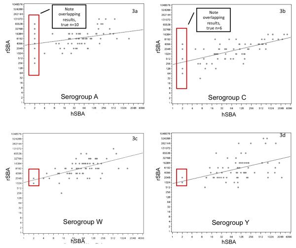
Figure 3. Scatter plots for paired results as measured by hSBA and rSBA, assessed 1 month after vaccination with MenACWY-CRM.
provides a representative sample of the matched hSBA and rSBA results from paired samples. Each point on the scatter plots represents the result of a single sample, for a single serogroup, at a single point in time (in this case, 1 month after vaccination), represented simultaneously by hSBA and rSBA. For example, the point at the bottom most left of figure 3a was a sample with a titer of 256 by rSBA and <4 by hSBA. The superimposed rectangles identify samples with discordant serostatus, i.e., where the hSBA was <1:4 but the rSBA was ≥ 8.

