Abstract
Context
De Montbeillard produced the first growth chart in the late 18th century. Since then, growth assessment has developed to become an essential component of child health practice.
Objective
To provide a brief history of i) anthropometry, i.e. growth measurements; ii) growth references, the statistical summary of anthropometry, and iii) growth charts, the visual representation of growth references for clinical use.
Methods
The major contributors in the three categories over the past 200 years were identified, and their historical contributions put in context with more recent developments.
Results
Anthropometry was originally collected for administrative or public health purposes, its medical role emerging at the end of the 19th century. Growth reference data were collected in earnest from the 19th century, during which time the familiar summary statistics – mean, SD, centiles – were developed. More advanced statistical methods emerged much later. Growth charts first appeared in the late 19th century, and Tanner and Whitehouse later popularised the concepts of velocity and conditional references for growth in puberty. The recent WHO growth standard has been adopted by many countries including the UK, where the UK-WHO charts have pioneered many design features to improve usability and accuracy.
Conclusion
Growth charts have come a long way in 200 years, and they represent an impressive synthesis of anthropometry, statistical summary and chart design.
Introduction
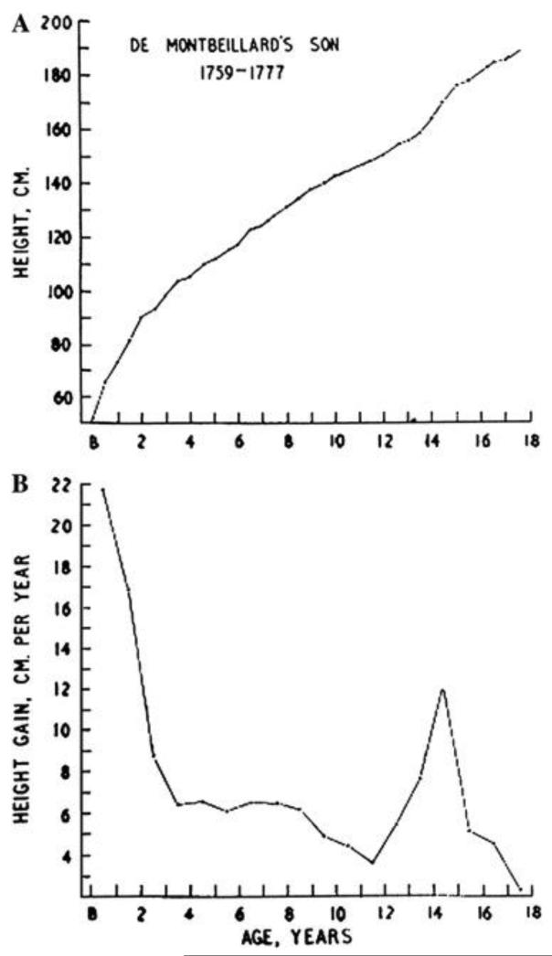
The idea of plotting a child’s body measurements on a chart to illustrate their pattern of growth is generally attributed to Count Philibert de Montbeillard (1720-1785), who plotted his son’s height every six months from birth to age 18 years, and George Buffon (1707-1788) then published the chart in his Histoire Naturelle, thus producing the first height growth curve (Tanner 1962). A growth curve is a powerful graphical tool, as it displays both the size of the child at a series of ages, and at the same time their growth rate or growth velocity over time, based on the slope of the curve.
Since it first appearance in the 18th century the use of the growth chart has expanded to include displaying the growth pattern of groups of children as well as individuals, and the chart has become an important tool in child health screening and paediatric clinical workup.
To describe the development of growth references and growth charts it is useful to start with some definitions. A growth reference is a statistical summary of anthropometry in a reference group of children, usually presented as the frequency distribution at different ages. The reference group is often representative of some geographic region at a particular time, e.g. Great Britain in 1990 (Freeman et al. 1995). The statistical summary involves the mean and standard deviation or alternatively the median and selected centiles, conditioned (usually) on age and sex. Growth references describe how children grow, and the references can be applied to other children to establish whether or not their measurements are typical of the reference group. A growth standard is essentially the same as a growth reference except that the underlying reference sample is selected on health grounds. Thus it represents a healthy pattern of growth, and the standard shows how children ought to grow rather than how they do grow.
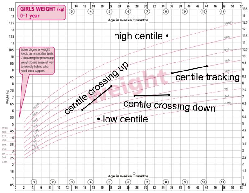
A growth chart is a growth reference presented as a visual display for clinical use, and in this sense it is a graphic design. Many aspects of the design can be varied to make the chart more or less effective as a clinical tool. A growth chart is also a ‘road to health’. Figure 1 is an example of a chart based on a growth reference, here the UK-WHO boys weight reference (Wright et al. 2010), consisting of a series of nine centile curves. By plotting individuals on the chart their measurements can be expressed as centiles. The centile for an individual indicates his or her size, be it height, weight or body mass index etc. The centile indicates the distance they have travelled along the growth road up to that age. The growth chart quantifies size/distance in terms of the centile.
Figure 1. UK-WHO chart for weight in girls aged 0-1 years illustrating centiles and centile crossing.
Furthermore, individuals whose growth curve tracks along the centiles over time are growing at average velocity, while if the curve crosses centiles up or down the individual is growing faster or slower than average – centile crossing is a measure of relative velocity. A growth chart visualises growth velocity, but it does not quantify it – centile crossing is uncalibrated. The combination of growth charts and growth references involves three distinct disciplines: the collection of anthropometry data, the statistical summary of the data, and the graphic design of the chart. The purpose of this paper is to sketch out developments in these three areas since the time of de Montbeillard.
Anthropometry
Anthropometry means the measurement of man. Hence it is a collective term for all the measurements that might appear on a growth chart, including most obviously height and weight (and ratio indices like body mass index – BMI), plus limb lengths and circumferences, skinfold thicknesses etc. Historically height has been the main focus, and James Tanner’s A History of the Study of Human Growth (Tanner 1981) impressively documents its changing role over the centuries.
Prior to the 19th century the main purpose of anthropometry was administrative, to identify, classify and screen individuals. For example, extensive documentation exists on the heights and weights of American slaves, which were useful as markers of their age, maturity and capacity for work, and hence value in the marketplace. Similarly army conscripts were routinely weighed and measured for screening to ensure a minimum level of fitness. Both sets of statistics have subsequently become useful for tracking the secular trend in height over time (Cole 2003), see for example the 150 year trends in Dutch conscript height (Van Wieringen 1972).
In the 19th century there was increasing awareness of the inequalities in British society, highlighted by the excesses of child labour, and the subsequent debate led to the Factory Acts and the regulation of children’s working conditions. During this time, driven by campaigners like Villermé (1782-1863) and Edwin Chadwick (1800-1890), the discipline of auxological epidemiology developed, defined by Tanner as “the use of growth data to search out and later to define suboptimal conditions of health”. (Auxology is Tanner’s term for the study of human growth.)
This trend was reflected by the increasing numbers of anthropometry surveys of schoolchildren undertaken from the mid-19th century onwards. Adolphe Quetelet (1796-1874) took the lead here, and was the first to investigate the statistical properties of anthropometry – discussed later. Charles Roberts (d. 1901) and Henry Bowditch (1840-1911) amassed large datasets of child anthropometry, and published them summarised in large tables.
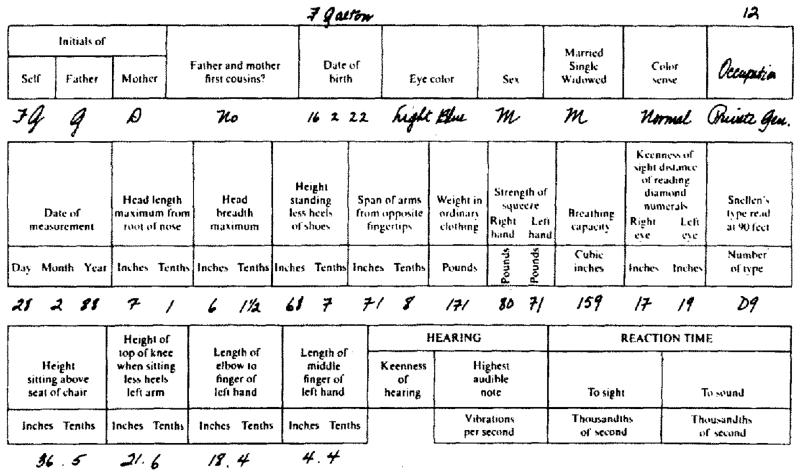
Around the same time Francis Galton (1822-1911) was developing his ideas on eugenics, and he was keen to quantify physical differences between individuals and across families and generations. Anthropometry proved the ideal medium, particularly height with its strong hereditary component and its links to social class. Galton’s keenness to obtain data led him to set up an Anthropometric Laboratory at the 1884 International Health Exhibition in London, where the public could come and pay 3d (1p) to receive 17 measurements of sight, hearing, strength, speed, breathing capacity, arm-span, height and weight, summarised on a card. Some 9337 individuals obliged, including 2954 children. See Figure 3 for Galton’s own set of measurements, where his occupation is recorded as “private gentleman” (Johnson et al. 1985). Galton’s interest in anthropometry differed from that of his contemporaries, or indeed anyone else preceding or following him. He wanted the data to test his ideas and to develop statistical concepts, which are described later.
Figure 3. A card containing Francis Galton’s measurements as obtained from his Anthropometric Laboratory at the South Kensington Museum (Johnson et al, 1985).
The motivation for collecting anthropometry altered again around the turn of the 20th century, when it was recognised that such measurements were useful for clinical assessment in the individual. This was the time when growth charts were first developed, both for weight in babies and height in children. In 1929 the Fels Growth Study was set up in the USA, the first of many such studies where anthropometry data were collected longitudinally over time, and the Fels continues to this day. In 1946 the UK National Study of Health and Development was initiated, the first of many such birth cohort studies, where individuals were recruited around the time of birth and followed up through life. Anthropometry was collected alongside other information, allowing the recent discipline of life course epidemiology to be developed. The 1946 Birth Cohort was followed by similar but larger cohorts in 1958, 1970, 2000 (the Millennium Cohort) and most recently the New Birth Cohort Study, which is planned to recruit in excess of 100,000 children. Many similar cohorts have been set up in other countries, so that the collection of anthropometry data for research purposes is now on a scale undreamt of at the time of de Montbeillard.
Statistics
The growth reference that underlies the growth chart is a statistical summary of the anthropometry of the reference sample. The summary statistics that are now used routinely for this purpose, the mean, standard deviation and distribution centiles, have themselves emerged since the time of de Montbeillard.
The normal distribution
The concept of the normal distribution, or “the law of frequency of error” as it was then called, was developed quite independently by Carl Friedrich Gauss (1777-1855) in 1809 and Pierre Simon Laplace (1749-1827) in 1810. Its discovery allowed data from a group of individuals to be summarised by their mean and probable error*, so long as they followed a normal distribution. This was a major step forward in reducing large numbers of measurements to just two summary statistics.
One of the first people to apply it to anthropometry was Adolphe Quetelet (1796-1874), an influential and energetic Belgian statistician who among many other things helped to found the Royal Statistical Society in 1834 and of whom Florence Nightingale was a great admirer. He introduced the concept of l’homme moyen, the average man who was representative of a particular group in society (Quetelet 1869). The status of this mean man was obtained from the mean and probable error of the group’s anthropometry, which he collected in many social surveys. His focus was on the mean and not the probable error, which he viewed as representing measurement error rather than true variability.
Galton’s percentile grades
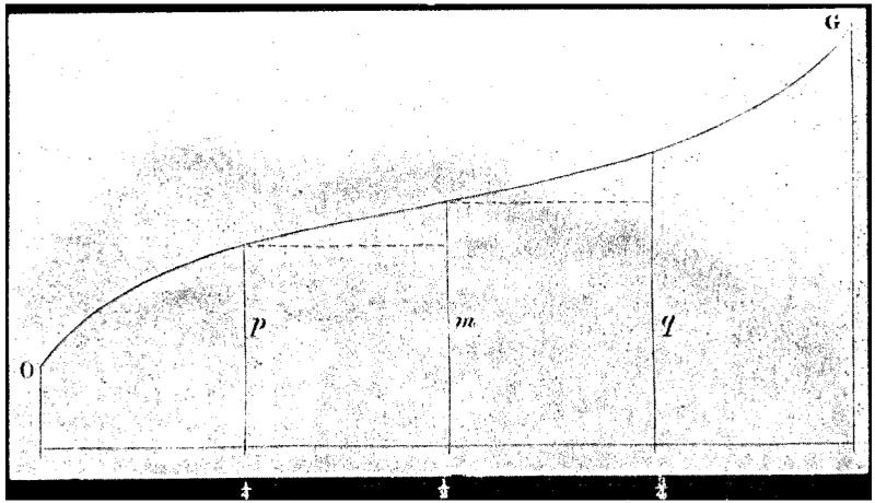
Francis Galton was well aware of Quetelet’s work, and he also latched onto the summary value of the normal distribution, in papers such as his “Notes on the Marlborough School statistics” (Galton 1874), which contained a table of the mean and probable error of height in annual age groups of boys from Marlborough School. However he was also aware of the need for the data to be normally distributed, and he recognised that this often did not apply. So it was that he introduced his concept of percentiles, which he claimed were “much simpler in conception, and of incomparably wider applicability” (Galton 1875). They were based on the ogive or cumulative distribution function, as shown in Figure 4. He described the ogive curve as follows, assuming 100 boys were arrayed against a wall in order of increasing height: “This line or curve would just touch the heads of all the 100 boys, and would give an exact, natural, and permanent record of the distribution of heights throughout the school.” (Galton 1876). The mean and probable error of the distribution were simple to estimate from the median and quartiles. The percentiles were obtained as the 99 cut-points splitting the ogive into 100 sections or grades, so that the median corresponded to the 50th percentile and the upper quartile to the 75th percentile. In addition for normally distributed data the mean would equal the median, and the probable error would be the distance from the 50th to the 75th percentile.
Figure 4. Galton’s ogive, or cumulative distribution function, showing the median, lower and upper quartile (Galton, 1875).
At this point it’s worth discussing terminology. Galton chose to call his cut-points percentiles, yet nowadays they are often called centiles. Galton himself called them centiles in at least one of his papers, where the word “centiles” appears in the title and text (Galton 1899). The Wikipedia entry for quantiles lists many terms like tertiles, quartiles, deciles etc, and the only ones whose names start with “per” are percentiles and permilliles (thousandths). So the case for using percentiles is not strong, and the preference here is to use centiles instead.
Centile spacing
To summarise the distribution of anthropometry on a chart one needs to display a subset of the available centiles. Generally the mean or median is provided along with a set of centiles symmetric about the median such as the 3rd, 10th and 25th below and the 75th, 90th and 97th above (Tanner et al. 1966). The 5th/95th centiles are sometimes preferred to the 3rd/97th (Hamill et al. 1977). Alternatively standard deviation spacings can be used, with zero SDs for the mean and −1, −2 and −3 SDs below and +1, +2 and +3 SDs above (WHO Multicentre Growth Reference Study Group 2006). A compromise between the two formats is provided by Cole’s two-thirds SD spacing, where centiles spaced two-thirds of an SD apart correspond to the (approximate) 2.3th, 9th, 25th, 50th, 75th, 91st and 97.7th centiles, i.e. close to the conventional set (Cole 1994). Note that the nine centiles in Figure 1 are two-thirds SD spaced. In addition, for a normal distribution the distance between the median and 75th centile, which corresponds to the probable error, is 0.6745 SDs, i.e. very close to two-thirds or 0.6667 SDs. In this sense the two-thirds SD spacing harks back to the beginning of summary statistics and the probable error.
Calculating centiles
The one remaining statistical issue is how to calculate the selected centiles for the measurement. This is most simply done by splitting the data into age groups, then sorting and counting the data in each group to obtain the centiles. (Nowadays there are several different ways of doing this, the quantile function in the statistical program R for example offering six alternatives (R Development Core Team 2010).) Alternatively if the data are known to be normally distributed, the centiles can be calculated from the mean and probable error (or later, SD). These could then be plotted and a smooth curve drawn through the points using either a French curve or a lead spline.
But jump forward 100 years, to the end of the 20th century when several new methods had become available, and it was hard to know which method to use. The World Health Organization, as part of its development of the WHO growth standard (WHO Multicentre Growth Reference Study Group 2006) carried out a review of all available methods for constructing growth centiles (Borghi et al. 2006), a total of 30 methods, and its recommendation was Generalized Additive Models for Location, Scale and Shape (GAMLSS) (Rigby and Stasinopoulos 2005). This is a generalisation of an earlier technique called the LMS method (Cole and Green 1992), which assumes that the measurement at each age can be transformed to a normal distribution using a Box-Cox transformation, and just three parameters, the Box-Cox power λ, the median μ, and the coefficient of variation σ, summarise the distribution. The three quantities are allowed to change smoothly with age, reflecting the changing underlying distribution, and the corresponding curves are called the L curve, M curve and S curve respectively. The M curve is the conventional median curve, the S curve shows the fractional SD as it changes with age, and the L curve indicates the age-changing skewness. Together they allow any centiles to be constructed, using the equation:
| [1] |
where zα is the normal equivalent deviate for the required centile, and the LMS values are over a series of ages. Inverting [1] allows a measurement X to be converted to an SD score (z-score):
| [2] |
where here the LMS values are for the child’s age and sex. Based on the reference population, the SD score has mean 0 and SD 1.
GAMLSS goes beyond the LMS method in several respects, but its main advantage over the LMS method is that it can adjust for kurtosis as well as skewness in the distribution. In the end the WHO growth standard was fitted without any adjustment for kurtosis, as its effect on the centiles was minimal, so that in practice the LMS method was used (WHO 2006).
Thus in summary, normally distributed anthropometric data could be summarised by the mean and probable error (or later the SD). Non-normal data were summarised initially with Galton’s centiles and latterly by the LMS method, which effectively added a third skewness summary statistic to the mean and SD.
Growth chart development
The first growth chart
Suppose we have anthropometry in a reference group of children over a range of ages. How exactly is this information to be presented on a chart? Henry Bowditch (1840-1911) set himself this task when describing the growth of Massachusetts children in 1891 (Bowditch 1891). The information to be presented is in three parts: the age groups into which the data are split (e.g. 11 years, 12 years etc), the selected centiles (e.g. 3rd, 10th etc), and the measurement values (e.g. height) corresponding to the centiles in each age group.
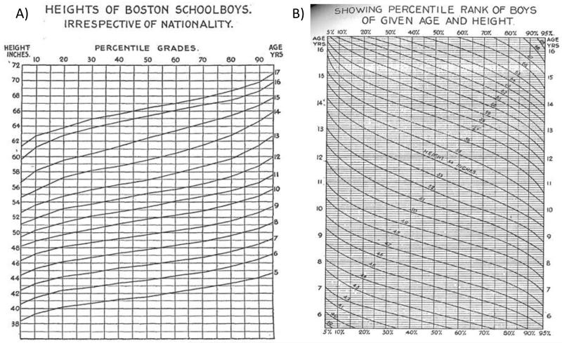
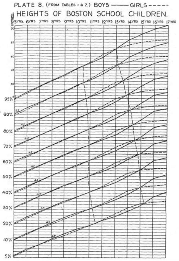
These three quantities can be presented on a conventional graph as curves of one variable plotted against another, with separate curves for each category of the third variable. Bowditch’s report demonstrated three alternative layouts for the chart: the first was height plotted against centile for each age group, where each curve corresponded in shape to Galton’s ogive – see Figure 5A. The second was age versus centile for different height categories, which gives a series of falling curves showing how the centile for a given height falls with increasing age – Figure 5B. The third format, which is the one that has endured, was curves of height versus age for each centile, as shown in Figure 6. This format had the advantage of allowing both the girls’ and boys’ curves to be displayed on the one chart.
Figure 5. Two growth chart designs proposed by Henry Bowditch, the first (left) based on Galton’s ogive (Figure 4), height plotted against centile by age group, and the second (right) an inverse ogive of age plotted against centile by height group (Bowditch, 1891).
Figure 6. Bowditch’s third growth chart design, height plotted against age by centile, the forerunner of most modern growth charts (Bowditch, 1891).
Bowditch’s was an enormously significant publication, stimulated by the concept of Galton’s percentile grades, and his third alternative (Figure 6) has stood the test of time to become the standard format of growth chart. Virtually all subsequent growth charts have adopted it, see for example the US NCHS 1977, British 1990 and WHO 2006 charts (Freeman et al. 1995, Hamill et al. 1977, WHO Multicentre Growth Reference Study Group 2006). Its appeal is that the centile curves are broadly the same shape as growth curves, and like growth curves they display both distance (position) and velocity (slope) on the one chart.
For much of childhood individual growth curves tend to track along a particular centile, which encourages users to think that the chart is designed to monitor growth over time, hence the name growth chart. But remember that the chart was constructed from cross-sectional data - Bowditch had just one measurement per child - so it can measure distance as a centile, but it cannot measure velocity. It contains no information on whether a given rate of centile crossing is common or uncommon.
Charting growth velocity
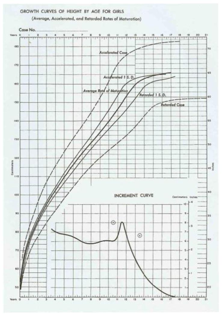
To assess velocity a velocity growth chart needed to be invented, based on child measurements collected serially over time. The first velocity chart, published by Leona Bayer and Nancy Bayley (Bayer and Bayley 1959), was designed to monitor height in puberty. The timing of puberty is very variable, with an SD of around 1 year, so that the growth curves of individuals with early and late puberty are very different in shape. Tanner used the term growth tempo for pubertal timing, where tempo is an important phenomenon reflecting the fact that individuals grow according to their developmental age not their chronological age. Thus in puberty the growth chart needs to be interpreted in the light of the individual’s tempo. The chart (see Figure 7 for girls) included an “increment curve” which showed the annual height velocity for children of average tempo, with a peak of 8 cm/year at 11.5 years.
Figure 7. Combined height distance and velocity chart for girls (Bayer and Bayley, 1959).
The rest of the chart consists of high and low centiles labelled “accelerated case” and “retarded case”. But the labels are confusing as the curves lead to tall and short final heights respectively, and hence are just as much to do with differences in height as differences in tempo. There are also three median curves labelled “accelerated 1 S.D.”, “average rate of maturation” and “retarded 1 S.D.” respectively, all ending at the same final height but showing their height spurts at different ages. In current notation these correspond to curves for advanced, average and delayed tempo.
The chart also provided height scales both in cm and inch units. A good idea in principle, it was let down by the grid above and to the left of the curves being 5 cm spacing, while below and to the right the grid was 1 inch spacing – quite confusing to use.
Growth assessment in puberty
James Tanner worked with Nancy Bayley during the 1950s and developed his particular interest in pubertal growth during that time. He published his Growth at Adolescence in 1955, and later a greatly expanded 2nd edition (Tanner 1962). According to Google Scholar it has been cited some 6000 times. He soon followed this up with a major paper on the design of growth charts, published in two parts (Tanner et al. 1966). Interestingly the paper’s title does not mention puberty, but its underlying theme is the impact of pubertal tempo on growth, and how the chart should address it.
At one level the paper is a simple tutorial in the development of distance and velocity references for height and weight. Height is treated as normally distributed, and its centiles by age are calculated from the mean and SD, both of which are tabulated with the centiles. For weight, which is recognised to be skew, there is no tabulated SD just the centiles including the median. These centiles, and corresponding ones for velocity references, are tabulated by age, sex and measurement in a series of no fewer than 18 tables.
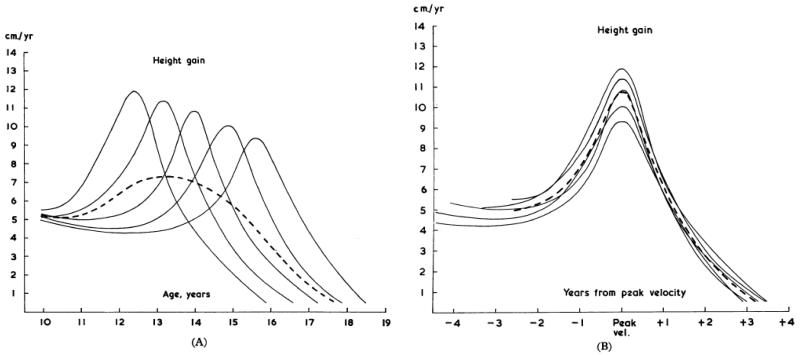
But the key message is in the paper’s Figure 1 (see Figure 8 here), height velocity curves for five individuals whose timing of puberty varies. Figure 8A shows the curves plotted against chronological age, where age at peak velocity varies between 12 and 16 years, while in Figure 8B the curves are plotted relative to age at peak velocity and hence are synchronised. In each case the average of the curves appears as a dashed line, and in Figure 8A it is widened and flattened compared to the individual curves. In Figure 8B the phase shift has been removed, and the average curve is the same shape as the individual curves. This bias in the average curve attributable to the age shift was first demonstrated formally for a logistic function growth curve (Merrell 1931), and more recently for a quite general growth function (Cole et al. 2008).
Figure 8. The effect of pubertal growth tempo on mean height velocity: left, with no tempo adjustment, and right, adjusted to age at peak height velocity (Tanner et al, 1966).
The mean velocity curve in each case is the dashed line.
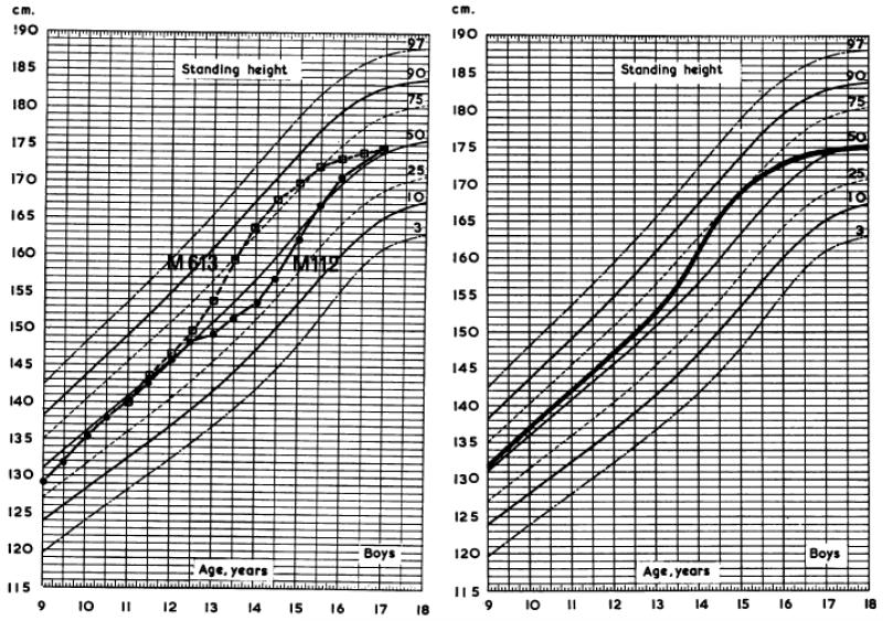
What it means is that distance curves based on cross-sectional measurements are less steep around the mean age of peak velocity than curves based on individual growth patterns. Tanner distinguishes between the two by calling them “cross-sectional” and “individual-type” curves. Figure 9 shows the contrast between them, two individual curves with relatively early and late peaks respectively (Figure 9A), and a smoothed individual-type curve (Figure 9B), superimposed on cross-sectional centiles. The curves show marked centile crossing around the time of the peak, so that the cross-sectional centiles give the misleading impression that the growth pattern is other than normal.
Figure 9. The effect of growth tempo on the height distance curve: left, two growth curves are steeper in puberty than the cross-sectional centiles, and right, similarly for the average longitudinal growth curve (Tanner et al, 1966).
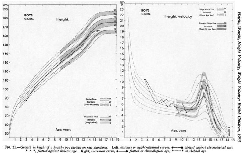
Tanner was keen to come up with a form of chart that minimised centile crossing in puberty, the aim being to optimise longitudinal growth assessment. To this end his paper included individual-type curves for height and weight during puberty, both for distance and for velocity, and Figure 10 shows a worked example for a healthy boy’s height from age 4 to adult. In terms of design these combined charts are a tour de force, though they are also complex for regular use. The cross-sectional (single time) centiles appear as lines, while the longitudinal (repeated visit) centiles are shaded. The velocity chart in particular highlights the difference between the two forms, with a narrow pointed longitudinal velocity curve and a wide flat cross-sectional velocity curve. Height is plotted against both chronological age and skeletal age, the latter providing an estimate of chronological age adjusted for puberty tempo.
Figure 10. Dual cross-sectional and longitudinal growth charts for height distance and velocity, illustrated with a child growing normally (Tanner et al, 1966).
The Tanner-Whitehouse charts proved to be extremely popular, with two revised versions appearing during the next twenty years (Tanner and Whitehouse 1976, Tanner and Davies 1985). But there were three problems with them that led people to explore other ways to assess growth in puberty. The first was that height velocity is hard to interpret in clinical practice. At the annual visit the doctor sees how fast the patient has grown in the previous year, and plots it on the velocity chart. But the clinical value of the chart is limited – it fails to highlight age at peak velocity until one or two years after it has happened, which is far too late for therapeutic intervention.
The second problem is that longitudinal centiles are designed to greatly reduce centile crossing, yet in fact individual growth curves still cross centiles up and down – see Figure 10 for example, where the child’s growth curve follows the cross-sectional centiles just as closely as the longitudinal centiles. So the advantage of the longitudinal centiles has been overstated. And the third problem is a shift in ethical attitudes since the 1960s, when skeletal age in children was routinely assessed with a hand-wrist x-ray. Since then there has been a movement against this practice, owing to the radiation dose, and as a result skeletal age is not now routinely measured. The absence of bone age means that there is no simple way to plot an individual growth curve adjusted for puberty, except after the event of peak height velocity, when then tempo effect can be obtained from the velocity curve.
Charting growth velocity as centile crossing – thrive lines
A completely different way of assessing velocity is to base it on centile crossing, as mentioned at the start of the paper. Velocity is conventionally measured in units of measurement per time, e.g. cm/year for height velocity. But if instead it is based on centile crossing the measurement units are SD scores rather than cm or kg (note not centiles – centiles are on a nonlinear bounded scale that is inappropriate for statistical summary). The properties of SD scores (mean 0, SD 1 in the reference population) make the variability of centile-crossing-based velocity particularly simple to calculate (Cole 1998). In addition one can incorporate an adjustment for regression to the mean, which is an important and often neglected consideration in assessing growth velocity. The effect of regression to the mean is that on average small children tend to grow relatively fast, and large children relatively slowly, and adjusting for regression to the mean allows velocity in small and large children to be compared directly.
The underlying algebra is as follows, where Z1 and Z2 are measurement SD scores on two occasions t1 and t2 from which velocity is to be calculated, and where the correlation between Z1 and Z2 is r1. The unconditional increment is given by Z2–Z1 (i.e. the change in SD score), and its SD is . This allows the increment to be expressed as an SD score where
| [3] |
Note that the velocity does not depend on t1 and t2, only on the SD scores and correlation.
For the conditional increment (i.e. adjusted for regression to the mean) the corresponding values are Z–r with SD , and the conditional increment as an SD score is where
| [4] |
Note that [3] and [4] are similar, and they only differ materially if r1 << 1.
In the same way as for a centile curve C100α and the LMS method, one can obtain a series of SD scores Zi and corresponding measurements Xi to plot against equally spaced ages ti that reflect a constant specified unconditional or conditional velocity. Z* = zα. The constant conditional velocity formula is
| [5] |
where zα is the normal equivalent deviate for the required velocity centile, and i is the correlation between Zi and Zi+1. The required series of SD scores is then obtained by daisy-chaining – use [5] to define Z2 from Z1, and then Z3 from Z2 etc. In words, given a starting SD score, a series of SD scores is calculated such that the conditional velocity between pairs of SD scores is zα. These SD scores can be converted back to measurements Xi to plot on the distance chart using [1]. For the simplest case, starting on the median and growing at median velocity, i.e. Z1 = 0 and z α =0, later SD scores Z1 are also all zero. Thus a child whose growth follows the median curve on the distance chart is growing at median conditional velocity, as one would expect.
For other choices of zα, positive or negative, the derived series of SD scores back-transformed to the measurement scale represents a “growth curve” with a consistent pattern of centile crossing on the distance chart. This “growth curve” is termed a thrive line, as it quantifies failure to thrive. The slope of the thrive lines, i.e. the degree of centile crossing, depends in a complex way on the initial SD score and the correlation, which in turn depends on the corresponding ages of measurement.
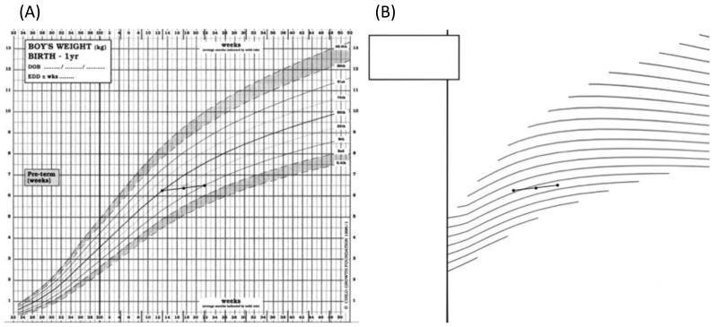
For assessment purposes a series of thrive lines is necessary, with different starting points, so that individual growth curves can be compared in slope with the nearest thrive line. The thrive lines can be printed on a transparent overlay to be superimposed on the chart. The assessment of velocity then involves comparing the slope of the child’s growth curve with the slope of the nearest thrive line. Figure 11A shows the British 1990 weight chart for boys 0-1 years, with the growth curve of a boy measured at 3, 4 and 5 months, over which time he falls from the median to the 9th centile. Clearly he is growing more slowly than average as he is crossing centiles downwards. But the Figure gives no clue as to whether his velocity is slightly low or very low. Figure 11B shows thrive lines for 5th centile weight velocity measured over a four-week period. This is designed as a transparent overlay to be placed over Figure 11A, so the growth curve can be compared directly with the thrive lines. It is clear that the growth curve is crossing thrive lines downwards, and hence the boy is growing appreciably more slowly than the 5th weight velocity centile. In addition he shows the same pattern over two successive months, which indicates a considerably lower velocity centile than the 5th (Cole 1998).
Figure 11. The use of thrive lines to assess weight velocity in infancy: left, the British 1990 boys weight chart with a baby showing growth faltering, and right, the thrive lines show that their weight velocity is well below the 5th centile.
See text for details.
So in summary, thrive lines provide a way to quantify centile crossing and hence velocity on the distance chart, without the need to calculate or plot velocity. In principle one could have a sheaf of overlays for different velocity centiles, and thrive lines could be applied to height velocity in puberty as well as weight velocity in infancy. It is worth pointing out that as a technology thrive lines are ideally suited to the computer screen, where they can be added to or removed from the chart at the touch of a button.
WHO growth standard
An important milestone in international health occurred in 2006 with the publication of the World Health Organization child growth standard (WHO Multicentre Growth Reference Study Group 2006). The study had a complex design involving infants and children from sites in six countries, selected to be free of constraints to growth and hence growing optimally. Data for the first two years were collected longitudinally, with up to 21 measurement occasions per child, and from 18-71 months the children were measured cross-sectionally. WHO also systematically reviewed the literature on the statistical construction of growth references (Borghi et al. 2006), and carefully documented the process of constructing the centiles (WHO 2006). As the pattern of growth was felt to be optimal, and linear growth in the six countries was similar, WHO has presented the growth standard as being of universal applicability. It has since been endorsed by over 150 countries of the world, and many countries have made it an integral part of their own growth assessment, e.g. the UK-WHO growth reference, see below (Wright et al. 2010).
It should be acknowledged that there has also been controversy surrounding the growth standard. For reasons that are unclear, weight on the WHO growth standard is low at birth and rises rapidly in the early weeks, a growth pattern viewed as unhelpful for encouraging breastfeeding (Binns et al. 2008). Also the WHO standard children are relatively light and with small head circumferences, which means that they differ materially from North European children (Juliusson et al. 2011). But since they were chosen as a growth standard rather than a growth reference, with a lower plane of nutrition (Cole 2008), it is perhaps not too surprising that they are relatively thin, and in a time of rising childhood obesity it is an important message that children growing healthily are thin children.
Chart design with the UK-WHO charts
The final stage in this brief and selective history of growth references and growth charts is to highlight recent work developing the UK-WHO growth charts as a synthesis of the British 1990 reference (Freeman et al. 1995) and the WHO growth standard (WHO Multicentre Growth Reference Study Group 2006). When the WHO standard was first published the British Government Department of Health caused a child growth expert group to be set up under the leadership of Professor Charlotte Wright (University of Glasgow) to develop a British version of the WHO charts. The result was a set of charts from birth to 4 years with evidence-based instructions, several innovative chart design features to simplify plotting and improve plotting accuracy, and they were fully trialled before launch (Wright et al. 2010). As an example Figure 1 illustrates the 0-1 year weight chart for girls, where the centiles start at age 2 weeks rather than at birth. This is for three reasons: i) growth assessment in the first two weeks should be relative to the individual’s own birthweight rather than weight centiles (i.e. has the infant regained birthweight?), so the early centiles are omitted; ii) the break in centiles between birth and 2 weeks reminds the user that the birth centiles (shown on the age 0 axis) are based on the British 1990 reference while those from 2 weeks are from the WHO standard, and iii) as stated earlier, WHO birthweight is very low compared to British 1990 birthweight and for this reason the first two weeks of WHO weight centiles are omitted (see (Cole et al. 2011) for a fuller explanation). The charts, instructions and training materials are all available at http://www.growthcharts.rcpch.ac.uk.
Conclusions
This whistle stop tour has shown how the process of growth assessment has developed and matured in the 200 years since de Montbeillard’s son’s growth curve was drawn. The process has involved an interesting synthesis of three distinct disciplines: anthropology for the collection of anthropometry, statistics to summarise the anthropometry for the growth reference, and graphic design to represent the growth reference as a growth chart. In fact there are other relevant disciplines too, including politics, psychology and ergonomics, where the aim is to encourage individuals to make the best use of the chart. Future developments in chart design are likely to be primarily electronic, exploiting computer and smartphone screen technology, which will free the design from its longstanding two-dimensional straitjacket.
Figure 2. Distance plot and velocity plot of height in Count de Montbeillard’s son (Tanner, 1962).
Footnotes
The probable error, the distance from the median to the third quartile, is approximately twothirds of the standard deviation.
References
- Bayer LM, Bayley N. Growth diagnosis. University of Chicago Press; Chicago: 1959. [Google Scholar]
- Binns C, James J, Lee MK. Why the new WHO growth charts are dangerous to breastfeeding. Breastfeeding Review. 2008;16:5–7. [PubMed] [Google Scholar]
- Borghi E, de Onis M, Garza C, Van den Broeck J, Frongillo EA, Grummer-Strawn L, Van Buuren S, Pan H, Molinari L, Martorell R, et al. Construction of the World Health Organization child growth standards: selection of methods for attained growth curves. Stat Med. 2006;25:247–265. doi: 10.1002/sim.2227. [DOI] [PubMed] [Google Scholar]
- Bowditch HP. The growth of children studied by Galton’s percentile grades. 22nd annual report of the State Board of Health of Massachusetts. Wright and Potter; Boston: 1891. pp. 479–525. [Google Scholar]
- Cole TJ. Do growth chart centiles need a face lift? BMJ. 1994;308:641–642. doi: 10.1136/bmj.308.6929.641. [DOI] [PMC free article] [PubMed] [Google Scholar]
- Cole TJ. Presenting information on growth distance and conditional velocity in one chart: practical issues of chart design. Stat Med. 1998;17:2697–2707. doi: 10.1002/(sici)1097-0258(19981215)17:23<2697::aid-sim36>3.0.co;2-o. [DOI] [PubMed] [Google Scholar]
- Cole TJ. The secular trend in human physical growth: a biological view. Econ Hum Biol. 2003;1:161–168. doi: 10.1016/S1570-677X(02)00033-3. [DOI] [PubMed] [Google Scholar]
- Cole TJ. The WHO Child Growth Standards and current Western growth references. Breastfeed Rev. 2008;16:13–16. [PubMed] [Google Scholar]
- Cole TJ, Cortina Borja M, Sandhu J, Kelly FP, Pan H. Nonlinear growth generates age changes in the moments of the frequency distribution: the example of height in puberty. Biostatistics. 2008;9:159–171. doi: 10.1093/biostatistics/kxm020. [DOI] [PubMed] [Google Scholar]
- Cole TJ, Green PJ. Smoothing reference centile curves: the LMS method and penalized likelihood. Stat Med. 1992;11:1305–1319. doi: 10.1002/sim.4780111005. [DOI] [PubMed] [Google Scholar]
- Cole TJ, Wright CM, Williams AF, RCPCH Growth Chart Expert Group Designing the new UK-WHO growth charts to enhance assessment of growth around birth. Arch Dis Child Fetal Neonatal Ed. 2012;97:F219–22. doi: 10.1136/adc.2010.205864. doi 10.1136/adc.2010.205864. [DOI] [PMC free article] [PubMed] [Google Scholar]
- Freeman JV, Cole TJ, Chinn S, Jones PRM, White EM, Preece MA. Cross-sectional stature and weight reference curves for the UK, 1990. Arch Dis Child. 1995;73:17–24. doi: 10.1136/adc.73.1.17. [DOI] [PMC free article] [PubMed] [Google Scholar]
- Galton F. Notes on the Marlborough School statistics. Journal of the Anthropological Institute. 1874;4:308–311. [Google Scholar]
- Galton F. Statistics by intercomparison, with remarks on the law of frequency of error. Philosophy Magazine. 1875;49:322. [Google Scholar]
- Galton F. On the height and weight of boys aged 14, in town and country public schools. J Anthropol Inst GB and Ire. 1876;5:174–181. [Google Scholar]
- Galton F. A geometric determination of the median value of a system of normal variants, from two of its centiles. Nature. 1899;61:102–104. [Google Scholar]
- Hamill PVV, Drizd TA, Johnson CL, Reed RB, Roche AF. NCHS growth curves for children birth - 18 years. National Center for Health Statistics; Washington DC: 1977. [PubMed] [Google Scholar]
- Johnson RC, McClearn GE, Yuen S, Nagoshi CT, Ahem F, Cole RE. Galton’s data a century later. American Psychologist. 1985;40:875–892. [PubMed] [Google Scholar]
- Juliusson PB, Roelants M, Hoppenbrouwers K, Hauspie R, Bjerknes R. Growth of Belgian and Norwegian children compared to the WHO growth standards: prevalence below-2 SD and above+2 SD and the effect of breastfeeding. Arch Dis Child. 2011;96:916–921. doi: 10.1136/adc.2009.166157. [DOI] [PubMed] [Google Scholar]
- Merrell M. The relationship of individual growth to average growth. Hum Biol. 1931;3:37–70. [Google Scholar]
- Quetelet LAJ. Physique sociale. C. Muquardt; Brussels: 1869. [Google Scholar]
- R Development Core Team . R: a language and environment for statistical computing. R Foundation for Statistical Computing; Vienna: 2010. [Google Scholar]
- Rigby RA, Stasinopoulos DM. Generalized additive models for location, scale and shape (with discussion) Applied Statistics. 2005;54:507, 544. [Google Scholar]
- Tanner JM. Growth at adolescence. Blackwell; Oxford: 1962. [Google Scholar]
- Tanner JM. A history of the study of human growth. Cambridge University Press; Cambridge: 1981. [Google Scholar]
- Tanner JM, Davies PSW. Clinical longitudinal standards for height and height velocity for North American children. Journal of Pediatrics. 1985;200:317–329. doi: 10.1016/s0022-3476(85)80501-1. [DOI] [PubMed] [Google Scholar]
- Tanner JM, Whitehouse RH. Clinical longitudinal standards for height, weight, height velocity, weight velocity, and the stages of puberty. Arch Dis Child. 1976;51:170–179. doi: 10.1136/adc.51.3.170. [DOI] [PMC free article] [PubMed] [Google Scholar]
- Tanner JM, Whitehouse RH, Takaishi M. Standards from birth to maturity for height, weight, height velocity, and weight velocity: British children, 1965 Parts I and II. Arch Dis Child. 1966;41:454–471. 613–635. doi: 10.1136/adc.41.219.454. [DOI] [PMC free article] [PubMed] [Google Scholar]
- Van Wieringen JC. Secular changes of growth. Netherlands Institute for Preventive Medicine TNO; Leiden: 1972. [Google Scholar]
- WHO. WHO Child Growth Standards: Methods and development: Length/height-for-age, weight-for-age, weight-for-length, weight-for-height and body mass index-for-age. WHO; Geneva: 2006. [Google Scholar]
- WHO Multicentre Growth Reference Study Group. WHO child growth standards based on length/height, weight and age. Acta Paediatr Suppl. 2006;450:76–85. doi: 10.1111/j.1651-2227.2006.tb02378.x. [DOI] [PubMed] [Google Scholar]
- Wright CM, Williams AF, Elliman D, Bedford H, Birks E, Butler G, Sachs M, Moy RJ, Cole TJ. Using the new UK-WHO growth charts. BMJ. 2010;340:c1140. doi: 10.1136/bmj.c1140. [DOI] [PubMed] [Google Scholar]


