

To the Editor
In biomedical research, it is often necessary to compare multiple data sets with different distributions. The bar plot, or histogram, is typically used to compare data sets on the basis of simple statistical measures, usually the mean with s.d. or s.e.m. However, summary statistics alone may fail to convey underlying differences in the structure of the primary data (Fig. 1a), which may in turn lead to erroneous conclusions. The box plot, also known as the box-and-whisker plot, represents both the summary statistics and the distribution of the primary data. The box plot thus enables visualization of the minimum, lower quartile, median, upper quartile and maximum of any data set (Fig. 1b). The first documented description of a box plot–like graph by Spear1 defined a range bar to show the median and interquartile range (IQR, or middle 50%) of a data set, with whiskers extended to minimum and maximum values. The most common implementation of the box plot, as defined by Tukey2, has a box that represents the IQR, with whiskers that extend 1.5 times the IQR from the box edges; it also allows for identification of outliers in the data set. Whiskers can also be defined to span the 95% central range of the data3. Other variations, including bean plots4 and violin plots, reveal additional details of the data distribution. These latter variants are less statistically informative but allow better visualization of the data distribution, such as bimodality (Fig. 1b), that may be hidden in a standard box plot.
Figure 1. Data visualization with box plots.
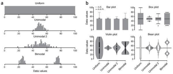
(a) Hypothetical sample data sets of 100 data points each that are uniform, unimodal with one of two different variances or bimodal. Simple bar plot representations and statistical parameters may obscure such different data distributions. (b) Comparison of data visualization methods. Bar plots typically represent only the mean and s.d. or s.e.m. Box plots visualize the five-number summary of a data set (minimum, lower quartile, median, upper quartile and maximum). Violin and bean plots represent the actual distribution of the individual data sets.
Despite the obvious advantages of the box plot for simultaneous representation of data set and statistical parameters, this method is not in common use, in part because few available software tools allow the facile generation of box plots. For example, the standard spreadsheet tool Excel is unable to generate box plots. Here we describe an open-source application, called BoxPlotR, and an associated web portal that allow rapid generation of customized box plots. A user-defined data matrix is uploaded as a file or pasted directly into the application to generate a basic box plot with options for additional features. Sample size may be represented by the width of each box in proportion to the square root of the number of observations5. Whiskers may be defined according to the criteria of Spear1, Tukey2 or Altman3. The underlying data distribution may be visualized as a violin or bean plot or, alternatively, the actual data may be displayed as overlapping or nonoverlapping points. The 95% confidence interval that two medians are different may be illustrated as notches defined as ±(1.58 × IQR/√n) (ref. 5). There is also an op on to plot the sample means and their confidence intervals. More complex statistical comparisons may be required to ascertain significance according to the specific experimental design6. The output plots may be labeled; customized by color, dimensions and orientation; and exported as publication-quality .eps, .pdf or .svg files. To help ensure that generated plots are accurately described in publications, the application generates a description of the plot for incorporation into a figure legend.
The interactive web application is written in R (ref. 7) with the R packages shiny, beanplot4, vioplot, beeswarm and RColorBrewer, and it is hosted on a shiny server to allow for interactive data analysis. User data are held only temporarily and discarded as soon as the session terminates. BoxPlotR is available at http://boxplot.tyerslab.com/ and may be downloaded to run locally or as a virtual machine for VMware and VirtualBox.
Acknowledgments
This work was supported by the Wellcome Trust through a Senior Research Fellowship to J.R. (084229), a core grant to the Wellcome Trust Centre for Cell Biology (092076), a European Research Council grant (233457) to M.T., a Genome Québec International Recruitment Award to M.T. and a Canada Research Chair in Systems and Synthetic Biology to M.T.
Footnotes
Competing financial interests: The authors declare no competing financial interests.
Contributor Information
Michaela Spitzer, Wellcome Trust Centre for Cell Biology, School of Biological Sciences, University of Edinburgh, Edinburgh, UK.
Jan Wildenhain, Wellcome Trust Centre for Cell Biology, School of Biological Sciences, University of Edinburgh, Edinburgh, UK.
Juri Rappsilber, Wellcome Trust Centre for Cell Biology, School of Biological Sciences, University of Edinburgh, Edinburgh, UK; Department of Biotechnology, Technische Universität Berlin, Berlin, Germany.
Mike Tyers, Wellcome Trust Centre for Cell Biology, School of Biological Sciences, University of Edinburgh, Edinburgh, UK; Institute for Research in Immunology and Cancer, Department of Medicine, Université de Montréal, Montréal, Québec, Canada.
References
- 1.Spear ME. Charting Statistics. McGraw-Hill: 1952. [Google Scholar]
- 2.Tukey JW. Exploratory Data Analysis. Addison-Wesley: 1977. [Google Scholar]
- 3.Altman DG. Practical Statistics for Medical Research. Chapman and Hall; 1991. [Google Scholar]
- 4.Kampstra P. J. Stat. Softw. 2008;28:c01. [Google Scholar]
- 5.McGill R, Tukey JW, Larsen WA. Am. Stat. 1978;32:12–16. [Google Scholar]
- 6.Nieuwenhuis S, Forstmann BU, Wagenmakers EJ. Nat. Neurosci. 2011;14:1105–1107. doi: 10.1038/nn.2886. [DOI] [PubMed] [Google Scholar]
- 7.Ihaka R, Gentleman RJ. Comput. Graph. Stat. 1996;5:299–314. [Google Scholar]