

Abstract
In 1958, Edward L. Kaplan and Paul Meier collaborated to publish a seminal paper on how to deal with incomplete observations. Subsequently, the Kaplan-Meier curves and estimates of survival data have become a familiar way of dealing with differing survival times (times-to-event), especially when not all the subjects continue in the study. “Survival” times need not relate to actual survival with death being the event; the “event” may be any event of interest. Kaplan-Meier analyses are also used in non-medical disciplines.
The purpose of this paper is to explain how Kaplan-Meier curves are generated and analyzed. Throughout this article we will discuss Kaplan-Meier (K-M) estimates in the context of “survival” before the event of interest. Two small groups of hypothetical data are used as examples in order for the reader to clearly see how the process works. These examples also illustrate the crucially important point that comparative analysis depends upon the whole curve and not upon isolated points.
INTRODUCTION
In 1958, Edward L. Kaplan and Paul Meier collaborated to publish a seminal paper on how to deal with incomplete observations.1 Subsequently, the Kaplan-Meier curves and estimates of survival data have become a familiar way of dealing with differing survival times (times-to-event), especially when not all the subjects continue in the study. Examples of when times-to-events may be important end-point variables include cancer survival times, tympanostomy tube duration, onset times of hypocalcaemia following parathyroid resection, or duration of nasal congestion following septoplasty. As illustrated by these examples, “survival” times need not relate to actual survival with death being the event; the “event” may be any event of interest. Kaplan-Meier analyses are also used in non-medical disciplines.
The purpose of this paper is to explain how Kaplan-Meier curves are generated and analyzed. Throughout this article we will discuss Kaplan-Meier (K-M) estimates in the context of “survival” before the event of interest. Two small groups of hypothetical data are used as examples in order for the reader to clearly see how the process works. These examples also illustrate the crucially important point that comparative analysis depends upon the whole curve and not upon isolated points.
IMPORTANT GENERAL CONCEPTS
Time-to-event is a clinical course duration variable for each subject having a beginning and an end anywhere along the time line of the complete study. For example, it may begin when the subject is enrolled into a study or when treatment begins, and ends when the end-point (event of interest) is reached or the subject is censored from the study (more on this later). This duration is known as serial time, describing the clinical-course time, in contrast to calendar (also known as secular) time. Calendar time refers to the way we usually think of time and the way clinical trials are designed. [FIGURE 1]. In most clinical trials, individual subjects may enter or begin the study (zero time) and reach end-point at vastly differing points along the trial calendar.[FIGURE 2]
FIGURE 1.
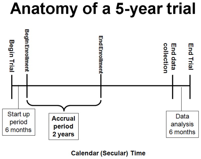
This figure illustrates the component parts of a clinical trial. Each trial may differ; however, all require a start up period, and end of accrual, and an end to the trial.
FIGURE 2.
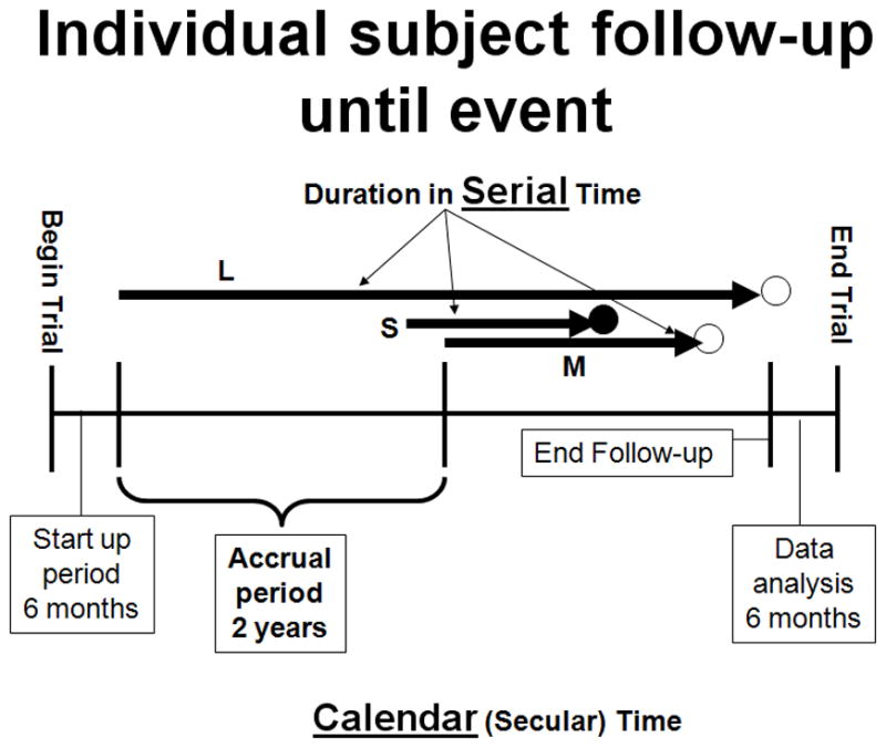
This figure illustrates subjects entering a trial and ending at different times. S, M, and L indicate a short, medium, and long serial times. The solid circle represents an event occurrence and the open circles represent censoring.
In preparing Kaplan-Meier survival analysis, each subject is characterized by three variables: 1) their serial time, 2) their status at the end of their serial time (event occurrence or censored), and 3) the study group they are in. These components may be displayed in a table. [TABLE I A] For the construction of survival time probabilities and curves, the serial times for individual subjects are arranged from the shortest to the longest, without regard to when they entered the study. By this maneuver, all subjects within the group begin the analysis at the same point and all are surviving until something happens to one of them. The two things that can happen are: 1) a subject can have the event of interest or 2) they are censored.
TABLE I A.
INITIAL SORTED TABLE FOR KAPLAN-MEIER ANALYSIS
| SUBJECT | SERIAL TIME (years) | STATUS AT SERIAL TIME (1=event; 0=censored) | Group (1 or 2) |
|---|---|---|---|
| B | 1 | 1 | 1 |
| E | 2 | 1 | 1 |
| F | 3 | 1 | 1 |
| A | 4 | 1 | 1 |
| D | 4.5 | 1 | 1 |
| C | 5 | 0 | 1 |
| U | 0.5 | 1 | 2 |
| Z | 0.75 | 1 | 2 |
| W | 1 | 1 | 2 |
| V | 1.5 | 0 | 2 |
| X | 2 | 1 | 2 |
| Y | 3.5 | 1 | 2 |
Censoring means the total survival time for that subject cannot be accurately determined. This can happen when something negative for the study occurs, such as the subject drops out, is lost to follow-up, or required data is not available or, conversely, something good happens, such as the study ends before the subject had the event of interest occur, i.e., they survived at least until the end of the study, but there is no knowledge of what happened thereafter. Thus censoring can occur within the study or terminally at the end. Note in figure 2, censoring has occurred within the study (M) and terminally (L). This only makes sense if one remembers that it is the duration of known survival that is being measured. If a subject survives to the end of the study without an event, his/her total survival is not known; it is not appropriate to consider his/her time interval as an indicator of the survival time.2,3 For example, if subject #1 has an event of interest at two years and subject #2 has only been in the study for one year before the study ends, it is not appropriate to say that subject #2 has a survival of one year. Subject #2 could have died 20 years later or 20 hours later. It helps to understand this further if we remember that clinically we may get information on our patients indefinitely; however, research is expensive, has a beginning and an end, and is formally closed when the study is complete (figuratively the lights go off, the telephones are not answered, and files are stored, and everyone goes to another job).
The serial time duration of known survival is terminated by the event of interest; this is known as an interval in Kaplan-Meier analysis and is graphed as a horizontal line (more on this later). In other words, only event occurrences define known survival time intervals. Censored subjects are indicated on the Kaplan-Meier curve as tick marks; these do not terminate the interval.
PREPARATION FOR KAPLAN-MEIER ANALYSIS
Raw data is stored using actual calendar dates and times. During analysis, serial times may be automatically calculated and these used in curve construction and analysis.
The first step in preparation for Kaplan-Meier analysis involves the construction of a table using an Excel spreadsheet or Word document table (Microsoft, Redmond, WA) containing the three key elements required for input. These are: 1) serial time, 2) status at serial time (1=event of interest; 0=censored), and 3) study group (group 1 or 2 etc). The table is then sorted by ascending serial times beginning with the shortest times for each group. [TABLE I A] Notice that each group has one censored subject. In Group 1 the subject made it to the end of the trial and was terminally censored; in Group 2 the subject was censored within an interval within the study time line.
Once this initial table is constructed, Kaplan-Meier analysis using a statistical program, such as SPSS (SPSS, Chicago, IL), SigmaPlot (Systat Software, Inc, San Jose, CA) or OriginPro (Origin Lab Corp., Northampton, MA) is simple. Because any long duration times may dominate means, medians and non-parametric tools are preferred in analysis. To illustrate how this all works, we prepared a small hypothetical, five-year trial of six subjects in each of two groups. Death was used as the event-of-interest. Table IA was prepared for statistical program analysis and pasted into the SigmPlot program to generate the data table shown in table I B [TABLE I B] and the survival curves shown in figure 3. [FIGURE 3] The tick marks for censored subjects are shown as black dots in this illustration. One member of Group 1 survived until the end of the study; in contrast, there were no remaining subjects in Group 2 after 3.5 years. The mean survival time for Group 1 was 3.25 years and the median survival was 3 years; Group 2 had a mean survival time of 1.75 years and a median of 1 year. These are obviously greatly different; however, the log rank test of the two curves showed them not to be significantly different (P=0.08). In addition to illustrating the Kaplan-Meier analysis with small enough numbers to be able to follow the method, these hypothetical data illustrate the important point that the Kaplan-Meier method’s “…main focus is on the entire curve of mortality rather than on the traditional clinical concern with rates at fixed periodic intervals.” 3
TABLE I B.
SIGMAPLOT KAPLAN-MEIER RESULTS
| GROUP 1 | |||
|---|---|---|---|
| Event Time (years) | No. of Events | No. at Risk | Probability |
| 1 | 1 | 6 | 0.833 |
| 2 | 1 | 5 | 0.667 |
| 3 | 1 | 4 | 0.500 |
| 4 | 1 | 3 | 0.333 |
| 4.5 | 1 | 2 | 0.167 |
| Mean | 95% CI lower limit | 95% CI upper limit | |
| 3.250 | 1.991 | 4.509 | |
| Median | |||
| 3.000 | 0.600 | 5.400 | |
| GROUP 2 | |||
| Event Time (years) | No. of Events | No. at Risk | Probability |
| 0.5 | 1 | 6 | 0.833 |
| 0.75 | 1 | 5 | 0.667 |
| 1 | 1 | 4 | 0.500 |
| 2 | 1 | 2 | 0.250 |
| 3.5 | 1 | 1 | 0.000 |
| Mean | 95% CI lower limit | 95% CI upper limit | |
| 1.750 | 0.675 | 2.825 | |
| Median | |||
| 1.0 | −0.200 | 2.200 |
FIGURE 3.
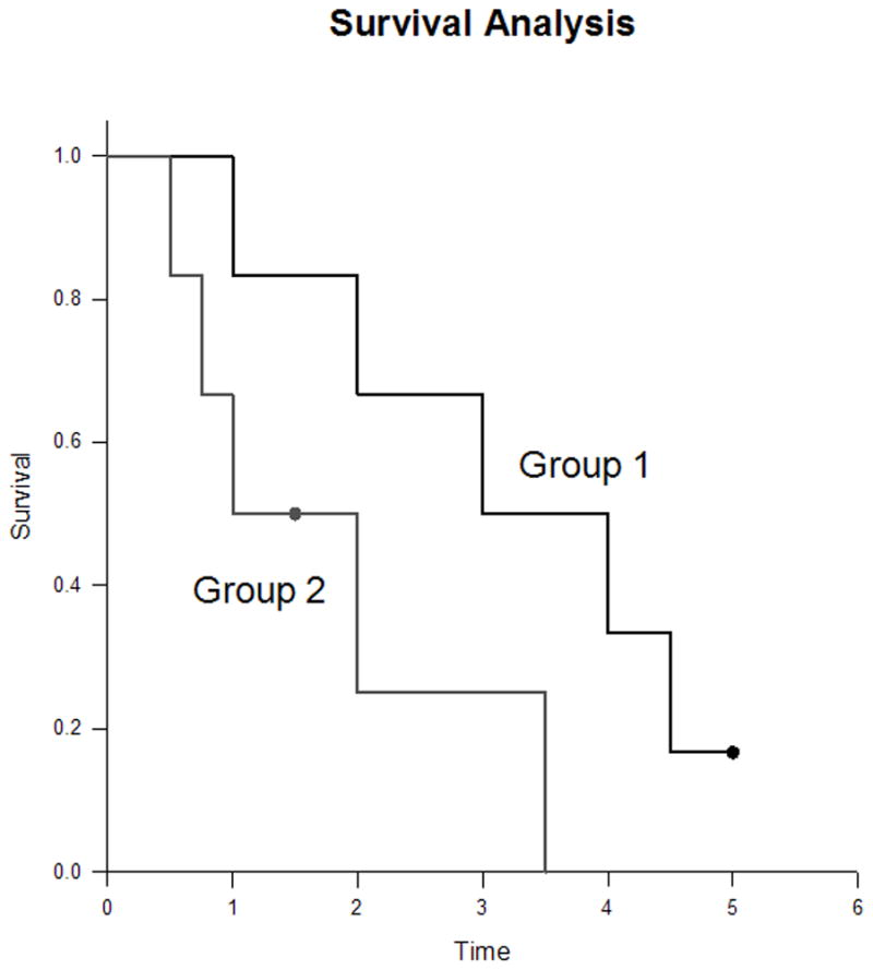
This is a Kaplan-Meier curve generated by SigmaPlot (SigmaPlot 11.0 for Windows, Systat Software Inc., San Jose, CA) from the data used as an example in Tables IA, B, C. Censoring is indicated by the black dot tic mark.
UNDERSTANDING KAPLAN-MEIER (K-M) ANALYSIS
The K-M curve
First, let’s look at the Kaplan-Meier curve in Figure 3. The lengths of the horizontal lines along the X-axis of serial times represent the survival duration for that interval. The interval is terminated by the occurrence of the event of interest. The vertical lines are just for cosmesis; they make the curve more pleasing to observe.3 However, the vertical distances between horizontals are important because they illustrate the change in cumulative probability as the curve advances. The non-continuous nature of the Kaplan-Meier curve emphasizes that they are not smooth functions, but rather step-wise estimates; thus, calculating a point survival can be difficult. The following is an example of a rough estimate of point survival; The cumulative probability of surviving a given time is seen on the Y-axis. For example, if you are in Group 1, your probability of surviving 11 months is 100%; conversely, if you are in Group 2, your probability of surviving the same time is slightly more than 66.7%. It is obvious that the steepness of the curve is determined by the survival durations (length of horizontal lines).
Now let’s look at the censored subjects. The one censored subject in Group 2 materially reduced the cumulative survival between intervals (more on how this works later). The terminally censored subject in Group 1 did not change the survival probability and the interval was not terminated by an event; it graphically tell us that the survival was at least this long. It also serves to caution us that we must be careful in interpreting anything beyond this point, knowing that all subjects might have died 20 hours later; hence, extrapolation is unjustified..
Data and calculations behind the curve
A more detailed look at what happens in the production of the Kaplan-Meier curve is seen in table I C. [TABLE I C] When cross referencing Table I C with Figure 3, it becomes apparent that intervals (horizontal lines in the K-M curve) and the attendant probabilities are only constructed for events of interest and not for censored subjects. Because an event ends one interval and begins another interval, there should be more intervals than events; in other words, there is one event between two intervals. It is easier to see this connection by looking at the verticals or the ends of the intervals (or corners joining horizontal with vertical). Thus, in Group 1 and in Group 2, there are five events (vertical connection between end of one interval and beginning of the next) demarcating six intervals (horizontals); note again there is no vertical change associated with the censored subjects. It is also obvious that the interval durations are variable; being able to deal with varying interval durations is a particular strength of the Kaplan-Meier method. The table helps explain the way the curves end. In Group 1, the curve ends without creating another interval below. The cumulative probability of surviving this long is determined by the last horizontal, sixth interval, and is 0.167. In Group 2, the curve drops to zero after the fifth interval to cause the sixth interval horizontal to be on the X-axis.
TABLE I C.
FULL ACCOUNTING OF DATA
| Subject | Serial Time (years) Serial time of event, = “event time”) | Interval (ending at event occurrence) | Number “surviving” AT RISK IN THE INTERVAL (defines the Denominator for the interval) | EVENT (defines end of interval) | CENSORED (removed from “surviving” IN the interval) | Number “surviving” AFTER EVENT (defines the Numerator) | CALC: Interval “survival” rate AFTER EVENT | Interval “survival” rate AFTER EVENT | CALC: Cumulative “survival” rate | Cumulative “survival” rate |
|---|---|---|---|---|---|---|---|---|---|---|
| Group 1 | 0 | 1 | 1.000 | |||||||
| B | 1 | 2 | 6 | 1 | 0 | 5 | 5/6 | 0.833 | 1.000*0.833 | 0.833 |
| E | 2 | 3 | 5 | 1 | 0 | 4 | 4/5 | 0.800 | 0.833*0.800 | 0.667 |
| F | 3 | 4 | 4 | 1 | 0 | 3 | 3/4 | 0.750 | 0.667*0.750 | 0.500 |
| A | 4 | 5 | 3 | 1 | 0 | 2 | 2/3 | 0.667 | 0.500*0.667 | 0.333 |
| D | 4.5 | 6 | 2 | 1 | 0 | 1 | 1/2 | 0.500 | 0.333*0.500 | 0.167 |
| C | 5 | 0 | 1 | |||||||
| Group 2 | 0 | 1 | 1.000 | |||||||
| U | 0.5 | 2 | 6 | 1 | 0 | 5 | 5/6 | 0.833 | 1.000*0.833 | 0.833 |
| Z | 0.75 | 3 | 5 | 1 | 0 | 4 | 4/5 | 0.800 | 0.833*0.800 | 0.667 |
| W | 1 | 4 | 4 | 1 | 0 | 3 | 3/4 | 0.750 | 0.667*0.750 | 0.500 |
| V | 1.5 | 0 | 1 | |||||||
| X | 2 | 5 | 2 | 1 | 0 | 1 | 1/2 | 0.500 | 0.500*0.500 | 0.25 |
| Y | 3.5 | 6 | 1 | 1 | 0 | 0 | 0/1 | 0 | 0.25*0 | 0 |
CALC = CALCULATION
Now let’s look at the probabilities of “survival”. The two different probabilities can be a little confusing. There is a cumulative probability and an interval probability. The cumulative probability defines the probability at the beginning and throughout the interval. This is graphed on the Y-axis of the curve. The interval survival rate (or probability) defines the probability of surviving past the interval, i.e. still surviving after the interval and beginning the next. The first intervals characteristically begin at zero time and end just prior to the first event. For example in Group 1, interval one begins at zero time with 6 subjects having a cumulative survival rate of 6/6 or 1.0. At serial time 1 year an event occurred leaving five surviving the interval to go on to interval two; thus, the probability of surviving up to year 1 is 6/6 and the probability of surviving past 1 year is 5/6 = 0.833. Cumulative probabilities for an interval are calculated by multiplying the interval survival rates up to that interval. For example, the chances of survival begin in interval one as 6/6, then are 5/6 in interval two, and 4/5 for interval three giving a cumulative survival rate (probability) in interval three of 6/6 × 5/6 × 4/5 = 0.667. The next thing to note is that the Y-axis in the curve only relates to the cumulative probability of the interval but does not tell us how many subjects were in the numerator or the denominator for each interval.
Censoring has an effect on the survival rates. Censored observations that coincide with an event are usually considered to fall immediately after the event. Censoring removes the subject from the denominator, i.e., individuals still at risk. For example, in Group 2, there were three surviving interval four and available to be at risk in interval five. However, during interval four one was censored; therefore, only two were left to be at risk in interval five, i.e. as seen in table II the denominator went from four in interval four to two in interval five.
COMPARISON OF KAPLAN-MEIER ESTIMATES
As tempting as it is to look at a series of time points, to properly compare the two curves requires analysis techniques that consider the “…entire curve of mortality…” 3. Comparing survival curves is of particular interest in clinical trials. While it is simple to visualize the difference between two survival curves, the difference must be quantified in order to assess statistical significance. Plotting confidence intervals can be useful in visualizing the differences. The mathematical computations for these analyses are beyond the scope of this article, but will be presented in their generalities.
The log rank test is the most common method. The log rank test calculates the chi-square (X2) for each event time for each group and sums the results. The summed results for each group are added to derive the ultimate chi-square to compare the full curves of each group. The log rank rest for the data in our example was P = 0.80; thus the two curves are not statistically significantly different. This is likely because such small numbers in the sample do not have the power to rule out a real difference and avoid a type two error (false negative). For a thorough description of this process the reader is referred to Douglas G. Altman’s text, Practical Statistics for Medical Research. 2
Another method of comparing K-M curves is using the hazard ratio, which gives a relative event rate in the groups. Again the same cumulative process of calculating the chi-square for each event time and summing the results, giving the final observed and expected numbers for the full K-M curve as performed in the log rank test; thus, the hazard ratio refers to the results of the full curves. 2 Statistical programs make these calculations within seconds; however, it is helpful to understand what they are doing.
DIFFERENT KAPLAN-MEIER CURVES USED IN CANCER LITERATURE
Some studies may use a combination of different types of survival curves to express their data. The main difference between the curves is what is defined as the event or end-point. In overall survival curves, the event of interest is death from any cause. This provides a very broad, general sense of the mortality of the groups. In disease free survival curves, the event of interest is relapse of a disease rather than death. Because patients may have relapsed but not yet died, disease free survival curves are lower than overall survival curves. Progression free survival uses progression of a disease as an end-point (i.e. tumor growth or spread). This is useful in isolating and assessing the effects of a particular treatment on a disease. Disease specific survival curves (also known as cause specific survival) utilize death from the disease of interest as the endpoint. This curve can be misleading in that it will always be higher than overall survival and disease free survival curves because events are limited only to death from a specific disease, i.e. patients that have disease relapse or die from non-related causes are not included as events. In addition, death caused by disease related factors (i.e. treatments) may not be included in disease-specific survival curves.
CONSIDERATIONS AND PITFALLS OF KAPLAN-MEIER CURVES
When analyzing a Kaplan-Meier survival curve, one must first identify what is the event of interest and the units of measurement along the axes. Next the shape of the curve is important to evaluate. Curves that have many small steps usually have a higher number of participating subjects, whereas curves with large steps usually have a limited number of subjects and are thus not as accurate.
The amount of censored subjects and the distribution of censored subjects is also important. If there is a large number of censored subjects one must question how the study was carried out or if the treatment was ineffective resulting in subjects leaving the study to pursue different therapies. A curve that does not demonstrate censored patients should be interpreted with caution.
As mentioned above, X2 from the log-rank test will suggest whether two curves are statistically different. The Cox proportional hazards will show the increased rate of having an event in one curve versus the other.
Survival at different time points can also be obtained and compared between curves. Studies will often include 2- or 5-year survival percentages for the survival curves within the text. If both curves pass through the 50 percentile mark, the median survivals for each curve can be quickly compared. This is done by drawing a vertical line from where the curve crosses the 50% down to the time axis.
Most clinical trials have a minimum follow-up time, at which point the status of each patient is known. The survival rate at this point becomes the most accurate reflection of the survival rate of the group. Survivor function at the far right of a Kaplan-Meier survival curve should be interpreted cautiously, since there are fewer patients remaining in the study group and the survival estimates are not as accurate.
For example, in a study looking at the survival of patients receiving treatment for stage I lung cancer, the median follow-up was 40 months. 4 However, 1 of the 302 patients had a follow-up at 10 years, and so a survival rate of 92% (95% confidence interval (CI), 88% to 95%) at 10 years was presented based on this one patient. Ninety-two percent at 10 years appears to be a very good estimated survival rate. However, with such a small subset of patients at this time point, the Kaplan-Meier estimates can be misleading and should be interpreted with caution. Carter et al. 5 pointed out that if this remaining patient had an event the following month, the survival probability would dramatically drop to 0% using the Kaplan-Meier calculations, with the CI 0% to 0%. Thus the estimations of survival from Kaplan-Meier analyses are most accurate at the time point when most patients are still present in the study. In this example, the median follow-up of the study was 40 months, and so the quoted survival rate of 92% (95% CI, 88% to 95%) is a better representation of the 4- or 5-year survival rate than the 10-year rate.5 This type of error can be avoided if authors include of patients at risk (remaining subjects in the study) for each interval.
It should also be remembered that after the first patient is censored the survival curve becomes an estimate, since we do not know if censored patients would have experienced an event at some point later in their life. Thus, the more patients that are censored in a study (especially early in the study), the less reliable is the survival curve. Likewise, it is helpful to know why patients were censored. If many patients were censored in a given group(s), one must question how the study was carried out or how the type of treatment affected the patients. This stresses the importance of showing censored patients as tick marks in survival curves.
CONCLUSION
We have described the basics of Kaplan-Meier survival curves by using two very small comparison groups as examples so that the details of construction and analysis could be easily seen. Despite what appeared to be a great different between the two very small groups, the log rank test showed the two curves were not significantly different (P=0.08). These hypothetical data illustrate a crucially important point: the Kaplan-Meier method’s “…main focus is on the entire curve of mortality rather than on the traditional clinical concern with rates at fixed periodic intervals. 3 Looking at the ends of the curves or points within them may easily miss the real message.
Acknowledgments
The authors wish to acknowledge the support of Kathryn Trinkaus, Ph.D. of the Biostatistics Core, Siteman Comprehensive Cancer Center, and NCI Cancer Center Support Grant P30 CA091842.
References
- 1.Kaplan EL, Meier P. Nonparametric estimation from incomplete observations. Journal of the American Statistical Association. 1958;53:457–81. [Google Scholar]
- 2.Altman DG. Practical statistics for medical research. New York: Chapman & Hall/CRC; 1991. pp. 365–396. [Google Scholar]
- 3.Feinstein AR. The architecture of clinical research. Philadelphia: W. B. Saunders Co; 1985. Clinical Epidemilogy; pp. 226–227.pp. 335pp. 343–346. [Google Scholar]
- 4.Henschke CI, Yankelevitz DF, Libby DM, et al. Survival of patients with stage I lung cancer detected on CT screening. NEJM. 2006;355:1763–71. doi: 10.1056/NEJMoa060476. [DOI] [PubMed] [Google Scholar]
- 5.Carter RE, Huang P. Cautionary note regarding the use of CIs obtained from Kaplan-Meier survival curves. J Clin Oncol. 2009;27:174–75. doi: 10.1200/JCO.2008.18.8011. [DOI] [PubMed] [Google Scholar]