Abstract
A visual analysis approach and the developed supporting technology provide a comprehensive solution for analyzing large and complex integrated genomic and biomedical data. This paper presents a methodology that is implemented as an interactive visual analysis technology for extracting knowledge from complex genetic and clinical data and then visualizing it in a meaningful and interpretable way. By synergizing the domain knowledge into development and analysis processes, we have developed a comprehensive tool that supports a seamless patient-to-patient analysis, from an overview of the patient population in the similarity space to the detailed views of genes. The system consists of multiple components enabling the complete analysis process, including data mining, interactive visualization, analytical views, and gene comparison. We demonstrate our approach with medical scientists on a case study of childhood cancer patients on how they use the tool to confirm existing hypotheses and to discover new scientific insights.
Keywords: data display, genomic visualization, interactive visualization, precursor cell lymphoblastic leukemia-lymphoma, visual analytics, visualization
Introduction
Among cancers, acute lymphoblastic leukemia (ALL) is the most common cancer occurring in children and is the driving paradigm for the work presented in this paper. Despite presenting with similar clinical features, ALL patients do not always respond in a similar manner to the same treatment strategies. The underlying complexities of the disease are not always clearly reflected by the clinical presentation or pathological results. Genomic variation, typified by single-nucleotide polymorphisms (SNPs), have considerable influence on how humans develop diseases and respond to pathogens, chemicals, drugs, vaccines, and other agents [1]. Similarly, gene expression patterns in diagnostic bone marrow can predict the sub-type of pediatric ALL as well as indicate relapse potential [2, 3]. The co-regulated activity of genes leads to metabolic actions that are driven by small changes in the expression of a large number of genes rather than large changes in only a few [2]. As a result, understanding genomic data and biomedical data (e.g., annotated clinical attributes, treatment details, domain ontologies, and patient's background) is crucial to improving the diagnosis and treatment of ALL.
As a rule, the knowledge discovery process involves the dialog between experts from different domains, including laboratory scientists, biostatisticians, computational biologists, and clinicians. In reality, most techniques were developed based on statistical analysis with simple visualization [4] in an attempt to create techniques that would be applicable in several domains. Basic statistics and visualizations without effective interaction and capabilities to control the visual data mining process are often insufficient for the analysis and exploration processes.
Intelligent visualization of complex genomic data will therefore bring the insight of information as well as the discovery of relationships, non-trivial structures, and irregularities that may pertain to the disease course of the patient. Genomic datasets are complex data structures with measurements for millions of SNPs affecting the activity of several thousand genes. These genomic 'attributes' are built into models that inform us about individual patients and allow cross-referencing and determining the interconnections between patients. It is important then to provide adequate tools in order to visualize these models and interactions and to simultaneously examine many attributes in the context of relevant clinical properties that can be measured in real time for the purpose of assessing a patient's clinical course and directing his clinical management.
Fundamentally, a large number of attributes need to be reduced to a manageable size so that data visualization techniques can be effectively applied. Typical dimensionality reduction methods applied to microarray data include principle component analysis [5], non-negative matrix factorization [6], multidimensional scaling [7], and local linear embedding [8]. The choice of method to apply depends to some extent on the nature of the information expected to be encoded in the dataset, since the quality of the resulting reduced matrices can vary across different datasets. Remarkably, most of the visualization techniques use matrix heatmaps, genomic coordinates, or networks (or pathways metaphor) to represent multidimensional genomic data [9,10,11].
- Heatmaps are common graphical representations that are used to present genomics values as matrices of colors. Matrix heatmaps are typically represented as rectangles (such as cBio Cancer Genomics Portal [12] and Caleydo StratomeX [13]) and occasionally as circles (such as CircleMap [14]).
- Genomic Coordinates represent oncogenomics data by showing alterations tied to their genomic loci. This approach is only suitable for analyzing the genomic topography of alternations or for inspecting particular genomic loci [9]. Typical techniques in this approach are Genomics Viewer [15], UCSC Cancer Denomics Browser [16], and Savant Genome Browser [17].
- Networks (or graphs) can be used to show changes in state for 1) interpreting and exploring large biological networks and 2) assembly and curation of pathways (such as Cytoscape [18], VANTED [19], VisANT [20], NAViGaTOR [21], and Cerebral [22]).
Visualization techniques for gene expression techniques that include reasonably advanced visualizations are presented in [23,24,25]. Other good visualization tools show the interdependencies of genes by bringing gene expression into context with pathways [26] or using dimension reduction methods to provide multi-dimensional data visualizations [27]. Web-based visual analysis integrates multiple visualization components, such as scatterplot, phylogenetic tree, and genome-wide circus viewer, to enable the analysis [28]. Although these tools provide somewhat effective ways for the analysis of data, they do not effectively present the data such that medical analysts can interactively explore and manipulate the information. Our approach seeks to provide a capability for viewing patients in the similarity space based on detailed genomic and gene of interest analysis, representing the underlying biological basis for the disease.
This paper presents a novel visual analysis approach and a tool where medical scientists can interrogate large and complex genomic and biological data. We focus on patient-to-patient comparisons through the biological data, including background and treatment, and high-dimensional genomic data, including Affymetrix expression microarrays and Illumina SNP microarrays. The innovation lies in its capability of providing seamless and multiple views of data, from overview of the entire patient population with the similarity space to overviews, detailed views, and genes of interest (GOI) views of selected items, for patient-to-patient comparison. The technology provides various ways to display the multi-dimensional data in cooperation with the automated analysis. In addition, by integrating domain knowledge into the development, we have provided meaningful visualization for medical data analysis as well as a quality assurance tool to verify the effectiveness of the automated analysis.
Methods
Biological background and data analysis
The expression and genomic SNP profiles of 100 pediatric B-cell ALL patients treated at The Children's Hospital at Westmead were generated using Affymetrix expression microarrays (U133A, U133A 2.0, and U133 Plus 2.0) and Illumina NS12 SNP microarrays, respectively. Each Affymetrix expression microarray has 22,277 attributes, while each Illumina SNP microarray has 13,917 attributes. Each attribute was mapped to a probe of DNA (or a gene), and the value for each attribute corresponded to the expression levels or genotype for the gene (each DNA spot contains picomoles (1012 moles) of a specific DNA sequence, known as probes or reporters). The annotations for each gene were mapped on separate files. Expression microarrays were hybridized with diagnostic bone marrow samples and genomic microarrays were hybridized with remission peripheral blood samples. The patients were treated following the Berlin-Frankfurt-Munich 95 (BFM95) protocol or the complimentary Australian and New Zealand Children's Hematology and Oncology Group Study VIII (Study 8).
Using these datasets, we aimed to develop a predictive model of treatment outcome by identifying genes capable of differentiating patients that survived and those that did not. To achieve this, we applied an attribute deletion approach: identifying and removing genes that were almost certainly not involved in a biological phenomenon and patient comparison. We used the attribute importance ranking that was implemented in 'Random forest' [29] to identify these genes. The remaining informative genes were then used to build a similarity space whereby the distances between patients in this space were indicative of genetic similarity.
The expression values were z-score-normalized within each platform, concatenated, and z-score-normalized to minimize inter- and intra-platform biases. For the genomic SNP profiles, the theta scores were used to represent genotypes. The two datasets were then concatenated, and 30% of all the patients were withheld from the model-building process as a validation set. Eight bootstraps of the validation set's patients were generated, and for each bootstrap, a random forest was performed. Each random forest produced an attribute ranking list, and we combined these eight lists to create a global list of an attribute's importance. The expression and SNP values for the top 250 genes in this global list were used to create a 3D similarity space using singular value decomposition-a matrix decomposition technique [30].
The visual analytics model
Our visual analytics model reflects the importance of the domain knowledge in the visual analytics process (see Fig. 1). Earlier, we mentioned the importance of validating a method by the outcomes in the discipline that the method is used. To do this, visual analytics must adapt to the respective discipline and conform to the language and norms expected of that discipline. For example, the expression of identified significant genes is required to be validated by the domain experts when the analysis is undertaken in independent laboratories.
Fig. 1.
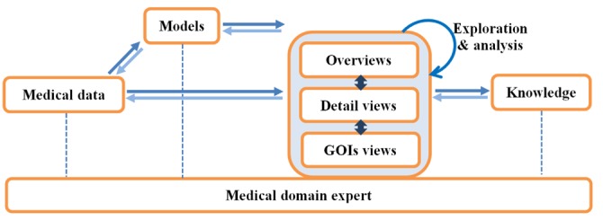
The visual analysis loop. Visual analytics model, reflecting the engagement of the domain knowledge in the visual analytics process. GOI, genes of interest.
An appropriate visualization helps the analyst to gain an understanding of the data and construct knowledge through our powerful human visual perception and reasoning capabilities. We provide three interactive views for patient-to-patient comparison, including 1) overviews of the entire patient population in the similarity space, 2) detailed views of selected patients, and 3) GOI. We describe these visualizations in the following sections. Domain analysts should be able to interact and explore through different views to make further discovery of, and insights into, the data. They can obtain a better understanding of the data and their structures and contribute their domain expertise to the knowledge discovery process. From the discovery of new knowledge, the analyst can evaluate, refine, go beyond, and ultimately confirm hypotheses built from previous iterations and automated analysis. The challenge presented to the construction of appropriate visualization is to cover the range of visualizing all of the data but making only all of the relevant data available to the analyst when it is relevant to do so.
The presented work was developed with strong involvement from cancer researchers at the Children's Hospital in Westmead, Sydney, Australia, who are experts in ALL research. The philosophy behind the work is that with this new way of looking at genetic and clinical details from the perspectives of both domain knowledge and technologies, visual analytics can provide a medium for the discovery of genetic and clinical problems, potentially leading to improved ALL treatment strategies.
Interactive visualization
The microarray automated data analysis produced a similarity space of the patients based on their genetic properties. A mapping table of 250 GOI is also created during this process. In order to present these results in a form suitable for visual analysis by medical experts, we have created interactive visualizations that operate with the treated data. The interactive visualization is applied to 1) present a flexible, changeable, and meaningful display of the patient cohort; 2) filter, explore, and manipulate the information; and 3) interactively provide the details of both the original and processed data on demand. Details of the interactive visualization components are presented as follows.
Overview of patients
The prototype version of the new interactive visualization system provides the set of views addressing the needs described above. The visualization provides a global overview of the entire cohort structure and the relative patient-to-patient comparisons but then allows the analyst to drill into the details of the relationships. Displaying the entire visual structure at once allows analysts to move rapidly to any location in the space. This makes less effort to navigate across the large structures and explore specific parts.
We utilized and extended our former works [31, 32] to provide a flexible, simple, yet powerful interface of the patient population in the similarity space. The visualization is capable of displaying both 2D and 3D visual projections of the same structure and switching between them from the same "area" in the dataset (see Figs. 2 and 3). Although each user might have a different preference, the 2D visualization is normally a better choice, thanks to its simplicity and familiarization to the analyst, its flexibility in interaction and attributed mapping, no obscuration, and perspective correction. The following sections are limited to the 2D version that was extended from TabuVis [31]. It is a robust and powerful visual analysis system that provides flexible, customizable, and effective visualization for multidimensional data. Our innovation lies in the ability to provide an easy-to-use yet effective way to view multidimensional data at different angles by mapping various attributes to different visual properties.
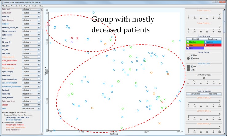
Fig. 2.
2D visualization of the entire patient sample. The entire 100 patients in the 2D similarity space with mapping attributes of 1) color → risk stratification (red, very high risk; orange, high risk; blue, medium risk; green, normal; and purple, unknown), 2) shape → gender (O, female; X, male), and 3) bar → status (top-bar, deceived; no-bar, survived). It shows that most of the deceased patients are located in the top-left area.
Fig. 3.
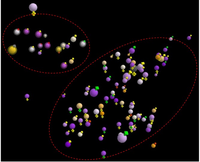
3D visualization of the entire patient sample. The entire 100 patients using the orange-purple color-blind friendly scheme using the same dataset as in Fig. 2. 1) Main colors (spheres) represent year of birth, 2) outer colors (signs) represent risk stratifications (red, very high risk; orange, high risk; yellow, medium risk; green, normal; and grey, unknown), and 3) status (bright outer-bound, deceived; no-out-bound, survived).
Key aspects for visually analyzing data with multiple attributes are quality and appropriateness of the analytical platform whose presentation can be adjusted via domain experts. The extended system consists of multiple components enabling the analysis process, including data processing, automatic marks, customizable visualization via interaction, control attributes, filtering, statistical display, save/open works, and many other figures.
The overview visualization supports several data types, including Integer, Float, Text (string), Boolean (true/false, yes/no, or 0/1), Date (with various format), Date and Time, and Percentage. The data types are categorized into two groups: Categorical (text and boolean) and Quantitative (integer, float, date, date and time, and percentage). We also map each data type to a color for better identification, particularly text → dark blue, boolean → blue, integer → red, float (and percentage) → orange, and date (and time) → purple. The color scheme can be easily modified via a property file and/or menus when running (see Fig. 2).
Patient's positions
The patient's positions are mapped into the 2D space according to his genetic property. This property reflects the genetic similarity of the patients. Two patients are close together if their genes are similar, and conversely, they are located far from each other if their genetic properties are different. For example, Fig. 2 clearly illustrates two distinctive groups of patients, marked by the dash-line ovals. The small group contains mostly deceased patients, while the other contains patients that responded well to the treatment and survived the disease. The fact that the deceased patients are located close to each other in the gene space may support the hypothesis that genetic properties are essential to determine whether a patient is likely to respond well in the context of the clinical treatment.
Interactive exploration
Mapping property
Rich graphical attributes are employed to provide clinical and background properties of the patients. The attributes are carefully selected based on the feedback from the medical analysts. The mapping property and items can be easily adjusted, filtered (or hidden), and/or re-mapped to different attributes (e.g., patient background and biomedical information) via interactive menus to suit the preferences and new requirements. The mapping options are label, axes, colors, size, shapes, and visual bars.
Filtering
From the visualization, users can interactively filter out uninteresting patients to enhance the view of the associated data. Filtering can be applied to all categorical and quantitative attributes through interactive menus. The filtering allows the researcher/clinician (domain expert) to extract, picture, and interrogate specific features for the patients selected within the similarity space.
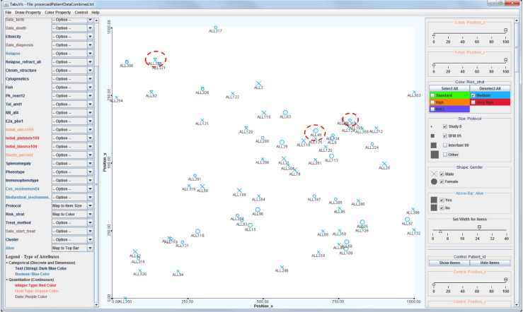
Fig. 4 illustrates the view at a navigational stage showing all medium-risk patients only. Patient identifications are also displayed in this example. The figure highlights three patients with similar clinical presentations, such as they were all stratified as medium risk (MR) (blue color), but having diverse outcomes. These patients were managed on the two treatment protocols BFM95 (larger size, ALL48) and Study 8 (smaller size, ALL134 and ALL323). With the patients placed into a similarity space based on genetic data, we have applied further computational methods to extract, visualize, and compare data from the chosen patients. By looking at the figure, we can quickly see that ALL323 is located at the top-left, while the other two patients are positioned closely together at a distance from the first patient. This observation indicates that the two surviving patients ALL48 and ALL134 are genetically similar and that they are genetically different from the deceased patient, ALL323.
Fig. 4.
Visualization at an exploration stage. Patients with medium risk who were treated with the Study 8 and BFM 95 protocols.
Probe set analysis
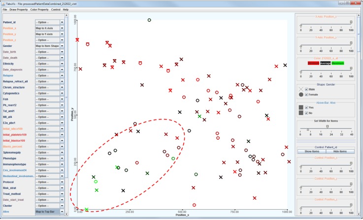
The system also provides a capability to show and compare the property of a particular probe set across the patient's population. This property allows the analysts to have a comparative view of how a probe set in a gene behaves across the population. Fig. 5 shows an example of the visualization of the population that is colored by the value of the probe set "212022_s_at" at the gene "MKI67." The figure clearly indicates the significant difference of patients in the bottom-left cluster, which are mostly painted with "greenish" colors, corresponding to the high values, in comparison to reddish colors, corresponding to low values. It raises a new hypothesis that the probe set "212022_s_at" (or the gene) might play an important role in specifying the similarity space.
Fig. 5.
Visualization showing the mapping by a probset. Probeset "212022_s_at" is applied to specify the colors across the population; green color corresponds to high values and red color corresponds to low values. It indicates clearly the significant difference of patients in the bottom-left cluster, who are mostly painted with "greenish" colors corresponding to the high values, in comparison to reddish colors corresponding to the low values.
Clustering
We provide a clustering method to group the patients in the similarity space. The clustering is used to enhance the visibility of patients in the space as the groups who are potentially sharing similar genomic properties. In addition, by using a filtering method, the analysts can quickly filter out unwanted clusters for clearer views of the population. We applied the k-means++ clustering algorithm [33] in the implementation. The algorithm was chosen because of its ability of choosing the initial values (or "seeds") for the popular k-means clustering algorithm and thus avoiding the sometimes poor clustering outcomes found by the standard k-means algorithm. The number of clusters can be specified via a menu. Fig. 6 shows an example of the visualization of the entire patient population who are painted with 4 colors corresponding to 4 clusters.
Fig. 6.
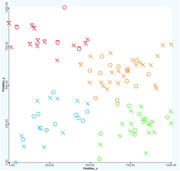
Visualization with clustering. Four groups of patients in the cohort corresponding to four colors (red, orange, green, and blue). The first group (red color) contains mostly deceased patients (with a bar on top).
Patient-to-patient visual analysis
From the overview of all patients, users can select one or more patients as well as groups of patients to analyze further. At first glance, the analytical view provides full information of both genomic and biological data. The layout of the panels is as follows: 1) the top-left panel displays information of the Affymetrix expression microarrays, 2) the top-right panel displays information of the Illumina SNPs, and 3) the middle table displays all background information of the patients, and the bottom table displays the treatment details (see Fig. 7). Each probe set in the gene is represented as a point on the x-y coordinate system. All genes are distributed orderly from top to bottom along the y-coordinate while their values are represented horizontally at the x-coordinate. This visual projection follows the biological rule-the order in which genes are displayed is sorted according to chromosomal order. A quick sort process is performed in prior to the visualization. By providing an overview of the entire genetic and biomedical information, the analysts can identify patterns and abnormalities before exploring further.
Fig. 7.
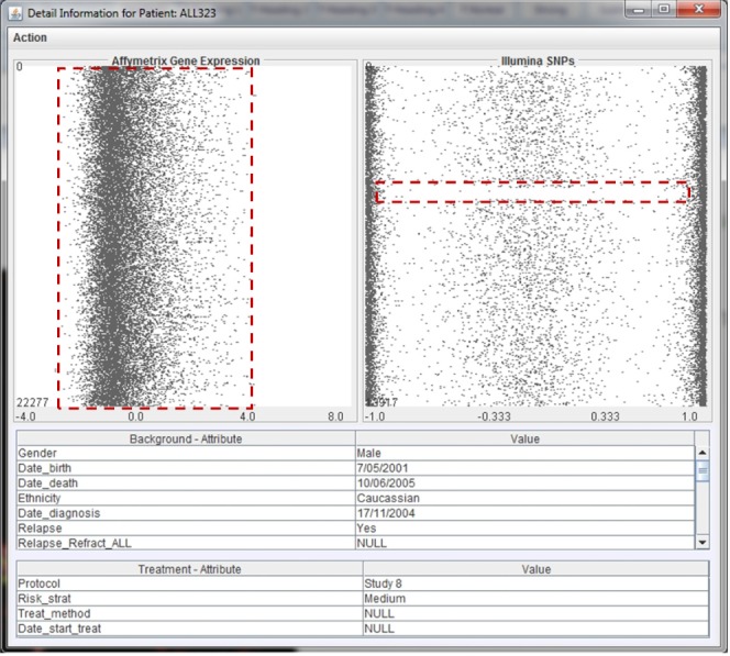
Detailed view of the genomic and biological data of a patient. Detailed view for patient ALL323. The top-left panel displays information of the Affymetrix expression microarrays; the top-right panel displays information of the Illumina SNPs; the middle table displays all background information of the patient; and the bottom table displays the treatment details. The view also highlights the pattern of the gene expression data and a gap in the single nucleotide polymorphism data.
Fig. 7 shows an example of the analytical window of the genetic and clinical data corresponding to patient ALL323. We can see that the Affymetrix expression microarray values of this person vary from -2 to 4, in which the majority of the genes' values are [-1, 0]. It is interesting to see that there is a region of loss of heterozygosity in ALL323 (highlighted by the red dash-line rectangle).
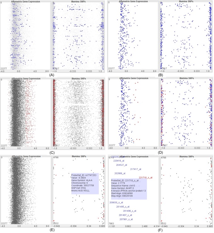
Following our revised model of the visual analytics process, the analytical exploration is an essential process to discover insight and knowledge. We provide a variety of functions to support the visual exploration and analysis, including highlighting the importance or difference, zooming, filtering, detailing on demand, and comparing multiple patients or groups of patients. A user can interactively highlight GOI and significantly different genes as well as deemphasize the others. This feature allows one to gain a better view of those GOI in comparison with the entire gene structure. The user can also select the option of displaying those GOI only. A semantic zooming technique is applied to zoom in (or zoom out) on any particular area of focus (see Fig. 8), which allows the analyst to explore and view in detail the genetic information. The level of details is updated dynamically depending on the amount of focused genes and the size of the windows. This property ensures the best fit of information on the available space. In addition, detailed information of a particular gene is shown when the mouse is over the gene (see Fig. 8E and 8F).
Fig. 8.
Visualization of a patient at various navigational stages and options. Views of patient ALL323 when the genes of interest are emphasized from the structure (A), the view shows the genes of interest only (B), the significantly different genes are highlighted (C), the significantly different genes are highlighted within the genes of interest (D), zoom in is applied to single-nucleotide polymorphism data (at the right-panel) (E), and further zoom is applied to gene expression data (at the left-panel) (F) so that detailed information of the probe sets in genes is displayed.
Fig. 8 shows an example of the visualization of patient ALL323 (same as Fig. 7) when various options and navigations are applied. In particular, the figure presents the views when a) the GOI are emphasized from the structure, b) the view shows the GOI only, c) the significantly different genes are highlighted, d) the significantly different genes are highlighted within the GOI, e) zoom in is applied to SNP data (at the right panel), and f) the user zooms in on the gene expression data (at the left panel) so that the detailed information of probe sets in the genes is displayed.
We also provide a mechanism to compare multiple patients by aligning the analytical windows together. This figure is particularly helpful for identifying the similarities, differences, regularities, and irregularities of the patients. Fig. 9 presents the view of genetic and clinical information of the 3 chosen patients (highlighted in Fig. 4). First, the complete data of each patient can be directly compared. By way of example, the figure indicates a significant difference of patient ALL323 when compared to the other two patients ALL48 and ALL134-in particular, a region of loss of heterozygosity in ALL323, a region that may contain the genetic differences with ALL134 and ALL48, which may explain the differences in treatment outcome despite being considered similar according to the clinical presentation. We now describe the technical details for visualization of the complete set of SNPs and probe sets for the genes represented by the 250 developed features.
Fig. 9.
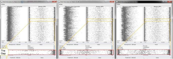
Comparison windows for patients. Comparison windows for three patients, namely ALL323, ALL48, and ALL134, respectively. The difference is highlighted in the yellow boxes in the single nucleotide polymorphism panel and the corresponding enlarged red boxes.
Visual analysis of GOI
The traditional methods usually use heatmaps to show all probe sets or genes in the datasets. Although this approach can show the overview, its visualizations are very dense. It makes it really difficult to analyze those important genes in detail from the crowded population. Our system innovatively focuses the interactive visualization of the GOI resulting from the automated analysis. By reducing the overhead of analyzing a large quantity of genes, the analysts can easily compare the GOI through a large population of patients.
The Gene Comparison Interactive Visualization is designed to allow an analyst to drill down further into the genetics and treatment data of patients identified as significant by the processes described in the previous sections. This visualization implements several mechanisms whereby the similarity and differences between patients and groups of patients can be examined in greater detail.
An important feature of this interactive visualization is the use of active regions to indicate what the analyst is currently focused on. Knowing this makes it possible to infer what extra information the analyst might find useful and to make sure that it is available. This interactive visualization consists of 5 separate visual components: A) the primary patient probe set heatmap component, B) the gene zoom component, C) the color gradient and Gaussian curve component, D) the gene ontology and probe set annotation component, and E) the patient biomedical data component (see Fig. 10).
Fig. 10.
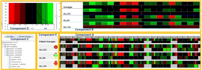
Genes of interests visual analysis for patients. There are 5 separate visual components the primary patient probeset heatmap component (component A), the gene zoom component (component B), the color gradient and Gaussian curve component (component C), the gene ontology and probeset annotation component (component D), and the patient biomedical data component (component E).
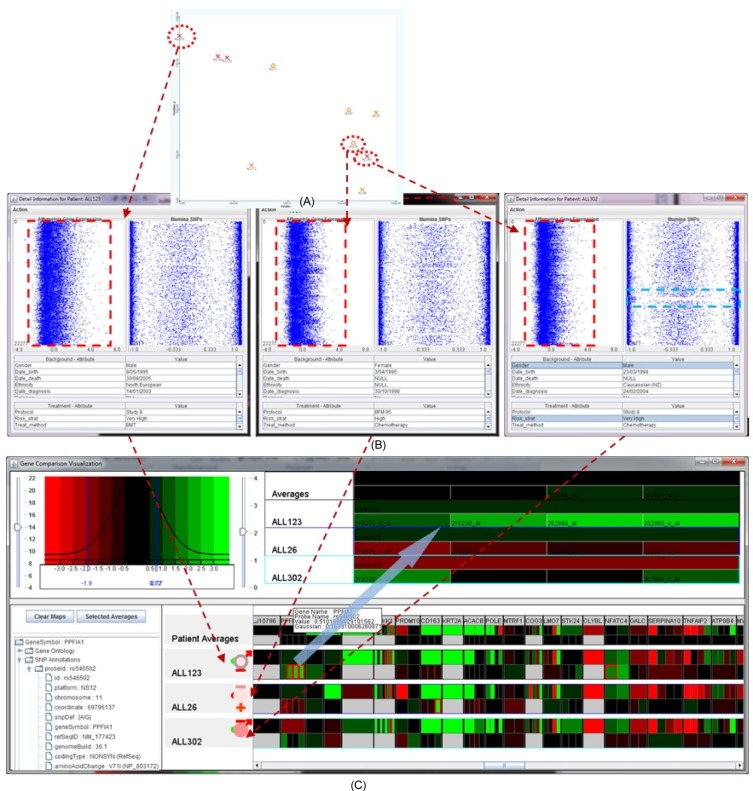
These 5 components are designed to interact with each other as well as other components, including the "Patient-to-Patient Visual Analysis" (described in section 6) and the main visualization (described in section 5) in several different ways to assist the analyst to examine the similarities and differences between significant patients and significant groups of patients. Fig. 11 presents an overview of the visualization of the entire Genes of Interest Visual Analysis module when the 3 patients highlighted in the similarity space are added. Please note that the figure shows both the probe set heatmap component and the patient information component.
Fig. 11.
A seamless analysis from overview to detailed view to genes of interest. Transition view from overview of three patients (ALL123, ALL26, and ALL302) in the similarity space (A) to patient-to-patient comparison view (B) and finally to the genes of interest view (C).
Results and Discussion
The prototype has been used for analyzing the biomedical and genomic datasets of 100 ALL cancer patients, from the perspectives of domain knowledge and technologies. In spite of the size limitation of the dataset due to the expensive data collection, the discovery is quite encouraging in the case of ALL patients. This pilot result will place a foundation, enabling further enhancement and discovery using more comprehensive datasets and/or clinical trials.
On the basis that patients who cluster together will have genotypically similar tumors, it is then anticipated that newly diagnosed and as yet untreated patients will be compared directly to local 'biologically' similar neighbors. By comparing the management and treatment outcomes for patients in this manner, the analyst (i.e., clinician) can glean specific information from the local neighbors that will assist with their clinical decision making for the individual patient, moving towards the 'personalization' of medicine. The analysis has partially confirmed this accuracy of the similarity space. To illustrate this, Fig. 11A highlights three patients with the red-dash ellipses, where the deceased patient ALL123 is at the top left and the surviving patients ALL26 and ALL302 are located close to each other at the near-bottom right. These patients have similar clinical presentations, such as all being stratified as high-risk, but diverse outcomes. Fig. 11B shows the detailed views of the biomedical and genomic data of the three selected patients, showing the significant difference in gene expression values of patient ALL123 in comparison with ALL26 and ALL302. This property may explain the differences in treatment outcome of the three patients despite the similar clinical presentation and treatment regimen. The interactive heatmap visualization of the expanded set of SNPs and gene expression probe sets used in the array platforms allows the analyst to examine each specific genetic attribute represented by the 250 features (Fig. 11C) that further confirm the hypothesis.
We also carried out an analysis for different groups of patients. The experiments also confirm the effectiveness of the similarity space. For example, the genetic analysis of four clusters of patients (see Fig. 5) has unveiled that all probe sets of the gene MKI67 of the patients in cluster 0 (at the bottom-left and painted with a light-pink color) are significantly different from the others (see Fig. 12). Further visualization with the probe set mapping across the patient's population has confirmed this property (see Fig. 5). Details of the other findings (and the confirmation of the prognoses) are described further as follows.
Fig. 12.

Genetic variation in the clusters of patients. All probe sets in gene MKI67 (highlighted) in group 0 (or cluster 0) are significantly different from the other groups.
There is little coherence between the genomic property and the biomedical property, such as risk, dead, or survival rate. Similar patients in terms of background and clinical information might have significant differences in their genetic properties. For example, Fig. 13 illustrates the details of several genes of interest for the four patients: ALL92, ALL129, ALL323, and ALL321. The patients' clinical properties are similar, including MR, male, deceased, and Study 8 protocol. However, the Affymetrix expression microarrays and Illumina SNPs values are quite varied among these patients.
Early treatments are more effective than late treatments (see Fig. 14). Particularly, there was only one death out of 19 cases (95% chance of survival from the disease) if the treatment was started within 5 years after birth. The dead case also happened to a very high-risk patient who was unlikely to survive because of the disease. If the treatment was started after 5 years but within 10 years from birth, the survival rate is 86% (3 deaths out of 22 cases), and if the treatment was used after 10 years from birth, the survival rate reduces significantly to 69% (4 deaths out of 13 cases).
Among the very high-risk patients ALL123, ALL143, ALL144, and ALL302 (top-left), patient ALL302 (near bottom-right) was the only survivor whose genetic property was significantly different from the others (at the top-left). Further examination using the 250 GOIs illustrated in Fig. 15 confirms this hypothesis for the expression values, especially for the genes ABHD10, LEPREL1, CNOT4, CHD9, EPOR, RASAL2, ZNF141, and SLC25A31. The variation at a particular gene or a combination of these genes might have contributed to the survival rate or an improvement in treatment. This finding can be verified by further analysis using larger and more comprehensive datasets and, ultimately, the actual proof of the clinical experiments.
Patients who were born in later years have a better chance of survival. For example, the rate of survival for those patients born after 1995 was approximately 94% while the rate for those patients born before 1995 was approximately 83%. This property reflects the improvement in treatment technology, treatment methodology, and living conditions.
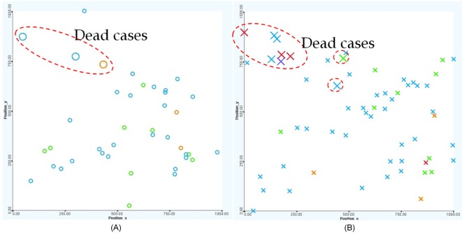
Female patients tend to fare better than male patients overall (see Fig. 16). There is a 92.5% chance of survival in females (3 dead cases out of 40) versus an 88.3% chance of survival in males (7 dead cases out of 60).
The Study 8 protocol is dominant. The BFM 95 protocol is mostly applied to standard- to medium-risk patients who were born before 2000. The Study 8 protocol is a much more popular method, and it was used for patients regardless of risk strategies and age. Fig. 17 shows the protocols used in ALL treatment, including Study 8 (green), BFM 95 (blue), Interfant 99 (orange), and others (red).
Chemotherapy is more effective in treatment. It is interesting that nearly one-half of all patients did not have any treatments (or there were no treatment records) on record. The untreated patients mostly have standard to MRs. The bone marrow transplant treatment method has little effect on the survival rate (only 1 out of 5 cases survived). The most commonly chosen treatment method is chemotherapy, the survival rate for which is over 90% (see Fig. 18).
Fig. 13.

Genetic variation in patients despite the similarity in biomedical data. Details of several genes of interest for the four patients: ALL92, ALL129, ALL321, and ALL323. The patients' clinical properties are similar, including medium risk, male, deceased, and Study 8 protocol. However, the Affymetrix expression microarrays and Illumina SNP values are quite varied among these patients.
Fig. 14.
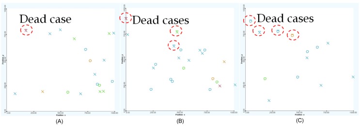
The survival rate by year of treatment: treatment within 5 years from birth (A), treatment after within 5 to 10 years from birth (B), and treatment after 10 years from birth (C), respectively. Early treatments are more effective than late treatments.
Fig. 15.

The genetic property of high-risk patients. For the very high-risk patients, the genetic property of patient ALL302 (the only survivor at the bottom-right) is significantly different from the others (at the top-left). Further examination using the 250 genes of interest confirms this hypothesis for the expression values, especially for the genes ABHD10, LEPREL1, CNOT4, CHD9, EPOR, RASAL2, ZNF141, and SLC25A31.
Fig. 16.
Views of patients who are females (A) and males (B), respectively. Female patients tend to fare better than male patients overall.
Fig. 17.
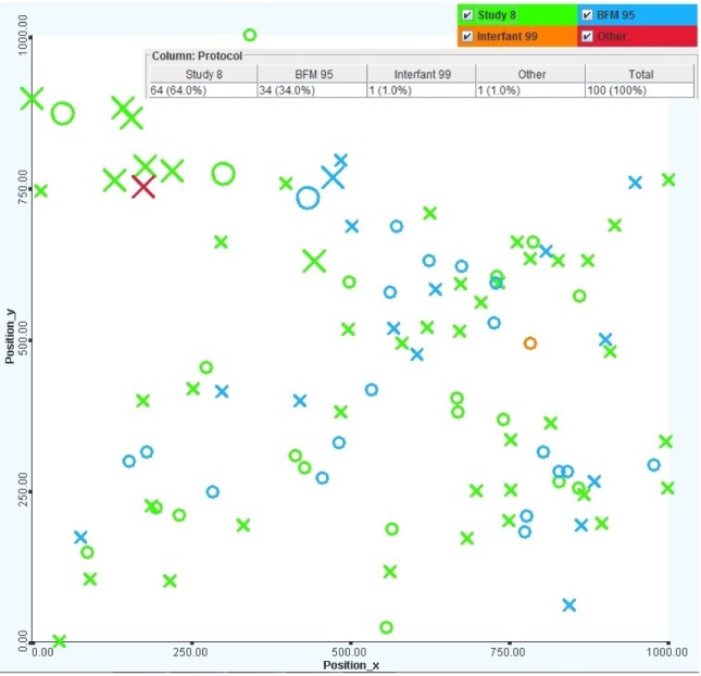
Views of patients with different protocols, including Study 8, BFM 95, Interfant 99, and others. The larger items represent deceased patients, and the colors represent the protocols, including Study 8 (green), BFM 95 (blue), Interfant 99 (orange), and others (red).
Fig. 18.
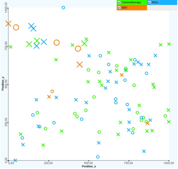
Views of patients with different treatment protocols, including chemotherapy and bone marrow transplant. Chemotherapy is more effective in treatment (green color). It is interesting that nearly one-half of all patients did not have any treatments (blue color). The untreated patients mostly had standard to medium risks.
References
- 1.Goronzy JJ, Matteson EL, Fulbright JW, Warrington KJ, Chang-Miller A, Hunder GG, et al. Prognostic markers of radiographic progression in early rheumatoid arthritis. Arthritis Rheum. 2004;50:43–54. doi: 10.1002/art.11445. [DOI] [PubMed] [Google Scholar]
- 2.Yeoh EJ, Ross ME, Shurtleff SA, Williams WK, Patel D, Mahfouz R, et al. Classification, subtype discovery, and prediction of outcome in pediatric acute lymphoblastic leukemia by gene expression profiling. Cancer Cell. 2002;1:133–143. doi: 10.1016/s1535-6108(02)00032-6. [DOI] [PubMed] [Google Scholar]
- 3.Flotho C, Coustan-Smith E, Pei D, Cheng C, Song G, Pui CH, et al. A set of genes that regulate cell proliferation predicts treatment outcome in childhood acute lymphoblastic leukemia. Blood. 2007;110:1271–1277. doi: 10.1182/blood-2007-01-068478. [DOI] [PMC free article] [PubMed] [Google Scholar]
- 4.McLachlan GJ, Wang K, Ng SK. Large-scale simultaneous inference with applications to the detection of differential expression with microarray data. Statistica. 2008;68:1–30. [Google Scholar]
- 5.Jolliffe IT. Principle Component Analysis? New York: Springer; 2002. [Google Scholar]
- 6.Ringnér M. What is principal component analysis. Nat Biotechnol. 2008;26:303–304. doi: 10.1038/nbt0308-303. [DOI] [PubMed] [Google Scholar]
- 7.Hao X, Sun B, Hu L, Lähdesmäki H, Dunmire V, Feng Y, et al. Differential gene and protein expression in primary breast malignancies and their lymph node metastases as revealed by combined cDNA microarray and tissue microarray analysis. Cancer. 2004;100:1110–1122. doi: 10.1002/cncr.20095. [DOI] [PubMed] [Google Scholar]
- 8.Chen Y, Meltzer PS, et al. Gene expression analysis via multidimensional scaling. Curr Protoc Bioinformatics. 2005;Chapter 7:Unit 7.11. doi: 10.1002/0471250953.bi0711s10. [DOI] [PubMed] [Google Scholar]
- 9.Schroeder MP, Gonzalez-Perez A, Lopez-Bigas N. Visualizing multidimensional cancer genomics data. Genome Med. 2013;5:9. doi: 10.1186/gm413. [DOI] [PMC free article] [PubMed] [Google Scholar]
- 10.Gehlenborg N, O'Donoghue SI, Baliga NS, Goesmann A, Hibbs MA, Kitano H, et al. Visualization of omics data for systems biology. Nat Methods. 2010;7(3 Suppl):S56–S68. doi: 10.1038/nmeth.1436. [DOI] [PubMed] [Google Scholar]
- 11.Procter JB, Thompson J, Letunic I, Creevey C, Jossinet F, Barton GJ. Visualization of multiple alignments, phylogenies and gene family evolution. Nat Methods. 2010;7(3 Suppl):S16–S25. doi: 10.1038/nmeth.1434. [DOI] [PubMed] [Google Scholar]
- 12.Cerami E, Gao J, Dogrusoz U, Gross BE, Sumer SO, Aksoy BA, et al. The cBio cancer genomics portal: an open platform for exploring multidimensional cancer genomics data. Cancer Discov. 2012;2:401–404. doi: 10.1158/2159-8290.CD-12-0095. [DOI] [PMC free article] [PubMed] [Google Scholar]
- 13.Lex A, Streit M, Schulz HJ, Partl C, Schmalstieg D, Park PJ, et al. StratomeX: visual analysis of large-scale heterogeneous genomics data for cancer subtype characterization. Comput Graph Forum. 2012;31:1175–1184. doi: 10.1111/j.1467-8659.2012.03110.x. [DOI] [PMC free article] [PubMed] [Google Scholar]
- 14.Vaske CJ, Benz SC, Sanborn JZ, Earl D, Szeto C, Zhu J, et al. Inference of patient-specific pathway activities from multi-dimensional cancer genomics data using PARADIGM. Bioinformatics. 2010;26:i237–i245. doi: 10.1093/bioinformatics/btq182. [DOI] [PMC free article] [PubMed] [Google Scholar]
- 15.Thorvaldsdóttir H, Robinson JT, Mesirov JP. Integrative Genomics Viewer (IGV): high-performance genomics data visualization and exploration. Brief Bioinform. 2013;14:178–192. doi: 10.1093/bib/bbs017. [DOI] [PMC free article] [PubMed] [Google Scholar]
- 16.Sanborn JZ, Benz SC, Craft B, Szeto C, Kober KM, Meyer L, et al. The UCSC Cancer Genomics Browser: update 2011. Nucleic Acids Res. 2011;39:D951–D959. doi: 10.1093/nar/gkq1113. [DOI] [PMC free article] [PubMed] [Google Scholar]
- 17.Fiume M, Smith EJ, Brook A, Strbenac D, Turner B, Mezlini AM, et al. Savant Genome Browser 2: visualization and analysis for population-scale genomics. Nucleic Acids Res. 2012;40:W615–W621. doi: 10.1093/nar/gks427. [DOI] [PMC free article] [PubMed] [Google Scholar]
- 18.Shannon P, Markiel A, Ozier O, Baliga NS, Wang JT, Ramage D, et al. Cytoscape: a software environment for integrated models of biomolecular interaction networks. Genome Res. 2003;13:2498–2504. doi: 10.1101/gr.1239303. [DOI] [PMC free article] [PubMed] [Google Scholar]
- 19.Junker BH, Klukas C, Schreiber F. VANTED: a system for advanced data analysis and visualization in the context of biological networks. BMC Bioinformatics. 2006;7:109. doi: 10.1186/1471-2105-7-109. [DOI] [PMC free article] [PubMed] [Google Scholar]
- 20.Hu Z, Hung JH, Wang Y, Chang YC, Huang CL, Huyck M, et al. VisANT 3.5: multi-scale network visualization, analysis and inference based on the gene ontology. Nucleic Acids Res. 2009;37:W115–W121. doi: 10.1093/nar/gkp406. [DOI] [PMC free article] [PubMed] [Google Scholar]
- 21.McGuffin MJ, Jurisica I. Interaction techniques for selecting and manipulating subgraphs in network visualizations. IEEE Trans Vis Comput Graph. 2009;15:937–944. doi: 10.1109/TVCG.2009.151. [DOI] [PubMed] [Google Scholar]
- 22.Barsky A, Munzner T, Gardy J, Kincaid R. Cerebral: visualizing multiple experimental conditions on a graph with biological context. IEEE Trans Vis Comput Graph. 2008;14:1253–1260. doi: 10.1109/TVCG.2008.117. [DOI] [PubMed] [Google Scholar]
- 23.Meyer M, Wong B, Styczynski M, Munzner T, Pfister H. Pathline: a tool For comparative functional genomics. Comput Graph Forum. 2010;29:1043–1052. [Google Scholar]
- 24.Venna J, Kaski S. Comparison of visualization methods for an atlas of gene expression data sets. Inf Vis. 2007;6:139–154. [Google Scholar]
- 25.Prasad TV, Ahson SI. Visualization of microarray gene expression data. Bioinformation. 2006;1:141–145. doi: 10.6026/97320630001141. [DOI] [PMC free article] [PubMed] [Google Scholar]
- 26.Lex A, Streit M, Kruijff E, Schmalstieg D. Caleydo: design and evaluation of a visual analysis framework for gene expression data in its biological context; Proceeding of the IEEE Symposium on Pacific Visualization (PacificVis '10); 2010 Mar 2-5; Taipei. pp. 57–64. [Google Scholar]
- 27.Cvek U, Trutschl M, Stone R, 2nd, Syed Z, Clifford JL, Sabichi AL. Multidimensional visualization tools for analysis of expression data. World Acad Sci Eng Technol. 2009;54:281–289. [Google Scholar]
- 28.Goecks J, Eberhard C, Too T, Galaxy Team. Nekrutenko A, Taylor J. Web-based visual analysis for high-throughput genomics. BMC Genomics. 2013;14:397. doi: 10.1186/1471-2164-14-397. [DOI] [PMC free article] [PubMed] [Google Scholar]
- 29.Breiman L. Radom forests. Mach Learn. 2001;45:5–32. [Google Scholar]
- 30.Golub GH, van Loan CF. Matrix Computations. Baltimore: Johns Hopkins University Press; 1996. [Google Scholar]
- 31.Nguyen QV, Qian Y, Huang ML, Zhang JW. TabuVis: a tool for visual analytics multidimensional datasets. Sci China Inf Sci. 2013;56:052105(12). [Google Scholar]
- 32.Nguyen QV, Gleeson A, Ho N, Huang ML, Simoff S, Catchpoole D. Visual analytics of clinical and genetic datasets of acute lymphoblastic leukaemia. Neural Inf Proces Lect Notes Comput Sci. 2011;7062:113–120. [Google Scholar]
- 33.Arthur D, Vassilvitskii S. K-means++: the advantages of careful seeding; SODA '07 Proceedings of the Eighteenth Annual ACM-SIAM Symposium on Discrete Algorithms; 2007 Jan 7-9; New Orleans. Philadelphia: Society for Mathematics; 2007. pp. 1027–1035. [Google Scholar]


