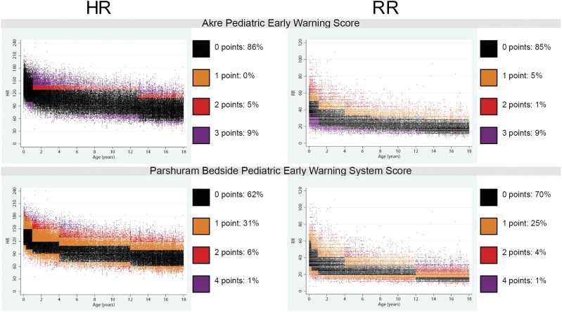
FIGURE 3.
Scatterplot array showing the distribution of HR and RR in the study sample in comparison with existing EWS point ranges. Each point on the scatterplot represents 1 vital sign observation. For each score, observations that would score 0 points are colored black, and observations that would score 1, 2, 3, or 4 points are colored according to each scatter plot’s legend. We found that 14% to 38% of HR observations and 15% to 30% of respiratory rate observations would have resulted in increased total EWSs.

