

Abstract
Objectives
This study assessed whether the 14 National Health Service (NHS) acute trusts reviewed by Sir Bruce Keogh in July 2013 were performance outliers on the Acute Trust Quality Dashboard (ATQD) and examined whether high mortality indices results are associated with increased numbers of quality risk alerts and alarms.
Design
The proportion of dashboard indicators rated amber or red in the Keogh Review trust group was compared with that for all trusts. Quality performance at primary care level was assessed for lead Clinical Commissioning Groups (CCG) of Keogh Review trusts through the national General Practice High Level Indicators.
Setting
England.
Participants
The study examined the performance of all acute NHS trusts in England and the performance of the lead CCGs for all acute NHS trusts included in the Keogh Review.
Main outcome measure
The primary outcome was the proportion of alerts and alarms identified in the summer 2013 ATQD.
Results
The mean proportion of indicators scored as alert or alarm across all trusts was 14.1% (13.5–14.7%). For Keogh Review trusts, the mean was 14.5% (12.6–16.4%). There was no significant difference between Keogh Review trusts and all acute trusts in numbers of alerts or alarms or for lead CCG quality performance.
Conclusion
This study finds no evidence to suggest the trusts reviewed by Sir Bruce Keogh in spring 2013 were outliers for overall quality of care as defined by the ATQD. The use of mortality indices alone to identify potential quality outliers in secondary care may not be sufficient.
Keywords: quality, monitoring, mortality, acute, dashboard
Introduction
Contemporary UK healthcare providers operate in an environment characterised by systematised scrutiny and target-based performance management. The current hegemony of central performance management of National Health Service (NHS) bodies dates back to the Thatcher Government of the 1980s. The Griffiths Report of 1983 recommended a system of general management in NHS hospitals and systematic performance monitoring of NHS hospitals be introduced in the hope that comparison between hospital units would drive managers to improve services.1 The 1980s and 1990s saw the introduction of outcome measurement as a key element of performance monitoring and these outcomes were viewed as the ‘ultimate measure of quality of care’.2 The White Paper ‘Equity and Excellence: Liberating the NHS’, which underpins the current organisation of the NHS, is explicit in setting a ‘relentless focus on clinical outcomes’ as the prime measurement of success.3
In July 2013, the Department of Health published a review by the National Medical Director for the NHS, Sir Bruce Keogh, into the quality of care provided by 14 acute NHS trusts in England.4 These trusts had been identified as having persistently high mortality rates; defined through being consistent statistical outliers for the previous two years on either the Hospital Standardised Mortality Ratio (HSMR) or the Summary Hospital-level Mortality Indicator (SHMI). Recent review (January 2014) identified six further instances of trusts being mortality ‘outliers’ using more recent data.5 The Francis Report into failings of care at NHS Mid Staffordshire NHS Foundation Trust6 had previously identified high mortality rates as being associated with other negative outcomes for clinical effectiveness, patient experience and safety. The Keogh Report found that ‘understanding mortality … is much more complex than studying a single hospital-level indicator’(4,p16) and that causes of high mortality are likely to be found in a combination of factors rather than in a single rogue surgeon or specialty.
The capability of hospital-wide mortality rates to identify avoidable deaths has been questioned elsewhere. In a retrospective case record review of 10 English acute hospitals, Hogan et al.7 found the proportion of preventable deaths to be much lower than previous estimates and concluded that hospital deaths may not be a good indicator of hospital quality. There are also methodological issues with hospital mortality as a quality measure. From the United States, Shahian et al.8 reported that when various methods to calculate hospital mortality were employed, they produced very different results. The authors question the utility of hospital deaths on their own as a quality measure.
In October 2013, the Care Quality Commission (CQC) announced the introduction of a new multi-factorial system of ‘intelligent monitoring’ of acute hospitals based on the analysis of more than 150 different performance indicators to inform prioritisation of inspection.9 The results of this monitoring have enabled the CQC to group trusts into six quality risk bandings, with Band 1 containing those at highest risk of negative quality outcomes and Band 6 trusts having the lowest risk.
Prior to this recent development, in 2012 the East Midlands Quality Observatory developed an Acute Trust Quality Dashboard (ATQD)10 in order to provide benchmarking information for trusts on a range of care quality indicators. The quality indicators use data from a wide variety of sources and use the most recent available data for each indicator. Appendix 1 provides a list of indicators included in the quality dashboard. Trust-specific reports are produced quarterly with results for each indicator presented in comparison to all other acute trusts with time trend analysis covering the previous seven quarters included. Statistical Process Control principles are used to indicate adverse and favourable variation from the mean for each indicator.9 The dashboards are currently produced and published by Methods Insight Analytics.11
The ATQD indicators are grouped into six domains in line with the NHS Outcomes Framework:
Preventing people from dying prematurely;
Enhancing quality of life for people with long-term conditions;
Helping people to recover from episodes of ill health or following injury;
Ensuring that people have a positive experience of care;
Treating and caring for people in a safe environment and protecting them from avoidable harm;
Organisational context.
The ATQD include both an overall SHMI measure and SHMI measures for eight specific conditions to measure mortality and these are included in Domain 1.
Further, primary care dashboards have been developed by NHS England12,13 to assess the performance of general practices through a set of General Practice High Level Indicators (GPHLIs). Performance can be reviewed at both individual practice level and Clinical Commissioning Group (CCG) level. We accessed this through the Primary Care Web Tool12 for approved users hosted by NHS England. Appendix 2 provides a list of available indicators.
This study aims to identify whether the 14 trusts reviewed by Professor Keogh are performance outliers on the ATQD and to examine whether high mortality indices results are associated with high numbers of alerts and alarms in the dashboard.
Method
The primary outcomes addressed in this study are the number and proportion of alerts and alarms identified in the Summer 2013 ATQD. Alerts are defined as any result showing an adverse difference of between 2 and 3 standard deviations from the mean (presented as amber results in the dashboard). Alarms are defined as any result showing an adverse difference of over 3 standard deviations from the mean (presented as red results). The number and proportion of green rated (favourable) results were also calculated for each domain.
The summer 2013 dashboard results for 130 acute NHS trusts in England were accessed from the Methods Insight Analytics website.11 This dashboard was selected so as to be coterminous with the period of Keogh Review, with the majority of indicators covering either January to March 2013 or being an annual figure for April 2012 to March 2013. Results were collated for each of the 92 indicators, where data were analysed on a quality judgement basis and where trusts had made data available for the dashboards. Data completeness for all trusts ranged from 94.6% to 100% for this specific set of indicators.
For each trust, indicator results were grouped into four categories: better than expected (green), as expected (grey), alert (amber) and alarm (red). The proportions of green, grey, amber and red results were calculated for each trust with trusts being ranked by proportion of amber and red results. These rankings were calculated both for the total dashboard indicator set and for specific dashboard domains. Results for Domain 2 (Enhancing quality of life for people with long-term conditions) were excluded from analysis as there were only three indicators against which quality judgements are made.
The proportion of all indicators rated amber or red in the Keogh Review trust group was compared with the proportion for all trusts with 95% confidence intervals calculated using to calculate the standard error of the proportions. The same process was conducted for red results only and for green results.
To assess primary care performance for the locality of each Keogh Review acute trust, lead CCGs were identified through the NHS Choices website.14 Review of the 2013 GPHLI results enabled calculation of the proportion of general practices with five or more adverse outlier results within each CCG. Outlier results were defined as being adverse scores of at least 2 standard deviations from the national mean.11,12 The results for this performance indicator were then compared for each Keogh Review trust CCG lead with the national mean.
Results
The results for the 130 acute trusts analysed through the ATQD for summer 2013 are shown in Figure 1. They are ranked by the proportion of amber or red indicators in that quarter's dashboard, with the highest proportion (and theoretically worst performing trusts) on the right hand side of the chart. Results for the 14 trusts reviewed by Sir Bruce Keogh are highlighted in the chart. The results show no clear association between inclusion in the Keogh review sample and negative comparative performance in the ATQD at the time of the Keogh review. Results for the Keogh Review trusts are distributed between the second and tenth tertiles for proportion of alerts and alarms. In every case, trusts achieved green rated results for at least seven of the 88 to 92 indicators where data were provided and rated.
Figure 1.
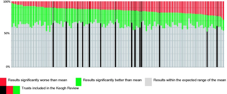
Ranked results for all acute trusts in England for the proportion of combined amber and red, and green rated results in the Summer 2013 Acute Trust Quality Dashboard.
Source: Acute Trust Quality Dashboards (Summer 2013), Methods Analytics.
Table 1 shows the proportion of red, amber/red and green indicator results for Keogh Review trusts in comparison to all acute trusts. For all acute trusts, the range of proportions of amber/red results was 3.3% to 28.3%. For Keogh Review trusts, the range was 9.9% to 22.2%.
Table 1.
Sum and proportion of red or amber or green results across all domains of the Acute Trust Quality Dashboard for Keogh Review trusts compared with all acute trusts in England, Summer 2013.
| Red results |
Red or amber results |
Green results |
||||
|---|---|---|---|---|---|---|
| Sum | Proportion (95% CI) | Sum | Proportion (95% CI) | Sum | Proportion (95% CI) | |
| Keogh Review trust indicators n = 1278 | 139 | 10.9% (9.2–12.6%) | 185 | 14.5% (12.6–16.4%) | 269 | 21.1% (18.9–23.3%) |
| All acute trust indicators n = 11,838 | 1213 | 10.3% (9.7–10.9%) | 1664 | 14.1% (13.5–14.7%) | 2635 | 22.3% (21.5–23.1%) |
Source: Acute Trust Quality Dashboards (Summer 2013), Methods Analytics.
The mean proportion of indicators scored either amber or red across all trusts was 14.1% (95% CI 13.5–14.7%). For the Keogh Review trusts, the mean proportion was 14.5% (95% CI 12.6–16.4%). There was no significant difference between Keogh Review trusts and all acute trusts in proportion of measures showing alert or alarm. When red ratings (indicating alarm) were analysed in isolation, there was likewise no statistically significant difference between the two groups, the proportions being 10.3% (95% CI 9.7–10.9%) for all acute trusts and 10.9% (95% CI 9.2–12.6%) for Keogh Review trusts.
Similarly, there is no significant difference in the proportion of green rated indicators scored for Keogh Review Trusts and that achieved by all acute trusts. For all acute trusts, the proportion of green results was 22.3% (95% CI 21.5–23.1%), whereas for the Keogh Review trusts, it was 21.1% (95% CI 18.9–23.3%).
Results for specific ATQD domains do show statistically significant differences between the two groups for proportions of adverse rated indicators (Table 2). The Keogh Review group had a significantly increased proportion of adverse scores in Domain 1 (Preventing people from dying prematurely), this being the domain that includes mortality indicators. However, the proportion of adverse scores in Domain 3 (Helping people to recover from episodes of ill health or following injury) in Keogh Review trusts (6.0%, 95% CI 3.6–8.4%) was significantly lower than that for all trusts combined (9.7%, 95% CI 8.7–10.7%). There was no statistically significant difference in any other dashboard domain.
Table 2.
Sum and proportion of red or amber or green results in specific domains of the Acute Trust Quality Dashboard for Keogh Review trusts compared with all acute trusts in England, Summer 2013.
| Red results |
Red or amber results |
Green results |
||||
|---|---|---|---|---|---|---|
| Sum | Proportion (95% CI) | Sum | Proportion (95% CI) | Sum | Proportion (95% CI) | |
| Domain 1 | ||||||
| Keogh Review trust indicators n = 209 | 23 | 11.0% (0–23.8%) | 30 | 14.4% (9.7–19.1%) | 18 | 8.6% (0–21.5%) |
| All acute trust indicators n = 1934 | 80 | 4.1% (1.9–8.5%) | 133 | 6.9% (5.7–8.1%) | 249 | 12.9% (8.7–17.0%) |
| Domain 2 | ||||||
| Data not included as there are only three indicators where quality judgement is made | ||||||
| Domain 3 | ||||||
| Keogh Review trust indicators n = 385 | 11 | 2.9% (0–12.7%) | 23 | 6.0% (3.6–8.4%) | 54 | 14.0% (4.8–23.2%) |
| All acute trust indicators n = 3498 | 197 | 5.6% (2.4–8.9%) | 340 | 9.7% (8.7–10.7%) | 472 | 13.5% (10.4–16.6%) |
| Domain 4 | ||||||
| Keogh Review trust indicators n = 246 | 19 | 7.7% (0–19.7%) | 20 | 8.8% (5.1–12.5%) | 66 | 26.8% (16.1–37.5%) |
| All acute trust indicators n = 2314 | 254 | 11.0% (7.1–14.8%) | 308 | 13.3% (11.9–14.7%) | 595 | 25.7% (22.2–29.2%) |
| Domain 5 | ||||||
| Keogh Review trust indicators n = 182 | 30 | 16.5% (3.2–29.8%) | 38 | 20.9% (8.0–33.8%) | 67 | 36.8% (25.3–48.3%) |
| All acute trust indicators n = 1695 | 240 | 14.2% (9.7–18.6%) | 327 | 19.3% (15.0–23.6%) | 599 | 35.3% (31.5–39.2%) |
| Domain 6 | ||||||
| Keogh Review trust indicators n = 217 | 55 | 25.3% (13.8–36.8%) | 64 | 29.5% (23.4–35.6%) | 62 | 28.6% (17.3–39.8%) |
| All acute trust indicators n = 2011 | 426 | 21.2% (17.3–25.1%) | 513 | 25.5% (23.5–27.5%) | 682 | 33.9% (30.4–37.5%) |
Source: Acute Trust Quality Dashboards (Summer 2013), Methods Analytics.
For primary care performance, there was no statistically significant difference between the lead CCGs for Keogh Review trusts and the national CCG mean for the proportion of general practices with five or more adverse outlier results in the 2013 GPHLI dashboards.11 The mean proportion of practices with five or more outlier quality scores was 4.6% (27 of 585) for Keogh Review trusts while the national mean was 6.6%.
Discussion
Statement of principal findings
When the clinical and organisational quality indicators included in the ATQD are analysed, the results suggest that adverse mortality results are not adequate markers of overall poor quality as defined in terms of the dashboard. Only two of the 14 Keogh Review trusts rank in the top quartile for proportion of indicators rated as alerts or alarms and six of the 14 have a proportion of favourably rated indicators above the median for all trusts.
Our analysis did not find any statistically significant differences between the Keogh Review group and the overall acute trust cohort for proportions of alert or alarm rated indicators for patient experience (Domain 4), safety (Domain 5) or workforce concerns (Domain 6).
There are numerous indicators of clinical and operational effectiveness distributed across multiple domains. As such, results for this key theme are more difficult to summarise within the ATQD. However, Domain 3 concentrates specifically on clinical and operational effectiveness, and it is noteworthy that the proportion of adverse scores was significantly lower in the Keogh Review trusts than the full trust cohort. The indicators contained in Domain 3 relate to emergency readmission, mean length of stay and patient reported outcome measures (PROMs). The results for these indicators suggest Keogh Review trusts were neither excessively risk averse nor premature in agreeing discharge dates for patients and patient reported outcomes were comparatively positive. Indeed, only one Keogh Review trust achieved an adverse score for a PROMs indicator. We are unable to identify a plausible reason for an association between a statistically significant favourable outcome for clinical and operational effectiveness and significantly adverse mortality beyond either chance or difference in data collection practices.
The results for primary care performance for the lead CCGs for Keogh Review trusts suggest that there is no significant difference in the quality of care provided at general practice level in the catchment areas for these trusts and that provided elsewhere. There was no preponderance of adverse outlier general practices in the Keogh Review trust localities, and this analysis provides no evidence of association between secondary care mortality indices and primary care quality as defined by this particular summary quality indicator.
The results of the CQC quality risk banding analysis published in October 2013 continue to show that 11 of the Keogh Review trusts are in Band 1 (indicating highest risk to care quality) with two more being in Band 2.9 However, this could be viewed as inevitable as one criterion for inclusion in Band 1 is a trust being subject to ‘special measures’, an outcome associated with inclusion in the Keogh Review.
Strengths and weaknesses of the study
This study provides comparison for all NHS acute trusts in England. Data completeness for the ATQD in the study period was high (94.6–100%), and sparklines provided in the ATQD suggest that the results for the period were not markedly different than for the quarters directly preceding the period.
However, our study has limitations that need to be borne in mind while interpreting the results. The authors could not identify whether the ATQD or the Primary Care Web Tool have been rigorously evaluated. However, these tools have been developed by the NHS and are in accepted use as an acute trust quality management tool. The measurement of primary care quality and its association with secondary care providers has always been difficult, and we have used available and accessible indicators for our analysis.
We adopted the value judgement of the ATQD developers in classifying an indicator as amber or red (i.e. an indicator of poor performance). However, the developers have not provided their rationale for this value judgement.
There is a possibility that some of the variables may be over dispersed and could diminish the impact of any association. However, it is very unlikely that this would systematically vary between the two groups of trusts included in our analysis.
We were interested in special cause variation, and as a red result is categorised as being outside 99.8% of the distribution, we have not undertaken detailed analysis of the range of deviation from the mean within red scores. This is methodologically complex and could hinder interpretation of the results.
Strengths and weaknesses in relation to other studies
To our knowledge, there have been no previous studies comparing mortality rates of a trust and overall quality as measured by the ATQD.
Meaning of the study
The Keogh Review examined the quality of care in trusts with persistently high mortality rates. As such, it identified trusts for inclusion through the use of two indicators covering one specific outcome area. The rationale for the request to Sir Bruce Keogh was that the Francis Report had found an association between high mortality rates and wider failings in care quality.
The Keogh review found that the interpretation of current aggregated hospital mortality indices (HSMR and SHMI) is complex. The fact that different sets of outlier trusts are identified when each indicator is used is a testament to this.4 Keogh notes that the CQC's development of its revised model for assessment should have broader inspection trigger mechanisms than mortality indices alone.4 While mortality is a key outcome indicator for all NHS trusts, clinician rated recovery outcomes, patient reported outcomes and patient experience outcomes can all be significant measures of success and failure.15
While there is a degree of overlap in the measures included in both the CQC banding calculations and the ATQD, the larger number of judgement enabled indicators (and the greater detail this brings) and the inclusion of assessment data from partner regulatory bodies may enable a more robust overall judgement to be made through the new CQC model. However, the allocation to Risk Band 1 of trusts subject to ‘special measures’ could be viewed as problematic when the primary criterion for inclusion in exceptional review is outlier status for mortality rate. There is a risk of negative performance for specific indicators (such as mortality indices) being double-counted in the overall analysis when including ‘special measures’ status in the summary risk assessment.
Unanswered questions and further research
This study used a proxy measure for the quality of primary care in patients prior to admission to the Keogh Review trusts. However, the majority of acute hospitals provide care to patients from more than one CCG and patients may not seek primary health care prior to secondary care admission. A more detailed analysis of primary and community care delivered to patients of the Keogh Review trusts in comparison to all other NHS acute trusts could be beneficial.
Conclusion
This study finds no evidence to suggest that the trusts reviewed by Sir Bruce Keogh in spring 2013 were outliers for overall quality of care as defined by the ATQD. While we agree that mortality is an important outcome indicator for care quality, the use of mortality indices in isolation as a means to identify potential quality outliers in secondary care may not be adequate. The Keogh Review identified serious quality concerns in each of the trusts and yet there is no discernible trend towards adverse results for these organisations in the ATQD. This study highlights the difficulties of trying to measure and monitor hospital quality using a small number of indicators and our limitations in surveillance of poorly performing hospitals. Any current or future quality monitoring systems in the NHS need to consider the methodology and include the breadth of coverage of Sir Bruce Keogh's review.
Appendix 1. Quality indicators included in the Acute Trust Quality Dashboard as at Summer 201311
| 1. Preventing people from dying prematurely | |
| PD02 | Age/Sex standardised hospital mortality from conditions amenable to healthcare |
| PD03 | Age/Sex standardised in hospital mortality in low-risk HRGs |
| PD04 | Crude in hospital perinatal mortality per 1000 births (including still births) |
| PD06 | Summary Hospital-level Mortality Indicator (SHMI) – Emergency & Elective |
| PD09 | SHMI – Stroke (sub-group 66) |
| PD10 | SHMI – COPD (sub-group 75) |
| PD11 | SHMI – MI (sub-group 57) |
| PD12 | SHMI – #NOF (group 120) |
| PD13 | SHMI – Pneumonia (sub-group 73) |
| PD14 | SHMI – CHF (sub-group 65) |
| PD15 | SHMI – Renal (sub-group 99) |
| PD16 | SHMI – Diabetes (sub-group 34 + 35) |
| PD25 | % of patients with a fractured neck of femur operated on within 48 hours |
| PD30 | Cancer waits – % waiting less than 31 days from decision to treat to first treatment |
| PD31 | Cancer waits – % waiting less than 62 days from GP referral to first treatment (HQU15) |
| 2. Enhancing quality of life for people with long-term conditions | |
| EQ01 | % emergency admissions for >65 years old with dementia |
| EQ02 | LOS (days) for patients >65 years old admitted in an emergency with dementia |
| EQ03 | LOS (days) for patients >65 years old admitted in an emergency |
| EQ04 | Ambulatory care sensitive conditions – % of emergency admissions for cellulitis and DVT (based on SQU04_01) |
| EQ05 | % of admissions with zero day LOS for emergency ambulatory care conditions |
| 3. Helping people to recover from episodes of ill health or following injury | |
| IH01 | Emergency readmission – % within 30 days following non-elective admission |
| IH02 | Emergency readmission – % within 30 days following elective admission |
| IH03 | Emergency readmission – % within 2 days following non-elective admission |
| IH04 | Emergency readmission – % within 2 days following elective admission |
| IH31 | Emergency readmission – % within 30 days following non-elective admission (same specialty) |
| IH32 | Emergency readmission – % within 30 days following elective admission (same specialty) |
| IH33 | Emergency readmission – % within 2 days following non-elective admission (same specialty) |
| IH34 | Emergency readmission – % within 2 days following elective admission (same specialty) |
| IH05 | Emergency readmission – % within 30 days following discharge – angina |
| IH35 | Mean length of stay (LOS) for patients admitted for angina |
| IH06 | Emergency readmission – % within 30 days following discharge – asthma |
| IH36 | Mean length of stay (LOS) for patients admitted for asthma |
| IH07 | Emergency readmission – % within 30 days following discharge – CCF |
| IH37 | Mean length of stay (LOS) for patients admitted for CCF |
| IH08 | Emergency readmission – % within 30 days following discharge – COPD |
| IH38 | Mean length of stay (LOS) for patients admitted for COPD |
| IH09 | Emergency readmission – % within 30 days following discharge – diabetes |
| IH39 | Mean length of stay (LOS) for patients admitted for diabetes |
| IH10 | Emergency readmission – % within 30 days following discharge – epilepsy |
| IH40 | Mean length of stay (LOS) for patients admitted for epilepsy |
| IH11 | Emergency readmission – % within 30 days following discharge – renal |
| IH41 | Mean length of stay (LOS) for patients admitted for renal |
| IH21 | % patients discharged to usual place of residence |
| IH22 | % of eligible patients taking part in PROMS (eligible FCEs) |
| IH23 | Patient Reported Outcome Measures – % Patients reporting an improvement following hip replacement |
| IH24 | Patient Reported Outcome Measures – % Patients reporting an improvement following knee replacement |
| IH25 | Patient Reported Outcome Measures – % Patients reporting an improvement following varicose vein procedure |
| IH26 | Patient Reported Outcome Measures – % Patients reporting an improvement following hernia procedure |
| 4. Ensuring that people have a positive experience of care | |
| PE00 | 95th Percentile wait for elective inpatient treatment (weeks) |
| PE01 | Median wait for elective inpatient treatment (weeks) |
| PE02 | Diagnostic Waits – % of patients waiting over 5 weeks |
| PE03 | Cancer waits – % seen within 14 days of GP referral to first out-patient appointment (HQU14) |
| PE23 | A&E – % of patients admitted, transferred or discharged within 4 hours of arrival |
| PE08 | A&E re-attendance – % within 7 days (HQU09) |
| PE10 | Median total time in minutes spent in A&E for admitted and non admitted patients (HQU10) |
| PE11 | A&E attendances – % of patients who leave without being seen (HQU11) |
| PE12 | A&E – Median Time to initial assessment for patients brought in via ambulance in minutes (HQU12) |
| PE13 | A&E – Median Time to treatment in minutes (HQU13) |
| PE14 | A&E – % Admissions with zero day LOS |
| PE15 | Mixed sex accommodation breach rate per 1000 FCEs (HQU08) |
| PE16 | On the day cancellations of elective surgery per 1000 procedures for non-clinical reasons |
| PE17 | Overall inpatient experience measure |
| PE18 | Overall outpatient experience measure |
| PE19 | Overall A&E experience measure |
| PE20 | Mother satisfaction measure |
| PE21 | Delayed Transfers of Care per 1000 occupied beds – NHS Responsibility |
| PE22 | Delayed Transfers of Care per 1000 occupied beds – Social Care Responsibility |
| 5. Treating and caring for people in a safe environment and protecting them from avoidable harm | |
| SC01 | Rate of patient safety incidents reported in trusts per 100 admissions |
| SC02 | Rate of ‘serious harm’ patient safety incidents reported in trusts per 100 admissions |
| SC03 | % of all admissions who have venous thromboembolism risk assessment (SQU01) |
| SC04 | Rate of surgical site infections per 10,000 specified orthopaedic operations |
| SC05 | HCAI – MRSA bacteraemia rate per 1,000,000 occupied beds (HQU01) |
| SC06 | HCAI – C. diff bacteria rate per 100,000 bed days (HQU02) |
| SC20 | HCAI – MSSA rate per 100,000 bed days |
| SC07 | Adult – BADS Daycase Rate (as per BADS V4 directory thresholds) |
| SC21 | Paediatric – BADS Daycase Rate (as per BADS V4 directory thresholds) |
| SC08 | % of planned day case procedures that are converted to inpatients on the day |
| SC09 | % of deliveries via Caesarean Section – elective |
| SC10 | % of deliveries via Caesarean Section – non-elective |
| SC12 | Emergency readmission – % babies within 30 days following delivery |
| SC17 | Medication errors per 1000 bed days |
| SC19 | Incidence of patients with pressure ulcers per 1000 admissions |
| 6. Organisational context | |
| OQ01 | Admitted Patient Care – % Valid data (average for all fields) |
| OQ02 | Out Patient – % Valid data (average for all fields) |
| OQ03 | Accident and Emergency – % Valid data (average for all fields) |
| OQ21 | Admitted Patient Care – % Records submitted with valid HRG on first submission |
| OQ04 | Elective – Depth of coding (mean number of secondary diagnosis) |
| OQ05 | Non-elective – Depth of coding (mean number of secondary diagnosis) |
| OQ06 | Rate of palliative care (ICD10: Z515) per 1000 episodes |
| OQ20 | Rate of palliative care (main specialty 315) per 1000 episodes |
| OQ18 | Rate of use of integrated palliative care pathway (ICD10: Z518) per 1000 episodes |
| OQ07 | Rate of written complaints per 1000 episodes |
| OQ08 | NHSLA Claims per 10,000 bed days |
| OQ09 | Workforce – FTE Nurses per bed day |
| OQ10 | Workforce – Sickness % – Medical |
| OQ11 | Workforce – Sickness % – Nurse |
| OQ12 | Workforce – Sickness % – Midwife |
| OQ13 | Workforce – Sickness % – Other |
| OQ14 | Staff recommendation of the trust as a place of work (CQC survey) |
| OQ15 | Staff recommendation of the trust as a place to receive treatment (CQC survey) |
| OQ16 | Overall medical trainees global satisfaction score (GMC survey) |
| OQ17 | Consultant clinical supervision trainers given to their trainees |
| OQ19 | % of A&E attendances which are ‘inappropriate’ (V08/VB11Z) |
Appendix 2. Indicators included in the General Practice High Level Indicator set (GPHLS)12
| Domain 1: Preventing people from dying prematurely |
| Cancer admissions |
| Two week wait |
| Diabetes BP monitoring |
| AF on anticoagulation |
| Cervical smears |
| Health checks for mental illness |
| Flu vaccination in over 65s |
| Flu vaccination in at risk patients |
| AF prevalence |
| CHD prevalence |
| COPD prevalence |
| Asthma prevalence |
| Diabetes prevalence |
| Domain 2: Enhancing quality of life for people with long-term conditions |
| AF prevalence |
| CHD prevalence |
| COPD prevalence |
| Asthma prevalence |
| Diabetes prevalence |
| Emergency admissions |
| A&E attendances |
| CHD admissions |
| Asthma admissions |
| Diabetes admissions |
| COPD admissions |
| Dementia admissions |
| Diabetes cholesterol monitoring |
| Diabetes HbA1C monitoring |
| CHD cholesterol monitoring |
| COPD diagnosis |
| Asthma diagnosis |
| Exception rate |
| Antidepressants |
| Insulin prescribing |
| Ezetimibe prescribing |
| Domain 3: Helping people to recover from illness or following injury |
| AF on anticoagulation |
| Flu vaccination in at risk patients |
| Emergency admissions |
| A&E attendances |
| ACS admissions |
| Diabetes renal screening |
| Antibacterial prescribing |
| Domain 4: Ensuring people have a positive experience of care |
| Patient experience |
| Getting through by phone |
| Making an appointment |
| Domain 5: Treating and caring for people in a safe environment |
| Cancer admissions |
| Cephalosporins and quinolones |
| Hypnotics prescribing |
| NSAIDS prescribing |
Declarations
Competing interests
None declared
Funding
None declared
Ethical approval
As this research is based on publicly accessible information, this did not require ethical approval.
Guarantor
PB
Contributorship
Conception, design, analysis and interpretation for this study were provided by ID and PB. SA provided further analysis and interpretation. All the authors contributed to the writing of the paper and uploaded the final manuscript.
Acknowledgements
The authors would like to thank the reviewer for his helpful comments and suggestions. They are also grateful to Professor Nick Wareham (University of Cambridge), and Tessa Lindfield (Director of Public Health, Suffolk) for their help and support.
Provenance
Not commissioned; peer-reviewed by Julian Flowers.
References
- 1. Rivett G. Chapter 4, 1978–1987 – Clinical Advance and Financial Crisis. In: National Health Service History, 2013. See http://www.nhshistory.net/chapter_4.htm (last checked 22 May 2014)
- 2. Lilford R, Mohammed M, Spiegelhalter D, Thomson R. Use and misuse of process and outcome data in managing performance of acute medical care: avoiding institutional stigma. Lancet 2004; 363: 1147–1154 [DOI] [PubMed] [Google Scholar]
- 3. Department of Health. Equity and Excellence: Liberating the NHS. London: The Stationery Office Limited, 2010. See https://www.gov.uk/government/uploads/system/uploads/attachment_data/file/213823/dh_117794.pdf (last checked 22 May 2014)
- 4. Keogh B. Review Into the Quality of Care and Treatment Provided by 14 Hospital Trusts in England: Overview Report. UK: NHS England, 2013. See http://www.nhs.uk/NHSEngland/bruce-keogh-review/Documents/outcomes/keogh-review-final-report.pdf (last checked 22 May 2014)
- 5. Hawkes N. Six hospitals are named as “outliers” for mortality rates. BMJ 2014; 348: 1252. [DOI] [PubMed] [Google Scholar]
- 6. Mid Staffordshire NHS Foundation Trust Public Inquiry. Report of the Mid Staffordshire NHS Foundation Trust Public Inquiry. London: The Stationery Office Limited, 2013. See http://www.midstaffspublicinquiry.com/sites/default/files/report/Executive%20summary.pdf (last checked 22 May 2014)
- 7. Hogan H, Healey F, Neale G, Thomson R, Vincent C, Black N. Preventable deaths due to problems in care in English acute hospitals: a retrospective case record review study. BMJ Qual Saf 2012; 21: 737–745 [DOI] [PMC free article] [PubMed] [Google Scholar]
- 8. Shahian D, Wolf R, Iezzoni L, Kirle L, Normand S-L. Variability in the measurement of hospital-wide mortality rates. New Engl J Med 2010; 363: 2530–2539 [DOI] [PubMed] [Google Scholar]
- 9. Care Quality Commission. Hospital Intelligent Monitoring. London: Care Quality Commission, 2013. See http://www.cqc.org.uk/public/hospital-intelligent-monitoring (last checked 22 May 2014)
- 10. East Midlands Quality Observatory. Acute Trust Quality Dashboard. UK: Quality Intelligence East, 2013. See http://www.qie.eoe.nhs.uk/qualityprofiles/qpindex.aspx (last checked 29 May 2014)
- 11. Methods Analytics. Acute Trust Quality Dashboards. UK: Methods Group, 2013. See http://analytics.methods.co.uk/atqd/ (last checked 22 May 2014)
- 12. NHS England. Primary Care Web Tool. General Practice Higher Level Indicators 2012–13. UK: NHS, 2013. See https://www.primarycare.nhs.uk/ (last checked 22 May 2014)
- 13. NHS England. Primary Care Web Tool. General Practice Outcome Standards. UK: NHS England, 2013. See https://www.primarycare.nhs.uk/
- 14. NHS Choices. NHS Authorities and Trusts. The NHS in England. UK: Department of Health, 2013. See http://www.nhs.uk/NHSEngland/thenhs/about/Pages/authoritiesandtrusts.aspx.
- 15. Gross P. Process versus outcome measures: the end of the debate. Medical Care 2012; 50: 200–202 [DOI] [PubMed] [Google Scholar]