

Abstract
Objectives. I compared US traffic fatality trends with those in 25 other countries.
Methods. I have introduced a new measure for comparing safety in different countries: traffic deaths in a specific year relative to largest annual number recorded. I used only data from the International Road Traffic Accident Database.
Results. The United States is a unique outlier. Fatalities in all 25 other countries declined further after reaching their maximum values. For example, the United States and the Netherlands both reached maximum values in 1972. From 1972 to 2011 US deaths declined by 41%, whereas those in the Netherlands declined by 81%. If US fatalities had declined by 81% there would have been 22 000 fewer US road deaths in 2011. If the United States matched percentage declines of 6 additional countries, US deaths would have declined by more than 20 000.
Conclusions. If US traffic deaths had declined by the same percentage as in any 1 of 7 other countries, more than 20 000 fewer Americans would have been killed in 2011.
Harm from road traffic crashes is arguably the largest public health problem facing the United States.1 Annually, more than 30 000 Americans are killed on our roads.2 That is more than 90 deaths per day. (Also, there are more than 3000 injuries per day.) Large though these numbers are, they reflect inadequately the harm from traffic crashes. Unlike victims of diseases, those killed in traffic are overwhelmingly young and, absent their crash, could have looked forward to a life of normal longevity in normal health. The victims include more than 500 children younger than 7 years killed annually, which surely should be more than adequate to terminate any discussion that the victims are all responsible for their fate. Additionally, many die in the womb.3–5
Three reasons help explain why harm from traffic is not recognized as the massive public health problem it is:
The word “accident”6–9 conveys a sense of inevitability, a belief that crashes are owing to fate and that nothing can be done. Perhaps this is what gives “accident” its most potent appeal—the sense that it exonerates participants and, more importantly, policymakers from responsibility. Although many safety professionals and publications10,11 no longer use this term, it is still in wide general use.
Harm in traffic is still not regarded in the United States as a component of public health to be addressed by public health countermeasures.12 Traffic safety has all too often been seen as an irritating appendage to transportation. Speed enforcement, a highly effective safety intervention13,14 if deployed properly, is often aimed more to raise revenue than to prevent deaths. There is no other aspect of public health that is viewed as a potential source of government revenue rather than a government duty to protect its citizens from being harmed by others.
Policymakers are often unaware that traffic safety has been studied as a science for more than 75 years. Insights in the 1938 article in the American Journal of Psychology titled “A theoretical field-analysis of automobile driving”15 are routinely ignored. An edifice of scientific understanding supported by a deep technical literature has blossomed since then.16–24 Despite this, all too many Americans, from adolescents to the highest ranking policymakers, think they are traffic safety experts because they drive. This is akin to thinking they are pulmonology experts because they breathe.
The launching pad for this research appears in my 2004 book Traffic Safety.1,25,26
I compared US traffic safety policy with that in 3 other countries—Great Britain,27 Canada,28 and Australia29—which were chosen because they have much in common with the United States in terms of language, culture, beliefs, and traditions, and because suitable data were available. I compared performance over the 23-year period 1979–2002, the latest data available when I performed the earlier research.
I chose 1979 as a reference year because in the late 1970s and early 1980s US traffic safety policies began to diverge from those in other countries. Comparing raw fatalities was 1 of 3 measures I examined.25 The others were fatalities per registered vehicle and fatalities for the same travel distance. In all cases the results of the comparisons were similar. US performance was so dramatically worse than that of the comparison countries that an additional more than 10 000 deaths per year were occurring on US roads in 2002 or, when summed over the period 1979–2002, an additional 200 000 American deaths.
One of the most common questions from Americans to these findings was “What is so special about the comparison countries that they do so enormously better than the United States?” One purpose of the research is to more definitively answer whether it is the United States or the comparison countries that are special.
Questions lingered regarding the earlier study. Perhaps the 3 comparison countries were exceptional at reducing fatalities. Perhaps the comparison countries simply did exceptionally well in the 1979–2002 period, but the United States would experience similar success later as progress in the comparison countries stagnated or faltered.
I have addressed 3 questions: (1) Do the conclusions derived from data through 2002 persist? (2) Are claims that the 3 comparison countries were not “special” validated by other countries? (3) Are even stronger conclusions now validated with even more clarity and confidence?
METHODS
I applied a better analysis method to compare US safety performance through 2011 with performance in 25 countries. My approach differs from that in many previous international comparisons30–32 in that I have introduced a new measure that uses only fatality data. This keeps the analysis largely assumption-free and also free from uncertainties in computing rates using additional data sets. For example, estimates of distance of travel are unavailable or unreliable for most countries.
The New Measure
The new measure is grounded on a characteristic of the evolution of fatalities in motorized countries. In the early days of motorization few traffic fatalities occurred because there were few vehicles. As motorization increased rapidly, so did the number of traffic deaths. In time the number of deaths declined in response to such factors as improved traffic law and the population maturing with respect to motorized traffic.21 Fatalities in some years accordingly reached a maximum number, FMax. We can therefore define
 |
Advantages of using the measure in Equation 1 include the following:
It depends only on fatalities. It requires no other data sets or comparison year, such as 1979.
It is dimensionless. In the physical sciences, measures that are dimensionless are sought because of their many advantages. Even the simplest rate used in fatality analysis, a simple count of fatalities, has the dimension fatalities per unit of time (or T−1), where the time unit is generally (but not necessarily) 1 year. Likewise, it is effective in analyzing national or smaller regional trends.
Because factors appear equally in numerator and denominator, it does not depend strongly on broad differences (e.g., high population density vs low population density, predominantly rural vs urban, widespread vs limited public transportation) or on the definition of fatality. If a jurisdiction’s data are systematically biased, this will also not affect results provided the bias remains unchanged. This may not be true if data reporting is improved or if data are distorted to provide false indications of safety improvements.
It is effective in comparing countries that are at different stages of motorization. For example, some countries that increased fatalities after 1979 subsequently achieved reductions greater than those of the United States.
Materials
My study is predicated on fatalities available in the International Road Traffic Accident Database (IRTAD)32,33 augmented with additional most recent IRTAD data.34 Using this 1 source can help other researchers replicate or later update this study. The safety data are derived mainly from police reports. The most reliable safety information is for fatalities, although this is still often less reliable than it might seem. Most jurisdictions define a fatality as death within 30 days of the crash as a result of the crash. Police may not consistently follow up crashes to record later outcomes. Another problem is that the government entities responsible for reducing traffic deaths are often the same ones collecting and analyzing data. This may produce biases.35 With these caveats, I take the IRTAD data as reflecting the actual number of traffic deaths.
IRTAD provides data for 35 jurisdictions, including the United Kingdom, Great Britain, and Northern Ireland. Data for 2011 are as follows: for the United Kingdom, 1960 fatalities; for Great Britain, 1901; and for Northern Ireland, 59. Because the United Kingdom consists of Great Britain and Northern Ireland, at most 1 of these can be included. It might be preferable to use United Kingdom data because they are for the entire nation and sample sizes are a few percentage points larger. However, to provide better comparisons with earlier analyses, and nearly all previous British safety studies, I used data for Great Britain. Additionally, estimates of vehicle travel36 apply only to Great Britain.
I included data for Germany but not for East Germany and West Germany. I excluded 5 additional countries: Slovenia (141 fatalities in 2011), Luxemburg (33), and Iceland (12) because of too few data, and Slovakia and Turkey because of too many missing values.
Data for the remaining 26 countries in selected years are presented in Table 1. Data for all years from the mid-1960s are available as supplemental material to the online version of this article at http://www.ajph.org. I computed all points plotted in the figures from the supplemental material. The main results can be computed from the selection in Table 1.
TABLE 1—
Number of Traffic Fatalities by Year in 26 Countries
| Country | 2011, No. | 2010, No. | 2009, No. | 2008, No. | 2007, No. | 2006, No. | 2005, No. | 2004, No. | 2003, No. | 2002, No. | 1979, No. | Max, No. | Year ofMaxa |
| United States | 32 367 | 32 885 | 33 833 | 37 423 | 41 259 | 42 708 | 43 510 | 42 836 | 42 884 | 43 005 | 51 093 | 54 589 | 1972 |
| Great Britain | 1901 | 1850 | 2222 | 2538 | 2946 | 3172 | 3201 | 3221 | 3508 | 3431 | 6352 | 7985 | 1966 |
| Canada | 2025 | 2227 | 2230 | 2419 | 2761 | 2884 | 2898 | 2731 | 2779 | 2921 | 5863 | 6706 | 1973 |
| Australia | 1275 | 1352 | 1488 | 1442 | 1603 | 1602 | 1627 | 1583 | 1621 | 1715 | 3508 | 3798 | 1970 |
| Austria | 523 | 552 | 633 | 679 | 691 | 730 | 768 | 878 | 931 | 956 | 2186 | 3027 | 1972 |
| Belgium | 858 | 840 | 944 | 944 | 1071 | 1069 | 1089 | 1162 | 1213 | 1353 | 2326 | 3101 | 1972 |
| Czech Republic | 773 | 802 | 901 | 1076 | 1222 | 1063 | 1286 | 1382 | 1447 | 1431 | 1377 | 1988 | 1971 |
| Denmark | 220 | 255 | 303 | 406 | 406 | 306 | 331 | 369 | 432 | 463 | 730 | 1213 | 1971 |
| Finland | 292 | 272 | 279 | 344 | 380 | 336 | 379 | 375 | 379 | 415 | 650 | 1156 | 1972 |
| France | 3963 | 3992 | 4273 | 4275 | 4620 | 4709 | 5318 | 5593 | 6058 | 7655 | 13 603 | 18 113 | 1972 |
| Germany | 4009 | 3648 | 4152 | 4477 | 4949 | 5091 | 5361 | 5842 | 6613 | 6842 | 15 558 | 21 332 | 1970 |
| Greece | 1114 | 1258 | 1456 | 1553 | 1612 | 1657 | 1658 | 1670 | 1605 | 1634 | 1483 | 2411 | 1995 |
| Hungary | 638 | 740 | 822 | 996 | 1232 | 1303 | 1278 | 1296 | 1326 | 1429 | 1750 | 2432 | 1990 |
| Ireland | 186 | 212 | 238 | 279 | 338 | 365 | 396 | 374 | 335 | 376 | 614 | 640 | 1972 |
| Israel | 341 | 352 | 314 | 412 | 382 | 405 | 437 | 467 | 445 | 515 | 555 | 702 | 1974 |
| Italy | 3860 | 4090 | 4237 | 4725 | 5131 | 5669 | 5818 | 6122 | 6563 | 6980 | 8983 | 11 964 | 1972 |
| Japan | 5507 | 5806 | 5772 | 6023 | 6639 | 7272 | 7931 | 8492 | 8877 | 9575 | 11 006 | 21 795 | 1970 |
| Korea | 5229 | 5505 | 5838 | 5870 | 6166 | 6327 | 6376 | 6563 | 7212 | 7222 | 6907 | 15 443 | 1991 |
| Netherlands | 661 | 640 | 720 | 750 | 791 | 811 | 817 | 881 | 1088 | 1066 | 2123 | 3506 | 1972 |
| New Zealand | 284 | 375 | 384 | 365 | 421 | 393 | 405 | 436 | 461 | 404 | 554 | 843 | 1973 |
| Norway | 168 | 208 | 212 | 255 | 233 | 242 | 223 | 258 | 282 | 312 | 437 | 560 | 1970 |
| Poland | 4189 | 3908 | 4572 | 5437 | 5583 | 5243 | 5444 | 5712 | 5640 | 5827 | 5793 | 7901 | 1991 |
| Portugal | 891 | 937 | 929 | 974 | 1071 | 1066 | 1372 | 1423 | 1701 | 1843 | 2741 | 3356 | 1975 |
| Spain | 2060 | 2478 | 2714 | 3100 | 3823 | 4104 | 4442 | 4741 | 5399 | 5347 | 6752 | 9344 | 1989 |
| Sweden | 319 | 266 | 358 | 397 | 471 | 445 | 440 | 480 | 529 | 532 | 926 | 1313 | 1966 |
| Switzerland | 320 | 327 | 349 | 357 | 384 | 370 | 409 | 510 | 546 | 513 | 1230 | 1720 | 1972 |
Note. Earlier studies used only the first 4 listed countries and compared 2002 to 1979 fatalities. Values reported for 2002 differ by inconsequential amounts from the preliminary values reported in 2004.
For the United States, the maximum number of annual fatalities (54 589) was recorded in 1972.
The Netherlands’ Special Case Data
The Netherlands data shown in Table 1 and the supplementary data (available at http://www.ajph.org) are in 2 series. From 1996 onward a revised procedure estimated “true” values rather than the long-established police reports that the Ministry of Transport provides. The true estimates augmented the police report totals with cause of death and coroners’ records.37 Some crashes reported as found body or alcohol offense were classified later as traffic crashes.38 Police underreporting was highest for crashes involving older road users (injuries more severe than the crash scene suggested), crashes in which people died later, single-vehicle crashes, and crashes not involving motor vehicles. The data include fatalities from crashes between bicycles, between bicycles and pedestrians, and single bicycle crashes.39 US data include only crashes involving motorized vehicles.2
For all years 1996 through 2012, the true value was at least 6.0% higher than was the police value. Larger discrepancies of 15.0% to 21.0% occurred in recent years, possibly reflecting reduced effort on the part of police to follow up on injuries because they knew others were doing this. The true value was, on average, 7.4% higher than was the police value. Accordingly, the data in Table 1 for years before 1966 are the police-reported data increased by 7.4%. This is the approach IRTAD uses.13
The results from the Equation 1 analysis were not materially different if I used the original police-reported data or if I used percentages other than 7.4 (including zero) to correct the pre-1996 fatalities.
I did not revise the data for any other country in a similar way. The revision of the Netherlands data reflects a commitment in the Netherlands to continual traffic safety improvement. The Netherlands Institute for Road Safety Research Web site provides further evidence of this.40 The Dutch government supports the Netherlands Institute for Road Safety Research, but it is an independent scientific institute that provides solicited and unsolicited science-based advice to the government. The United States lacks any remotely comparable organization.
The Netherlands achieves one of the best safety records in the world while still allowing road users’ freedoms that are often taken away in the United States. Although bicyclists are about one third of fatalities, bicyclists are not required to wear helmets because evidence indicates this would reduce bicycling, a healthy, convenient, economic, and environmentally friendly mode of transportation. Speed limits on motorways are 130 kilometers per hour (80.8 miles per hour). Higher speed increases risk sharply,14 but when the base risk is very low, increasing it by a factor produces a risk that is still acceptable. Where risks are high, speeds are far lower than are those in the United States.
RESULTS
From 1979 to 2002 fatalities in the United States declined by 16% (from 51 093 in 1979 to 43 005 in 2002; Table 1). Taken in isolation this might look like impressive progress. Indeed, US officials hailed it as showing that their policies were highly successful. However, when the US 16% reduction is compared with the average reduction of 49% computed from Table 1 for the 3 comparison countries, an entirely different conclusion is unavoidable.
Figure 1a provides no evidence that after 2002 the large difference between the United States and the comparison countries was cancelled. On the contrary, the United States barely kept parallel with Canada and Australia but fell even further behind Great Britain.
FIGURE 1—
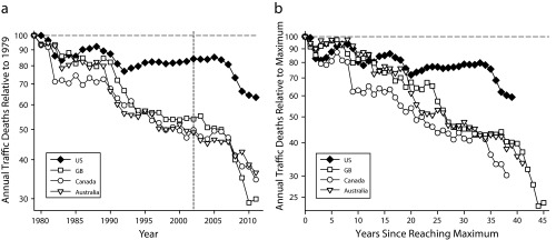
Two ways to compare traffic fatality changes in the United States (US) to those in 3 comparison countries, Great Britain (GB), Canada, and Australia, (a) relative to 1979 value and (b) relative to the maximum number reached.
Note. The portion 1979–2002 (delineated by vertical line in part a) reproduces a figure published in 2004 when the most recent data were for 2002. The plot for each country in part b has a different number of points because each attained its maximum number in a different year, as follows: United States, 1972; Great Britain, 1966; Canada, 1973; and Australia, 1970. All graphs use logarithmic scales.
Source. Data were obtained from the International Road Traffic and Accident Database.
Figure 1b shows the evolution of fatalities in the United States and the 3 comparison countries since each attained its maximum number (Equation 1). Plots have different numbers of points because each country achieved its maximum in a different year (listed in the last column in Table 1).
Figure 2a shows the United States and the 3 comparison countries compared with a number of other countries that achieved larger reductions than did the 3 comparison countries. Japan, Sweden, and other countries are not plotted because their data largely overlap with those of Great Britain, the original comparison country that attained the largest fatality reductions.
FIGURE 2—
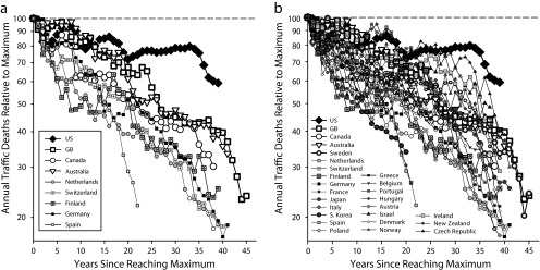
Traffic fatality declines since reaching maximum values in (a) selection of countries that had larger fatality declines than did Great Britain (GB), Canada, and Australia, and (b) United States (US) compared with all 25 other countries.
Note. Fatalities in each of the other countries declined further than did those in the United States. All graphs use logarithmic scales.
Source. Data were obtained from the International Road Traffic and Accident Database.
Clearly, the original 3 comparison countries were not uniquely successful. If I had chosen other countries, the measured difference between them and the United States would have been even larger.
Figure 2b, which includes all the graphs in Figure 2a, shows data for all 26 countries. In this representation the individual countries are not always distinct. The striking feature is the way the United States stands out from all the others—fatalities in each of the other 25 countries dropped further from their highs than occurred in the United States.
Other Measures
I augmented my analysis with an examination of 2 traditional measures of traffic safety1 in different countries.
Driver fatalities per 1000 registered vehicles are presented in Figure 3a. All governments collect the number of registered vehicles to tax vehicles; this number is available in IRTAD data.11 In the 1970s the number of US deaths per 1000 registered vehicles was lower than was the number for each of the other 25 countries. US traffic was often heralded at the time as the safest in the world.41
FIGURE 3—
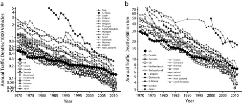
Two traditional ways to compare traffic safety in different countries by (a) number of deaths per 1000 registered vehicles, and (b) fatalities for same travel distance.
Note. Part a shows that in the early 1970s each of the 25 other countries had a higher rate than did the United States (US). The US has dropped from number 1 in safety to number 19 out of 26. The 18 countries that now have fewer deaths per 1000 vehicles than the United States are Australia, Austria, Canada, Denmark, Finland, France, Germany, Great Britain (GB), Greece, Ireland, Italy, Japan, the Netherlands, New Zealand, Norway, Spain, Sweden, and Switzerland. Part b shows that in the early 1970s each of the other 18 countries providing data had a higher rate than did the US. The US has dropped from number 1 to number 13 out of 19. The 12 countries with rates now lower than the US are Australia, Canada, Denmark, Finland, Germany, GB, Ireland, Israel, the Netherlands, Norway, Sweden, and Switzerland. All graphs use logarithmic scales.
Source. Data were obtained from the International Road Traffic and Accident Database.
By 2011 the United States had dropped from number 1 in safety to number 19 (out of 26). The 18 countries that had fewer deaths per 1000 vehicles than did the United States by 2011 were Australia, Austria, Canada, Denmark, Finland, France, Germany, Great Britain, Greece, Ireland, Italy, Japan, the Netherlands, New Zealand, Norway, Spain, Sweden, and Switzerland. Each of these countries had higher rates in 1970. Because rates in other countries are continuing to decline faster than is the US rate, it seems likely that the United States will fall to lower ranking than its present number 19.
Traffic fatalities per billion kilometers of vehicle travel are presented in Figure 3b. The distance traveled by all vehicles in a nation can be determined only if a measurement program is established and provided ongoing support. The most reliable data are from Great Britain, which has a long-time commitment to estimating total travel in Great Britain. Britain currently obtains estimates based mainly on around 10 000 manual counts, by which trained enumerators count traffic by vehicle type over a 12-hour period.42 Estimates of total travel in the United States are on the basis of estimates from the individual states. There is no published information on how states make such estimates.
The US rate in 1970 was 29.64 deaths per billion kilometers of travel. By 2011 it dropped to 6.83 per billion kilometers (or 1.10 deaths per 100 000 000 miles19). This is a 77.0% decline. From 1970 to 2011 the rate for Great Britain declined from 34.89 to 3.30 deaths per billion kilometers, an 88.9% decline. Note that the Great Britain rate was substantially higher than was the US rate in 1970 but substantially lower in 2011. If the US rate had declined by the same 88.9% as that of Great Britain, the US rate would have dropped to 3.02 deaths per billion kilometers, and US fatalities would have been 15 661 instead of the 32 367 observed. The Equation 1 estimate for Great Britain from the data in Table 1 is 12 996 US fatalities in 2011. A greater increase in travel in the United States than the increase in Great Britain could explain a portion (17.0%) of the Equation 1 effect. A parallel calculation for the deaths per 1000 registered vehicles variable gave 12 898 fatalities, very close to the Equation 1 estimate.
Everyone driving an additional 1000 kilometers on low-risk interstate highways1 would kill additional people but lower the number of deaths per billion kilometers. More generally, extra miles driven are safer than is the average of previous miles driven. This brings into question the value of deaths per billion kilometers as a good public health metric.
Of the 26 countries I studied, 19 had some sort of estimate for distance of travel in the IRTAD data, not always through the most recent years.32 In the 1970s no country had a lower rate than did the United States. By 2011 the United States had dropped from best in the world to rank number 13 out of 19, in which the comparison was for the most recent year of available data. The 12 countries with rates lower than that of the United States are Australia, Canada, Denmark, Finland, Germany, Great Britain, Ireland, Israel, the Netherlands, Norway, Sweden, and Switzerland.
Numerical Example of United States vs The Netherlands
Applying Equation 1 to examine the latest fatalities relative to maximum fatalities and using only the data in Table 1, fatality reductions in the United States can be compared with reductions in any 1 of the other 25 countries. I compared fatality declines in the United States and in the Netherlands. The United States and the Netherlands both experienced their maximum number of fatalities in 1972 (last columns in Table 1), so results can be interpreted as either progress since 1972 or progress since reaching their maximum number of fatalities.
In the 39 years from 1972 to 2011, US fatalities declined from 54 589 to 32 367—a 40.7% decline. In the same period, fatalities in the Netherlands declined from 3506 to 661—an 81.1% decline. If US fatalities had declined by 81.1%, US fatalities in 2011 would have been 10 292 and not the 32 367 observed. In other words, because the United States failed to match the decline in the Netherlands, an additional 22 075 deaths occurred on US roads.
I compared each of the 25 other countries with the United States in the same way. Each of them declined from their all-time highs by more than the US decline. If the United States had matched the average decline for all 25 counties, there would have been 16 330 fewer deaths in the United States in 2011. In addition to the Netherlands, 6 other countries (Austria, Denmark, France, Germany, Spain, and Switzerland) produced the result that if the United States had matched their declines since reaching their maximum values, US fatalities in 2011 would have been more than 20 000 fewer than actually occurred. Instead of 32 000 fatalities, the United States would have experienced fewer than 11 000.
DISCUSSION
The conclusions as determined by data through 2002 persist, the earlier comparison countries were not particularly special, and the conclusions, now supported with enormously more data, are even more firmly established.
All the fatality rates examined declined in the United States over the past 4 decades. However, they declined more rapidly in each of the other 25 countries, in most cases far more rapidly. In terms of declines after reaching a maximum number of fatalities, the United States is a unique outlier. All 25 other countries declined further and faster.
The differences found are of such enormous magnitude as to be largely unaffected by explanations in terms of confounding factors, which in any event are mainly rendered moot by the Equation 1 measure and additionally by the other measures in Figure 3.
The United States was the safest country in the world in the 1970s. By 2011 the United States dropped from number 1 to number 19 in terms of traffic fatalities per registered vehicle and to number 13 (out of 19 countries providing data) in terms of traffic fatalities for the same travel distance.
The failure of the United States in traffic safety is of near incomprehensible magnitude. By simply matching the road safety changes in a number of other unremarkable countries, the United States could prevent 20 000 traffic deaths per year.
US safety policy continues to be a public health catastrophe. If the United States could only match the far from perfect safety performance of a number of other countries, 20 000 fewer Americans would be killed annually and almost a million injuries prevented. An explanation of why this happens is given in an editorial43 in this issue.
As a US citizen and member of the US National Academy of Engineering, it pains me to come to these conclusions. However, the data speak for themselves, and the conclusions are inescapable. They apply only to road safety; the United States is the world leader in other safety areas, such as air travel.
Acknowledgments
Information on the change in fatality reporting in the Netherlands was generously provided by Marjan Hagenzieker, Niels Bos, and Frits Bijleveld, all from the Netherlands Institute for Road Safety Research, with whom, in addition, many productive interactions are gratefully acknowledged. Inputs on data were provided by Don Redelmeier, Sunnybrook Research Institute, Canada; Véronique Feypell, Organisation for Economic Co-operation and Development Paris; and Paul Voerman, Statistics Netherland. Discussions with Elihu Richter, the Hebrew University of Jerusalem, Israel, on safety versus speed were illuminating. The article has benefitted from comments from 2 anonymous reviewers.
Human Participant Protection
No protocol approval was necessary because data were obtained from secondary sources.
References
- 1.Evans L. Traffic Safety. Bloomfield Hills, MI: Science Serving Society; 2004. [Google Scholar]
- 2.National Highway Traffic Safety Administration. Fatality Analysis Reporting System. Available at: http://www-fars.nhtsa.dot.gov/Main/index.aspx. Accessed January 31, 2014.
- 3.Vladutiu CJ, Marshall SW, Poole C et al. Adverse pregnancy outcomes following motor vehicle crashes. Am J Prev Med. 2013;45(5):629–636. doi: 10.1016/j.amepre.2013.06.018. [DOI] [PMC free article] [PubMed] [Google Scholar]
- 4.Weiss HB, Songer TJ, Fabio A. Fetal deaths related to maternal injury. JAMA. 2001;286(15):1863–1868. doi: 10.1001/jama.286.15.1863. [DOI] [PubMed] [Google Scholar]
- 5.Wolf ME, Alexander B, Rivara F et al. Retrospective cohort study of seatbelt use and pregnancy outcome after a motor vehicle crash. J Trauma. 1993;34(1):116–119. doi: 10.1097/00005373-199301000-00021. [DOI] [PubMed] [Google Scholar]
- 6.Evans L. Traffic Safety. Bloomfield Hills, MI: Science Serving Society; 2004. [Google Scholar]
- 7.Doege TC. Sounding board—an injury is no accident. N Engl J Med. 1978;298(9):509–510. doi: 10.1056/NEJM197803022980911. [DOI] [PubMed] [Google Scholar]
- 8.Langley JD. The need to discontinue the use of the term “accident” when referring to unintentional injury events. Accid Anal Prev. 1988;20(1):1–8. doi: 10.1016/0001-4575(88)90009-7. [DOI] [PubMed] [Google Scholar]
- 9.Evans L. What’s in a word? J Traffic Med. 1999;27(1–2):3–4. [Google Scholar]
- 10.Evans L. Medical accidents: no such thing? BMJ. 1993;307(6917):1438–1439. doi: 10.1136/bmj.307.6917.1438. [DOI] [PMC free article] [PubMed] [Google Scholar]
- 11.Davis RM, Pless B. BMJ bans “accidents.”. BMJ. 2001;322(7298):1321–1322. doi: 10.1136/bmj.322.7298.1320. [DOI] [PMC free article] [PubMed] [Google Scholar]
- 12.Evans L. The dominant role of driver behavior in traffic safety. Am J Public Health. 1996;86(6):784–786. doi: 10.2105/ajph.86.6.784. [DOI] [PMC free article] [PubMed] [Google Scholar]
- 13.Richter ED, Berman T, Friedman L, Ben-David G. Speed, road injury, and public health. Annu Rev Public Health. 2006;27:125–152. doi: 10.1146/annurev.publhealth.27.021405.102225. [DOI] [PubMed] [Google Scholar]
- 14.Elvik R. The power model of the relationship between speed and road safety—update and new analyses. 2009. Available at: https://www.toi.no/getfile.php/Publikasjoner/T%C3%98I%20rapporter/2009/1034-2009/1034-2009-nett.pdf. Accessed February 1, 2014.
- 15.Gibson JJ, Crooks LE. A theoretical field-analysis of automobile driving. Am J Psych. 1938;5l:453–47l. [Google Scholar]
- 16.Tillmann WA, Hobbs GE. The accident-prone automobile driver: a study of the psychiatric and social background. Am J Psychiatry. 1949;106(5):321–331. doi: 10.1176/ajp.106.5.321. [DOI] [PubMed] [Google Scholar]
- 17.Forbes TW, editor. Human Factors in Highway Traffic Safety Research. New York, NY: Wiley-Interscience; 1972. [Google Scholar]
- 18.Näätänen R, Summala H. Road-User Behavior and Traffic Accidents. Amsterdam, The Netherlands: North Holland; 1976. [Google Scholar]
- 19.Shinar D. Psychology on the Road—the Human Factor in Traffic Safety. New York, NY: John Wiley; 1978. [Google Scholar]
- 20.Evans L, Schwing RC. Human Behavior and Traffic Safety. New York, NY: Plenum Press; 1985. [Google Scholar]
- 21.Evans L. Traffic Safety and the Driver. New York, NY: Van Nostrand Reinhold; 1991. [Google Scholar]
- 22.Hauer E. Observational Before–After Studies in Road Safety. Bingley, UK: Emerald Publishing; 2007. [Google Scholar]
- 23.Shinar D. Traffic Safety and Human Behavior. Bingley, UK: Emerald Publishing; 2007. [Google Scholar]
- 24.Elvik R, Høye A, Vaa T, Sørensen M, editors. The Handbook of Road Safety Measures. 2nd ed. Bingley, UK: Emerald Publishing; 2009. [Google Scholar]
- 25.Evans L. The dramatic failure of US safety policy. In: Evans L, editor. Traffic Safety. Bloomfield Hills, MI: Science Serving Society; 2004. pp. 381–411. [Google Scholar]
- 26.Eisenberg D. Traffic. JAMA. 2005;294(6):746–747. [Google Scholar]
- 27.Department for Transport. Transport statistics, Table 9.10. Road accidents and casualties: 1950–2002. Available at: http://www.dft.gov.uk/stellent/groups/dft_transstats/documents/page/dft_transstats_506740.xls. Accessed May 8, 2014.
- 28.Transport Canada. 2002 Canadian motor vehicle traffic collision statistics. Available at: http://news.gc.ca/web/article-en.do?nid=89989. Accessed May 8, 2014.
- 29.Australian Transport Safety Bureau. Road deaths Australia, monthly bulletin, January 2005. Available at: http://www.infrastructure.gov.au/roads/safety/publications/2005/Stats_Aust_12.aspx. Accessed May 8, 2014.
- 30.Haight FA. Traffic safety in developing countries. J Safety Res. 1980;12:50–58. [Google Scholar]
- 31.Oppe S. The development of traffic and traffic safety in six developed countries. Accid Anal Prev. 1991;23(5):401–412. doi: 10.1016/0001-4575(91)90059-e. [DOI] [PubMed] [Google Scholar]
- 32.International Traffic Safety Data and Analysis Group. The International Road Traffic and Accident Database. Available at: http://www.irtad.net. Accessed January 25, 2014.
- 33.Institute for Road Safety Research. International Road Traffic and Accident Database. Available at: http://www.swov.nl/UK/Actueel/Archive.htm. Accessed January 25, 2014.
- 34.International Transport Forum. Annual Report. 2013. Available at: http://internationaltransportforum.org/Pub/pdf/13IrtadReport.pdf. Accessed January 31, 2014.
- 35.Hauer E. The reign of ignorance in road safety: a case for separating evaluation from implementation. In: Moses LN, editor. Transportation Safety in an Age of Deregulation. Cary, NC: Oxford University Press; 1989. pp. 56–69. [Google Scholar]
- 36.Gov.UK. Revised road traffic estimates for Great Britain in 2010. Available at: http://www.gov.uk/government/publications/road traffic-estimates-2010-revised. Accessed January 25, 2014.
- 37.Institute for Road Safety Research. Road fatalities in the Netherlands. 2009. Available at: http://www.swov.nl/rapport/Factsheets/UK/FS_Road_fatalities.pdf. Accessed January 28, 2014.
- 38.Vis MA, Reurings MCB, Bos NM, Stipdonk HL, Wegman FCM. The registration of fatalities in the Netherlands. 2011. Available at: http://www.swov.nl/rapport/R-2011-10.pdf. Accessed January 30, 2014.
- 39.Institute for Road Safety Research. Cyclists. 2009. Available at: http://www.swov.nl/rapport/Factsheets/UK/FS_Cyclists.pdf. Accessed January 28, 2014.
- 40.Netherlands Institute for Road Safety Research. Available at: http://www.swov.nl/index_uk.htm. Accessed January 28, 2014.
- 41.MVMA Facts and Figures 1981. Detroit, MI: Motor Vehicle Manufacturers Association of the United States; 1981. [Google Scholar]
- 42.Department of Transport. Transport statistics, notes and guidance: road traffic. Available at: http://www.gov.uk/government/uploads/system/uploads/attachment_data/file/230528/annual-methodology-note.pdf. Accessed January 25, 2014.
- 43.Evans L. Twenty thousand more Americans killed annually because US traffic-safety policy rejects science. Am J Public Health. 2014;104(7):1349–1351. doi: 10.2105/AJPH.2014.301919. [DOI] [PMC free article] [PubMed] [Google Scholar]