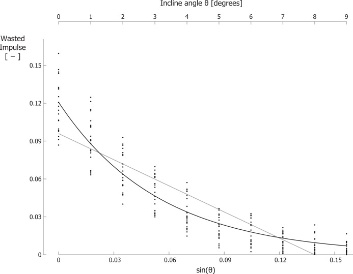
Figure 3. The wasted GRF impulse per step decreases for increasing inclines.
Wasted GRF impulse for different inclines and velocities. Each small dot represents a single participant’s wasted GRF impulse for a specific trial. The black line is the best-fit curve to the data according Eq. (6); the grey line is the best-fit linear equation. Note that the secondary horizontal axis at the top is the incline angle θ, which is not linear, so the tick marks are not evenly spaced.

