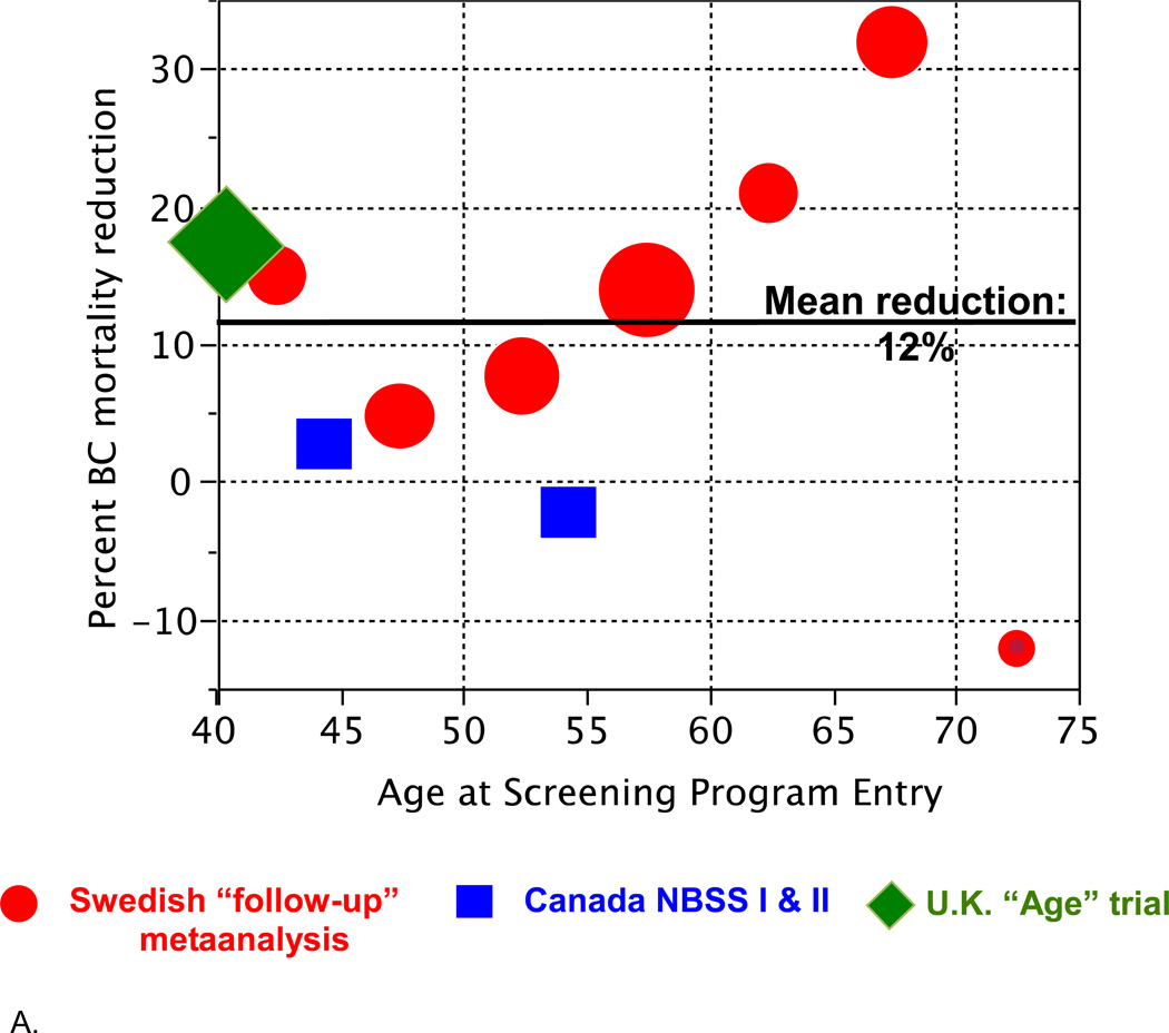
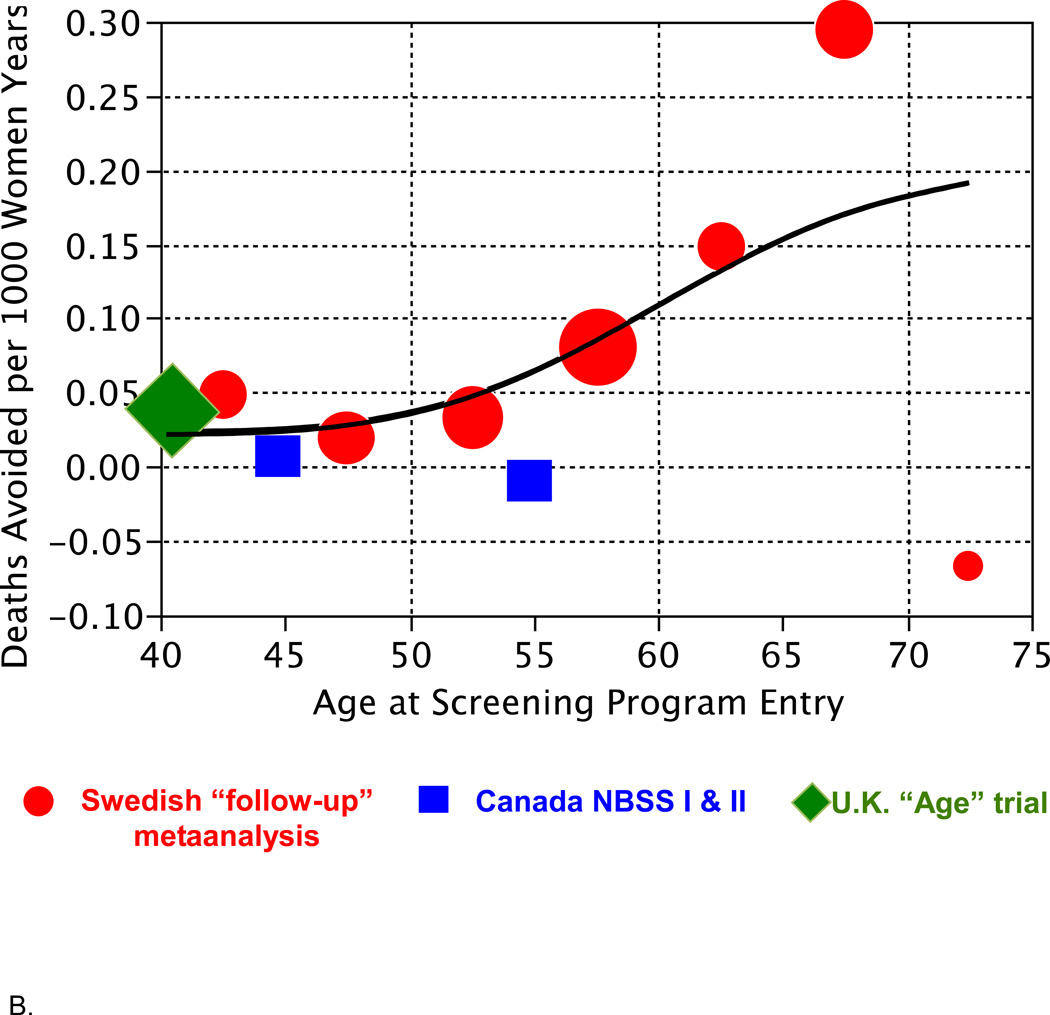
Figure 2.
A. Reduction in breast cancer mortality from Table 1 as it depends on age at entry into a screening program, plotted by age groups (5- or 10-year intervals). The areas of the symbols are proportional to the numbers of deaths in the corresponding control group.
B. Deaths avoided per 1000 women years depending on age (rightmost column in Table 1). The smooth curve shown is a spline fitted to these data. The fitted values at ages 45, 55, and 65 are 0.026, 0.064, and 0.156, respectively.


