Abstract
Historically, studying the Medicare managed care favorable-selection issue has been difficult because direct data on managed care enrollees have been unavailable. In this study, we analyzed the first year of Balanced Budget Act (BBA)-mandated inpatient encounter data. Based on this comparison of actual managed care and fee-for-service (FFS) beneficiaries, it appears that there are significant differences between these populations. The most striking differences are found in the comparison of average risk factors, indicating a clear bias in the managed care populations toward beneficiaries predicted to be less costly.
Introduction
For years, researchers have attempted to study whether the general health status— and hence the relative costliness—of Medicare beneficiaries enrolled in managed care plans and FFS plans differed systematically. Generally managed care plans have had favorable selection, that is, they enroll healthier beneficiaries than do FFS plans. This is an important issue because, even under the new Medicare+Choice (M+C) capitated payment system, payments for managed care plans are largely based on average expenditures under FFS. The risk-adjustment system used by the M+C program should be able to detect differences among individuals and between the managed care and FFS populations as a whole.
Until 2000, the managed care payment system included adjustments for the age, sex, Medicaid, and institutional status of enrolled beneficiaries. Although not a particularly accurate risk-adjustment system (these factors account for about 1 percent of variation of expenditures among individuals), these demographic factors were at least a crude attempt to adjust for differences in health status. Under the M+C program, a more accurate system of risk adjustment has been implemented. The Principal Inpatient Diagnostic Cost Group (PIPDCG) system is described in Pope et al. (2000) and Ingber (2000). The new system is being phased in slowly, and its weight is 10 percent of capitated payments in 2000 and 2001. The PIPDCG risk-adjustment model explains approximately 6 percent of variation in individual health care costs. This is significant because the new system has much greater power to differentiate among groups, particularly atypical groups.
The favorable-selection issue has been difficult to study because data have been lacking. Until the BBA required M+C plans to submit inpatient encounter data, researchers had little direct information on the health status of managed care enrollees. The abundant data that researchers have historically used to study the diagnostic history and expenditure patterns of Medicare beneficiaries is a byproduct of the FFS claims system. HCFA did not receive claims for health maintenance organization (HMO) enrollees, however. Therefore, most past studies examining the selection issue used indirect methods, such as looking at the expenditures of managed care enrollees in the year prior to when they joined an HMO, and comparing these new-enrollee experiences to FFS counterparts. As a result of the new encounter data requirements, researchers can look more directly at differences between Medicare FFS and managed care beneficiaries. We present evidence that there is favorable selection bias in the M+C program and that it is more a result of directly measured health status than demographic factors.
Data
In this analysis, we utilized the first year of BBA-mandated inpatient encounter data. These data report managed care enrollee inpatient diagnostic information, for service dates between July 1997 and June 1998. Our analysis compares managed care and FFS beneficiaries at the county level. We compared M+C enrollees and FFS beneficiaries in counties with at least 1,000 managed care enrollees. For the FFS groups, we used 1996 claims for FFS beneficiaries residing in these same counties. The time periods for these two data sets differ slightly; we have evidence, however, that the characteristics of large groups do not change rapidly. To compare the health status of FFS versus managed care enrollees, we compared PIPDCG risk factors for each of these populations by county. The risk factor is a measure of the expected cost of a person or group to that of the national average Medicare FFS beneficiary. This factor is a function of demographic characteristics and the principal diagnoses from inpatient encounter and claim records. We examined these components of the risk model to better understand the nature of observed differences.
Each bar in the figures is labeled by the range of values it encompasses. For example, for bars marked <-2.5 to -1.5, the range includes negative percent differences from slightly higher than -2.5 up to -1.5. The ranges are equal for bars within a given chart. The numbers of counties cited in the following text are actual counts.
Findings
Risk-Factor Differences
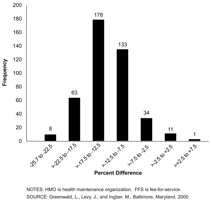
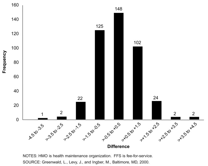
Figure 1 shows the distribution of relative differences between the PIPDCG risk factors of actual managed care and FFS enrollees, by county. Negative values in this figure reflect the percentage by which county managed care enrollee risk factors are below those for FFS beneficiaries, indicating a less costly population and favorable selection. Because these risk factors have been standardized to the same national mean, observed percent differences can be interpreted as differences in predicted costs.
Figure 1. Distribution of 428 Counties, by Difference Between HMO and FFS Mean Risk Factors.
The vast majority of counties showed favorable selection in the managed care population. Only four counties exhibited managed care populations with higher risk factors than the FFS populations. Three of these were only slightly positive; one was approximately 6 percent higher.
Managed care enrollee risk factors relative to FFS vary significantly at the county level. The median favorable selection difference is 13.6 percent. The range for these counties is -25.1 percent to +5.9 percent.
These findings are consistent with previous selection studies, which estimated that managed care enrollees were 10-20 percent less costly than FFS. The key point here, however, is that these findings are based on actual managed care enrollees; lack of direct data on managed care enrollees has traditionally been a criticism of earlier studies.
In analyzing the sources of disparity in predicted cost, we examined differences in a number of the factors that contribute to risk. We concentrated on demographic factors because, even under the PIPDCG model, demographic characteristics still drive about 80 percent of the dollars predicted under the model. To the extent that the demographic differences are small, the direct health measures account for the disparity.
Age Differences
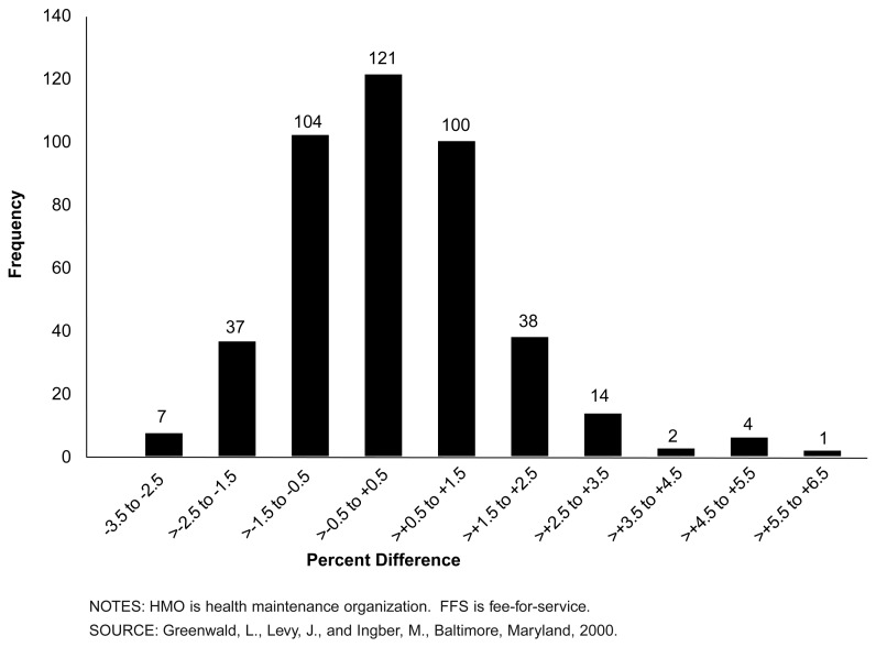
Age is a major factor that contributes to beneficiaries' PIPDCG risk factors; predicted costs generally rise with advancing age. Figure 2 shows differences between managed care and FFS enrollees using the same 428 counties as in Figure 1. At the county level, managed care enrollees are slightly older than their FFS counterparts—a finding that would tend toward unfavorable selection.
Figure 2. Distribution of 428 Counties, by Difference Between HMO and FFS Mean Age.
In 206 counties, managed care enrollees are slightly younger than FFS. Among these, 82 counties had managed care populations that were more than 1 percent younger relative to FFS. In 222 counties, the managed care populations were older than the FFS populations. In 106 counties, the managed care populations were more than 1 percent older.
In our analysis sample, only two counties had managed care populations that were more than 5 percent older than FFS.
Sex Differences
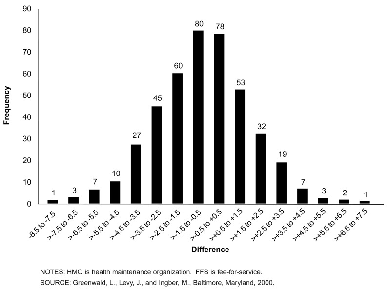
Sex is another factor that contributes to beneficiaries' PIPDCG risk factors. In general, males have higher predicted costs. Figure 3 shows the distribution of differences in percentage of females between managed care and FFS enrollees. Negative numbers here indicate a population that has a lower proportion of female (generally healthier and less costly) beneficiaries. The distribution is almost symmetric around -0.73 percent, with a majority of counties having a greater percentage of males in managed care than does FFS.
Figure 3. Distribution of 428 Counties, by Difference Between HMO and FFS Percentage Female.
In 281 counties, the proportion of females among managed care enrollees was lower than in FFS; 147 counties had a higher proportion of females in managed care. In 123 of the counties, the percentage-point difference was less than 2 in absolute value. Only 18 counties had a percentage-point difference greater than 5 in absolute value.
Medicaid Eligibility Differences
Eligibility for Medicaid has historically been correlated with higher Medicare expenditures. Although the relationship is not fully understood, it is, in part, a function of the well-documented link between poverty and increased incidence and severity of illness. In general, dually eligible beneficiaries (those eligible for both Medicare and Medicare) have higher predicted costs.
In the PIPDCG model, Medicaid eligibility adds between 0.17 and 0.46 points to risk factors for the aged population. (Medicaid factors vary by age group and sex.) For this reason, the proportion of dually eligible persons in managed care is a major factor in determining relative risk factors.
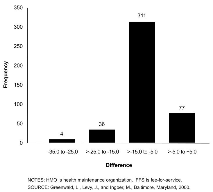
Figure 4 shows the distribution of differences in the percentage of people with Medicaid eligibility between FFS and managed care in the 428 counties. Negative numbers indicate a population that has a lower proportion of Medicaid-eligible (generally sicker and more costly) beneficiaries.
Figure 4. Distribution of 428 Counties, by Difference Between HMO and FFS Percentage with Medicaid.
The vast majority of counties exhibited managed care populations with smaller proportions of dually eligible beneficiaries relative to FFS. In 350 counties, the difference exceeded 5 percentage points. Indeed, 120 exceeded 10 percentage points. In only one county did the managed care proportion exceed the FFS proportion. To put these numbers into context, the mean percentage in FFS is about 15 percent. There is a substantial difference between the populations in this dimension, but the proportion of the population affected by this difference does not dominate the risk-factor computation.
Disability Differences
Disability as the original reason for Medicare entitlement is a factor in the PIPDCG model that has not been used previously for payment. The logic for this factor is that beneficiaries who originally qualified for Medicare as a result of a disability are historically more expensive than those who “age into” the program at age 65.
In the past, managed care payments for disabled beneficiaries actually decreased as these individuals crossed over into the traditional aged rate cells. This occurred because expected costs for this small but more expensive group were averaged into the large and generally inexpensive risk group for new enrollees who have aged into the program. The “originally disabled” factor adds between 0.14 and 0.60 to aged beneficiaries' risk factors.
Figure 5 shows differences in ever-disabled status between managed care and FFS enrollees. Negative percentages indicate a lower proportion of originally disabled aged beneficiaries in managed care than in FFS.
Figure 5. Distribution of 428 Counties, by Difference Between HMO and FFS Percentage Originally Entitled Due to Disability.
In 227 of the 428 counties, the proportion of ever-disabled beneficiaries among managed care enrollees was lower than in FFS, though these differences were not large. A total of 291 of the counties had a percentage-point difference of less than 1 in absolute value.
Summary
Based on this comparison of actual managed care and FFS beneficiaries, it appears that there are some significant differences between these two populations, with considerable local variation. The most striking differences are found in the comparison of average risk factors, indicating a clear bias in the managed care populations toward beneficiaries predicted to be less costly. However, when we compared the demographic factors that, in large part, drive the relative risk factors, we found that managed care enrollees are very similar to FFS beneficiaries in terms of age, sex, and originally disabled status. The notable exception was Medicaid status—whether beneficiaries were dually entitled to Medicare and Medicaid. Managed care had systematically lower proportions of Medicaid-eligible enrollees.
In interpreting these findings, it is clear that the trends in the demographic factors are insufficient to account for the differences in the risk factors in Figure 1. The bulk of the selection bias is therefore related to explicit health-status measures. In the case of the risk model used in this analysis, principal inpatient diagnoses are the indicators of health status that flow through the model to contribute to the total risk factor for a person.
Although this is a simple descriptive presentation, the findings are similar to those of studies done with indirect methods and the actual payment impacts found in the early months of payment under the PIPDCG system. In comparing early estimates of a fully phased-in PIPDCG risk-adjusted payment with a pure demographically adjusted payment, the mean reduction attributable to health-status factors was on the order of 6 percent.
These findings are interesting, in that they are our first comparison of these populations using data on actual managed care enrollees. But we note two caveats. First, data we used here on managed care enrollees were based in part on the first year of M+C encounter data; any first-year data collection should be viewed with caution and updated in later years to determine if these initial patterns persist. Second, this analysis is at the county, not plan, level. We did not weight the counties by the size of the populations, except that we only examined counties with at least 1,000 managed care enrollees. Our purpose in this data analysis was to make a general comparison of managed care and FFS populations, not indicate potential payment impacts; inferences regarding potential plan payment effects cannot be made using these county-level analyses.
The range of county population average risk-factor differences and demographic components is supportive of the need for risk adjustment in the Medicare capitated program. There is considerable geographic variation in the differences in the risk factors that is not reflected in demographic composition of the populations. To the extent that predicted risk-adjustment factors correlate with actual expenditures better than pure demographic factors (Pope et al., 2000) equity in payment for managed care enrollees is enhanced by implementation of such systems.
Footnotes
The authors are with the Office of Strategic Planning, Health Care Financing Administration (HCFA). The opinions expressed are those of the authors and do not necessarily reflect the views of HCFA.
Reprint Requests: Leslie M. Greenwald, Ph.D., Mail Stop C3-19-26, 7500 Security Blvd., Baltimore, MD 21244. E-mail: lgreenwald@hcfa.gov
References
- Ingber MJ. Implementation of Risk Adjustment for Medicare. Health Care Financing Review. 2000 Spring;21(3):119–126. [PMC free article] [PubMed] [Google Scholar]
- Pope GC, Ellis RP, Ash AS, et al. Principal Inpatient Dianostic Cost Group Model for Medicare Risk Adjustment. Health Care Financing Review. 2000 Spring;21(3):93–118. [PMC free article] [PubMed] [Google Scholar]


