

Abstract
Map makers have for many years searched for a way to construct cartograms, maps in which the sizes of geographic regions such as countries or provinces appear in proportion to their population or some other analogous property. Such maps are invaluable for the representation of census results, election returns, disease incidence, and many other kinds of human data. Unfortunately, to scale regions and still have them fit together, one is normally forced to distort the regions' shapes, potentially resulting in maps that are difficult to read. Many methods for making cartograms have been proposed, some of them are extremely complex, but all suffer either from this lack of readability or from other pathologies, like overlapping regions or strong dependence on the choice of coordinate axes. Here, we present a technique based on ideas borrowed from elementary physics that suffers none of these drawbacks. Our method is conceptually simple and produces useful, elegant, and easily readable maps. We illustrate the method with applications to the results of the 2000 U.S. presidential election, lung cancer cases in the State of New York, and the geographical distribution of stories appearing in the news.
Suppose we wish to represent on a map some data concerning, to take the most common example, the human population. For instance, we might wish to show votes in an election, incidence of a disease, number of cars, televisions, or phones in use, numbers of people falling in one group or another of the population, by age or income, or any of very many other variables of statistical, medical, or demographic interest. The typical course under such circumstances would be to choose one of the standard projections for the area of interest and plot the data on it with some color code or similar representation. Such maps, however, can be misleading. A plot of disease incidence, for example, will inevitably show high incidence in cities and low incidence in rural areas, solely because more people live in cities.
The obvious cure for this problem is to plot a fractional measure rather than raw incidence data; we plot some measure of the number of cases per capita, binned in segments small enough to give good spatial resolution but large enough to give reliable sampling. This method has its own problems, however, because it discards all information about where most of the cases are occurring. One case per thousand people means something entirely different in Sydney from what it means in Siberia.
What we would like is some representation of the data that factors out variations in the population density but, at the same time, shows how many cases are occurring in each region. It appears at first that these two goals are irreconcilable, but this is not the case. On a normal area-preserving or approximately area-preserving projection, such as a Robinson projection or an equal-area conic projection, they are indeed irreconcilable. However, if we can construct a projection in which areas on the map are proportional not to areas on the ground but instead to human population, then we can have our cake and eat it. Disease cases or other similar data plotted on such a projection will have the same density in areas with equal per capita incidence regardless of the population, since both the raw incidence rate and the area will scale with the population. However, each case or group of cases can still be represented individually, so it will be clear to the eye where most of the cases occur. Projections of this kind are known as value-by-area maps, density-equalizing maps, or cartograms.
The construction of cartograms is a challenging undertaking. A variety of methods have been put forward, but none is entirely satisfactory. In particular, many of these methods produce highly distorted maps that are difficult to read or projections that are badly behaved under some circumstances, with overlapping regions or strong dependence on coordinate axes. In many cases the methods proposed are also computationally demanding, sometimes taking hours to produce a single map. In this article we propose a method that is, we believe, intuitive, but also produces elegant, well behaved, and useful cartograms, whose calculation makes relatively low demands on our computational resources.
Previous Methods for Constructing Cartograms
Mathematically, the construction of a (flat 2D) cartogram involves finding a transformation r → T(r) of a plane to another plane such that the Jacobian ∂(Tx,Ty)/∂(x,y) of the transformation is proportional to some specified (population) density ρ(r), thus:
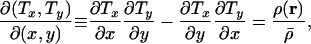 |
[1] |
where  is the mean population density averaged over the area to be mapped. (This choice of normalization for the Jacobian ensures that the total area before and after the transformation is the same.)
Eq. 1 does not determine the cartogram projection uniquely. To do that, we need one more constraint; two constraints are needed to fix the projection for a 2D cartogram. Different choices of the second constraint give different projections, and no single choice appears to be the obvious candidate, which is why many methods of making cartograms have been suggested. One idea is to demand conformal invariance under the cartogram transformation, i.e., to demand that angles be preserved locally. This requirement is equivalent to demanding that the Cauchy–Riemann equations be satisfied, but this imposes two, not one, additional constraints, and hence it is normally not possible to construct a conformally invariant cartogram.
In an attempt at least to minimize the distortion of angles, Tobler (1, 2) took the first steps in the automated computer generation of cartograms in the late 1960s. He proposed a method in which the initial map is divided into small rectangular or hexagonal cells, each of which is then independently dilated or shrunk to a size proportional to its population content. Because each cell is scaled separately, the corners of adjacent cells do not match afterward. To reestablish a match, Tobler's method takes a vector average over the positions of corresponding corners and draws a new map with the resulting distorted cells. The process is iterated until a fixed point of the transformation is reached. Although the principle is simple and intuitive it runs into practical problems. First, convergence tends to be rather slow because a node a few cells away from a population center will feel the effect of that center only after several iterations. Second, under some circumstances the transformation can produce overlapping or “folded” regions of the map, thereby ruining the topology. This problem can be corrected by introducing additional constraints, but the result is a more complex algorithm with even slower run times.
To increase the speed of the calculations, Dougenik et al. (3) introduced an algorithm where the borders of a cell move in response not only to local space requirements but also to “forces” exerted by other cells. Cells create force fields that diminish with distance from the cell and that are larger for cells that contain larger populations. These forces “push” other cells away from areas of high population in a manner reminiscent of the behavior of charged objects in electrostatics (although the authors do not use this metaphor). Again, the positions are relaxed iteratively to achieve the final cartogram, and convergence is substantially faster than Tobler's algorithm, although topological errors still cannot be ruled out.
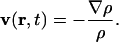
Gusein-Zade and Tikunov (4) suggested a further twist that does away with the cells altogether and uses a continuous “displacement field” that measures the displacement of each point in the map. Areas of high population exert a repulsive force on this displacement field and the authors are able to derive a differential equation for the field, which they integrate numerically. The method is somewhat arcane but produces some of the most attractive cartograms among the existing algorithms (see Fig. 1).
Fig. 1.

U.S. population cartogram constructed with the method of Gusein-Zade and Tikunov. [Reproduced with permission from ref. 17 (Copyright 1993, American Congress on Surveying and Mapping)]
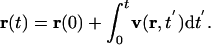
Appel et al. (5) and recently Dorling (6) have both proposed methods based on cellular automata, which are quite intuitive. In Dorling's method, for instance, the original map is drawn on a fine grid. On each iteration of the algorithm, cells lying on or close to the boundaries of regions are identified and if a neighboring region needs extra area those cells are reassigned to the neighbor. The procedure is iterated and the regions with greatest population grow slowly larger until an equilibrium is reached and no further changes are needed. The procedure is elegant and simple, but in practice it can distort shapes quite badly (see Fig. 2). One can add additional constraints on the shapes to make the maps more readable, but then the method quickly loses its main advantage, namely its simplicity.
Fig. 2.

Population cartogram of Britain by county. (Left) The original map. (Right) Cartogram generated with the cellular automaton algorithm of Dorling. [Reproduced with permission from Dorling (6) (Copyright 1996, University of East Anglia)].
Researchers have also experimented with several other methods. Kocmoud (7), for example, uses a mass-and-spring model acting on a map expressed as points and lines, with constraints applied to maintain certain topographic features such as angles or lengths. Because of its complexity, however, this algorithm is prohibitively slow. The method of D. Keim, S. North, and C. Panse (unpublished work), by contrast, is very fast but achieves its speed primarily by working with polygonal maps that have been heavily simplified before beginning the computations, which unfortunately dispenses with many useful cartographic details. Finally, if one is willing to live with a noncontiguous cartogram (one in which regions adjacent in real life are not adjacent on the cartogram), then several quite simple methods give good results, such as Dorling's circular cartograms (6). Other reviews and discussions of cartogram methods can be found in refs. 8–11.
The Diffusion Cartogram
In this article we propose a different type of cartogram, which might be called a “diffusion cartogram” for reasons we now describe. It is a trivial observation that, on a true population cartogram, the population is necessarily uniform; once the areas of regions have been scaled to be proportional to their population then, by definition, population density is the same everywhere. Thus, one way to create a cartogram, given a particular population density, is to allow population somehow to “flow away” from high-density areas into low-density ones, until the density is equalized everywhere. An obvious candidate process exists that achieves this, the linear diffusion process of elementary physics (12), and this is the basis of our method. We describe the population by a density function ρ(r), where r represents geographic position, and then we allow this density to diffuse. In the limit of long time t → ∞, the population density becomes uniform and so comes to rest, and its total displacement from start to finish determines the projection of the map necessary to produce a perfectly density-equalizing cartogram.
In the standard treatment of diffusion, the current density is given by
 |
[2] |
where v(r,t) and ρ(r,t) are the velocity and density, respectively, at position r and time t. Diffusion follows the gradient of the density field, thus,
 |
[3] |
meaning that the flow is always directed from regions of high density to regions of low density and will be faster when the gradient is steeper. (A diffusion constant conventionally appears in Eq. 3, but we can set this constant to 1 without affecting our results.) The diffusing population is also conserved locally so that
 |
[4] |
Combining Eqs. 2, 3, and 4 we then arrive at the familiar diffusion equation:
 |
[5] |
and the expression for the velocity field in terms of the population density:
 |
[6] |
The calculation of the cartogram involves solving Eq. 5 for ρ(r,t) starting from the initial condition in which ρ is equal to the given population density of the region of interest and then calculating the corresponding velocity field from Eq. 6. The cumulative displacement r(t) of any point on the map at time t can be calculated by integrating the velocity field thus:
 |
[7] |
In the limit t → ∞ the set of such displacements for all points on the original map defines the cartogram.
Most of the time, we are not interested in mapping the entire globe, but only some part of it, which means that the area of interest will have boundaries (e.g., country borders or coastlines) beyond which we don't know or don't care about the population density. It would be inappropriate to represent the regions outside these boundaries as having zero population, even if they are, like the ocean, unpopulated, since this would cause arbitrary expansion of the cartogram as the population diffused into its uninhabited surroundings. (This is true of essentially all methods for constructing cartograms.) Instead, therefore, we apply a “neutral buoyancy” condition, floating the area of interest in a “sea” of uniform population density equal to the mean density of the map as a whole. This keeps the total area under consideration constant during the diffusion process.
The whole system, including the sea, is then enclosed in a box. For simplicity in this article, we will consider only rectangular boxes, as most others have done also. (Note that we do not fix the shape of the borders or coastlines in our cartogram, as others have occasionally done. Doing so can create bottlenecks in the diffusion flow, which we avoid by allowing free motion of all points, whether they are near a border or not.) Provided the dimensions Lx and Ly of the box are substantially larger than the area to be mapped, the dimensions themselves do not matter. In the limit Lx,Ly → ∞ the cartogram will be a unique deterministic mapping, independent of the coordinate system used, with no overlapping regions. In practice, we find that quite moderate system sizes are adequate; dimensions two to three times the linear extent of the area to be mapped appear to give good results.
We also need to choose boundary conditions on the walls of the box. These conditions also have no great effect on the results, provided the size of the box is reasonably generous, and we have found a good choice to be the Neumann boundary conditions in which no flow of population occurs through the walls of the box.
These considerations completely specify our method and are intuitive and straightforward. The actual implementation of the method, if one wants a calculation that runs quickly, involves a little more work. We solve the diffusion equation in Fourier space, where it is diagonal, and backtransform before integrating over the velocity field. With the Neumann boundary conditions, the appropriate Fourier basis is the cosine basis, in which the solution to the diffusion equation has the form
 |
[8] |
where the sum is over all wave vectors k = (kx,ky) = 2π(m/Lx,n/Ly), with m and n nonnegative integers, and  is the discrete cosine transform of ρ(r,t = 0):
 |
[9] |
where δi,j is the Kronecker symbol. The velocity field v is then easily calculated from Eqs. 6 and 8 and has components
 |
[10a] |
 |
[10b] |
Eqs. 9 and 10 can be evaluated rapidly by using the fast Fourier transform and its backtransform, respectively, both of which in this case run in time of order LxLy log(LxLy). We then use the resulting velocity field to integrate Eq. 7, which is a nonlinear Volterra equation of the second kind and can be solved numerically by standard methods (13). In practice, it is the Fourier transform that is the time-consuming step of the calculation and with the aid of the fast Fourier transform this step can be performed fast enough that the whole calculation runs to completion in a matter of seconds or at most minutes, even for large and detailed maps.
It is straightforward to see that our diffusion cartogram satisfies the fundamental definition, Eq. 1, of a cartogram. In the limit t → ∞, Eq. 8 is dominated by the k = 0 term and gives
 |
[11] |
where  is again the mean population density over the area mapped. Furthermore, by definition, the total population within any moving element of area does not change during the diffusion process, and hence, denoting by T(r) the final position of a point that starts at position r, we have
  , and, rearranging, the Jacobian is given by
  ,,in agreement with Eq. 1.
Conceptually our algorithm is in some respects similar to the cellular automaton method of Dorling (6). Our description of the diffusion method has been entirely in terms of macroscopic variables and equations, but one could equally look at the method as a microscopic diffusion process in which each individual member of the population performs a Gaussian random walk about the surface of the map. Over time the population will diffuse until it is uniform everywhere within the box enclosing the map, except for statistical fluctuations. The cartogram is derived by moving all boundaries on the map in such a way that the net flow passing through them is zero at all times during the diffusion process. This resembles Dorling's method in the sense that different regions trade their area until a fair distribution is reached.
Our method, however, has the advantage of being based on a global, lattice-independent process. The exchange of area between regions in Dorling's method occurs only between nearestneighbor squares along the principle axes of a square lattice and this introduces a strong signature of the lattice topology into the final cartogram (Fig. 2). Furthermore, the cellular automaton method gives only the displacements of region boundaries, whereas our method gives the displacement of any point on the map. In this respect, our algorithm is more like the method of Gusein-Zade and Tikunov (4). (We provide an implementation of our algorithms in pseudo-code in Supporting Text, which is published as supporting information on the PNAS web site.)
Population Density Function
The description of our method tells, in a sense, only half the story of how to create a cartogram. Before applying this or indeed any method, we need to choose the starting density ρ(r) for the map. We can, by defining ρ(r) in different ways, control the properties of the resulting cartogram, including crucially the balance between accurate density equalization and readability.
Population density is not strictly a continuous function, since people are themselves discrete and not continuous. To make a continuous function the population must be binned or coarse-grained at some level. All methods of constructing cartograms require one to do this, and no single accepted standard approach exists. Part of the art of making a good cartogram lies in shrewd decisions about the definition of the population density.
If we choose a very fine level of coarse-graining for the population density, then the high populations in centers such as cities will require substantial local distortions of the map to equalize the density. A coarser population density will cause less distortion, resulting in a map with features that are easier to recognize, but will give a less accurate impression of the true population distribution. The most common choice made by others has been to coarse-grain the population at the level of the (usually political) regions of interest. For example, if one were interested in the United States, one might take the population of each state and distribute it uniformly over the area occupied by that state. This method can be used also with our cartogram algorithm, and we give some examples below. But we are not obliged to use it, and in some cases it may be undesirable, because binning at the level of states erases any details of population distribution below the state level. Instead, in our work, we have mostly adopted a spatially uniform Gaussian blur as our coarse-graining function. By varying the width σ of the blurring function we can tune our cartogram between accuracy and readability.
Ultimately the choice of population-density function is up to the user of the method, who must decide what particular features are most desirable in his or her application. One advantage of our diffusion-based algorithm is that it is entirely agnostic about this choice; the process of computing the cartogram is decoupled from the calculation of the population density and, hence, is not slanted in favor of one choice or another.
Applications
We give three examples of the use of our cartograms, focusing on the United States and using population data from the 2000 U.S. Census.
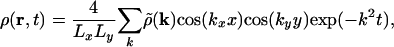
First, we examine the results of the U.S. presidential election of 2000. Fig. 3c shows the popular vote by state in this election, the simple fraction of voters voting each way, with state majorities for the two major candidates represented as shades of red (George Bush, Republican) and blue (Al Gore, Democrat). The briefest appraisal immediately reveals that the Republicans dominate much more than a half of the country. This finding, however, is misleading, because the population of the United States is highly nonuniform, as shown in Fig. 3 a and b. Much of the Republicans' dominance comes from their success in the large but relatively unpopulated states in the center of the map, whereas the Democrats carry the more populous areas in the northeast and on the west coast. Clearly then, a simple map is a poor visual representation of the election results, in the sense that it is hard to tell which party got more votes by looking at the map.
Fig. 3.

(a) Population density with Gaussian blur, as described in the text. The width σ of the Gaussian is ≈80 km. (b) Gaussian blur with width ≈8 km. Results of the 2000 U.S. presidential election shown on a standard Albers conic projection (c), on a cartogram based on the population density in a (d), and on a cartogram constructed with the finer population density of b (e). The latter results in greater distortion of some state boundaries, most noticeably for Pennsylvania and Indiana. (f) A cartogram based on states' representation in the electoral college. The density of electors was calculated by spreading each state's electors evenly across the state.
A better representation is given by Fig. 3d, in which the same data are shown on a population cartogram constructed with the methods described in this article. This cartogram is based on the density function of Fig. 3a, which incorporates a moderately broad Gaussian blur, as described above, yielding a map whose features are distorted relatively little on short scales; the individual states are still easily recognizable while being scaled close to the size appropriate to their populations. To a good approximation the amounts of red and blue in the figure now correspond to the true balance of the popular vote, and, as is clear to the eye, this vote was very close between the two parties, in fact being won not by the Republican candidate but by the Democrat. In Fig. 3e, we show a further cartogram constructed with the population density of Fig. 3b, which is less heavily coarse-grained, resulting in a map that more perfectly represents states' populations, but that also has more distortion on short length scales, making some regions hard to recognize. For example, the small but densely populated Long Island now expands (quite correctly) to a size greater than the entire state of Wyoming. The user concerned both with readability and accurate portrayal of the data would probably choose a map similar to Fig. 3d in this case.
Ultimately, the presidency is decided not by the popular vote, but by the electoral college. Under the U.S. system, each state contributes a certain number of electors to the electoral college, who vote according to the majority in their state. The candidate receiving a majority of the votes in the electoral college wins the election. The appropriate visualization for a vote of this kind is one in which the sizes of the states are scaled in proportion to their numbers of electors. This then is an example in which a coarse-graining according to political boundaries (state boundaries in this case) makes good sense. We show a cartogram calculated in this way in Fig. 3f. The allocation of electors to states roughly follows population levels, but contains a deliberate bias in favor of less populous states, and as a result some of these states appear larger in Fig. 3f than in 3e; Wyoming, Montana, and the Dakotas are good examples. Since most such states are majority Republican, we can now understand how the Republican candidate came to win the election despite losing the popular vote.
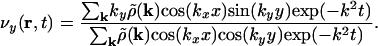
For our second example, we look at a case in which a very fine level of coarse-graining is needed to understand the data fully. We study the distribution of cases of lung cancer among the male population in the state of New York. [A similar study using a different technique and for a smaller area was carried out by Merrill (14).] In Fig. 4a we show a scatter plot of lung cancer cases between 1993 and 1997. This map is of precisely the kind discussed in the introduction; it shows clearly how many cases exist and that they are geographically concentrated in the areas that have high populations. However, it is impossible to tell whether a statistically higher per capita incidence of lung cancer occurs in one area or another, because any such variation is masked by the highly nonuniform population density.
Fig. 4.

Lung cancer cases among males in the state of New York, 1993–1997. Each dot represents 10 cases, randomly placed within the zip-code area of occurrence. (a) The original map. (b) Cartogram with a coarse-grained population density with σ = 0.3°.(c) Cartogram with a much finer-grained population density with σ = 0.04°. (Data are from the New York State Department of Health.)
In Fig. 4b, we show the same data on a population cartogram with moderate coarse-graining of the initial population density. Although the map is visibly distorted, little difference is visible in the distribution of cancer cases. In Fig. 4c, on the other hand, we use a very fine-grained population density, creating a cartogram with better population equalization and significantly greater distortion. Now, the virtue of this representation becomes strikingly clear. As the figure shows, when we use a projection that truly equalizes the population density over the map, there is no longer any significant variation in the distribution of cases over the state; the dots have about the same density everywhere. The shape of the map in Fig. 4c does not much resemble the shape of the original any more, but this is the price we pay for equalizing the population almost perfectly.
Our method of generating cartograms is fast, an important consideration for interactive use. As discussed above, the bulk of the work involved in creating the maps is in the Fourier transforms, which can be computed rapidly by using fast Fourier transforms. Fig. 4c, for example, was produced in <100 s on a standard desktop computer, including the time to read in the census data, perform the Gaussian blur, solve the diffusion equation, and plot the figure. Previous techniques are either significantly slower [Kocmoud (7) reports 16 h for a U.S. state cartogram using his constraint-based approach] or are obliged to use simplified maps to reduce the computational load.
The cartograms shown so far have all been based, more or less, on human population density, which is certainly the most common type of cartogram. Other types, however, are also possible and for our third example we study one such. Anyone who reads or watches the news in the United States (and similar observations probably apply in other countries as well) will have noticed that the geographical distribution of news stories is not uniform. Even allowing for population, a few cities, notably New York and Washington, DC, get a surprisingly large fraction of the attention, whereas other places get little. Apparently, some locations loom larger in our mental map of the nation than others, at least as presented by the major media. We can turn this qualitative idea of a mental map into a real map by using our cartogram method.
We have taken ≈72,000 newswire stories from November 1994 to April 1998 (15), and extracted from each the “dateline,” a line at the head of the story that gives the date and the location that is the main focus of the story. Binning these locations by state, we then produce a map in which the sizes of the U.S. states are proportional to the number of stories concerning that state over the time interval in question. The result is shown in Fig. 5.
Fig. 5.

The distribution of news stories by state in the United States. (a) Albers conic projection. (b) Cartogram in which the sizes of states are proportional to the frequency of their appearance in news stories. States are the same shades in a and b.
The stories are highly unevenly distributed. New York City alone contributes 20,000 stories to the corpus, largely because of the preponderance of stories about the financial markets, and Washington, DC, contributes another 10,000, largely political stories. We chose to bin by state to avoid large distortions around the cities that are the focus of most news stories. We made one exception, however; because New York City had far more hits than any other location, including the rest of the state of New York (which had ≈1,000), we split New York State into two regions, one for the greater New York City area and one for the rest of the state.
The cartogram is a dramatic depiction of the distribution of U.S. news stories. The map is highly distorted because the patterns of reporting show such extreme variation. Washington, DC, for instance, which normally would be virtually invisible on a map of this scale, becomes the second largest “state” in the union. (The District of Columbia is not technically a state.) People frequently overestimate the size of the northeastern part of the United States by comparison with the middle and western states, and this map may give us a clue as to why. Perhaps people's mental image of the United States is not really an inaccurate one; it is simply based on things other than geographical area, such as the news.
Numerous other possible applications of cartograms come readily to mind, such as visualizations of gross regional products, energy consumption, crime rates, and so forth. Diffusion cartograms might also have applications outside geography. One possibility is the creation of a homunculus, a representation of the human body in which each bodily part is scaled in proportion to the size of the brain region devoted to it (16). Such representations are usually constructed as 2D plots, but there is no reason in theory why one could not create a fully 3D homunculus; the diffusion process is easily generalized to any number of dimensions.
Conclusions
In this article we have presented a general method for constructing density-equalizing projections or cartograms, which provide an invaluable tool for the presentation and analysis of geographic data. Our method is simpler than many earlier methods, allowing for rapid calculations, while generating accurate and readable maps. The method allows its users to choose their own balance between good density equalization and low distortion of map regions, making it flexible enough for a wide variety of applications. We have presented several examples of the use of our cartograms in the representation of human data, including election results and incidence data for cancer.
Implementation in gis software packages should be straight-forward, and we hope that in this or other forms it will prove a valuable tool for researchers in a wide variety of disciplines.
Supplementary Material
Acknowledgments
We thank the staff of the Numeric and Spatial Data Services, University of Michigan, for their help with the geographic data, and Dragomir Radev for useful discussions about the geographic distribution of news messages. This work was funded in part by National Science Foundation Grant DMS-0234188 and by the James S. McDonnell Foundation.
This paper was submitted directly (Track II) to the PNAS office.
References
- 1.Tobler, W. R. (1963) Geogr. Rev. 53, 59-78. [Google Scholar]
- 2.Tobler, W. R. (1973) Ann. N.Y. Acad. Sci. 219, 215-220. [DOI] [PubMed] [Google Scholar]
- 3.Dougenik, J. A., Chrisman, N. R. & Niemeyer, D. R. (1985) Prof. Geogr. 37, 75-81. [Google Scholar]
- 4.Gusein-Zade, S. M. & Tikunov, V. S. (1993) Cartogr. Geogr. Inf. Syst. 20, 167-173. [Google Scholar]
- 5.Appel, A., Evangelisti, C. J. & Stein, A. J. (1983) IBM Tech. Disclosure Bull. 26, 953-956. [Google Scholar]
- 6.Dorling, D. (1996) Area Cartograms: Their Use and Creation. Concepts and Techniques in Modern Geography (CATMOG) No. 59 (Univ. of East Anglia, Norwich, U.K.).
- 7.Kocmoud, C. J. (1997) Master's thesis (Texas A&M Univ., College Station).
- 8.Selvin, S., Merrill, D., Schulman, J., Bedell, L., Wong, L. & Sacks, S. (1988) Soc. Sci. Med. 26, 215-221. [DOI] [PubMed] [Google Scholar]
- 9.Cauvin, C., Schneider, C. & Cherrier, G. (1989) Cartogr. J. 26, 96-104. [Google Scholar]
- 10.Torguson, J. S. (1990) Master's thesis (Univ. of Georgia, Athens).
- 11.Edelsbrunner, H. & Waupotitsch, R. (1997) Comput. Geom. 7, 343-360. [Google Scholar]
- 12.Honerkamp, J. & Römer, H. (1993) Theoretical Physics: A Classical Approach (Springer, Berlin).
- 13.Press, W. H., Teukolsky, S. A., Vetterling, W. T. & Flannery, B. P. (1992) Numerical Recipes in C (Cambridge Univ. Press, Cambridge, U.K.).
- 14.Merrill, D. W. (2001) Stat. Med. 20, 1499-1513. [DOI] [PubMed] [Google Scholar]
- 15.Linguistic Data Consortium (1998) North American News Text Supplement (Linguistic Data Consortium, Philadelphia, PA).
- 16.Mitchel, J., ed. (1990) The Random House Encyclopedia (Random House, New York), 3rd Ed., p. 667.
- 17.Gusein-Zade, S. M. & Tikunov, V. S. (1993) Cartogr. Geogr. Inf. Syst. 20, 75-81. [Google Scholar]
Associated Data
This section collects any data citations, data availability statements, or supplementary materials included in this article.