Abstract
In this approach, dual-analysis views depict distributions of genes or data samples within Caleydo. Significant-difference plots show the elements of a cancer subtype that differ significantly from other subtypes. Analysts can characterize subtypes, investigate how samples relate to their subtype and other groups, and create well-defined subtypes based on statistical properties.
Although cancers are colloquially referred to by the tissue from which they originate (for example, lung cancer), significant differences can exist between cancers from the same tissue. The differences are often characterized by various biomolecular properties. These different forms of cancer are called subtypes. Large-scale research projects such as the Cancer Genome Atlas (TCGA; http://cancergenome.nih.gov) elicit comprehensive genomic and clinical datasets with the goals of characterizing the molecular alterations responsible for cancer and identifying and characterizing cancer subtypes.
Owing to next-generation sequencing and microarray technology, these projects can employ large, heterogeneous datasets. However, deriving insight from these complex datasets remains a challenge. Current analysis relies largely on custom scripts to find interesting genes or clusters of patients (stratifications) in these datasets. To remedy this, we developed Caleydo StratomeX, an interactive visualization method to analyze and discover relationships in these datasets.1 Researchers can use StratomeX to evaluate overlaps and relationships of stratifications.
However, StratomeX doesn’t inherently enable analysts to identify the characteristic genes of candidate subtypes, nor does it communicate how patients relate to a given subtype. The former capability is important because the characteristic genes could also be causally involved in a subtype and thus might be a target for a therapeutic or diagnostic approach. With the latter capability, researchers can investigate how samples relate to a subtype to estimate the quality of candidate subtypes and build a deeper characterization of a subtype.
To address these limitations, we integrated two techniques into StratomeX:
-
■
dual analysis,2 a general high-dimensional data analysis methodology, and
-
■
significant-difference plots, a novel visual representation of the differences between data subsets.
With this approach, domain scientists can discover genes that are distinctive for specific subtypes. They can also observe the properties of a cluster’s samples and compare how they behave in different datasets and clusters. These capabilities can provide a deeper understanding of stratifications. Moreover, scientists can employ the dual-analysis methodology to interactively generate stratifications.
Biological Background and Analysis Tasks
Subtype analysis is based on a variety of biomolecular datasets that capture different aspects of the process of life, ranging from the information stored in the genome to the functional products that trigger biochemical reactions in cells. Projects such as TCGA capture information on gene activity, factors influencing gene expression, and the genome’s structure and sequence. An example of gene activity data is messenger RNA (mRNA) data, which measures mRNA’s abundance in the cell. mRNA is translated into proteins, which are the functional products. In addition, microRNA (miRNA) and DNA methylation influence gene expression and thus are important factors in many processes and diseases.
All these factors play a role in the development of certain cancers, so a comprehensive analysis solution must take into account all these datasets, in addition to metadata such as clinical patient data. In this article, we demonstrate our approach by investigating mRNA, mRNA-seq (which relates to the same biological process as mRNA but uses a different acquisition technique), miRNA, and methylation data. However, a comprehensive analysis would also incorporate other datasets—for instance, related to structural variations occurring on various scales in the genome.
In previous research, we elicited subtype analysis tasks that dealt with finding and evaluating stratifications based on multiple datasets.1 We recently revisited those requirements in collaboration with domain scientists and found the need to supplement them with the following three tasks to further characterize stratifications.
Find Distinctive Elements
Identifying distinctive elements of clusters in a stratification provides a deeper understanding of why a particular cluster exists and how it relates to other clusters in the analysis. Distinctive elements are also good candidates to investigate as diagnostic markers or might even be causally involved in the disease.
Compare Samples
Investigating samples’ characteristics over several datasets and in comparison to other stratifications helps build a more complete picture of the samples’ properties. Analysts can observe how strongly a cluster’s members are related and explore whether they show similar properties in a dataset different from the one used for clustering.
Create Clusters
Analysts should be able to create clusters in an exploratory manner and interactively compare the intermediate results to metadata such as clinical data. Moreover, this manual clustering should enable analysts to merge observations of different datasets. The resulting clusters will be well defined in terms of statistical properties and richer in terms of the information sources included during construction.
Methodological Building Blocks
To enable the aforementioned tasks, our solution employs StratomeX and dual analysis.
StratomeX
Caleydo (www.caleydo.org) is an open-source visualization framework for biomolecular data analysis. It provides rich functionality for loading and handling multiple heterogeneous datasets as well as stratifications defined on the data. A core strength is its ability to slice datasets into meaningful subsets and flexibly combine multiple small visualizations of these subsets, using views such as histograms or heat maps, to create a fully integrated composite visualization.3 Other examples of visual methods that improve analysis of genomics data are the Hierarchical Cluster Explorer4 and Mayday.5
StratomeX, a Calyedo project, is a comparative-visualization technique that uses slicing. It lets analysts investigate the relationships between multiple stratifications, represented as columns. Each column consists of blocks, each corresponding to a group of patients. Ribbons of varying width visualize the overlap between neighboring stratifications, resulting in an overall appearance similar to Parallel Sets6 or Sankey Diagrams.7 Wide ribbons indicate a strong overlap between two groups; thin or absent ribbons correspond to only a few or no shared patients. Each block contains a visualization of the data for that group’s patients. Analysts can switch between different types of visualizations. For numerical data, clustered heat maps are the default because they effectively communicate global trends and patterns.
Dual Analysis
In this approach, the visual analysis occurs in parallel on both the data items and the dimensions. We achieve this duality by using statistics computed over both the dataset rows and columns.
For example, consider an mRNA gene expression dataset given as a 2D data table with n rows and p columns, where each row corresponds to a single sample (patient) and each column to a single gene. The matrix cells contain the expression values.
After normalizing the data appropriately, we calculate the central tendency (the mean, μ, or median) and the spread (the standard deviation, σ, or interquartile range, IQR), using each of the n samples and p genes separately. We calculate the robust counterparts of statistical moments to increase the statistics’ resistance to outlier values. Because experts are often accustomed to using nonrobust versions of the statistics (for example, μ or σ), our system incorporates such measures. This helps users quickly familiarize themselves with the information in the views, and at any point in an analysis, they can modify the set of statistics they’re using.
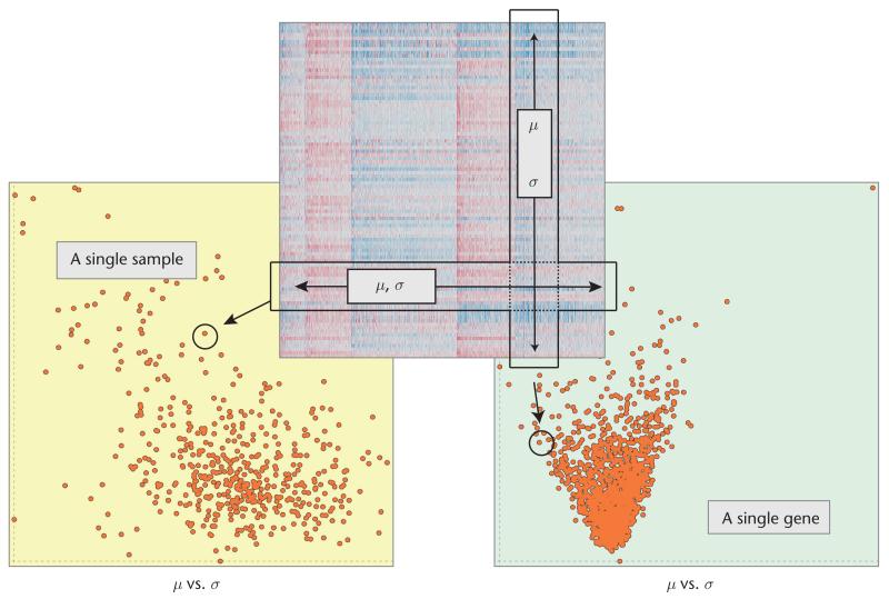
Figure 1 illustrates how we construct dual-analysis views. Visualizations of samples have a yellow background, with each point representing a sample; visualizations of genes have a light-green background, with each point depicting a gene. The computed statistics determine a point’s location in a scatterplot. We can elaborate the analysis by using statistics other than the first two statistical moments. For the analyses in this article, we also computed skewness, which indicates a distribution’s asymmetry (and the asymmetry’s direction), and kurtosis, which characterizes its peakedness.
Figure 1. Setting up dual-analysis views depicting the data as a 2D heat map.
To construct the view depicting samples (the one with the yellow background), we computed the statistics for each sample (the mean, μ, and standard deviation, σ) using a row of the data. To construct the view of the genes (the one with the light-green background), we computed the statistics using a column of the data.
Characterizing Subtypes
To facilitate subtype characterization, we incorporate dual-analysis scatterplots and significant-difference plots as blocks. We also use these visualizations as separate linked views to enhance interactive visual exploration and achieve tasks such as manual cluster creation.
Dual-Analysis Views
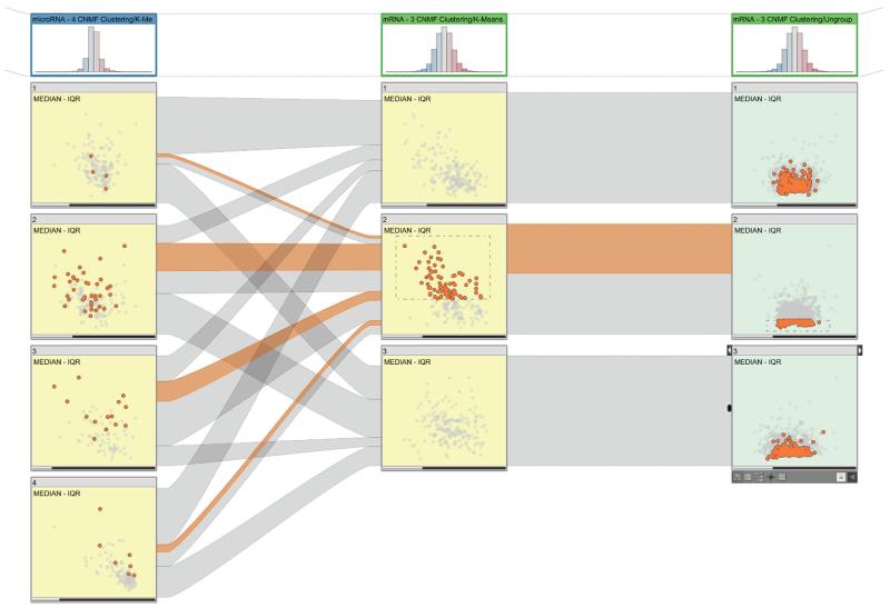
Figure 2 shows the embedded dual-analysis views. The sample scatterplots (yellow) display only those samples that are members of the represented cluster. The gene scatterplots (green) display the statistics for all the genes computed, using only the members of the represented cluster.
Figure 2. Dual-analysis views in StratomeX.
The first column shows a four-cluster stratification for a microRNA (miRNA) dataset. The scatterplots show the median versus the interquartile range (IQR) for the cluster samples. The second column shows a three-cluster stratification for a messenger RNA (mRNA) dataset, again showing samples. The third column uses the same three-cluster stratification for the same dataset but shows genes instead of samples. The sample scatterplots (yellow) depict the statistical characteristics of each cluster’s members; the gene scatterplots (green) depict statistics computed for the genes using only the samples from the cluster represented by the block. The selection of samples is highlighted in the first two columns and in the ribbons. The selection of the genes enables investigation of the distribution of expression values for the genes for different clusters in a stratification.
We enhance interactive exploration by enabling a selection mechanism that’s linked with all the views in StratomeX. Users can select both samples (see the second cluster in the second column of Figure 2) and genes (see the second cluster in the third column in Figure 2) at the same time. In Figure 2, the ribbons in StratomeX highlight the selection of the samples.
Significant-Difference Plots
We previously used plots to effectively display the changes in statistical computations in response to a user’s selection.8 Here, we extend that approach with the determination and communication of the visualized differences’ significance.
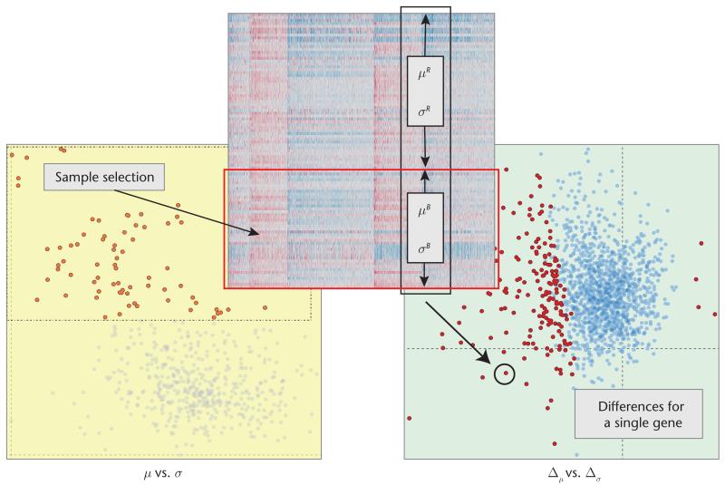
Figure 3 illustrates how we construct significant-difference plots (we call them just difference plots from now on). The user first selects (brushes) a subset of samples. In response, the system automatically calculates μ and σ for each gene using only the set of selected samples B (μB and σB) and the rest of the samples R (μR and σR) separately. We then compute the differences between the values with
| (1) |
where Δμ and Δσ are data vectors of size p, the number of genes. The difference plot then visualizes these values for all p. When no difference exists between a gene’s expression values for B and R, we place that gene at the origin (0, 0). While building this view, we compare the selected set of samples to the rest instead of comparing against all the samples. This approach avoids overlap between the two compared sets.
Figure 3. A significant-difference plot.
The plot visualizes the differences between the selected samples (B) and unselected samples (R) for the genes. Δμ and Δσ are data vectors of size p, the number of genes. Genes that differ significantly are red; all others are blue.
The difference plot on the right in Figure 3 displays the distribution of the differences in the statistic computations in response to the (sample) selection in the scatterplot (see the left of Figure 3). In this example, most genes have lower μ values for the selected items; that is, they’re on the left of the y-axis.
Communicating significance
An important consideration for analyzing differences between two subsets is statistical significance—whether the difference is not likely due to chance. As in many other domains, researchers who analyze genomic data use statistical hypothesis tests to test for significance.9 So, we enhance difference plots with integrated statistical hypothesis testing.
As the hypothesis-testing procedure, we use the two-sample Welch’s t-test.10 This test doesn’t assume that the two subsets have equal variance, which makes it suitable for our application. We perform the test on B and R and test against the (null) hypothesis that they have equal central tendencies. We compute t and the degrees of freedom, d.f.:
where is the sample mean, is the sample variance, and Ni is the sample size of B and R.
We then use these values together with the t-distribution and test the null hypothesis with a significance level of 0.05, employing a two-tail strategy. We perform this test for all p. For each gene, we store whether it shows a significant difference between B and R. We communicate this information by modifying the color of each gene in the difference plot. Genes with significant differences are red; the others are blue (see the right side of Figure 3). This enhancement lets analysts get immediate feedback on the differences’ significance. On the basis of this initial assessment, analysts can employ more-advanced routines to confirm the significance of the changes between the two subsets.
Difference plots as blocks
While constructing these blocks, we again compute Δμ and Δσ for each gene, using Equation 1. Here, however, B corresponds to the samples that are members of the represented cluster, and R corresponds to the rest of the samples. We also compute the differences’ significance and color the visualization accordingly. The resulting blocks communicate which genes are more distinctive for each cluster. Moreover, the selection mechanism lets analysts compare these distinctive genes across different clusters. We show an example of this feature later.
Case Studies
We demonstrated our approach’s effectiveness by analyzing a comprehensive invasive breast carcinoma (BRCA) dataset collected by the TCGA consortium. We used the mRNA expression data, miRNA sequencing data, and methylation data from more than 800 breast cancer patients. First, we loaded the BRCA data, which is available pre-packaged for Caleydo. For comparison and evaluation, we used a recently published reference study that provided a stratification of samples.11
The case studies aimed to demonstrate how our approach lets analysts execute the three tasks we described earlier.
Find Distinctive Elements
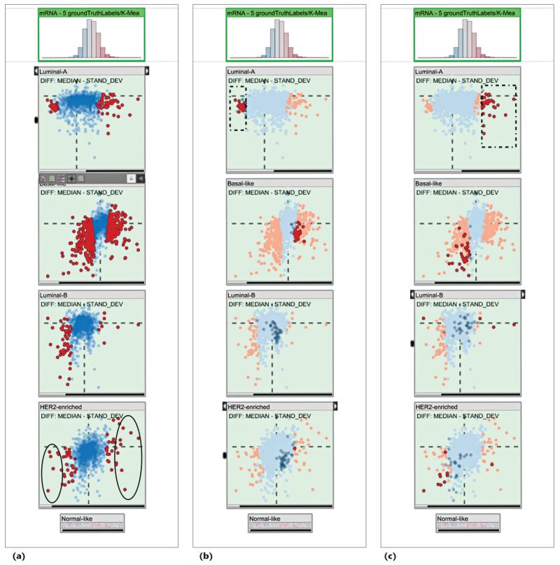
We first compared the significantly distinctive genes suggested by our computations with those that the reference study identified. That study reported four subtypes: Luminal-A, Basal-like, Luminal-B, and HER2-enriched (see Figure 4a). It used unsupervised clustering to identify a list of genes that are differentially expressed for the HER2-enriched subtype (see supplementary Table 7 of the study11). We selected the seven most significantly underexpressed genes (AGR3, ESR1, GFRA1, NPY1R, PGR, SER-PINA3, and SUSD3) and the 10 most significantly overexpressed genes (ABCA12, CALML5, CLCA2, CRYM, DCD, GLYATL2, MUCL1, NXPH1, PNMT, and SOX11). All seven underexpressed genes and six of the 10 overexpressed genes were identical to the ones in the reference study. This match demonstrates that our approach quickly yields relevant results in determining descriptive genes.
Figure 4. Using difference plots to find descriptive genes.
(a) We marked descriptive genes for the HER2-enriched subtype. A comparison to a reference study11 showed the marked genes’ relevance. (b) We selected underexpressed genes for the Luminal-A subtype. They showed overexpression for the Basal-like subtype; that is, they constituted good features to discriminate these two subtypes. (c) The overexpressed genes for Luminal-A could also be considered good discriminators for this subtype but showed similar expression profiles for the Basal-like and HER2-enriched subtypes.
Next, we explored the expression characteristics of the Luminal-A subtype’s distinctive genes compared to the other subtypes. We first selected the significantly underexpressed genes for the Luminal-A subtype (see Figure 4b). These genes (AQP9, FAM83D, GGH, MCM10, and MMP1 being some of the lowest) were often overexpressed for the Basal-like subtype. We concluded that they’re potentially good markers to distinguish the Luminal-A subtype from the Basal-like subtype.
Similarly, when we selected the overexpressed genes for the Luminal-A subtype (see Figure 4c), we observed that they were underexpressed for the Basal-like subtype. However, unlike the previous set, they showed expression profiles similar to the HER2-enriched subtype. Consequently, these genes carried less distinctive characteristics compared to the previous set.
Compare Samples
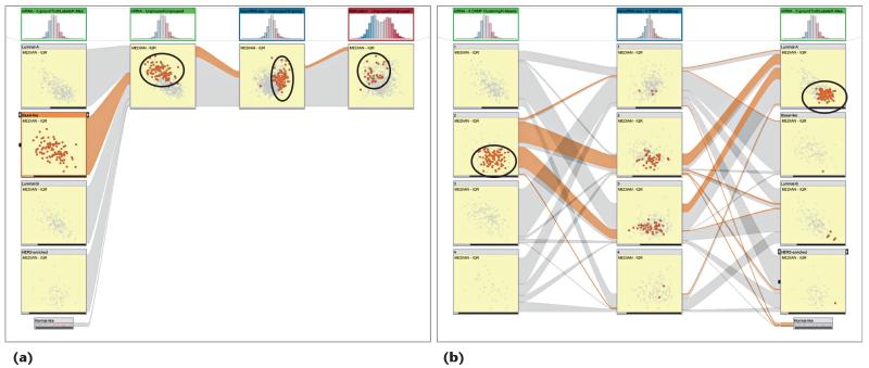
Here, we investigated how different datasets share certain properties of samples from a particular subtype—for instance, outliers or trends. We first investigated the characteristics of samples from the Basal-like subtype by considering the mRNA, miRNA, and methylation datasets. We created a view with the subtypes from the reference study as the first column and unstratified versions of the three datasets as the following columns (see Figure 5a). After selecting the samples, we observed that they had lower expression values with a high variance in the mRNA dataset and higher expression values in the miRNA dataset. When looking at their methylation values, however, we saw no dominant characteristics.
Figure 5.
(a) Investigating the sample profiles for the Basal-like subtype (column 1) over three datasets (mRNA, miRNA, and DNA methylation). The subtype contained samples with lower values and high variance for the mRNA data and usually higher values for the miRNA data. In the methylation data, however, we saw no dominant characteristic. (b) We selected core members of a cluster from an unsupervised stratification of mRNA data (circled in the left column) and visualized them with a miRNA stratification (the middle column) and the subtypes. The selected members corresponded to a subgroup in the Luminal-A subtype (circled in the right column).
We used the same approach to determine the characteristics of a cluster computed as a result of an unsupervised clustering of the mRNA dataset (see the left column in Figure 5b). We selected the second cluster’s core members—those with similar expression values and variance. These samples didn’t show any dominant characteristics in an unsupervised clustering of the miRNA data (see the middle column in Figure 5b). However, when considering the reference subtypes from the BRCA study (see the right column in Figure 5b), we observed that the selected samples constituted a subgroup of the Luminal-A subtype. We could also see that these samples were the overexpressed Luminal-A members with a lower variance. So, we conclude that we can use the second cluster from the mRNA stratification to determine a Luminal-A subgroup.
Create Clusters
Sometimes in tumor subtype analysis, the stratification information isn’t readily available. In these cases, we use dual analysis to manually create stratifications, instead of automated methods. This ability lets analysts discover structures through different views of multiple datasets and represent these structures as a stratification.
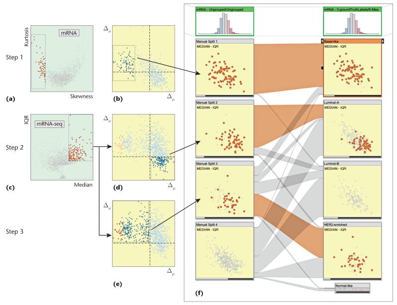
We performed the manual clustering process on the BRCA data. We used dual-analysis views as separate linked views rather than embedding them in StratomeX; that is, selections in any view were highlighted in the others. We brought up two linked views of the mRNA dataset: a skewness-versus-kurtosis visualization of the genes (see Figure 6a) and a difference plot for the samples for Δμ versus Δσ (see Figure 6b). We added two other views of the mRNA-seq dataset: median versus IQR visualization of the genes (see Figure 6c) and difference plots for the samples for Δμ versus Δσ (see Figures 6d and 6e).
Figure 6. Manual clustering of an unstratified mRNA dataset using dual-analysis views.
(a) We selected negatively skewed genes through a skewness-versus-kurtosis visualization. (b) The difference plot for the samples updated automatically; we observed a group of samples with lower values and marked them as our first cluster. (c) We then switched to the mRNA-seq dataset and selected genes that were more highly expressed with a large variety in the values. We identified two groups and marked them as (d) cluster 2 and (e) cluster 3. (f) For validation, we compared our stratification with the subtypes from the reference study and observed a significant overlap of the subtypes.
Then, we marked an unstratified mRNA dataset as the target for the manual clustering (through a user interface not shown in the images). The clustering involved three steps.
In step 1, we used skewness. High skewness indicated that a gene had nonuniform expression levels over the samples and thus was a good candidate to be a discriminator between subtypes. So, in this example, we selected the left-skewed genes (the ones with negative skew values) (see Figure 6a) and selected a group of samples that were visually separate from the rest (see the left of Figure 6b). At this point, we marked this subset of samples as a stratification of the mRNA dataset (the first cluster in the first column in Figure 6f).
In step 2, we switched to the mRNA-seq dataset and selected the genes with higher expression values and higher variety (see Figure 6c). The difference plot updated automatically; we selected the samples with higher expression values and lower variance (see Figure 6d). From the difference plot, we selected the samples in the lower-right quadrant—that is, high values and variety. Instead of using the observed visual structures to guide selection (as in step 1), we used the visualization axes—another strategy for making interesting selections. We made this selection because we expected to see higher variance and higher values for the samples in response to the selection of genes in Figure 6c. We finished this step by marking the sample selection as a second cluster.
In step 3, without updating the selection of genes, we selected the samples with higher variety but smaller mRNA-seq values (see Figure 6e). This selection corresponded to the difference plot’s upper-left quadrant—that is, lower values and higher variety. We marked this selection as the third cluster. We left the rest of the samples as an unclustered set.
We compared our custom stratification to the one from the reference study (see Figure 6f). The cluster from step 1, characterized by genes with negative skewness, almost completely overlapped with the Basal-like subtype. The cluster from step 2 corresponded largely to a subgroup of the Luminal-A subtype. Finally, more than half of the samples from the cluster from step 3 belonged to the HER2-enriched subtype. This overlap between the manually created clusters and the reference subtypes showed that manual clustering can produce relevant results.
Our interactive approach enables analysts to merge interesting structures observed in several datasets using different perspectives on the data—for example, using the skewness-versus-kurtosis view for the mRNA dataset and the median-versus-IQR view for the mRNA-seq dataset. This flexibility leads to outcomes that aren’t so straightforward to generate through automated methods. Moreover, manual clustering provides a way to externalize analysis findings. Analysts can compare manually generated clusters with automatically computed results such as hierarchical clustering.
Throughout these studies, we’ve seen that our approach facilitates the characterization of cancer subtypes by enabling an investigation of them over both the samples and the genes. In the future, we aim to include advanced statistical tests and procedures, such as analysis of variance, Bonferroni correction,9 and dimension reduction. We’ll include these methods through integration of the R statistical-computing environment.12 We also plan to extend difference plots to compare more than two groups. Furthermore, besides comparing one cluster to all the other elements, we plan to implement mechanisms to compare clusters with each other.
Acknowledgments
We thank Nils Gehlenborg, Samuel Gratzl, and Christian Partl for their input. Austrian Science Fund grant J 3437-N15 and US Air Force Research Laboratory and DARPA grant FA8750-12-C-0300 supported this research. Cagatay Turkay carried out his research mostly at the University of Bergen, and his research is funded by the university’s Department of Informatics.
Biographies
Cagatay Turkay is a faculty member and lecturer in applied data science at the giCentre in the Department of Computer Science at City University London. His research focuses on the tight integration of interactive visualizations, data analysis techniques, and supporting exploratory knowledge and the capabilities of experts. Turkay received a PhD from the University of Bergen. Contact him at turkay.cagatay.1@city.ac.uk.
Alexander Lex is a postdoctoral visualization researcher at the Visual Computing Group at the Harvard School of Engineering and Applied Sciences. His research interests are data visualization, especially for molecular biology, and human-computer interaction. Lex received a PhD from the Graz University of Technology’s Institute for Computer Graphics and Vision. Contact him at alex@seas.harvard.edu.
Marc Streit is an assistant professor at the Institute of Computer Graphics at Johannes Kepler University Linz, where he leads the visualization group. His research interests include information visualization, visual analytics, and biological data visualization, particularly the integrated analysis of large heterogeneous data. Streit received his PhD in visualization from the Graz University of Technology. Contact him at marc.streit@jku.at.
Hanspeter Pfister is the Gordon McKay Professor of Computer Science at Harvard University’s School of Engineering and Applied Sciences. His research in visual computing lies at the intersection of visualization, computer graphics, and computer vision. Pfister received a PhD in computer science from the State University of New York at Stony Brook. He received the 2010 IEEE Visualization Technical Achievement Award. He’s coeditor of Point-Based Graphics (Elsevier, 2007). Contact him at pfister@seas.harvard.edu.
Helwig Hauser is a professor at the University of Bergen’s Informatics Department, where he leads a visualization research group. His research interests include interactive visual analysis; flow visualization; illustrative visualization; and visualization for medicine, geosciences, biology, fluid dynamics, and so on. Hauser received a habilitation in visualization from the Vienna University of Technology. He received the 2006 Heinz-Zemanek Award in computer science (for research on generalizing focus+context visualization) and the 2013 Dirk Bartz Prize for visual computing in medicine (for pioneering high-quality visualization of sonographic medical data). He’s on the Eurographics Conference on Visualization steering committee. Contact him at helwig.hauser@uib.no.
Contributor Information
Cagatay Turkay, City University London.
Alexander Lex, Harvard University.
Marc Streit, Johannes Kepler University.
Hanspeter Pfister, Harvard University.
Helwig Hauser, University of Bergen.
References
- 1.Lex A, et al. StratomeX: Visual Analysis of Large-Scale Heterogeneous Genomics Data for Cancer Subtype Characterization. Computer Graphics Forum. 2012;31(3):1175–1184. doi: 10.1111/j.1467-8659.2012.03110.x. [DOI] [PMC free article] [PubMed] [Google Scholar]
- 2.Turkay C, Filzmoser P, Hauser H. Brushing Dimensions—a Dual Visual Analysis Model for High-Dimensional Data. IEEE Trans. Visualization and Computer Graphics. 2011;17(12):2591–2599. doi: 10.1109/TVCG.2011.178. [DOI] [PubMed] [Google Scholar]
- 3.Lex A, et al. VisBricks: Multiform Visualization of Large, Inhomogeneous Data. IEEE Trans. Visualization and Computer Graphics. 2011;17(12):2291–2300. doi: 10.1109/TVCG.2011.250. [DOI] [PubMed] [Google Scholar]
- 4.Seo J, Shneiderman B. Interactively Exploring Hierarchical Clustering Results. Computer. 2002;35(7):80–86. [Google Scholar]
- 5.Dietzsch J, Gehlenborg N, Nieselt K. Mayday—a Microarray Data Analysis Workbench. Bioinformatics. 2006;22(8):1010–1012. doi: 10.1093/bioinformatics/btl070. [DOI] [PubMed] [Google Scholar]
- 6.Kosara R, Bendix F, Hauser H. Parallel Sets: Interactive Exploration and Visual Analysis of Categorical Data. IEEE Trans. Visualization and Computer Graphics. 2006;12(4):558–568. doi: 10.1109/TVCG.2006.76. [DOI] [PubMed] [Google Scholar]
- 7.Riehmann P, Hanfler M, Froehlich B. Interactive Sankey Diagrams; Proc. 2005 IEEE Symp. Information Visualization (InfoVis 05); 2005.pp. 233–240. [Google Scholar]
- 8.Turkay C, Parulek J, Hauser H. Dual Analysis of DNA Microarrays; Proc. 2012 Conf. Knowledge Management and Knowledge Technologies (i-KNOW 12); 2012; article 26. [Google Scholar]
- 9.Allison DB, et al. Microarray Data Analysis: From Disarray to Consolidation and Consensus. Nature Reviews Genetics. 2006;7(1):55–65. doi: 10.1038/nrg1749. [DOI] [PubMed] [Google Scholar]
- 10.Ruxton GD. The Unequal Variance t-test Is an Underused Alternative to Student’s t-test and the Mann-Whitney U Test. Behavioral Ecology. 2006;17(4):688–690. [Google Scholar]
- 11.Koboldt D, et al. Comprehensive Molecular Portraits of Human Breast Tumours. Nature. 2012;490(7418):61–70. doi: 10.1038/nature11412. [DOI] [PMC free article] [PubMed] [Google Scholar]
- 12.R Core Team . R: A Language and Environment for Statistical Computing. R Foundation for Statistical Computing; 2013. http://cran.r-project.org/doc/manuals/r-release/fullrefman.pdf. [Google Scholar]


