Abstract
Available urban health metrics focus primarily on large area rankings. Less has been done to develop an index that provides information about level of health and health disparities for small geographic areas. Adopting a method used by the Human Development Index, we standardized indicators for small area units on a (0, 1) interval and combined them using their geometric mean to form an Urban Health Index (UHI). Disparities were assessed using the ratio of the highest to lowest decile and measurement of the slope of the eight middle deciles (middle; 80 %) of the data. We examined the sensitivity of the measure to weighting, to changes in the method, to correlation among indicators, and to substitution of indicators. Using seven health determinants and applying these methods to the 128 census tracts in the city of Atlanta, USA, we found a disparity ratio of 5.92 and a disparity slope of 0.54, suggesting substantial inequality and heterogeneity of risk. The component indicators were highly correlated; their systematic removal had a small effect on the results. Except in extreme cases, weighting had a little effect on the rankings. A map of Atlanta census tracts exposed a swath of high disparity. UHI rankings, ratio, and slope were resistant to alteration in composition and to non-extreme weighting schemes. This empirical evaluation was limited to a single realization, but suggests that a flexible tool, whose method rather than content is standardized, may be of use for local evaluation, for decision making, and for area comparison.
Keywords: Urban health, Urban metrics, Small area estimation, Indicators, Indices
Introduction
The health of the cities is described by complex and interconnected health indicators and health determinants. Major health assessment projects have assembled a large collection of such markers (e.g., 109 in the WHO Compendium Indicators;1 579 in the Community Health Status Indicators;2 420 in the World Bank’s World Development Indicators;3 467 objectives and indicators for the United States’ Healthy People 2010 project4) that provide a comprehensive picture of health and health disparities. But making sense of such information is a formidable task.5–10 A single number that summarizes the crucial data—an Index of Urban Health and Health Disparities—is an attractive prospect and offers a number of potential advantages. Ideally, it would be constructed from information about the physical characteristics of cities, about health and its determinants, and about the extent to which health status differs among population groups. Using transparent and accessible technology, it would provide an absolute measure of health as well as a basis for ranking urban areas. It would be used as an objective marker for setting goals, evaluating interventions, and planning for future improvements. The greatest asset of a unitary index, however, may be its social and political values. As Saltelli et al. 11 note, indices are really models that have the interesting property of being negotiated rather than derived. Their construction requires the consensus of scientists, policy makers, and practitioners. The political process of reaching agreement sets the stage for effective political use of an index.
As attractive as an Urban Health Index (UHI) may be, its realization is difficult, and debate about its worth has been lively. Practitioners note the deficiencies of a composite statistic,11–19 whose simplicity may conceal distortion. The factors making up a statistic may covary, and a change in the resulting metric may not be directly interpretable. In addition, it seems unlikely that identically collected information will be available at a small area level. Urban areas are heterogeneous, and the concerns of local decision makers and analysts, and thus the data they collect, are likely to vary widely across different countries and regions. Finally, ability to squeeze meaningful information into a single metric that captures the level of health, the intensity of health determinants, and the extent of disparities, is limited.
In this study, based on the assumption that there is a considerable variation in available data among geopolitical units, we have chosen a method over content. This assumption rests on the notion that disparities are not isolated phenomena, and underlying health inequality will be reflected in a wide range of indicators and determinants. We illustrate the proposed method with an example from a large city for which health determinants, but not health indicators, are available on a small area basis.
Methods
Underlying Assumptions
In an effort to meet the requirements of a UHI, we build on the extraordinary body of work that already exists in the measurement of community health. We chose to use an existing methodologies that have been applied for global ranking 20,21 and to reorient them for local use. This approach rests on the hypotheses that indicators are highly correlated on a local level; that weighting schemes, except in extreme (pathologic) situations, will have relatively little impact; and that contiguous small areas will be similar, making geovisualization especially useful.
These hypotheses would be difficult to “prove” on a theoretical level, but they are amenable to empirical examination. Inductive demonstration of interchangeability of indicators, for example, can provide confidence (though not certainty) that the derived indices can pinpoint areas at greatest risk and can demonstrate important inequalities. If the assumptions are tenable, they could have a positive effect on the use of indices, since the metrics would not then be burdened by the requirement of standard indicators. The indices would, however, be uniform with respect to construction, so that decision makers in different geographic areas use the same logic to measure and understand health disparities.
Index Construction
Any indicator for a set of geographically-associated administrative units will have a distribution. For urban areas containing small area jurisdictions, the exact shape of such a distribution is hard to predict, but it is likely that the tails are distorted, with a larger than expected lower end and a smaller than expected upper end. The distribution between the tails will be a function of the extent of heterogeneity within the geographic entity. Lacking a clear statistical model, we have adopted the approach used by the Human Development Index20 and in many other contexts for standardizing and amalgamating indicators for use in an index.
Standardization
For any indicator, we transform the actual values (e.g., age-adjusted rate) into a dimensionless proportion: the distance of the value from the minimum, divided by the range:
 |
1 |
where IS is the standardized indicator, Ii is the observation in the small area, “max (I)” is the maximum value for that indicator in the group, and “min*(I)” is the minimal value altered by a very small amount to avoid zero values in the numerator (in small areas for which Ii is the minimum value, the numerator would be zero without this small alteration, rendering the UHI for that area zero). An alternative to this approach, one used by the Human Development Index, is to select an intuitively justifiable minimum (e.g., subsistence value) that is applied to all areas (The HDI also uses a standard maximum, to assure comparability over time.). We chose to use “internal” minima and maxima to assure local relevance, but the method can easily accommodate such other choices.
Amalgamation
After standardizing the indicators that will be used in the index and applying a coding scheme that uniformly makes a low value undesirable and a higher value desirable, the indicators are all of the same logical type: proportions of the range. These indicators can be combined with a variety of weighting systems, but the most straightforward is to use one of the three Pythagorean means: arithmetic, geometric, or harmonic. When at least one element in the set differs from the others, then the geometric mean will lie between the other two. Following the lead of the Human Development Index, we combine m standardized indicators using the geometric mean:  where ISi is the ith standardized indicator.
Assessing Disparities
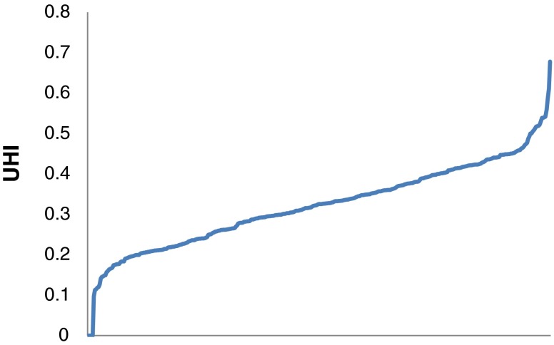
Perhaps a dozen or more schemes for assessing disparities have been developed.19,22–29 Of these, we have devolved on two measures of inequality, both of which derive from the distribution of the indicators (the ISi) for a small area group. If we order the units by the size of the indicator (that is, by rank) on the abscissa and their Urban Health Index (the geometric mean of the proportions of the standardized indicators for each census tract) on the ordinate, we get a curve with roughly the shape shown in Fig. 1 (this particular graph was drawn using data from 403 counties that contained major urban areas in the USA and four health determinants derived from the WHO’s Urban HEART project 30). This graph’s shape—linear, with markedly deviant extremes (below the 10th and above the 90th deciles)—manifests itself in virtually all the areas we have examined (various aggregations from the USA and Japan; data not shown). The shape of the tails and the slopes of the middle portions vary, however, and thus serve as potential measures of inequality.
FIG. 1.
Generic cumulative probability distribution.
The RATIO of the Extremes (Disparity Ratio)
The ratio of the mean of the upper 10 % of the distribution to the mean of the lower 10 % of the distribution is a marker of the overall disparity between the best-off and the worst-off area units. We use the ratio of means rather than the ratio of medians (which would be equivalent to the ratio of the 95th to the 5th percentiles) in order to accentuate the difference between the extremes. The ratio itself may be viewed as a relative risk comparing those exposed to benefits to those not exposed.
The SLOPE of the Midsection (Disparity Slope)
Using simple linear regression, we calculated the slope of the line that includes the middle 80 % of the data. (Rank is rescaled to have equal-spaced interval of 1/n for calculation of the health disparities slope, since the number of units may vary and differing n’s will produce non-comparable slopes). The slope of the midsection provides an estimate of the extent of heterogeneity in the overall grouping. A steep slope suggests a heterogeneous group with important difference over the distribution. A flat slope, in contrast, suggests relative uniformity in the central segment of the data.
Visualization
With ArcGIS, we displayed the distribution of Urban Health Indices using a single color with different hues. Though indicators have different implications (low mortality is desirable; low income is undesirable), we ordered the values for indicators so that desirable and undesirable values matched. For maps, areas with undesirable features were assigned the more intense hues in order to stand out visually, and those with desirable features were assigned the less intense hues.
Analytic Methods
Index Construction
Using the available data from the 2009 5-year (2005–2009) American Community Survey (ACS) for the 129 Census Tracts that are wholly or partially within the city of Atlanta, GA (drawn from both DeKalb and Fulton counties),31 we chose seven indicators from three domains: (1) economic; % employed, % above poverty level, household median income, and household mean income; (2) education; % high school graduate or higher and % with bachelor’s degree or higher; and (3) demographic; % of households not headed by a single female with children under 18 years of age. We constructed the Urban Health Index using the geometric mean of the standardized indicators (as described); calculated descriptive statistics for the rank order distribution of the UHIs for these 128 census tracts (one omitted owing to missing data); calculated the disparity ratio and disparity slope of the distribution; and displayed results on a census tract map of Atlanta.
Testing Robustness of the UHI
We performed a number of checks and simulations to determine the sensitivity of the value and rank ordering of the UHI’s to changes in critical parameters.
-
Sensitivity to the minimum value used to calculate the standardized indicator.
As noted, we used the minimum observed value for an indicator, altered slightly to avoid zero’s in the numerator of Eq. 1. As a single test of the sensitivity of the UHI to this parameter, we used zero as the minimum in all cases, thus reducing the formula for the standardized indicator to Ii/max(Ii). For the indicators selected for this study, the standardized indicators based on zero as the minimum retain their ratio scale properties.
-
Correlation among Indicators
We used two methods to assess the interrelationship of the indicators. First, a multiple correlation matrix was constructed. Second, we ran a set of seven ordinary least square regressions, using each indicator as the dependent variable and the remaining six as the independent variables, to determine the proportion of the variance explained (R2) for each indicator by the others.
-
The effect of weighting schemes
Health indicators are often combined using weights to give greater importance to selected indicators. We tested the sensitivity of the UHI to a broad set of arbitrary weights. We produced 1,000 sets of the seven indicators, each with weights simulated by picking the weight, v, independently from a standard uniform distribution (U[0,1]) using the random function in SAS.
Each set of weights was rescaled to sum to the number of indicators (n = 7). The sum of the weights is given by: As in the unweighted version, the weighted geometric mean of the standardized indicators was computed for each of the 1,000 sets of weights for the 128 census tracts. The formula for the geometric mean is altered slightly to account for weighting:
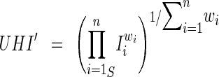
The simulation provided a distribution for the UHIs for each of the census tracts. Those distributions are captured by looking at the unweighted values for each census tract and displaying the demarcations for the 10th and 90th percentiles of their distributions as well.
-
Sensitivity to the alteration of indicators
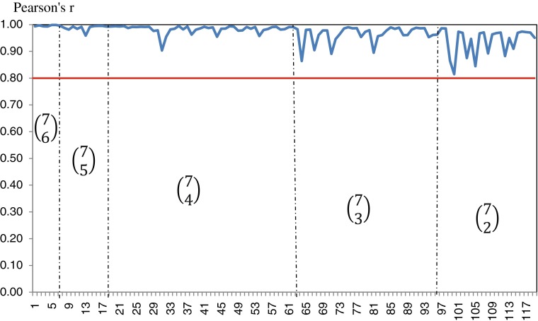
Without the availability of a large number of alternative indicators, we tested the robustness of the UHI by systematically removing the indicators. We calculated the UHI and its attendant properties for the set of seven indicators taken 6, 5, 4, 3, and 2 at a time. For each result, we calculated a Pearson (r) and Spearman (rs) correlation coefficients for the rank order of census tracts compared to the rank order with the original set of seven indicators.
Large Area Data
To examine the applicability of this approach to subdivisions within an entire nation, we used from the 2003–2007 National Japanese Health Statistics Database, National Statistics Center, and the Statistics Bureau (http://www.e-stat.go.jp/SG1/estat/eStatTopPortalE.do). We constructed and graphed the UHI using the area level data available for Japan as a whole and for the agglomeration of 56 of the 62 municipalities within the Tokyo prefecture (23 special wards that constituted the former city of Tokyo, 8 villages, 5 towns, and 26 cities [6 municipalities were dropped due to missing data]). The indicators for this purpose were all-cause mortality and cause-specific mortality for malignant neoplasm; heart disease, cerebrovascular disease, and pneumonia. These indicators were available in the form of standardized mortality ratios calculated for the 5-year period 2003–2007,
 |
The jurisdiction demarcations in Japan are complex, with nine different designations (from “village” to “core city”). Taking into account data availability and changing boundaries over the interval in interest, we were able to calculate the UHI for 1,873 small area units.
Results
The UHI for Atlanta, with Modification of the Minimum Value
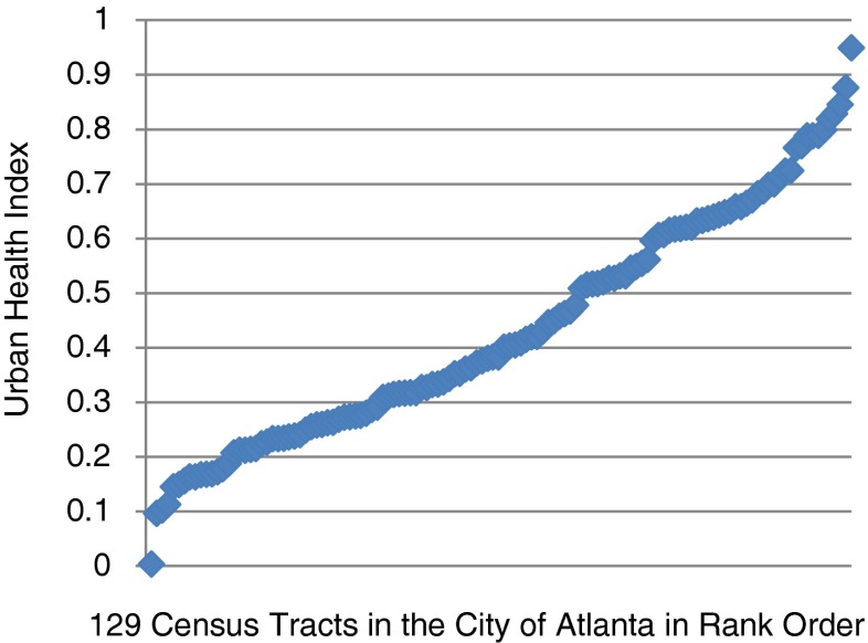
The distribution for the 128 census tracts reveals a large disparities ratio (5.92) and a steep disparities slope (0.54) (Fig. 2). These distributional results are strongly influenced by extreme values at either end of the distribution. The distributional properties of the UHI are virtually uninfluenced by the use of zero as the minimum value rather than the use of the observed minimum (Table 1). The Pearson correlation coefficient between the two indices was 0.996.
FIG. 2.
Distribution of UHI for 128 census tracts in Atlanta, GA, 2009. Disparities Ratio = 5.92; Disparity Slope = 0.54
TABLE 1.
Descriptive statistics for the UHI and the alternative UHI using zero as the minimum value—Atlanta, GA, 2009
| Mean | Std Dev | Minimum | P10 | Median | P90 | Maximum | |
|---|---|---|---|---|---|---|---|
| UHI | 0.43 | 0.21 | 0.00 | 0.17 | 0.39 | 0.72 | 0.95 |
| UHI-0 | 0.49 | 0.18 | 0.13 | 0.27 | 0.45 | 0.74 | 0.96 |
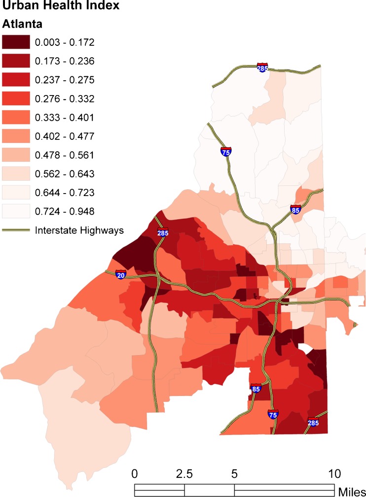
Visualization of the Atlanta UHI distribution (Fig. 3) shows a swath of low index census tracts through the midsection of the city. This band runs roughly along the major east–west artery and, in its eastern portion, along the primary north–south artery (a confluence of two major interstates that join in the city and then separate). On the western side, the band is traversed by a portion of the outer perimeter highway. Though not uniform, the pattern suggests rising UHI toward the city’s periphery.
FIG. 3.
Map of Atlanta displaying the Urban Health Index.
Correlation of Indicators
In this data set, all Pearson correlation coefficients were above 0.50, range from 0.54 (% high school graduates with % employed) to 0.81(median or mean household income with % with bachelor’s degree or higher). The correlation between mean and median income was 0.96. The percent of the variance of each indicator explained by the other six varied from 51.5 (% employed) to 94.1 % (mean household income), with all the others in excess of 70 %.
The Effect of Weighting
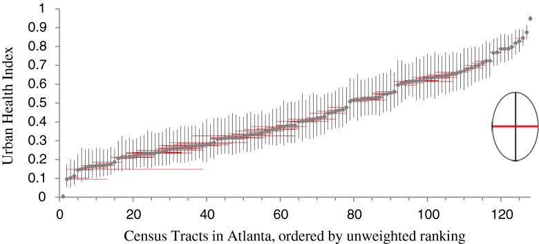
With only a few exceptions, the value of the UHI does not change dramatically over the 1,000 simulated set of weights (vertical bars) (Fig. 4). More important, however, is that the change in ranking over the simulations is relatively small (horizontal bars) (Fig. 4). In one instance, a census tract’s rank increased by 40 places, but no other large shifts were observed. If the viewer draws an ellipse whose axes are the horizontal and vertical bars around any census tract (see inset), it defines the space wherein the UHI for that census tract would fall approximately 80 % of the time. Similarly, the median disparity ratio from the simulation did not differ appreciably from the observed disparity ratio (6.04 vs. 5.92), nor did the median disparity slope differ from the observed (0.53 vs. 0.54).
FIG. 4.
Results of weighting simulations. Vertical bars represent the 10th and 90th percentiles of the distribution of UHIs for each census tract. Horizontal bars depict the range of ranks for each census tract.
Sensitivity to Indicator Alteration
For these data, systematic removal of indicators from the index had a small effect (that is, a very high correlation between the original UHI and the UHI with one or more indicators removed) until more than three indicators were removed (Fig. 5). Even with five indicators removed, the correlation between the simulated UHI and the original UHI never falls below 0.8, reflecting the high correlation of the chosen indicators and suggesting the overall scheme is robust to the alteration of indicators.
FIG. 5.
Pearson correlation coefficient for UHI with subset of 6, 5, 4, 3, and 2 indicators (N = 119). As described in the text, each section represents the UHI with one or more component indicators removed. For example, in the first vertical section, we recalculate the UHI with 6 or the 7 indicators, for all possible combinations of 6 (N =  = 7!/(6! × 1!) = 7 combinations. The correlation of each these points with the original URI is approximately 0, 99. The correlations become smaller as an increasing number of indicators are removed, but remains above 0.9 until more than three are removed.
Initial Comparison with Another Site
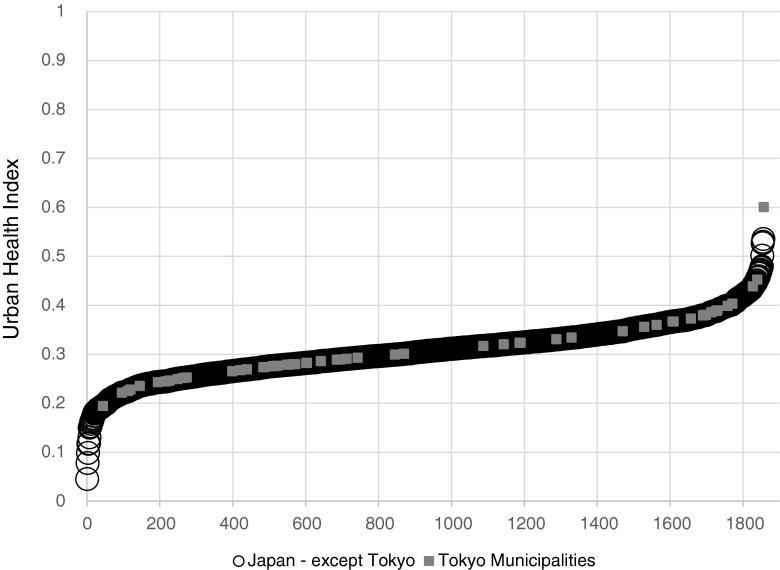
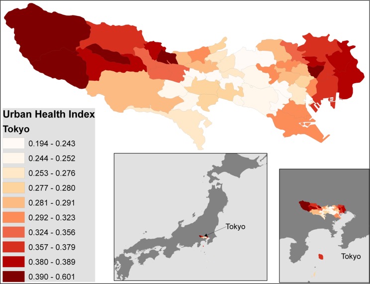
Applied to a nation as a whole, the UHI demonstrates the expected linear distribution with distorted tails (Fig. 6). The data for Tokyo are embedded in the graph and reveal that disparity is not as marked for this large conurbation, but follows the same pattern. The map of Tokyo (Fig. 7) reveals that the areas of greatest disparity are in the outlying districts; the central city has the more propitious mortality experience.
FIG. 6.
Distribution the UHI for all municipalities in Japan, with the values for municipalities in Tokyo prefecture superimposed. The graph depicts the distribution of the UHI using the minimum value for the data set, adjusted to prevent zeros in the numerator of the contributing indicators (see text). The graph for the UHI using zero as the minimum is virtually identical.
FIG. 7.
Map of the Tokyo prefecture displaying the range of UHIs. The darker hues represent areas that are less well off with regard to the indicators of mortality that are depicted.
Discussion
The chosen approach consciously foregoes uniform components to rank large geographic units in favor of a flexible tool, derived from a well-established index20,21 that can be used by public health workers and decision makers to compare small local areas. The assessment of local disparities does not gainsay the need for global measures, but may provide an important link between the standing of a nation and the source of its internal disparities. That such a link is possible is demonstrated by applying the technique to a nation as a whole (Japan) and to an urban megapolis within it (Tokyo). Preservation of the HDI approach for small area assessment permits congruent interpretation of global ranking of nations and small unit ranking within a nation. Unlike the modification of the HDI for inequality—the IHDI which adjusts the parent measure using the ratio of the geometric to arithmetic mean—this approach permits public health workers and policy makers to explore the available data in detail. It permits the question: If our nation is ranked Nth on the IHDI, where within our country is the source of the disparity? The geovisualization provides a fractal metaphor (though perhaps not a strict mathematical one). Inequality among nations is mirrored in the inequality within nations and the inequalities within their cities.
Earlier consultations with experts convened by the WHO Kobe Center32 concluded that a single urban health index, incorporating information about the level of health, health outcomes, and health disparities, was not feasible. The suggestion emerged that a flexible tool which could assess each as separate measures and allow visual representations might serve better, especially at the local level. The Urban Health Index that we propose fulfills these criteria. This example provides a demonstration of how this might work, but also points to a key problem that pervades the field of health summarization: lack of information on the local level. Though the USA has a highly developed health system, health outcome data are not publicly available at the census tract or smaller level. In addition, the sample health determinants that we chose for illustration, though adequate for the purpose, are not necessarily those that would be chosen by other investigators. Data remain the paramount obstacle to health assessment, global or local.
Our underlying premise—that health disparities congregate—leads to several hypotheses. First, minor manipulations of the methodology will not have a material impact. Second, indicators will tend to be correlated at the small area level. Third, an index formulated from available indicators will not be highly sensitive to substitutions. Fourth, weighting schemes, except when extreme, do not have a major influence. Though only a single empirical assessment, this evaluation supports those hypotheses. Extreme alteration of the minimum indicator value (from minimum observed to zero) had a little impact neither on the actual values of the UHI nor on their relative ranking. The indicators used, especially those from a similar domain, are highly correlated in the data set we used. Removing indicators systematically from the index had minimal effect until most had been removed, but even then, correlation of the revised indicator with the original one was high. Finally, a simulation of weighting schemes suggests the potential for local change in rankings, but major changes in rankings that result from weighting are rare.
A single empirical realization is no proof, but these results suggest that further validation is warranted, and the method may be of value in identifying health needs, disparities, and special “hot spots” that require public health attention. For example, we termed the observed disparity ratio of 5.92 “high” and the observed disparity slope of 0.54 “heterogeneous,” but further empirical exploration is needed for greater confidence in such value judgments. Performed periodically over time, the technique may permit evaluation of change and of public health intervention. Finally, geovisualization, an emerging field in geoscience,33 can be enhanced by the amalgamation of data from disparate domains, providing a more nuanced approach to the structure of health disparities. In keeping with the WHO Commission on Social Determinants of Health to “measure and understand the problem and assess the impact of action,”34 this approach to demonstrating urban health disparities may promote rational health policy formation.
Acknowledgment
This study was supported by a grant from the WHO Center for Health Development (the WHO Kobe Center). Research support was also provided by the National Institute of Minority Health and Health Disparities of the National Institutes of Health under award number 1P20MD004806. The content is solely the responsibility of the authors and does not necessarily represent the official views of the World Health Organization or of the National Institutes of Health.
The authors would like to acknowledge the advice and encouragement of Dr. Michael Eriksen, Founding Dean of the School of Public Health, GSU; and Byungwoo Cho, Prasanth Kambhatla, and Kumiko Miyake, who provided technical assistance in translation, data management, and analysis.
References
- 1.World Health Organization. World Health Statistics 2010. Indicator compendium. Web, 2010. http://www.who.int/whosis/indicators/WHS10_IndicatorCompendium_20100513.pdf. Accessed 21 Dec 2010.
- 2.US Department of Health and Human Services. Community Health Status Indicators. Web, 2009. http://communityhealth.hhs.gov/homepage.aspx?j=1. Accessed 21 Dec 2010
- 3.The World Bank. World Development Indicators. Web, 2010. http://data.worldbank.org/indicator. Accessed 21 Dec 2010.
- 4.Office of Disease Prevention and Health Promotion, US Department of Health and Human Services. Health People 2010. Web, 2010. http://www.healthypeople.gov/default.htm. Accessed 21 Dec 2010.
- 5.Boerma J, Mathers C, Abou-Zahr C. WHO and Global Health Monitoring: the Way Forward. PLoS Med. 2010;7:11. doi: 10.1371/journal.pmed.1000373. [DOI] [PMC free article] [PubMed] [Google Scholar]
- 6.Byass P. The imperfect world of global health estimates. PLoS Med. 2010;7:11. doi: 10.1371/journal.pmed.1001006. [DOI] [PMC free article] [PubMed] [Google Scholar]
- 7.Graham WJ, Adjei S. A call for responsible estimation of global health. PLoS Med. 2010; 7(11). [DOI] [PMC free article] [PubMed]
- 8.Murray CJL, Lopez AD. Production and analysis of health indicators: the role of academia. PLoS Med. 2010;7:11. doi: 10.1371/journal.pmed.1001004. [DOI] [PMC free article] [PubMed] [Google Scholar]
- 9.PLoS Medicine Editors We count on global health estimates? PLoS Med. 2010;7:(11. doi: 10.1371/journal.pmed.1001002. [DOI] [PMC free article] [PubMed] [Google Scholar]
- 10.Sankoh O. Global health estimates: tronger collaboration needed with low- and middle-income countries. PLoS Med. 2010; 7(11). [DOI] [PMC free article] [PubMed]
- 11.Saltelli A, Nardo M, Saisana J, Tarantola S. Composite indicators: the controversy and the way forward. In Proceedings of the OECD Forum "Statistics, Knowledge and Policy: World Forum on Key Indicators" November 2004. Web, 2004. http://www.sourceoecd.org/general/economics/9264009000. Accessed 21 Dec 2010.
- 12.European Commission Joint Research Centre. Composite Indicators. Web, 2009. http://composite-indicators.jrc.ec.europa.eu/. Accessed 30 Dec 2010.
- 13.Saltelli A. Composite indicators: between analysis and advocacy. Soc Indic Res. 2007; 81: 65–77.
- 14.Saltelli A. Composite Indicators: ten Steps. Web, 2009. http://composite-indicators.jrc.ec.europa.eu/Seminar_Eurostat_2009/Saltelli-TenSteps.pdf. Accessed 30 Dec 2010.
- 15.Tarantola S, Saltelli A. Composite indicators: the art of mixing apples and oranges. Web, 2007. http://kolloq.destatis.de/2007/tarantola.pdf. Accessed 30 Dec 2010.
- 16.Gardner JW, Sanborn JS. Years of Potential Life Lost (YPLL)-What does it measure? Epidemiology. 2010;1:322–9. doi: 10.1097/00001648-199007000-00012. [DOI] [PubMed] [Google Scholar]
- 17.Nardo M, Saisana M, Saltelli A, Tarantola S, Hoffman A, Giovannini E. Handbook on constructing composite indicators: methodology and user guide. OECC Statistics Working Papers, 2005/3. Paris, France: OECD Publishing; 2005.
- 18.Nardo M, Saisana J, Saltelli A, Tarantola S. Tools for composite indicators building. from European Commission: Joint Research Centre. Web, 2005. http://citeseerx.ist.psu.edu/viewdoc/download?doi=10.1.1.114.4806&rep=rep1&type=pdf. Accessed 28 Mar 2014.
- 19.Rey G, Jougla E, Fouillet A, Hemon D. Ecological association between a deprivation index and mortality in France over the period 1997–2001: variations with spatial scale, degree of urbanicity, age, gender, and cause of death. BMC Public Health. 2009; 9: 33. [DOI] [PMC free article] [PubMed]
- 20.United National Development Programme. Human Development Indices: technical notes. Web, 2010. http://hdr.undp.org/en/media/HDR_2010_EN_TechNotes_reprint.pdf. Accessed 30 Dec 2010.
- 21.United National Development Programme. Human Development Report 2010. Web, 2010. http://hdr.undp.org/en/statistics/indices/. Accessed 21 Dec 2010.
- 22.Etches V, Frank J, DiRuggiero E, Manuel D. Measuring population health: a review of indicators. Annu Rev Public Health. 2006;27:29. doi: 10.1146/annurev.publhealth.27.021405.102141. [DOI] [PubMed] [Google Scholar]
- 23.Handcock M, Morris M. Relative distribution methods. Sociol Methodol. 1998;28:53–97. doi: 10.1111/0081-1750.00042. [DOI] [Google Scholar]
- 24.Handcock M, Morris M. Relative distribution methods in the social sciences. In: Fienberg S, Lievesley D, Rolph J, eds. Statistics for Social Sciences and Public policy. New York, NY: Springer-Verlag, Inc; 1999.
- 25.Houweling TAJ, Kunst AE, Mackenbach JP. World health report 2000: inequality index and socioeconomic inequalities in mortality. Lancet. 2001;357:1671–2. doi: 10.1016/S0140-6736(00)04829-7. [DOI] [PubMed] [Google Scholar]
- 26.Mackenbach JP, Kunst A. Measuring the magnitude of socio-economic inequalities in health: and overview of available measures illustrated with two examples from Europe. Soc Sci Med. 2010;44(6):757–71. doi: 10.1016/S0277-9536(96)00073-1. [DOI] [PubMed] [Google Scholar]
- 27.Schneider MC, Castillo-Salgado C, Bacallao J, et al. Methods for measuring health inequalities (Part I) Epidemiol Bull. 2004;25(2):12–4. [PubMed] [Google Scholar]
- 28.Schneider MC, Castillo-Salgado C, Bacallao J, et al. Methods for measuring health inequalities (Part II) Epidemiol Bull. 2005;26(1):5–10. [PubMed] [Google Scholar]
- 29.Schneider MC, Castillo-Salgado C, Bacallao J, et al. Methods for measuring health inequalities (Part III) Epidemiol Bull. 2005;26(2):12–5. [PubMed] [Google Scholar]
- 30.World Health Organization: centre for Health Development. Urban Health Equity Assessment and Response Tool (Urban HEART). Web, 2010. http://www.who.or.jp/urbanheart.html. Accessed 22 Dec 2010.
- 31.United States Census Bureau. Pre-2010 Census Cartographic Boundary Files. US Census Bureau, 2012. http://www.census.gov/geo/www/cob/bdy_files.html. Accessed 20 Jan 2013.
- 32.WHO Kobe Centre. Report of Consultation Meeting on Urban Health Metrics Research 23–25 February, 2011. 2012.
- 33.Hardisty F, Robinson AC. The GeoViz Toolkit: using component-oriented coordination methods for geographic visualization and analysis. Int J Geogr Inf Sci. 2011;25(2):191–210. doi: 10.1080/13658810903214203. [DOI] [PMC free article] [PubMed] [Google Scholar]
- 34.WHO Commission of Social Determinants of Health. Closing the gap in a generation: health equity through action on the social determinants of health. Geneva: world Health Organization, 2013. http://www.who.int/social_determinants/thecommission/finalreport/en/index.html. Accessed 21 Jan 2013.


