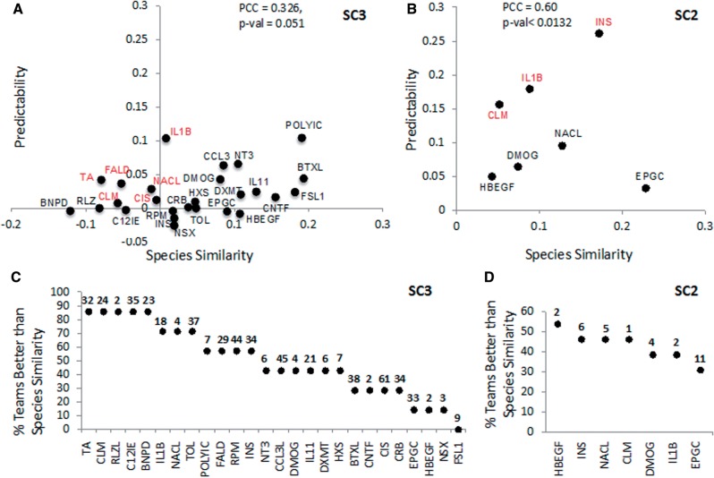
Fig. 3.
Predictability versus species similarity for stimuli. (A) The y-axis indicates for each stimulus the mean predictability Prs of all team predictions when considering gene set activation in SC3. The x-axis is species similarity Ss of gene set activation. In red are stimuli where Prs > Ss > 0. (B) The y-axis indicates for each stimulus the mean predictability Prs of all team predictions when considering protein phosphorylation activation in SC2. The x-axis is Sp of phosphoprotein activation. In red are stimuli where Prs > Ss > 0. (C, D) Plots showing the percentage of teams where Prs > Ss for each stimulus when predicting gene set activation (C) or phosphoprotein activation (D). Stimuli are ordered by percentage of teams and the number of activated gene sets or phosphorylated proteins is indicated on top of each stimulus. The number of active calls per gene set is shown on the top of the graph. Nineteen stimuli are not shown in (B) and (D) because no proteins were measured as phosphorylated

