Abstract
Purpose:
In this case study we describe key features of the structured communication tool—a style guide—used to support interdisciplinary collaboration, and we propose the use of such a tool for research teams engaged in similar projects. We employ tailored infographics to present patient reported outcome data from a community health survey back, in a comprehensible and actionable manner, to the individuals who provided it. The style guide was developed to bridge the semantic gap between the domain and programming experts engaged in this effort.
Innovation:
The style guide supports the communication of complex design specifications in a highly structured format that is nevertheless flexible enough to accommodate project growth. Unlike the typical corporate style guide that has a more narrative format, our style guide is innovative in its use of consistent fields across multiple, standalone entries.
Credibility:
The process of populating the style guide prompted the designer toward greater design efficiency and led to consistent and specific instructions that met the framework architect’s stated information needs.
Discussion and Conclusion:
The guiding values in the creation of the style guide were consistency, clarity, and flexibility. It serves as a durable reference to the desired look and functionality of the final infographic product without dictating an implementation strategy. The style guide format can be adapted to meet the communication needs of other interdisciplinary teams facing a semantic gap.
Keywords: 2014 EDM Forum Symposium, Data Visualization, WICER, Methods
Introduction and Purpose
For the Washington Heights/Inwood Informatics Infrastructure for Comparative Effectiveness Research (WICER) project, we compiled survey data from >5,800 primarily Latino members of a northern Manhattan community. Survey variables included anthropometric measures (e.g., blood pressure, waist circumference, height, weight), health behaviors (e.g., physical activity, nutrition), self-reported outcomes (e.g., depression and anxiety symptoms, sleep quality, chronic stress, overall health), and health literacy and numeracy. In an effort to return these survey data to participants in an easily comprehensible and actionable format, we created infographics for the variables collected.1 Eventually, participants will be able to log in to a community-facing online health portal to view infographics that have been individually tailored to the participants using their WICER data.
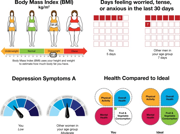
Infographics are graphical displays of information, such as charts or diagrams, supplemented with text. Infographics are tailored if they have been customized according to characteristics specific to the intended viewer.2 We used an iterative participatory design process in which prototype infographics were refined based on feedback from WICER participants. The tailored infographics are intended to promote community health and effective self-management by supporting community members’ comprehension of their personal health information. Patient reported outcomes and other health data can be converted into health communication and community engagement tools. As health communication tools, tailored infographics can facilitate conversation between patients and clinicians. As community engagement tools, they have the potential to help to build a strong fabric of trust with the community when its members see the data they contributed become products useful for health self-management. Examples of infographic formats are shown in Figure 1.
Figure 1.
Four Examples of Infographic Formats Specified in the Style Guide
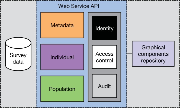
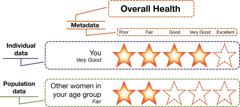
The generation of thousands of infographics containing protected health information (PHI) necessitates secure automation, which we achieve using a novel, adaptable, reusable, and generalizable software approach—Electronic Tailored Infographics for Community Engagement, Education, and Empowerment (EnTICE3).3 EnTICE3 utilizes a web service application programming interface (API) to perform two major functions: gatekeeping and infographic assembly (see Figure 2). Gatekeeping functions are shown in the dark gray box (Figure 2): EnTICE3 verifies the user’s identity, controls access to the survey data, and audits activity. To assemble infographics, EnTICE3 queries the survey database for the necessary metadata, individual data, and population data. Those data are then used to arrange the graphical components in its repository into an infographic tailored to the user according to graphic design specifications. In Figure 3, a sample infographic has been marked up to show the data sources necessary to generate the various parts of a tailored infographic. The EnTICE3 approach builds upon the Data Driven Document repository (D3.js), a programming code library that uses digital data to create and control dynamic and interactive graphical forms in web browsers.4,5
Figure 2.
The EnTICE3 Framework
Figure 3.
A Sample Infographic Annotated with Data Sources and Color Coded to Figure 2
A high degree of communication and collaboration was required between the lead infographic designer and the framework architect in order to convert correctly the infographic design specifications into the EnTICE3 computer code that assembles the graphical components. Their professional vocabularies have little overlap; thus they were faced with a “semantic gap” in communication. In the presence of a semantic gap, differing core assumptions and terminology definitions can substantially hinder communication. The semantic gap between domain and programming experts has been well documented in general and in health care, and has been addressed through a number of structured communication approaches. For example, there are tools that domain experts can use to author rules for decision support systems in natural rather than computer language with subsequent automated transformation for processing.6,7,8 The Unified Modeling Language (UML) is another approach in which visualizations (e.g., activity diagrams) are explained through structured communication and transformed into computer code. This approach has been used extensively to facilitate communication between domain and technical experts to develop Health Level Seven (HL7) standards for interoperability (transfer of data between information systems)9 and to develop a model of shared understanding of the clinical research semantics.10
Given the visual, rather than textual, nature of the structured communication required to produce the design specifications for EnTICE3, another approach was needed. In order to support this visualization automation effort, we created a structured communication tool—a style guide—in which the design specifications were recorded. The principal users of the style guide are a nurse scientist with a background in artistic design (the lead infographic designer) and a software developer (the framework architect). The purpose of this case study is to describe key features of the style guide and to propose use of such a tool for other teams facing a semantic gap or engaged in similar projects.
Design Process
In meetings between the lead infographic designer and the framework architect, it became clear that each infographic had numerous unique attributes to be operationalized into formal computational processes. The two parties collaborated to identify which components of each infographic would be dynamic, as well as the various framework architecture strategies that could be employed to automatically generate each dynamic component. Particular attention was paid to strategies flexible enough to display very low, very high, and nonmissing zero values. The meetings also served to familiarize the framework architect with the most current design iterations and to identify his information needs. To achieve high-quality communication, detailed written documentation was deemed more practical than frequent, informal in-person consultation. Based on the framework architect’s questions and stated information needs, the lead infographic designer identified the attributes that were common across infographics and could thus serve as the organizing structure for the design specifications.
The designer’s prior exposure to corporate marketing and branding practices prompted the borrowing of the term “style guide.” Organizations employ style guides primarily to promote consistency in visual identity and textual voice. Interested readers can conduct an online search for “style guide” to see many excellent examples.
Style Guide Features
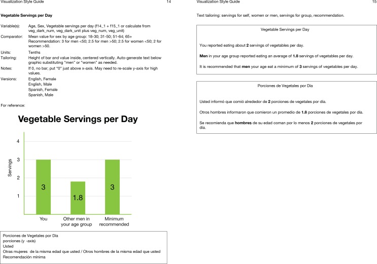
The style guide document comprises two sections: the front matter (i.e., introductory pages), and the infographic entries. The front matter includes a table of contents, a notation of the default font, and a table of the standardized codes that uniquely identify the colors in the graphics. Each of the 23 infographics has its own two-page entry that appears on facing pages when the style guide is printed and bound along the left margin (see Figure 4). Each entry has up to 11 fields that are the organizing structure for the design specifications. See Table 1 for descriptions of the 11 fields and examples how the fields are populated. The lead infographic designer populated the fields for each entry with concise, specific information that uniquely describes the attributes of each infographic in order to provide the framework architect with a ready reference of infographic design specifications.
Figure 4.
Facing Pages in the Style Guide for the “Vegetable Servings per Day” Infographic
Table 1.
Style Guide Fields, Descriptions of the Fields, and Examples of How the Fields Are Populated
| Field Name | Description | Examples |
|---|---|---|
| 1. Variables | The descriptive names of the survey variables needed to create the infographic and the variable names as they appear in the database, if these differ. Generally, variables continued to be defined as they had been when the survey data were collected, but in some instances, a new variable was needed. New variables were transformations of existing variables (e.g., continuous to categorical, composite of two or more variables). |
|
| 2. Comparators | Comparators are recommendations and mean values for other WICER participants as matched by gender and age group. This field applies to many, but not all, of the infographics. Age groups are defined in this field. |
|
| 3. Units | The unit of measure to be displayed in the infographic. Rules for transformation from numerical values to categories as well as instructions for the creation of composite variables are provided here. |
|
| 4. Tailoring | The dynamic aspects of each infographic are specified in this field. |
|
| 5. Criteria | This field applies only to infographics that referenced body mass index, waist circumference, and blood pressure. Standard Centers for Disease Control and Prevention reference ranges are provided. |
|
| 6. Versions | All infographics have at least two language versions. Additionally, some differ by gender as well and thus have four versions. |
|
| 7. Notes | This field includes miscellaneous instructions for how to treat very high, very low, and nonmissing zero values. |
|
| 8. Sample Images for Reference | Typically, one sample image is provided; two samples are given for infographics that vary according to gender. | See Figures 1 and 4. |
| 9. Spanish Translations | A text box below the sample image contains the official translation of all text that might appear in the infographic. Word choice is standardized across infographics. | See Figure 4. |
| 10. Text-only Versions | In order to assess whether or not the infographics support comprehension and perceived ease of comprehension, we designed an experimental protocol in which the infographics are compared to text-only versions. The text was composed according to two principles: it should be as easy to read as possible for individuals with low literacy, and it should accurately reflect all the relevant information provided in the infographic. Like the infographics, the text-only versions must be generated automatically. The official text-only versions, English and Spanish, are shown in text boxes on the second (facing) page. Bolded text indicates the words and numbers subject to tailoring. These will not be bolded in the final product. |
|
| 11. Text Tailoring | This field is used to specify which components of the Text-only Versions are dynamic. Typically, these are the same as those in the infographic—but for some text descriptions, additional notes are given for the Spanish version if words change based on gender or number. |
|
Although the style guide served as documentation of the design specifications, its more important function was as a structured communication tool. To that end, the guiding values in its creation were consistency, clarity, and flexibility. Consistency was applied to format and layout throughout the document, as well as to naming conventions, fonts, colors, and word choice. Clarity was promoted primarily through the use of concise, precise descriptions. Given that some infographics are similar in either appearance or title, the use of unique names supported clarity. The style guide needed to be flexible enough to remain useful even if infographics are eventually modified, added, or removed. For that reason, cross-referencing between style guide entries was avoided; each set of facing pages is meant to stand independently. The existing fields are general enough to be broadly applicable and can be left blank if not needed; additional fields can be added if and when they become necessary.
Discussion
The style guide facilitated communication between the lead infographic designer and the framework architect by organizing, into a consistent and structured format, all the information that was necessary for programming. The typical corporate style guide has a more narrative, guideline-based format marked by design jargon (e.g., “Be sure to maintain clear space around the wordmark and the positioning line so that they are clearly legible”). Our style guide is innovative in its use of consistent fields across multiple, standalone entries to facilitate communication across disciplines. The modular template structure of the style guide makes it easier to make changes to the collection of infographics. Designs are easily modified, added, or removed. For example, if our future work with infographics leads us to add animation or interactivity, the addition of one or two fields may be all that is needed to accommodate the added complexity. The adaptability of the style guide in this respect contributes to the long-term sustainability of the project. One of the unexpected benefits of the style guide development process was that it pushed the designer to think systematically about how each graphic would be operationalized. In a few cases, this led to small design changes that had no real effect on the message of the infographic but streamlined the number of dynamic components. The act of populating the fields for each infographic also challenged the designer to anticipate atypical use cases, especially with respect to very high and very low values, and to plan for them accordingly. For the framework architect, the intended benefit is that the style guide serves as a durable reference to the desired look and functionality of the final product without dictating an implementation strategy.
The style guide offers distinct advantages over both UML and natural language communication approaches to closing the semantic gap. In a UML approach, the programmer and domain expert typically adopt a third, shared language and work synchronously. The added burden of learning an additional language is a clear disadvantage of the UML approach. The style guide allows for asynchronous work and requires that team members have a shared understanding of only a handful of terms (i.e., how the fields used in the guide are defined). Interdisciplinary teams employing a natural language approach may not share all of the same core assumptions about the meanings of specific terms, concepts, or processes. As such, a team can appear to agree on a work plan only to discover later that the various team members had substantially different conceptions of the plan. The style guide format pushes domain experts toward spelling out their intentions explicitly and can thus help circumvent overreliance on assumptions. Furthermore, a highly detailed record of design specifications can support the continuity of a project in the event of personnel changes.
Our experience thus far with the style guide leads us to recommend the use of a similar structured communication tool to other teams engaged in similar work. We believe that it supports interdisciplinary collaboration and promotes consistency and specificity across the final product. The style guide format is applicable to a wide range of projects because the fields provide a framework for recording design specifications that emphasizes the necessary ingredients and the appearance of the finished product, rather than the implementation steps. The framework is applicable whether or not the data depicted are categorical or continuous, publicly available or PHI, individual or aggregate. One key limitation of the style guide is that the specific format we used may not meet all the needs of other projects. Adaptations to the style guide, such as addition or modification of fields, may be enough to broaden the utility of the tool for a larger range of projects. For example, our current set of infographics depicts only cross-sectional data. Depicting longitudinal data would require an additional field to specify the time points to be shown.
Also, we specified a font and color palette in the front matter because these were the same across the infographics. A team wishing to have more varied infographics might move that information out of the front matter and into the individual entries by adding Colors and Fonts as fields. We anticipate that adherence to the values of consistency, clarity, and flexibility will help to maximize success. The essential, adaptable components of the style guide are the following: (1) standalone entries that avoid cross-referencing; (2) a consistent set of fields to capture all relevant design specifications; and (3) population with concise, specific information. This last component highlights the other key limitation to the style guide: that it is only as good as the quality of the input. In other words, the utility of the tool depends heavily on the detailed diligence of the person who completes it. In our experience, though, the format itself promotes comprehensive reporting of design specifications.
Conclusions
The style guide is a fluid document that will continue to evolve as our project matures. Ongoing subjective evaluation of the style guide will inform future refinements. Evaluation is focused on noting any areas of impaired communication that arise (pain points) in the transformation of the specifications into software code and on the level of congruence between design prototypes and final products.
Tailored infographics contribute to a learning health system by adding value to existing data streams. To that end, our intent is to make EnTICE3 publicly available when the build is complete; the mechanism for distribution is still to be determined. Also pending is a time frame for disseminating the infographics to WICER participants via a community health portal. We are exploring options for implementation that allow participants to view their PHI and that also meet the data security and Health Insurance Portability and Accountability Act (HIPAA)-compliance standards of the NewYork-Presbyterian/Columbia University Medical Center. At present, we offer our style guide and infographics for use and extension by others; requests for these should be directed to the first author.
Acknowledgments
This research was supported by R01 HS019853, R01 HS022961, NYS Department of Economic Development NYSTAR (C090157). Dr. Arcia was supported by T32 NR007969. This submission is based on work presented at the 2014 EDM Forum Symposium.
References
- 1.Arcia A, Bales ME, Brown W, 3rd, Co MC, Gilmore M, Lee YJ, Park CS, Prey J, Velez M, Woollen J, Yoon S, Kukafka R, Merrill JA, Bakken S. Method for the development of data visualizations for community members with varying levels of health literacy. AMIA Annu Symp Proc. 2013 Nov 16;2013:51–60. [PMC free article] [PubMed] [Google Scholar]
- 2.Kreuter MW, Stretcher VJ, Glassman B. One size does not fit all: the case for tailoring print materials. Ann Behav Med. 1999;21(4):276–283. doi: 10.1007/BF02895958. [DOI] [PubMed] [Google Scholar]
- 3.Velez M, Bales ME, Arcia A, Bakken S. Electronic Tailored Infographics for Community Engagement, Education, and Empowerment (EnTICE3). Poster presented at: 2014 Summit on Clinical Research Informatics; 2014 Apr 7–9; San Francisco, CA. [Google Scholar]
- 4. Data-Driven Documents [Internet]. [place unknown]: Mike Bostock; [cited 2014 Jul 30]. Available from http://d3js.org/
- 5. D3.js [Internet]. [place unknown]: Wikipedia; [updated 2014 Jul 28; cited 2014 Jul 30]. Available from http://en.wikipedia.org/wiki/D3.js.
- 6.Jenders RA, Dasgupta B. Assessment of a knowledge-acquisition tool for writing Medical Logic Modules in the Arden Syntax. Proc AMIA Annu Fall Symp. 1996:567–71. [PMC free article] [PubMed] [Google Scholar]
- 7.Ali T, Hussain M, Ali Khan W, Afzal M, Lee S. Authoring tool: acquiring sharable knowledge for Smart CDSS. Conf Proc IEEE Eng Med Biol Soc. 2013;2013:1278–81. doi: 10.1109/EMBC.2013.6609741. [DOI] [PubMed] [Google Scholar]
- 8.Jung CY, Sward KA, Haug PJ. Executing medical logic modules expressed in ArdenML using Drools. J Am Med Inform Assoc. 2012 Jul-Aug;19(4):533–6. doi: 10.1136/amiajnl-2011-000512. [DOI] [PMC free article] [PubMed] [Google Scholar]
- 9. OHT - HL7 UML Modeling Tools [Internet]. [place unknown]: Health Level Seven International; 2010 Jan 18[ cited 2014 Jul 30]. Available from http://wiki.hl7.org/index.php?title=OHT_-_HL7_UML_Modeling_Tools.
- 10.Fridsma DB, Evans J, Hastak S, Mead CN. The BRIDG project: a technical report. J Am Med Inform Assoc. 2008 Mar-Apr;15(2):130–7. doi: 10.1197/jamia.M2556. [DOI] [PMC free article] [PubMed] [Google Scholar]


