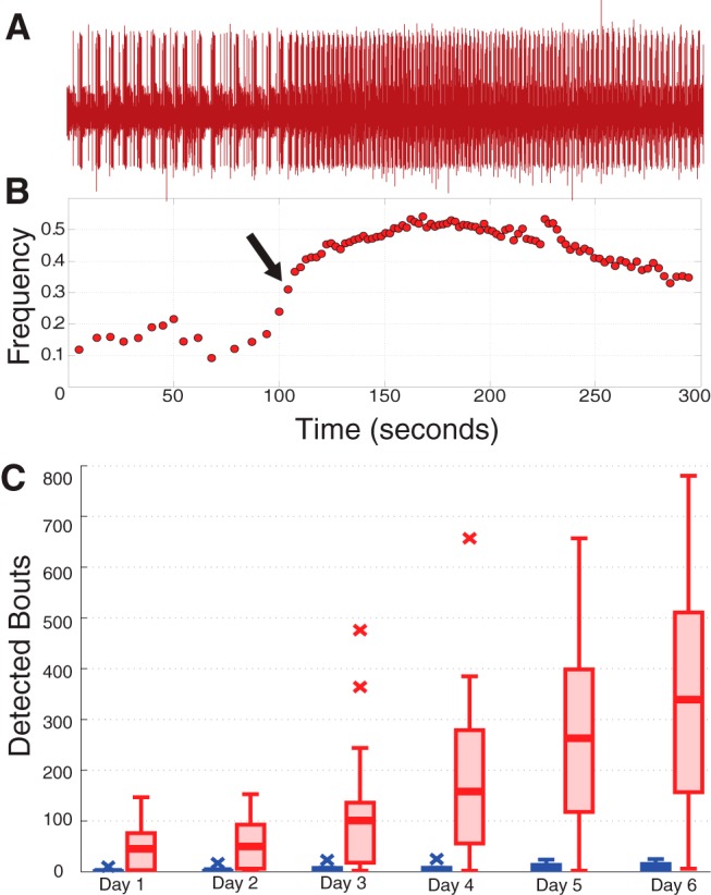
Figure 5.

Analysis of bouting. A, Example lvn recording featuring one detected bout, visible here in the noticeable increase in pyloric cycle frequency starting mid-trace. B, Frequency plot corresponding to the data in A. Arrow designates the point at which the bout was detected. C, Box plots show population data of the number of detected bouts by day for intact (blue) and decentralized (red) preparations.
