App Specs
App icon URL: http://da5wf380ybs7x.cloudfront.net/extension/imdesign/design/ezwebin/images/product-icon-69.jpg
App name: e-Anatomy
App developer: Imaios SAS
App developer website: imaios.com
App price: US$90 per year for individuals; free with website subscription (individual or institutional)
Apple App Store URL: https://itunes.apple.com/en/app/e-anatomy/id334876403
Google Play Store URL: https://play.google.com/store/apps/details?id=net.imaios.eanatomy
Category: Reference
Tags: #clinical, #reference, #educational, #anatomy, #radiology
Works offline: Y (∼400 MB download)
FDA approval: N/A
Promotion code: N/A
Quick Review
(1 star: lowest/5 stars: highest)
Overall rating (1–5): 5
Content (1–5): 4.5
Usability (1–5): 4.5
Pros: Outstanding adaptation of the website’s functionality to a mobile setting. Image quality and responsiveness are excellent. Content is quite comprehensive and multiple modalities are included (illustrations, XR, MR, CT, 3D).
Cons: User interface slightly unintuitive. Home screen customization is difficult.
At a glance: Users of the website will feel right at home with this mobile adaptation of the e-Anatomy online reference. With multiple modalities (radiography, MR, CT, diagrams, and others), the service is a well-labeled and accurate reference covering the entire body. At the moment, this app should represent the standard for mobile anatomy references.
Full Review
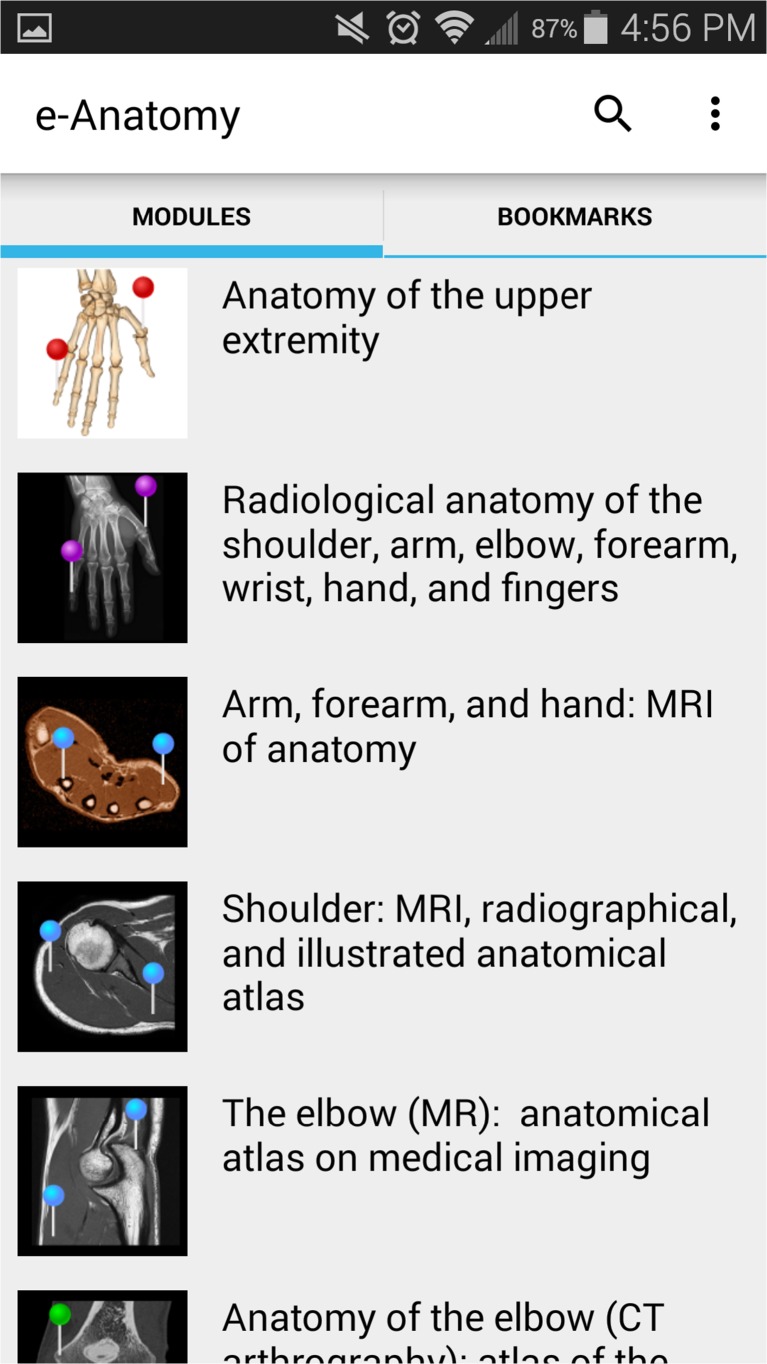
Intro: e-Anatomy represents one of the oldest and most developed web-based anatomy resources available for radiologists and health-care professionals. Many radiology residencies and academic centers hold institutional licenses. In my practice, when seeking anatomic information, I will often use a hard-book reference like Frank Netter’s Atlas of Human Anatomy [1] or a Google Image search. However, for users preferring to use a mobile device, those who are on the go or without a connection, or anyone who may require a comprehensive anatomic reference in his pocket, the e-Anatomy app should represent the standard in mobile anatomy references (Figs. 1, 2, and 3).
Fig. 1.
The home screen
Fig. 2.
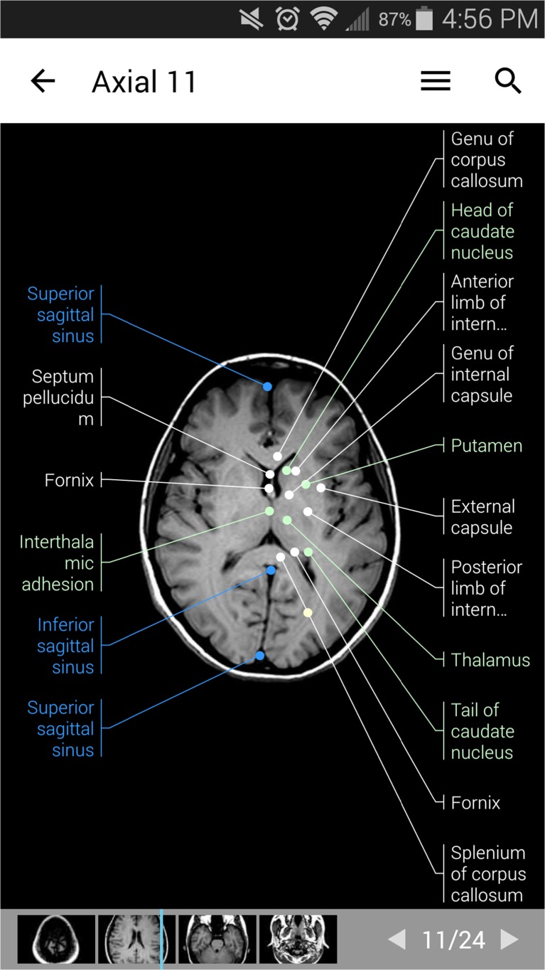
Axial MR brain slice with venous sinuses, optic tracts, and basal ganglia labels enabled
Fig. 3.
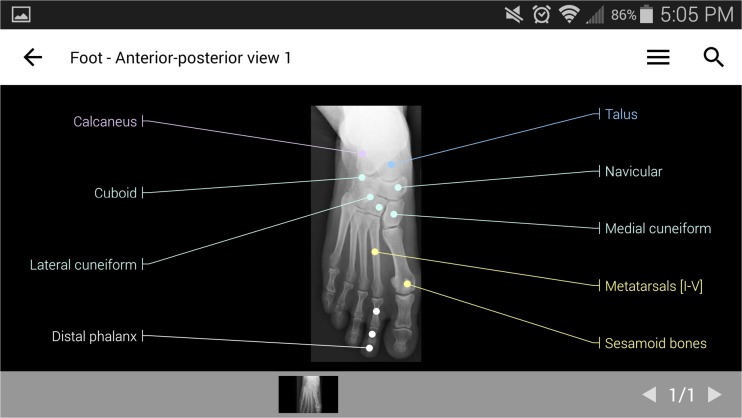
AP radiograph of the foot with bone labels enabled
Users of the website will feel right at home with this mobile adaptation of the e-Anatomy reference. With multiple modalities (radiography, MR, CT, diagrams, and others), the service is a well-labeled, comprehensive, and accurate resource.
Purpose/Features/Content: The e-Anatomy website and app divide the body into 43 categories, such as “Brain: Atlas of human anatomy with MRI,” “Radiological anatomy of the lower limb,” and “Heart: illustrated anatomy.” Within each selection are further subcategories which can be viewed individually or as a group in sequence. For instance, the “Brain” MR category can be viewed showing 132 axial, 157 coronal, 64 sagittal, and 26 3D images in sequence.
A given image will typically have numerous labeled anatomical structures. The types of anatomical structures labeled can be selected easily via a drop-down menu, e.g., on a brain MR slice, arterial labels can be shown or hidden. This allows the user to specify the anatomical structures of interest labeled without being visually overwhelmed. Structures can also be selected for in-depth description and other images of that structure.
Usability: The recently overhauled user interface is now excellent. Although initially somewhat unintuitive, the UI works very well once the user has learned it: a single finger swiping up and down controls the place within the series of images while two-finger gestures allow zooming and panning. A simple drop-down menu to choose structures for labeling can be cumbersome, but the app authors have done well with the difficult balance of usability versus depth of information. Some small quirks remain—including difficulty rearranging the home screen—but overall the usability represents an excellent adaptation to the mobile environment.
Good: Excellent UI. Comprehensive and accurate. High image quality. Search function works well.
Room for Improvement: Categories are confusing and redundant (“Brain: Atlas of human anatomy” versus “Cross-sectional anatomy of the brain”?). Navigation scheme works better for cross-sectional imaging than for illustrations or radiographs.
Reference
- 1.Netter FH. Atlas of human anatomy. 5. Teterboro: Icon Learning Systems; 2014. [Google Scholar]


