

Abstract
Continuous glucose monitoring (CGM) devices are being increasingly used to monitor glycemia in people with diabetes. One advantage with CGM is the ability to monitor the trend of sensor glucose (SG) over time. However, there are few metrics available for assessing the trend accuracy of CGM devices. The aim of this study was to develop an easy to interpret tool for assessing trend accuracy of CGM data. SG data from CGM were compared to hourly blood glucose (BG) measurements and trend accuracy was quantified using the dot product. Trend accuracy results are displayed on the Trend Compass, which depicts trend accuracy as a function of BG. A trend performance table and Trend Index (TI) metric are also proposed. The Trend Compass was tested using simulated CGM data with varying levels of error and variability, as well as real clinical CGM data. The results show that the Trend Compass is an effective tool for differentiating good trend accuracy from poor trend accuracy, independent of glycemic variability. Furthermore, the real clinical data show that the Trend Compass assesses trend accuracy independent of point bias error. Finally, the importance of assessing trend accuracy as a function of BG level is highlighted in a case example of low and falling BG data, with corresponding rising SG data. This study developed a simple to use tool for quantifying trend accuracy. The resulting trend accuracy is easily interpreted on the Trend Compass plot, and if required, performance table and TI metric.
Keywords: continuous glucose monitoring, blood glucose, trend, Trend Compass, metric, accuracy
Background
Continuous glucose monitoring (CGM) devices are becoming increasingly used by individuals with diabetes to help control their condition.1-6 Unlike traditional self monitoring blood glucose (BG) devices, which offer a snapshot of glucose concentration at the time of testing, CGMs give additional information about the approximate rate of change of BG, by measuring interstitial glucose every 1-5 minutes. This information is particularly useful for revealing abnormal glycemia, such as hypoglycemia or hyperglycemia, and deciding on the appropriate course of treatment.7-9 However, to make good treatment decisions it is important to have good trend accuracy, not just good point accuracy.
Trend accuracy refers to the ability of a CGM device to accurately capture the true rate-of-change or “shape” of glycemia over time, whereas, point accuracy assesses the discrepancy between a CGM and reference BG measurement at a single point in time. One important area where trend information is used is closed loop glycemic control, where CGM devices are coupled with insulin pumps and an appropriate control algorithm to provide automatic glycemic control. Several pilot studies have investigated closed loop control in people with diabetes,10-12 but the methods are still being developed and it is not used as a standard therapy. Another area where trend accuracy is particularly important is hypoglycemia alarms, which often inherently use trends to predict the onset of hypoglycemia.7,13-16 In this case, poor trend accuracy can result in a high rate of false alarms, or worse, missed hypoglycemic events.
In these applications, trend accuracy is particularly important because even though good trend accuracy doesn’t guarantee success, poor trend accuracy is likely to cause failure. As trend dependent applications/features, such as closed loop control or hypoglycemic alarms, become more common in CGM devices the need for good trend accuracy increases.
Many users of CGM devices are likely to be unaware of the level of trend accuracy of their particular device. Furthermore, studies in the literature that use CGMs or investigate CGM performance often report point accuracy, but rarely quantify trend accuracy.17,18 This could be because there are many methods or metrics available for assessing point accuracy, such as MAD, MARD, the Bland-Altman plot,19 and Clarke error grid,20 but very few metrics to assess trend accuracy.21
One method that does assess CGM trend accuracy is the continuous glucose error grid analysis (CG-EGA).21 CG-EGA evaluates the accuracy of continuous glucose monitoring sensors in terms of both point accuracy and trend (rate) accuracy. Results from the CG-EGA are presented in a table, showing the proportion of paired BG/SG measurements that fall into clinically acceptable, unacceptable and benign zones. While the results produced by CG-EGA have been reported to be difficult to interpret,22 the method certainly represents a step in the right direction in terms of assessing both aspects of sensor accuracy.
There is a need for additional trend metrics as increasing numbers of CGM devices make their way into the market. Both regulatory bodies and end users need to be confident that CGM devices have good trend accuracy, as well as good point accuracy, especially if they feature predictive hypoglycemic alarms based on trends. The aim of this study was to develop a metric or tool that could quantify trend accuracy and present the results in an intuitive plot that is easy to interpret for any user. This tool is intended to be used in conjunction with traditional point accuracy methods to provide a more comprehensive assessment of sensor accuracy and clinical utility. This article describes that tool: the Trend Compass.
Methods
This article focuses on introducing a novel trend metric that can be used to assess the trend accuracy of sensor glucose (SG) measurements from a continuous glucose monitoring device, with reference to BG reference measurements determined using a gold standard measurement device such as a Yellow Springs Instruments (YSI) chemistry analyzer.
Quantifying trend
Trend accuracy can be defined as the level of agreement between the rates-of-change of two independent devices measuring a single time series, over the same time period. An effective way to quantify trend accuracy is derived from the geometric interpretation of the dot product. The dot product assesses the similarity of 2 vectors A and B and is shown in Equation 1,
where represents two measurements from a BG reference and represent two CGM measurements at the same time points. Rearranging to make the subject gives a normalized measure of similarity between A and B:
The output of Equation 2 provides the angle (θ) between the two vectors, A and B, where a smaller angle is indicative of better trend accuracy. Thus, Equation 2 can be used with clinical data to quantify the level of trend accuracy between paired sets of BG/SG measurements, independent of the point bias error. The value of θ is dependent on the time interval between BG/SG samples, which should be held constant. This study uses a 1 hour time interval between consecutive samples of BG and SG. More frequent sampling such as 15 minutes can be analyzed with the Trend Compass by using a 1 hour window, sliding at 15 minute increments. The sensitivity of the Trend Compass to timing errors in the sampling frequency has not been investigated yet as this article was written to present the overall method, which can be refined by consensus or future studies in due course.
Trend Compass plot
Overall trend accuracy from Equation 2 can be conveyed visually using the Trend Compass shown in Figure 1. A polar coordinate system is used. The angular coordinate depicts the trend accuracy (θ degrees from top or bottom vertical) and the radial coordinate shows the reference BG level (see the appendix for a step-by-step guide to using the Trend Compass). Trend accuracy is plotted against reference BG level to show how it changes over the range of glucose values, because very good trend accuracy is more crucial during hypoglycemia or hyperglycemia where important treatment choices are potentially affected. For example, a mismatch in trend at 150 mg/dL would likely lead to less severe complications than the same mismatch in trend at 60 mg/dL.
Figure 1.
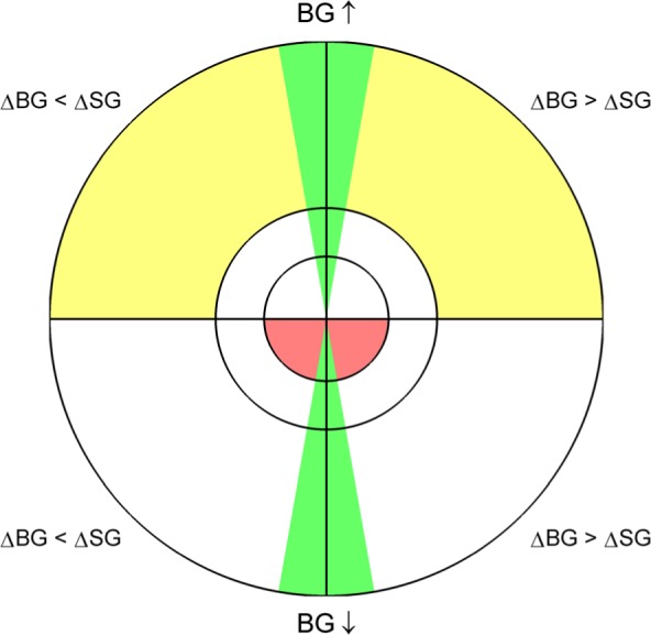
The Trend Compass, used to assess the trend accuracy of a set of measurements relative to a corresponding reference set of measurements. Green zones show areas of good trending, and yellow and red zones show areas of moderate to severe clinical risk, respectively.
The top hemisphere of the Trend Compass shows trend accuracy when the reference BG rate of change is ≥ 0 (BG is rising—examples F, A, B in Figure 2) and the bottom hemisphere shows trend accuracy when the reference BG rate of change is < 0 (BG is falling—examples C, D, E in Figure 2). Furthermore, the hemispheres are divided into two quadrants, which each give information about the relative rate-of-change between the reference BG and the SG. For example B in Figure 2 shows a BG change from 126 mg/dL to 148 mg/dL and an SG change from 126 mg/dL to 135 mg/dL, so the top-right quadrant is used. Alternatively, if the rate-of-change of SG is greater than that of BG, like F in Figure 2, then the top-left quadrant is used. Note examples A and D in Figure 2 have perfect trend accuracy, even though there is a significant offset between SG and BG in A, so they are plotted on the vertical line between quadrants. Importantly, these examples are shown to reinforce that this Trend Compass assesses trend accuracy independent of point bias error, which would affect traditional accuracy metrics.
Figure 2.

Six examples of SG and BG paired measurements with their corresponding point on the Trend Compass. Note: comparing A to D shows that the constant bias has no effect on how trending is displayed on the Trend Compass (both examples have perfect trend accuracy so θ = 0°).
In addition to separating the Trend Compass into four quadrants, two green zones around the vertical axis were added to show “good” trend accuracy. To present the method, the size of the green zones were set at ±10° on the plot, which captured mismatches in trend of up to 20° (see note at the bottom of the appendix). The size of the green zones was set with conservative acceptability in mind to present the method and may be changed by future users as desired, so long as it is held constant when comparing the trend accuracy of multiple devices. A few survey inputs from physicians suggest these limits are reasonable, although this was not comprehensively done and a large survey might be required for consensus on zone boundaries.
In the radial direction, the Trend Compass has been separated into three zones to reflect the clinically significant glycemic zones: (1) hypoglycemia, (2) normoglycemia, and (3) hyperglycemia. The boundaries presented in this article are 0 to 90 mg/dL (0-5 mmol/L) for hypoglycemia, 90 to 160 mg/dL (5-8.9 mmol/L) for normoglycemia, and greater than 160 mg/dL (8.9 mmol/L) for hyperglycemia. These zones are similar to what is widely accepted and published, but, again, may be changed by the user as desired.
Finally, four regions of the Trend Compass are colored to highlight clinically significant zones where trend accuracy is most important. The yellow regions show areas where reference BG is above 160 mg/dL (8.9 mmol/L) and rising with poor trend accuracy. Hence, moderate caution should be applied. The red regions highlight areas where the consequences of poor trending could be far more significant, such as when reference BG is below 90 mg/dL (5 mmol/L) and falling. In both cases treatment decisions based on poor trending in SG data could increase the risk of adverse outcomes.
Accompanying Numerical Trend Metrics
The Trend Compass was intended to be a visual tool that is fast and easy to interpret. The use of vector agreement as the basis of the Trend Compass allows direct, objective numerical comparison between devices. For this reason, a simple evaluation table can also be created for direct analysis, comparison and/or regulatory processes. Table 1 represents a simple choice to present the concept and it could easily be augmented as desired for analysis or regulatory purposes.
Table 1.
A Table of Metrics to Accompany the Trend Compass Plot.
| Overall trend accuracy | ||||
|---|---|---|---|---|
| Percentage in green | ||||
| Percentage in yellow | ||||
| Percentage in red | ||||
| When BG is rising | BG < 90 mg/dL | 90 mg/dL < BG < 160 mg/dL | BG > 160 mg/dL | Overall |
| Percentage in green | ||||
| Percentage outside green | ||||
| When BG is falling | BG < 90 mg/dL | 90 mg/dL < BG < 160 mg/dL | BG > 160 mg/dL | Overall |
| Percentage in green | ||||
| Percentage outside green | ||||
Furthermore, analogous to mean absolute difference (MAD—a numerical metric that is frequently used to quantify point accuracy2,23,24) the user could present the trend accuracy using the Trend Index (TI), defined:
TI describes the average overall trend accuracy and a lower TI is indicative of better global trend accuracy.
Simulated Data
To validate the Trend Compass in silico, artificial SG and BG data sets were created in MATLAB™ (The Mathworks, Natick, MA). A glucose trace was created using a random walk model and normally distributed error was added to give hourly paired measurements. The paired measurement sets are used to illustrate the use of the Trend Compass. The data sets simulated four typical scenarios that might be encountered during real-world use:
Low glucose variability patient with low sensor error
Low glucose variability patient with high sensor error
High glucose variability patient with low sensor error
High glucose variability patient with high sensor error
Clinical Data
Guardian real-TIME (Medtronic, Northridge, CA) Continuous glucose monitoring data and YSI 2300 (YSI Inc, Yellow Springs, OH) reference BG measurements from 2 patients were used to show the Trend Compass in use with clinical data. Each patient was monitored for ~3 days, during which time the SG was recorded every 5 minutes and BG was determined approximately every 60 minutes. BG measurements were paired with the SG measurement that was sampled closest to the time of BG sampling. Overall, the median (interquartile range, IQR) sampling interval between BG measurements was 60 (55-62) minutes. Finally, these data were used to show the independence of this trend metric to point bias error.
Results
Simulated data
The Trend Compass was first tested using simulated paired SG and BG measurements, sampled at 1 hour intervals. In all figures, the blue line represents simulated SG data and the red circles represent BG data.
Figure 3 shows a low glucose variability patient, with low sensor error and the corresponding Trend Compass plot. The Trend Compass plot shows very good trend accuracy, with most of the points lying close to the vertical lines at the cardinal north (N) and south (S) position (TI = 11.3°). In the radial direction, the Trend Compass plot depicts the patient as a low glucose variability patient, as all of the points are contained within the normoglycemic band. Table 2 also shows good trend accuracy results for this patient with 91.3% of measurements falling within the green zones.
Figure 3.
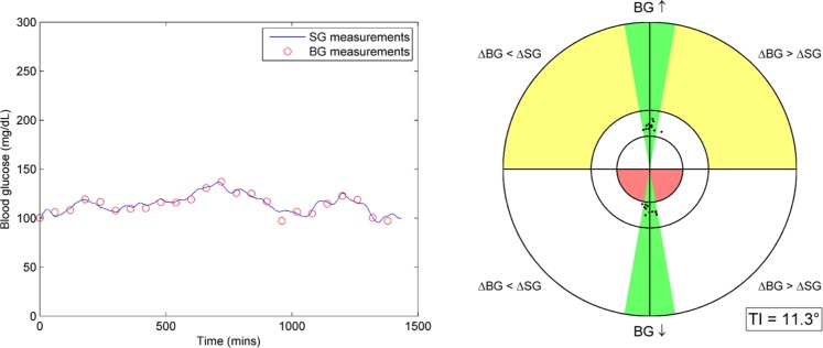
(left) BG and SG measurements for a stable patient with low sensor error. (right) Trend Compass plot for this data set with TI metric.
Table 2.
Performance Table Showing Trend Accuracy for This Data Set.
| Overall trend accuracy | ||||
|---|---|---|---|---|
| Percentage in green | 91.3 | |||
| Percentage in yellow | 0 | |||
| Percentage in red | 0 | |||
| When BG is rising | BG < 90 mg/dL | 90 mg/dL < BG < 160 mg/dL | BG > 160 mg/dL | Overall |
| Percentage in green | 0 | 47.8 | 0 | 47.8 |
| Percentage outside green | 0 | 4.3 | 0 | 4.3 |
| When BG is falling | BG < 90 mg/dL | 90 mg/dL < BG < 160 mg/dL | BG > 160 mg/dL | Overall |
| Percentage in green | 0 | 43.5 | 0 | 43.5 |
| Percentage outside green | 0 | 4.3 | 0 | 4.3 |
Figure 4 shows a patient with the same glucose trace characteristics as in Figure 3, but with a higher level of sensor error. The increase in error has resulted in a Trend Compass plot with visibly more points outside the green zones (TI = 28.1°). This result is also reflected in Table 3, which reports 39.1% of points in the green zones and 8.7% of points in the red zone.
Figure 4.
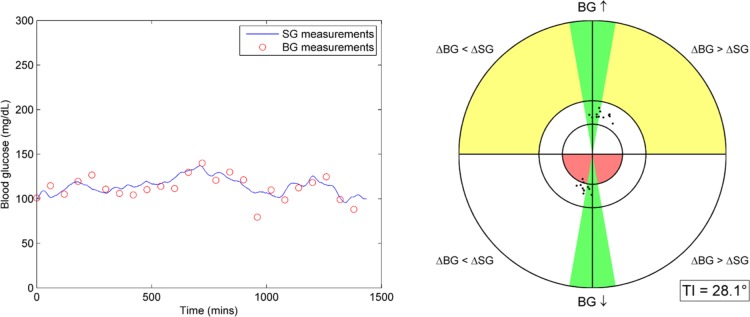
(left) BG and SG measurements for a stable patient with high sensor error. (right) Trend Compass plot for this data set with TI metric.
Table 3.
Performance Table Showing Trend Accuracy for This Data Set.
| Overall trend accuracy | ||||
|---|---|---|---|---|
| Percentage in green | 39.1 | |||
| Percentage in yellow | 0 | |||
| Percentage in red | 8.7 | |||
| When BG is rising | BG < 90 mg/dL | 90 mg/dL < BG < 160 mg/dL | BG > 160 mg/dL | Overall |
| Percentage in green | 0 | 26.1 | 0 | 26.1 |
| Percentage outside green | 0 | 26.1 | 0 | 26.1 |
| When BG is falling | BG < 90 mg/dL | 90 mg/dL < BG < 160 mg/dL | BG > 160 mg/dL | Overall |
| Percentage in green | 0 | 13 | 0 | 13 |
| Percentage outside green | 8.7 | 26.1 | 0 | 34.8 |
Figure 5 shows an example of a patient with high glucose variability, coupled with low sensor error. The Trend Compass plot for this patient appears similar to Figure 3 with majority of points near the N and S positions, and a similar TI of 11.1°. However, in the radial direction the points are far more spread out due to the large range of glucose values in the data set. Table 4 shows trend accuracy to be good, with 82.6% of data points in the green zones and 0% in the yellow or red zones.
Figure 5.

(left) BG and SG measurements for a variable patient with low sensor error. (right) Trend Compass plot for this data set with TI metric.
Table 4.
Performance Table Showing Trend Accuracy for This Data Set.
| Overall trend accuracy | ||||
|---|---|---|---|---|
| Percentage in green | 82.6 | |||
| Percentage in yellow | 0 | |||
| Percentage in red | 0 | |||
| When BG is rising | BG < 90 mg/dL | 90 mg/dL < BG < 160 mg/dL | BG > 160 mg/dL | Overall |
| Percentage in green | 0 | 13 | 30.4 | 43.5 |
| Percentage outside green | 0 | 13 | 0 | 13 |
| When BG is falling | BG < 90 mg/dL | 90 mg/dL < BG < 160 mg/dL | BG > 160 mg/dL | Overall |
| Percentage in green | 0 | 13 | 26.1 | 39.1 |
| Percentage outside green | 0 | 4.3 | 0 | 4.3 |
Finally, Figure 6 shows an example patient with high glucose variability and high sensor error. The resulting Trend Compass shows a reduction in trend accuracy when compared to Figure 5, with a much wider angular spread of results (TI = 27.0°). Table 5 shows that this data set has 52% in the green zones, 8.7% in the yellow zones and 4.2% in the red zone.
Figure 6.

(left) BG and SG measurements for a variable patient with high sensor error. (right) Trend Compass plot for this data set with TI metric.
Table 5.
Performance Table Showing Trend Accuracy for This Data Set.
| Overall trend accuracy | ||||
|---|---|---|---|---|
| Percentage in green | 52.2 | |||
| Percentage in yellow | 8.7 | |||
| Percentage in red | 4.3 | |||
| When BG is rising | BG < 90 mg/dL | 90 mg/dL < BG < 160 mg/dL | BG > 160 mg/dL | Overall |
| Percentage in green | 0 | 4.3 | 26.1 | 30.4 |
| Percentage outside green | 0 | 17.4 | 8.7 | 26.1 |
| When BG is falling | BG < 90 mg/dL | 90 mg/dL < BG < 160 mg/dL | BG > 160 mg/dL | Overall |
| Percentage in green | 4.3 | 8.7 | 8.7 | 21.7 |
| Percentage outside green | 4.3 | 4.3 | 13 | 21.7 |
Clinical Data
Using clinical CGM data with paired BG measurements, the Trend Compass can quantify the level of trend accuracy allowing sensor performance to be evaluated and compared. The solid blue line in Figure 7 shows CGM sensor data and the red circles represent BG data from the same patient. Overall, the trend accuracy is very good and ~70% of the points lie in the green areas. Furthermore, Table 6 shows only 11.6% of points are in the yellow zone and only 1.4% in the red zone. The TI for this data set is 18.2° and this is potentially slightly skewed by a few outlier BG data points seen in the trace. Figure 8 uses the same data set as Figure 7, but with a 72 mg/dL constant bias applied to CGM sensor data. The Trend Compass plot and TI in Figure 8 and the performance metric table in Table 7 remain unchanged with the offset SG data, further illustrating the independence of this method from point bias error.
Figure 7.

(left) Clinical CGM data and BG measurements from the same subject. (right) Trend Compass plot for this data set with TI metric.
Table 6.
Performance Table Showing Trend Accuracy for This Data Set.
| Overall trend accuracy | ||||
|---|---|---|---|---|
| Percentage in green | 69.6 | |||
| Percentage in yellow | 11.6 | |||
| Percentage in red | 1.4 | |||
| When BG is rising | BG < 90 mg/dL | 90 mg/dL < BG < 160 mg/dL | BG > 160 mg/dL | Overall |
| Percentage in green | 0 | 24.6 | 14.5 | 39.1 |
| Percentage outside green | 0 | 7.2 | 11.6 | 18.8 |
| When BG is falling | BG < 90 mg/dL | 90 mg/dL < BG < 160 mg/dL | BG > 160 mg/dL | Overall |
| Percentage in green | 0 | 26.1 | 4.3 | 30.4 |
| Percentage outside green | 1.4 | 4.3 | 5.8 | 11.6 |
Figure 8.

(left) Clinical CGM data with a 72 mg/dL bias and BG measurements from the same subject. (right) Trend Compass plot for this data set with TI metric.
Table 7.
Performance Table Showing Trend Accuracy for This Data Set.
| Overall trend accuracy | ||||
|---|---|---|---|---|
| Percentage in green | 69.6 | |||
| Percentage in yellow | 11.6 | |||
| Percentage in red | 1.4 | |||
| When BG is rising | BG < 90 mg/dL | 90 mg/dL < BG < 160 mg/dL | BG > 160 mg/dL | Overall |
| Percentage in green | 0 | 24.6 | 14.5 | 39.1 |
| Percentage outside green | 0 | 7.2 | 11.6 | 18.8 |
| When BG is falling | BG < 90 mg/dL | 90 mg/dL < BG < 160 mg/dL | BG > 160 mg/dL | Overall |
| Percentage in green | 0 | 26.1 | 4.3 | 30.4 |
| Percentage outside green | 1.4 | 4.3 | 5.8 | 11.6 |
Figure 9 shows the CGM data from Figures 7 and 8, coupled with BG measurements from a different data set. The trend accuracy is expected to be marginal because the SG/BG are sampled from different individuals and are independent. The Trend Compass shows a wide spread of points indicating poor trend accuracy and this is reinforced by the TI of 37.2°. Sections A and C in Figure 9 show periods of good trending, and section B shows a period of poor trend accuracy. The trend metrics shown in Table 8 report 34% of points are in the green zones, 13.6% in yellow and 3% in the red zones.
Figure 9.

(left) Clinical CGM data and BG measurements from two different subjects. (right) Trend Compass plot for this data set with TI metric.
Table 8.
Performance Table Showing Trend Accuracy for This Data Set.
| Overall trend accuracy | ||||
|---|---|---|---|---|
| Percentage in green | 34.8 | |||
| Percentage in yellow | 13.6 | |||
| Percentage in red | 3 | |||
| When BG is rising | BG < 90 mg/dL | 90 mg/dL < BG < 160 mg/dL | BG > 160 mg/dL | Overall |
| Percentage in green | 1.5 | 12.1 | 3 | 16.7 |
| Percentage outside green | 1.5 | 18.2 | 13.6 | 33.3 |
| When BG is falling | BG < 90 mg/dL | 90 mg/dL < BG < 160 mg/dL | BG > 160 mg/dL | Overall |
| Percentage in green | 0 | 13.6 | 4.5 | 18.2 |
| Percentage outside green | 3 | 10.6 | 18.2 | 31.8 |
Discussion
The aim of this study was to develop a novel tool that could quantify the trend accuracy of CGM devices. The results present an intuitive plot that gives a quick visual assessment of relative CGM trend accuracy, and allows detailed quantified results for in-depth comparison. The Trend Compass is described in this article with reference to SG data from a continuous glucose monitoring system that is compared to paired BG measurements from a reference method. It should be noted that error in reference BG measurements can have an impact on trend accuracy. To minimize this impact, it is recommended that a gold standard BG measurement device/method be used during the CGM monitoring period.
With the introduction of CGM devices, trend accuracy has become very important due to increased investigation of closed loop glycemic control and the increased use of hypo/hyperglycemia alarm algorithms, which all inherently use trend patterns. The trend compass was not designed to replace conventional accuracy metrics such as MARD or the Bland Altman plot. In fact, it is intended to be used in conjunction with traditional measures of point sensor accuracy. Using error metrics alongside the Trend Compass gives the user much more useful information about the overall performance of a sensor. Equally, as an objective measurement of trend accuracy, the Trend Compass could potentially be useful for regulatory bodies when assessing sensor performance prior to approval.
The results for the simulated data show how the Trend Compass can effectively differentiate between good trend accuracy and poor trend accuracy. Figures 3 and 4 assess the trend accuracy for a stable, with low glucose variability patient with different levels of sensor noise. Comparing the plot of SG-BG data for each patient it is difficult to determine which data have better trend accuracy, although it is obvious that the data in Figure 3 have a lower sensor error. It is important that the Trend compass is able to differentiate between the trend accuracy of the two devices in a robust way. In this case with a simulated stable patient the Trend Compass clearly shows that the data in Figure 3 have better trend accuracy. This outcome extends to Figures 5 and 6 which show different sensor error levels for the same high glucose variability simulated patient. Again, the Trend compass is clearly able to show which sensor has better trend accuracy, in this case the data plotted in Figure 5.
Another aspect that needed to be robust is the impact of patient variability. Comparing Figure 3 to Figure 5, and Figure 4 to Figure 6, it is clear that the patient variability doesn’t impair the ability of the Trend Compass to reliably assess trend accuracy. This aspect is very important as different patients or cohorts can have very different glycemic dynamics, so the assessment of trend accuracy must be robust to these differences. Figures 3 and 5 show two different patient dynamics, but with similar levels of sensor error. The Trend Compass effectively conveys that in both cases the trend accuracy is very good. This is further reinforced with the accompanying performance table and TI metric. Figures 4 and 6 also show two different patient dynamics, but this time for a higher level of sensor error. Again, the Trend Compass is consistent in showing both data sets with moderate to poor trend accuracy.
When using the Trend Compass with clinical data the usefulness of the method is immediately clear, as shown by comparing Figures 7, 8, and 9. Figure 7, which contains well correlated data collected from one patient shows good trending compared to Figure 9 which contains uncorrelated data collected from two different individuals. The discrepancies between the trend accuracy of the two data sets can be easily interpreted from the Trend Compass plots alone. Interestingly, Table 8 shows the Trend Compass for the uncorrelated data set still has ~35% of points in the green zones. This result is likely due to the sections marked A and C in Figure 9, which both show relatively good trending between SG and BG by chance.
Figures 7 and 8 show how the Trend Compass can classify trend accuracy independent of point measurement bias error. The blue SG trace in Figure 8 is the same data as shown in Figure 7, but with a positive 72 mg/dL offset. This offset significantly increases the point error, but the Trend Compass remains unchanged. This lack of change occurs because the relative slope between SG and BG has not changed with the offset, and that relative slope is the fundamental mechanism used to quantify trend with this method. This example further reinforces the intended use of the Trend Compass to assess solely trend accuracy in conjunction with traditional point measurement error metrics, creating a more complete assessment of sensor performance.
The importance of assessing trend accuracy as a function of BG level is made clear by the paired BG-SG measurements in section B in Figure 9. The trend accuracy in section B falls within the red zone of the Trend Compass, because the BG is falling while the SG is reporting a rise in glucose at a substantially different rate. The implications of a drop in glucose being reported as a rise by a CGM device could be very dangerous, potentially leading to missed treatment of hypoglycemia. Furthermore, alarm algorithms that use trend information may not alert the user at the onset of these events.
Finally, there is one limitation that should be noted when comparing blood and interstitial glucose concentrations, for either trend accuracy or point accuracy assessment. The interactions between the two compartments are not fully understood and discrepancies in the concentration of glucose in each compartment may occur due to physiological effects. Thus, when point or trend accuracy metrics are used to assess sensor performance, any physiological effects that may exist are “lumped in” with actual sensor inaccuracies.
Conclusion
The Trend Compass is a tool that can quantify trend accuracy between two devices measuring a single time series, such as a CGM device and a reference BG. It is robust when used with different patient cohorts (different dynamics), as well as different levels of sensor error. The resulting trend accuracy is easily interpreted on the Trend Compass plot, and if required, accompanying performance table and TI metric. Importantly, it assesses trend accuracy independent of BG level and point bias error. Thus, a device may have poor point accuracy, but excellent trend accuracy. Assessing trend accuracy is as important as assessing point measurement error as CGM devices become more widely used, and a tool such as the Trend Compass provides an easy to interpret, reliable method to do so.
Appendix
The angle () is divided by 2 to give so the full range of theoretic angles can be displayed on each quadrant. The theoretical limit is BG rising vertically and SG falling vertically (or vice versa), which would result in 180° between the vectors (displayed as = 90° on the Trend Compass. See flow chart of how to implement Trend Compass at http://dst.sagepub.com/supplemental).
Footnotes
Abbreviations: BG, blood glucose; CG-EGA, continuous glucose error grid analysis; CGM, continuous glucose monitoring; IQR, interquartile range; MAD, mean absolute difference; N, north; S, south; SG, sensor glucose; TI, Trend Index; YSI, Yellow Springs Instruments.
Declaration of Conflicting Interests: The author(s) declared the following potential conflicts of interest with respect to the research, authorship, and/or publication of this article: RG is an employee of Medtronic. Medtronic provided scholarship support for MS for this work.
Funding: The author(s) disclosed receipt of the following financial support for the research, authorship, and/or publication of this article: This work was jointly funded by UC Department of Mechanical Engineering, New Zealand and Medtronic Diabetes, Northridge, CA.
References
- 1. Tamborlanev WV, Beck RW, Bode BW, et al. Continuous glucose monitoring and intensive treatment of type 1 diabetes. N Engl J Med. 2008;359:1464-1476. [DOI] [PubMed] [Google Scholar]
- 2. Klonoff DC. Continuous glucose monitoring: roadmap for 21st century diabetes therapy. Diabetes Care. 2005;28:1231-1239. [DOI] [PubMed] [Google Scholar]
- 3. Deiss D, Bolinder J, Riveline JP, et al. Improved glycemic control in poorly controlled patients with type 1 diabetes using real-time continuous glucose monitoring. Diabetes Care. 2006;29:2730-2732. [DOI] [PubMed] [Google Scholar]
- 4. Battelino T, Phillip M, Bratina N, Nimri R, Oskarsson P, Bolinder J. Effect of continuous glucose monitoring on hypoglycemia in type 1 diabetes. Diabetes Care. 2011;34:795-800. [DOI] [PMC free article] [PubMed] [Google Scholar]
- 5. Fritschi C. Use of real-time continuous glucose monitoring versus traditional self-monitoring of blood glucose levels improves glycaemic control in patients with type 1 diabetes. Evid Based Nurs. 2012;15:7-8. [DOI] [PubMed] [Google Scholar]
- 6. Pickup JC, Freeman SC, Sutton AJ. Glycaemic control in type 1 diabetes during real time continuous glucose monitoring compared with self monitoring of blood glucose: meta-analysis of randomised controlled trials using individual patient data. BMJ. 2011;343:d3805. [DOI] [PMC free article] [PubMed] [Google Scholar]
- 7. Bequette BW. Continuous glucose monitoring: real-time algorithms for calibration, filtering, and alarms. J Diabetes Sci Technol. 2010;4:404-18. [DOI] [PMC free article] [PubMed] [Google Scholar]
- 8. Hoeks LB, Greven WL, de Valk HW. Real-time continuous glucose monitoring system for treatment of diabetes: a systematic review. Diabet Med. 2011;28:386-394. [DOI] [PubMed] [Google Scholar]
- 9. Beck RW, Hirsch IB, Laffel L, et al. The effect of continuous glucose monitoring in well-controlled type 1 diabetes. Diabetes Care. 2009;32:1378-1383. [DOI] [PMC free article] [PubMed] [Google Scholar]
- 10. Breton M, Farret A, Bruttomesso D, et al. Fully integrated artificial pancreas in type 1 diabetes: modular closed-loop glucose control maintains near normoglycemia. Diabetes. 2012;61:2230-2237. [DOI] [PMC free article] [PubMed] [Google Scholar]
- 11. Clarke WL, Anderson S, Breton M, Patek S, Kashmer L, Kovatchev B. Closed-loop artificial pancreas using subcutaneous glucose sensing and insulin delivery and a model predictive control algorithm: the Virginia experience. J Diabetes Sci Technol. 2009;3:1031-1038. [DOI] [PMC free article] [PubMed] [Google Scholar]
- 12. Weinzimer SA, Steil GM, Swan KL, Dziura J, Kurtz N, Tamborlane WV. Fully automated closed-loop insulin delivery versus semiautomated hybrid control in pediatric patients with type 1 diabetes using an artificial pancreas. Diabetes Care. 2008;31:934-939. [DOI] [PubMed] [Google Scholar]
- 13. Dassau E, Cameron F, Lee H, et al. Real-Time hypoglycemia prediction suite using continuous glucose monitoring: a safety net for the artificial pancreas. Diabetes Care. 2010;33:1249-1254. [DOI] [PMC free article] [PubMed] [Google Scholar]
- 14. McGarraugh G. Alarm characterization for a continuous glucose monitor that replaces traditional blood glucose monitoring. J Diabetes Sci Technol. 2010;4:49-56. [DOI] [PMC free article] [PubMed] [Google Scholar]
- 15. Eren-Oruklu M, Cinar A, Quinn L. Hypoglycemia prediction with subject-specific recursive time-series models. J Diabetes Sci Technol. 2010;4:25-33. [DOI] [PMC free article] [PubMed] [Google Scholar]
- 16. Pretty CG, Chase JG, Le Compte A, Shaw GM, Signal M. Hypoglycemia detection in critical care using continuous glucose monitors: an in silico proof of concept analysis. J Diabetes Sci Technol. 2010;4:15-24. [DOI] [PMC free article] [PubMed] [Google Scholar]
- 17. Corstjens AM, Ligtenberg JJ, van der Horst IC, et al. Accuracy and feasibility of point-of-care and continuous blood glucose analysis in critically ill ICU patients. Crit Care. 2006;10:R135. [DOI] [PMC free article] [PubMed] [Google Scholar]
- 18. Djakoure-Platonoff C, Radermercker R, Reach G, Slama G, Selam JI. Accuracy of the continuous glucose monitoring system in inpatient and outpatient conditions. Diabetes Metab. 2003;29:159-162. [DOI] [PubMed] [Google Scholar]
- 19. Bland JM, Altman DG. Measuring agreement in method comparison studies. Stat Methods Med Res. 1999;8:135-160. [DOI] [PubMed] [Google Scholar]
- 20. Clarke WL. The original Clarke error grid analysis (EGA). Diabetes Technol Ther. 2005;7:776-779. [DOI] [PubMed] [Google Scholar]
- 21. Kovatchev BP, Gonder-Frederick LA, Cox DJ, Clarke WL. Evaluating the accuracy of continuous glucose-monitoring sensors: continuous glucose-error grid analysis illustrated by TheraSense Freestyle Navigator data. Diabetes Care. 2004;27:1922-1928. [DOI] [PubMed] [Google Scholar]
- 22. Wentholt IM, Hoekstra JB, Devries JH. A critical appraisal of the continuous glucose-error grid analysis. Diabetes Care. 2006;29:1805-1811. [DOI] [PubMed] [Google Scholar]
- 23. Kovatchev B, Anderson S, Heinemann L, Clarke W. Comparison of the numerical and clinical accuracy of four continuous glucose monitors. Diabetes Care. 2008;31:1160-1164. [DOI] [PMC free article] [PubMed] [Google Scholar]
- 24. Clarke WL, Kovatchev B. Continuous glucose sensors: continuing questions about clinical accuracy. J Diabetes Sci Technol. 2007;1:669-675. [DOI] [PMC free article] [PubMed] [Google Scholar]