

Abstract
Temperature changes are known to have significant impacts on human health. Accurate estimates of population-weighted average monthly air temperature for US counties are needed to evaluate temperature’s association with health behaviours and disease, which are sampled or reported at the county level and measured on a monthly—or 30-day—basis. Most reported temperature estimates were calculated using ArcGIS, relatively few used SAS. We compared the performance of geostatistical models to estimate population-weighted average temperature in each month for counties in 48 states using ArcGIS v9.3 and SAS v 9.2 on a CITGO platform. Monthly average temperature for Jan-Dec 2007 and elevation from 5435 weather stations were used to estimate the temperature at county population centroids. County estimates were produced with elevation as a covariate. Performance of models was assessed by comparing adjusted R2, mean squared error, root mean squared error, and processing time. Prediction accuracy for split validation was above 90% for 11 months in ArcGIS and all 12 months in SAS. Cokriging in SAS achieved higher prediction accuracy and lower estimation bias as compared to cokriging in ArcGIS. County-level estimates produced by both packages were positively correlated (adjusted R2 range=0.95 to 0.99); accuracy and precision improved with elevation as a covariate. Both methods from ArcGIS and SAS are reliable for U.S. county-level temperature estimates; However, ArcGIS’s merits in spatial data pre-processing and processing time may be important considerations for software selection, especially for multi-year or multi-state projects.
Keywords: temperature estimation, county data, ArcGIS, SAS, cokriging
1 Background
Spatial data analysis has received considerable attention and played an important role in disciplines of environmental science and socio-economic science due to the rapid development of Geographic Information Systems (GIS) in recent years. The need for reliable environmental geospatial databases is fast-growing (Croner et al. 1996). Ecology is the scientific study of the relations that people have with respect to each other and their natural environment. The environment is dynamically interlinked, imposed upon and constrains people at any time throughout their life. Meteorological measurements such as temperature and precipitation are needed to assess links between the environment and diseases in the population.
Temperature changes are known to have significant impacts on human health. Research findings have documented temperature’s impact on mortality from respiratory and cardiovascular disease (Vaaler et al. 2010); transmission of infectious disease (Ludington-Hoe et al. 2002; Lee et al. 2005; Nommsen-Rivers et al. 2010); and malnutrition due to crop failure (Parry et al. 2004). Comprehensive disease surveillance systems in the US monitor disease prevalence at national, state, and county levels for developing preventive health policies and tracking populations at high risk (Centers for Disease Control and Prevention[CDC] 2009). County-level estimates of temperature are needed to further the study of temperature’s health impact.
Various spatial interpolation methods including inverse distance weighting (IDW), multiple regression, thin plate smoothing spline (TPSS), kriging and cokriging have been evaluated (Boer et al. 2001; Lapen and Hayhoe 2003; Zhao et al. 2005; Ishida and Kawashima 1993; Mahdian et al. 2009). Kriging has been used widely by researchers in creating temperature estimates (Bolstad et al. 1998; Brown and Comrie 2002; Hudson and Wackernagel 1994; Benavides et al. 2007; Zhao et al. 2005; Li et al. 2005; Ninyerola et al. 2000; Mahdian et al. 2009; Ishida and Kawashima 1993) and found to be a valid method with high accuracy and low bias compared to other methods by researchers (Boer et al. 2001; Li et al. 2005; Mahdian et al. 2009; Ishida and Kawashima 1993; Yang et al. 2004). Studies have shown that estimates could be improved by taking elevation into consideration through cokriging (Li et al. 2004; Hudson and Wackernagel 1994; Ishida and Kawashima 1993).
SAS and ArcGIS are the most popular tools in statistical analysis in public health research. Both support spatial analysis. Ordinary cokriging is available in the ArcGIS Geostatistical Analyst; Ordinary kriging with covariates is also available from the SAS Proc Mixed procedure. ArcGIS Geostatistical Analyst estimates variance by modelling a semivariogram cloud and SAS Proc Mixed calculates variance by using restricted maximum likelihood estimation. With these two methods, elevation can be taken into consideration as a covariate in model-based estimates of monthly temperature by county. These two methods perform comparably in terms of prediction accuracy, estimation bias and processing speed. ArcGIS Geostatistical Analyst has been used by researchers to obtain temperature estimates (Brown and Comrie 2002; Li et al. 2005; Zhao et al. 2005; Ninyerola et al. 2000), however, very few peer-reviewed studies have used SAS Proc Mixed to estimate average temperature (Boer et al. 2001). To the best of our knowledge, no studies have compared kriging methods for temperature estimation in ArcGIS and SAS nor reported county-level temperature estimates for population centroids rather than geographic centroids. The purpose of our study was to compare the performance and reliability of geospatial models in creating population-weighted county-level estimates of monthly population-weighted average temperatures in the US using ArcGIS Geostatistical Analyst and SAS Proc Mixed.
2 Methods
2.1 Data source
Our study includes all the states in the US except Alaska and Hawaii, because these two states are geographically separated from the US mainland and inclusion would increase interpolation prediction error if analyzed in conjunction with mainland data (Fig. 1). A comprehensive and integrated spatial database was constructed using data collected by different US federal agencies, including monthly weather station temperature data, elevation data, county polygon data and population distribution data. Data were provided in different formats, including table, raster and vector (point and polygon). All the spatial data were converted to the same Geographic Coordinate System (GCS North American 1983) and projected Coordinate System (Albers). ArcGIS 9.3 and SAS 9.2 software were used for data pre-processing and analyses.
Fig. 1.

Weather station locations and elevation values in January 2007.
2.1.1 Weather station temperature data
Monthly mean temperature data from 2007 were chosen to test the methodology of county-level temperature estimation. Data from the National Oceanic and Atmospheric Administration (NOAA) were collected at more than 5000 national temperature stations each month. Stations are distributed unevenly across the continental US, with lower density in the west (Fig. 1). There are missing values for some stations each month. To maximize the sample size, we retain stations with valid data for any month in the analyses; the number of stations with valid data varies by month. From January to December of 2007, the number of weather stations with valid data ranges from 5252 to 5435. Observed monthly average temperature ranged from −30.67 °C to 41.22 °C. Stations were mapped as one point layer in ArcGIS using the x, y coordinate information for each station from the NOAA data set.
2.1.2 Elevation data
GTOPO30 is a digital elevation model (DEM) for the world, developed by United States Geological Survey (USGS). It is in raster format and has a 30-arc second resolution (approximately 1 km). After comparing the elevation values of the stations from NOAA and GTOPO30 DEM data, missing values and discrepant values were identified in the NOAA data (Fig. 1), so the final weather station elevation values and population-centroid elevation values in each county were extracted from GTOPO30. Station elevations ranged from −65 m to 3664 m.
2.1.3 County polygon data
The county polygon GIS layer from ESRI Data & Maps 9.3 (updated in 2007) was used to calculate population centroid and average temperature at the county level. The total number of counties in the continental US was 3109 in 2007. County FIPS codes can be used to connect temperature estimates with disease surveillance data.
2.1.4 Population distribution data
The distribution of human population is important for improving understanding of human diseases in relation to the environment. Evaluating the total number of people at risk from a disease in a specific area requires not just tabular or jurisdictional population data, but data that are spatially-explicit and global in extent at a moderate resolution (Balk et al. 2006). Many factors can affect the distribution of human population, such as land use (Tian et al. 2005), net primary productivity (NPP), elevation, city distribution and transport infrastructure distribution (Yue et al. 2005). Data for some of these factors are captured in Remote Sensor data, such as Thematic Mapper (TM) imagery (Wu and Murray 2005).
Population distribution data for this study were obtained from LandScan 2008™, ORNL, UT-Battelle, LLC (Developed under Prime Contract with the US Department of Energy). It is in raster format at nearly 1 km resolution (30"×30"). Each cell value represents the number of people in that 30 arc second cell. It uses spatial data and imagery analysis technologies and a multivariate dasymetric modelling approach to disaggregate US Census counts within an administrative boundary (Dobson et al. 2000). In the LandScan models, the typical dasymetric model is improved by integrating multiple ancillary or indicator data layers. The modelling process uses sub-national level census counts for each country and primary geospatial input or ancillary datasets, including land cover, roads, slope, urban areas, village locations, and high resolution imagery analysis, all of which are key indicators of population distribution (ORNL: http://www.ornl.gov/sci/landscan/landscan/documentation.shtml). Population distribution data were also used to calculate the population centroid of each county with county polygon data.
2.2 Population distribution at county level
Population health studies focus on the impact of temperature on the health of the population of each county. The average temperature can have greater spatial variation within each county, especially in the larger counties of the western US. There are two methods to accurately estimate the population distribution at county level. The better one is called population proportion method at county level. It was thought that the population in each cell (1 km2) in one county will proportionally contribute to the population distribution based on the total population in this county. The population proportion of each cell will be regarded as population weight when the county-level temperature was calculated. The ArcGIS calculating process is shown in Fig. 2.
Fig. 2.
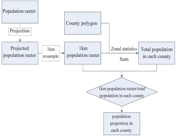
Computing process of population proportion.
The second one is called population centroid method at county level. Population centroid can be thought of as a mean population location and might be another way to represent the location of the majority of the population. Temperature of this center point is regarded as the county-level temperature. The population-weighted mean center method is used for the population centroid calculation:
where xi and yi are the coordinates for each grid cell of the population distribution in each county; wi is the population number in each grid cell; and n is the number of population grid cells in a county. The resulting X̄, Ȳ coordinate pair is the location of the population-weighted mean center, which is called population centroid. The ArcGIS calculating process is shown in Fig. 3.
Fig. 3.
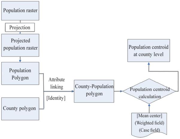
Computing process of population centroid.
From this, we obtain the number of grids in each county, the grid locations and the population number in each grid. Then the population mean center in each county is calculated based on the formula above. One of the problems of population centroid is that the centroid will not represent the population cluster if there were two or more population centers in one county. The centroid will be located in the middle of the two centers.
Simple average temperature, population centroid temperature and population proportion at the county level have been compared. If the population proportion method was thought as the golden standard, the result from population centroid method is closer to it (StDev is 0.05) than the simple average method (StDev is 0.18) based on the whole areas. For some specific counties, such as counties in the western mountain areas, simple average method can bring more biases. In this paper, population centroid was selected finally because SAS software cannot interpolate temperature at cell level on US scale, which will cost months of time.
2.3 Geostatistical analysis with ArcGIS
Geostatistics is a branch of statistics focusing on theory and methods for spatial or spatiotemporal analyses with wide application in environmental surveys (Juan et al. 2010). It is intimately related to interpolation methodology, but extends far beyond simple interpolation problems. It consists of a collection of numerical and mathematical techniques to characterize spatial phenomena. Our goal is to take a set of spatially related data points (temperature measured at weather station locations) and create a model describing the distribution of temperature across the contiguous US, at locations with and without recorded temperature measurements (Goovaerts 2000).
2.3.1 Exploratory Spatial Data Analysis (ESDA)
The intent of ESDA is to gain a better understanding of the data and make better decisions when creating a surface, the results of a model of the distribution of temperature. ESDA includes visualizing the distribution of the data, assessing the presence of trends and global and local outliers, examining spatial autocorrelation and understanding the covariation among multiple data sets (ESRI 2001). Histograms, Normal QQ Plots, trend analyses and Semivariogram/Covariance clouds are the methods used for ESDA (Johnston et al. 2003).
ESDA of the weather station data found that: temperature measurements at weather stations were approximately normally distributed and the normal QQ Plot affirmed the normal distribution, so no transformations were needed for subsequent analyses; trend analysis revealed a ‘U’ shaped trend from the northwest to southeast suggesting that a model with a second order polynomial would fit the data well. The semivariogram indicated spatial autocorrelation among observed temperature measurements.
2.3.2 Kriging and Cokriging interpolation
Many researchers have evaluated various methods for interpolation of point climate data, such as Thiessen polygons, inverse distance weighting, least-squares polynomial regression, spline surface fitting, kriging and cokriging (Zhao et al. 2005; He et al. 2005; Li et al. 2006; Lapen and Hayhoe 2003). In our study, we employed ordinary cokriging considering elevation as a covariate because, at larger scales, elevation is most closely related to temperature (Stahl et al. 2006).
Kriging is an advanced geostatistical procedure that generates an estimated surface from a scattered set of points with measured values. Its weights depend on a model fitted to the measured points, the distance to the prediction location, and the spatial relationships among the measured values around the prediction location. Cokriging is similar to kriging except that cokriging incorporates infonnation from multiple variables. The main variable of interest in our study is weather station temperature, and both autocorrelation for temperatme and cross-correlations between temperatme and elevation are used to make better predictions. Weighted least squares is the main algorithm in Arcgis cokriging. Based on the ESDA results, we chose ordina1y cokriging for this study. It assumes the models :
where the symbol s indicates the location; Z1(s) describes temperature as a function of location and Z2(s) describes elevation as a function of location; µ1 and µ2 are unknown constants, ε1(s) and ε2(s) are two random errors. There is autocorrelation among errors within each model and cross-correlation between errors from both models. The detailed algorithm of Arcgis cokriging has been published elsewhere (Cressie 1993).
Several semivariogram models can be chosen in Ordina1y Cokriging, such as SPHERICAL, CIRCULAR, EXPONENTIAL, GAUSSIAN, and LINEAR methods, which are used to fit a line or curve to the semivariance data in the semivariogram (Calder et al. 2009) . The semivariogram quantifies the assumption that things nearby tend to be more similar than things that are farther apart. After comparing the results from cross-validation and validation, the EXPONENTIAL method was chosen because it shows the lowest et1'or. Below is the general shape and the equation of the EXPONENTIAL model used to describe the semivariance.
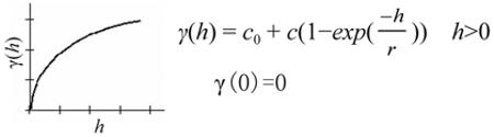
where γ(h) represents semivariance as a function of the distance between observations; h is a lag distance; c0, or the "nugget" is defined as the intercept; c is known as the partial sill or strnctural variance, which is the difference of the sill minus the nugget; the sill is defined as the value of the semivariogram at the plateau reached for larger h; r represents range which is defined as the value of r at which the semivariogram reaches the sill. For distances less than the range, observations are spatially c01Telated. For distances greater than or equal to the range, spatial correlation is effectively zero.
2.4 Spatial Analysis with SAS Proc Mixed
The spatial correlation model employed by Proc Mixed can be conceptualized as follows (Littell et al. 2006):
where Yi represents the ith observed air temperature with mean μ and the ei represents the corresponding error term. An independent error structure cannot be assumed due to spatial autocorrelation, unlike inference from the ordinary least squares regression.
In general, the spatial correlation model can be defined as (Littell et al. 2006):
Let si and sj denote geographic locations, which are specified by the coordinates latitude and longitude; dij denotes the distattce between si and sj. The covariance is a function of the distance between the locations si and sj, and it has the general fom1(Littell et al. 2006):
Several common isotropic variance models can be fitted in Proc Mixed. In our study, we test two widely used models—spherical and exponential—to estimate monthly population-weighted average temperature.
The parameter σ2 corresponds to the sill and ρ is the range of the process. The range of a second-order stationary spatial process is that distance at which observations are no longer correlated (Littell et al. 2006).
The ordina1y kriging model with elevation as a covariate in SAS Proc Mixed (SAS cokriging) can be expressed as:
where Temperature represents an estimate of air temperature, β0 is the fixed effect of geographic locations. β1 is the regression coefficient of covrariate-elevation and ei is a random error of a spatial correlation model. However, unlike standard regression, inference on this model must take into account spatial correlation runong the errors (Littell et al. 2006).
The covariance between two observations (with coordinates x and y is computed as (Littell et al. 2006):
where θ1, θ2 are the decay parameters which tell us how quickly the correlation decays as the distances increases; σ2 is the partial sill or va11ance.
Proc Mixed does not compute semivariograms or use them in model fitting . The variance components of these models are estimated using a restricted maximum likelihood (REML) method (Littell et al. 2006). Although Proc Mixed can fit models by using parameters of the range, sill, and nugget estimated from separate analyses, such as in SAS procedures Proc Variogram, Proc Kt1g2d and Proc NLIN, these approaches were not explored in our study because they require user interaction to select parruneters for each area, which is not feasible for a study with a large number of areas.
2.5 Evaluation
2.5.1 Cross validation
ArcGIS Geostatistical Analyst includes a cross-validation procedme that uses all of the data. The procedure omits one location point, calculates the value of this location using the remaining points, and then repeats the procedure for each remaining location. Finally, measured and predicted values from all points are compared. SAS Proc Mixed does not include a cross–validation option, and we did not manually conduct a cross-validation in SAS.
2.5.2 Split Validation
In ArcGIS Geostatistical Analyst, test and training data sets were created by randomly selecting data points’ geographic locations based on certain percentage cut points. Training data points were used to fit the models, omitting the test data points. We tested the model performance using different cut points: 60%, 65%, 70%, 75% and 80% for training data sets and found that lowest RMSE and highest adjust R2 were achieved with 70% of the samples in the training data set. So in our study, we randomly selected 30% of weather stations as test data points, and the remaining 70% of weather stations served as the training data points. The same test and training datasets for split validation were used in SAS Proc Mixed and ArcGIS Geostatistical Analyst.
2.5.3 Mean Absolute Error (MAE) and Root Mean Square Error (RMSE)
MAE and RMSE were used in evaluating prediction precision and bias. MAE and RMSE were calculated using the following equations:
where Z* is the estimated temperature, Z is the observed temperature, and n is the number of weather stations.
MAE measures the magnitude of error ignoring direction. RMSE provides a measure of error magnitude that is sensitive to outliers. Lower MAE and RMSE represent higher prediction accuracy and lower prediction bias.
3 Results
3.1 Correlation between temperature and elevation, latitude and longitude
Strong correlation exists between monthly temperature average and latitude, between monthly temperature average and elevation for all twelve months of 2007 (Table 1). Inverse relationships between monthly temperature average and latitude, and between monthly temperature average and altitude were found.
Table 1.
Correlations of temperature with elevation, latitude and longitude.
| Month | No. of stations used | Correlation between temperature and: | |||||
|---|---|---|---|---|---|---|---|
| Elevation | P value | Latitude | P value | Longitude | P value | ||
| 1 | 5389 | −0.5054 | <0.0001 | −0.7900 | <0.0001 | −0.1655 | 0.0001 |
| 2 | 5435 | −0.1096 | <0.0001 | −0.7851 | <0.0001 | 0.2845 | 0.0001 |
| 3 | 5384 | −0.3310 | <0.0001 | −0.8461 | <0.0001 | 0.0657 | 0.0001 |
| 4 | 5397 | −0.3941 | <0.0001 | −0.8571 | <0.0001 | −0.0123 | 0.3653 |
| 5 | 5374 | −0.5738 | <0.0001 | −0.7575 | <0.0001 | −0.2620 | 0.0001 |
| 6 | 5326 | −0.4978 | <0.0001 | −0.7468 | <0.0001 | −0.3060 | 0.0001 |
| 7 | 5317 | −0.2198 | <0.0001 | −0.5502 | <0.0001 | −0.0862 | 0.0001 |
| 8 | 5357 | −0.4310 | <0.0001 | −0.7648 | <0.0001 | −0.2580 | 0.0001 |
| 9 | 5300 | −0.5190 | <0.0001 | −0.8357 | <0.0001 | −0.2973 | 0.0001 |
| 10 | 5374 | −0.5984 | <0.0001 | −0.8366 | <0.0001 | −0.3933 | 0.0001 |
| 11 | 5334 | −0.3663 | <0.0001 | −0.8943 | <0.0001 | −0.0304 | 0.0264 |
| 12 | 5252 | −0.4193 | <0.0001 | −0.8452 | <0.0001 | −0.1276 | 0.0001 |
3.2 Split validation of monthly population-weighted average temperature estimates
Split validation results are shown in Table 2. Seventy percent of weather stations were spatially randomly assigned to the training data set and the remaining 30% of weather stations were assigned to the test data set. Models were fit using the training data set. The prediction accuracy and bias were examined by comparing estimates from the training data set to observed values for locations in the test data set. Three different models of Arc GIS cokriging, SAS ordinary kriging and SAS cokriging were used to estimate monthly population-weighted average temperature for the training and test data sets separately. Compared with estimates from SAS ordinary kriging, SAS cokriging had higher prediction accuracy (higher adjusted R2) and lower estimation bias (lowers MAE and lower RMSE). Results from Arc GIS cokriging and SAS cokriging indicated that estimates from SAS cokriging had higher adjusted R2 and lower MAE and RMSE.
Table 2.
Split validation of monthly average temperature estimations using ArcGIS and SAS Proc Mixed.
| Month | Sample size |
ArcGIS Cokriging |
SAS Proc Mixed |
||||||||
|---|---|---|---|---|---|---|---|---|---|---|---|
| Ordinary Kriging |
Cokriging |
||||||||||
| Train data | Test data | RMSE | MAE | Adj. R2 | RMSE | MAE | Adj. R2 | RMSE | MAE | Adj. R2 | |
| 1 | 3772 | 1617 | 1.2026 | 0.7935 | 0.9681 | 1.2314 | 0.8136 | 0.9666 | 1.1116 | 0.7541 | 0.9728 |
| 2 | 3804 | 1631 | 1.2910 | 0.8735 | 0.9724 | 1.2889 | 0.8733 | 0.9724 | 1.0230 | 0.7525 | 0.9827 |
| 3 | 3768 | 1616 | 1.2816 | 0.8654 | 0.9539 | 1.3141 | 0.8891 | 0.9515 | 1.0471 | 0.7699 | 0.9692 |
| 4 | 3777 | 1620 | 1.2415 | 0.8350 | 0.9293 | 1.2146 | 0.8321 | 0.9328 | 0.9087 | 0.6805 | 0.9625 |
| 5 | 3761 | 1613 | 1.2271 | 0.8118 | 0.9164 | 1.2576 | 0.8384 | 0.9125 | 0.9503 | 0.6945 | 0.9499 |
| 6 | 3727 | 1599 | 1.2461 | 0.8433 | 0.8957 | 1.2357 | 0.8370 | 0.8974 | 0.9784 | 0.6984 | 0.9360 |
| 7 | 3721 | 1596 | 1.3485 | 0.8562 | 0.8303 | 1.3330 | 0.8506 | 0.8340 | 0.9893 | 0.6999 | 0.9087 |
| 8 | 3749 | 1608 | 1.3030 | 0.8468 | 0.9052 | 1.2937 | 0.8432 | 0.9065 | 0.9737 | 0.6976 | 0.9469 |
| 9 | 3710 | 1590 | 1.3073 | 0.8629 | 0.9095 | 1.3285 | 0.8789 | 0.9073 | 1.0141 | 0.7261 | 0.9457 |
| 10 | 3761 | 1613 | 1.1152 | 0.7505 | 0.9490 | 1.1208 | 0.7755 | 0.9490 | 0.8905 | 0.6592 | 0.9678 |
| 11 | 3733 | 1601 | 1.0554 | 0.7385 | 0.9628 | 1.1456 | 0.7839 | 0.9562 | 0.9857 | 0.7175 | 0.9676 |
| 12 | 3676 | 1576 | 1.1552 | 0.8077 | 0.9755 | 1.1601 | 0.8061 | 0.9753 | 0.9777 | 0.7075 | 0.9825 |
RMSE=root mean square error; MAE=mean absolute error.
3.3 County-level estimation using ArcGIS cokriging and SAS co kriging
Table 3 shows mean, minimum and maximum of standard prediction error for the monthly population-weighted average temperature estimates in 3109 US counties and correlation coefficients of predicted values from ArcGIS cokriging and SAS cokriging. All correlation coefficients for each of the 12 months were larger than 0.95. If using mean standard prediction error to judge which method has better prediction comprehensively, SAS cokriging produced better estimates in most of the months.
Table 3.
Correlations between ArcGIS and SAS Proc Mixed estimates of county-level monthly temperature averages (3109 US counties)
| Month | No. of stations used |
Standard predicted error |
Adj. R2 | |||||
|---|---|---|---|---|---|---|---|---|
| ArcGIS |
SAS Proc Mixed |
|||||||
| Mean | Minimum | Maximum | Mean | Minimum | Maximum | |||
| 1 | 5389 | 0.843 | 0.671 | 1.343 | 0.796 | 0.296 | 1.671 | 0.992 |
| 2 | 5435 | 0.614 | 0.035 | 1.432 | 0.734 | 0.266 | 2.102 | 0.994 |
| 3 | 5384 | 1.021 | 0.903 | 1.349 | 0.748 | 0.247 | 1.621 | 0.985 |
| 4 | 5397 | 1.324 | 1.275 | 1.450 | 0.655 | 0.165 | 1.453 | 0.969 |
| 5 | 5374 | 0.909 | 0.771 | 1.302 | 0.692 | 0.209 | 1.511 | 0.962 |
| 6 | 5326 | 0.480 | 0.027 | 1.108 | 0.715 | 0.194 | 1.576 | 0.966 |
| 7 | 5317 | 0.662 | 0.037 | 1.430 | 0.706 | 0.182 | 1.557 | 0.951 |
| 8 | 5357 | 0.503 | 0.028 | 1.006 | 0.712 | 0.202 | 1.560 | 0.974 |
| 9 | 5300 | 1.436 | 1.391 | 1.589 | 0.708 | 0.186 | 1.557 | 0.959 |
| 10 | 5374 | 0.884 | 0.787 | 1.176 | 0.672 | 0.219 | 1.461 | 0.977 |
| 11 | 5334 | 1.131 | 1.079 | 1.264 | 0.730 | 0.244 | 1.582 | 0.983 |
| 12 | 5252 | 1.034 | 0.923 | 1.363 | 0.724 | 0.240 | 1.546 | 0.992 |
3.4 Estimation bias distribution at the grid and county level
The prediction standard errors for each grid ranged from 0.7 to 3.6 °C (Fig. 4) and for counties ranged from 0.3 to 1.67 °C (Fig. 5). The distribution illustrates the higher estimation bias of monthly temperature averages in the western and mid-western United States. Similar patterns of estimated prediction standard errors were found for other months of the year (not shown).
Fig. 4.
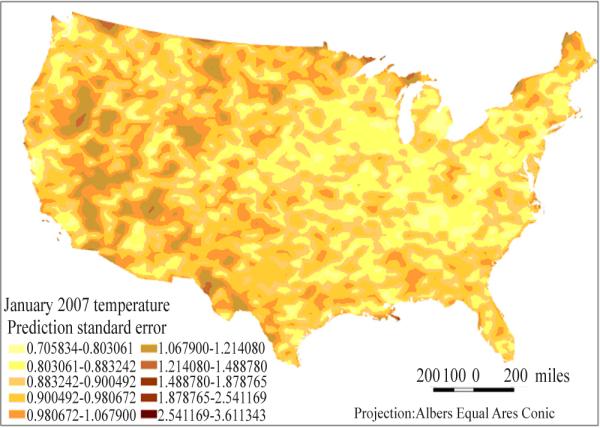
Grid’s temperature average estimates prediction standard errors in January 2007.
Fig. 5.
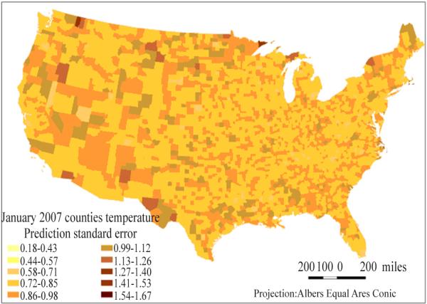
County’s temperature averages estimates prediction standard errors in January 2007.
3.5 Processing times for SAS Proc Mixed and ArcGIS
Table 4 displays the processing times for SAS ordinary kriging and cokriging in producing monthly population-weighted average temperature estimates for counties using the spherical and exponential models. Processing time was tested on a Citrix-based platform with SAS version 9.2 during January and February of 2011. For test data, ordinary kriging with the spherical model was 3 to 15 times faster than the same kriging method with the exponential model; cokriging with the spherical model was about 29 times faster than cokriging with the exponential model. For county data, cokriging with the spherical model was about 16 times faster than cokriging with the exponential model. Although a little higher prediction accuracy and a little lower prediction bias were achieved with the exponential model relative to the spherical model in our primary analysis for 2007 April and May data (For April’s estimation, Adj. R2 is 0.9329 and 0.9328 respectively with spherical and exponential model; RMSE is 1.19767 and 1.19700 respectively with spherical and exponential model), the spherical model was chosen for the final analysis due to its shorter processing time.
Table 4.
Processing time of SAS ordinary kriging and SAS cokriging.
| Month | 1 | 2 | 3 | 4 | 5 | 6 | 7 | 8 | 9 | 10 | 11 | 12 |
|---|---|---|---|---|---|---|---|---|---|---|---|---|
| Ordinary Kriging for test data (spherical model) |
00:33 | 0:35 | 00:33 | 00:34 | 00:33 | 00:32 | 00:32 | 00:33 | 00:31 | 00:33 | 00:32 | 00:30 |
| Ordinary Kriging for test data (exponential model) |
07:56 | 8:07 | 07:26 | 02:30 | 01:59 | 01:43 | 01:31 | 01:57 | 02:06 | 02:36 | 07:25 | 07:14 |
| Cokriging for test data (spherical model) |
00:33 | 0:34 | 00:33 | 00:33 | 00:40 | 00:33 | 00:33 | 00:35 | 00:20 | 00:33 | 00:31 | 00:30 |
| Cokriging for test data (exponential model) |
16:03 | * | * | * | * | * | * | * | * | * | * | * |
| Cokriging for county-level estimation (spherical model) |
01:41 | 01:44 | 01:56 | 02:25 | 01:10 | 01:06 | 01:03 | 01:03 | 01:01 | 01:40 | 01:37 | 01:33 |
| Cokriging for county-level estimation (exponential model) |
22:40 | * | * | * | * | * | * | * | * | * | * | * |
Note: processing time is reported in hours:minutes;
Computing time was not tested in every month due to the very long computing time observed for the month of January.
Processing time of ArcGIS was tested on a Citrix-based platform with ArcGIS Info 9.3. Processing time in ArcGIS was much shorter than in SAS. Producing estimates for one month with ordinary cokriging took about two minutes in processing. However, model adjustments that require user interaction, including optimizing parameters and removing trends, would take longer, from 10 minutes to one hour for the models used in this study.
4 Discussion
Relative to ArcGIS ordinary kriging and SAS ordinary kriging, ArcGIS cokriging and SAS cokriging using elevation as a covariate increased precision and decreased bias substantially in estimation of population-weighted average temperature for each month in 2007. This result is consistent with previously published findings from other researchers (Ishida and Kawashima 1993; Hudson and Wackernagel 1994; Li et al. 2004).
Results from the split validation using SAS cokriging and ArcGIS cokriging indicated that better precision can be achieved with SAS cokriging than with ArcGIS cokriging. Cokriging in SAS uses the restricted maximum likelihood method to estimate variance and covariance of the models. The estimation processes do not require building semivariograms and computing corresponding semivariogram parameters. The model fitting process can be automated without manual intervention required by ArcGIS cokriging. However, cokriging in SAS had longer processing times, especially for the exponential model.
ArcGIS Geostatistical Analyst obtained spatial interpolations of monthly population-weighted average temperature by constructing semivariogram models. The model building process requires manual intervention to select model parameters such as nugget, range and lag size. Although the precision obtained by ArcGIS methods is not higher than that obtained by SAS cokriging method, ArcGIS has a strong advantage in the pre-processing of spatial data, such as import of elevation data; spatially random division of training and testing data; and estimating county population centroid point. Considering the models, restricted maximum likelihood (REML) is the most accurate method for determining variography parameters; however, it doesn't scale well. For large datasets, the method quickly becomes computationally infeasible. Because SAS uses REML, it takes an very long time to process larger data sets with thousands or millions of points. The ArcGIS weighted least-squares algorithm, however, is able to efficiently handle datasets with billions of points.
The results of split validation showed that prediction accuracy rates in all twelve months of 2007 were above 90% for about 1600 weather stations using SAS cokriging; similar prediction accuracy rates were also reached in ten months of 2007 (except for June and July 2007) for the same test locations using ArcGIS cokriging. MAEs of the estimates ranged from 0.74 to 0.87 °C using ArcGIS cokriging and ranged from 0.68 to 0.77 °C with SAS cokriging. Among other temperature interpolation studies: Mahdian et al. estimated monthly temperature averages in southeastern Iran using cokriging and obtained MAEs of the estimates ranging from 1.2 to 2.0 °C (Mahdian et al. 2009); Bolstad et al. conducted daily mean temperature interpolation in the southern Appalachian mountains with autoregressive moving average models and reported MAEs of the estimates ranging from 1.39 to 2.40 °C (Bolstad et al. 1998); Ninyerola et al. reported correlation coefficients between observed and estimated monthly mean temperatures ranging from 0.75 to 0.97 through validation with independent data (Ninyerola et al. 2000); Jiang et al. found R2 values ranging from 0.76 to 0.97 between observed and predicted values from cokriging estimates of daily maximum temperature in China (Jiang et al. 2010). Compared with these studies, our study found much lower MAEs and much larger correlation coefficients between observed and predicted values. These results indicated that both SAS cokriging and ArcGIS cokriging used in our study reached higher prediction accuracy and can be effective spatial interpolation methods for producing county-level monthly average temperature estimates.
Highly positive relationships (all adjusted correlation coefficient for twelve months are greater than 0.95) were found from cokriging in SAS and cokriging in ArcGIS for corresponding estimates in all twelve months of 2007 for 3109 US counties. These results support the performance of both methods in creating county-level estimates for monthly population-weighted average temperature.
The geographic distribution of weather stations in Fig. 1 displayed uneven geographic distribution characteristics of weather stations in the US. The densities of weather stations are lower in the western and mid-western US than that in the eastern US The lower densities of weather stations in the West and Midwest likely contributed to the larger estimation bias in the area.
5 Conclusions
The study confirmed findings from previous studies that reported the value of elevation as a covariate to improve estimation precision and reduce bias in temperature interpolation using cokriging methods.
This study first compared precision, bias, and advantages and disadvantages of using SAS cokriging and ArcGIS cokriging for county-level temperature estimation from weather surface observing stations. The study found that higher prediction accuracy and lower estimation bias can be achieved with cokriging in SAS as compared to cokriging in ArcGIS. ArcGIS has strong advantages in pre-processing of spatial data and in processing time for estimation. Both methods from ArcGIS and SAS produced reliable US county-level temperature estimates; however, ArcGIS’s advantages in data pre-processing and estimation processing time may be important considerations for software selection, especially for multi-year or multi-area projects.
The study first created monthly temperature average estimates in US county level by using SAS cokriging and ArcGIS cokriging and confirmed the reliability and performance of SAS cokriging and ArcGIS cokriging in creating these estimates. Population-weighted monthly temperature estimates is the specific application in public health since it considers the interaction between environment and population within the ecosystem. It can be used by researchers to study temperature’s health impacts at the county level.
Acknowledgements
QI Xiaopeng’s work on this study was supported by the CDC Public Health Informatics Fellowship Program (PHIFP). WEI Liang’s work on this study was supported by the Dental, Oral and Craniofacial Data Resource Center, a joint project of CDC’s Division of Oral Health and NIH’s National Institute of Dental and Craniofacial Research. And the authors wish to thank Dr. Herman TOLENTINO, director of the PHIFP for his valuable help.
Footnotes
Note: the findings and conclusions in this report are those of the authors and do not necessarily represent the official position of the Centers for Disease Control and Prevention.
References
- Balk DL, Deichmann U, Yetman G, et al. Determining global population distribution: Methods, applications and data. Advances in Parasitology. 2006;62:119–156. doi: 10.1016/S0065-308X(05)62004-0. [DOI] [PMC free article] [PubMed] [Google Scholar]
- Benavides R, Montes F, Rubio A, et al. Geostatistical modelling of air temperature in a mountainous region of Northern Spain. Agricultural and Forest Meteorology. 2007;146:173–88. [Google Scholar]
- Boer EPJ, de Beurs KM, Hartkamp AD. Kriging and thin plate splines for mapping climate variables. International Journal of Applied Earth Observation and Geoinformation. 2001;3:146–54. [Google Scholar]
- Bolstad PV, Swift L, Collins F, et al. Measured and predicted air temperature at basin to regional scales in the southern Appalachian Mountains. Agricultural and Forest Meteorology. 1998;91:161–76. [Google Scholar]
- Brown DP, Comrie AC. Spatial modeling of winter temperature and precipitation in Arizona and New Mexico, USA. Climate Research. 2002;22:115–28. [Google Scholar]
- Calder CA, Cressie N, Rob K, et al. International Encyclopedia of Human Geography. Elsevier; Oxford: 2009. Kriging and variogram models. [Google Scholar]
- Centers for Disease Control and Prevention[CDC] Estimated county-level prevalence of diabetes and obesity - United States, 2007. MMWR Morb Mortal Wkly Rep. 2009;58:1259–63. [PubMed] [Google Scholar]
- Cressie N, editor. Statistics for spatial data. John Wiley and Sons; New York: 1993. [Google Scholar]
- Croner CM, Sperling J, Broome FR. Geographic information systems (GIS): New perspectives in understanding human health and environmental relationships. Statistics in Medicine. 1996;15:1961–77. doi: 10.1002/(sici)1097-0258(19960930)15:18<1961::aid-sim408>3.0.co;2-l. [DOI] [PubMed] [Google Scholar]
- Dobson JE, Bright EA, Coleman PR, et al. LandScan: A global population database for estimating populations at risk. Photogrammetric Engineering & Remote Sensing. 2000;66:849–57. [Google Scholar]
- ESRI ArcGIS geostatistical analyst: Statistical tools for data exploration, modeling, and advanced surface generation. 2001 An ESRI White Paper. [Google Scholar]
- Goovaerts P. Geostatistical approaches for incorporating elevation into the spatial interpolation of rainfall. Journal of Hydrology. 2000;228:113–29. [Google Scholar]
- He HY, Guo ZH, Xiao WF. Review on spatial interpolation techniques of rainfall. Chinese Journal of Ecology. 2005;23:6–11. [Google Scholar]
- Hudson G, Wackernagel H. Mapping temperature using kriging with external drift: theory and an example from scotland. International Journal of Climatology. 1994;14:77–91. [Google Scholar]
- Ishida T, Kawashima S. Use of cokriging to estimate surface air temperature from elevation. Theoretical and Applied Climatology. 1993;47:147–57. [Google Scholar]
- Jiang X, Liu X, Huang F, et al. Comparison of spatial interpolation methods for daily meteorological elements. Chinese Journal of Applied Ecology. 2010;21:624–30. [PubMed] [Google Scholar]
- Johnston K, Hoef JMV, Krivoruchko K, et al. ArcGIS 9 using ArcGIS geostatistical analyst. ESRI. 2003 [Google Scholar]
- Juan P, Mateu J, Jordan MM, et al. Geostatistical methods to identify and map spatial variations of soil salinity. Journal of Geochemical Exploration. 2010;108:62–72. [Google Scholar]
- Lapen DR, Hayhoe HN. Spatial analysis of seasonal and annual temperature and precipitation normals in Southern Ontario, Canada. Journal of Great Lakes Research. 2003;29:529–44. [Google Scholar]
- Lee HJ, Rubio MR, Elo IT, et al. Factors associated with intention to breastfeed among low-income, inner-city pregnant women. Maternal and Child Health Journal. 2005;9:253–61. doi: 10.1007/s10995-005-0008-5. [DOI] [PubMed] [Google Scholar]
- Li JL, Zhang J, Zhang C, et al. Analyze and compare the Spatial Interpolation Methods for climate factor. Pratacultural Science. 2006;23:6–11. [Google Scholar]
- Li J, You S, Huang J. Spatial interpolation method and spatial distribution characteristics of monthly mean temperature in China during 1961-2000. Ecology and Environment. 2004;15:109–14. [Google Scholar]
- Littell RC, Milliken GA, Stroup WW, et al. SAS for mixed models. SAS Institute Inc.; Cary, NC: 2006. [Google Scholar]
- Li X, Cheng G, Lu L. Spatial analysis of air temperature in the Qinghai-Tibet Plateau. Arctic, Antarctic, and Alpine Research. 2005;37:246–52. [Google Scholar]
- Ludington-Hoe SM, McDonald PE, Satyshur R. Breastfeeding in African-American women. Journal of National Black Nurses' Association. 2002;13:56–64. [PubMed] [Google Scholar]
- Mahdian MH, Bandarabady SR, Sokouti E, et al. Appraisal of the geostatistical methods to estimate monthly and annual temperature. Journal of Applied Sciences. 2009;9:128–34. [Google Scholar]
- Ninyerola M, Pons X, Roure JM. A methodological approach of climatological modelling of air temperature and precipitation through GIS techniques. International Journal of Climatology. 2000;20:1823–41. [Google Scholar]
- Nommsen-Rivers LA, Chantry CJ, Cohen RJ, et al. Comfort with the idea of formula feeding helps explain ethnic disparity in breastfeeding intentions among expectant first-time mothers. Breastfeeding Medicine. 2010;5:25–33. doi: 10.1089/bfm.2009.0052. [DOI] [PubMed] [Google Scholar]
- Parry ML, Rosenzweig C, Lglesias A, et al. Effects of climate change on global food production under SRES emissions and socio-economic scenarios. Global Environmental Change. 2004;14:53–67. [Google Scholar]
- Stahl K, Moore RD, Floyer JA, et al. Comparison of approaches for spatial interpolation of daily air temperature in a large region with complex topography and highly variable station density. Agricultural and Forest Meteorology. 2006;139:224–36. [Google Scholar]
- Tian Y, Yue T, Zhu L, et al. Modeling population density using land cover data. Ecological Modelling. 2005;189:72–88. [Google Scholar]
- Vaaler ML, Stagg J, Parks SE, et al. Breast-feeding attitudes and behavior among WIC mothers in Texas. Journal of Nutrition Education and Behavior. 2010;42:S30–S38. doi: 10.1016/j.jneb.2010.02.001. [DOI] [PubMed] [Google Scholar]
- Wu C, Murray AT. A cokriging method for estimating population density in urban areas. Computers, Environment and Urban Systems. 2005;29:558–79. [Google Scholar]
- Yang J, Wang Y, August PV. Estimation of land surface temperature using spatial interpolation and satellite-derived surface emissivity. Journal of Environmental Informatics. 2004;4:37–44. [Google Scholar]
- Yue TX, Wang YA, Liu JY, et al. Surface modelling of human population distribution in China. Ecological Modelling. 2005;181:461–78. [Google Scholar]
- Zhao CY, Nan ZR, Cheng GD. Methods for modelling of temporal and spatial distribution of air temperature at landscape scale in the southern Qilian Mountains, China. Ecological Modelling. 2005;189:209–20. [Google Scholar]