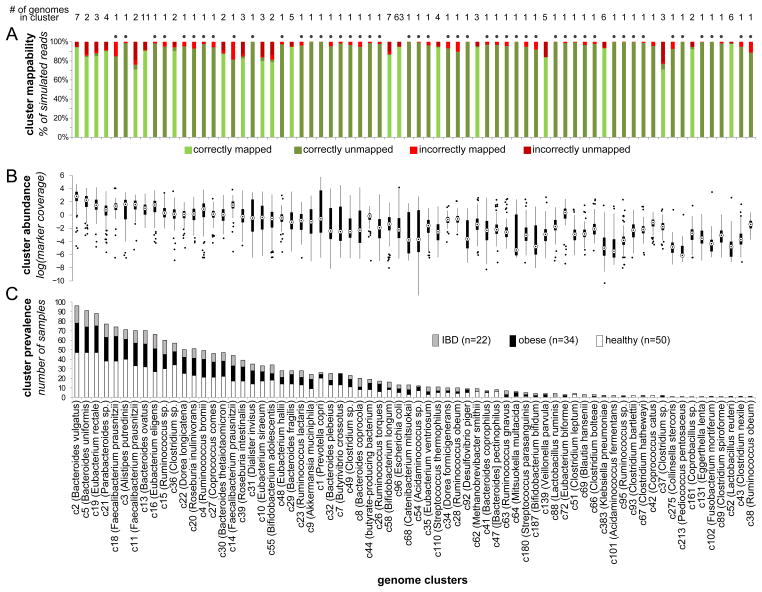
Figure 2. Genome cluster statistics.
The mappability, abundance, and prevalence of each genome cluster (representing a species-level group) are shown in a 3 vertically aligned plots. Clusters are sorted by their prevalence across samples. (A) Cluster mappability, as determined by a large-scale simulation assay measuring the accuracy of mapping reads extracted from the cluster’s genomes to a database in which the genome of origin was removed. In this simulation, reads from clusters represented in the reference database by a single genome (marked with a dot above the column) are expected to remain unmapped. (B) The distribution of each cluster’s abundance (rather than that of single genomes) across samples, as determined by the average coverage of 13 single-copy marker genes. (C) Cluster prevalence (the number of samples in which the cluster was ‘detectable’) within each host group, shown as a stacked bar plot. See also Figures S1–S2 and Tables S1–S2.

