

Abstract
High-throughput DNA sequencing technologies, coupled with advanced bioinformatics tools, have enabled rapid advances in microbial ecology and our understanding of the human microbiome. QIIME (Quantitative Insights Into Microbial Ecology) is an open-source bioinformatics software package designed for microbial community analysis based on DNA sequence data, which provides a single analysis framework for analysis of raw sequence data through publication quality statistical analyses and interactive visualizations. In this paper, we demonstrate the use of the QIIME pipeline to analyze microbial communities obtained from several sites on the bodies of transgenic and wild-type mice, as assessed using 16S rRNA gene sequences generated on the Illumina MiSeq platform. We present our recommended pipeline for performing microbial community analysis, and provide guidelines for making critical choices in the process. We present examples of some of the types of analyses that are enabled by QIIME, and discuss how other tools, such as phyloseq and R, can be applied to expand upon these analyses.
2. Introduction
Advances in DNA sequencing technologies, together with the availability of culture-independent sequencing methods and software for analyzing the massive quantities of data resulting from these technologies, have vastly improved our ability to characterize microbial communities in many diverse environments. The human microbiota, the collection of microbes living in or on the human body, is of considerable interest: microbial cells outnumber human cells in our bodies by a ratio of up to 10 to 1 (Savage, 1977). These microbial communities contribute to healthy human physiology (De Filippo, Cavalieri, Di Paola, Ramazzotti, Poullet, Massart et al., 2010; Dethlefsen & Relman, 2011; Spencer, Hamp, Reid, Fischer, Zeisel, & Fodor, 2011) and development (Dominguez-Bello, Costello, Contreras, Magris, Hidalgo, Fierer et al., 2010; Koenig, Spor, Scalfone, Fricker, Stombaugh, Knight et al., 2011), and dysbiosis (or imbalance in these communities) is now known to be associated with disease, including obesity (Turnbaugh, Hamady, Yatsunenko, Cantarel, Duncan, Ley et al., 2009) and Crohn's disease (Eckburg & Relman, 2007). More recently, evidence from transplants into germ-free mice suggests that some of these associations may be causal, because certain phenotypes can be transmitted by transmitting the microbiota (Carvalho, Koren, Goodrich, Johansson, Nalbantoglu, Aitken et al., 2012; McLean, Bergonzelli, Collins, & Bercik, 2012; Turnbaugh et al., 2009), even including transmission of human phenotypes into mice (Diaz Heijtz, Wang, Anuar, Qian, Bjorkholm, Samuelsson et al., 2011; Koren, Goodrich, Cullender, Spor, Laitinen, Backhed et al., 2012; Smith, Yatsunenko, Manary, Trehan, Mkakosya, Cheng et al., 2013).
Illumina's MiSeq and HiSeq DNA sequencing instruments respectively sequence tens of millions, or billions, of DNA fragments in a single sequencing run (Kuczynski, Lauber, Walters, Parfrey, Clemente, Gevers et al., 2012). The rapidly increasing data volumes typical of recent studies drives a need for more efficient and scalable tools to study the human microbiome (Gonzalez & Knight, 2012a). QIIME (Quantitative Insights Into Microbial Ecology) (Caporaso, Kuczynski, Stombaugh, Bittinger, Bushman, Costello et al., 2010b) is an open-source pipeline designed to provide self-contained microbial community analyses, from interacting with raw sequence data through publication-quality statistical analyses and visualizations.
QIIME integrates commonly used third-party tools, and implements many diversity metrics, statistical methods, and visualization tools for analyzing microbial data. Consequently, most individual steps in the microbial community analysis can be performed in multiple ways. Here, we describe how samples are prepared for an Illumina MiSeq run, the QIIME pipeline, and our view of the current best practices for analyzing microbial communities with QIIME. Although there are other pipelines available, including mothur (Schloss, Westcott, Ryabin, Hall, Hartmann, Hollister et al, 2009), the RDP tools (Olsen, Larsen, & Woese, 1991; Olsen, Overbeek, Larsen, Marsh, McCaughey, Maciukenas et al., 1992), ARB (Ludwig, Strunk, Westram, Richter, Meier, Yadhukumar et al., 2004), VAMPS (Sogin, Welch, & Huse, 2009), and other platforms, in this review we focus on analysis with the MiSeq platform and QIIME as this combination is increasingly popular as a method for analyzing microbial communities and a detailed comparison of other available pipelines and sequencing platforms is beyond the scope of the present work.
3. QIIME as integrated pipeline of third party tools
An early barrier to adoption of QIIME was that it was difficult to install, in part because of the large number of software dependencies (third party packages that need to be installed before QIIME is operational). The large number of dependencies was, however, a deliberate choice made during QIIME development. To build a pipeline for sequence analysis that encompasses the many steps from sequence collection, curation, and statistical analysis, the user must consider many existing tools that have been developed to perform specific functions, and extensively benchmarked on their ability to perform these functions, such as the UCLUST program for clustering sequences into Operational Taxonomic Units (OTUs) (Edgar, 2010). A pipeline thus has two options: either re-implement the algorithm, or use the existing software (by creating a “wrapper” that allows its input and output to be incorporated into the pipeline). The QIIME developers choose to wrap all the algorithms rather than re-implement them. This choice preserves the integrity of the programs that make up the pipeline, as there is no doubt that the tool being used is the one designed, created, and tested by the original authors, and, in most cases, peer-reviewed by the scientific community. The reuse of existing software also allows the QIIME pipeline to include and distribute newly developed and improved algorithms more rapidly than would be possible if each algorithm had to be re-implemented and re-tested to check that it matched the original. Thus QIIME users can be sure that they have the most up-to-date tools for their analysis, and can credit the authors of the component software packages appropriately.
One important, but sometimes poorly understood, aspect of the QIIME pipeline is that it wraps algorithms and tools produced by other researchers into a single pipeline for sequence analysis. It is therefore important to cite the individual tools that you use as well as QIIME itself. For example, an analysis using the default QIIME parameters (Caporaso et al., 2010b)would use uclust (Edgar, 2010) to cluster the sequences against the GreenGenes database (DeSantis, Hugenholtz, Larsen, Rojas, Brodie, Keller et al., 2006), assign taxonomy using the RDP classifier (Wang, Garrity, Tiedje, & Cole, 2007), and build PCoA beta diversity plots using Uni Frac (Lozupone & Knight, 2005). It is important for researchers who are considering contributing to the QIIME pipeline to recognize that their contributions will be cited, so that they can continue to expand upon their work. For example, the pick_otus.py script alone offers a choice of nine different clustering algorithms, each developed by researchers who should be acknowledged if their particular algorithm is used.
For taxonomy databases and other reference databases, including GreenGenes, it is also important to cite the release version that you are using (DeSantis et al., 2006), not least because the results will change depending on which release you used, and others may not be able to reproduce your results without this information. For GreenGenes, the default taxonomy database in QIIME, the version is named after the release date, such as the 12_10 release. The latest version of GreenGenes can always be downloaded from the qiime.org website. Using the same GreenGenes reference database version is critical for comparisons of taxonomy assignments and OTUs across different studies. For this reason, all the studies in the QIIME database are always processed against the same release version of GreenGenes.
An overview of some of the key tools used by the default QIIME pipeline follows:
UCLUST (Edgar, 2010). Used for OTU picking.
USEARCH (Edgar, 2010). Used for OTU picking and chimera checking.
RDP Classifier (Wang et al., 2007). Used for taxonomy assignment.
GreenGenes Database (DeSantis et al., 2006). Used as a reference database for taxonomy assignment and reference-based OTU picking (see below).
PyNAST (Caporaso, Bittinger, Bushman, DeSantis, Andersen, & Knight, 2010a). Used for multiple sequence alignment.
UniFrac (Lozupone et al., 2005). Used as a phylogenetic metric for beta diversity analysis.
4. PCR and sequencing on Illumina MiSeq
Microbial community analysis typically begins with the extraction of DNA from primary samples (note that although most of this DNA comes from cells in the sample, some may consist of dead cells or extracellular DNA, so the representation of the active community from these sources is not perfect). Although methods for DNA extraction vary, several large initiatives such as the Earth Microbiome Project (Gilbert, Meyer, Antonopoulos, Balaji, Brown, Brown et al., 2010; Gilbert, Meyer, Jansson, Gordon, Pace, Tiedje et al., 2010) and the Human Microbiome Project (Human Microbiome Project, 2012a, 2012b; Turnbaugh, Ley, Hamady, Fraser-Liggett, Knight, & Gordon, 2007) have standardized on the MOBIO PowerSoil DNA extraction kit (www.mobio.com) to efficiently recover DNA from a wide range of sample types. After extraction, samples are PCR amplified under permissive conditions with primers containing the MiSeq sequencing adapters, a 12-nucleotide Golay barcode (first introduced in Fierer, Hamady, Lauber, and Knight (2008)) on the forward primer, followed by the bases matching the 16S rRNA gene; the reverse primer is not barcoded (Caporaso, Lauber, Walters, Berg-Lyons, Huntley, Fierer et al., 2012). The annealing temperature is set to 50°C, which in our hands minimizes PCR artifacts (both primer dimer and background ‘smear’) while encouraging the primers to anneal to the largest diversity of sequences possible. Similarly, we believe that including sequencing adaptors and barcodes in the PCR step has advantages over multiple enzymatic treatments of the 16S amplicon that are otherwise needed to introduce adaptors and barcodes after PCR. The first, and most important consideration is the reduction of sample handling, which lowers the chance of contamination, mislabeling and loss of small-volume samples during preparation. Combining the adapters and barcodes in the PCR step allows for exact well-to-well mapping of samples to primers, providing a standardized way to track sample-barcode combinations through library preparation, an important consideration when sequencing hundreds to thousands of samples using 96- or 384-well sample preparation formats.
Because the MiSeq can generate a large number of sequences per run, many samples can be multiplexed on each single sequencing run. The choice of barcodes thus deserves some attention. For instance, homebrew ‘barcodes’ can be as simple as using an arbitrary sequence of known nucleotides placed at the front of the amplicon and fed into an informatics pipeline for detection. Although simple, this approach has limited ability to detect sequencing error (Caporaso et al., 2012), and increases the risk of misassignment of a sequence to the wrong sample. The use of error correcting barcodes, such as Hamming (Hamady, Walker, Harris, Gold, & Knight, 2008) or Golay codes (Caporaso et al., 2012), allows the user to detect and correct errors in the barcode, decreasing the chances that a sequence is assigned to the wrong sample. Error-correcting barcodes also allow the user to retain more sequences, because 8-nucleotide Hamming codes can detect and correct 2 and 1 bit errors, respectively (Hamady et al., 2008), and 12-nucleotide Golay codes can detect and correct 4 and 3 bit errors, respectively (Hamady & Knight, 2009). With the unique Golay codes described in Caporaso et al., (2012), up to 2167 samples could be multiplexed on a single MiSeq run at a depth of 4600 per sample, certainly sufficient to detect the effects of many biological phenomena of interest (Kuczynski, Costello, Nemergut, Zaneveld, Lauber, Knights et al., 2010a; Kuczynski, Liu, Lozupone, McDonald, Fierer, & Knight, 2010b). As the QIIME default settings detect Golay barcodes, we encourage the use of these codes when possible to maximize sequence retention and assignment accuracy.
Detailed instructions for loading the MiSeq for amplicon runs with custom barcodes can be found on the Earth Microbiome Project website (www.earthmicrobiome.org). Briefly, pooled libraries are analyzed by Bioanalyzer (Agilent Technologies) and diluted to 2 ηM quantitated by use of a Qubit Fluorometer (Life Technologies, High Sensitivity reagents). The phiX spike-in library (Illumina Inc.) is also diluted to 2 ηM prior to use. Denaturation of the pooled 16S rRNA gene amplicon libraries and the phiX control is performed according to manufacturer's instructions (Illumina Inc.), giving a denatured template concentration of 20ρM. Denatured templates are further diluted to 5 ρM (using Illumina HT1 buffer) and subsequently combined to give an 85% 16S rRNA gene amplicon library and 15% phiX control pool (1000 μL total volume). Improvements in the Illumina analysis software may allow reduction of this phiX spike-in, allowing more of the sequences to be used for 16S rRNA gene amplicons.
MiSeq reagent cartridges are prepared according to the manufacturer's instructions (Illumina Inc.). The sample pool (1000 μL total volume) is loaded in to cartridge position 17. Custom 16S rRNA gene Read 1, Index Read, and Read 2 sequencing primers are added directly to cartridge wells containing the standard Illumina Read 1, Index Read, and Read 2 sequencing primers (wells 12, 13 and 14 respectively, 5 μL each primer at 100 μM concentration (Caporaso et al., 2012)). Primers are added to wells using a long gel loading tip, and gently mixed using a plastic Pasteur pipette. Care must be taken to assure that reagents in the cartridge are localized to the bottom of the wells, and that no bubbles are present.
The spike-in of PhiX, at least at low levels, is still critical for obtaining usable amplicon data because the optics require diversity at each nucleotide position, which is not possible with absolutely conserved nucleotides within the 16S rRNA gene (or most other genes of interest). Many users have had difficulty mixing this protocol for custom amplicons with Illumina's own indexing protocol, which allows a maximum of 96 samples to be multiplexed per run at the time of writing. It is critical to use either this protocol exactly (allowing arbitrary numbers of custom barcodes) or to use Illumina's barcoding protocol, but not to mix and match steps and reagents.
5. QIIME workflow for conducting microbial community analysis
The Illumina MiSeq technology can generate up to 107 sequences in a single run (Kuczynski et al., 2012). QIIME takes the instrument output, and generates useful information about the community represented in each sample. At a coarse-grained level, we divide this process into “upstream” and “downstream” stages (Figure 1). The upstream step includes all the processing of the raw data (sequencing output), and generating the key files (OTU table and phylogenetic tree) for microbial analysis. The downstream step uses the OTU table and phylogenetic tree generated in the upstream step to perform diversity analysis, statistics and interactive visualizations of the data. Additionally, QIIME increasingly interfaces with other packages such as IPython and R, allowing additional analyses to be conducted.
Figure 1.
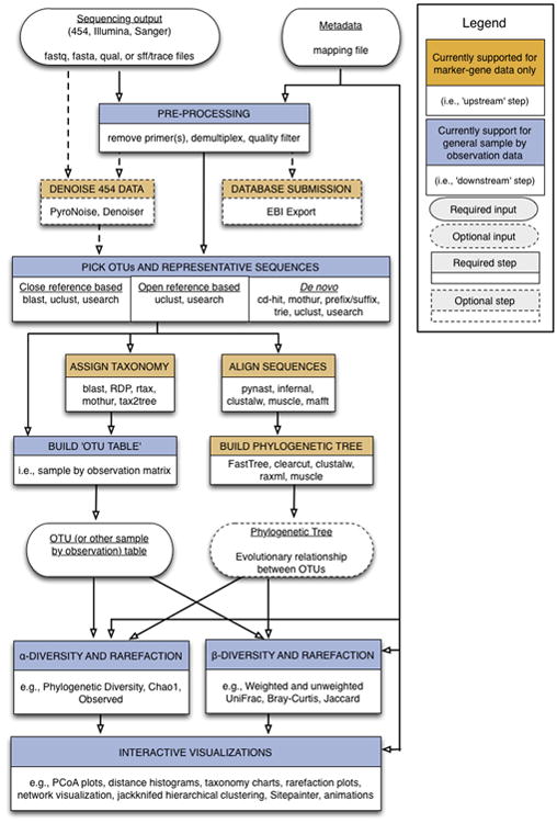
QIIME workflow overview. The Upstream process (brown boxes) includes all the steps that generate the OTU table and the phylogenetic tree. This step starts by preprocessing the sequence reads and ends by building the OTU table and the phylogenetic tree. The Downstream process (blue boxes) includes steps involved in analysis and interpretation of the results, starting with the OTU table and the phylogenetic tree and ending with alpha and beta diversity analyses, visualizations and statistics.
To illustrate some of the main features of QIIME, together with some of the analyses that can be performed outside QIIME, we use an example dataset consisting of samples from different body sites of 12 mice: the oral cavity, ileum, cecum, colon, fecal pellet, skin and whole mouse sample by homogenizing the mouse carcass. 7 mice were wild type genotype (WT from here so on), while the 5 remaining mice were transgenic (TG from here so on). The samples were collected by students during the IQ-Bio course taught by Manuel Lladser and Rob Knight during Spring 2013 at University of Colorado at Boulder (course identifiers: APPM5720-001-2013, CHEM4751-001-2013, CHEM5751-001-2013, CSCI4830-006-2013, CSCI7000-006-2013, MCDB6440-001-2013).
5.1. Upstream analysis steps
The QIIME analysis workflow starts with the sequencing output (fastq files), and a user-generated mapping file. The mapping file contains information for understanding what is in each sample and is therefore critical for performing the rest of the analyses; it is in tab-delimited text format. The main information in this file is a unique identifier for each sample, the barcode used for each sample, the primer sequence used, and a description for each sample, together with additional user-defined information that is necessary for understanding the results such as which species the sample was taken from, which site on the body is being studied, clinical variables relevant to the study, etc. The sample identifier, barcode and primer sequence information are required for the first step of the QIIME workflow. This preprocessing step combines sample demultiplexing, primer removal and quality-filtering. Additional information provided about the samples in the mapping file is helpful for later steps, especially for analyses that aggregate the samples by these fields (for example, comparing lean to obese subjects). We therefore recommend including as much additional data about the samples as possible (often called “sample metadata”).This auxiliary information is also very useful for identifying contaminated samples. For example, SourceTracker (Knights, Kuczynski, Charlson, Zaneveld, Mozer, Collman et al., 2011b) is a package included in QIIME that identifies the proportion of different community sources, including contamination, in each sample based on a database of samples from known communities.
5.1.1. De-multiplexing and quality filtering
As mentioned above, high-throughput sequencing allows multiple samples to be combined in a single sequencing run (Kuczynski et al., 2012). However, each sequence must then be linked back to the individual sample that it came from via a DNA barcode. The barcodes, which are short DNA sequences unique to each sample, are incorporated into each sequence from a given sample during PCR. QIIME uses the barcodes in the mapping file to demultiplex, i.e. to assign the sequences back to the samples they are derived from, using error-correcting codes where available (as noted above). QIIME is also able to demultiplex variable-length barcodes such as those used in the HMP: see Variable-length barcodes in Other features below.
During demultiplexing, QIIME removes the barcodes and primer sequences because they are not needed in later steps. Thus, the result after demultiplexing is a sequence matching the amplified 16S rRNA gene.
The third part of preprocessing is quality-filtering. Quality-filtering improves diversity estimates with Illumina sequencing substantially (Bokulich, Subramanian, Faith, Gevers, Gordon, Knight et al., 2013). Illumina instruments, like most sequencing instruments, generate a quality score for each nucleotide (Phred), related to the probability that each nucleotide was read incorrectly. QIIME uses the Phred score and user-defined parameters to remove sequence reads that do not meet the desired quality. These user-defined parameters are: the percentage of consecutive high quality base calls (p), the maximum number of consecutive low quality base calls (r), the maximum number of ambiguous bases (typically coded as N) (n) and the minimum Phred quality score (q). For a detailed discussion of how these parameters affect diversity results, see Bokulich et al. (2013). This study recommends standard values for these parameters as r = 3, p = 75%, q = 3 and n = 0, which are the default values in the QIIME pipeline. However, the optimal values for these parameters can vary both for individual sequencing runs and for different downstream analyses: for example, analyses such as machine learning benefit from larger numbers of low-quality sequences, whereas accurate counts of OTUs from a mock community require fewer, higher-quality sequences. Table 1 contains an overview of the guidelines presented in Bokulich et al. (2013) for tuning these parameters to a given dataset.
Table 1. Overview of the guidelines to tune up the quality filtering parameters (adapted from Bokulich et al. (2013)).
| Dataset characteristics | q | p | r | Results |
|---|---|---|---|---|
| Majority of high-quality, full-length sequences | increase | increase | - | Retrieving full-length sequences with low error rates, increasing the discovery rate of rare OTUs |
|
| ||||
| Short reads, or reads truncated by early low-quality base calls | - | lower | increase | Retain lower-quality but taxonomic usefult reads |
|
| ||||
| Maximize read count for machine-learning tools, cross-metadata OTU counts comparison, etc | - | lower | - | Increased sample size |
The Illumina quality filtering approach differs in its fundamental principles from 454 denoising (Quince, Lanzen, Curtis, Davenport, Hall, Head et al., 2009; Reeder & Knight, 2010). 454 denoising is based on flowgram clustering (Quince et al., 2009; Quince, Lanzen, Davenport, & Turnbaugh, 2011) and is primarily targeted at reducing homopolymer runs, which are not a problem on the Illumina platform to the same extent. In contrast, the Illumina quality filtering is based on a per-base Phred quality score and does not target indels.
The QIIME quality filtering process works as follows. Starting at the beginning of the sequence, QIIME checks that the next r Phred values exceed the user-defined quality threshold q. If the test is positive, it continues slicing the window of r bases until the test fails, or the end of the sequence is reached. The sequence is then trimmed to the last base that met the quality threshold. The next test determines whether the length of the trimmed sequence exceeds p, expressed as the percentage of length of the raw sequence. If this check fails, the sequence is excluded. Otherwise, QIIME performs the last check on the sequence, which counts the number of ambiguous characters (N) in the trimmed sequence and checks that it is less than n. If the test fails, the sequence is rejected. QIIME combines the de-multiplexing, primer removal and quality filtering processes in a single script, split_libraries_fastq.py:
split_libraries_fastq.py -i $PWD/IQ_Bio_16sV4_L001_sequences.fastq.gz -b $PWD/IQ_Bio_16sV4_L001_sequences_barcodes.fastq.gz -m $PWD/IQ_Bio_16sV4_L001_map.txt -o $PWD/slout --rev_comp_mapping_barcodes
In our example dataset, we used the --rev_comp_mapping_barcodes option in order to indicate that the barcodes present in the mapping file are reverse complements of Golay 12 barcodes. We used the recommended default parameters for quality filtering on this dataset. However, to change the values for the r, p, n and q quality filtering parameters, we can use the -r, -p, -n and -q options to the script. This command will write a FASTA-formatted file in the slout folder, called seqs.fna, which contains the demultiplexed sequences that pass the quality filter. Each sequence contains the information about which sample it came from encoded in the name of the sequence.
Multiple lanes of Illumina fastq data can be processed together in a single call to the script, just by passing the sequence files, the barcode files and the mapping files in the same order to the -i, -b and -m options, respectively. For example, with two lanes, the command would look like:
split_libraries_fastq.py -i sequences1.fastq,sequences2.fastq -b sequences1_barcodes.fastq,sequences2_barcodes.fastq -m mapping1.txt,mapping2.txt -o slout
The user can check how many sequences have been demultiplexed and passed quality-filtering by using the count_seqs.py command. This command also shows the mean and standard deviation of the sequence length:
count_seqs.py -i $PWD/slout/seqs.fna
12687021 :slout/seqs.fna (Sequence lengths (mean +/- std): 150.9989 +/- 0.1715)
12687021 : Total
5.1.2. OTU picking
The next step is clustering the preprocessed sequences into Operational Taxonomic Units (OTUs), which in traditional taxonomy represent groups of organisms defined by intrinsic phenotypic similarity that constitute candidate taxa (Sneath & Sokal, 1973; Sokal & Sneath, 1963). For DNA sequence data, these clusters, and hence the OTUs, are formed based on sequence identity. In other words, sequences are clustered together if they are more similar than a user-defined identity threshold, presented as a percentage (s). This level of threshold is traditionally set at 97% of sequence similarity, conventionally assumed to represent bacterial species (Drancourt, Bollet, Carlioz, Martelin, Gayral, & Raoult, 2000); other levels approximately represent other taxa, although the fit between molecular data and traditional taxonomy varies for different taxa. QIIME supports three approaches for OTU picking (de novo, closed-reference and open-reference), and multiple algorithms for each of these approaches (Table 2). The de novo approach (Figure 2a) groups sequences based on sequence identity. The closed-reference approach (Figure 2b) matches sequences to an existing database of reference sequences. If a sequence fails to match the database, it is discarded. The open-reference approach (Figure 2c) also starts with an existing database and tries to match the sequences against them. However, if a sequence does not match the database, it is added to the database as a new reference sequence.
Table 2.
Supported OTU picking methods in QIIME, with a brief description of the algorithm employed and in which OTU picking approach can be used.
| Method | Picking approach | Description | Reference | ||
|---|---|---|---|---|---|
| denovo | closed reference | open reference | |||
| cd-hit | yes | - | - | Applies a “longest-sequence-first list removal algorithm” to cluster sequences. | Li and Godzik (2006) Li, Jaroszewski, and Godzik (2001) |
| Mothur | yes | - | - | Takes an aligned set of sequences and clusters them using a nearest-neighbor, furthest-neighbor or average-neighbor algorithm. | Schloss et al. (2009) |
| prefix/suffix | yes | - | - | Clusters sequences which are identical in their first and/or last bases. | QIIME team, unpublished |
| Trie | yes | - | - | Clusters sequences which are identical sequences and sequences which are subsequences of other sequences. | QIIME team, unpublished |
| blast | - | yes | - | Compares and clusters each sequence against a reference database of sequences. | Altschul et al. (1990) |
| uclust | yes | yes | yes | Creates seed sequences which generate clusters based on percent identity. | Edgar (2010) |
| usearch | yes | yes | yes | Creates seed sequences which generate clusters based on percent identity, filters low abundance clusters and performs de novo and reference based chimera detection. | Edgar (2010) |
Figure 2.
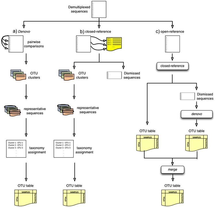
Cartoon representation of the OTU picking approaches. (a) de novo, (b) closed-reference and (c) open reference OTU picking respectively. In the de novo method, sequences are compared to each other and then clusters are formed. In the closed-reference method, sequences are compared directly to a reference dataset (e.g. GreenGenes). Sequences that match a reference sequence are clustered; the remaining sequences are discarded. In both OTU picking methods, once clusters are formed, a representative sequence is selected and then taxonomy is assigned to that sequence (and applied to the rest of the sequences that make up the OTU). Open-reference combines the closed-reference and open-reference methods. The first step is identical to closed-reference, sequences discarded in the first step are clustered into OTUs by the de novo method, and both OTU tables are merged into a single final OTU table. De novo and open-reference cluster all the sequences, but closed-reference allows better comparisons between studies, especially those using different primers, because all OTUs occur in a common reference space.
The OTU picking strategies shown in Figure 2 are built on top of algorithms for de novo clustering. Of the various algorithms available, the furthest-neighbor, average-neighbor or nearest neighbor in mothur (Schloss & Handelsman, 2005; Schloss et al., 2009) (also named complete linkage, average linkage, and single linkage respectively) are the most widely used. Furthest-neighbor requires that each sequence is closer than the distance threshold to every other sequence already in the OTU (Figure 3). Average-neighbor requires that the average pairwise distance of all sequences in the OTU is closer than the distance threshold. Nearest-neighbor requires that each sequence is closer than the distance threshold to any sequence already in the OTU. Because these three algorithms are variants on hierarchical clustering, they require loading the distance matrix (proportional to the square of the number of dereplicated sequences) into memory, and are therefore challenging to apply to large datasets (e.g., larger than 105 sequences). The OTUs yield by these three algorithms also change their memberships at different sequencing depths (i.e. the number of sequences chosen for clustering), which can be a problem for estimates of total OTU numbers (Roesch, Fulthorpe, Riva, Casella, Hadwin, Kent et al., 2007).
Fig 3.
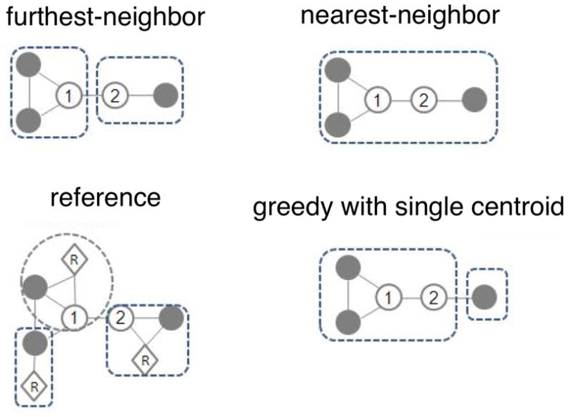
Cartoon demonstrating different clustering algorithms. Circles representing sequences linked with lines are within the distance threshold. The two numbered sequences are the first and second sequences in order in the file. The reference algorithms only consider the distance between reference (R) and sequences.
A solution to the distance matrix problem comes from uclust and usearch, which are greedy algorithms based on using a single centroid in each OTU (Edgar, 2010). The centroid could be either from a reference database (usearch) or identified de novo from the sequence dataset (both uclust and usearch) (Figure 3). Sequences are serially compared to centroids in a user-defined order (usually decreasing abundance). If a sequence falls within the distance threshold of more than one centroid, the new sequence can either be grouped with the first centroid encountered, or the one with the closest distance. Both uclust and usearch are much more efficient than the hierarchical methods, and they do not need to load a large distance matrix into memory (although recent versions of mothur also avoid the constraint of loading the full distance matrix). usearch is the default de novo OTU picking method in QIIME. Note that it is essential to note both your OTU picking strategy, and, if de novo OTU picking is used, which algorithm you used to do it: it is not sufficient simply to state that you used a 97% threshold.
Because the OTU picking approach selection is a critical point in microbial community analysis, the QIIME team has produced a detailed document that describes the OTU picking protocols, their advantages and limitations (https://github.com/qiime/qiime/blob/master/doc/tutorials/otu_picking.rst). Table 3 compares the different OTU picking approaches and gives guidelines for choosing an appropriate OTU picking strategy.
Table 3.
OTU picking approaches comparison. The table shows when each of the OTU picking approaches should be used and when they cannot be applied. It briefly describes the advantages and disadvantages of using each of the OTU picking approaches.
| denovo | closed-reference | open-reference | |
|---|---|---|---|
| Must use if | There is no reference sequence collection to cluster against (e.g. infrequently used marker gene) | Comparing non-overlapping amplicons. The reference set of sequences must span both of the regions being sequenced | - |
|
| |||
| Cannot use if | Comparing non-overlapping amplicons (e.g. V2 and V4 regions of 16S rRNA) | There is no reference sequence collection to cluster against (e.g. infrequently used marker gene) | Comparing non-overlapping amplicons (e.g. V2 and V4 regions of 16S rRNA) There is no reference sequence collection to cluster against (e.g. infrequently used marker gene) |
|
| |||
| Pros | All reads are clustered | Fast, as it is fully parallelizable (useful for extremely large datasets) Better tree and taxonomy quality since the OTUs are already defined on the reference set. | All reads are clustered. Fast, as is partially run on parallel |
|
| |||
| Cons | Time consuming since it runs in serial | Inability to detect novel diversity with respect to the reference set because the reads that don’t hit the reference sequence collection are discarded, so the analysis focus on the “already known” diversity If the studied environment is not well-characterized, a large fraction of the reads can be thrown away | There are still some steps performed in serial. If the data set contains a lot of novel diversity with respect to the reference set, this can still be slow |
The recommended OTU picking approach is open-reference OTU picking, because this approach provides the best trade-off between the time taken to complete the analysis and the ability to discover novel diversity.
Once the sequences have been clustered into OTUs, a representative sequence is picked for each OTU. The entire cluster will thus be represented by a single sequence, speeding up subsequent steps (because redundant sequences need not be considered). QIIME allows the representative sequence to be selected using several techniques: choosing a sequence at random, choosing the longest sequence, the most abundant sequence or the first sequence. If using uclust or usearch (Edgar, 2010), the cluster seed will be used as the representative sequence. The default behavior in QIIME is to use the most abundant sequence in each OTU as the representative sequence, because these sequences are least likely to represent sequencing errors (for other applications, such as clustering with near-full-length Sanger sequences, it may be more desirable to pick the longest sequence instead). In case of closed-reference OTU picking, sequences from the reference collection should be used as the representative sequences, which is the default behavior when the closed-reference approach is selected.
5.1.3. Identify chimeric sequences
During the PCR amplification process, some of the amplified sequences can be produced from multiple parent sequences, generating sequences known as chimeras. Although these sequences are technical artifacts rather than representing actual members of the community, chimeric sequences are important for alpha diversity estimates (although they are less important for cross-sample comparisons, because each chimera is relatively rare and the same chimera is unlikely to be generated systematically in different samples (Ley, Hamady, Lozupone, Turnbaugh, Ramey, Bircher et al., 2008). However, the same chimera can sometimes be generated in multiple PCR reactions: for example, Haas et al. (2011) reported that chimeric sequences formed from Streptococcus and Staphylococcus occurred multiple times independently, so presence of the same sequence in multiple PCRs does not mean that it is not chimeric.
QIIME currently supports three different methods for detecting chimeras: blast fragments, a taxonomy-assignment-based approach using BLAST (Altschul, Gish, Miller, Myers, & Lipman, 1990); ChimeraSlayer (Haas et al., 2011), which uses BLAST to identify potential chimera parents; and usearch 6.1 (Edgar, 2010), which can perform de novo chimera detection based on abundances as well as reference-based chimera detection. The recommended method for identifying chimeric sequences is uchime (Edgar, Haas, Clemente, Quince, & Knight, 2011), which is integrated in the usearch 6.1 (Edgar, 2010) pipeline. Uchime is the fastest method for detecting chimeric sequences and it is executed by default if the usearch method is selected for picking OTUs.
5.1.4. Taxonomy assignment
The next step in the QIIME workflow is to assign the taxonomy to each sequence of the representative set. This step connects the OTUs to named organism, which is useful for inferring likely functional roles for members of the community. When using a closed-reference approach for OTU picking, the taxonomy of the sequences can be pulled out from the reference set. In case of the open-reference and de novo approaches, because the clusters are not created from any reference database (as a reminder, in the open-reference approach, sequences that fail to cluster to the reference database form new clusters), the taxonomy should be assigned using a reference dataset. We recommend the GreenGenes database (DeSantis et al., 2006; McDonald, Price, Goodrich, Nawrocki, DeSantis, Probst et al., 2012b) as the default reference data set for assigning taxonomy, although the RDP (Cole, Wang, Cardenas, Fish, Chai, Farris et al., 2009) and Silva (Quast, Pruesse, Yilmaz, Gerken, Schweer, Yarza et al., 2013) databases also have strengths and weaknesses relative to GreenGenes and should be considered for some analyses. Silva includes microbial eukaryotes and has invested substantial effort in cleaning up marine taxa; RDP has close links to formally recognized names in taxonomy, which can be especially useful for medical microbiology. QIIME can assign taxonomy against any of the given databases, or against a custom database, using several methods: BLAST (Altschul et al., 1990), RDP Classifier (Wang et al., 2007), rtax (Soergel, Dey, Knight, & Brenner, 2012), mothur (Schloss et al., 2009) and tax2tree (McDonald et al., 2012b). The QIIME team recommends the RDP classifier method (Wang et al., 2007) with a confidence value of 0.8. However, if the user has paired-end reads, the best method to use is the rtax (Soergel et al., 2012), and the user should provide the fasta files with both the first and second read from the paired-end sequencing. Note that the taxonomy assignment method and the reference database must both be described in order for an analysis to be reproducible, and that these methods can have a larger effect on taxonomy than the underlying biological sample, so it is important to be consistent (Liu, DeSantis, Andersen, & Knight, 2008).
5.1.5. Sequence alignment
The next step in the QIIME workflow is to align the sequences. The sequences must be aligned to infer a phylogenetic tree, which is used for diversity analyses and to understand the relationships among the sequences in the sample. Currently, QIIME supports the following methods for performing sequence alignment: PyNAST (Caporaso et al., 2010a), Infernal (Nawrocki, Kolbe, & Eddy, 2009), clustalw (Larkin, Blackshields, Brown, Chenna, McGettigan, McWilliam et al., 2007), muscle (Edgar, 2004) and mafft (Katoh, Misawa, Kuma, & Miyata, 2002). The recommended (and default) method is PyNAST (Caporaso et al., 2010a). This method aligns the sequences against a template sequence alignment, for which we recommend the GreenGenes core set (DeSantis et al., 2006).
When sequences do not align well using PyNAST, the Infernal package (Nawrocki et al., 2009) should be used. Like PyNAST, it requires a template alignment, but unlike PyNAST, it uses stochastic context-free grammars (SCFGs) to align incorporating secondary structure. Although this method is slow compared to other methods, it does takes advantage of RNA secondary structure (provided in a Stockholm-format file) and can be useful for aligning more variable rRNAs. For marker genes other than rRNA genes, the best strategy for building phylogenetic trees is to align the protein sequences (if available) using MUSCLE.
5.1.6. Phylogeny construction
This step in the QIIME workflow infers a phylogenetic tree from the multiple sequence alignment generated by the previous step. The phylogenetic tree represents the relationships among sequences in terms of the amount of sequence evolution from a common ancestor. This phylogenetic tree is used in many downstream analyses, such as the UniFrac metric (Lozupone et al., 2005) for beta diversity.
The current methods supported for inferring the phylogenetic tree in QIIME are FastTree (Price, Dehal, & Arkin, 2009), clearcut (Evans, Sheneman, & Foster, 2006), clustalw (Larkin et al., 2007), raxml (Stamatakis, Ludwig, & Meier, 2005) and muscle (Edgar, 2004). The default and recommended method in QIIME is the FastTree (Price et al., 2009) method because it shows the best trade-off between run time and reliability of the inferred tree.
5.1.7. Make OTU table
The last part of the upstream stage in QIIME is to construct the OTU table. The OTU table is a sample by observation matrix that also includes the taxonomic prediction for each OTU. For the OTU table representation, QIIME uses the Genomics Standards Consortium candidate standard Biological Observation Matrix (BIOM) format (McDonald, Clemente, Kuczynski, Rideout, Stombaugh, Wendel et al., 2012a). The OTU table, the mapping file and the phylogenetic tree, are the main files for performing the downstream analysis.
QIIME can perform all the steps for generating the OTU table and the phylogenetic tree from the preprocessed data in a single command. There is a separate command for each OTU picking approach. In the following commands, we assume that the GreenGenes reference files (DeSantis et al., 2006) are located in the current directory. As a remainder, our seqs.fna has 12.687.021 sequences of length 150.9989 +/- 0.1715:
-
For de novo (run time ∼80 hours on 1 processor (not parallelizable)):
pick_de_novo_otus.py -i $PWD/slout/seqs.fna -o $PWD/denovo_otus
-
For closed-reference (run time ∼2 hours on 20 processors):
pick_closed_reference_otus.py -i $PWD/slout/seqs.fna -o $PWD/closed_ref_otus -r
$PWD/gg_12_10_otus/rep_set/97_otus.fasta -t
$PWD/gg_12_10_otus/taxonomy/97_otu_taxonomy.txt -a -O 20
-
For open-reference (run time ∼27 hours on 20 processors):
pick_open_reference_otus.py -o $PWD/open_ref_otus -i $PWD/slout/seqs.fna -r $PWD/gg_12_10_otus/rep_set/97_otus.fasta -a -O 20
Because the closed-reference and open-reference OTU picking approaches can be run in parallel, we use the -a and -O 20 options in order to run them using 20 processors.
5.2. Downstream analysis steps
Once we have generated the OTU table and the phylogenetic tree, we can start the downstream analysis. At this point, we strongly recommend performing a second level of quality-filtering, based on OTU abundance. The recommended procedure is to discard those OTUs with a number of sequences less than 0.005% of the total number of sequences (see Bokulich et al. (2013) for a detailed description of the effect of this parameter in further downstream analyses). QIIME executes the OTU abundance quality-filtering step through the script filter_otus_from_otu_table.py:
filter_otus_from_otu_table.py -i
$PWD/open_ref_otus/otu_table_mc2_w_tax_no_pynast_failures.biom -o
$PWD/open_ref_otus/otu_table_filtered.biom --min_count_fraction 0.00005
This step greatly reduces the problem of spurious OTUs, most of which are present at very low abundance.
QIIME 1.7.0 allows a first-pass view of common diversity analyses using a single command: core_diversity_analysis.py. One of the parameters required by this command is the sampling depth, the number of sequences that should be included in each sample for diversity analyses. This is required, because many of the commonly used diversity metrics are very sensitive to the number of sequences obtained per sample, such that samples that are similar in the number of sequences that were obtained appear similar to one another. This is bad because the number of sequences per sample is typically a methodological artifact, not reflective of biological reality. The sampling depth defines the size of the random subset of sequences that will be selected for each sample for all subsequent diversity analyses.
The optimal sampling depth is data-dependent. There is no universal way of choosing a rarefaction level, although heuristics can be applied. For example, if most samples have more than 10,000 sequences and the rest range from 500 to 50 sequences per sample, it would be recommended to use 10,000 as the rarefaction level. Although many studies show marked variation in sequence depth with only a few “bad” samples, it is not always easy to choose the rarefaction level. We strongly recommend rarefying over 1000 sequences/sample for Illumina MiSeq, because samples below this level often suffer from other quality issues as well.
The information needed to choose the rarefaction level can be obtained from the script print_biom_table_summary.py, which shows summary information on the OTU table such as the number of sequences, the number of OTUs, the number of samples and the number of counts per sample, among others:
print_biom_table_summary.py -i $PWD/open_ref_otus/otu_table_filtered.biom
Num samples: 90
Num observations: 783
Total count: 10637688.0
Table density (fraction of non-zero values): 0.4289
Table md5 (unzipped): eb0f1d7fbb50bc31695dade31db1e198
Counts/sample summary:
Min: 1.0
Max: 493427.0
Median: 99111.0
Mean: 118196.533333
Std. dev.: 94277.5956531
Sample Metadata Categories: None provided
Observation Metadata Categories: taxonomy
Counts/sample detail:
BLANK4.732555: 1.0
BLANK5.732537: 1.0
Joshua.Jose.WTAbd.732533: 1.0
Nick.Krishna.TG.Fec.732513: 2.0
TH.CVA.WT.Oral.732491: 2.0
BLANK2.732552: 3.0
BLANK3.732479: 5.0
BLANK6.732470: 7.0
Elizabeth.Chris.WT.Abd.732490: 10.0
Uri.Jake.TGAbd.732468: 10.0
TH.CVA.WT.Abd.732477: 13.0
BLANK10.732524: 812.0
Elizabeth.Chris.WT.Oral.732520: 7410.0
Elizabeth.Chris.WT.Col.732481: 21746.0
Jordan.Lisette.TG.Ile.732463: 27149.0
…
TH.CVA.WT.Fec.732553: 372327.0
Wang.TG.Cec.732527: 396391.0
TH.CVA.WT.Ile.732517: 493427.0
In the above output we can see the information contained in the OTU table resulting from applying the open-reference OTU picking. Some of the relevant information contained in this output is the total number of samples (90), the total number of OTUs (783), the number of reads (10637688) and the number of OTUs per sample. Applying the above heuristic, we could select a subsampling depth of 7410 sequences. However, because we have run three different OTU picking approaches and we want to compare them, we must search for the rarefaction level that best fits the three OTU tables. Below are the summarized information for the de novo OTU table and the closed reference OTU table, respectively:
print_biom_table_summary.py -i $PWD/denovo_otus/otu_table_filtered.biom
Num samples: 93
Num observations: 600
Total count: 11122386.0
Table density (fraction of non-zero values): 0.4344
Table md5 (unzipped): b002dd85c93fd9d0571ff23b05d21dde
Counts/sample summary:
Min: 0.0
Max: 497234.0
Median: 108322.0
Mean: 119595.548387
Std. dev.: 93487.3335598
Sample Metadata Categories: None provided
Observation Metadata Categories: taxonomy
Counts/sample detail:
BLANK7.732497: 0.0
BLANK8.732522: 0.0
Jordan.Lisette.TG.Abd.732467: 0.0
BLANK4.732555: 1.0
BLANK5.732537: 1.0
Joshua.Jose.WTAbd.732533: 1.0
BLANK2.732552: 3.0
Nick.Krishna.TG.Fec.732513: 3.0
TH.CVA.WT.Oral.732491: 3.0
BLANK3.732479: 5.0
BLANK6.732470: 9.0
Elizabeth.Chris.WT.Abd.732490: 10.0
Uri.Jake.TGAbd.732468: 10.0
TH.CVA.WT.Abd.732477: 13.0
BLANK10.732524: 825.0
Elizabeth.Chris.WT.Oral.732520: 7376.0
Joey.Aaron.Kyle.WT.Abd.732541: 35655.0
…
Wang.TG.Cec.732527: 394351.0
TH.CVA.WT.Ile.732517: 497234.0
print_biom_table_summary.py -i $PWD/closed_ref_otus/otu_table_filtered.biom
Num samples: 90
Num observations: 673
Total count: 9434459.0
Table density (fraction of non-zero values): 0.4250
Table md5 (unzipped): 257b528478a2700c72f979ce8d9a9a1c
Counts/sample summary:
Min: 1.0
Max: 347785.0
Median: 90092.0
Mean: 104827.322222
Std. dev.: 78560.4683831
Sample Metadata Categories: None provided
Observation Metadata Categories: taxonomy
Counts/sample detail:
BLANK4.732555: 1.0
BLANK5.732537: 1.0
Joshua.Jose.WTAbd.732533: 1.0
BLANK3.732479: 2.0
Nick.Krishna.TG.Fec.732513: 2.0
TH.CVA.WT.Oral.732491: 2.0
BLANK2.732552: 3.0
Uri.Jake.TGAbd.732468: 5.0
BLANK6.732470: 7.0
Elizabeth.Chris.WT.Abd.732490: 10.0
TH.CVA.WT.Abd.732477: 12.0
BLANK10.732524: 710.0
Elizabeth.Chris.WT.Oral.732520: 7205.0
Elizabeth.Chris.WT.Col.732481: 22652.0
…
TH.CVA.WT.Fec.732553: 329988.0
TH.CVA.WT.Ile.732517: 347785.0
From the above output, we see that a reasonable rarefaction level for the three tables is 7205 counts per sample, derived from the closed reference OTU picking.
Once the subsampling depth is chosen, we can execute the core_diversity_analyses.py command over the three OTU tables. We provide the subsampling depth via the -e parameter, the OTU table via the -i parameter, the mapping file through the -m parameter and the metadata categories to use in categorical analyses through the -c parameter. The -o parameter is used to provide the output directory and the -a -O 64 are used to run the command in parallel using 64 processes.
mkdir $PWD/diversity_analysis
core_diversity_analyses.py -i $PWD/open_ref_otus/otu_table_filtered.biom -m $PWD/IQ_Bio_16sV4_L001_map.txt -t $PWD/open_ref_otus/rep_set.tre -e 7205 -c GENOTYPE,BODY_SITE -o $PWD/diversity_analysis/open_ref -a -O 64
core_diversity_analyses.py -i $PWD/denovo_otus/otu_table_filtered.biom -m $PWD/IQ_Bio_16sV4_L001_map.txt -t $PWD/denovo_otus/rep_set.tre -e 7205 -c GENOTYPE,BODY_SITE - o $PWD/diversity_analysis/denovo -a -O 64
core_diversity_analyses.py -i $PWD/closed_ref_otus/otu_table_filtered.biom -m $PWD/IQ_Bio_16sV4_L001_map.txt -t $PWD/gg_12_10_otus/trees/97_otus.tree -e 7205 -c GENOTYPE,BODY_SITE -o $PWD/diversity_analysis/closed_ref -a -O 64
The core_diversity_analyses.py command filters the OTU table before executing the diversity analyses. The filter removes samples from the OTU table that do not have at least the user-defined subsampling depth (7205 in our case). This filtering removes low-coverage samples from the OTU table, because they are not informative enough to be included in the study. After these samples have been filtered, the script performs the rarefaction step at the given subsampling depth.
The output of this script is an HTML file that can be opened in a web browser (Figure 4). This HTML file gives access to the results of the different diversity analysis performed (taxa summaries, α-diversity, β-diversity and category significance) which will be explained in further sections.
Figure 4.
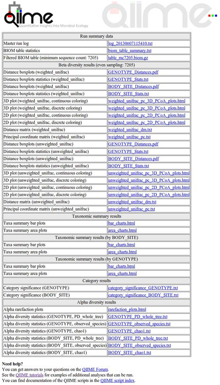
HTML result from core_diversity_analyses.py. This HTML file summarizes and gives access to the results of the diversity analyses conducted on the given OTU table.
For the following downstream analysis we have used the OTU table and phylogenetic tree resulting from the open-reference OTU picking approach. In cases where we are performing comparisons between OTU picking approaches, we will specify which approaches we have used.
5.2.1. Taxa summaries
One way to visualize the OTUs in each sample is a taxa summary, which summarizes the relative abundance of the taxa present in a set of samples on multiple taxonomic levels (e.g. phylum, order, etc.) (see Figure 5). This provides a quick way to identify samples that may be drastically different from others (i.e. outliers), and visually identify expected patterns and differences between and among samples. For example, this tool can be used to identify patterns such as differences in the relative abundance of Firmicutes and Bacteroidetes in the gut microbiomes of lean versus obese mice, e.g.Ley, Backhed, Turnbaugh, Lozupone, Knight, and Gordon (2005). These patterns can then be statistically tested using other methods, either within QIIME or elsewhere. QIIME contains a workflow called summarize_taxa_through_plots.py that generates user-specified plot types, including bar, pie, and area graphs. These graphs provide a way to visually compare the composition of each sample, or of groups of samples. An OTU table with assigned taxonomies is the only required input file, and options allow the user summarize across categories (using the metadata file), at different taxonomic levels, or only using OTUs that are present at abundances higher or lower than user-defined thresholds. The web interface allows a scroll-over feature that identifies the taxonomy of the separate taxa. Additional output files include image files of the charts and legends, and tab-delimited files of the calculated abundances, which can then be further filtered and manipulated for downstream statistical analyses.
Figure 5.
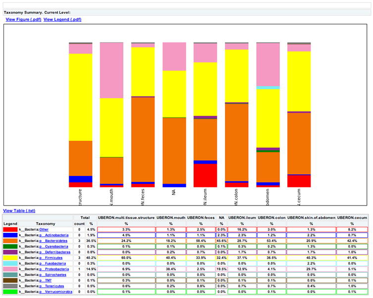
Taxa summary of the example dataset. Samples have been grouped and averaged by body site, and taxonomic composition is shown on the phylum level. Each column in the plot represents a body site, and each color in the column represents the percentage of the total sample contributed by each taxon group at phylum level. The taxa summaries plot help us to see which taxon groups are more prevalent in a sample. For example, the fecal samples are dominated by Bacteroidetes, while mouth and skin samples are dominated by Proteobacteria. We can also see that Fusobacteria is only present at appreciable levels in the skin samples.
5.2.2 Diversity analysis
Microbial ecology studies the diversity of microorganisms by characterizing bacterial communities in different environments, and determining the factors that drive diversity in these communities (Atlas & Bartha, 1998). Whittaker (1960) and Whittaker (1972) define different types of measurements of diversity as alpha, beta and gamma diversities. Alpha diversity is defined as the diversity of organisms in one sample or environment. Beta-diversity is the difference in diversities across samples or environments. Finally, gamma-diversity (γ-diversity) measures the diversity at a broader scale, such as a province or region. Several different metrics of alpha- and beta-diversity are implemented in in QIIME pipeline. Diversity measurements and their applications in microbial have been discussed in detail elsewhere (Jost, 2007; Kuczynski et al., 2010b; Lozupone & Knight, 2008), and here we focus on examples of their application.
5.2.3 Alpha diversity analysis
QIIME can generate plots showing the results of alpha diversity, allowing the user to choose the diversity metric and different rarefaction levels (Figure 6). These images are often used to estimate the true species richness of a community.
Figure 6.
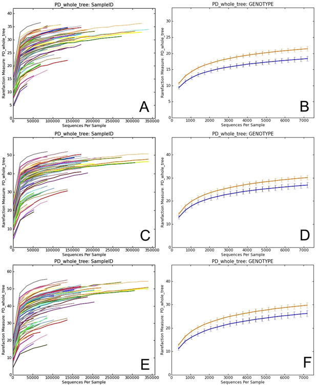
Alpha diversity curves at different rarefaction depths using different OTU picking methods. Each line represents the results of the alpha diversity phylogenetic diversity whole tree metric (PD Whole Tree in QIIME). A, C and E represent alpha diversity of each sample at a different sequence depth in each of the OTU picking protocols (closed-, open-reference and de novo). In closed-reference, the diversity plateaus (reaches an asymptote) because only OTUs in the reference database already can be considered, greatly reducing the OTU number over what is possible if the sequences are clustered de novo. Comparing these curves is difficult because the sequencing depth differs among samples. B, D and F show differences in alpha diversity between the two mouse genotypes, wild type (WT - orange) and transgenic (TG - blue), using the different OTU picking approaches. Both curves show the same rarefaction levels, allowing easier comparisons between categories. The curves again level off, showing that the sequencing effort is sufficient to detect most of the OTUs (this saturation can be confirmed using Good's coverage, or conditional uncovered probability, or other formal coverage statistics). The error bars show the standard error of the mean diversity at each rarefaction level across the multiple iterations.
QIIME implements dozens of the most widely used alpha diversity indices, including both phylogenetic indices (which require a phylogenetic tree) and non-phylogenetic indices. Users can obtain a list of the alpha diversity indices implemented in QIIME by passing the parameter –s to the alpha_diversity.py script. Phylogenetic metrics have been especially useful in our experience because they provide additional power by accounting for the degrees of phylogenetic divergence between sequences within each sample. Thus, for alpha diversity, we recommend Phylogenetic Distance (PD) (Faith, 1992) over OTU counts; however, the choice of metric will depend on the question. In particular, one might be interested in pure estimates of community richness (such as the observed number of OTUs, or the Chao1 estimator of the total number that would be observed with infinite sampling), in pure estimates of evenness, or of measures that combine richness and evenness such as the Shannon entropy (if there is no hypothesis in advance about which richness measure is appropriate, remember to correct for multiple comparisons if many are applied to the same dataset). Here is an example of how to compute rarefaction curves for three different alpha diversity metrics using a QIIME parameters file:
echo “alpha_diversity:metrics shannon, PD_whole_tree,observed_species” > alpha_params.txt alpha_rarefaction.py -i $PWD/open_ref_otus/otu_table_filtered.biom -m $PWD/IQ_Bio_16sV4_L001_map.txt -o $PWD/diversity_analysis/alpha_rare_open_ref_uneven -a -O 64 -n 20 --min_rare_depth 1000 -e 340000 -p $PWD/alpha_params.txt -t $PWD/open_ref_otus/rep_set.tre
This step generates an interactive HTML document with figures showing the results for each alpha diversity metric and for each group of samples. Curves reach asymptotes when the sequencing effort (sequencing depth) does not contribute additional OTUs. In this sense, curves would differ in their shape as a function of the selected OTU picking method.
Comparisons should be adjusted to the same depth of sequencing. Rarefaction curves can be useful for assessing the sequencing effort sufficient for representing and comparing the microbial communities (Figure 6). However, although rarefaction curves were widely used during the era of Sanger sequencing, when most communities were undersampled, it is often more useful today to report the coverage and the estimated and observed numbers of OTUs at one rarefaction depth rather than to use a figure for rarefaction curves.
5.2.4. Beta diversity analysis
Beta diversity can also be calculated from the rarefied OTU tables, comparing the microbial communities based on their compositional structures. As with alpha diversity, QIIME can compute many phylogenetic and non-phylogenetic beta diversity metrics (shown by the command beta_diversity.py -s).Of these, we have found UniFrac to be most generally useful in revealing biologically meaningful patterns. Unifrac measures the amount of unique evolution within each community with respect to another by calculating the fraction of branch length of the phylogenetic tree that is unique to either one of a pair of communities (Lozupone et al., 2005). QIIME implements several variants of Unifrac, including weighted and unweighted Unifrac. The weighted Unifrac metric is weighted by the difference in probability mass of OTUs from each community for each branch, whereas unweighted Unifrac only consider the absence/presence of the OTUs (Lozupone, Hamady, Kelley, & Knight, 2007). Weighted Unifrac is thus recommended for detecting community differences that arise from differences in relative abundance of taxa, rather than in which taxa are present. Like other metrics considering taxon abundance, weighted Unifrac is sensitive to the bias from DNA extraction efficiency, PCR amplification, etc.; this may explain why, in our hands at least, unweighted UniFrac has often provided results that correlate better with clinical or environmental variables than does weighted UniFrac. The choice of metrics is critical in beta diversity analysis as metrics differ substantially in their ability to detect clustering or gradient patterns among microbial communities on the same dataset (Arumugam, Raes, Pelletier, Le Paslier, Yamada, Mende et al., 2011; Ravel, Gajer, Fu, Mauck, Koenig, Sakamoto et al., 2012; Schloss & Handelsman, 2006). See Kuczynski et al. (2010b) for a detailed discussion of the performance of different nonphylogenetic metrics.
QIIME calculates the beta diversities between each pairs of input samples, forming a distance matrix. The distance matrix then can be visualized with methods such as Principal Coordinate Analysis (PCoA) (Mardia, Kent, & Bibby, 1979) and hierarchical clustering (Tryon, 1939), both of which have been widely used for data visualization for decades. PCoA transforms the original multidimensional matrix to a new set of orthogonal axes that explain the maximum amount of inertia in the dataset (Gower, 1966; Mardia et al., 1979) and the current implementation in QIIME scales to thousands of samples. We are currently evaluating approximate methods that will allow scaling to millions of samples (Gonzalez et al., 2012a). QIIME allows the PCoA plots to be visualized interactively in 3-dimensions, currently using the KiNG viewer (Chen, Davis, & Richardson, 2009). To assess the stability of the PCoA plot, jackknife resampling can be performed on the OTU table, repeating the PCoA procedure for each resampled table and plotting the aggregate results as confidence ellipsoids around the sample points (Figure 7). Jackknifing is recommended because many diversity metrics, including UniFrac, are sensitive to the number of sequences per sample (Lozupone, Lladser, Knights, Stombaugh, & Knight, 2011).
Figure 7.
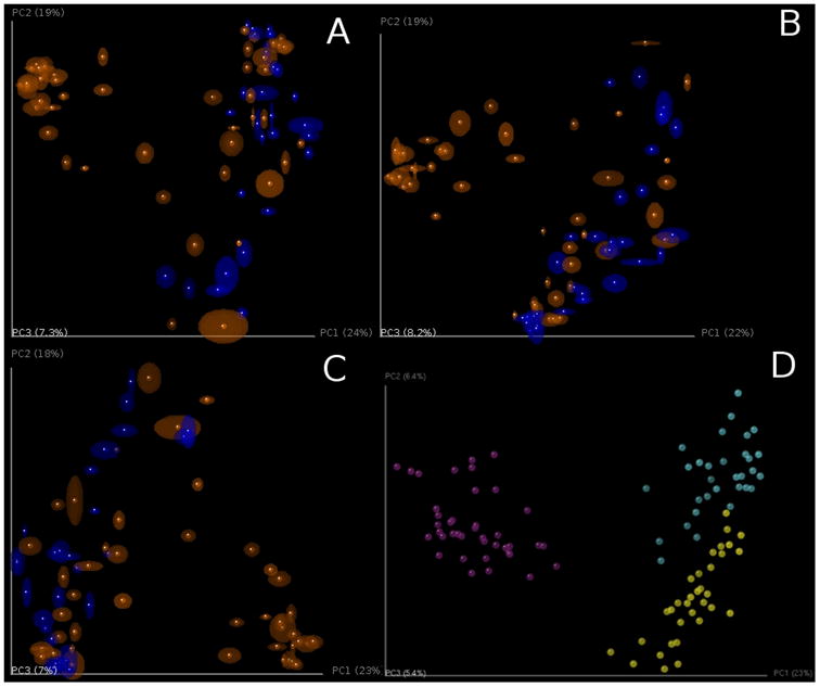
PCoA plots of unweighted Unifrac beta diversity. Panels A-C shows jackknifed replicate results for the example data set using de novo OTU picking, closed-reference OTU picking and open-reference OTU picking, illustrating different results from the three OTU picking approaches (Table 3). Each dot represents a sample, either from a WT mouse (orange) or TG mouse (blue). The two groups are not clearly separated, probably because the data set is contaminated (recall that this is a class project and different participants varied in their dissection skills). The size of the ellipsoids show the variation for each sample calculated from jackknife analysis. These plots are generated by the command jackknifed_beta_diversity.py -i $PWD/denovo_otus/otu_table_filtered.biom -t $PWD/denovo_otus/rep_set.tre -m $PWD/IQ_Bio_16sV4_L001_map.txt -o $PWD/diversity_analysis/jk_denovo -e 7205 -a -O 64 (the input parameters should be adapted for using the OTU tables from different OTU picking approaches). Panel D shows the beta diversity PCoA plot of a data set from the “keyboard” data set (Fierer, Lauber, Zhou, McDonald, Costello, & Knight, 2010) which links individuals to their computer keyboard through microbial community similarity. Each dot represents a microbial community sampled from either fingertips or keyboard keys from three individuals, annotated by the three colors shown in the plot. In contrast to panels A-C, Panel D shows the microbial communities well-separated by individual in the PCoA plot.
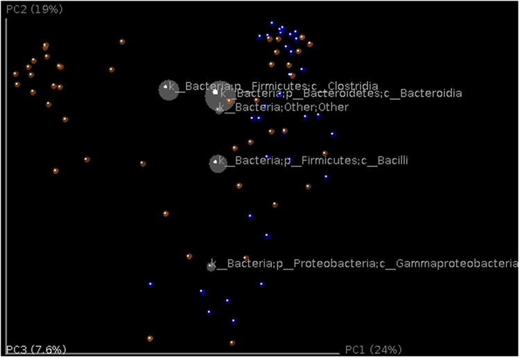
Taxonomic information can be displayed on top of the PCoA using biplots (Figure 8) (this analysis requires the output file from previous taxon summary step). The coordinates of a given taxon are computed as the weighted average of the coordinates of all samples, where the weights are the relative abundances of the given taxon in the set of samples. This plot is particularly suited for identifying taxa that drive the differentiation between groups of microbial communities.
Figure 8.
Biplot of the example data set. This is the unweighted Unifrac beta diversity plot, similar to Figure 7, with labels for the most 5 abundant phylum-level taxa added. The size of the sphere for each taxon is proportional to the mean relative abundance of that taxon across all samples. This plot is created by the command make_3d_plots.py -i $PWD/diversity_analysis/open_ref/bdiv_even7205/unweighted_unifrac_pc.txt -m $PWD/IQ_Bio_16sV4_L001_map.txt -t $PWD/diversity_analysis/open_ref/taxa_plots/table_mc7205_sorted_L3.txt --n_taxa_keep 5 -o $PWD/diversity_analysis/3d_biplot
Another popular method for finding relationships among samples is hierarchical clustering, which groups samples together into a tree. Although hierarchical clustering can be effective in some cases, it should be used with caution because the eye can easily be drawn to incorrect relationships (such as samples that are adjacent in terms of the order of their labels but are topologically far apart in the tree). In general, we recommend using PCoA as a method of detecting grouping in the data, but demonstrate hierarchical clustering here as an example. Here we analyze the beta diversity distance matrix using UPGMA, which forces the samples into an ultrametric tree (i.e. a tree in which the distance from the roots to the tips is the same for every tip) (Figure 9). The resulting tree file is in Newick format, and can be visualized by programs including TopiaryExplorer (Pirrung, Kennedy, Caporaso, Stombaugh, Wendel, & Knight, 2011), the R package ape (Paradis, Claude, & Strimmer, 2004) and the package distory (Chakerian & Holmes, 2012). UPGMA can also be applied to the jackknifed subsamples to provide an estimate of the statistical confidence in the clustering, by showing the frequency of each nodes in the original full data set cluster that are supported by the jackknife replicates. We generally recommend against the use of hierarchical clustering as a method for identifying and visualizing sample groupings, so have not invested as much effort in enabling this technique in QIIME as has been invested in other visualizations. However, if you do plan to use hierarchical clustering, it is important to be aware that substantial work has been done on more effective visualization methods, e.g. in distory (Chakerian et al., 2012), and performing additional analyses outside QIIME may allow improvements over the default visualizations.
Figure 9.
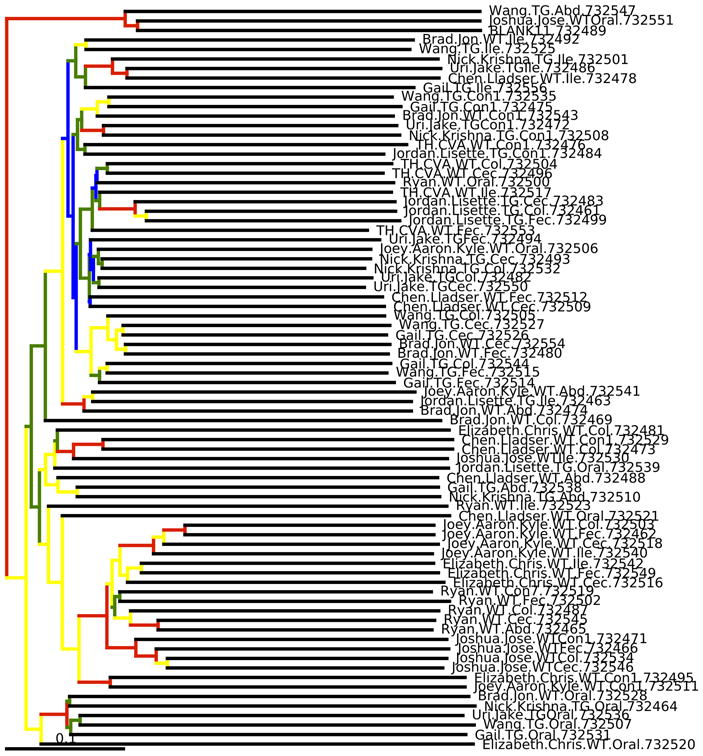
Bootstrapped UPGMA clustering on the example data set. The tree is shown with the internal nodes colored by bootstrap support (red: 75-100%, yellow: 50-75%, green: 25-50% and blue: < 25%). Although this visualization is popular in the literature, we generally recommend alternatives such as PCoA.
5.2.5. Statistical significance of differences in alpha and beta diversity
Which statistical tests should be applied depends on the particular hypotheses and predictions defined a priori in a given research study. QIIME implements several scripts that perform a broad range of statistical tests between samples or groups of samples using both alpha and beta diversity measurements. For alpha diversity, the compare_alpha_diversity.py script performs comparisons between groups of samples. The script uses the alpha diversity measurements of samples standardized to a given number of sequences per sample, and performs nonparametric two-sample t-tests (i.e. using Monte Carlo permutations to calculate the p-value) comparing each pair of groups of samples. Rarefaction is a critical step in these analyses, as noted above, because typically diversity estimates depend on the number of sequences per sample. At the maximum rarefaction depth, wild type and transgenic mice did not show differences in alpha diversity as measured by PD metric (wild type: (mean +/- sd) = 45.19 +/- 10.6; transgenic: 40.01 +/- 9.5; t = -2.17, p = 0.102). We also tested for differences in alpha diversity between body sites. We found differences between cecum and ileum (cecum (mean +/- s.d.) = 51.1 +/- 3.6; ileum: 36.72 +/- 8.2; t = 5.35, p = 0.028), cecum and mouth (mouth: 29.54 +/- 10.1; t = 6.62, p = 0.028) and feces and mouth (feces: 48.4 +/- 4.0; t = 5.47, p = 0.028). None of the other pairs of comparisons between body sites showed significant differences in alpha diversity (colon: 46.0 +/- 9.2; multi-tissue: 46.26 +/- 9.1; skin: 42.13+/- 7.4; all p-values > 0.056).
The appropriate statistical tests of beta diversity also depend on the research question being asked. These tests compare sets of distances between samples in the distance matrix. Careful attention must be paid both to Type I error (rejecting the null hypothesis when it is actually true), and to Type II error (accepting the null hypothesis when it is actually false, i.e. lack of statistical power). Type I error is more likely when variance is unequal between groups, and when many comparisons are performed on the same data (although multiple comparisons corrections correct for the increased Type I error, they often raise the Type II error rate instead). As always, results should be interpreted with caution and common sense. A highly statistically significant result stemming from data with a low correlation coefficient may indicate that a relationship has little biological meaning, and examining the scatterplot to see if the result is driven by a few outliers would be prudent. Further theoretical validation (especially of the multivariate statistical tests) is also needed, especially because the distributions underlying microbial community data have in general not yet been well characterized.
Comparisons between distance matrices are performed in QIIME using the compare_distance_matrices.py script. This script can perform analyses including the Mantel test, the Partial Mantel test, and the Mantel Correlogram. The Mantel test is a non-parametric test that compares two distance matrices, and calculates a correlation coefficient and a significant p-value using permutations that preserve the rows and columns. For the purpose of showing some examples (because the mouse data does not include a time series component), we will use the sequence dataset published by Caporaso et al. (2010b), where the authors studied variation in the bacterial community in the human gut over time series. We will compare the Unifrac distance matrix and a distance matrix as differences in days since the treatment started. Both distance matrices showed a significant correlation (Mantel test: p = 0.035), showing that bacterial communities were more similar as they were close in sampling. The Mantel test measures the overall correlation between distance matrices, but Mantel Correlograms measure this effect when taking into account the distances between samples marked by specific metadata variables. Essentially, the second distance matrix (in our case, days since the treatment started) is divided into classes. The classes into which the second distance matrix (days after experiment started) is determined by Sturge's rule, a method for determining the width of bars in a histogram based on the binomial formula. Then Mantel tests are run between these distance classes and the beta diversity distance matrix. We found that none of the distance classes were significantly related to the bacterial community (Figure 10: all comparisons p > 0.120, after Bonferroni correction for multiple comparisons).The Mantel test showed us that there is an overall correlation between bacterial community and “days after the experiment started” (samples collected closer in time had more similar bacterial communities), and Mantel Correlogram showed that there is no significant correlation between the bacterial community and any of the classes into which the “days after the experiment started” matrix was divided. In other words, in this case, discretization of the data into a few timepoint classes led to an undetectable pattern; in contrast, use of the whole time series yielded an interpretable result. However, in other datasets, the reverse is often true, especially if the variation is not monotonic (e.g. in the case of seasonal variation).
Figure 10.
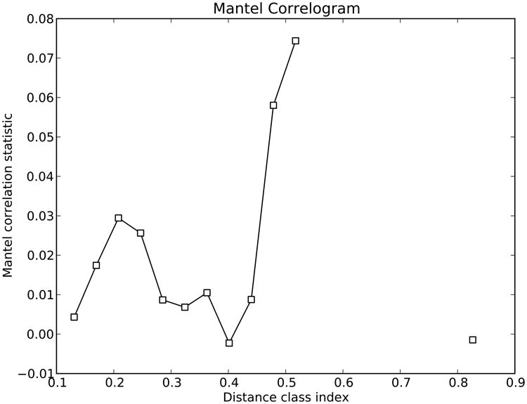
Mantel Correlogram showing the Mantel correlation statistics between unweighted Unifrac distance matrix and each class in the days after experiment started distance matrix. Classes in the second distance matrix are determined by Sturge's rule. White dots show non-significant relationship since black dots show significant ones.
The partial Mantel test is similar to the Mantel test, except that the analysis is controlled by a third variable. When we compare the beta diversity distance matrix with days after the experiment started by controlling by sampling date, we find the same trend noted before (Partial Mantel test: p = 0.010). Samples collected close in time have similar bacterial communities and this effect is independent of the date of collection.
Several visual and statistical tests have been implemented in QIIME in order to compare between and within beta-diversity distances. Distance histograms are an easy way to compare both types of distances graphically ( make_distance_histograms.py). The output is an html file that shows as many histograms as categories. It is very useful to compare all-within “category” against all-between “category”, or the distribution of distances within each group (Figure 11). Probably a more useful tool to compare these beta-diversity distances is by means of box-plots ( make_distance_boxplots.py, Figure 12). The box-plot script generates a box-plot graph and performs a t-test. Box-plots showed that there were no differences between the distances within mouse type and between types. However, the statistical test shows highly significant differences (p < 0.001) when comparing within and between distances. Once again, we recommend caution and common sense when the p-values are interpreted. It is likely to get a significant p-value, although a close inspection of the box-plot reveals that standard error bars overlap. Basically this result is due to the large number of comparisons: a small Student t-statistic (obtained when differences between two data set are small) and these large degrees of freedom may be highly significant (i.e. the two data set are very different) even with conservative multiple test corrections (as Bonferroni).
Figure 11.
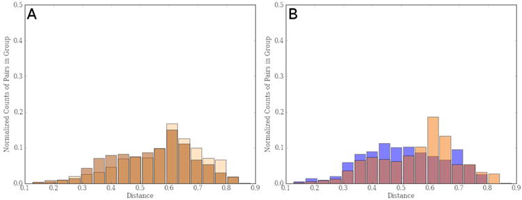
(A) Histogram showing distribution of distances between (light brown) and within (dark brown) mice gut microbiota taking into account both wild type and transgenic mouse groups. (B) Distribution of within distances in gut bacterial community of wild type mice (light orange) and transgenic ones (blue).
Figure 12.
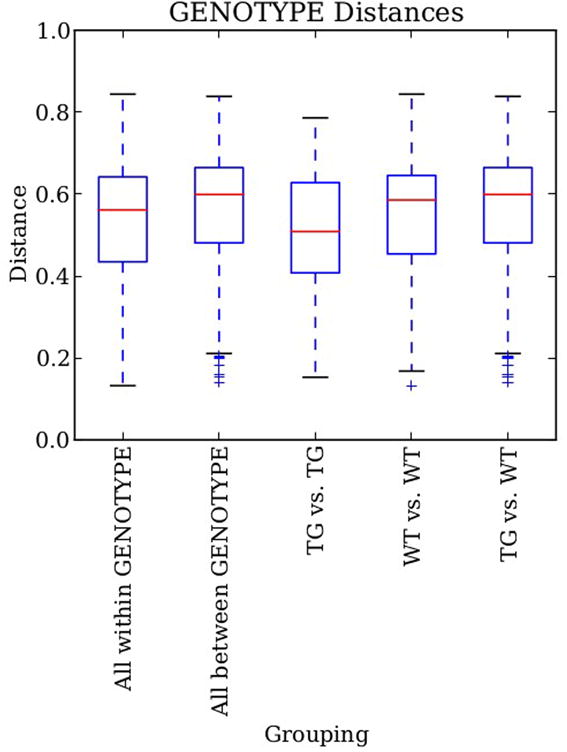
Box-plots of the unweighted UniFrac distances for bacterial gut microbiota in both mouse type (WT: wild type; TG: transgenic). “Within” distances represent distances within any of the two groups since “between” distances show distances between both groups. “TG vs. TG” and “WT vs. WT” represent within distances in transgenic and wild type groups respectively. Although averages are different, standard error overlaps in all cases.
Other multivariate analyses provide additional powerful tools for exploring significant relationships between the beta diversity distance matrix and factors or covariates. compare_categories.py offer different statistical tests, where ANOSIM and adonis are usually employed. ANOSIM is a non-parametric statistical test that compares ranked beta-diversity distances between different groups and calculates a p-value and a correlation coefficient by permutation. Adonis partitions the variance in a similar way to the ANOVA family of tests, specifically testing variation within a category is smaller or greater than variation between categories. It calculates a pseudo F-value, a p-value and a correlation coefficient (R2). Significant p-values must be interpreted together with their R2 values to infer biological meanings from the results. It is worth to mentioning here that PERMANOVA and adonis are similar statistical methods, and usually provide equivalent results. However, PERMANOVA only allows categorical factors, whereas both categorical and continuous variables may be used in adonis. Both ANOSIM and adonis analyses indicate that bacterial communities in wild-type and transgenic mice significantly differ from one another (ANOSIM: r = 0.134, p < 0.001; adonis, r2 = 0.046, p < 0.001). However, the correlation coefficients are low, so the significant p-values need to be interpreted cautiously because this result may not be biologically relevant.
5.2.6. OTU networks
Network-based analysis can sometimes be very useful for displaying how OTUs are partitioned between samples, and how samples are related each other, although we have found that this analysis only works well for datasets in which the samples are not all equally connected. Networks are therefore a powerful way for visually displaying certain large and complex datasets to emphasize similarities and differences among samples. Network analyses are implemented in QIIME through the script make_otu_network.py. This script generates the OTU network files to be passed into Cytoscape (Shannon, Markiel, Ozier, Baliga, Wang, Ramage et al., 2003) and statistics for those networks (specifically, a bipartite graph in which nodes represent either OTUs or samples, and edges represent a connection between an OTU and a sample (Ley et al., 2008)). Cytoscape is not wrapped in the QIIME pipeline and it is run as a separate program. The files used by Cytoscape 2.8.2 are: the real edge table (real_edge_table.txt) which contains the columns “from”, “to”, “eweight” and “consensus_lin”, among others dictated by the headers in the mapping file; and the real node file (real_node_table.txt) which contains a node for each OTU and each sample in the study. It uses the OTU file and the user metadata mapping file.
The visual output of this analysis is a clustering of samples according to their shared OTUs (i.e. samples that share more OTUs cluster closer together, as do OTUs shared by more samples): samples and OTUs are represented as dots in the space (“nodes”) and connected by lines (“edges”). The degree to which samples cluster is based on the number of OTUs shared between samples, and this is weighted according to the number of sequences within an OTU.
In the network diagram, both types of nodes, OTU nodes and sample nodes, can be easily modified using Cytoscape's graphical user interface, with symbols such as filled circles for OTUs and filled squares for samples. If an OTU is found within a sample, both nodes are connected with a line (an edge). The nodes and edges can then be colored to emphasize certain aspects of the data.
This method is not simply used for descriptive visualizations: the connections within the network can also be analyzed statistically to provide support for the clustering patterns displayed in the network. A G-test for independence is used to test whether sample nodes within categories (such as within a genotype, in our example mouse study) are more connected within than a group than expected by chance. Each pair of samples is classified according to whether its members shared at least one OTU, and whether they share a category. Pairs are then tested for independence in these categories (this asks whether pairs that share a category also are equally likely to share an OTU). This statistical test can also provide support for an apparent lack of clustering when it appears that a parameter is not contributing to the clustering.
In our example dataset, mouse samples show some degree of clustering in the space depending on whether the genotype is wild-type or transgenic (Figure 13). These clusters in the network were significant different (G-test: p < 0.001). Surprisingly, bacterial communities of mice did not visually cluster by body site, although the statistical test shows highly significant differences in samples from different body sites. These results must be interpreted cautiously. The degrees of freedom in the statistical test depend on the number of comparisons so, highly significant results might be obtained even when differences between clusters are slight. In other cases, these differences are obvious and easy to interpret. In the first application of this analysis in microbial ecology, the gut bacteria of a variety of mammals was surveyed, and the network diagrams were colored according to the diets of the animals, which highlighted the clustering of hosts by diet category (herbivores, carnivores, omnivores). In a later meta-analysis of bacterial surveys across habitat types, the networks were colored in such a way that the phylogenetic classification of the OTUs was highlighted: this analysis revealed the dominance of shared Firmicutes in vertebrate gut samples versus a much higher diversity of phyla represented amongst OTUs shared among environmental samples (Ley et al., 2008).
Figure 13.
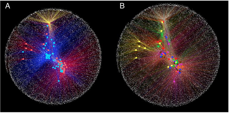
OTU-Network bacterial community analysis applied in wild type and transgenic mice. (A) Network colored by genotype (wild type: blue; transgenic: red). Control sample (yellow dot) is external in the network and several OTU are not shared with mice. Although we can see some degree of clustering, discrimination by genotypes is difficult to assess. (B) Network colored by body site (mouth: yellow; skin: in red; ileum: in blue; colon: in pink; cecum: in orange; feces: in brown; and multi-tissue samples: in green). A control sample is colored in grey. There is no clear sample clustering by body site, suggesting that there is not a core set of OTUs that differentiates one site from another.
This OTU-based approach to comparisons between samples provides a counterpoint to the tree-based PCoA graphs derived from the UniFrac analyses. In most studies, the two approaches reveal the same patterns. They can, however, reveal different aspects of the data. The network analysis can provide taxonomic connections among samples in a visual manner, whereas PCoA-UniFrac clustering can reveal sub-clusters that may be obscured in the network. The principal coordinates can be pulled out individually and regressed against other metadata; the network analysis can provide a visual display of shared versus unique OTUs. Thus, together these tools can be used to draw attention to different aspects of a dataset.
5.2.7. OTU heatmaps
Another method to visualize the relationships between OTUs and samples is the heatmap, which is widely used for other applications in molecular biology (Wilkinson & Friendly, 2009). This method was initially developed by Loua (1873) to visualize population characteristics of 20 districts of Paris.
In our case, heatmaps can be used for exploratory analysis of microbiomes by mapping abundance values to a color scale in a condensed, pattern-rich format, in which each row corresponds to an OTU and each column corresponds to a sample. A good heatmap graphic can generate hypotheses about sample and/or OTU clustering in the data, which can then be followed up with additional more formal analyses. Two key structural aspects of a heatmap graphic greatly affect whether it will reveal interpretable patterns: (1) the ordering of the axes, and (2) the color scaling.
QIIME can create OTU heatmaps using two different scripts: make_otu_heatmap.py and make_otu_heatmap_html.py. The first script generates a heatmap in which OTUs are represented in rows and samples in columns. OTUs and samples can be sorted and clustered by the phylogenetic tree and by the UPGMA hierarchical clustering, respectively. However, the visualizations of both trees (phylogenetic and hierarchical) in the final heatmap are not currently implemented directly in QIIME, and these hierarchical displays must be prepared using external software such as R. QIIME also supports sample clustering by a metadata category if the user provides a mapping file. The samples will be clustered within each category level using Euclidean UPGMA. The script sort_otu_table.py allows sorting the OTU table by a category in the mapping file, allowing defining the order of the samples in the heatmap. Figure 14 shows the output of make_otu_heatmap.py. There we can see a drawback to heatmaps: when the number of samples or OTUs included in the graphic is too high, the density of the graphic can be overwhelming. Thus, we recommend that the OTU table be filtered to a smaller number of samples (or categories) and taxa to identify the most important patterns, as we will show later in this section.
FIGURE 14.
Heatmap of OTUs present in the different samples from transgenic and wild type mice. The intensity of black shows the abundance of certain OTU in each sample. Both samples and OTUs are sorted by UPGMA tree and the OTU phylogenetic tree, respectively.
The second script ( make_otu_heatmap_html.py) creates an interactive OTU heatmap from an OTU table (Figure 15). This script parses the OTU count table and filters the table by counts per OTU (user-specified). It then converts the table into a javascript array, which can be loaded into a web browser. The OTU heatmap displays raw OTU counts per sample, where the counts are colored based on the contribution of each OTU to the total OTU count present in the sample (blue: contributes low percentage of OTUs to sample; red: contributes high percentage of OTUs). This web application allows the user to filter the OTU table by number of counts per OTU. The user also has the ability to view the table based on taxonomy assignment. Additional features include: the ability to drag rows up and down by clicking and dragging on the row headers; and the ability to zoom in on parts of the heatmap by clicking on the counts within the heatmap.
Figure 15.
Interactive heatmap of OTUs present in the different samples from transgenic and wild type mice. This visualization is a result of an HTML file that can be opened in any web browser. The advantage of this heatmap is that it is easy to manipulate the abundance level for coloring, or transpose samples and OTUs between columns and rows.
Improved OTU heatmap visualizations can be generated using the plot_heatmap() command in the phyloseq package for R (McMurdie & Holmes, 2013). This package takes a similar approach to NeatMap (Rajaram & Oono, 2010), in that it uses ordination results rather than hierarchical clustering to determine the index order of each axis. For plot_heatmap, the default color scaling maps a particular shade of blue to a log transformation of abundance that generally works well for microbiome data, although the user can select alternative transformations.
In this example, a key step was proper filtering of the data. We removed OTUs that appear in only a few samples. The possible contribution to the graphic of these infrequent OTUs is limited, more often contributing to “noise” that causes the heatmap to look dark, empty, and uninterpretable (see Supplemental File 1, Figure 14). We used a non-metric multidimensional scaling of the Bray-Curtis distance to determine the order of the OTUs and samples. From this representation, it is possible to distinguish high-level patterns and simultaneously note the samples and OTUs involved. For instance, all but a few of the mouth samples are in a cluster toward the middle of the heatmap. One of the key features of this group is an obvious relative overabundance of three Firmicutes OTUs, which are among the most abundant in this subset of the data. Similarly, another clear pattern is a distinction between a group of wild type samples from various body sites on the left of the heatmap that appear to have higher proportions of a number of different Firmicutes OTUs, as well as a few specific Bacteroidetes OTUs. This is distinct from the largest cluster of samples on the right-hand side of the heatmap, in which many of the most-abundant OTUs are a different subset of Bacteroidetes and Firmicutes OTUs. We also found it helpful to further pursue these high-level patterns by splitting the data into Firmicutes-only and Bacteroidetes-only subsets, and then plotting new heatmaps with finer-scale taxonomic labels. This required essentially the same commands and limited additional effort, well-tailored for exploratory interactive analysis, much of which we have documented in Supplemental File 1.
Although heatmaps have been deployed widely in molecular biology, especially in protein expression studies, some of the other displays we have discussed such as principal coordinates plots and taxonomy plots often provide more easily interpretable results. However, summarizing relations between taxa through ordination plots or network analyses have been shown to be powerful tools for highlighting similarities and differences among samples and taxa in our OTU table, and a carefully constructed heatmap (though not, in most cases, the default output) can be a useful guide to understanding and hypothesis generation.
5.2.8. OTU category significance
The experimental design of a microbial study will often involve comparing two or more groups for differences in the abundance of OTUs; for example, are there taxa that significantly differ between the control group and the experimental group? One way to assess this question is to compare the relative abundances of each microbial member between the two groups. This functionality is built into a script called otu_category_significance.py. We can test if there are significant differences in OTU abundance between mouse genotypes either wild type (WT) or transgenic (TG). We can assess differences between these groups using the following command:
otu_category_significance.py -i $PWD/diversity_analysis/open_ref/table_mc7205.biom -m $PWD/IQ_Bio_16sV4_L001_map.txt -o $PWD/open_ref_otu_categ_sig_output -c GENOTYPE -s ANOVA
Here we run an ANOVA to assess the relative abundance of each taxon in the OTU table between our two genotype groups. The output will be written to a user-specified file called otu_cat_sig.txt. This document will list the OTU ID, the raw p-value, the Bonferonni corrected p-value, the False Discovery Rate (FDR) p-value, as well as the relative average abundance for each of the groups in the selected category (genotype in our case), and the OTU taxonomy string (if provided in the initial OTU table). While many of these taxa may be significantly different between groups according to the raw p-value, it is extremely important that only p-values that have been corrected for against multiple comparisons, using either Bonferroni or FDR, be considered as significant. Many times a user's OTU table will contain hundreds or thousands of OTUs, and thus a p-value is likely to reach significance based solely on the large number of statistical comparisons being computed (for a probability threshold of 0.05, 1 of 20 comparisons results significant just by chance). It is often very helpful to open the .txt files produced by otu_category_significance.py in a spreadsheet so that columns can be sorted according to p-values.
The otu_category_significance.py script also contains several other statistics for comparing groups. The g-test can be used to determine if the presence or absence of a given taxa is significantly different between groups, and can be specified by passing the option -s g_test in the command. The user can also run a paired t-test to determine whether there are taxa that significantly differ between two paired points. For example, imagine the experimental design sampled a group of mice before and after a dietary intervention. Using the paired-t statistic in otu_category_significance.py would then compare each mouse's after timepoint to the before timepoint, and test for differences that were consistent across mice, rather than grouping all the before and after timepoints together. For continuous variables, QIIME can calculate the Pearson correlations of OTU abundance with those variables. QIIME is also capable of longitudinal data analysis, which is suitable for the samples tracking the same subjects at multiple points in time, e.g., the oral microbiota of 6 persons after meals in a day. Specifically, longitudinal Pearson correlation can be calculated, accounting for intra-subject correlation of measurements.
5.2.9. Machine learning
QIIME can also take advantage of several machine learning algorithms to solve two important issues in high-throughput metagenomic studies: correction of mislabeling, and quantifying sample contamination.
This mislabeling problem is an increasing issue as the number of processed and pooled sequences increases (Knights, Kuczynski, Koren, Ley, Field, Knight et al., 2011c). This mislabeling can be addressed using supervised classifiers, a machine learning technique that is able to fix incorrect metadata. QIIME uses the random forest (Breiman, 2001) supervised classifier implemented in R (Liaw, 2002) to recover the mislabeled samples by training the classifier with the relative abundance taxa (Knights, Costello, & Knight, 2011a). Knights et al. (2011c) shows that this approach can even recover up to 30-40% mislabeled samples when the biological patterns are especially clear.
This same technique can be also applied to find taxa that play a key role in differentiating groups of samples, as is done in OTU category significance. However, the difference between OTU category significance and the machine learning technique is the type of model the construct. While the OTU category significance creates an explanatory model (i.e. it gives a model that best fits the current dataset), the machine learning technique creates a predictive model (Knights et al., 2011a).That is, it creates a model that is able to generalize future data, minimizing the expected prediction error.
Since the supervised learning trains a classifier, it is important to provide useful predictors (OTUs in our case). Thus, it is highly recommended to filter the input OTU table to remove those OTUs that are present in few samples (e.g. < 10 samples). As in previous analyses, a rarified OTU table should be used, so that artificial diversity induced due to different sampling effort is removed. In our example dataset, we can use the subsampled OTU table generated for previous analyses and remove the low-abundance OTUs:
filter_otus_from_otu_table.py -i $PWD/diversity_analysis/open_ref/table_mc7205.biom -o $PWD/diversity_analysis/open_ref/otu_table_filtered10.biom -s 10
Running the following command, will run the supervised learning algorithm using the GENOTYPE category and 10-fold cross-validation, providing mean and standard deviation of errors:
supervised_learning.py -i $PWD/diversity_analysis/open_ref/otu_table_filtered10.biom -m $PWD/IQ_Bio_16sV4_L001_map.txt -c GENOTYPE -o $PWD/open_ref_supervised_learning_output -e cv10
This script will store several files on the output folder. The most important file is summary.txt:
cat $PWD/open_ref_supervised_learning_output/summary.txt
Model Random Forest
Error type 10-fold cross validation
Estimated error (mean +/- s.d.) 0.23373 +/- 0.15058
Baseline error (for random guessing) 0.42308
Ratio baseline error to observed error 1.81011
Number of trees 500
The important information in this file is the Ratio baseline error to observed error, which shows the ratio between the expected error of the random forest classifier and the expected error of a classifier that always guesses the most abundant class (Baseline error). Our recommendation is that a ratio of at least 2 shows a good classification. In our example data set, this value is 1.81011, which is close to 2 but not enough to be considered a good classification.
The contamination quantification problem is addressed in QIIME using SourceTracker (Knights et al., 2011b). Given a list of known source environments and a sink (or set of sinks) environment(s), SourceTracker uses a Bayesian approach jointly with Gibbs sampling to predict the quantity of taxa that each source, or an unknown source, contributes to the taxa that makes up the sink environment. For a more detailed description of the algorithm, see Knights et al. (2011b).
The first step to use SourceTracker in QIIME is to modify the mapping file of our example dataset and add two columns: SourceSink and Env. The SourceSink column tells SourceTracker which sample is a source and which sample is a sink, while the Env column provides the environment. In our example, we have defined samples from mouth, ileum, cecum, colon, fecal pellet and skin as sources and the whole mouse homogenization as a sink. In the Env column we have defined the environments as the body site (mouth, ileum, cecum, colon, feces, skin and homogenization).
As a machine learning algorithm, SourceTracker needs useful OTUs (predictors) as inputs for training the algorithm. Here, we will use the same OTU table as used for the supervised_learning.py script. However, SourceTracker does not yet accept BIOM tables, so we have to transform them into to a tab-delimited OTU table (note that this table can also be opened in Excel or other popular tools):
convert_biom.py -i $PWD/diversity_analysis/open_ref/otu_table_filtered10.biom -o $PWD/diversity_analysis/open_ref/otu_table_filtered10.txt -b
Then, we can call SourceTracker using the following command (the $SOURCETRACKER_PATH variable should be defined if you have successfully install SourceTracker):
R --slave --vanilla --args -i $PWD/diversity_analysis/open_ref/otu_table_filtered10.txt -m $PWD/IQ_Bio_16sV4_L001_map_ST.txt -o $PWD/open_ref_sourcetracker_output < $SOURCETRACKER_PATH/sourcetracker_for_qiime.r
The output from the SourceTracker algorithm is a set of pdf files that shows the mixture of the sources that makes up the sink (see Figure 17).
Figure 17.
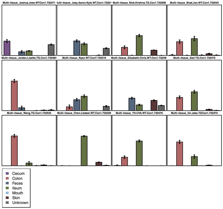
SourceTracker output showing a bar plot for each sink (mouse) present in the dataset. Each bar is a potential source (body site) and the height of each bar represents the percentage of taxa the source contributes to the taxa in the sink. The advantage of this visualization over the other two (area and pie chart) is that it shows error bars that allow to see the variance of the prediction.
5.2.10. Procrustes analysis
When we want to compare samples in PCoA space that were processed in different ways, such as: different ribosomal RNA subunits, primer sets, or algorithmic choices for processing, we can use Procrustes analysis (Gower, 1966; Muegge, Kuczynski, Knights, Clemente, Gonzalez, Fontana et al., 2011; Vinten, Artz, Thomas, Potts, Avery, Langan et al., 2011). Procrustes analysis is a statistical shape algorithm that allows us to compare different distributions by rescaling and applying a rotation matrix; this is, if the group of samples we are have the same shape but in different size or orientation the algorithm will resize and rotate them to make the shapes fit. As an example, we present the results of comparing the different OTU picking algorithms, see Section 5.2.2, where we can see that even as the number of OTU clusters change the distribution described is similar with a confidence of MC p-value: 0.00 and M2: 0.097 for closed-reference vs. de novo, and MC p-value: 0.00 and M2: 0.035 for closed-reference vs. open reference. Both cases used the first three axes (i.e. the axes displayed in the plot), and 100 repetitions, Figure 18. To generate these plots we ran these commands:
Figure 18.
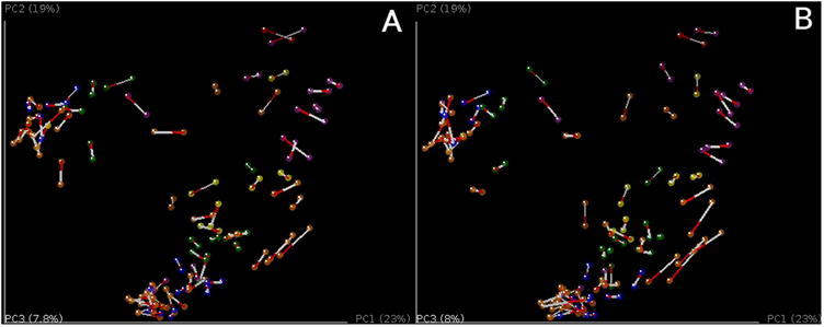
Procrustes analysis of different picking algorithms, where we can see that different OTU clustering methods yield similar PCoA distributions. PCoA plots are colored by BODY_HABITAT. A) Comparing samples with clusters picked using the de novo picking protocol against the closed-reference. B) Comparing samples with clusters picked using the open-reference picking protocol against the closed-reference.
transform_coordinate_matrices.py -i $PWD/diversity_analysis/closed_ref/bdiv_even7205/unweighted_unifrac_pc.txt,$PWD/diversity_analysis/denovo/bdiv_even7205/unweighted_unifrac_pc.txt -r 100 -o $PWD/procrustes/closed_ref-denovo
compare_3d_plots.py -i $PWD/procrustes/closed_ref-denovo/pc1_transformed.txt,$PWD/procrustes/closed_ref-denovo/pc2_transformed.txt -o $PWD/procrustes/closed_ref-denovo/plot -m $PWD/IQ_Bio_16sV4_L001_map.txt
transform_coordinate_matrices.py -i $PWD/diversity_analysis/closed_ref/bdiv_even7205/unweighted_unifrac_pc.txt,$PWD/diversity_analysis/open_ref/bdiv_even7205/unweighted_unifrac_pc.txt -r 100 -o $PWD/procrustes/closed_ref-open_ref
compare_3d_plots.py -i $PWD/procrustes/closed_ref-open_ref/pc1_transformed.txt,$PWD/procrustes/closed_ref-open_ref/pc2_transformed.txt -o $PWD/procrustes/closed_ref-open_ref/plot -m $PWD/IQ_Bio_16sV4_L001_map.txt
5.2.11. SitePainter
Spatial data poses unique challenges, and the types of statistical analyses described above often obscure spatial patterns (Gevers, Knight, Petrosino, Huang, McGuire, Birren et al., 2012; Hewitt, Mannino, Gonzalez, Chase, Caporaso, Knight et al., 2013). SitePainter (Gonzalez, Stombaugh, Lauber, Fierer, & Knight, 2012b) is a web-based tool that creates images representing the geographical (spatial) distribution of our samples, and then color them based on taxonomy summaries (defining which taxa occur where), and PCoA axes (defining how similar the patches are along the principal axes).
To create a new image we suggest using Adobe Illustrator, Inkscape or SitePainter. This list is in descending order of usability. In any of these tools, we need to create a SVG (Scalable Vector Graphics) image that has closed paths, ellipsoids and rectangles for any path that we want to color; and open paths, lines or text for those that we want SitePainter to ignore. The latter are useful for static images and give a nice background for the image. Note that SVG images are text files, so they can be opened in any graphics program in the list above, or in any text editor. The difference between an open and closed paths is that the element in has a letter z at the end of the definition of the lines of the path, so, for example, <path d=“M 10 10 L 30 10 L 20 30 z”> is a closed path but <path d=“M 10 10 L 30 10 L 20 30”> is an open one.
There are two main QIIME-generated inputs that should be loaded into SitePainter: taxa summaries and Multidimensional Scaling (MDS) technique results, including NMDS and PCoA. To exemplify the creation and usage of images in SitePainter, we will filter the OTU table and the beta diversity file to only have one mouse. Filtering and summarizing the OTU table:
filter_samples_from_otu_table.py -i $PWD/diversity_analysis/open_ref/bdiv_even7205/table_mc7205_even7205.biom -m $PWD/IQ_Bio_16sV4_L001_map.txt -o $PWD/forSitePainter/otu_table_Gail.biom -s ‘GROUP:Gail’
summarize_taxa.py -i $PWD/forSitePainter/otu_table_Gail.biom -o $PWD/forSitePainter/taxa_sum -t
Filtering the beta diversity file and then recalculating PCoA is necessary every time we add or remove samples of our analyses, because PCoA results depend on the samples included in the analysis. Thus it is not sufficient to simply remove samples from PCoA results calculated on a larger set of samples:
filter_distance_matrix.py -i $PWD/diversity_analysis/open_ref/bdiv_even7205/unweighted_unifrac_dm.txt -m IQ_Bio_16sV4_L001_map.txt -o $PWD/forSitePainter/unweighted_unifrac_dm.txt -s ‘GROUP:Gail’
principal_coordinates.py -i $PWD/forSitePainter/unweighted_unifrac_dm.txt -o $PWD/forSitePainter/unweighted_unifrac_pc.txt
Then we create an image in Adobe Illustrator that represents the mice and its gastrointestinal tract, Figure 19-A. Once this figure is created and saved in SVG format (this example uses version 1.1 of SVG), we open the image in any text editor and replace any letter ‘z’ with nothing; this will destroy all the closed paths and will facilitate manipulation in SitePainter.
Figure 19.
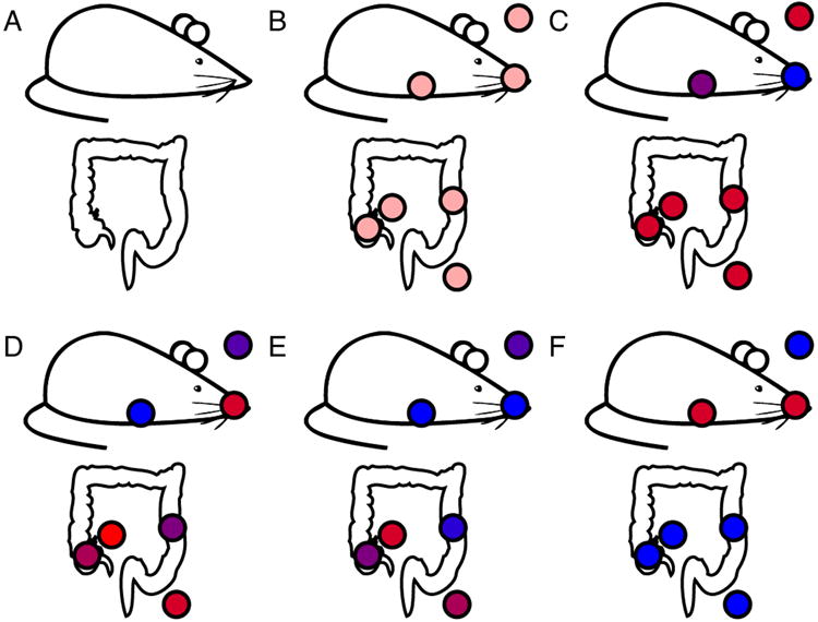
Image representing the mouse and its gastrointestinal tract. A) Raw image without samples. B) Image in SitePainter with samples. C-D) PCoA axis 1 and 2, in red high values, in blue low values, similar colors represent similar communities. E-F) Taxonomic distributions of (E) Betaproteobacteria and (F) Gammaproteobacteria, in red high abundance, in blue low abundance.
Now, we can open this image in SitePainter by clicking on the pencil/flower image on the right corner, choosing “Open Image”, and select our file. Then we add the places that we want to color using the rectangle or ellipsoid tool, Figure 19-B. Now we need to make our samples in the image match the names of the sample names from our files; for this we need to click on “Elem. -> Click to update” on the right menu, this will show us the current sample names in the image; then, we double click on each one and change the name to make it match the sample name in the mapping file. Note that SitePainter does not accept sample names with dots (.), so if the sample name has this character, we need to replace it with an underscore (_). We do not need to change the QIIME files, as this will happen automatically in SitePainter. When we hover over each name, the sample will change color, facilitating the identification of the image we are selecting. If different sites have the same name, they will be colored with the same value from the QIIME output files.
The final step is to load the resulting QIIME files. To do this, we use the Metadata loader on the top left of the menu. This opens the file. We then move the right menu to the “Meta.” tab. Here we can select which column we want to use for coloring, and then click “Color elements”, to select more, Figure 19-C-F. For detailed instructions about changing colors and other details visit: http://sitepainter.sourceforge.net/tutorials/index.html
6. Other features
6.1. Testing linear gradients, including time series analysis
Recent microbiome surveys have started integrating gradients (commonly over time) in their study design. We will discuss a first and general approach for those cases, using the Moving Pictures of the Human Microbiome Dataset (Caporaso, Lauber, Costello, Berg-Lyons, Gonzalez, Stombaugh et al., 2011), where two subjects were sampled daily for up to 396 days in three different body sites (sebum, saliva and feces). Note that the mouse dataset that we use as a primary example lacks a natural temporal ordering in the study design, so we can not use it as an example for this analysis.
PCoA plots provide a snapshot about the relative communities of many samples condensed in a single figure. However, coloring the points in PCoA space according to a color gradient can be very difficult to understand. A first approach in this case is to connect the samples belonging to the same subject/treatment subsequently sorted using the values in the gradient, i.e. one timepoint after the other (see Figure 20 b). An interactive plot like this can be generated using the following command:
Figure 20.
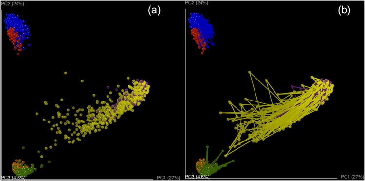
Beta diversity plots for the moving pictures dataset using unweighted UniFrac as the dissimilarity metric (Caporaso et al., 2011). (a) PCoA plot colored by the body site and subject. (b) PCoA plot colored by the body site and subject with connecting lines between samples. Note in (b) that these lines allow us to track the individual body sites with a different approach.
make_3d_plots.py -i $PWD/moving_pictures/unweighted_unifrac_pc.txt -m $PWD/moving_pictures/merged_columns_mapping_file.txt -o $PWD/moving_pictures/vectors --add_vectors=BODY_SITEHOST_SUBJECT_ID,DAYS_SINCE_EPOCH
An important thing to note here is that because we want to track each of the three body-sites (SampleTypes) for the two subjects (Subject), we need a column in our mapping file that allows us to make that distinction. Hence we need to concatenate those two columns in our metadata mapping file using an external spreadsheet editor or another tool. Also note that the gradient used is a category named DAYS_SINCE_EPOCH (i.e. the number of days since January 1, 1970). The idea here is to have a common reference for the collection date of each of the samples.
Although a visualization like the one created in the previous example is often sufficient, replacing one of the axes in the PCoA plot with the data explaining the gradient provides a different insight into the analyzed data (See Figure 21).
Figure 21.
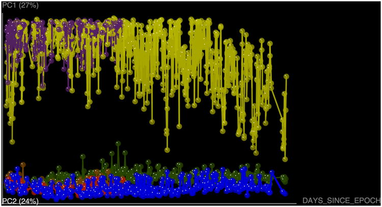
Three dimensional plots in which two of the axes are PC1 and PC2 and the other is the day when that sample was collected in reference to the epoch time. Although this is not explicitly a beta diversity plot, this representation allows differentiation of the individual trajectories over time.
make_3d_plots.py -i $PWD/moving_pictures/unweighted_unifrac_pc.txt -m $PWD/moving_pictures/merged_columns_mapping_file.txt -o $PWD/moving_pictures/vectors --add_vectors=BODY_SITEHOST_SUBJECT_ID,DAYS_SINCE_EPOCH -a DAYS_SINCE_EPOCH
These visual representations can often identify meaningful patterns. To statistically support these assertions, one-way analysis of variance (ANOVA) can be used over the values grouped by a category of interest. In a case where user wants to test for independence between the variation of one group of trajectories and another, this command could be used:
make_3d_plots.py –i unweighted_unifrac_pc.txt –m mapping_file.txt –o vectors –add_vectors=SampleTypeAndSubject,days_since_epoch –a days_since_epoch --vectors_algorithm avg --vectors_path anova_stats.txt
6.2. Processing 454 data
We have described the recommended workflow for conducting microbial community analysis on an Illumina MiSeq dataset. However, QIIME can also perform microbial community analysis on the 454 platform. The main advantage of 454 over Illumina is that 454 generates longer sequences, which can allow a better taxonomy assignment. However, the 454 technology produces fewer reads per dollar, or per sequencing run (Kuczynski et al., 2012).
The 454 processing workflow differs from the Illumina workflow in the sequence preprocessing. In this case, the output file from the sequencing facility is a fasta file containing the reads, and a quality score file which contains the score for each base in each sequence included in the FASTA file. In this case, the command used for the 454 preprocessing is split_libraries.py:
split_libraries.py -m Fasting_map.txt -f Fasting_Example.fna -q Fasting_Example.qual -o slout
Similarly to the Illumina processing, this script also performs a quality filtering. In this case, the quality filtering is based on cut-offs for sequence length, end-trimming or minimum quality score. However, to successfully remove the read artifacts, a denoising process has to be performed (Reeder et al., 2010) to reduce the impact of homopolymer runs (runs of the same base). The 454 denoising process is a slow, computationally intensive problem that does not scale to large datasets, as it is based on flowgram clustering (Quince et al., 2011).
6.2.1. Variable length barcodes
Variable-length barcodes are used for two reasons: to make the number of flows (rather than the number of bases) constant (Frank, 2009), or to stagger the reads to reduce bad signal from low complexity at a given position in the set of amplicons being sequenced. This approach is not recommended today because such samples are not easily demultiplexed, and there is checksum, like Hamming or Golay, that allows error-correction and improved sample assignment (Hamady et al., 2008). However, the Human Microbiome Project (HMP) used variable length barcodes to identify their samples within sequencing runs. Thus, QIIME allows demultiplexing such files by using the parameter -b in split_libraries.py, as follows:
split_libraries.py -m map_file_with_variable_length_barcodes.txt -f your_fna.fna -q your_qual.qual -o split_library_output_variable_length/ -b variable_length,
6.3. 18S rRNA gene sequencing
QIIME can be also used to perform analysis on 18S rRNA gene sequence data (in eukaryotes), as well as other markers such as ITS. The main difference between performing analyses with 18S rRNA gene data instead of 16S rRNA gene data (or ITS data) is the reference database used for OTU picking, the taxonomic assignments and the template-based alignment building, since it must contain eukaryotic sequences.
The recommended database to use as a reference for 18S rRNA sequences is the Silva database (Quast et al., 2013). At the time of writing, the most recent QIIME-compatible Silva database is the 108 release. Since this database contains the three domains of life, it can be used as a reference for 18S rRNA data sets.
When conducting studies mixing 18S rRNA data and 16S rRNA data, you should take into account that picking OTUs against the Silva database will assign taxa to all three domains of life. In this case, it is recommended to split the OTU table by domain, generating an OTU for each domain (Archaea, Bacteria and Eukarya). At this point, each of these tables can be used in downstream analysis in the same way as performed for 16S rRNA data.
6.4. Shotgun metagenomics
Shotgun metagenomics is also supported in QIIME, although it is still experimental and it should be used at the user's own risk. Currently, the QIIME team recommends the blat method (Kent, 2002) for searching nucleic acid sequence reads in a reference database, although usearch (Edgar, 2010) is also supported. The main reason for preferring blat against usearch is that protein reference database often require 64-bit applications, and blat is free of charge, while the 64 bit version of usearch is not.
There are many reference databases (IMG, KEGG, M5nr, among others), and they all supported by QIIME, since the user only needs to supply a single fasta file containing the sequence records. The command that QIIME provides for mapping reads against the reference database is map_reads_to_reference.py, and it can be performed in parallel using the parallel_map_reads_to_reference.py script.
6.5. Support for QIIME in R
First published in 1996, “R” is an integrated software application and programming language designed for interactive data analysis (R Core Team). It is available for Linux, Mac OS, and Windows free of charge under an open-source license (GPL2). Since its inception, R has found a niche as a tool for interactive statistical analysis through functional programming. Primary investigation and inference are performed by writing a series of repeatable commands as “scripts” that can be recorded and published. This paradigm lends itself well to reproducible research, and is enhanced substantially by R's integration with tools for literate programming such as Sweave (Leisch, 2002), knitr (Xie, 2013), and R markdown (Allaire, Horner, Marti, & Porte, 2013), as well as data graphics. There are thousands of free and open-source extensions to R (“packages”) available from the main R repository, CRAN, further organized by volunteer experts into 31 task “views” (which are in fact workflow inventories). Among these are dedicated package lists relevant to microbiome data, including phylogenetics, clustering, environmetrics, machine learning, multivariate and spatial statistics, as well as a separate reviewed and curated repository dedicated to biological statistics called Bioconductor (over 600 packages).
At present, support for QIIME in R is predominantly achieved through a package called “phyloseq” (McMurdie et al., 2013) dedicated to the reproducible analysis of microbiome census data in R. phyloseq defines an object-oriented data class for the consistent representation of related (heterogenous) microbiome census data that is independent of the sequencing- or OTU-clustering method (storing OTU abundance, taxonomy classification, phylogenetic relationships, representative biological sequences and sample covariates). The package supports QIIME by including functions for importing data from biom-format files derived from more recent versions of QIIME (import_biom) as well as legacy OTU-taxonomy delimited files (import_qiime and related user accessible subfunctions). Later editions of phyloseq (>1.5.15) also include an API for importing data directly from the microbio.me/qiime data repository. In all cases, these API functions return an instance of the “phyloseq” class that contains the available heterogenous components in “native” R classes. phyloseq includes a number of tools for connecting with other microbiome analysis functions available in other R packages, as well as its own functions for flexible graphics production built using ggplot2 (Wickham, 2009), demonstrated in supplemental files (Supplemental File 1) and online tutorials. For researchers interested in developing or using methods not directly supported by phyloseq, nor its data infrastructure, the biom-format specific core functions in phyloseq have been migrated to an official API in the biom-format project as an installable R package called “biom”, now released on CRAN. This also includes some biom-format specific functionality that is beyond the scope of phyloseq, though support for QIIME is still likely best achieved using phyloseq.
As with some of the earlier examples of QIIME commands with corresponding output and figures, in this section we have included some key R commands potentially useful during interactive analysis in the R environment. For simplicity, show only results related to the open-reference OTU data, stored in an object in our examples named open, and imported into R using the phyloseq command import_biom.
open = import_biom(“path-to-file.biom”, …)
Additional input data files can also be provided to import_biom, or merged with open after its instantiation. For clarity, subsets and transformations of the data in open are stored in objects having names that begin with “ open”. As with the remainder of the examples highlighted in this section, the complete code sufficient for reproducing all results and figures are included in the R Markdown originated document, Supplemental File 1, which includes several additional examples not shown here, and is available with supporting files on GitHub (https://github.com/joey711/navasetal).
Although not always very illuminating, a comparison of OTU-richness between samples or groups of samples can easily be achieved with the plot_richness command. For the most precise estimates of richness for most samples, this should be performed before random subsampling or other transformations of the abundance data. Here open contains data that has already been randomly subsampled. In figure 22 we can see that the wild type samples are generally more diverse (higher richness) and somewhat more variable than the transgenic samples for essentially all body sites, though the differences between the two mice genotypes are small.
Figure 22.
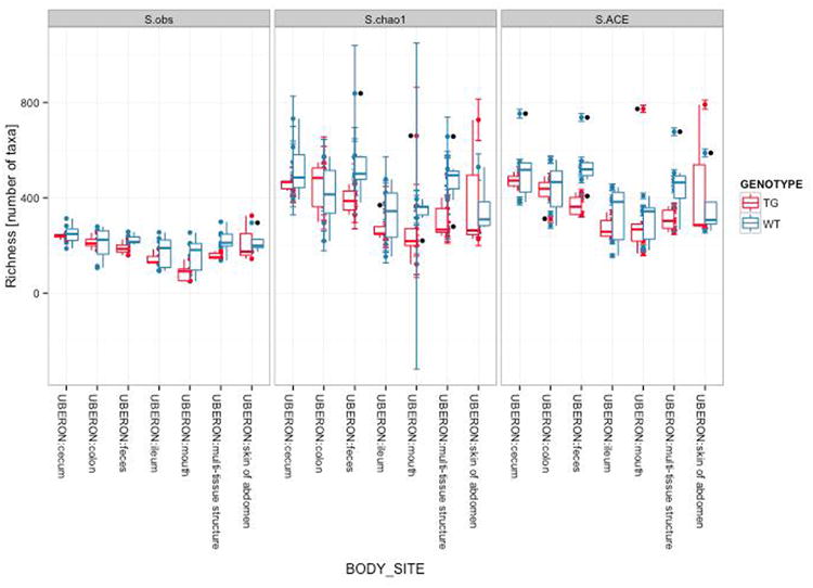
Categorically summarized OTU richness estimates using the plot_richness function. Samples are grouped on the horizontal axis according to body site, and color shading indicates the mouse genotype. The vertical axis indicates the richness estimates in number of distinct OTUs, and a separate boxplot is overlaid on the points for each combination of genotype and body site. The “S.obs”, “S.chao1”, and “S.ACE” panels show the “rarefied” observed richness, Chao-1 richness, and ACE richness estimates, respectively.
plot_richness(open, x= “BODY_SITE”, color = “GENOTYPE”) + geom_boxplot()
This plot command also illustrates the use of a function in ggplot2, geom_boxplot, that instructs the ggplot2 graphics engine to add an additional graphical element – in this case a boxplot for each of the natural groups in the graphic. These available additional graphical instructions (called “layers” in the grammar of graphics nomenclature) are embedded with the returned plot object for subsequent rendering, inspection, or further modification, allowing for powerfully customized representations of the data.
Here is an example leveraging the abundance bar plot function from phyloseq, plot_barr, in order to compare the relative abundances of key phyla between the wild type and transgenic mice across body sites. The first step was actually some additional data transformations (not shown, see Supplemental File 1) in order to subset the data to only major expected phyla ( subset_taxa), merge OTUs from the same phyla as one entry ( merge_taxa), and merge samples from the same body site and mouse genotype ( merge_samples).
p2 = plot_bar(openphyab, “bodysite”, fill = “phyla”, title = title)
p2 + facet_gird(∼GENOTYPE)
From this first bar plot it is clear that all body sites from the average wild type mouse have Firmicutes as their phylum of largest cumulative proportion, except for the “feces”, where it is anyway a close call between Firmicutes and Bacteroidetes. By contrast, some of the average transgenic mice samples have a much higher proportion of Proteobacteria or Bacteroidetes than the corresponding wild type samples. One drawback to this type of stacked bar representation is that it is difficult to compare any of the sub-bars except for those at the bottom. If needed, this can be alleviated by changing the facet_grid call such that a separate panel is made for each phyla in the dataset, as follows.
p2 + facet_grid(phyla ∼ GENOTYPE) + ylim(0, 100)
With essentially the same effort to produce, the 14 panels of this second bar plot graphic allow an easy and quantitative comparison of the relative abundances of each phylum across body sites and genotype.
Microbiome datasets can be highly multivariate in nature, and dimensional reduction (ordination) methods can be a useful form of exploratory analysis to better understand some of the largest patterns in the data. Many ordination methods are wrapped in phyloseq by the ordinate function, and many more are offered in available R packages. Here we show an example performing multidimensional scaling (MDS) on the precomputed unweighted UniFrac distance matrix for the open-reference dataset. The ordination result ( openUUFMDS) is first passed to plot_scree in order to explore the “scree plot” representing the relative proportions of variability represented by each successive axis. Both the ordination result and the original data are then passed to plot_ordination with sufficient parameters to shade the sample points by genotype, and create separate panels for each body site.
openUUFMDS = ordinate(open, “MDS, distance = UniFrac[[“unweighted”]][[“open””]]) plot_scree(openUUFMDS, “Unweighted Unifrac MDS”) plot_ordination(open, openUUFMDS, color = “GENOTYPE”) + geom_point(size = 5) + facet_wrap(∼BODY_SITE)
It appears that a subset of the wild-type samples from all but the mouth and abdomen-skin body sites cluster toward the left of the plot. This appears to be the major pattern along the axis that also comprises the greatest proportion of variability in the dataset. At this stage of analysis it seems worthwhile to try to identify which OTU abundances are most different between these groups, and then perform some formal validation/testing of these differences.
7. Recommendations
Here, we highlight some of the main aspects to take into account when performing microbial community analysis:
Use the open-reference OTU picking approach if your data allows it. It will reduce the running time and will recover all the diversity in your samples.
Perform an OTU quality filtering based on abundance, by removing singletons, for instance. See Bokulich et al. (2013) for further discussion on how to tune this quality filtering and its effects on downstream analysis. Quality filtering is critical for obtaining reasonable numbers of OTUs from a sample.
Consider whether you need to remove specific taxa from your study, such chloroplast or host DNA sequences when analyzing microbial datasets.
Remove samples from your study that have low coverage (i.e. low OTU counts). They are likely uninformative and usually indicate low-quality reads.
Rarefy your OTU table in order to mitigate the differences on the sequencing effort, so the downstream diversity analyses won’t be biased by the artificial diversity generated due to the difference in sequencing depth.
8. Conclusions
QIIME is a powerful tool for the analysis of bacterial community allowing researchers to recapitulate the necessary steps in the processing of sequences from the raw data to the visualizations and interpretation of the results. Two advantages make QIIME very useful: fidelity to the algorithms used, and consistency in the analysis. Fidelity is obtained because QIIME wraps existing software, preserving the integrity of the original programs and algorithms designed, created, and tested by the original authors. Consistency is obtained because QIIME can be applied to sequences from different platforms, and once the upstream process is done; the analysis (downstream) process is the same independent of the sequencing platform used. These characteristics, together with the fact that QIIME is open-source software with continuous support to users via QIIME forum, have promoted the rapid increase in the QIIME user community since its publication (Caporaso et al., 2010b).
Downstream and upstream processes are implemented in QIIME in a way that offers several options to perform the analyses. In this review, we discuss and demonstrate the principles for each step, what the scripts do and how to choose between options. Independent of the use of QIIME, this review also provides an overview of many of the typical steps in a microbial community analysis based on analysis of 16S rRNA sequences produced by high-throughput sequencing. Some of these tools are well developed with a long history in general ecology, whereas others are still in rapid development; we encourage microbial ecologists and bioinformaticians to work together to create, develop and implement new strategies and tools that allow further exploration of this fascinating field.
Supplementary Material
Figure 16.
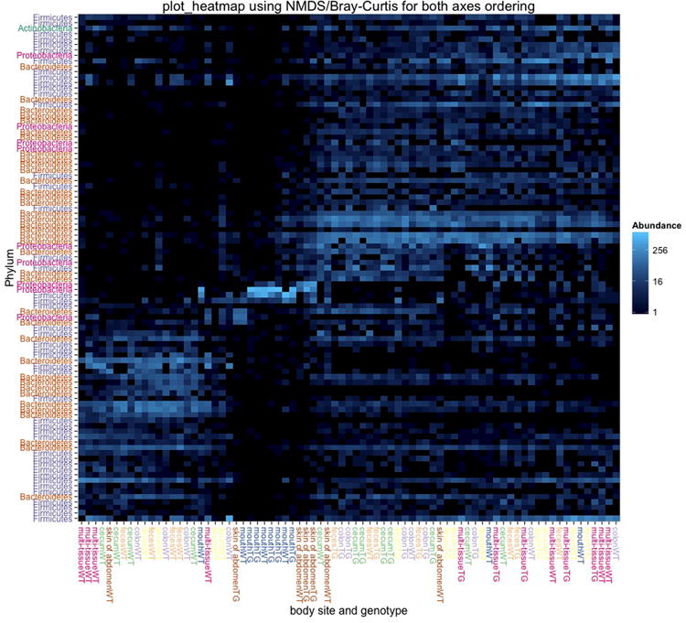
Example heatmap of the high-level patterns in the open-reference dataset. The graphic was produced by the plot_heatmap() function in phyloseq implemented in R after sub-setting the data to the most-prevalent 100 OTUs (Supplemental File 1). The order of sample and OTU elements was determined by the radial position of samples/OTUs in the first two aces of a Non-metric multidimensional scaling (NMDS) of the Bray-Curtis distance. Other choices for distance and ordination method can be also useful. The horizontal axis represents samples, with the genotype and body site labeled, while the vertical axis represents OTUs, labeled by phyla. Both axes are further color-coded to emphasize the different categories of labels. The blue-shade color scale indicates the abundance of each OTU in each sample, from black (zero, not observed) to very light blue (highly abundant, >1000 reads). The call used to create this figure was the following, omitting some details to improve the axis labels for publication: “plot heatmap (openfpp, “NMDS”, “bray”, taxa.label=“Phylum”, sample.label=“bsgt”, title=”plot heatmap using NMDS/Bray-Curtis for both axes ordering”)
Figure 23.
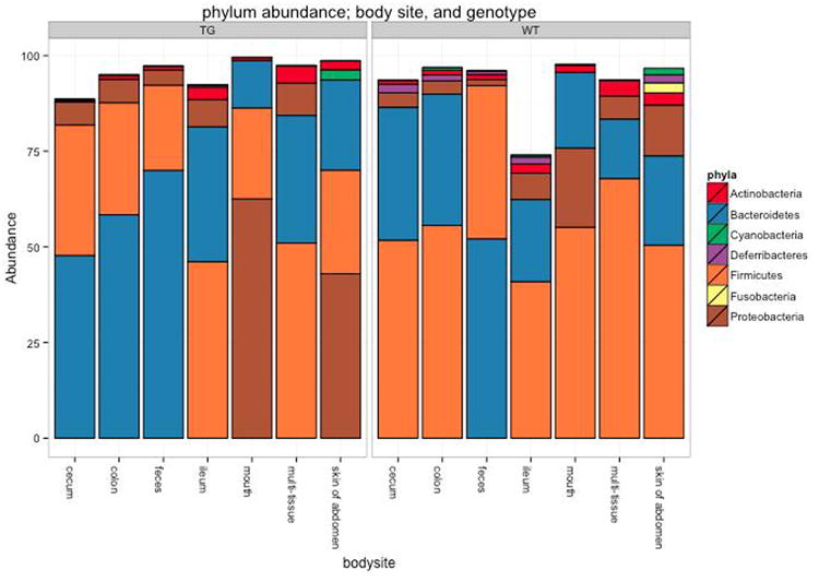
Stacked bar plot of the abundance values in the open-reference dataset. The bars are shaded according to phyla, with each rectangle representing the relative abundance of a phylum in a particular sample group. The OTU rectangle in each stack is ordered according to abundance. The horizontal and vertical axes indicate the body site of the samples and the average fractional abundance of the OTU within the sample group, respectively. The separate panels “TG” and “WT” indicate the mouse genotype, achieved automatically by the facet_grid(∼GENOTYPE) layer in the command.
Figure 24.
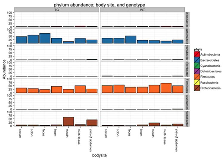
Alteration of the stacked bar plot shown in Figure 23 with an additional facet dimension. In this case, an additional argument has been added to the faceting formula so that the data is separated by a row of panels for each phyla, as well as a column of panels for each mouse genotype. The color shading and other attributes generally remain the same, with the average cross-category changes for each phylum more discernible.
Figure 25.
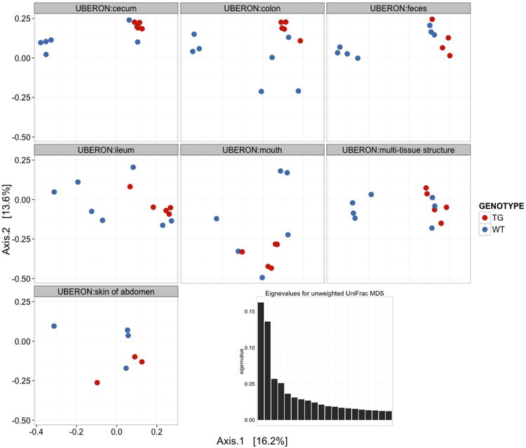
MDS ordination results on the unweighted UniFrac distances of the open reference dataset. The samples are separated into different panels according to body site, and shaded red or blue if they were from transgenic or wild type mice, respectively. The horizontal and vertical axis of each panel represents the first and second axis of the ordination, respectively, with the relative fraction of variability indicated in brackets. (Inset) A scree plot showing the distribution of eigenvalues associated with each ordination axis.
Acknowledgments
We thank William A Walters and Jessica Metcalf for productive discussion and their useful comments about QIIME. We also acknowledge Manuel Lladser for helping collect the dataset and allowing us to use it, and the IQBio IGERT grant for funding data collection. JANM is supported by a graduate scholarship funded jointly by the Balsells Foundation and by the University of Colorado at Boulder. SH is partially supported by NIH grant R01 GM086884. This work was partially supported by the Howard Hughes Medical Institute.
References
- Altschul SF, Gish W, Miller W, Myers EW, Lipman DJ. Basic local alignment search tool. J Mol Biol. 1990;215(3):403–410. doi: 10.1016/S0022-2836(05)80360-2. [DOI] [PubMed] [Google Scholar]
- Allaire J, Horner J, Marti V, Porte N. markdown: Markdown rendering for R. from http://CRAN.R-project.org/package=markdown.
- Arumugam M, Raes J, Pelletier E, Le Paslier D, Yamada T, Mende DR, et al. Enterotypes of the human gut microbiome. Nature. 2011;473(7346):174–180. doi: 10.1038/nature09944. [DOI] [PMC free article] [PubMed] [Google Scholar]
- Atlas RM, Bartha R. Microbial ecology : fundamentals and applications. 4. Menlo Park, Calif: Harlow: Benjamin/Cummings; 1998. [Google Scholar]
- Bokulich NA, Subramanian S, Faith JJ, Gevers D, Gordon JI, Knight R, et al. Quality-filtering vastly improves diversity estimates from Illumina amplicon sequencing. Nat Methods. 2013;10(1):57–59. doi: 10.1038/nmeth.2276. [DOI] [PMC free article] [PubMed] [Google Scholar]
- Breiman L. Random forests. Machine Learning. 2001;45(1):5–32. [Google Scholar]
- Caporaso JG, Bittinger K, Bushman FD, DeSantis TZ, Andersen GL, Knight R. PyNAST: a flexible tool for aligning sequences to a template alignment. Bioinformatics. 2010a;26(2):266–267. doi: 10.1093/bioinformatics/btp636. [DOI] [PMC free article] [PubMed] [Google Scholar]
- Caporaso JG, Kuczynski J, Stombaugh J, Bittinger K, Bushman FD, Costello EK, et al. QIIME allows analysis of high-throughput community sequencing data. Nat Methods. 2010b;7(5):335–336. doi: 10.1038/nmeth.f.303. [DOI] [PMC free article] [PubMed] [Google Scholar]
- Caporaso JG, Lauber CL, Costello EK, Berg-Lyons D, Gonzalez A, Stombaugh J, et al. Moving pictures of the human microbiome. Genome Biol. 2011;12(5):R50. doi: 10.1186/gb-2011-12-5-r50. [DOI] [PMC free article] [PubMed] [Google Scholar]
- Caporaso JG, Lauber CL, Walters WA, Berg-Lyons D, Huntley J, Fierer N, et al. Ultra-high-throughput microbial community analysis on the Illumina HiSeq and MiSeq platforms. ISME J. 2012;6(8):1621–1624. doi: 10.1038/ismej.2012.8. [DOI] [PMC free article] [PubMed] [Google Scholar]
- Carvalho FA, Koren O, Goodrich JK, Johansson ME, Nalbantoglu I, Aitken JD, et al. Transient inability to manage proteobacteria promotes chronic gut inflammation in TLR5-deficient mice. Cell Host Microbe. 2012;12(2):139–152. doi: 10.1016/j.chom.2012.07.004. [DOI] [PMC free article] [PubMed] [Google Scholar]
- Cole JR, Wang Q, Cardenas E, Fish J, Chai B, Farris RJ, et al. The Ribosomal Database Project: improved alignments and new tools for rRNA analysis. Nucleic Acids Res. 2009;37(Database issue):D141–145. doi: 10.1093/nar/gkn879. [DOI] [PMC free article] [PubMed] [Google Scholar]
- Chakerian J, Holmes S. Computational Tools for Evaluating Phylogenetic and Hierarchical Clustering Trees. Journal of Computational and Graphical Statistics. 2012;21(3):581–599. doi: 10.1080/10618600.2012.640901. [DOI] [PMC free article] [PubMed] [Google Scholar]
- Chen VB, Davis IW, Richardson DC. KING (Kinemage, Next Generation): a versatile interactive molecular and scientific visualization program. Protein Sci. 2009;18(11):2403–2409. doi: 10.1002/pro.250. [DOI] [PMC free article] [PubMed] [Google Scholar]
- De Filippo C, Cavalieri D, Di Paola M, Ramazzotti M, Poullet JB, Massart S, et al. Impact of diet in shaping gut microbiota revealed by a comparative study in children from Europe and rural Africa. Proc Natl Acad Sci U S A. 2010;107(33):14691–14696. doi: 10.1073/pnas.1005963107. [DOI] [PMC free article] [PubMed] [Google Scholar]
- DeSantis TZ, Hugenholtz P, Larsen N, Rojas M, Brodie EL, Keller K, et al. Greengenes, a chimera-checked 16S rRNA gene database and workbench compatible with ARB. Appl Environ Microbiol. 2006;72(7):5069–5072. doi: 10.1128/AEM.03006-05. [DOI] [PMC free article] [PubMed] [Google Scholar]
- Dethlefsen L, Relman DA. Incomplete recovery and individualized responses of the human distal gut microbiota to repeated antibiotic perturbation. Proc Natl Acad Sci U S A. 2011;108(Suppl 1):4554–4561. doi: 10.1073/pnas.1000087107. [DOI] [PMC free article] [PubMed] [Google Scholar]
- Diaz Heijtz R, Wang S, Anuar F, Qian Y, Bjorkholm B, Samuelsson A, et al. Normal gut microbiota modulates brain development and behavior. Proc Natl Acad Sci U S A. 2011;108(7):3047–3052. doi: 10.1073/pnas.1010529108. [DOI] [PMC free article] [PubMed] [Google Scholar]
- Dominguez-Bello MG, Costello EK, Contreras M, Magris M, Hidalgo G, Fierer N, et al. Delivery mode shapes the acquisition and structure of the initial microbiota across multiple body habitats in newborns. Proc Natl Acad Sci U S A. 2010;107(26):11971–11975. doi: 10.1073/pnas.1002601107. [DOI] [PMC free article] [PubMed] [Google Scholar]
- Drancourt M, Bollet C, Carlioz A, Martelin R, Gayral JP, Raoult D. 16S ribosomal DNA sequence analysis of a large collection of environmental and clinical unidentifiable bacterial isolates. J Clin Microbiol. 2000;38(10):3623–3630. doi: 10.1128/jcm.38.10.3623-3630.2000. [DOI] [PMC free article] [PubMed] [Google Scholar]
- Eckburg PB, Relman DA. The role of microbes in Crohn's disease. Clin Infect Dis. 2007;44(2):256–262. doi: 10.1086/510385. [DOI] [PubMed] [Google Scholar]
- Edgar RC. MUSCLE: multiple sequence alignment with high accuracy and high throughput. Nucleic Acids Res. 2004;32(5):1792–1797. doi: 10.1093/nar/gkh340. [DOI] [PMC free article] [PubMed] [Google Scholar]
- Edgar RC. Search and clustering orders of magnitude faster than BLAST. Bioinformatics. 2010;26(19):2460–2461. doi: 10.1093/bioinformatics/btq461. [DOI] [PubMed] [Google Scholar]
- Edgar RC, Haas BJ, Clemente JC, Quince C, Knight R. UCHIME improves sensitivity and speed of chimera detection. Bioinformatics. 2011;27(16):2194–2200. doi: 10.1093/bioinformatics/btr381. [DOI] [PMC free article] [PubMed] [Google Scholar]
- Evans J, Sheneman L, Foster J. Relaxed neighbor joining: a fast distance-based phylogenetic tree construction method. J Mol Evol. 2006;62(6):785–792. doi: 10.1007/s00239-005-0176-2. [DOI] [PubMed] [Google Scholar]
- Faith DP. Conservation Evaluation and Phylogenetic Diversity. Biological Conservation. 1992;61(1):1–10. [Google Scholar]
- Fierer N, Hamady M, Lauber CL, Knight R. The influence of sex, handedness, and washing on the diversity of hand surface bacteria. Proc Natl Acad Sci U S A. 2008;105(46):17994–17999. doi: 10.1073/pnas.0807920105. [DOI] [PMC free article] [PubMed] [Google Scholar]
- Fierer N, Lauber CL, Zhou N, McDonald D, Costello EK, Knight R. Forensic identification using skin bacterial communities. Proc Natl Acad Sci U S A. 2010;107(14):6477–6481. doi: 10.1073/pnas.1000162107. [DOI] [PMC free article] [PubMed] [Google Scholar]
- Frank DN. BARCRAWL and BARTAB: software tools for the design and implementation of barcoded primers for highly multiplexed DNA sequencing. BMC Bioinformatics. 2009;10:362. doi: 10.1186/1471-2105-10-362. [DOI] [PMC free article] [PubMed] [Google Scholar]
- Gevers D, Knight R, Petrosino JF, Huang K, McGuire AL, Birren BW, et al. The Human Microbiome Project: a community resource for the healthy human microbiome. PLoS Biol. 2012;10(8):e1001377. doi: 10.1371/journal.pbio.1001377. [DOI] [PMC free article] [PubMed] [Google Scholar]
- Gilbert JA, Meyer F, Antonopoulos D, Balaji P, Brown CT, Brown CT, et al. Meeting report: the terabase metagenomics workshop and the vision of an Earth microbiome project. Stand Genomic Sci. 2010;3(3):243–248. doi: 10.4056/sigs.1433550. [DOI] [PMC free article] [PubMed] [Google Scholar]
- Gilbert JA, Meyer F, Jansson J, Gordon J, Pace N, Tiedje J, et al. The Earth Microbiome Project: Meeting report of the “1 EMP meeting on sample selection and acquisition” at Argonne National Laboratory October 6 2010. Stand Genomic Sci. 2010;3(3):249–253. doi: 10.4056/aigs.1443528. [DOI] [PMC free article] [PubMed] [Google Scholar]
- Gonzalez A, Knight R. Advancing analytical algorithms and pipelines for billions of microbial sequences. Curr Opin Biotechnol. 2012a;23(1):64–71. doi: 10.1016/j.copbio.2011.11.028. [DOI] [PMC free article] [PubMed] [Google Scholar]
- Gonzalez A, Stombaugh J, Lauber CL, Fierer N, Knight R. SitePainter: a tool for exploring biogeographical patterns. Bioinformatics. 2012b;28(3):436–438. doi: 10.1093/bioinformatics/btr685. [DOI] [PMC free article] [PubMed] [Google Scholar]
- Gower JC. Some Distance Properties of Latent Root and Vector Methods Used in Multivariate Analysis. Biometrika. 1966;53:325–&. [Google Scholar]
- Haas BJ, Gevers D, Earl AM, Feldgarden M, Ward DV, Giannoukos G, et al. Chimeric 16S rRNA sequence formation and detection in Sanger and 454-pyrosequenced PCR amplicons. Genome Res. 2011;21(3):494–504. doi: 10.1101/gr.112730.110. [DOI] [PMC free article] [PubMed] [Google Scholar]
- Hamady M, Knight R. Microbial community profiling for human microbiome projects: Tools, techniques, and challenges. Genome Res. 2009;19(7):1141–1152. doi: 10.1101/gr.085464.108. [DOI] [PMC free article] [PubMed] [Google Scholar]
- Hamady M, Walker JJ, Harris JK, Gold NJ, Knight R. Error-correcting barcoded primers for pyrosequencing hundreds of samples in multiplex. Nat Methods. 2008;5(3):235–237. doi: 10.1038/nmeth.1184. [DOI] [PMC free article] [PubMed] [Google Scholar]
- Hewitt KM, Mannino FL, Gonzalez A, Chase JH, Caporaso JG, Knight R, et al. Bacterial diversity in two Neonatal Intensive Care Units (NICUs) PLoS One. 2013;8(1):e54703. doi: 10.1371/journal.pone.0054703. [DOI] [PMC free article] [PubMed] [Google Scholar]
- Human Microbiome Project, C. A framework for human microbiome research. Nature. 2012a;486(7402):215–221. doi: 10.1038/nature11209. [DOI] [PMC free article] [PubMed] [Google Scholar]
- Human Microbiome Project, C. Structure, function and diversity of the healthy human microbiome. Nature. 2012b;486(7402):207–214. doi: 10.1038/nature11234. [DOI] [PMC free article] [PubMed] [Google Scholar]
- Jost L. Partitioning diversity into independent alpha and beta components. Ecology. 2007;88(10):2427–2439. doi: 10.1890/06-1736.1. [DOI] [PubMed] [Google Scholar]
- Katoh K, Misawa K, Kuma K, Miyata T. MAFFT: a novel method for rapid multiple sequence alignment based on fast Fourier transform. Nucleic Acids Res. 2002;30(14):3059–3066. doi: 10.1093/nar/gkf436. [DOI] [PMC free article] [PubMed] [Google Scholar]
- Kent WJ. BLAT--the BLAST-like alignment tool. Genome Res. 2002;12(4):656–664. doi: 10.1101/gr.229202. [DOI] [PMC free article] [PubMed] [Google Scholar]
- Knights D, Costello EK, Knight R. Supervised classification of human microbiota. FEMS Microbiol Rev. 2011a;35(2):343–359. doi: 10.1111/j.1574-6976.2010.00251.x. [DOI] [PubMed] [Google Scholar]
- Knights D, Kuczynski J, Charlson ES, Zaneveld J, Mozer MC, Collman RG, et al. Bayesian community-wide culture-independent microbial source tracking. Nat Methods. 2011b;8(9):761–763. doi: 10.1038/nmeth.1650. [DOI] [PMC free article] [PubMed] [Google Scholar]
- Knights D, Kuczynski J, Koren O, Ley RE, Field D, Knight R, et al. Supervised classification of microbiota mitigates mislabeling errors. ISME J. 2011c;5(4):570–573. doi: 10.1038/ismej.2010.148. [DOI] [PMC free article] [PubMed] [Google Scholar]
- Koenig JE, Spor A, Scalfone N, Fricker AD, Stombaugh J, Knight R, et al. Succession of microbial consortia in the developing infant gut microbiome. Proc Natl Acad Sci U S A. 2011;108(Suppl 1):4578–4585. doi: 10.1073/pnas.1000081107. [DOI] [PMC free article] [PubMed] [Google Scholar]
- Koren O, Goodrich JK, Cullender TC, Spor A, Laitinen K, Backhed HK, et al. Host remodeling of the gut microbiome and metabolic changes during pregnancy. Cell. 2012;150(3):470–480. doi: 10.1016/j.cell.2012.07.008. [DOI] [PMC free article] [PubMed] [Google Scholar]
- Kuczynski J, Costello EK, Nemergut DR, Zaneveld J, Lauber CL, Knights D, et al. Direct sequencing of the human microbiome readily reveals community differences. Genome Biol. 2010a;11(5):210. doi: 10.1186/gb-2010-11-5-210. [DOI] [PMC free article] [PubMed] [Google Scholar]
- Kuczynski J, Lauber CL, Walters WA, Parfrey LW, Clemente JC, Gevers D, et al. Experimental and analytical tools for studying the human microbiome. Nat Rev Genet. 2012;13(1):47–58. doi: 10.1038/nrg3129. [DOI] [PMC free article] [PubMed] [Google Scholar]
- Kuczynski J, Liu Z, Lozupone C, McDonald D, Fierer N, Knight R. Microbial community resemblance methods differ in their ability to detect biologically relevant patterns. Nat Methods. 2010b;7(10):813–819. doi: 10.1038/nmeth.1499. [DOI] [PMC free article] [PubMed] [Google Scholar]
- Larkin MA, Blackshields G, Brown NP, Chenna R, McGettigan PA, McWilliam H, et al. Clustal W and Clustal X version 2.0. Bioinformatics. 2007;23(21):2947–2948. doi: 10.1093/bioinformatics/btm404. [DOI] [PubMed] [Google Scholar]
- Leisch F. Sweave: Dynamic Generation of Statistical Reports Using Literate Data Analysis. In: Wolfgang Härdle BR, editor. Compstat: Proceedings in Computational Statistics. Physica-Verlag HD: 2002. pp. 575–580. [Google Scholar]
- Ley RE, Backhed F, Turnbaugh P, Lozupone CA, Knight RD, Gordon JI. Obesity alters gut microbial ecology. Proc Natl Acad Sci U S A. 2005;102(31):11070–11075. doi: 10.1073/pnas.0504978102. [DOI] [PMC free article] [PubMed] [Google Scholar]
- Ley RE, Hamady M, Lozupone C, Turnbaugh PJ, Ramey RR, Bircher JS, et al. Evolution of mammals and their gut microbes. Science. 2008;320(5883):1647–1651. doi: 10.1126/science.1155725. [DOI] [PMC free article] [PubMed] [Google Scholar]
- Li W, Godzik A. Cd-hit: a fast program for clustering and comparing large sets of protein or nucleotide sequences. Bioinformatics. 2006;22(13):1658–1659. doi: 10.1093/bioinformatics/btl158. [DOI] [PubMed] [Google Scholar]
- Li W, Jaroszewski L, Godzik A. Clustering of highly homologous sequences to reduce the size of large protein databases. Bioinformatics. 2001;17(3):282–283. doi: 10.1093/bioinformatics/17.3.282. [DOI] [PubMed] [Google Scholar]
- Liaw A, Wiener M. Classification and Regression by randomForest. R News: The Newsletter of the R Project. 2002;2(3):4. [Google Scholar]
- Liu Z, DeSantis TZ, Andersen GL, Knight R. Accurate taxonomy assignments from 16S rRNA sequences produced by highly parallel pyrosequencers. Nucleic Acids Res. 2008;36(18):e120. doi: 10.1093/nar/gkn491. [DOI] [PMC free article] [PubMed] [Google Scholar]
- Loua T. Atlas statistique de la population de Paris. Paris: J. Dejey & cie; 1873. [Google Scholar]
- Lozupone C, Knight R. UniFrac: a new phylogenetic method for comparing microbial communities. Appl Environ Microbiol. 2005;71(12):8228–8235. doi: 10.1128/AEM.71.12.8228-8235.2005. [DOI] [PMC free article] [PubMed] [Google Scholar]
- Lozupone C, Lladser ME, Knights D, Stombaugh J, Knight R. UniFrac: an effective distance metric for microbial community comparison. ISME J. 2011;5(2):169–172. doi: 10.1038/ismej.2010.133. [DOI] [PMC free article] [PubMed] [Google Scholar]
- Lozupone CA, Hamady M, Kelley ST, Knight R. Quantitative and qualitative beta diversity measures lead to different insights into factors that structure microbial communities. Appl Environ Microbiol. 2007;73(5):1576–1585. doi: 10.1128/AEM.01996-06. [DOI] [PMC free article] [PubMed] [Google Scholar]
- Lozupone CA, Knight R. Species divergence and the measurement of microbial diversity. FEMS Microbiol Rev. 2008;32(4):557–578. doi: 10.1111/j.1574-6976.2008.00111.x. [DOI] [PMC free article] [PubMed] [Google Scholar]
- Ludwig W, Strunk O, Westram R, Richter L, Meier H, Yadhukumar, et al. ARB: a software environment for sequence data. Nucleic Acids Res. 2004;32(4):1363–1371. doi: 10.1093/nar/gkh293. [DOI] [PMC free article] [PubMed] [Google Scholar]
- Mardia KV, Kent JT, Bibby J. Multivariate analysis. London: Academic Press; 1979. [Google Scholar]
- McDonald D, Clemente JC, Kuczynski J, Rideout JR, Stombaugh J, Wendel D, et al. The Biological Observation Matrix (BIOM) format or: how I learned to stop worrying and love the ome-ome. Gigascience. 2012a;1(1):7. doi: 10.1186/2047-217X-1-7. [DOI] [PMC free article] [PubMed] [Google Scholar]
- McDonald D, Price MN, Goodrich J, Nawrocki EP, DeSantis TZ, Probst A, et al. An improved Greengenes taxonomy with explicit ranks for ecological and evolutionary analyses of bacteria and archaea. ISME J. 2012b;6(3):610–618. doi: 10.1038/ismej.2011.139. [DOI] [PMC free article] [PubMed] [Google Scholar]
- McLean PG, Bergonzelli GE, Collins SM, Bercik P. Targeting the microbiota-gut-brain axis to modulate behavior: which bacterial strain will translate best to humans? Proc Natl Acad Sci U S A. 2012;109(4):E174. doi: 10.1073/pnas.1118626109. author reply E176. [DOI] [PMC free article] [PubMed] [Google Scholar]
- McMurdie PJ, Holmes S. phyloseq: An R Package for Reproducible Interactive Analysis and Graphics of Microbiome Census Data. PLoS One. 2013;8(4):e61217. doi: 10.1371/journal.pone.0061217. [DOI] [PMC free article] [PubMed] [Google Scholar]
- Muegge BD, Kuczynski J, Knights D, Clemente JC, Gonzalez A, Fontana L, et al. Diet drives convergence in gut microbiome functions across mammalian phylogeny and within humans. Science. 2011;332(6032):970–974. doi: 10.1126/science.1198719. [DOI] [PMC free article] [PubMed] [Google Scholar]
- Nawrocki EP, Kolbe DL, Eddy SR. Infernal 1.0: inference of RNA alignments. Bioinformatics. 2009;25(10):1335–1337. doi: 10.1093/bioinformatics/btp157. [DOI] [PMC free article] [PubMed] [Google Scholar]
- Olsen GJ, Larsen N, Woese CR. The ribosomal RNA database project. Nucleic Acids Res. 1991;19 Suppl:2017–2021. doi: 10.1093/nar/19.suppl.2017. [DOI] [PMC free article] [PubMed] [Google Scholar]
- Olsen GJ, Overbeek R, Larsen N, Marsh TL, McCaughey MJ, Maciukenas MA, et al. The Ribosomal Database Project. Nucleic Acids Res. 1992;20 Suppl:2199–2200. doi: 10.1093/nar/20.suppl.2199. [DOI] [PMC free article] [PubMed] [Google Scholar]
- Paradis E, Claude J, Strimmer K. APE: Analyses of Phylogenetics and Evolution in R language. Bioinformatics. 2004;20(2):289–290. doi: 10.1093/bioinformatics/btg412. [DOI] [PubMed] [Google Scholar]
- Pirrung M, Kennedy R, Caporaso JG, Stombaugh J, Wendel D, Knight R. TopiaryExplorer: visualizing large phylogenetic trees with environmental metadata. Bioinformatics. 2011;27(21):3067–3069. doi: 10.1093/bioinformatics/btr517. [DOI] [PMC free article] [PubMed] [Google Scholar]
- Price MN, Dehal PS, Arkin AP. FastTree: computing large minimum evolution trees with profiles instead of a distance matrix. Mol Biol Evol. 2009;26(7):1641–1650. doi: 10.1093/molbev/msp077. [DOI] [PMC free article] [PubMed] [Google Scholar]
- Quast C, Pruesse E, Yilmaz P, Gerken J, Schweer T, Yarza P, et al. The SILVA ribosomal RNA gene database project: improved data processing and web-based tools. Nucleic Acids Res. 2013;41(D1):D590–596. doi: 10.1093/nar/gks1219. [DOI] [PMC free article] [PubMed] [Google Scholar]
- Quince C, Lanzen A, Curtis TP, Davenport RJ, Hall N, Head IM, et al. Accurate determination of microbial diversity from 454 pyrosequencing data. Nat Methods. 2009;6(9):639–641. doi: 10.1038/nmeth.1361. [DOI] [PubMed] [Google Scholar]
- Quince C, Lanzen A, Davenport RJ, Turnbaugh PJ. Removing noise from pyrosequenced amplicons. BMC Bioinformatics. 2011;12:38. doi: 10.1186/1471-2105-12-38. [DOI] [PMC free article] [PubMed] [Google Scholar]
- Rajaram S, Oono Y. NeatMap--non-clustering heat map alternatives in R. BMC Bioinformatics. 2010;11:45. doi: 10.1186/1471-2105-11-45. [DOI] [PMC free article] [PubMed] [Google Scholar]
- Ravel J, Gajer P, Fu L, Mauck CK, Koenig SS, Sakamoto J, et al. Twice-daily application of HIV microbicides alter the vaginal microbiota. MBio. 2012;3(6) doi: 10.1128/mBio.00370-12. [DOI] [PMC free article] [PubMed] [Google Scholar]
- Reeder J, Knight R. Rapidly denoising pyrosequencing amplicon reads by exploiting rank-abundance distributions. Nat Methods. 2010;7(9):668–669. doi: 10.1038/nmeth0910-668b. [DOI] [PMC free article] [PubMed] [Google Scholar]
- Roesch LF, Fulthorpe RR, Riva A, Casella G, Hadwin AK, Kent AD, et al. Pyrosequencing enumerates and contrasts soil microbial diversity. ISME J. 2007;1(4):283–290. doi: 10.1038/ismej.2007.53. [DOI] [PMC free article] [PubMed] [Google Scholar]
- Savage DC. Microbial ecology of the gastrointestinal tract. Annu Rev Microbiol. 1977;31:107–133. doi: 10.1146/annurev.mi.31.100177.000543. [DOI] [PubMed] [Google Scholar]
- Schloss PD, Handelsman J. Introducing DOTUR, a computer program for defining operational taxonomic units and estimating species richness. Appl Environ Microbiol. 2005;71(3):1501–1506. doi: 10.1128/AEM.71.3.1501-1506.2005. [DOI] [PMC free article] [PubMed] [Google Scholar]
- Schloss PD, Handelsman J. Introducing SONS, a tool for operational taxonomic unit-based comparisons of microbial community memberships and structures. Appl Environ Microbiol. 2006;72(10):6773–6779. doi: 10.1128/AEM.00474-06. [DOI] [PMC free article] [PubMed] [Google Scholar]
- Schloss PD, Westcott SL, Ryabin T, Hall JR, Hartmann M, Hollister EB, et al. Introducing mothur: open-source, platform-independent, community-supported software for describing and comparing microbial communities. Appl Environ Microbiol. 2009;75(23):7537–7541. doi: 10.1128/AEM.01541-09. [DOI] [PMC free article] [PubMed] [Google Scholar]
- Shannon P, Markiel A, Ozier O, Baliga NS, Wang JT, Ramage D, et al. Cytoscape: a software environment for integrated models of biomolecular interaction networks. Genome Res. 2003;13(11):2498–2504. doi: 10.1101/gr.1239303. [DOI] [PMC free article] [PubMed] [Google Scholar]
- Smith MI, Yatsunenko T, Manary MJ, Trehan I, Mkakosya R, Cheng J, et al. Gut microbiomes of Malawian twin pairs discordant for kwashiorkor. Science. 2013;339(6119):548–554. doi: 10.1126/science.1229000. [DOI] [PMC free article] [PubMed] [Google Scholar]
- Sneath PHA, Sokal RR. Numerical taxonomy : the principles and practice of numerical classification. San Francisco: Freeman; 1973. [Google Scholar]
- Soergel DA, Dey N, Knight R, Brenner SE. Selection of primers for optimal taxonomic classification of environmental 16S rRNA gene sequences. ISME J. 2012;6(7):1440–1444. doi: 10.1038/ismej.2011.208. [DOI] [PMC free article] [PubMed] [Google Scholar]
- Sogin M, Welch DM, Huse S. The Visualization and Analysis of Microbial Population Structures. doi: 10.1186/1471-2105-15-41. from http://vamps.mbl.edu. [DOI] [PMC free article] [PubMed]
- Sokal RR, Sneath PHA. Principles of numerical taxonomy. San Francisco: W. H. Freeman; 1963. [Google Scholar]
- Spencer MD, Hamp TJ, Reid RW, Fischer LM, Zeisel SH, Fodor AA. Association between composition of the human gastrointestinal microbiome and development of fatty liver with choline deficiency. Gastroenterology. 2011;140(3):976–986. doi: 10.1053/j.gastro.2010.11.049. [DOI] [PMC free article] [PubMed] [Google Scholar]
- Stamatakis A, Ludwig T, Meier H. RAxML-III: a fast program for maximum likelihood-based inference of large phylogenetic trees. Bioinformatics. 2005;21(4):456–463. doi: 10.1093/bioinformatics/bti191. [DOI] [PubMed] [Google Scholar]
- Tryon RC. Cluster analysis. Ann Arbor Mich: Edwards Bros; 1939. [Google Scholar]
- Turnbaugh PJ, Hamady M, Yatsunenko T, Cantarel BL, Duncan A, Ley RE, et al. A core gut microbiome in obese and lean twins. Nature. 2009;457(7228):480–484. doi: 10.1038/nature07540. [DOI] [PMC free article] [PubMed] [Google Scholar]
- Turnbaugh PJ, Ley RE, Hamady M, Fraser-Liggett CM, Knight R, Gordon JI. The human microbiome project. Nature. 2007;449(7164):804–810. doi: 10.1038/nature06244. [DOI] [PMC free article] [PubMed] [Google Scholar]
- Vinten AJ, Artz RR, Thomas N, Potts JM, Avery L, Langan SJ, et al. Comparison of microbial community assays for the assessment of stream biofilm ecology. J Microbiol Methods. 2011;85(3):190–198. doi: 10.1016/j.mimet.2011.03.001. [DOI] [PubMed] [Google Scholar]
- Wang Q, Garrity GM, Tiedje JM, Cole JR. Naive Bayesian classifier for rapid assignment of rRNA sequences into the new bacterial taxonomy. Appl Environ Microbiol. 2007;73(16):5261–5267. doi: 10.1128/AEM.00062-07. [DOI] [PMC free article] [PubMed] [Google Scholar]
- Whittaker RH. Vegetation of the Siskiyou Mountains, Oregon and California. Ecological Monographs. 1960;30(3):280–338. [Google Scholar]
- Whittaker RH. Evolution and Measurement of Species Diversity. Taxon. 1972;21(2/3):213–251. [Google Scholar]
- Wickham H. ggplot2: Elegant Graphics for Data Analysis. Vol. 6991. Use R!; Springer; 2009. [Google Scholar]
- Wilkinson L, Friendly M. The History of the Cluster Heat Map. The American Statistician. 2009;63(2):179–184. [Google Scholar]
- Xie Y. Dynamic Documents with R and knitr. Chapman and Hall/CRC; 2013. [Google Scholar]
Associated Data
This section collects any data citations, data availability statements, or supplementary materials included in this article.