Abstract
Motivation: Analysis of RNA sequencing (RNA-Seq) data revealed that the vast majority of human genes express multiple mRNA isoforms, produced by alternative pre-mRNA splicing and other mechanisms, and that most alternative isoforms vary in expression between human tissues. As RNA-Seq datasets grow in size, it remains challenging to visualize isoform expression across multiple samples.
Results: To help address this problem, we present Sashimi plots, a quantitative visualization of aligned RNA-Seq reads that enables quantitative comparison of exon usage across samples or experimental conditions. Sashimi plots can be made using the Broad Integrated Genome Viewer or with a stand-alone command line program.
Availability and implementation: Software code and documentation freely available here: http://miso.readthedocs.org/en/fastmiso/sashimi.html
Contact: mesirov@broadinstitute.org, airoldi@fas.harvard.edu or cburge@mit.edu
Supplementary information: Supplementary data are available at Bioinformatics online.
RNA sequencing analyses revealed that most human genes are alternatively spliced, and that differential regulation of isoforms is widespread across tissues (Wang et al., 2008, Pan et al., 2008). While many genome browsers can display raw RNA sequencing (RNA-Seq) reads, a quantitative visualization that conveys the abundances of alternatively spliced isoforms has been missing. For example, the popular UCSC Genome Browser can visualize RNA-Seq reads as tracks from BAM files (Kent et al., 2002), but does not make exon inclusion levels readily apparent and comparable across samples.
1 Results
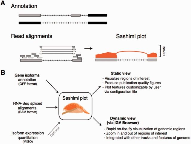
To visualize exon inclusion levels, we developed Sashimi plots (Katz et al., 2013). Given an input annotation of transcripts and spliced alignments of reads from a sample, a region of interest is visualized in a Sashimi plot using the following rules: (i) alignments in exons are represented as read densities (optionally normalized by length of genomic region and coverage), and (ii) splice junction reads are drawn as arcs connecting a pair of exons, where arc width is drawn proportional to the number of reads aligning to the junction (or to the log of this number; Fig. 1A).
Fig. 1.
(A) Anatomy of a Sashimi plot. Gene model annotation containing two isoforms differing by inclusion/exclusion of middle exon. Sashimi plot for the two grey exons (blue boxed region) is shown, where genomic reads are converted into read densities (per-base expression on y-axis) and junction reads are plotted as arcs whose width is proportional to the number of reads aligned to the junction spanning the exons connected by arc. Genomic coordinates are shown on x-axis. (B) Inputs required for making a Sashimi plot. Gene model annotations (in GFF format), RNA-Seq read alignments (BAM format) and optionally isoform expression estimates (by MISO) are used to make Sashimi plots. Sashimi plots can be made with a stand-alone program that makes customizable publication quality figures, or dynamically from the IGV browser
Sashimi plots take as input spliced alignments (in BAM format) and gene model annotations in GFF format (Stein, 2010), available from databases such as Ensembl or custom-made by user (Fig. 1B). Two implementations of Sashimi plots are available: (i) stand-alone command line implementation for making customizable publication-quality figures, and (ii) an implementation built into the Integrated Genome Viewer (IGV) browser (Thorvaldsdóttir et al., 2013), IGV-Sashimi, which enables dynamic creation of Sashimi plots for any genomic region of interest, suitable for exploratory analysis of isoform usage across experiments (Fig. 1B). Isoform expression estimates generated by the MISO algorithm (Katz et al., 2010) are optionally plotted in Sashimi plots. Sashimi plots can visualize alternative splicing for use in figures, or for rapid surveying of genomic regions for differential isoform usage across multiple samples.
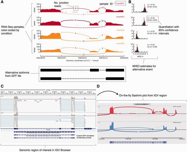
A Sashimi plot generated by the stand-alone program for four RNA-Seq samples is shown in Figure 2A. Samples are color-coded by condition, with RNA-Seq samples from wild type mice in red and mouse heart tissues depleted for the splicing factor Muscleblind1 (‘heartKOa’, ‘heartKOb’) in orange. Read densities across exons are normalized to obtain a measure of expression, like RPKM or similar measures that incorporate library size and length of transcripts. Single-end junction reads are plotted as arcs that are optionally annotated with the raw number of junction reads present in each sample, alternative isoforms from the input annotation are shown at bottom. The plot in Figure 2A highlights the differential splicing of the middle exon, which appears to be predominantly included in the wild type samples but mostly excluded in the knockout samples. This difference is confirmed by the MISO estimates for the inclusion of the exon (Fig. 2B), which indicate that inclusion levels for the exon [quantified as ‘Percent Spliced In’ or Ψ, as in (Katz et al., 2010)] is ∼77% in wild type samples and only ∼25% in the knockout samples. Users can customize the scales, colours, labels and other features of the plot through a text settings file.
Fig. 2.
(A) Sashimi plot (stand-alone) for alternatively spliced exon and flanking exons in four samples (colored by experimental condition). Per-base expression is plotted on y-axis of Sashimi plot, genomic coordinates on x-axis, and mRNA isoforms quantified are shown on bottom (exons in black, introns as lines with arrow heads). (B) Optional display of isoform expression information produced by MISO. Posterior distributions over Ψ values are shown as histograms (Ψ values on x-axis, frequency on y-axis). (C) Genomic region of interest in IGV along with two alignment tracks (top). (D) Sashimi plot for region shown in (C). Genomic coordinates are plotted on x-axis and read density (whose value is configurable via IGV) on y-axis
For comparison, UCSC visualization of the same data used to generate the Sashimi in Figure 2 is shown in Supplementary Figure S1 (using ‘dense’ and ‘squish’ views). While the ‘dense’ view is compact (Supplementary Fig S1A), it does not present a quantitative measure of exon inclusion levels. The ‘squish’ view by contrast is too detailed for the task, as each read is plotted (Supplementary Fig. S1B). Finally, tracks corresponding to samples with more coverage get allocated more space in the ‘squish’ view, making it challenging to visualize multiple samples.
An IGV-Sashimi plot for the genomic region containing the same alternative exon is shown in Figure 2C-D with one wild type heart sample shown in red and one knockout heart sample in blue. The GFF annotation of the alternatively spliced exon is shown in the lower panel, and RefSeq canonical transcripts for the gene are shown above. The boundaries of the Sashimi plot are determined by the region of interest shown in the IGV browser window, and can be altered to include more or fewer exons using the zoom in/out feature of the browser. The raw junction read counts are shown on top of each junction arc in Figure 2D. IGV-Sashimi combines the compactness of a Sashimi plot with the versatility of a genome browser.
Genomic features apart from expression can be integrated into Sashimi plots either programmatically or as tracks through the IGV browser. The Sashimi plot code is freely available (accessible via GitHub), and can be used to combine isoform and exon expression levels with other genomic data. This code was recently extended to display splicing Quantitative Trait Loci (‘sQTL’) alongside genotypic information (Wu et al., 2014).
The advent of significantly longer, high-throughput RNA-Seq reads can enable exact identification of some isoforms. Sashimi plots may then be used to display other features related to exon/junction usage, such as sQTLs. While extensible, Sashimi plots can become cluttered or hard to interpret in cases of complex alternative splicing, for genes that have tens or hundreds of expressed isoforms. It remains a challenge for future work to distill RNA-Seq data from such genes into quantitative and interpretable visualizations.
Supplementary Material
Acknowledgements
The authors thank V. Butty, S. Katzman and N. Robine for insightful discussions.
Footnotes
A version of btv034 has been created to amend the formatting of the article's first paragraph and update figure 2.
Funding
For funding, R01 CA-157304 (NIH/NCI) and Starr Cancer Consortium to J.M., R01 GM-096193 (NIGMS), IIS-1149662 (NSF) and Alfred P. Sloan research fellowship to E.M.A., R01 GM-085319 (NIGMS), U01 CA-184897 (NCI) and R01 HG-002439 (NHGRI) to C.B.B.
Conflict of Interest: none declared.
References
- Katz Y., et al. (2010) Analysis and design of RNA sequencing experiments for identifying isoform regulation. Nat. Methods , 7, 1009–1015. [DOI] [PMC free article] [PubMed] [Google Scholar]
- Katz Y., et al. (2013) Sashimi plots: quantitative visualization of RNA sequencing read alignments. arXiv, manuscript no. 1306.3466. [Google Scholar]
- Kent J.W., et al. (2002) The human genome browser at UCSC. Genome Res. , 12, 996–1006. [DOI] [PMC free article] [PubMed] [Google Scholar]
- Pan Q., et al. (2008) Deep surveying of alternative splicing complexity in the human transcriptome by high-throughput sequencing. Nat. Genet. , 40, 1413–1415. [DOI] [PubMed] [Google Scholar]
- Stein L. (2010) Generic feature format, Version 3. http://www.sequenceontology.org/gff3.shtml2. [Google Scholar]
- Thorvaldsdóttir H., Robinson J.T., Mesirov J.P. (2013) Integrative Genomics Viewer (IGV): high-performance genomics data visualization and exploration. Brief. Bioinf. , 14, 178–192. [DOI] [PMC free article] [PubMed] [Google Scholar]
- Wang E.T., et al. (2012) Transcriptome-wide regulation of pre-mRNA splicing and mRNA localization by muscleblind proteins. Cell , 150, 710–724. [DOI] [PMC free article] [PubMed] [Google Scholar]
- Wu E., et al. (2014) SplicePlot: a utility for visualizing splicing quantitative trait loci. Bioinformatics , 30, 1025–1026. [DOI] [PMC free article] [PubMed] [Google Scholar]
Associated Data
This section collects any data citations, data availability statements, or supplementary materials included in this article.


