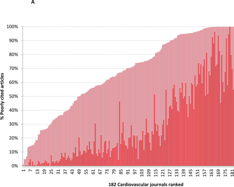
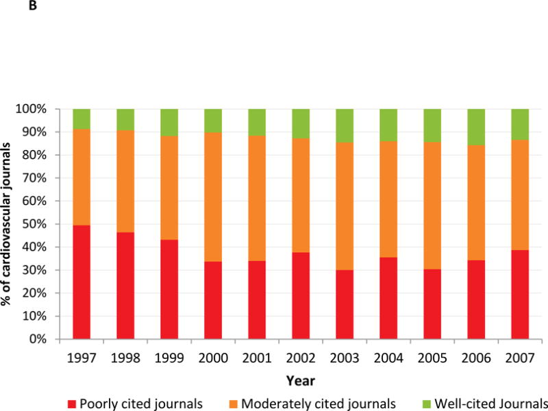
Figure 3.


Figure 3A shows cardiovascular journals ranked by the proportion of poorly cited article content. Journals with the least amount of poorly cited content are placed on the left of the graph (journal 1) and those with the highest proportion of poorly cited content is placed to the right of the graph (journal 182). The red bars indicate the proportion of poorly cited content. The dark red bars indicate the proportion of uncited content; a subset of the poorly cited content. Only journals with at least 20 publications in a given year were included in this analysis. Figure 3B shows the yearly trend in poorly cited journals from 1997 to 2007. The red bars indicate the proportion of poorly cited journals. Orange bars indicate the proportion of moderately cited journals and the green bars indicate the proportion of well cited journals. Only journals with at least 20 publications in a given year were included in this analysis.
