

Abstract
Objective
Given the long natural history of prostate cancer we assessed differing graphical formats for imparting knowledge about the longitudinal risks of prostate cancer recurrence with or without therapy.
Methods
Male volunteers without a history of prostate cancer were randomized to one of eight risk communication instruments that depicted the likelihood of prostate cancer returning or spreading over 1, 2, and 3 years. The tools differed in format (line, pie, bar, or pictograph) and whether the graph also included no numbers, 1 number (indicating the number of affected individuals) or 2 numbers (indicting both the number affected and the number unaffected). The main outcome variables evaluated were graphical preference and knowledge.
Results
A total of 420 men were recruited with respondents being least familiar and experienced with pictographs (p<0.0001) and only 10% preferred this particular format. Overall accuracy ranged from 79-92%, and when assessed across all graphical sub-types the addition of numerical information did not improve verbatim knowledge (p=0.1). Self-reported numeracy was a strong predictor of accuracy of responses ((OR=2.6, p=0.008), and the impact of high numeracy varied across graphical type having a greater impact upon line (OR= 5.1 95%CI [1.6,16],p=0.04) and pie charts (OR=7.1 95%CI [2.6,19],p=0.01) without an impact on pictographs (OR=0.4 95%CI [0.1,1.7], p=0.17) or bar charts (OR=0.5 95%CI [0.1,1.8], p=0.24).
Conclusion
For longitudinal presentation of risk, baseline numeracy was strongly prognostic for outcome. However, The addition of numbers to risk graphs only improved the delivery of verbatim knowledge for subjects with lower numeracy. Although subjects reported the least familiarity with pictographs they were one of the most effective means of transferring information regardless of numeracy.
Introduction
Approximately 10-30% of men who undergo definitive external beam radiation therapy (EBRT) for localized prostate cancer will have evidence of biochemical failure (as defined by rising serologic prostate specific antigen (PSA) level) following treatment over the first 10-years. For men with a rising PSA after RT there is often a need to initiate androgen deprivation therapy (ADT) as salvage treatment. However, because ADT is not curative and has significant side effects, its impact upon quality of life (QOL) is important and must be balanced against its clinical need, especially since the benefit of early initiation of ADT in improving clinical outcome is not clear [1]. Furthermore, men on ADT may experience significant side-effects including bone thinning, body composition changes, increased risk of cardiovascular disease, and cognitive changes [2]. As a result clinicians need to effectively communicate and counsel patients about the balance of risks and benefits from ADT. They also need to make clear that these risks change in relation to the duration of time since their treatment [3].
Discussions with patients about the risks and benefits of ADT are complex. While the presentation of risk and benefit information in numerical formats (e.g., percentages) has been shown to result in accurate verbatim knowledge [4, 5], other research has demonstrated that many Americans have significant difficulty understanding and interpreting numbers [6, 7]. Additionally, the stress and anxiety of a diagnosis can make it even more challenging for patients to understand complex numerical information, which may in turn, negatively affect decision making [8, 9]. Patient educational materials (including patient decision aids) often do not contain visual aids to help convey risk and benefit information [10]. Research shows, however, that under certain circumstances graphs can improve patients' understanding of statistical information [11]. The presentation of risk and benefit information in different formats has a significant impact on how patients evaluate information and may alter outcomes [4, 12-14]. While previous research has shown pictographs (sometimes called icon arrays) lead to improved understanding when numbers are not included with the graph this research has been limited in that it only includes information at one point in time [5, 15-18] which does not represent changing benefit and risk over time for a specific treatment. One previous study by Brundage et al looking at serial quality of life outcomes did report that line graphs with little extraneous data were better than stacked bar graphs in helping subjects to pick which treatment was associated with a better outcome.[19]
Nevertheless, aside from the previous study by Brundage there is little known in regards to the best method for displaying how a risk accrues over time. A risk describes the ratio of events observed in a population over a certain time period. Using survival curves, past research has shown that inattention to time has an impact on the perceived effectiveness of treatment and, therefore, has potential for introducing bias into decision making [20, 21]. Although graphs have been suggested as a method for patients to better understand risk and benefit information, longitudinal risk is not easily displayed in most graphical formats. Therefore, patients are often presented information as lifetime risk, which is often more alarming than interval specific risks and does not adequately inform patients. In fact, it is advised that when presenting cancer-risk statistics it is critical to use relevant time intervals [22]. In the current study we addressed a particular clinical problem, while providing novel insight into how to convey a changing benefit and risk longitudinally over time.
The main outcome of this study was to determine which graphical format (line, pie, bar, or pictograph) improved verbatim knowledge while communicating risk over multiple time periods (e.g., your risk of recurrence in Year 1 is 3%, in Year 2 is 5%, and in Year 3 is 7%) using graphical formats alone or while providing the numeric information about the both the percent of the population at risk and not at risk of recurrence.[23] Secondary outcomes of interest included analysis of the graphical formats most preferred, understood, and familiar for respondents.
Methods
Study Design and Participants
As part of a larger study to develop individually tailored decision aids for men with a rising PSA after radiotherapy for prostate cancer a study was undertaken to evaluate the utility of different graphical tools to confer the longitudinal risk of recurrence over time. A hypothetical prostate recurrence scenario was presented to study participants who were recruited in the waiting areas (family surgical waiting area, cafeteria, etc.) of an academic medical center located in a moderately sized US city. All men specifically did not have a history of prostate cancer. Men were asked to complete the survey if they were 18 years of age or older, could read and understand the English language, and had not been previously diagnosed with prostate cancer. Participants were offered a candy upon completion of the survey.
Procedures
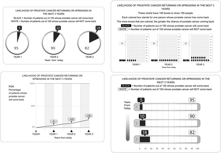
Participants were randomized to 1 of 8 risk communication messages that differed in format (line, pie, bar, or pictograph) and whether the graph included no numbers (pictograph), 1 (number affected individuals only: line, pie graph 1, bar graph 1, and pictograph 1) or 2 numbers (both the number of affected and the number unaffected; pie graph 2, bar graph 2 and pictograph 2. Participants were asked to imagine they had previously had radiation to treat prostate cancer and now had increasing PSA levels which could indicate but was not certain for cancer recurrence [3]. They then viewed 2 graphs that described the likelihood of prostate cancer recurrence either with no treatment or with ADT. In each graph, data about each risk was displayed at 1, 2, and 3 years. Figure 1 shows an example of each of the four graphical presentations, in this case for the risk of recurrence with no treatment while all graphs are shown in Supplementary materials.
Figure 1. Examples of Graphical Formats Presented To Subjects on the Risks of Prostate Cancer Recurrence over Time with and without Androgen Deprivation Therapy.
Outcome Measures
Verbatim Knowledge
We defined relevant verbatim knowledge to be the ability to understand the exact numbers presented. Given difficulty in estimating off from graphical formats and the potential impact of small differences on these outcomes we defined a correct answer as that +/- 1 from the number presented. We assessed patients' verbatim knowledge with 4 questions, as follows: (1) How many people will have their prostate cancer come back in Year 1 if they did not use hormone therapy? (2) How many people will have their prostate cancer come back in Year 2 if they did not use hormone therapy? (3) For people who take hormone therapy, how many people will have their prostate cancer come back in Year 1? and (4) For people who take hormone therapy, how many people will have their prostate cancer come back in Year 3? Note that these questions measured respondents' understanding of the level of risk at different time points but did not assess their perceptions of the pattern of risk over time. Missing data was treated as an incorrect answer.
Numeracy was assessed using the Subjective Numeracy Scale (SNS), an 8-item validated scale that measures respondent experience with numerical tasks, their perceived cognitive ability characterized by how well and how quickly respondents believed they could perform numerical tasks, and their comfort and interest in performing numerical tasks [24, 25].
Respondent Graph Preference, Understanding and Experience
After answering all knowledge questions based upon a single graphical format, respondents were presented with all four types of graphs. They were asked 2 questions that measured their reaction to the graphs: 1) If you had to make an important medical decision and you wanted to learn about its risks and benefits of treatment, which of these ways of presenting the information would you prefer to receive? 2) If you had to make an important medical decision and you wanted to learn about its risks and benefits of treatment, which of these ways of presenting the information would you understand better? Additionally, they were asked to rate their past experience with each of the 4 formats to assess their baseline experience with formats: Please rate how much experience you have had with each of the following graphs before today (answers on 1-5 scale 1=no experience, 5=a lot of experience).
Analysis
In this analysis, the primary independent variable was the risk communication message that was viewed, categorized into eight groups: line with 1 number, pie with 1 number, pie with 2 numbers, bar with 1 number, bar with 2 numbers, or pictograph with no number (not pictured), 1 number or 2 numbers (Figure 1). Descriptive and frequency statistics were performed by demographic variables (education, age, numeracy and race) and risk communication message. Differences in distribution between the groups were tested using a t-test for age and continuous numeracy and a chi-square test for education, race, and categorical numeracy. Respondent preference for graphs and perceived understanding of the graphs was assessed by overall graph format (line, pie, bar or pictograph) and between those with 1 or 2 numbers using Chi-square tests. Logistic models were used to compare verbatim knowledge across graphs viewed for each question and the corresponding Wald chi-square p-values are reported in Table 2. An overall test of all questions was assessed by including all questions for a responder in a logistic general estimating equation and including a repeated structure to account for correlation of the 4 questions for each responder and the corresponding score statistic p-values are reported. The score statistic is analagous to the Wald statitistic but is from general estimating equations. Modeling was done with graph type as the lone independent predictor and then adjusting for demographic covariates, age, race, education, and numeracy.
Table 2. Percent Correct Knowledge by Graph Version.
| Graphical Format (N=420) | How many people will have their prostate cancer come back in Year 1 if they did not use hormone therapy? | How many people will have their prostate cancer come back in Year 2 if they did not use hormone therapy? | For people who take hormone therapy, how many people will have their prostate cancer come back in Year 1? | For people who take hormone therapy, how many people will have their prostate cancer come back in Year 3? | Overall Percent Correct |
|---|---|---|---|---|---|
| Bar graph 1 (54) | 91% | 87% | 87% | 83% | 87% |
| Bar graph 2 (51) | 88% | 86% | 92% | 84% | 88% |
| Line graph 1 (56) | 86% | 71% | 80% | 79% | 79% |
| Pie graph 1 (50) | 84% | 82% | 90% | 86% | 86% |
| Pie graph 2 (54) | 89% | 89% | 87% | 85% | 88% |
| Pictograph (56) | 88% | 84% | 89% | 91% | 88% |
| Pictograph 1 (49) | 82% | 88% | 88% | 90% | 87% |
| Pictograph 2 (50) | 92% | 90% | 94% | 92% | 92% |
| Wald Chi-square p-value | 0.81 | 0.20 | 0.56 | 0.53 | 0.55ˆ |
| Adjusted* Wald Chi-square p-value | 0.46 | 0.28 | 0.49 | 0.66 | 0.35ˆ |
Adjusted by including age, education, race and numeracy as covariates
Score statistic from the logistic GEE repeated measures model
There has been no previous published stratification based upon the SNS numeracy scale. As a result to identify those with low or moderate numeracy as compared to those with high numeracy a cut-off of 5 or more was utilized to define high numeracy, 4 - <5 as medium numeracy and <4 as low numeracy. High and medium groups had similar estimates so they were grouped together for final analysis and ease of presentation. The logistic general estimating equations model was used to determine the impact of numeracy on verbatim knowledge. An interaction between plot type and numeracy was included to determine if numeracy effect differs by plot type. [5]. Estimates of proportion of answers correct reported in the figures were calculated and 95% confidence intervals derived using the Taylor series expansion method to account for clustering by person.
Results
A total of 420 men completed the survey and they had a median age of 52 years (interquartile range [IQR], 36-63 years). Seventy-nine percent of respondents self-identified as white, whereas 6%, 4% and 11% identified as black, Asian or multi/other, respectively, which reflects the demographics of the patient population of the medical center. Fifty-four percent of individuals had at least a Bachelor's degree (Table 1). When analyzing respondent characteristics by study arm, there was no statistical difference between groups based upon demographic characteristics (all p>0.10).
Table 1. Respondent Characteristics.
| Characteristic | Total % (n=420) |
|---|---|
| Age Median (IQR) | 52 (36-63) |
| Education | |
| High School or less | 13% (54) |
| Trade School | 4% (17) |
| Some College | 29% (116) |
| Bachelor's or more | 54% (218) |
| Race | |
| White | 79% (331) |
| Black | 6% (26) |
| Asian | 4% (16) |
| Other | 5% (23) |
| Not Reported | 6% (24) |
| Numeracy* (4% missing) | |
| Median (IQR) | 5.25 (4.5 - 5.625) |
|
| |
| High (5-6) | 55% (231) |
| Medium (4 - <5) | 31% (130) |
| Low (1 - <4) | 10.5% (44) |
Verbatim Knowledge
Verbatim knowledge by question and proportion for each graph version are shown in Table 2. Overall when comparing graph types by overall verbatim knowledge score, graphs with 2 numbers resulted in marginally higher knowledge than graphs with 1 number (OR=1.3 95%CI[0.9,2.5], p=0.10) (Figure 2). When limited to graphs with 2 numbers (pictograph 2, bar graph 2 and pie graph 2), there was no statistical difference between graphs in terms of overall verbatim knowledge. Additionally, there was no difference in overall verbatim knowledge between graph types that only contained 1 number (pie graph 1, bar graph 1, pictograph 1 and line graph 1). When assessing overall verbatim knowledge those randomized to pictographs with 2 numbers demonstrated the best verbatim knowledge, answering correctly 92% (+/- 3% standard error of the mean (SEM) of the time; while those viewing the data in a line graph with 1 number had the poorest verbatim knowledge, answering correctly 79% (+/-4% SEM) of the time (p=0.018) (Table 2). When just focusing on pictographs the addition of numbers did result in a statistically significant improvement in accuracy which was 88% (+/-4% SEM) with no numbers, 87% (+/- 3% SEM) with one number and 92% (+/-3% SEM) with 2 numbers.
Figure 2. Overall Correct Response Rate as A Function of Numeracy and Graphical Format.

N= The Number of Responses for Each Graphical Type
Low= Low numeracy (bottom 10%)
High= Moderate or High Numeracy (from 10th to 100th percentile)
Values represent the mean percent correct (+/- standard deviation) for each sub-group
The influence of graphical format and the inclusion of numeracy self-assessment information on verbatim knowledge were also assessed (Figure 2). Increasing numeracy as a continuous variable was significantly associated with overall verbatim knowledge (OR=1.5 95%CI[1.2,1.8]; p=0.001). To clarify potential interactions between numeracy and graph type, we parsed our sample into high, medium and low numeracy groups based upon the scoring distribution. Overall this was a highly educated sample with 87% having more than a high-school education. There was no difference in outcome between high (>5) and medium (4-5) numeracy groups that were, therefore, combined in order to make comparisons to those with low (<4) numeracy. Not surprisingly, those with high or medium numeracy had significantly higher odds of having correct knowledge responses than those with low numeracy (OR=2.8 95%CI [1.6,4.9]; p=0.006). The effect of numeracy did not differ by the addition of numbers on the graph when assessed for all graphical formats (p=0.13). However, there was an association between numeracy and graph type (Figure 2). Numeracy was significantly associated with knowledge response for line graphs (OR= 5.1 95%CI [1.6,16],p=0.04) and pie charts (OR=7.1 95%CI [2.6,19],p=0.01) without an impact on pictographs (OR=0.4 95%CI [0.1,1.7], p=0.17) or bar charts (OR=0.5 95%CI [0.1,1.8], p=0.24) (Figure 2). When assessed further those with medium/high numeracy had similar chances of answering correctly across all graphical sub-types and numeric representations (Figure 3, right panel). However, in those with lower numeracy there was a trend towards more accurate responses when presented with numbers in addition to the graphical format in particular for those presented with line and pie graphs (Figure 3, left panel). In contrast, for those presented with pictographs there did not appear to be differences in response based upon the presence or absence of numbers. Nevertheless, with the small sample size with low numeracy these trends were not statistically significant when broken down by graphical format.
Figure 3. Overall Correct Response Rate as A Function of Numeracy, Graphical Format, and the Number of Numbers Presented on the Graphical Presentation.

N= The Number of Responses for Each Graphical Type
Low= Low numeracy (bottom 10%)
High= Moderate or High Numeracy (from 10th to 100th percentile)
Values represent the mean percent correct (+/- standard deviation) for each sub-group
Graph Experience, Preference, and Understanding
Participants indicated that they were highly familiar with bar, line and pie graphs (median rating of 4.0, 4.0 and 5.0, respectively) and least familiar with pictographs (median rating 3.0, p<0.0001). Respondents with high numeracy reported significantly more experience with all graph formats (line (high=5 vs low=3), bar (high=5 vs low=3), pie (high=5 vs low=3), and pictographs (high=3 vs low=2) (each p<0.003)). However, as shown in Table 3 there was no significant difference between numeracy groups and their graph preference (p=0.72) or their graph understanding (p=0.93). When asked about specific graph types, 31%, 27%, and 25% of respondents would prefer to learn about risk and benefits of ADT treatment using a bar, pie, and line graph, respectively. This was similar to 29%, 26% and 27% of respondents who answered that they would better understand risks and benefits of ADT treatment with bar, pie, and line graph, respectively. Only 10% of individuals answered that they would prefer or that they would better understand risks and benefits of ADT treatment using a pictograph (both, p<0.0001). Overall respondents had the least experience with pictographs and felt that they preferred and understood them the least regardless of whether they were randomized to surveys with line, bar, pie or pictographs and the presence of 1 or 2 numbers.
Table 3. Experience, Perceived Ability to Understand, and Preference for Different Graphical Sub-Types Based Upon Numeracy.
| Overall | Low Numeracy | High/Med Numeracy | p-value | |
|---|---|---|---|---|
| EXPERIENCE WITH GRAPHICAL TYPE | ||||
| Bar Graph | <0.0001 | |||
| High Experience* | 263 (68%) | 12 (30%) | 251 (73%) | |
| Low Experience* | 121 (32%) | 28 (70%) | 93 (27%) | |
| Line Graph | <0.0001 | |||
| High Experience | 274 (72%) | 10 (25%) | 264 (77%) | |
| Low Experience | 108 (28%) | 30 (75%) | 78 (23%) | |
| Pictograph | .003 | |||
| High Experience | 155 (41%) | 7 (18%) | 148 (44%) | |
| Low Experience | 220 (59%) | 31 (82%) | 189 (56%) | |
| Pie | <0.0001 | |||
| High Experience | 278 (73%) | 13 (33%) | 265 (77%) | |
| Low Experience | 103 (27%) | 26 (67%) | 77 (23%) | |
| PERCEIVED ABILITY TO UNDERSTAND GRAPHICAL TYPE | 0.93 | |||
| Bar | 122 (32%) | 15 (37.5%) | 107 (31%) | |
| Line | 113 (29%) | 8 (20%) | 105 (31%) | |
| Pictograph | 42 (11%) | 3 (7.5%) | 39 (11%) | |
| Pie | 107 (28%) | 14 (35%) | 93 (27%) | |
| PREFERENCE TO RECEIVE INFORMATION IN GRAPHICAL TYPE | 0.72 | |||
| Bar | 129 (33%) | 15 (37.5%) | 114 (33%) | |
| Line | 105 (27%) | 6 (15%) | 99 (29%) | |
| Pictograph | 40 (10%) | 5 (12.5%) | 35 (10%) | |
| Pie | 112 (29%) | 14 (35%) | 98 (28%) | |
High Experience defined as a 4 or 5 on a scale from 1 to 5 while Low Experience was defined as a 1, 2, or 3 on a scale from 1 to 5
Discussion
To our knowledge, this is the first study evaluating the impact of graphical format on subjects' perception and understanding of longitudinal risk with and without androgen deprivation therapy for biochemically recurrent prostate cancer. Our results suggest that for longitudinal data, graphical format may not be as critical for ensuring knowledge of risk at different time periods as compared to that using a single time-point especially when numbers are explicitly included with the graphs. In addition, these results also highlight that patient familiarity and ease of use may not necessarily correlate with accurate presentation of information. Specifically, while participants reported less familiarity and preference for pictographs, knowledge was highest among those receiving pictographs. Nevertheless, there were modest differences in overall conveyance of verbatim information across all 8 graphical types that may have been influence by the overall educated sample, which had high numeracy. Nevertheless, the results seemed to favor graphical formats with the addition of numbers being most effective especially in the lower numeracy group.
In a previous study looking at the ability of graphical format to convey information Feldman-Steward et al found that for making a decision or choice between two options vertical bar graphs, horizontal bar graphs, and pictographs (what they called systematic ovals) had equal utility while pie charts and random ovals took longer to assess and were less accurate (4). In contrast, they further found that when attempting to estimate precise numbers (which we have termed verbatim knowledge) just presenting the raw numbers in a tabular form or using pictographs led to the most accurate estimates. Brundage et al had subjects identify which of two different hypothetical treatments was likely to be associated with a better quality of life, and they found that line graphs were interpreted most accurately for this general or gist comparison. However, our study differed from Brundage et al in several important ways. First, Brudage et al did not include pictographs in their analysis. Second, we chose to focus on verbatim, rather than gist [23], knowledge as previous studies have found relatively small differences in gist knowledge across graphs. [26, 27] In the current study we did not evaluate gist knowledge and focused only upon verbatim knowledge. In this setting our results concur with those of Feldman-Stewart et al in that we found that for accurate assessment of verbatim information line and pie graphs performed most poorly, particularly in those with lower numeracy, but bar graphs and pictographs resulted in the best knowledge.
Our study replicates previous studies that demonstrated pictographs were the most effective tool for demonstrating risk and benefit information to patients at a specific point in time [5, 15-18]. Tait et al. [18] surveyed 4,685 parents to examine the optimal method of presenting pediatric risk/benefit information using text, tables, and pictographs and demonstrated that pictographs were associated with greater likelihood of verbatim and gist knowledge. Of note they did not utilize line graphs as they were assessing a single time-point and not a longitudinal risk over time which would contrast with Brundage et al who found line graphs optimal for this longitudinal gist task. Similarly, Hawley et al. [5] demonstrated pictographs to be the best format for graphical presentation of shared decision making after administering a survey to 2,412 participants as it was the only graphical format that led to both high verbatim and gist knowledge. Using graphs in patient education tools has been shown to improve perception, understanding, and interpretation of risk information when compared to text/number formats (27, 28). Verbatim knowledge is also improved when raw numbers are presented. Our addition of numbers to graph formats was not done in many other studies and may explain why the type of graphical format was less important than previously observed. Hawley et al. (5), found that numeric tables were more effective at conveying verbatim knowledge than were multiple graphical formats. However, the graphs in that study did not include any numbers (similar to our Pictograph 0 condition), which may have led to this finding.
Conveying medical risk and benefit information to those with low numeracy can be problematic (7, 9, 21). Garcia-Retamero and Galesic (29) demonstrated large improvements in risk accuracy when pictographs (which they termed icon arrays) were used in addition to numerical information. Importantly, these visual aids were most effective for the participants who had low numeracy. Our results confirm these aforementioned studies and additionally, we demonstrated that adding numeric information to graphical formats such as line and pie graphs may help those with low numeracy to make informed decisions.
Although the findings from this study are novel for the presentation of risk at multiple time points in this hypothetic patient population, they should be interpreted in light of several limitations. First, this sample may not represent the normal distribution of patients who develop a potential prostate recurrence following radiation therapy. The median age of 52 years of respondents is younger than those who typically receive radiation therapy for prostate cancer, which is approximately 69 years old and thus are likely in their mid-70's when experiencing a recurrence (30). Additionally, almost all of our subjects (98%) received at least a high-school education which is higher than national averages. However, it was not the purpose of this study to achieve representative sampling of those with prostate cancer but to compare and contrast the impact of different graphical formats with and without numbers using longitudinal risk information. In the current study subjects were randomly assigned different formats, thus decreasing the impact of confounding variables. Secondly, this sample represents a cohort of normal male volunteers presented with a hypothetical treatment scenario. Past studies have shown that stress and anxiety have an impact on decision making ability (8, 9); therefore, these results need to be validated and confirmed among patients who are making treatment decisions in regards to ADT when faced with recurrent prostate cancer where anxiety is anticipated to be greater (8). Nevertheless, our results which are in accordance with previous studies using a single time-point suggest that for longitudinal risk data the use of a pictograph that also includes numeric data about those both at risk and not at risk may be the ideal format to convey verbatim knowledge. Finally, although the current study found less of an impact of different graphical formats, it was significantly smaller than previous studies where graphical format was found to be important and this study did not assess gist knowledge. The current study was designed and powered to detect large differences in verbatim knowledge and although some differences would appear clinically significant between graph format for verbatim knowledge, they were not statistically significant. This was likely due to the small sample size between each format type. As a result the current analysis may in part simply be limited by sample size, although we did show confirmatory findings similar to those seen in larger studies (5, 18).
Conclusion
For longitudinal presentation of data using graphical formats the addition of numbers did not improve the overall accuracy for the population as a whole; however, patients with lower numeracy had the most difficulty in accurately answering questions across a broad range of graphical formats, and the addition of numeric information did improve accuracy. Although subjects reported the least familiarity with pictographs they were one of the most effective means of transferring information when accompanied by numeric information. Given the previous studies suggesting that pictographs provide optimal conveyance of gist and verbatim information, the current analysis would suggest that pictographs with associated numbers both at risk and not at risk may provide an optimized means to convey both gist and verbatim knowledge particularly in a longitudinal scenario. Nevertheless, when numbers were included in graph legends, the type of graph had less influence upon verbatim knowledge. This may provide more leeway to decision aid developers in regards to what graph they include in decision aids.
Practice Implications
These findings have important implications for communicating risk and benefit information to patients with prostate cancer, as well as other health conditions. A rising PSA after radiation therapy is a very early indicator of recurrence although there is not clear evidence that early intervention at the time of a rising PSA increases patient survival. However, given risks of disease progression and risks of treatment side-effects patients are faced with a significant clinical dilemma. Previously, uncertainty and the perception of danger related to aspects of prostate cancer control were shown to be associated with treatment satisfaction and outcome. [28] Analysis of 328 participants in the Prostate Cancer Outcomes and Satisfaction with Treatment Quality Assessment (PROSTQA) demonstrated that following treatment for localized prostate cancer, uncertainty was associated with a greater perception of danger (p<0.001) and that as both variables increased, treatment satisfaction decreased (p<0.001). These conclusions suggest that improved patient educational tools are necessary for men undergoing treatment for prostate cancer and that a successful intervention may lead to both decreased uncertainty and improved patient satisfaction. This is especially true in the context of ADT where treatment is often initiated at time of cancer recurrence and the patient's perception of danger and uncertainty may be more prevalent. Dale et al. [8], conducted a prospective study of patients with prostate cancer who experienced biochemical recurrence and demonstrated that the initiation of ADT occurred earlier in men who had higher levels of prostate cancer specific anxiety. In fact prostate cancer specific anxiety (but not general anxiety) was the strongest predictor of later use of ADT having a greater impact than clinically significant prognostic factors. As a result, means to more effectively convey the risks and benefits of both the disease and the therapy may lessen the impact of this anxiety. Together, these studies identify potential targets (uncertainty, a subjective sense of danger, and prostate cancer anxiety) for intervention and identify future directions for design and implementation of educational tools in this patient population.
Supplementary Material
Acknowledgments
Financial support for this study was provided by a grant from the University of Michigan Center for Health Communication Research (CHCR) to Daniel A. Hamstra, MD, PhD. CHCR is funded by the NCI's Center of Excellence in Cancer Communication Research (P50 CA101451). The funding agreement ensured the authors' independence in designing the study, interpreting the data, writing, and publishing the report.
References
- 1.Souhami L, et al. Timing of salvage hormonal therapy in prostate cancer patients with unfavorable prognosis treated with radiotherapy: a secondary analysis of Radiation Therapy Oncology Group 85-31. Int J Radiat Oncol Biol Phys. 2010;78(5):1301–6. doi: 10.1016/j.ijrobp.2009.10.007. [DOI] [PubMed] [Google Scholar]
- 2.Saylor PJ, Keating NL, Smith MR. Prostate cancer survivorship: prevention and treatment of the adverse effects of androgen deprivation therapy. J Gen Intern Med. 2009;24 Suppl 2:S389–94. doi: 10.1007/s11606-009-0968-y. [DOI] [PMC free article] [PubMed] [Google Scholar]
- 3.Taylor JM, Yu M, Sandler HM. Individualized predictions of disease progression following radiation therapy for prostate cancer. J Clin Oncol. 2005;23(4):816–25. doi: 10.1200/JCO.2005.12.156. [DOI] [PubMed] [Google Scholar]
- 4.Feldman-Stewart D, Brundage MD, Zotov V. Further insight into the perception of quantitative information: judgments of gist in treatment decisions. Med Decis Making. 2007;27(1):34–43. doi: 10.1177/0272989X06297101. [DOI] [PubMed] [Google Scholar]
- 5.Hawley ST, et al. The impact of the format of graphical presentation on health-related knowledge and treatment choices. Patient Educ Couns. 2008;73(3):448–55. doi: 10.1016/j.pec.2008.07.023. [DOI] [PubMed] [Google Scholar]
- 6.Lipkus IM, Samsa G, Rimer BK. General performance on a numeracy scale among highly educated samples. Med Decis Making. 2001;21(1):37–44. doi: 10.1177/0272989X0102100105. [DOI] [PubMed] [Google Scholar]
- 7.Peters E, et al. Numeracy skill and the communication, comprehension, and use of risk-benefit information. Health Aff (Millwood) 2007;26(3):741–8. doi: 10.1377/hlthaff.26.3.741. [DOI] [PubMed] [Google Scholar]
- 8.Dale W, et al. Patient anxiety about prostate cancer independently predicts early initiation of androgen deprivation therapy for biochemical cancer recurrence in older men: a prospective cohort study. J Clin Oncol. 2009;27(10):1557–63. doi: 10.1200/JCO.2008.18.5850. [DOI] [PMC free article] [PubMed] [Google Scholar]
- 9.Fagerlin A, et al. Making numbers matter: present and future research in risk communication. Am J Health Behav. 2007;31 Suppl 1:S47–56. doi: 10.5555/ajhb.2007.31.supp.S47. [DOI] [PubMed] [Google Scholar]
- 10.Fagerlin A, et al. Patient education materials about the treatment of early-stage prostate cancer: a critical review. Ann Intern Med. 2004;140(9):721–8. doi: 10.7326/0003-4819-140-9-200405040-00012. [DOI] [PubMed] [Google Scholar]
- 11.Elwyn G, et al. Developing a quality criteria framework for patient decision aids: online international Delphi consensus process. BMJ. 2006;333(7565):417. doi: 10.1136/bmj.38926.629329.AE. [DOI] [PMC free article] [PubMed] [Google Scholar]
- 12.Edwards A, et al. Presenting risk information to people with diabetes: evaluating effects and preferences for different formats by a web-based randomised controlled trial. Patient Educ Couns. 2006;63(3):336–49. doi: 10.1016/j.pec.2005.12.016. [DOI] [PubMed] [Google Scholar]
- 13.Schapira MM, Nattinger AB, McAuliffe TL. The influence of graphic format on breast cancer risk communication. J Health Commun. 2006;11(6):569–82. doi: 10.1080/10810730600829916. [DOI] [PubMed] [Google Scholar]
- 14.Timmermans DR, Ockhuysen-Vermey CF, Henneman L. Presenting health risk information in different formats: the effect on participants' cognitive and emotional evaluation and decisions. Patient Educ Couns. 2008;73(3):443–7. doi: 10.1016/j.pec.2008.07.013. [DOI] [PubMed] [Google Scholar]
- 15.Price M, Cameron R, Butow P. Communicating risk information: the influence of graphical display format on quantitative information perception-Accuracy, comprehension and preferences. Patient Educ Couns. 2007;69(1-3):121–8. doi: 10.1016/j.pec.2007.08.006. [DOI] [PubMed] [Google Scholar]
- 16.Burkell J. What are the chances? Evaluating risk and benefit information in consumer health materials. J Med Libr Assoc. 2004;92(2):200–8. [PMC free article] [PubMed] [Google Scholar]
- 17.Fagerlin A, Wang C, Ubel PA. Reducing the influence of anecdotal reasoning on people's health care decisions: is a picture worth a thousand statistics? Med Decis Making. 2005;25(4):398–405. doi: 10.1177/0272989X05278931. [DOI] [PubMed] [Google Scholar]
- 18.Tait AR, et al. The effect of format on parents' understanding of the risks and benefits of clinical research: a comparison between text, tables, and graphics. J Health Commun. 2010;15(5):487–501. doi: 10.1080/10810730.2010.492560. [DOI] [PMC free article] [PubMed] [Google Scholar]
- 19.Brundage M, et al. Communicating quality of life information to cancer patients: a study of six presentation formats. Journal of clinical oncology: official journal of the American Society of Clinical Oncology. 2005;23(28):6949–56. doi: 10.1200/JCO.2005.12.514. [DOI] [PubMed] [Google Scholar]
- 20.Zikmund-Fisher BJ, Fagerlin A, Ubel PA. What's time got to do with it? Inattention to duration in interpretation of survival graphs. Risk Anal. 2005;25(3):589–95. doi: 10.1111/j.1539-6924.2005.00626.x. [DOI] [PubMed] [Google Scholar]
- 21.Zikmund-Fisher BJ, Fagerlin A, Ubel PA. Mortality versus survival graphs: improving temporal consistency in perceptions of treatment effectiveness. Patient Educ Couns. 2007;66(1):100–7. doi: 10.1016/j.pec.2006.10.013. [DOI] [PubMed] [Google Scholar]
- 22.Fagerlin A, Zikmund-Fisher BJ, Ubel PA. Helping patients decide: ten steps to better risk communication. J Natl Cancer Inst. 2011;103(19):1436–43. doi: 10.1093/jnci/djr318. [DOI] [PMC free article] [PubMed] [Google Scholar]
- 23.Reyna VF. A theory of medical decision making and health: fuzzy trace theory. Medical decision making: an international journal of the Society for Medical Decision Making. 2008;28(6):850–65. doi: 10.1177/0272989X08327066. [DOI] [PMC free article] [PubMed] [Google Scholar]
- 24.Zikmund-Fisher BJ, et al. Validation of the Subjective Numeracy Scale: effects of low numeracy on comprehension of risk communications and utility elicitations. Med Decis Making. 2007;27(5):663–71. doi: 10.1177/0272989X07303824. [DOI] [PubMed] [Google Scholar]
- 25.Fagerlin A, et al. Measuring numeracy without a math test: development of the Subjective Numeracy Scale. Med Decis Making. 2007;27(5):672–80. doi: 10.1177/0272989X07304449. [DOI] [PubMed] [Google Scholar]
- 26.Hawley ST, et al. The impact of the format of graphical presentation on health-related knowledge and treatment choices. Patient education and counseling. 2008;73(3):448–55. doi: 10.1016/j.pec.2008.07.023. [DOI] [PubMed] [Google Scholar]
- 27.Tait AR, et al. The effect of format on parents' understanding of the risks and benefits of clinical research: a comparison between text, tables, and graphics. Journal of health communication. 2010;15(5):487–501. doi: 10.1080/10810730.2010.492560. [DOI] [PMC free article] [PubMed] [Google Scholar]
- 28.Kazer MW, et al. Uncertainty and perception of danger among patients undergoing treatment for prostate cancer. BJU Int. 2013;111(3 Pt B):E84–91. doi: 10.1111/j.1464-410X.2012.11439.x. [DOI] [PMC free article] [PubMed] [Google Scholar]
Associated Data
This section collects any data citations, data availability statements, or supplementary materials included in this article.