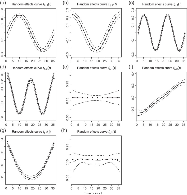
Fig. 3.
Fitted principal components curves for  simulated data sets: (a) and (b) principal components curves
  and
and  , (c) and (d) principal components curves
  and
and  , (e) and (f) principal components curves
  and
and  , (g) and (h) principal components curves
  and
and  . Dotted lines denote true curves. Solid lines represent the averaged values of fitted curves. The upper and lower dashed lines are the 10% and 90% quantiles of the fitted values in 500 simulation studies.

