Abstract
On April 2nd, 2014, the Department of Health and Human Services (HHS) announced a historic policy in its effort to increase the transparency in the American healthcare system. The Center for Medicare and Medicaid Service (CMS) would publicly release a dataset containing information about the types of Medicare services, requested charges, and payments issued by providers across the country. In its release, HHS stated that the data would shed light on “Medicare fraud, waste, and abuse.” While this is most certainly true, we believe that it can provide so much more. Beyond the purely financial aspects of procedure charges and payments, the procedures themselves may provide us with additional information, not only about the Medicare population, but also about the physicians themselves. The procedures a physician performs are for the most part not novel, but rather recommended, observed, and studied. However, whether a physician decides on advocating a procedure is somewhat discretionary. Some patients require a clear course of action, while others may benefit from a variety of options. This article poses the following question: How does a physician's past experience in medical school shape his or her practicing decisions? This article aims to open the analysis into how data, such as the CMS Medicare release, can help further our understanding of knowledge transfer and how experiences during education can shape a physician's decision's over the course of his or her career. This work begins with an evaluation into similarities between medical school charges, procedures, and payments. It then details how schools' procedure choices may link them in other, more interesting ways. Finally, the article includes a geographic analysis of how medical school procedure payments and charges are distributed nationally, highlighting potential deviations.
Key words: : big data analytics, data acquisition and cleaning, data mining
Introduction
Upon graduation from college, an aspiring medical professional would approximately spend an additional 10 years in medical training.1 It is evident that a substantial amount of knowledge is instilled in the students during this extended training time. However, prior work has suggested that the knowledge may not be completely clinical, detailing the existence of an unwritten set of rules that govern the actions and development of medical students known as the “informal” or “unintended” curriculum.2,3 While these rules have been shown to affect student's personal and moral development, they appear to extend to professional decisions as well.4–6
If experiences throughout medical school can have such a pronounced effect on a physician's personal and career development, it then raises another interesting question: Do influential experiences during training reach further than career trajectory, extending into the physician's practice decisions including procedure choices and pricing? We consider the following three statistics around practice decisions in this article: total quantity of procedures performed; average charge billed; and average payment received for each procedure aggregated from all physicians who attended the respective school. Can we leverage the variety in “big data” to gain such additional insights? It has already been established that a physician's characteristics such as age, prior experience, and salary structure have an influence on his or her overall practice patterns and hospital utilization.7,8 A study by Feinglass et al. also noted that significant differences between physicians' service intensity, including the ordering of laboratory tests, may be related to differences in teaching philosophy or practice patterns.9 Furthermore, there is psychological support for the notation that these preferences are constructed over an extended period of time and through past experiences.10 Thus, the concept of “preference construction” forms the basis for this work, whereby we present the idea that early influences during medical school may have lasting impacts on a physician's future clinical decisions.
This article is a data science endeavor that goes through the process of data integration from disparate sources to delivering answers to posited questions around clinical practices.
Materials and Methods
We supplemented the April 2014 Center for Medicare and Medicaid Service (CMS) physician compare data with CMS and external data sources for our analyses.11
CMS data
The CMS physician compare dataset contained records for approximately 877,000 physicians.12 Each record contained 40 features, including information on the physician's national provider identifier (NPI) and medical school attended.13 While the physician compare dataset provided details about medical school affiliation, a secondary source also provided by CMS, known as the CMS Medicare provider utilization and payment dataset, provided the procedural data.14 This dataset provided detailed procedural information for each physician, including quantity of procedures performed, average charge billed, and average payment received per procedure. It contained 5,949 unique procedure codes documented with the Healthcare Common Procedures Coding System (HCPCS). We linked the two CMS datasets.
External data
Although detailed, the two CMS datasets lacked sufficient detail to perform the analysis required in this work, prompting the use of two external data sources. First, while the physician compare data provided the medical school affiliation of each physician, it did not contain the medical school locations, required for the geographic analysis. To obtain this data, the zip code of each medical school was backfilled. This process required significant effort, as a percentage of schools were defunct or had been acquired by other medical schools. Investigation into the location for these schools required the usage of historical records, newspaper articles, and medical school announcements. For acquired schools, the original zip code was used when available. In a limited set of cases, no zip code was available for a defunct school, and a central zip code for the residing state was used. Second, the Association of American Medical Colleges Tuition and Student Fees Reports (circa 2012) was used to obtain the tuition costs for each school.15
Data preprocessing
First, utilizing the physician's NPI, the corresponding medical schools were attached to each physician's cost and procedure records from the Medicare provider utilization and payment dataset. In the rare case where a physician's procedural and cost data did not match a medical school, the instance was removed. It should be noted that some physicians had a medical school listed as “Other,” likely indicating a non-U.S. medical school. While the data was maintained for accuracy, this group was not considered in our analysis, as it provided no reference for further analysis. Next the data was aggregated based on medical school. Utilizing each provider's cost and procedure record, 5,949 instances were created for each medical school in the dataset. Each instance represented a procedure code, containing the total quantity of procedures performed, average charge billed, and average payment received for each procedure aggregated from all physicians who attended the respective school.
Procedure code significance testing
One of the primary goals of our analysis was to identify differences among the three statistics (total quantity performed, average charge billed, and average payment received) among schools. As such, it was important to identify which procedure codes were performed at statistically significantly higher quantities, and charged or paid at statistically significantly higher dollar amounts, and which were the result of normal variance between institutions. In order to determine these significance levels, a 10,000-iteration Fisher–Yates shuffle was performed at a 95% significance level.16 These Fisher–Yates tests were performed for each of the three procedure statistics in question. For the charge billed and payment received statistics, only those schools that recorded an average value greater than 0 were considered as these were the schools that performed any of the procedure, and the inclusion of 0 values in the shuffled array would incorrectly skew the mean dollar value of the shuffled array downward, and produce a biased z-score. Conversely, when evaluating the significance for the quantity of procedures performed, all school values—including 0—were used within the shuffle as performing no instances of a procedure is a valid attribute of an institution.
Analysis methods
Three distinct analyses were evaluated throughout this work. The first is an evaluation of the Fisher–Yates significance testing results (distribution analysis). The second is an analysis of school similarity based on the specific procedure codes identified as significant for an institution over each of the three procedure statistics (school similarity analysis). The third is a geographic analysis investigating the location of schools based on the quantity of procedures billed or charged significantly higher (geographic distribution analysis).
Distribution analysis
We began our analysis by performing a detailed examination of the Fisher–Yates results for each of the three procedure statistics. Due to the large number of procedural codes (5,949), it became apparent that the Fisher–Yates shuffling identified at least 1 procedure code as significant for the majority of schools in each of the 3 statistics. This observation is noteworthy as it highlights the fact that the majority of medical schools have alumni that performed a procedure a statistically higher number of times, charged a significantly higher dollar amount, or received a significantly higher payment for at least one of the 5,949 procedure codes than alumni of other institutions. Thus, as the presence of a single significant procedure cannot be used to differentiate schools, we decided to take the analysis one step further, identifying those schools with a statistically higher number of significant procedures. These schools were identified using standard outlier detection at a threshold of 1.5 times over/under the interquartile range (IQR), and denoted as of interest.
School similarity analysis
Next, we performed a similarity comparison between each school. For each of the 3 statistics, a 5,949-element vector was constructed for each medical school, representing each of the possible procedure codes. For a given school, each vector element was populated with a 1 if the respective procedure was found to be significant through the Fisher–Yates testing and a 0 otherwise. For example, for the charges-billed statistic, a school's procedure vector would be populated with 1's if the school charged a significantly higher dollar amount for that procedure than other institutions. Once all of the vectors had been created, an all-pairs comparison was performed between each of the school's vectors, for each of the three statistics, using the Spearman rank-order correlation coefficient. The Spearman correlation was utilized over the Pearson correlation, as it does not require the variables to be normally distributed.17,18 This was an important consideration, and as we construct these vectors from the Fisher–Yeats shuffle results, and not from a distribution, we can guarantee the normality assumption.
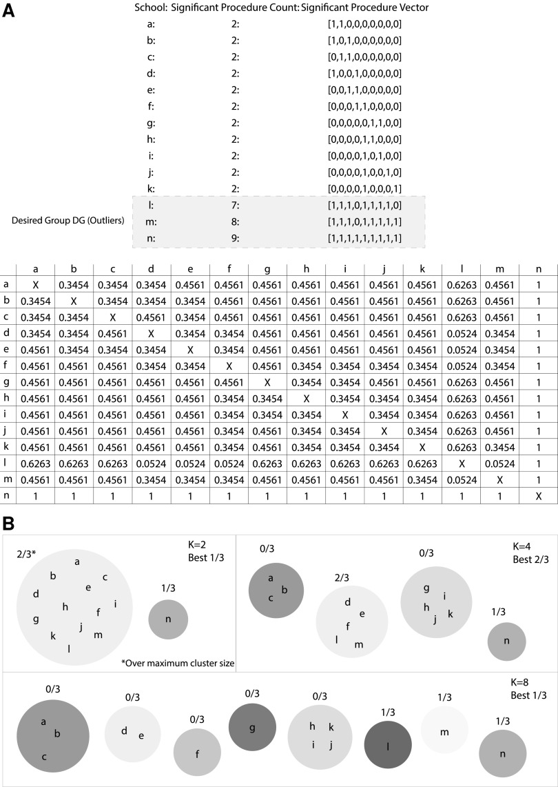
With over 5,000 possible procedural codes, the significant procedures vectors can be quite sparse. As a result, the Spearman correlation coefficients exhibit minimal variance between schools, making differentiation between schools difficult. However, since the vectors are so large, the p-value associated with each correlation can still be statistically significant even if the correlation value itself would be typically considered low. A theoretical example utilizing 14 schools and 9 possible procedure codes can be found in Figure 1A. The results of a theoretical Fisher–Yeats shuffle indicate the significant procedures for each school and can be found in the “Significant Procedure Vector” column. Below we find a table of p-values resulting from the all-pairs Spearman correlation calculation.
FIG. 1.
Clustering procedure example.
Utilizing the results of the similarity comparison, the correlation p-values were then clustered using a standard k-means algorithm. The algorithm was seeded and initialized with 10 unique seeds to help protect against local minima, and the optimal cluster count was obtained through a sweep of 10–100 clusters. For each value k, clustering was evaluated in the following manner. Based on the procedure statistic being evaluated, the set of schools marked as of interest (those outside of 1.5×IQR for the statistic using the count of significant procedures based on the Fisher–Yates test) from the distribution analysis were selected for that statistic and labeled as the “Desired Group” (DG). Each k was scored as the maximum percentage of the DG within any cluster. Finally, to prevent a single cluster from performing well simply by encapsulating a majority of schools, the constraint that no cluster could contain more than 30 schools was imposed. The highest scoring k-value was deemed optimal for each of the three statistics. Utilizing the sample school vectors from Figure 1A, an example of the clustering and evaluation process can be found in Figure 1B.
Geographic distribution analysis
The final analysis investigated the geographic distributions of the average charges and payments using the zip code of each medical school. To begin, each school location was transformed into latitude and longitude coordinates. As noted above, most schools had at least one significant procedure code for each of the two statistics (average charge billed and average payment received), and thus a geographic comparison between them may not be very meaningful, as both would encompass the same geographic space. To account for this effect, we partitioned the data based on the quantity of significant procedure codes, that is, those locations in the upper 25%, 50%, and 75% of the overall significant procedures for both statistics.
At each partition level, the valid locations for charges billed were marked as node type A, and payments received type B. Next, a modified Fisher–Yates shuffle was used, where the node markings are shuffled between the locations. Then, the Gcross algorithm (a nearest-neighbor distance function between two point types) is run as a measure of geographic distribution.19–21 The window geometry was bound to the latitude and longitude coordinates of the United States. However, due to the irregular window geometry, Gcross should be run with edge corrections, and for this evaluation both the Boarder correction (reduced sample) and Kaplan–Meier corrections were calculated.22,23 The average Gcross value of all points from each shuffle was stored and used to compute a z-score using the average Gcross score of the unmodified distribution values, representing the significance in geographic distribution deviation.
Results
While, due to the word limit, a detailed analysis across all parameters could not be included in the article, we have released all of our results for public use at the link provided.24 The results below highlight interesting cases encountered through our analyses. A discussion of the school similarity and geographic distribution results can be found in detail in sections titled “Are school's procedures indicative of additional implicit features?” and “Do charges and payments follow similar geographic distributions?” respectively.
Distribution analysis
The distributions for the count of significant codes for each statistics found through Fisher–Yates testing can be seen in the histograms in Figure 2A–C. Figure 2D–F represents the distribution of count frequencies, that is, how many schools had a specific number of significant procedures. These figures clearly demonstrate the right-tailed distribution that supports the utilization of the outlier detection to form the DG for each of the statistics from the clustering method. The top 5 schools identified as of interest for each of the statistics are in Table 1. The complete list is available on the supplementary website.
FIG. 2.
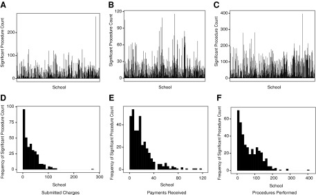
Significant procedure count distribution.
Table 1.
Top 5 outlier schools
| Charges billed | Payments received | Procedures performeda |
|---|---|---|
| University of Wisconsin Medical School | State University of New York Downstate Medical Center | Other |
| Cornell University Medical College | New York University Medical College | University of Nebraska College of Medicine |
| University of Illinois at Chicago Health Science Center | Albert Einstein College of Medicine of Yeshiva University | Johns Hopkins University School of Medicine |
| Mount Sinai School of Medicine of City University of New York | New York College of Osteo Medicine of New York Institute of Technology | Columbia University College of Physicians and Surgeons |
| Medical College of Wisconsin | Mount Sinai School of Medicine of City University of new York |
Only four schools were calculated as outliers in significant procedure count.
Another principal result of the Fisher–Yates test was the ability to investigate not only the distribution, but also the specific significant procedures for each school. To demonstrate this, Table 2 details the procedures performed at higher total quantity by the Pacific University College of Optometry. As would be expected, the alumni of this school perform eye-related procedures more than physicians graduating from other institutions.
Table 2.
Significant procedures (total quantity performed): Pacific University College of Optometry
| HCPCS code | HCPCS code description |
|---|---|
| 76514 | Echo exam of eye thickness |
| 92004 | Eye exam new patient |
| 92012 | Eye exam established patient |
| 92014 | Eye exam & treatment |
| 92083 | Visual field examination(s) |
| 92133 | Cmptr ophth img optic nerve |
| 92250 | Eye exam with photos |
| 92002 | Eye exam new patient |
| 92134 | Cptr ophth dx img postsegmt |
| 92225 | Special eye exam initial |
| 92082 | Visual field examination(s) |
| 95930 | Visual evoked potential test |
| 92081 | Visual field examination(s) |
| 96150 | Assess hlth/behave init |
| 96152 | Intervene hlth/behave indiv |
| 92286 | Internal eye photography |
| 76516 | Echo exam of eye |
| 92100 | Serial tonometry exam(s) |
| 92065 | Orthoptic/pleoptic training |
| 92284 | Dark adaptation eye exam |
HCPCS, Healthcare Common Procedures Coding System.
School similarity analysis
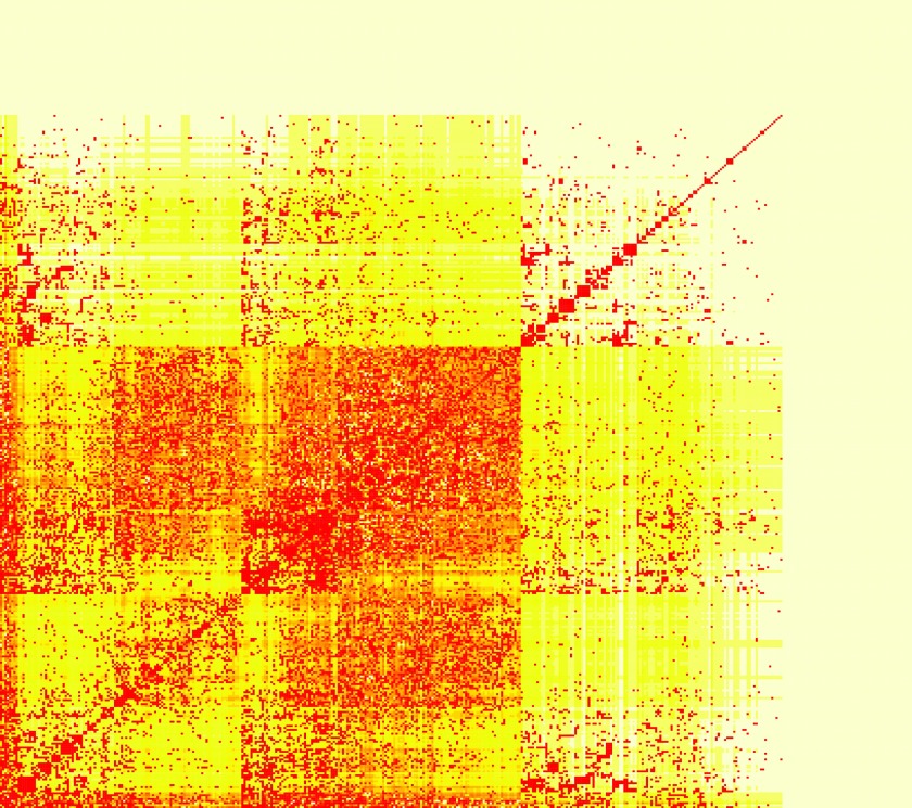
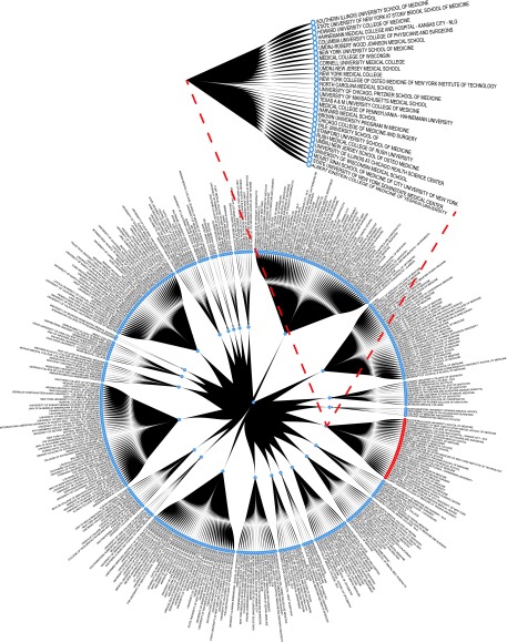
Table 3 details the results of the k-means clustering discussed above. It should be noted that, for the procedures quantity, the “Other” group was labeled of interest for significant procedures. Although it was not included in the DG, “Other” can be found as the fourth school in the optimal cluster, further demonstrating the power of this clustering technique. Figure 3 details a heatmap of the resulting correlation p-values between each of the schools on the charges billed dataset. A closer inspection of the similarity matrix reveals that the values coincide well with a real-world breakdown of institution types. This can best be illustrated with an example. Looking at the similarity vector between all schools and the Indiana University School of Dentistry, we can analyze the schools for which the correlation p-value is lowest. In order of increasing p-value (range 9.117e−154 to 2.21e−50) we find Case Western University School of Dental Medicine, University of Manitoba Faculty of Dentistry, University of Iowa College of Dentistry, University of Toronto Faculty of Dentistry, and finally Ohio State University College of Dentistry. These results seem to align with expectations, as the alumni with dental schools are likely to charge significantly higher for similar sets of dental procedures than would alumni from other medical schools. Building from similarity matrix, Figure 4 details the clustering results on the charges billed dataset. The schools that comprise the DG are noted in red, and the optimal cluster has been expanded for the readers' convenience. Upon closer inspection it is clear that clusters 12,17, and 6 are predominantly comprised of dental schools. This supports the merit of this clustering method as it is reasonable that alumni of dental schools would typically charge higher for dental procedure codes than alumni of other medical institutions—particularly for less common specialty procedures.
Table 3.
K-means clustering results
| Seed: 3 | Charges billed | Payments received | Procedures performed |
|---|---|---|---|
| Optimal K | 24 | 10 | 59 |
| Largest cluster size | 29 | 27 | 4 |
| “Desired Group” (DG) size | 10 | 22 | 3 |
| Correctly identified DG in optimal cluster | 9 | 21 | 3 |
| Missed DG schools | New York University Medical College | Columbia University College of Physicians and Surgeons | None |
FIG. 3.
Similarity score matrix: charges billed.
FIG. 4.
Cluster results: charges billed.
Geographic distribution analysis
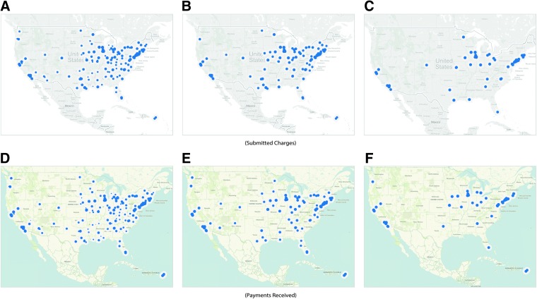
The final analysis performed was the geographic distribution between the charges billed and payments received. Figure 5 exhibits these distributions at 3 threshold ranges: baseline (A,D), 50% (B,E), and 75% (C,F). Table 4 details the divergence significance values over varying threshold values with significant levels marked with an asterisk.
FIG. 5.
Geographic distribution.
Table 4.
Geographic divergence significance charges billed vs. payments received
| Threshold value | Kaplan–Meier edge correction p-value | Boarder correction (reduced sample) edge correction p-value |
|---|---|---|
| Baseline | <0.00001* | <0.00001* |
| 10 | <0.00001* | <0.00001* |
| 20 | 1.20E-05* | <0.00001* |
| 30 | 9.80E-05* | 7.20E-05* |
| 40 | 0.00014* | 0.000102* |
| 50 | 0.003314* | 0.002486* |
| 60 | 0.054606 | 0.052137 |
| 70 | 0.44905 | 0.603064 |
| 80 | 0.989628 | 0.97846 |
| 90 | 0.840699 | 0.753521 |
Significant at a p-value 0.05 or smaller.
Discussion and Inference
Our work posed two overarching questions and the analysis of each can be found in the respective section below. However, before discussing the results obtained through our analyses, it is important to note that the data provides only a year-long snapshot to a physician's overall practice. Thus, we must be careful to avoid presuming causation for correlation, and correlation for heuristic.
Are school's procedures indicative of additional implicit features?
To explore this question, we utilized the resulting optimal clustering for each of the procedure statistics. We analyzed the resulting clusters with respect to factors from external data, such as tuition. We begin by identifying the schools within the DG that clustered together, as they represented a defined group (statistical outliers). Reviewing all of the schools comprising this cluster, we identified two potential subgroups: schools with highly ranked programs or specialties, and schools with above-average tuition costs. It should be noted that, due to the large variance of tuition levels across institutions, the median cost rather than mean was used. Furthermore, while some schools, particularly public, may offer discounted tuition rates for resident students, we utilized the full tuition rate as a baseline for our analysis. Of the 9 schools, 5 had higher tuition than the respective groups' median. Private schools demonstrated an average tuition of $46,968, $1,470 over the reported $45,498 median, while public schools were an immense $14,262 over the reported $47,799 median. Of the remaining 4 schools, 2 had rankings in the top 20 or higher. These factors are not mutually exclusive, as 4 of the 9 schools had elevated tuitions, as well as rankings in the top 20, with 3 having specialties in the top 5 nationally.
As these groupings covered 7 of the 9 schools within the cluster, we then investigated those that may not fit into our proposed categories. One school, the Albert Einstein College of Medicine (Einstein), was not ranked in the top 20 (34). However, it is closely affiliated with the Children's Hospital at Montefiore (CHAM). CHAM was “recognized as one of the best in the country” and “ranked in all 10 specialties in the 2011–12” by U.S. News & World Report's standard and Best Children's Hospitals rankings.25 Next, we investigated the DG school missed by the cluster, New York University Medical College. While marked of interest for the procedure statistics, the school was in fact below the median tuition, and in 2012 was ranked outside the top 20 nationally (24), and was as low as 34 only 5 years earlier.26 These factors accord with our cluster observations and proposed groupings.
Finally, we must be careful to associate correlation or causation with these groups to influence a physician's pricing decisions. Instances such as Einstein indicate that there may be additional underlying groups beyond tuition and ranking. However, with 7 of 9 schools falling into one or more of the categories above, it does deliver an interesting prospective on factors that may carry correlation with procedures.
Do charges and payments follow similar geographic distributions?
Our next investigation was performed on the geographic distribution analysis results. Although it may seem that schools billing the highest would also receive the highest payments, this may not be the case. As mentioned above, the geographic distributions for the charges billed and payments received were taken over a range of thresholds. Figure 3A–D details the baseline distributions. Examining Table 4, we find statistically significant differences in geographic distribution for average charged dollar amount, and average payment received for schools up through a threshold value of 60%. While the payment distribution appears to follow the U.S. population density, focusing on major cities, the charges seem to deviate from this pattern, representing a possible underlying feature influencing pricing models. As we increase the threshold, we see that the cost distributions reconverge. This is unsurprising, as those locations with the highest values typically represent major cities where elevated cost, and thus payment, is correlated directly with the cost of living in the area. However, it is the divergence at baseline and low-level thresholds that seem to be influenced by factors other than population and cost of living.
Conclusion and Reflection
Looking back, we believe that this work represents a comprehensive analysis of the publicly available Medicare datasets in conjunction with other public datasets. This work represents an important step to achieving an understanding of the complex healthcare practice and school environment. This understanding is critical not only for the Medicare service, but also for the physicians themselves. A deeper understanding of the factors influencing their practice offers an opportunity to improve it. However, for this to become a reality there remains much work to be done. Snapshot studies such as these must be replaced with longitudinal studies, from which true correlation and causation can be ascertained. Until then, we hope that the data made available through this work will provide a steppingstone for those who wish to continue this work.
Abbreviation Used
- CHAM
Children's Hospital at Montefiore
- CMS
Center for Medicare and Medicaid Service
- HCPCS
Healthcare Common Procedures Coding System
- HHS
Department of Health and Human Services
- IQR
interquartile range
- NPI
national provider identifier
Acknowledgment
This work is supported in part by the National Science Foundation (NSF) Grant IIS-1447795.
Author Disclosure Statement
No competing financial interests exist.
References
- 1.Emanuel EJ, Fuchs VR. Shortening medical training by 30%. JAMA. 2012;307:1143–1144 [DOI] [PubMed] [Google Scholar]
- 2.Hundert EM, Hafferty F, Christakis D. Characteristics of the informal curriculum and trainees' ethical choices. Acad Med. 1996;71:624–642 [DOI] [PubMed] [Google Scholar]
- 3.Hafler JP, et al. . Decoding the learning environment of medical education: a hidden curriculum perspective for faculty development. Acad Med. 2011;86:440–444 [DOI] [PubMed] [Google Scholar]
- 4.Woloschuk W, Harasym PH, Temple W. Attitude change during medical school: a cohort study. Med Educ. 2004;38:522–534 [DOI] [PubMed] [Google Scholar]
- 5.Patenaude J, Niyonsenga T, Fafard D. Changes in students' moral development during medical school: a cohort study. Can Med Assoc J. 2003;168:840–844 [PMC free article] [PubMed] [Google Scholar]
- 6.Wright S, Wong A, Newill C. The impact of role models on medical students. J Gen Intern Med. 1997;12:53–56 [DOI] [PMC free article] [PubMed] [Google Scholar]
- 7.Eisenberg JM. Physician utilization: the state of research about physicians' practice patterns. Med Care 2002;40:1016–1035 [DOI] [PubMed] [Google Scholar]
- 8.Madison K. Hospital–physician affiliations and patient treatments, expenditures, and outcomes. Health Serv Res. 2004;39:257–278 [DOI] [PMC free article] [PubMed] [Google Scholar]
- 9.Feinglass J, Martin GJ, Sen A. The financial effect of physician practice style on hospital resource use. Health Serv Res. 1991;26:183. [PMC free article] [PubMed] [Google Scholar]
- 10.Slovic P. The construction of preference. Am Psychol. 1995;50:364 [Google Scholar]
- 11.Blum J. Letter to Madara James L., M.D. 2 Apr. 2014. Centers for Medicare & Medicaid Services; Retrieved from http://downloads.cms.gov/files/Madara_Final_Signed.pdf (accessed Oct. 3, 2014) [Google Scholar]
- 12.Center for Medicare and Medicaid Service. 2014. Physician Compare (June 2014). Retrieved from https://data.medicare.gov/data/physician-compare (accessed Oct. 3, 2014)
- 13.HIPAA Administrative Simplification: Standard Unique Health Identifier for Health Care Providers; Final Rule. Federal Register 2004;69:3434–3469. Print [PubMed] [Google Scholar]
- 14.Center for Medicare and Medicaid Service. 2014. Provider Utilization and Payment (2012). Retrieved from www.cms.gov/Research-Statistics-Data-and-Systems/Statistics-Trends-and-Reports/Medicare-Provider-Charge-Data/Physician-and-Other-Supplier.html (accessed Oct. 3, 2014)
- 15.Association of American Medical Colleges. 2014. Tuition and Student Fees Reports (2012). Retrieved from https://services.aamc.org/tsfreports/select.cfm?year_of_study=2012 (accessed Oct. 3, 2014)
- 16.Fisher RA, Yates F. Statistical Tables for Biological, Agricultural and Medical Research (3rd ed.). London: Oliver & Boyd, 1948. [1938], pp. 26–27. OCLC 14222135. [Note: the 6th edition, ISBN 0-02-844720-4, is available on the Web, but gives a different shuffling algorithm by C.R. Rao.] [Google Scholar]
- 17.Spearman C. The proof and measurement of association between two things. Am J Psychol. 1904;15:72–101 [PubMed] [Google Scholar]
- 18.Sedgwick P. Pearson's correlation coefficient. BMJ. 2012;345:e4483 [Google Scholar]
- 19.Cressie NAC. Statistics for Spatial Data. New York: John Wiley and Sons, 1991 [Google Scholar]
- 20.Diggle PJ. Statistical Analysis of Spatial Point Patterns. New York: Academic Press, 1983 [Google Scholar]
- 21.Ripley BD. Statistical Inference for Spatial Processes. Cambridge: Cambridge University Press, 1988 [Google Scholar]
- 22.Baddeley AJ. Spatial sampling and censoring. In: Stochastic Geometry: Likelihood and Computation. Barndorff-Nielsen OE, Kendall WS, van Lieshout MNM. (eds). New York: Chapman and Hall, 1998; chapter 2, pp. 37–78 [Google Scholar]
- 23.Baddeley AJ, Gill RD. Kaplan-Meier estimators of interpoint distance distributions for spatial point processes. Ann Stat. 1997;25:263–292 [Google Scholar]
- 24.From Data to Insights: A School of Thought and Practice. http://healthcare3.crc.nd.edu/Medicare/Home.html (accessed Oct. 3, 2014)
- 25.Albert Einstein College of Medicine. Children's Hospital at Montefiore. Retrieved from www.einstein.yu.edu/departments/neurology/training/adult-neurology-training/cham.aspx (accessed Oct. 3, 2014)
- 26.NYU Langone Medical Center. NYU School of Medicine Ranked Top-20 on the 2015 U.S. News & World Report's Best “Graduate Schools” Rankings. Retrieved from http://communications.med.nyu.edu/media-relations/news/nyu-school-medicine-ranked-top-20-2015-us-news-world-report's-“best-graduate-sc (accessed Oct. 3, 2014)
References
Cite this article as: Feldman K, Chawla NV (2015) Does medical school training relate to practice? Evidence from big data. Big Data 3:2, 103–113, DOI: 10.1089/big.2014.0060.


