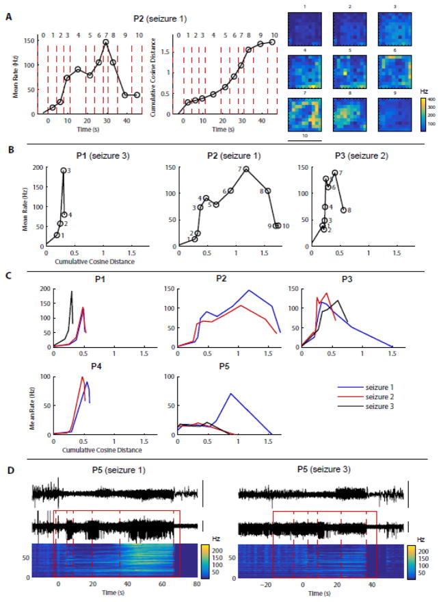
Figure 5. MUA population activity and spatial patterns change across stages but their evolution is similar within a given patient.
(A) Data in this panel are from the 2nd example shown in Fig. 4 (P2, seizure 1). Left: population mean rate over time. Each dot: MUA rate averaged over time and across electrodes during the corresponding stage of the segmented seizure (numbered 0, 1, etc., 0 being the last stage before seizure onset). Middle: cumulative cosine distance over time. Each dot: cumulative cosine distance of the MUA rate maps between the stage where the dot is represented and the preceding stage. The cosine distance is used to compare MUA rate maps independently of the population overall activity (see Materials and Methods for more details). Right: corresponding MUA rate maps (from Fig. 4, P2) shown as a reminder. (B) Condensed representation of seizure evolution: for each example shown in Fig. 4, the population mean MUA rate is plotted as a function of the cumulative cosine distance introduced in (A). The coordinates of each dot show the cumulative cosine distance and the population mean MUA rate during one stage of the seizure (stage numbers indicated next to each dot). (C) Same representation as in (C) but for all seizures from each patient. These “signatures” of seizure evolution are relatively consistent within each patient. The most important exceptions are seizure 1 from P3 and seizure 1 from P5. (D) LFP and MUA data for 2 seizures from patient P5, where the biggest variability between seizures was observed in (C).

