Abstract
Increasingly sophisticated technologies, such as On-Line Analytical Processing (OLAP) and Geospatial Information Systems (GIS), are being leveraged for conducting community health assessments (CHA). Little is known about the usability of OLAP and GIS interfaces with respect to CHA. We conducted an iterative usability evaluation of the Spatial OLAP Visualization and Analysis Tool (SOVAT), a software application that combines OLAP and GIS. A total of nine graduate students and six community health researchers were asked to think-aloud while completing five CHA questions using SOVAT. The sessions were analyzed after every three participants and changes to the interface were made based on the findings. Measures included elapsed time, answers provided, erroneous actions, and satisfaction. Traditional OLAP interface features were poorly understood by participants and combined OLAP-GIS features needed to be better emphasized. The results suggest that the changes made to the SOVAT interface resulted in increases in both usability and user satisfaction.
Keywords: Public Health Informatics, Community Health Assessment, OLAP, GIS, decision support, usability evaluation, think-aloud protocol, human-computer interaction, interface design
Introduction
Data analysis during community health assessments (CHA) involves the use of information technology for analyzing large health and population datasets. For this purpose, we have developed the Spatial OLAP Visualization and Analysis Tool (SOVAT) (Scotch M & Parmanto B, 2005, 2006). SOVAT is a novel public health informatics (PHI) decision support system in that it combines two key technologies: On-Line Analytical Processing (OLAP) and Geospatial Information System (GIS) (for this paper, the combination of OLAP and GIS, will be referred to as “OLAP-GIS”).
OLAP-GIS systems for public health informatics provide the potential for powerful decision support; however, they also present significant usability challenges. OLAP alone is considered to be a complex application (especially by novice users). The notion of a multidimensional cube with dimensions, attributes, and special drilling methods is much more daunting from a conceptual standpoint than traditional flat-file relational tables. OLAP features such as slice and dice, drill-up, drill-down, and even new capabilities such as drill-out are available during analysis. Slicing refers to ‘cutting out a slice of the OLAP cube’ and viewing a section of the data. For example, one could perform a spatial slice by viewing data for one particular county rather than all the counties. Drilling-down in the context of OLAP refers to viewing data at a finer level of granularity. Since data in OLAP is structured as dimensions (or views) this is equivalent to traversing a hierarchical tree. Drilling down on a ‘time’ dimension might involve going from data aggregated as a single year (1997) to data aggregated as individual months (January 1997 – December 1997). Drilling up is the reverse of this concept. To the novice user, it might be difficult to determine what these features mean during a community health analysis. The user might ask, “How does ‘drill down’ help me analyze and compare different geographic regions?” OLAP conceptually stores data as multidimensional rather than two-dimensional (row-column). Most people are more comfortable analyzing data in a two-dimensional framework rather than a multi-dimensional framework. With GIS, usability issues are likely to occur when additional layers (roads, water, and houses) and themes are added to a single view.
Combining OLAP and GIS creates the potential for unique usability issues. For example, SOVAT offers a unique function called ‘drill-out’ that is not available in standard OLAP. Drill-out combines OLAP and GIS technology by performing boundary detection (“Which counties border a specific county?”) and numerical analysis (“For the counties that border a specific county, which ones have a higher cancer rate?”).
Even for non-OLAP users, usability of combined spatial and numerical environments is a significant issue. This can be seen as far back as the work of John Snow. Snow, who helped eradicate the deadly Cholera outbreak in London in the mid-nineteenth century, combined numerical and spatial information (death counts and city map of London) to support his hypothesis that the outbreak was caused by contaminated water from a popular street pump (an example can be seen on page 30 of (Tufte E, 1997)). Snow used a simple drawing to combine these two types of information; however this method of problem solving can be implemented today using different types of technology including GIS, traditional databases, and OLAP.
This paper describes the usability evaluation conducted as part of an iterative design methodology for SOVAT. Our goal for SOVAT was to create a public health decision support system that would be usable by any community health professional regardless of their familiarity with either OLAP or GIS.
SOVAT Interface
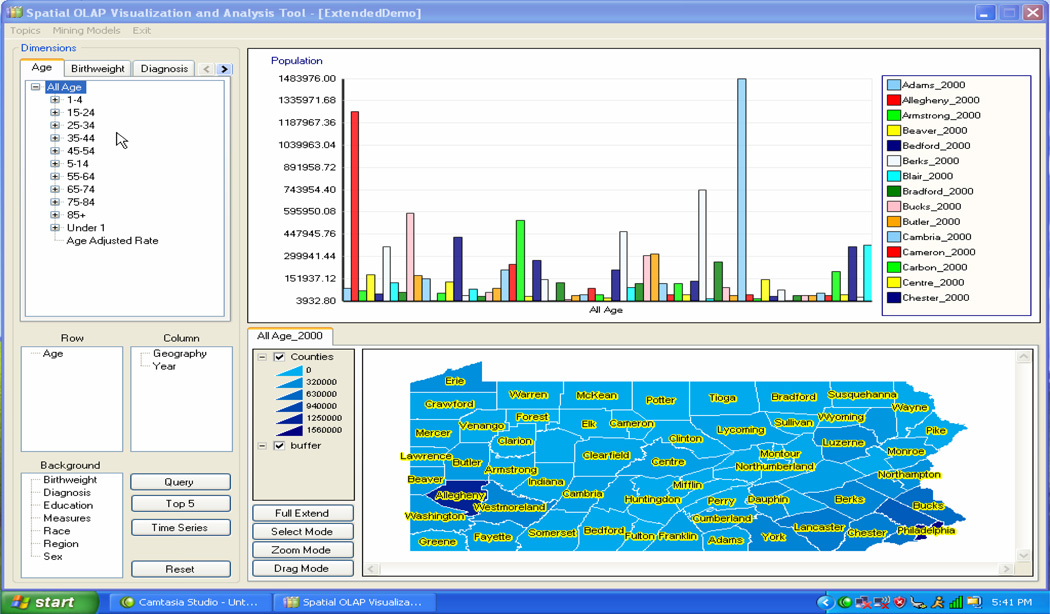
The original SOVAT interface (at startup mode) is shown in figure 1. The SOVAT graphical user interface (GUI) supports drag/drop and direct manipulation actions.
figure 1.
Original SOVAT interface at ‘startup’.
The four distinct areas of the interface are: the dimension tabs (top left), charting area (top right), row and column lists as well as special functions (bottom left), and finally the map area (bottom right). The dimension tabs (meta-data) represent the types of public health information stored in SOVAT. Each dimension has its own tab. Tabs are commonly used for displaying meta-data in traditional OLAP front-end clients. In addition, charts are commonly used to display descriptive data. The final popular OLAP interface feature is the use of row, column, and background lists. These allow the individual to characterize which dimensions should be incorporated into the query. In addition they dictate how the results should be displayed on the bar chart. Dimension names can be dragged to either the row or column list before a query is submitted. The map area represents a traditional GIS interface feature. This interface component contains technology for addressing spatial problems and shows the same (numerical) results as the bar chart. Here the data is displayed via color gradation and defined on the map’s legend.
Querying involves selecting dimension attributes and dragging and dropping them onto the charting area. The result of the query is shown on both the chart and the map. Direct manipulation is also supported by selecting map elements and performing spatial OLAP drilling functions. These OLAP-GIS functions such as spatial drill-up, spatial drill-down, and spatial drill-out represent the true synergy and uniqueness of the OLAP-GIS decision support system. For example, performing spatial drill-up allows the user to view data at a more aggregated level of geographic granularity (for example going from county level to state-wide level). Conversely, spatial drill-down allows data to be examined at a finer level of geographic granularity (for example going from county level to municipality level). Finally, spatial drill-out is a unique function only to SOVAT which performs spatial boundary detection and numerical aggregation of an area selected on the map. For example, selecting Allegheny County and performing spatial drill-out will compare Allegheny County to the counties that border it (in this case Butler, Beaver, Washington, Westmoreland, and Armstrong). These OLAP-GIS functions represent the essence of combining OLAP and GIS technology for public health informatics. However, their uniqueness to public health problem solving brings the potential for significant usability concerns.
Methods
Participants
SOVAT is intended for professionals who analyze health and population data for the purpose of learning about health factors within a defined population. For this study, both future system users and representative system users were recruited. Representative users were directly sent recruitment letters while future users were recruited by fliers hung throughout the University of Pittsburgh campus. Future users were defined as students within the University of Pittsburgh’s Graduate School of Public Health. Within this school are such departments as: Behavioral and Community Health Sciences, Biostatistics, and Epidemiology. Representative users were defined as working professionals who routinely utilize health and population datasets to perform community health analyses. Example of these types of professionals include: biostatisticians and epidemiology data managers at local/state health departments; data analysts within business or academic research settings; university faculty/researchers; data analysts in non-profit foundations; and data analysts in healthcare institutions (hospitals, HMOs, etc.). Although a sample of purely representative users would have been ideal for this study, due to the scarcity of these individuals locally as well as the time commitment involved in the study session (which meant time away from their workplace), it was determined that a mix of professionals and students was more practical. Since SOVAT was a new system that was yet to be distributed to any users, none of the participants had experience using it.
Setting
The study took place in the conference room at the Department of Biomedical Informatics, on the campus of the University of Pittsburgh. Separate study times were scheduled for each of the participants. In the conference room was a laptop with SOVAT and screen capture software and an external mouse and microphone.
Study Procedure
A think-aloud protocol was utilized for this study. This approach is commonly used in usability studies and requires the participant to verbalize their thoughts as they interact with the system and attempt to complete the question at hand. This method allows researchers to determine ‘what’ and ‘why’; that is ‘what’ they are doing in relation to system interaction and ‘why’ they are doing that type of interaction (Nielsen J, 1993). This information is helpful for researchers in identifying usability issues that need to be addressed (Nielsen J, 1993).
Before using the system, the participants were shown an 8-minute instructional video that described the interface and the important functionality. After watching the video, they were then given five CHA questions to answer using SOVAT. The participants were asked to “think-aloud” once they were handed the questions (one-by-one) on an 8.5” x 11” piece of paper. Once they finished using SOVAT to answer the question, they were handed the next question. The CHA questions represented realistic community health assessment problems, and were deemed appropriate by an active community health researcher (through personal communication). They consisted of performing local and state-wide comparisons of geographic areas, ranking of diseases or geographic areas based on health measures, and defining and comparing customized geographic communities. The questions were not presented in a randomized order, since it was preferred to have the session start with the perceived easier questions. Camtasia screen capture software was used to record the participants’ actions and verbalized thoughts. There was no time limit for the study and thus the participants were given as much time as they needed to complete each question. If they were unable to complete the question and provide an answer, they were asked to reset the interface and were then given the next question. Once the participants completed the five questions, they were asked to fill-out two questionnaires. For their time, participants were paid $30. Approval was granted from the University of Pittsburgh IRB office before the commencement of the study.
Objective Measurement
In order to identify usability issues, the following four criteria were considered:
Time to complete each question
Erroneous Action – An erroneous action was defined as an action that did not get the user closer to their goal of solving the problem.
Problem Space – A problem space was defined as an action that represents a different method of solving a question sub-goal from what was previously tried.
Answer to Problem – An answer was defined as the action of the participant verbalizing an answer to all the aspects of the question followed by saying that they were ‘done’.
Erroneous actions represent user responses such as: trying to right-click on a map item that has yet to be selected (or highlighted) or dragging a querying item (an attribute) to a list box that does not accept querying items. Problem space instances were examples of when participants tried multiple methods of solving the question. An example of a problem space instance is if the participant had difficulty using the map to perform a geographical comparison, and then reverted to using the bar chart to perform the comparison. Erroneous actions might occur during a new instance of a problem space and thus they are not necessarily mutually exclusive.
The benchmarks were determined prior to the study based upon an expert user’s (the principal investigator, MS) completion of the questions. As a result of the expert’s scores, benchmarks were established by estimating how a beginner might perform. For this purpose, no mathematical equation was used to establish the benchmarks (such as % reduction of the expert’s performance). Instead, estimations were generated after discussion among the researchers. Camtasia videos were analyzed mainly by one of the researchers (MS) after study sessions. Any identification of usability variables were recorded using a Usability Aspect Report. No inter-rater reliability was performed since most of the videos were analyzed by only one of the researchers.
Subjective Measurement
Usability issues were also identified via subjective self-report measures. The IBM Post-Study System Usability Questionnaire (PSSUQ) was used to gather participant’s opinions about the system. The PSSUQ is mainly a close-ended questionnaire that has been found to be both a reliable and valid instrument for lab-oriented usability evaluations (Lewis JR, 1995). The PSSUQ utilizes a 7-point Likert Scale format with lower numbers indicating higher levels of satisfaction. The questionnaire is designed to analyze across three categorical areas: system usefulness, information quality, and interface quality. System usefulness refers to the belief to which a system can improve job performance. It is considered one of the most important psychometric variables because it has been closely linked to user acceptance and adoption of information technology (Davis F, 1989). Information quality is the belief to which a system provides the user with helpful and important information to complete the questions. This could include help messages, and clear display of information content. The final category is interface quality which relates to the perception of the user interface layout.
Besides the PSSUQ, an additional more open-ended questionnaire was also used to record opinions about the best and worst aspects of the system.
Results
The usability evaluation consisted of five evaluation rounds, with three participants per round (for a total of fifteen participants). Nine students participated in the first two rounds and the final round (round 5) of the usability assessment. Six professionals participated in the third and fourth rounds of the study (it was preferred to have professionals for the final round; however, this did not occur due to difficulty in recruitment). After each round, the investigators reviewed the objective and subjective results and made changes to the interface based on the findings.
A background survey obtained information related to technical experience and age. The average age of the graduate students was 30 and the average age of the professionals was 50. One of the survey questions asked “In a typical week, how many hours do you personally use a computer hands-on?” The average time per week was 43 for the students and 32 for the professionals.
Table 1 shows the mean time for completion of the five tasks by round. For each question, average time was calculated for the three participants in the round and then the average of the averages was calculated. There was no time limit given to the participants. However, if the participant did not complete the task, no time was recorded for that task (this occurred roughly 11% of the time in the study and mostly among the students). If one of the three participants in the round was unable to complete a task, the mean time for the round was not computed and QNC (Question Not Completed) was indicated in the results. For time, one-way ANOVA was performed to analyze the difference between the rounds. Each round was compared to one another (for example, round 1 to 2, 1 to 3, etc.). Statistically significant comparisons were observed in rounds: 2 vs. 3 (t [14] = 2.72, p <0.05), 3 vs. 4 (t [14] = −2.82, p <0.05), and 3 vs. 5 (t [14] = −4.09, p <0.05). Comparison was also done for students vs. professionals (rounds 1, 2, 5 vs. 3, 4). The results showed no statistically significant difference between the groups (t[16] = 2.05, > 0.05).
Table 1.
Time to Complete Usability Tasks by Round
| Time (min) | |||||
|---|---|---|---|---|---|
| Round | 1 | 2 | 3 | 4 | 5 |
|
Question 1 |
QNC* | 9 | 17 | 6 | 4 |
|
Question 2 |
QNC | 14 | 16 | 9 | 5 |
|
Question 3 |
QNC | 12 | QNC | 14 | 7 |
|
Question 4 |
QNC | 8 | QNC | 12 | 12 |
|
Question 5 |
QNC | 12 | 18 | 13 | 12 |
| Average† | N/A | 11 | 17 | 11 | 8 |
QNC ~ Question Not Completed
Average was calculated for round 3 with only the three values 17, 16, 18. The other two Questions are QNC.
Table 2 shows the accuracy of the responses by round as measured by the number of correct answers. If a participant was unable to complete a question, an ‘incorrect’ response was assigned. The success rate was calculated as the number of correct answers per round divided by the number of total questions per round (15, or 3 × 5). Statistically significant comparisons were observed in rounds: 1 vs. 2 (t[20] = 3.50, p <0.05), 1 vs. 3 (t[20] = 3.50, p <0.05), 1 vs. 4 (t[20] = 4.28, p <0.05), and 1 vs. 5 (t[20] = 4.28, p <0.05). Comparing the students vs. the professionals, the results showed no statistically significant difference between the groups (t[23] = 0.150, > 0.05). As can be seen in the table, the success rate improves dramatically after round 1 and reaches its highest level in rounds 4 and 5.
Table 2.
Accuracy in Completing the Usability Tasks by Round
| Answers (number of correct) |
|||||
|---|---|---|---|---|---|
| Round | 1 | 2 | 3 | 4 | 5 |
|
Question 1 |
0 | 3 | 3 | 3 | 3 |
|
Question 2 |
1 | 2 | 3 | 2 | 3 |
|
Question 3 |
0 | 0 | 1 | 2 | 2 |
|
Question 4 |
0 | 3 | 2 | 3 | 3 |
|
Question 5 |
1 | 3 | 2 | 3 | 2 |
|
Success Rate† |
2/ 15 |
11/ 15 |
11/ 15 |
13/ 15 |
13/ 15 |
Success rate is the number of correct answers divided by 15, which is the number of possible correct answers in a round (3 participants x 5 questions)
Table 3 shows the results for problem space.
Table 3.
Problem space instances in Completing the Usability Tasks by Round. Lower numbers indicate more efficiency and less back tracking during problem solving.
| Problem Space (number of instances) |
|||||
|---|---|---|---|---|---|
| Round | 1 | 2 | 3 | 4 | 5 |
|
Question 1 |
3 | 2 | 3 | 0 | 0 |
|
Question 2 |
7 | 6 | 4 | 0 | 0 |
|
Question 3 |
6 | 3 | 3 | 1 | 1 |
|
Question 4 |
6 | 1 | 3 | 1 | 1 |
|
Question 5 |
9 | 4 | 2 | 2 | 1 |
| Average | 6 | 3 | 3 | 1 | 1 |
Statistically significant comparisons were observed in rounds: 1 vs. 2 (t[20] = −3.37, p <0.05), 1 vs. 3 (t[20] = −3.59, p <0.05), 1 vs. 4 (t[20] = −6.06, p < 0.05), 1 vs. 5 (t[20] = −6.29, p < 0.05), 2 vs. 4. (t[20] = −2.69, p < 0.05), 2 vs. 5 (t[20] = −2.92, p <0.05), 3 vs. 4 (t[20] = −2.47, p <0.05), and 3 vs. 5 (t[20] = −2.69, p <0.05). Comparing the students vs. the professionals, the results showed no statistically significant difference between the groups (t[23] = −1.48, > 0.05). The data suggests that the participants were much more efficient in solving the questions in the later rounds; in that they had fewer instances of ‘backtracking’ during problem solving.
The other objective result, erroneous action (not shown) also included similar trends. Statistically significant comparisons were observed in rounds: 1 vs. 4(t[20] = −2.97, p < 0.05), 1 vs. 5 (t[20] = −3.84, p < 0.05), 3 vs. 4 (t[20] = −2.39, p < 0.05), and 3 vs. 5 (t[20] = −3.26, < 0.05). Comparing the students vs. the professionals, the results showed no statistically significant difference between the groups (t[23] = 0.155, > 0.05).
Interface Components
As previously described, the interface can be divided into 4 components: dimension tabs, chart, map, and row/columns and special functions. These components will be described separately for the purpose of detailing the changes made to the interface.
Dimension Tabs
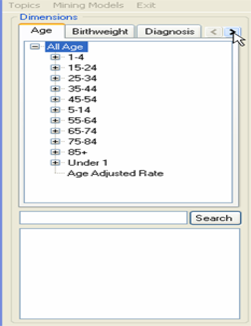
In round 1, some participants encountered difficulty in finding a diagnosis attribute within the diagnosis hierarchy. The diagnosis hierarchy contains branches up to three levels deep (e.g. Respiratory System ➔ Chronic Obstructive Pulmonary Disease ➔ Asthma). One participant listed the fact that there was “No ‘Search’ option” as one of the worst things about the system. In order to enhance the usability of the dimension tab, a search option was added under the dimension tab (figure 2). This was designed to enable participants to type a search name for an attribute within a tab rather than manually scrolling through the hierarchy. It was hoped that users without a medical background would now be able to find an attribute without needing to know where it might be in the hierarchy.
figure 2.
New dimension tabs for round 2 with added search option.
In both round 4 and 5, the search box proved to be very helpful in finding attributes. The participants had little trouble with this feature. In fact one participant in round 4 indicated that one of the best things about the system was that by using the search option it was “easy to find ICD [diagnosis] and [other] groups”. The usability data from rounds 4 or 5 did not suggest that changes needed to be made to the search box or the dimension tabs.
Chart Display
In round 1, the participants used the chart mostly as a data presentation feature. They would look to the chart to interpret the results of their query. Direct manipulation with the chart, such as right clicking on a chart element (such as a bar) and drilling down, was rarely used. One area of confusion was the interpretation of the chart. In the original interface, the chart did not have an English language title that clearly described the query. In fact, the only label above the chart was the numerical measure in the query (for example, “Cancer Incidence/1,000”). This feedback seemed to be insufficient to the participants. In many instances the participants were frustrated as they struggled to interpret the chart. In order to enhance the usability of the chart, a title was added on the top to provide an explanation of the result.
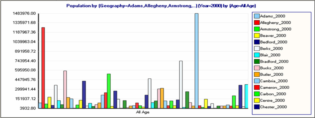
In round 2, it was apparent that the title was very helpful in interpreting the chart. Instead of just the numerical measure, the title now included the attributes within the query (figure 3). The format consists of the measure first and then the other attributes separated with the word ‘by’ such as “Population by (Geography=Adams, Allegheny, Armstrong…), by (Year=2000) by (Age=All Age).” Ideally a true English language phrase (such as “2000 Pennsylvania Population by County”) would have been used, however it was felt this would be too time consuming to develop and thus it was decided not to implement it. Despite lacking a true English phrase, the new title was well perceived. In fact participants listed “chart display” as one of the best aspects of the system in round 2.
figure 3.
SOVAT chart for round 2 of the usability evaluation.
In round 3, 4, or 5 the findings suggested that no further changes to the chart were necessary. The only change to the chart at all was the addition of the numerical measure on the Y-axis after round 3. This was not motivated by specific usability findings, but rather the desire to make the chart look a little more like a “traditional bar chart” found in the literature.
Map Display
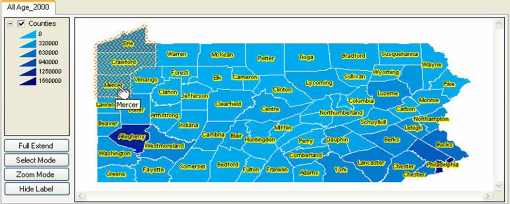
In round 1, the majority of the erroneous actions related to attempts of direct manipulation with the map. This occurred when participants needed to produce a query with geographical elements and attempted to drag and drop map elements (selected counties or municipalities) onto the charting area. Drag and drop actions could not be carried out with the map elements. Based on this limitation, the participants were not certain how to compare the current selection against the other area(s). It was felt that enhancing the tools for direct manipulation of the map through drag and drop operations would facilitate this process. Users would then be able to drag one set of geographical areas and then repeat this action to perform the comparison (figure 4). Allowing for map elements to be dragged and dropped might enhance system usability for this type of sub-question and reduce the number of problem space and erroneous actions.
figure 4.
SOVAT map for round 2 of the usability evaluation. The user is able to select map elements and drag and drop them in order to produce queries.
Row/Column and Special Functions
In round 1, the use of the row/column feature was found to be a very confusing concept. Row/column list boxes were meant to include the dimension names (such as Age, Diagnoses, Sex, Race, etc.). The dimensions in the row/column list boxes determine how the data is oriented on the chart display. For example in figure 1, the “Age” dimension is in the row list box and hence the age-related information “All Age”, is shown on the X-axis of the chart. “Geography” and “Year” are included in the column list box and hence the geography-related information (the county names) and the year-related information (2000) are shown in the chart’s legend. If the dimensions were switched (i.e. Age was moved to the column list box and Geography and Year were moved to the row list box) then Age-related information would be shown in the legend and Geography and Year would be shown on the X-axis of the chart.
There were many examples that demonstrated that the participants were not clear about this concept. For example, they frequently populated the row/column boxes with a dimension attribute name (e.g., “Allegheny County”) from above instead populating it with a dimension name from the background list below (e.g., “Geography”). Thus, they failed to recognize that the concept of “row and column” is dimension specific and not attribute specific. Once they did recognize this notion, the questions requiring Top 5 or ranking analysis (Questions 3, 4, and 5) put significant requirements on them to place the appropriate dimensions in these lists. This produced many erroneous actions and problem space issues as incorrect dimensions were frequently chosen.
In round 3 especially, the row/column concept proved to be extremely frustrating for the participants. It led to many errors, confusion, and increase in time to completion. It was clear from the think-aloud data that drastic changes needed to be done with this interface feature. The participants did not seem to grasp the purpose of the row and column. When accessed, problems ensued, such as: allocation of improper dimensions to either the row or column list, failure to include a single dimension in both the row or column list, or use of the dimension names in either the row or column list as a drag and droppable querying element. It was then concluded that the presence of row/column on the interface did not correspond to its importance as a necessary feature for community health problem-solving. It was more of a data orientation feature than anything else. Its purpose is to affect the presentation of the data on the chart; changing a dimension from a “row” dimension to a “column” dimension would switch it from the legend to the x-axis on the chart. As such, the magnitude of space it contained on the interface as well as its form as a drag and droppable feature seemed inappropriate given its true importance in problem solving. In order to enhance usability of the interface, it was decided row/column would be removed from the interface. In its place, it was decided to add a “pivot” button on the chart section of the interface. It was believed that this change would fulfill the purpose of row/column while eliminating the usability issues it caused. In addition, the placement of the pivot button in the chart area of the interface seemed appropriate since it only affected the presentation of the chart and not the map.
The usability data from round 4 suggested the changes to row/column and special query features enhanced the usability of the interface. The pivot chart button eliminated any errors from previous rounds that involved interaction with the row/column component.
The SOVAT Interface at Query Formulation
The usability data from round 3 suggested that the participants had trouble formulating queries. The use of the dimension tabs to support the ad hoc nature of dragging and dropping attribute elements seemed confusing to the participants. It was decided to examine more closely the process of problem solving with SOVAT. Understanding the process of solving community health problems is necessary for building an effective and usable public health informatics decision support system. It was believed that at this point, SOVAT did not adequately support the process of solving these types of problems. Participants were constantly confused with how to set up a query and what essential components were needed to produce the query. A brainstorming session identified the problem solving process to consist of selecting:
A numerical measure such as a death rate, cancer rate, or inpatient/outpatient hospital rate
A temporal component such as a year
A geographical component such as counties, municipalities, or custom-made communities.
Additional data on which to filter the query such as: an age range, a particular diagnosis, or a particular sex or race.
It was believed that modifying SOVAT to support this problem solving process was necessary for constructing a usable system. In supporting this process, the interface would need to resemble more of a step-by-step systematic flow rather than a muddled multidirectional drag and drop environment seen in traditional OLAP environments. In addition, in order to realize the full potential of the OLAP-GIS decision support system, it was felt that the emphasis of query formulation needed to be on the OLAP-GIS features such as spatial drill-up, spatial drill-down, and spatial drill-out. These functions are available only through direct manipulation of the map, thus the new interface flow needed to emphasize the importance of interaction with the map and these OLAP-GIS functions. While this would constitute a massive overhaul of the interface’s layout, it was felt it was a modification that needed to be made.
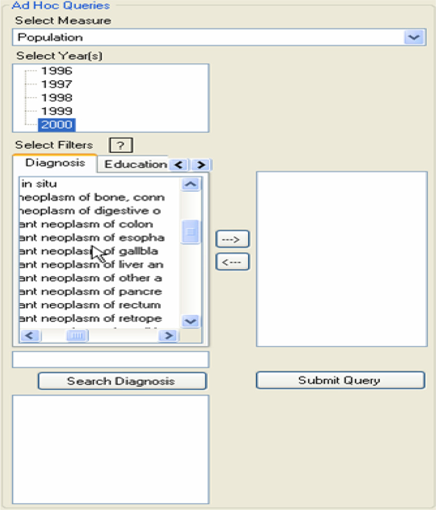
Figure 5 shows the new (left-side) interface design to support query formulation.
figure 5.
Dimension tabs for round 4 of the usability evaluation.
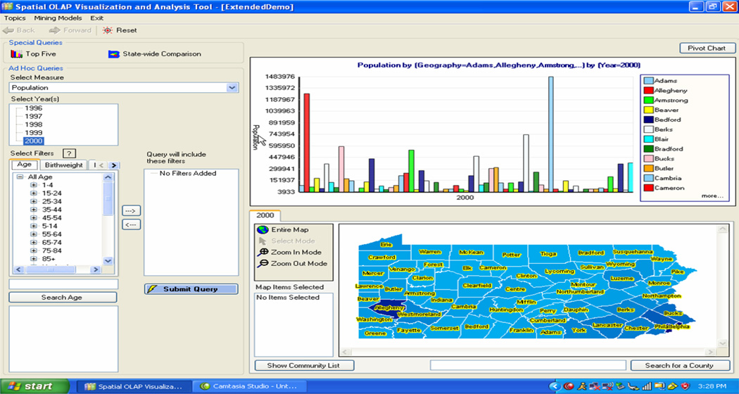
The usability data from round 4 and 5 suggested that the different layout facilitated ad hoc query construction. Participants had little trouble with the lists for the year and the measure. Most of them understood the purpose of the filter tabs and were able to use the arrow to populate the filter list. In fact, one of the participants in round 4 indicated that the filter tabs were one of the best aspects of the system, responding that the “filters were quite easy to use”. The final version of the SOVAT interface with all of the discussed modifications is shown in figure 6.
figure 6.
Final version of the SOVAT interface after round 5 of the usability evaluation.
Subjective Results
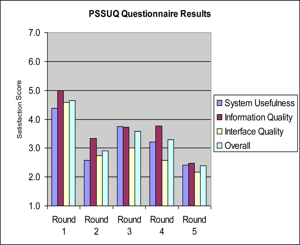
Figure 7 shows the subjective results from the Post-Study System Usability Questionnaire (PSSUQ). The results shown here are summarized by round. Lower numerical values indicate a higher level of user satisfaction. As mentioned, in addition to overall satisfaction score, the responses can be divided into three sections: system usefulness, information quality, and interface quality.
figure 7.
PSSUQ scores summarized by round. Lower numbers indicate higher levels of satisfaction.
The data suggests improvement in all three usability categories (system usefulness, information quality, and interface quality) from the first round to the final round. System usefulness, which measures the users’ perception of how the system can improve their job performance, improved the most with a 70% change (4.38 to 2.58) between round 1 and 2, but was the worst from round 2 to round 3 with a 45% negative change (2.58 to 3.75). It improved over the final two rounds with a final-round score of 2.42 (a 33% improvement from round 4).
Discussion
In the early evaluation rounds, participants were confused about how to solve complex questions using traditional OLAP front-end features such as attribute drag and drop, and formulation of row/column components. Traditional GIS features were confusing as well in relation to geographic comparison. The drastic modifications to the interface after round 3 represented a breakthrough in system usability of this public health decision support system. In designing public health informatics decision support systems using OLAP and GIS, designers must go beyond traditional OLAP and traditional GIS front-end features and develop a more synergized OLAP-GIS interface to support public health problem solving. This requires tailoring the interface and creating a systematic flow of element selection required for a public health query (ex. numerical element ➔ temporal element ➔ filtering elements ➔ geographical elements). In addition, the driving force behind query formulation needs to be the OLAP-GIS functionality, such as spatial drill-up, spatial drill-down, and spatial drill-out. These are the functions that distinguish an OLAP-GIS public health system from traditional systems and offer the greatest potential for solving complex public health problems. For example, spatial drill-out is a unique function to SOVAT and its use in solving public health questions is extremely valuable. The ability, in one single mouse click, to compare one geographic area to its bordering areas in relation to a public health concern, is an example of how an OLAP-GIS system can be used to solve complex public health questions quickly, easily, and accurately. Not emphasizing and highlighting these types of functions within an OLAP-GIS public health system reduces its potential and impact as a unique public health decision support tool.
Limitations
One limitation of this study was that all participants were not considered representative system users. The future users (the graduate students) potentially had greater technical experience and were able to “work around” some of the early usability problems. For example in round 2, three students were used. The usability results from this round were extremely positive compared to the first round of professionals (in round 3). Potentially the students in this round had a lot of technical knowledge and were not as affected by the many usability problems from the early version of the system. A group of representative users with less technical experience might have been more sensitive to these usability concerns and the results might have reflected a less usable system. These observed differences highlight the need to include representative users in usability assessments whenever possible. Another limitation is that the usability of system was only examined for these five questions. It is possible that for other types of public health questions, the system is not as usable. While this is potentially true for other areas of public health such as environmental health, the authors feel however that these five questions represent a broad array of community health scenarios. Since the earliest development phase, the researchers focused on the domain area and included public health experts in on design issues and concerns.
Conclusions
This paper described the rigorous usability evaluation of the SOVAT interface for public health problem solving during community health assessment analysis. In total five rounds were used with three individuals per round (for a total of fifteen people). Both future users (public health graduate students) and representative users (community health assessment professionals) participated in the study. Evaluation and system enhancement occurred after each round. Think-aloud protocol was used as the participants completed five community health problem solving questions. Screen capture software and a microphone were used to record their interaction with SOVAT. After completion of the questions, the participants were asked to complete two post-study questionnaires aimed at identifying their satisfaction with the system. Objective and subjective measurements were used to identify usability issues. Objective measurements consisted of: time to question completion, erroneous actions during each question, problem space or number of different methodologies used to solve the problem, and finally whether the verbal answer they gave was correct. Subjective measurements consisted of the responses from the post-study questionnaires.
Drastic system modifications were made after round 3 to better emphasize the OLAP-GIS functions for public health decision support. Once the SOVAT interface better represented an OLAP-GIS system, system usability improved in relation to solving the complex public health questions. Objectively, the improvements made to the system reduced the time of question completion, the number of erroneous actions, the number of problem space occurrences, and increased the accuracy of the responses. Subjectively, the system improved in all areas including: perceived usefulness, information quality, and interface quality. Further work needs to be done in relation to other problem solving areas of public health; for example examining the usability issues of an OLAP-GIS system for environmental health decision support. The visual interface expectations for an environmental health professional are seemingly much different than a community health professional’s expectations. Different geospatial layers are required as well as different interface functions. It is likely that an individual examining environmental health data would need a detailed (raster) map that contains specific landmarks, waterways, and buildings. This might not be the case with a community health professional where the spatial needs stop at the municipality level without the emphasis on specific city markers. In addition, it is probable that an environmental health expert would need specific spatial functions such as buffering and shortest path analysis. How these features and functions are perceived in relation to an OLAP-GIS interface would need to be analyzed through rigorous usability analysis.
Practitioner’s Take Away
OLAP-GIS decision support systems offer potential for enhancing public health decision support in areas such as community health assessment and environmental health. If available, this type of system should be considered for use in health departments, university research settings, or private foundations.
OLAP and GIS by themselves are viewed as complex technology. Thus, combining OLAP and GIS presents many usability challenges that must be addressed before system implementation.
From our study, we suggest tailoring an OLAP-GIS interface to emphasize a systematic flow for selecting query elements (ex. numerical element ➔ temporal element ➔ filtering elements ➔ geographical elements).
Acknowledgements
The project is supported in part by The National Library of Medicine (NLM) Training Grant 5 TI5 LM007059 to Matthew Scotch, and by the National Institute on Disability and Rehabilitation Research (NIDRR) and National Telecommunication and Information Administration (NTIA) to Bambang Parmanto. The authors would like to thank Dr. Ravi Sharma for input and feedback during the development of the system as well as I. Wayan Sugiantara for his programming work for SOVAT development. In addition, the authors would like to thank Mike Meit and the University of Pittsburgh’s Center for Rural Health Practice for funding support.
Footnotes
Permission to make digital or hard copies of all or part of this work for personal or classroom use is granted without fee provided that copies are not made or distributed for profit or commercial advantage and that copies bear this notice and the full citation on the first page. To copy otherwise, or republish, to post on servers or to redistribute to lists, requires prior specific permission and/or a fee.
Contributor Information
Matthew Scotch, Department of Biomedical Informatics, University of Pittsburgh, 200 Meyran Avenue, VALE M183, Pittsburgh, PA 15260 USA, scotch@cbmi.pitt.edu.
Bambang Parmanto, Department of Health Information Management, University of Pittsburgh, Forbes Tower - Suite 6020, Pittsburgh, PA 15260 USA, parmanto@pitt.edu.
Valerie Monaco, Department of Biomedical Informatics, University of Pittsburgh, 200 Meyran Avenue, VALE M183, Pittsburgh, PA 15260 USA, monacov@upmc.edu.
References
- Davis F. Perceived Usefulness, Perceived Ease of Use, and User Acceptance of Information Technology. MIS Quarterly. 1989;13(3):319–340. [Google Scholar]
- Lewis JR. IBM Computer Usability Satisfaction Questionnaires: Pyschometric Evaluation and Instructions for Use. Internaitonal Journal of Human-Computer Interaction. 1995;7(1):57–78. [Google Scholar]
- Nielsen J. Usability Engineering. New York, NY: Morgan Kaufman; 1993. [Google Scholar]
- Scotch M, Parmanto B. SOVAT: Spatial OLAP Visualization and Analysis Tool. Proceedings of HICSS-38(Track 6) 2005;142b [PMC free article] [PubMed] [Google Scholar]
- Scotch M, Parmanto B. Development of SOVAT: A numerical-spatial decision support system for community health assessment research. Int J Med Inf. 2006;75(10–11):771–784. doi: 10.1016/j.ijmedinf.2005.10.008. [DOI] [PubMed] [Google Scholar]
- Tufte E. Visual Explanations. Cheshire, CT: Graphics Press; 1997. [Google Scholar]


