Abstract
Data analysts often build visualizations as the first step in their analytical workflow. However, when working with high-dimensional datasets, identifying visualizations that show relevant or desired trends in data can be laborious. We propose SeeDB, a visualization recommendation engine to facilitate fast visual analysis: given a subset of data to be studied, SeeDB intelligently explores the space of visualizations, evaluates promising visualizations for trends, and recommends those it deems most “useful” or “interesting”. The two major obstacles in recommending interesting visualizations are (a) scale: evaluating a large number of candidate visualizations while responding within interactive time scales, and (b) utility: identifying an appropriate metric for assessing interestingness of visualizations. For the former, SeeDB introduces pruning optimizations to quickly identify high-utility visualizations and sharing optimizations to maximize sharing of computation across visualizations. For the latter, as a first step, we adopt a deviation-based metric for visualization utility, while indicating how we may be able to generalize it to other factors influencing utility. We implement SeeDB as a middleware layer that can run on top of any DBMS. Our experiments show that our framework can identify interesting visualizations with high accuracy. Our optimizations lead to multiple orders of magnitude speedup on relational row and column stores and provide recommendations at interactive time scales. Finally, we demonstrate via a user study the effectiveness of our deviation-based utility metric and the value of recommendations in supporting visual analytics.
1. INTRODUCTION
Data visualization is often the first step in data analysis. Given a new dataset or a new question about an existing dataset, an analyst builds various visualizations to get a feel for the data, to find anomalies and outliers, and to identify patterns that might merit further investigation. However, when working with high-dimensional datasets, identifying visualizations that show interesting variations and trends in data is non-trivial: the analyst must manually specify a large number of visualizations, explore relationships between various attributes (and combinations thereof), and examine different subsets of data before finally arriving at visualizations that are interesting or insightful. This need to manually specify and examine every visualization hampers rapid analysis and exploration.
In this paper, we tackle the problem of automatically identifying and recommending visualizations for visual analysis. One of the core challenges in recommending visualizations is the fact that whether a visualization is interesting or not depends on a host of factors. In this paper, we adopt a simple criterion for judging the interestingness of a visualization: a visualization is likely to be interesting if it displays large deviations from some reference (e.g. another dataset, historical data, or the rest of the data.) While simple, we find in user studies (Section 6) that deviation can often guide users towards visualizations they find interesting. Of course, there are other elements that may make a visualization interesting. Examples include aesthetics (as explored in prior work [35, 19]), the particular attributes of the data being presented (our interactive tool allows analysts to choose attributes of interest) or other kinds of trends in data (for example, in some cases, a lack of deviation may be interesting). Therefore, while our focus is on visualizations with large deviation, we develop a system, titled SeeDB, and underlying techniques that are largely agnostic to the particular definition of interestingness. In Section 7, we describe how our system can be extended to support a generalized utility metric, incorporating other criteria in addition to deviation.
Given a particular criteria for interestingness, called the utility metric, the goal of recommending visualizations based on this metric raises several issues: first, even for a modest dataset with a small number of attributes, the number of visualizations that need to be considered is often in the hundreds or thousands. For some datasets, simply generating each of these visualizations can take many minutes (as we will see in this paper). Second, evaluating each of these visualizations for utility requires repeated computations on the same underlying data, wasting time and computational resources. Third, recommendations need to be made at interactive speeds, necessitating approximations that return visualizations with slightly lower accuracy. Addressing these challenges and trade-offs in our system, SeeDB, is the primary focus of this paper.
We begin with an illustrative example that explains the SeeDB use case and motivates our deviation-based utility metric.
Example 1.1
Consider a journalist performing research for a news article about millennials. Previous analyses show that millennials are getting married at an older age than previous generations, raising questions about how this change affects wider society. Consequently, the journalist is examining how marital-status impacts socio-economic indicators like education and income, among others. She uses the US Census data [28] to conduct her analysis comparing unmarried US adults to married US adults.
As is common in many analytical workflows, the journalist begins by using her favorite visualization software to graph various indicators in the data. For instance, she may build a chart showing average income as a function of marital status, visualize marital status as a function of education, plot the correlation with race and gender, visualize impact on hours worked per week, and so on. Depending on the types of visualizations created, the number of possible visualizations grows exponentially with the number of indicators in the dataset. As a result, creating and examining all possible visualizations quickly becomes intractable.
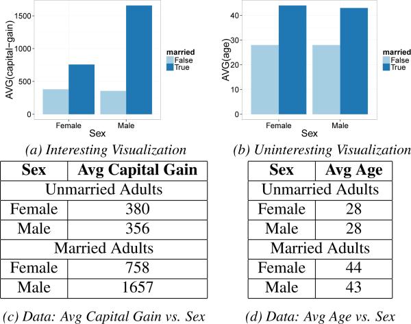
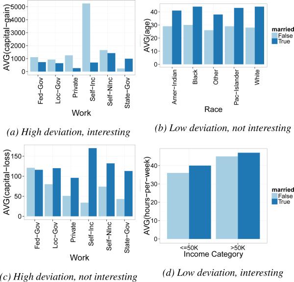
We have identified that across many analyses, visualizations that show trends in the target data (unmarried adults) that deviate from trends in reference data (married adults) are potentially interesting to analysts. For example, from our user study (Section 6), we know that for this particular task, analysts find the visualization in Figure 1a interesting since it depicts a property of the data that is different for unmarried adults compared to married adults. Specifically, the chart depicts that although capital gain for female and male unmarried adults is approximately equal, capital gain for female, married adults is only half that of male, married adults (Figure 1c). The same user study also shows that Figure 1b is a visualization that analysts do not find interesting. Note that this chart depicts that age does not show different trends between unmarried and married adults (Figure 1d).
Figure 1.
Motivating Example
The example above suggests that visualizations that depict deviations from a reference are potentially interesting to analysts; our goal in the current paper is to build a system that uses deviation as a means to identify the most interesting visualizations from a large set of potential visualizations. No existing system that we are aware of makes use of variation from a reference to recommend visualizations. As noted previously, in addition to our deviation-based metric, there are of course many other dimensions that can influence the perceived utility of a visualization, a few of which we discuss in Section 7, leaving a detailed investigation of such metrics for future work.
Our implementation of SeeDB incorporates an end-to-end data querying and visualization environment that allows analysts to manually generate their own visualizations (like Tableau or Spotfire), or get data-driven recommendations on demand, which can be further refined using the manual interface. We chose to support both automated and manual interaction in SeeDB because we believe that a mixed-initiative interface [12] is essential for keeping analysts in the loop and allowing them to drive the analytical process.
In developing SeeDB as a middleware layer that can run on any database system, we develop and validate the use of two orthogonal techniques to make the problem of recommending visualizations based on deviation tractable:
Sharing Computation. We develop a suite of multi-query optimization techniques to share computation among the candidate visualizations, reducing time taken by upto 40X.
Pruning Computation. We develop pruning techniques to avoid wasting computation on obviously low-utility visualizations, adapting techniques from traditional confidence-interval-based top-k ranking [11] and multi-armed bandits [38], further reducing time taken by 5X.
Lastly, we develop a general-purpose phase-based execution framework that allows us to leverage the benefits of these two techniques in tandem, reducing the time for execution by over 100X and making many recommendations feasible in real-time. In summary, the contributions of this paper are:
We build a system that uses deviation from reference as a criterion for finding the top-k most interesting visualizations for an analytical task (Section 2).
We present the design of SeeDB as a middleware layer that can run on any SQL-compliant DBMS (Section 3).
We describe SeeDB's execution engine (Section 4) that uses sharing techniques to share computation across visualizations (Section 4.1) and pruning techniques to avoid computation of low-utility visualizations (Section 4.2).
We evaluate the performance of SeeDB and demonstrate that SeeDB can identify high-utility visualizations with high accuracy and at interactive time scales (Section 5).
We present the results of a controlled user study that validates our deviation-based utility metric, and evaluates SeeDB against a manual chart construction tool showing that SeeDB can speed up identification of interesting visualizations (Section 6).
We note that this work builds upon the high-level ideas for SeeDB as described in our short vision paper [24] and demo paper [36].
2. PROBLEM STATEMENT
As is standard in OLAP, and in visual analytics tools such as Tableau and Polaris [1, 35], we focus on a database D with a snowflake schema. We denote the attributes that we would like to group-by in our visualizations as dimension attributes, A, and the attributes that we would like to aggregate in our visualizations as measure attributes, M. Further, we denote by F the set of potential aggregate functions over the measure attributes (e.g. COUNT, SUM, AVG). For visualization purposes, we assume that we can group D along any of the dimension attributes A and we can aggregate any of the measure attributes M. This leads to a two-column table that can be easily visualized via standard visualization mechanisms, such as bar charts or trend lines. (Recent work has shown that bar charts are the overwhelming majority of visualizations created using visual analytics tools [22].) Our techniques also apply to the general Polaris table algebra [35], where we can aggregate across multiple attributes at once, and group-by multiple attributes, potentially leading to more than two columns. For ease of exposition, we focus on two-column result visualizations in this paper, which can be readily visualized using bar charts or trend lines.
In addition to the database D, we assume that the analyst has indicated a desire to explore a subset of data specified by a query Q. The goal of SeeDB is to recommend visualizations of Q that have high utility (which we measure using deviation, as explained in this section). The class of queries Q posed over D that we support encompasses a general class of queries that select a horizontal fragment of the fact table and one or more dimension tables. Conceptually, we can view this as a simple selection query over the result of joining all the tables involved in the snowflake schema. That said, we can also support projections and joins which essentially have the effect of respectively dropping certain columns or tables from consideration in the visualizations. Thus, we support a general class of select-project-join (SPJ) queries over the snowflake schema. For the purpose of this discussion, we focus on simple selection queries over the result of joining all the tables in the snowflake schema. We note that this class of queries suffices for most visualization tasks. For instance, in our illustrative example, Q can select any subset of records from the Census table. We denote the result of Q as DQ.
Each SeeDB visualization can be translated into an aggregate over group-by query on the underlying data. We represent a visualization Vi as a function represented by a triple (a, m, f), where m ∈ M, a ∈ A, f ∈ F. We call this an aggregate view or simply a view. The aggregate view performs a group-by on a and applies the aggregation function f to measure attribute m. As an example, Vi(D) represents the results of grouping the data in D by a, and then aggregating the m values using f; Vi(DQ) represents a similar visualization applied to the data in DQ.
SeeDB determines the utility of visualizations via deviation; visualizations that show different trends in the query dataset (i.e. DQ) compared to a reference dataset (called DR) are said to have high utility. The reference dataset DR may be defined as the entire underlying dataset (D), the complement of DQ (D − DQ) or data selected by any arbitrary query Q′ (DQ′). The analyst has the option of specifying DR; we use DR = D as the default if the analyst does not specify a reference. Given a view Vi, the deviation-based utility of Vi is computed as the deviation between the results of applying Vi to the query data, DQ, and applying Vi to the reference data, DR. View Vi applied to the query data can be expressed as query QT below. We call this the target view.
Similarly, view Vi applied to the reference data can be expressed as QR. We call this the reference view.
The (two) SQL queries corresponding to each view are referred to as view queries. The results of the above view queries are summaries with two columns, namely a and f(m). To ensure that all aggregate summaries have the same scale, we normalize each summary into a probability distribution (i.e. the values of f(m) sum to 1). For our example visualization of Average Capital Gain vs. Sex (Figure 1), the probability distribution for the target view Vi(DQ) (unmarried adults, data in Table 1c), denoted as P [Vi(DQ)] is: (F: 0.52, M: 0.48) while that for the reference view Vi(DR) (married adults, Table 1c), denoted as P[Vi(DR)] is: (F: 0.31, M: 0.69). In contrast, the distributions for the visualization Average Age vs. Sex are (F: 0.5, M: 0.5) and (F: 0.51, M: 0.49) for the target and reference views respectively (data in Table 1d). Qualitatively, we see that the distributions show a large deviation for the former visualization and hardly any deviation for the latter.
Table 1.
Datasets used for testing
| Name | Description | Size | |A| | |M| | Views | Size (MB) |
|---|---|---|---|---|---|---|
| Synthethic Datasets | ||||||
| SYN | Randomly distributed, varying # distinct values | 1M | 50 | 20 | 1000 | 411 |
| SYN*-10 | Randomly distributed, 10 distinct values/dim | 1M | 20 | 1 | 20 | 21 |
| SYN*-100 | Randomly distributed, 100 distinct values/dim | 1M | 20 | 1 | 20 | 21 |
| Real Datasets | ||||||
| BANK | Customer Loan dataset | 40K | 11 | 7 | 77 | 6.7 |
| DIAB | Hospital data about diabetic patients | 100K | 11 | 8 | 88 | 23 |
| AIR | Airline delays dataset | 6M | 12 | 9 | 108 | 974 |
| AIR10 | Airline dataset scaled 10X | 60M | 12 | 9 | 108 | 9737 |
| Real Datasets - User Study | ||||||
| CENSUS | Census data | 21K | 10 | 4 | 40 | 2.7 |
| HOUSING | Housing prices | 0.5K | 4 | 10 | 40 | <1 |
| MOVIES | Movie sales | 1K | 8 | 8 | 64 | 1.2 |
Given an aggregate view Vi and probability distributions for the target view (P[Vi(DQ)]) and reference view (P[Vi(DR)]), we define the utility of Vi as the distance between these two probability distributions. The higher the distance between the two distributions, the more likely the visualization is to be interesting and therefore higher the utility. Formally, if S is a distance function,
Computing distance between probability distributions has been well studied in the literature, and SeeDB supports a variety of distance functions to compute utility, including Earth Mover's Distance, Euclidean Distance, Kullback-Leibler Divergence (K-L divergence), and Jenson-Shannon Distance. SeeDB uses Earth Mover's Distance as the default distance function, and we find that using other distance functions gives comparable results [37].
We can formally state the SeeDB problem as follows:
Problem 2.1
Given a user-specified query Q on a database D, a reference dataset DR, a utility function U as defined above, and a positive integer k, find k aggregate views V ≡ (a, m, f) that have the largest values of U(V) among all the views (a, m, f), while minimizing total computation time.
In Section 7, we describe how our metric can be generalized to capture aspects of interestingness besides deviation.
3. SeeDB FRONT-END & ARCHITECTURE
We now describe SeeDB's front-end user experience, and then describe the architecture and the execution engine in more detail.
Front-end Experience
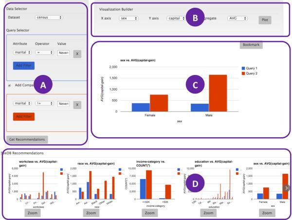
SeeDB's visualization recommendation capabilities are packaged into an end-to-end visual analytics environment, with basic visualization functionalities such as those provided by Tableau. The SeeDB front-end allows analysts to manually generate visualizations, or obtain data-driven recommendations on demand, which can be further refined using the manual interface. We design the frontend as a mixed-initiative interface to keep the human in the loop and allow the user to steer the analysis. Figure 2 shows the web front-end for SeeDB comprising four parts (A) dataset selector used to connect to a database and query builder used to formulate queries; (B) visualization builder used to manually specify visualizations; (C) visualization display pane; and (D) a recommendations plugin that displays recommended visualizations. The recommendations provided by SeeDB change in response to changes in the query (A) issued against the database.
Figure 2.
SeeDB Frontend
Architectural Overview
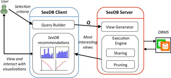
SeeDB is implemented as a middleware layer that can run on top of any SQL-compliant database system. Figure 3 depicts the overall architecture of our system. The SeeDB client is a web-based front-end that captures user input and renders visualizations produced by the SeeDB server. The SeeDB server is composed of two main components. The first component, the view generator, is responsible for parsing the input query, querying system metadata and generating the list of visualization queries that must be evaluated. The goal of the execution engine is to evaluate the collection of queries using our optimizations on top of the underlying DBMS. The selected aggregate views (i.e., those with high deviation) are sent to the SeeDB client and are displayed as visualization recommendations to the user, who can then interact with these visualizations.
Figure 3.
SeeDB Architecture
Basic Execution Engine
To motivate the need for optimizations, we first describe how our execution engine would work without optimizations. To identify the k best aggregate views, SeeDB needs to do the following: for each aggregate view, it generates a SQL query corresponding to the target and reference view, and issues the two queries to the underlying DBMS. It repeats this process for each aggregate view. As the results are received, it computes the distance between the target and reference view distributions, and identifies the k visualizations with highest utility.
This basic implementation has many inefficiencies. In a table with a dimensions, m measures, and f aggregation functions, 2 × f × a × m queries must be executed. As we show in Section 5, this can take >100s for large data sets. Such latencies are unacceptable for interactive use.
Execution Engine with Optimizations
To reduce latency in evaluating the collection of aggregate views, the SeeDB execution engine applies two kinds of optimizations: sharing, where aggregate view queries are combined to share computation as much as possible, and pruning, where aggregate view queries corresponding to low utility visualizations are dropped from consideration without scanning the whole dataset. These optimizations are largely orthogonal to each other. To derive benefits from both these kinds of optimizations, we develop a phased execution framework. Each phase operates on a subset of the dataset. Phase i of n operates on the ith of n equally-sized partitions of the dataset. For instance, if we have 100, 000 records and 10 phases, the i = 4th phase processes records 30, 001 to 40, 000. The execution engine begins with the entire set of aggregate views under consideration. During phase i, SeeDB updates partial results for the views still under consideration using the ith fraction of the dataset. The execution engine applies sharing-based optimizations to minimize scans on this ith fraction of the dataset. At the end of phase i, the execution engine uses pruning-based optimizations to determine which aggregate views to discard. The partial results for each aggregate view on the fractions from 1 through i are used to estimate the quality of each view, and the views with low utility are discarded. The retained aggregate views are then processed on the i + 1th round, and the process continues. In this manner, the set of views under consideration decreases across these phases, with all aggregate views at the start of the first phase, and only the k views left at the end of the nth phase.
4. SeeDB EXECUTION ENGINE
In this section, we describe the sharing and pruning optimizations designed to efficiently generate visualization recommendations. Our extended technical report [37] describes additional offline pre-computation and pruning techniques.
4.1 Sharing-based Optimizations
In the basic implementation of th execution engine, each visualization is translated into two view queries that get executed independently on the DBMS. However, for a particular user input, the queries evaluated by SeeDB are very similar: they scan the same underlying data and differ only in the attributes used for grouping and aggregation. This presents opportunities to intelligently merge and batch queries, reducing the number of queries issued to the database and, in turn, minimizing the number of scans of the underlying data. Sharing computation in our setting is a special case of the general problem of multi-query optimization [33]; we discuss the relationship in more detail in Section 8. Specifically, we apply the following optimizations:
Combine Multiple Aggregates
Aggregate view queries with the same group-by attribute can be rewritten as a single query with multiple aggregations. Therefore, instead of views (a1, m1, f1), (a1, m2, f2) . . . (a1, mk, fk), each requiring execution of two queries, we combine these views into a single view (a1, {m1, m2 . . . mk}, {f1, f2 . . . fk}) requiring execution of just two queries. We have found that there is minimal to no impact on latency for combining aggregates in both row and column stores.
Combine Multiple GROUP BYs
After applying our multiple aggregates optimization, SeeDB is left with a number of queries with multiple aggregations but only single-attribute groupings. These queries can be further combined to take advantage of multi-attribute grouping. However, unlike combining multiple aggregates, the addition of a grouping attribute can dramatically increase the number of groups that must be maintained and (possibly) lead to slower overall performance for large number of groups.
We claim (and verify in Section 5) that grouping can benefit performance so long as memory utilization for grouping stays under a threshold. Memory utilization is, in turn, proportional to the number of distinct groups present in a query. If a set of attributes a1. . . am are used for grouping, the upperbound on the number of distinct groups is given by . Given a memory budget , the challenge is now to determine the optimal grouping of attributes such that each group respects the memory budget.
Problem 4.1 (Optimal Grouping)
Given memory budget and a set of dimension attributes A = {a1. . . an}, divide the dimension attributes in A into groups A1, . . . , Al (where and Ai=A) such that if a query Q groups the table by any Ai, the memory utilization for Q does not exceed .
Notice that the above problem is isomorphic to the NP-Hard bin-packing problem [18]. If we let each dimension attribute ai correspond to an item in the bin-packing problem with weight log(|ai|), and set the bin size to be log , then packing items into bins is identical to finding groups A1, . . . , Al, such that the estimated memory utilization for any group is below . We use the standard first-fit algorithm [14] to find the optimal grouping of dimension attributes.
Combine target and reference view query
Since the target and reference views differ only in the subset of data on which the query is executed, SeeDB rewrites these two view queries as one. For instance, if the target and reference view queries are Q1 and Q2 respectively, they can be combined into a single query Q3.
Parallel Query Execution
SeeDB executes multiple view queries in parallel as these queries can often share buffer pool pages, reducing disk access times. However, the precise number of parallel queries needs to be tuned taking into account buffer pool contention, locking, and cache line contention, among other factors [26].
4.2 Pruning-Based Optimizations
In practice, most visualizations are low-utility, meaning computing them wastes computational resources. Thus, as described earlier, at the end of every phase, the execution engine uses pruning optimizations to determine which aggregate views to discard. Specifically, partial results for each view based on the data processed so far are used to estimate utility and views with low utility are dropped. The SeeDB execution engine supports two pruning schemes. The first uses confidence-interval techniques to bound utilities of views, while the second uses multi-armed bandit allocation strategies to find top utility views.
Confidence Interval-Based Pruning
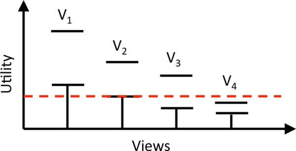
Our first pruning scheme uses worst-case statistical confidence intervals to bound view utilities. This technique (called CI) is similar to top-k based pruning algorithms developed in other contexts [13, 27]. Our scheme works as follows: during each phase, we keep an estimate of the mean utility for every aggregate view Vi and a confidence interval around that mean. At the end of a phase, we use the following rule to prune low-utility views: If the upper bound of the utility of view Vi is less than the lower bound of the utility of k or more views, then Vi is discarded. To illustrate, suppose a dataset has 4 views V1. . . V4 and we want to identify the top-2 views. Further suppose that at the end of phase i, V1-V4 have confidence intervals as shown in Figure 4. Views V1 and V2 have the highest utility estimates so far and are likely to be in the top-2 views. View V3 is currently not in the top-2, but its confidence interval overlaps with that of the top-2, making it possible that V3 could replace V1 or V2. The confidence interval for V4, on the other hand, lies entirely below the confidence intervals of V1 and V2. Since we can claim with high probability that the utility of V4 lies within its confidence interval, it follows that, with high probability, V4's utility will be lower than that of both V1 and V2, and it will not appear in the top-2 views. Pseudocode for our pruning scheme can be found in our technical report [37].
Figure 4.
Confidence Interval based Pruning
We use worst case confidence intervals as derived from the Hoeffding-Serfling inequality [34]. The inequality states that if we are given N values y1, . . . , yN in [0, 1] with average μ, and we have drawn m values without replacement, Y1, . . . , Ym, then we can calculate a running confidence interval around the current mean of the m values such that the actual mean of the N is always within this confidence interval with a probability of 1 − δ:
Theorem 4.1
Fix any δ > 0. For 1 ≤ m ≤ N − 1, define
In our setting, each Yi corresponds to an estimate of utility computed based on the records seen so far.
Multi-Armed Bandit Pruning
Our second pruning scheme employs a Multi-Armed Bandit strategy (MAB) [38]. In MAB, an online algorithm repeatedly chooses from a set of alternatives (arms) over a sequence of trials to maximize reward. We note that this is the first time that bandit strategies have been applied to the problem of identifying interesting visualizations.
A recently-studied variation of MAB focuses on finding the arms with the highest mean reward [5, 4]. This variation is identical to the problem addressed by SeeDB: our goal is to find the visualizations (arms) with the highest utility (reward). Specifically, we adapt the Successive Accepts and Rejects algorithm from [5] to find arms with the highest mean reward. At the end of every phase (Section 3), views that are still under consideration are ranked in order of their utility means. We then compute two differences between the utility means: Δ1 is the difference between the highest mean and the k + 1st highest mean, and Δn is the difference between the lowest mean and the kth highest mean. If Δ1 is greater than Δn, the view with the highest mean is “accepted” as being part of the top-k (and it no longer participates in pruning computations). On the other hand, if Δn is higher, the view with the lowest mean is discarded from the set of views in the running. The pseudocode can be found in the technical report [37]. [5] proves that under certain assumptions about reward distributions, the above technique identifies the top-k arms with high probability.
Consistent Distance Functions
Note that the two pruning schemes described above have guarantees in other settings that do not directly carry over to our setting—for example, the MAB setting assumes that each trial samples from a fixed underlying distribution, while in fact, our trials correspond to random values across m distributions (groups), which are aggregated together to form a utility estimate for a given view. In our evaluation, we show that in spite of this limitation, the pruning schemes work rather well in practice.
We can, however, get a weaker guarantee: we can show that, as we sample more and more, the estimated utility Û can be made to be arbitrarily close to U for all aggregate views. Essentially, this means that a pruning algorithm (such as CI and MAB) that uses a sufficiently large sample will prune away low utility views with high probability. We can state this property formally as follows.
Property 4.1 (Consistency)
Let the target and reference visualizations both have m groups. Let Û denote our estimate of the utility U based on a uniformly random sample across all m groups. Then, as the number of samples tends to ∞, Û → U with probability 1 − δ, for as small δ as needed.
We call distance functions that have this property as consistent distance functions. Consistent distance functions allow pruning schemes to gather increasingly better estimates of utility values over time (as long as the samples are large enough). In the extended technical report [37], we prove using Hoeffding's inequality that this property holds for Euclidean distance. Our results in Section 5.4 and in [37] empirically show that CI and MAB-based pruning schemes work well for a variety of metrics including EMD based deviation, Euclidean distance based deviation, as well as metrics such as MAX_DIFF that rank visualizations by the difference between respective groups in the target and reference distributions.
5. PERFORMANCE EVALUATION
In the next two sections, we present an evaluation of SeeDB both in terms of performance when returning visualizations and in terms of user studies. In both sections, we report results for SeeDB on a variety of real and synthetic datasets listed in Table 1.
In this section, we focus on performance studies, where our goal is to evaluate how well our sharing and pruning optimizations improve latency, and how our pruning optimizations affect accuracy. In each experiment, our primary evaluation metric is latency, i.e., how long does it take SeeDB to return the top-k visualizations. For experiments involving our pruning strategies, we measure quality of results through two additional metrics, namely accuracy and utility distance (discussed further in Section 5.4). Since we expect data layout to impact the efficacy of our optimizations, we evaluate our techniques on a row-oriented database (denoted ROW) as well as a column-oriented database (denoted COL).
The following experiments use earth mover's distance (EMD) as our distance function for computing deviation (Section 2). All experiments were run on a single machine with 8 GB RAM and a 16 core Intel Xeon E5530 processor. Unless described otherwise, we report measurements averaged over three runs.
We begin by presenting a summary of our experimental findings and then dive into performance results for individual optimizations.
5.1 Summary of Findings
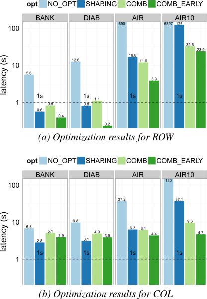
Figures 5.a and 5.b show a summary of SeeDB performance for the four real datasets from Table 1 (BANK, DIAB, AIR and AIR10). For each dataset, we show the latencies obtained on the ROW and COL store by the basic SeeDB framework (NO_OPT), by our sharing optimizations (SHARING), and by the combination of our sharing and pruning optimizations (COMB). We also show latencies for early result generation with COMB (COMB_EARLY), where we return approximate results as soon as the top-k visualizations have been identified. The results in Figure 5 use the Confidence Interval (CI) pruning scheme and k=10.
Figure 5.
Performance gains from all optimizations
[> 100X speedup overall] The combination of our sharing and pruning optimizations provides a speedup between 50X (COMB) – 300X (COMB_EARLY) for ROW (Figure 5a) and 10X (COMB) – 30X (COMB_EARLY) for COL (Figure 5b). This reduces latencies for small datasets like DIAB from 12s to 200ms, and from almost 2 hrs to tens of seconds for large datasets like AIR10.
[6–40X speedup from sharing] The sharing optimizations (Section 4.1) alone produce performance gains of up to 40X for ROW and 6X for COL.
[5X speedup from pruning without loss of accuracy] Pruning optimizations (Section 4.2) provide additional gains of up to 5X. Early result return, in particular, enables real-time response for large datasets, e.g. for AIR, the COMB_EARLY strategy allows SeeDB to return results in under 4s while processing the full dataset takes tens of seconds. We also find that quality of results is not adversely affected by pruning: the utility distance (defined later) for our pruning strategies is close to 0.
[Multiplicative gains] A gain of 40X from sharing optimizations in the ROW store combines with the 5X gain from pruning to produce an overall gain of over 200X (Figure 5a).
[Gains improve on larger datasets] The overall gain is much larger for AIR10 (300X) vs. BANK (10X). We find that our SHARING optimization is best suited for small datasets like BANK and DIAB, while COMB and COMB_EARLY are essential for large datasets like AIR and AIR10.
In the next sections, we discuss the performance of individual optimizations and how they relate to the overall performance gain.
5.2 Basic SeeDB Framework
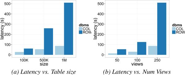
Summary: Applying no optimizations leads to latencies in the 100s of seconds for both ROW and COL; latency increases linearly in the size of the dataset and number of views. Without any optimizations, the basic SeeDB framework serially executes two SQL queries for each possible view. Figure 6a shows latency of SeeDB vs. the number of rows (100K rows–1M rows) in the dataset, while Figure 6b shows latency as a function of the number of views (50–250). These charts show results for the SYN dataset obtained by varying the size of the table and number of attributes (SYN is comparable to the AIR dataset). First, notice that the basic framework with no optimizations has very poor performance: latency for ROW is between 50-500s, while it is between 10-100s for COL. This is because, depending on the dataset, both ROW and COL run between 50 to 250 SQL queries for each SeeDB invocation. Second, COL runs about 5X faster than ROW. This is expected because most queries only select a few attributes, benefitting from a column layout. Third, as expected, the latency of the basic framework is proportional to the number of rows as well as the number of views in the table. Since the latencies for the basic framework are very high for interactive applications, it is clear that aggressive optimization needs to be employed.
Figure 6.
Baseline performance
5.3 Sharing Optimizations
In this section, we study the performance of sharing optimizations described in Section 4.1. Recall that the goal of these optimizations is to reduce the number of queries run against the DBMS and to share scans as much as possible between queries. The following experiments report results on the synthetic datasets SYN and SYN* (Table 1). We chose to test these optimizations on synthetic data since we can control all parameters of the data including size, number of attributes, and data distribution. (Results on real datasets are shown in Figure 5a and 5b).
Combining Multiple Aggregates
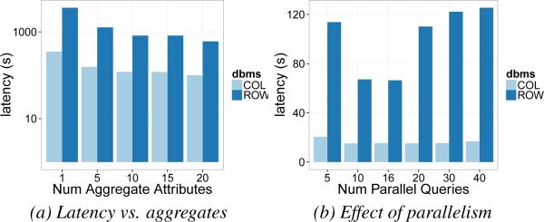
Summary: Combining view queries with the same group-by attribute but different aggregates gives a 3-4X speedup for both row and column stores. To study the limits of adding multiple aggregates to a single view query, we varied the maximum number of aggregates in any SeeDB-generated SQL query (nagg) between 1 and 20. The resulting latencies on the SYN dataset are shown in Figure 7a (log scale on the y-axis). As we can see, latency reduces consistently with the number of aggregations performed per query. However, the latency reduction is not linear in nagg because larger nagg values require maintenance of more state and access more columns in a column store. Overall, this optimization provides a 4X speedup for ROW and 3X for COL.
Figure 7.
Effect of Group-by and Parallelism
Parallel Query Execution
Summary: Running view queries in parallel can offer significant performance gains. Executing SeeDB-generated SQL queries in parallel can provide significant performance gains because queries can share buffer pool pages. However, a high degree of parallelism can degrade performance for a variety of reasons [26]. Figure 7b shows how latency varies with the number of parallel SQL queries issued by SeeDB. As expected, low levels of parallelism produce sizable performance gains but high levels degrade performance. The optimal number of queries to run in parallel is approximately 16 (equal to the number of cores), suggesting that choosing a degree of parallelism equal to the number of cores is a reasonable policy.
Combining Multiple Group-bys
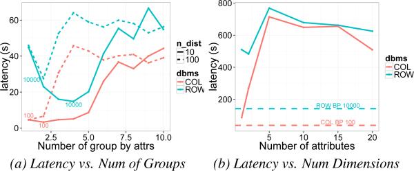
Summary: Combining multiple view queries, each with a single group-by attribute into a single query with multiple group-by attributes improves performance by 2.5X in row stores. Unlike the multiple aggregates optimization, the impact of combining multiple group-bys attributes into one query is unclear due to the (potentially) significantly larger memory utilization. We claim in Section 4.1 that grouping can benefit performance so long as the total memory utilization stays under a threshold. To verify our claim, we ran an experiment with datasets SYN*-10 and SYN*-100. For each dataset, we varied the number of group-by attributes in SeeDB-generated SQL queries (ngb) between 1 and 10. Since each attribute in SYN*-10 has 10 distinct values and that in SYN*-100 has 100, a query with ngb = p will require memory proportional to max(10p, num_rows) for SYN*-10 and proportional to max(100p, num_rows) for SYN*-100. The results of the experiment are shown in Figure 8a. We see that as the number of group-by attributes increases from 1 to 10, the latency of ROW (blue) decreases initially. However, once the memory budget (proxied by the number of distinct groups) exceeds 10000, latency increases significantly. We see a similar trend for COL, but with a memory budget of 100.1 Thus, we find empirically that memory usage from grouping is, in fact, related to latency and that optimal groupings must respect the memory threshold.
Figure 8.
Effect of Groups and Dimensions
To evaluate the gains offered by our bin-packing optimization, we evaluate two methods to perform grouping, MAX_GB and BP. MAX_GB simply sets a limit on the number of group-bys in each query (ngb) whereas BP applies our bin-packing strategy using the respective memory budgets. Figure 8b shows a comparison of the two methods on the SYN dataset. To evaluate MAX_GB, we varied ngb between 1 and 20 (solid lines). Since SYN contains attributes with between 1 – 1000 distinct values, memory utilization for a given ngb can be variable. For example, ngb = 3 can have anywhere between 1 and 109 distinct groupings, thus breaking the memory budget for some groups. Because groupings with MAX_GB depends on order, results in Figure 8b are averages over 20 runs. Dotted lines show the latency obtained by BP, our bin-packing scheme. Unlike MAX_GB, BP consistently keeps memory utilization under the memory budget. Consequently, we observe that BP improves performance for both ROW and COL. We observe a signifi-cant, 2.5X improvement in ROW because the large memory budget, , allows many queries to be combined. COL, in contrast, shows a much less pronounced speedup since its smaller memory budget () biases optimal grouping to contain single attribute groups.
All Sharing Optimizations
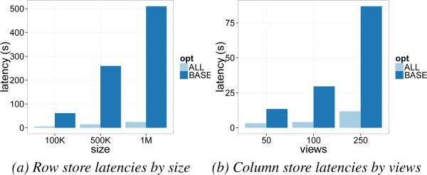
Summary: Applying all of our sharing optimizations leads to a speedup of up to 40X for row stores, and 6X for column stores; column stores are still faster than row stores. Based on the optimal parameters identified from the previous experiments, we combined our optimizations to obtain the best performance. For ROW, we set nagg equal to the total number of measure attributes in the table, memory threshold and parallelism as 16. For COL, we set nagg and number of parallel queries similarly but did not apply the group-by optimization because of low performance gains. Figure 9 shows the latency of SeeDB on SYN when all optimizations have been applied. (Results on real datasets are presented in Section 5.1.) We see that our sharing optimizations lead to a speed up of upto 40X for ROW (Figures 9a) and a speedup of 6X in COL (Figures 9b). Sharing is most effective for datasets with large sizes and many views, particularly for ROW where reduction in table scans has large benefits.
Figure 9.
Effect of All Optimizations
5.4 Pruning Optimizations
In the next set of experiments, we evaluate the impact of our pruning optimizations (Section 4.2).
Metrics
We evaluate performance of pruning optimizations along two dimensions, latency, as before, and result quality. We measure result quality with two metrics: (1) accuracy: if {νT} is the set of aggregate views with the highest utility and {νS} is the set of aggregate views returned by SeeDB, the accuracy of SeeDB is defined as , i.e. the fraction of true positives in the aggregate views returned by SeeDB. (2) utility distance: since multiple aggregate views can have similar utility values, we use utility distance as a measure of how far SeeDB results are from the true top-k aggregate views. We define utility distance as the difference between the average utility of {νT} and the average utility of {νS}, i.e., .
Accuracy vs. Utility Distance
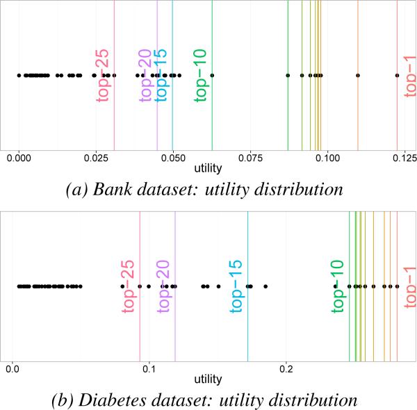
Since pruning relies on utility estimates, the accuracy of pruning depends on the differences between utilities of consecutive views. Specifically, if V1 . . . Vn is the list of aggregate views ordered by decreasing utility, then the accuracy of pruning is inversely proportional to the difference between the k-th highest utility and the k+1-st utility, i.e., Δk = U(Vk)−U(Vk+1). Views with large Δk values can be pruned accurately while whose with small Δks can lead to lower absolute accuracy. While this is true, notice that small Δks are, in fact, the result of views at the top-k boundary having similar utility (and, therefore, interestingness). For instance, the utilities at the top-5 boundary for the DIAB dataset are U(V5) = 0.257, U(V6) = 0.254, and U(V7) = 0.252 (see Figure 10b). The small Δks lead to lower accuracy for k = 5, but the very similar utility values indicate that V6 and V7 are (almost) as interesting as V5. Therefore, even if V6 or V7 are incorrectly chosen to be in the top-k, the quality of results is essentially as high as when V5 is chosen. Our utility distance metric correctly captures this overall quality of results. Utility distance indicates that, in the worst case, even when both V6 or V7 are incorrectly chosen, the overall utility of the top-5 differs only by 0.013 units (≈5% error) compared to the true top-5. As a result, we jointly consider accuracy and utility distance when evaluating result quality.
Figure 10.
Distribution of Utilities
Techniques
In the following experiments, we evaluate four techniques for pruning low-utility views. In addition to the two pruning strategies from Section 4.2, namely the Hoeffding Confidence Intervals (CI) and the Multi-Armed Bandit (MAB), we implement two baseline strategies. The no pruning strategy processes the entire data and does not discard any views (NO_PRU). It thus provides an upperbound on latency and accuracy, and lower bound on utility distance. The other baseline strategy we evaluate is the random strategy (RANDOM) that returns a random set of k aggregate views as the result. This strategy gives a lowerbound on accuracy and upperbound on utility distance: for any technique to be useful, it must do significantly better than RANDOM. Since absolute latencies of any pruning strategy depend closely on the exact DBMS execution techniques, in this section, we report relative improvements in latency, specifically, the percent improvement in latency with pruning compared to latency without pruning. Absolute latency numbers are discussed in Section 5.1. We do not employ early stopping in the next set of experiments.
Datasets
Because pruning quality depends closely on the underlying data distribution, we evaluate our pruning optimizations on the real-world datasets from Table 1. In this section, we analyze the results for BANK and DIAB in detail; results for AIR and AIR10 are discussed in Section 5.1.
In each of our experiments, we vary k — the number of visualizations to recommend — between 1 and 25 (a realistic upper limit on the number of aggregate views displayed on a screen) and measure the latency, accuracy, and utility distance for each of our strategies. We pay special attention to k = 5 and 10 because these k values are most common. Since the accuracy and utility distance of our techniques are influenced by the ordering of data, we repeat each experiment 20 times and randomize data between runs. We report average metrics over 20 runs.
Accuracy and Utility Distance
Summary: The MAB and CI strategy both produce results with accuracy >75% and near-zero utility distance for a variety of k values. MAB does slightly better than CI when utlity values are closely spaced. In general, smaller Δk values lead to lower accuracy, but this is offset by lower utility distance that is a consequence of the smaller Δks.
BANK dataset
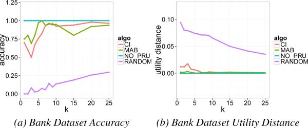
The distribution of utilities for all aggregate views of the bank dataset is shown in Figure 10a. In this chart, vertical lines denote the cutoffs for utilities of the top-k views where k={1,. . . ,10,15,20,25}. The highest utility for this dataset corresponds to the right-most line in this chart while the 25-th highest utility corresponds to the left-most line. We observe that the highest and second highest utility are spread well apart from the rest (Δk=0.0125). The top 3rd–9th utilities are similar (Δk<0.002) while the 10th highest utility is well separated from neighboring utilities (Δ10=0.0125). The remaining aggregate views once again have similar utilities (Δk<0.001). We see the effect of utility distribution in the performance of our pruning strategies. Figure 11a and Figure 11b respectively show the average accuracy and utility distance of our strategies over 20 runs. We find that MAB consistently produces 75% or better accuracy for all values of k, and CI produces 85% or better accuracy for k>10. For k=1 and 2, the accuracy is 75% for both pruning strategies (due to large Δk values). The corresponding utility distance is almost zero for MAB and about 0.015 for CI (note that these are averages). Between k=3. . . 9, the accuracy for all strategies suffers due to small Δks (< 0.002). In spite of lower accuracies, note that utility distance is consistently small (< 0.02). After k=10, the performance of all our strategies improves once again and tends to 100% accuracy and 0 utility distance. We note that NO_PRU necessarily has perfect performance, while RANDOM has extremely poor accuracy (<0.25) and utility distance (>5X that of CI and MAB).
Figure 11.
Bank dataset result quality
DIAB dataset
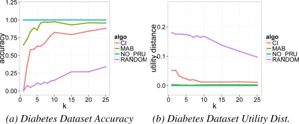
Next, we briefly review results for the diabetes dataset. The distribution of true utilities for all aggregate views in this dataset are shown in Figure 10b. We observe that utilities for the top 10 aggregate views are very closely clustered (Δk <0.002) while they are sparse for larger ks. Therefore, we expect lower pruning accuracy for k < 10 but high accuracy for large k's. We see this behavior in Figure 12a where the accuracy of pruning is quite low (< 60%) for k=1 but improves consistently to 68% (CI) and 86% (MAB) for k=5 and is >80% for k≥10. In the companion figure, Figure 12b, we see that although accuracy is relatively low for k<5, utility distance is small (0.013 for CI, 0.002 for MAB) indicating that the results are high quality. Both CI and MAB produce 40X smaller utility distances compared to RANDOM.
Figure 12.
Diabetes dataset result quality
Latency
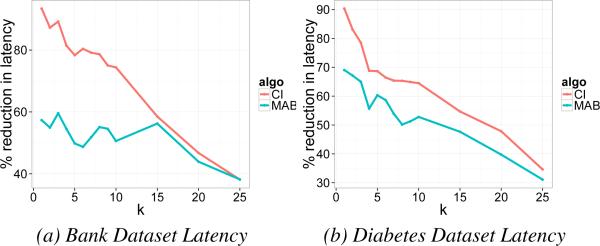
Summary: Both pruning strategies provide a reduction in latency of 50% or more relative to NO_PRU. For smaller k, reductions can be even higher, closer to 90%; this can be especially useful when we want to identify and quickly display the first one or two top views. Figures 13a and 13b show the latency of our strategies for the banking and diabetes dataset. First off, we observe that the use of either CI or MAB produces a 50% reduction in latency for k≤15. In fact, for CI, we obtain almost a 90% reduction in latency for small k. For k=5, MAB produces between 50 - 60% reduction while CI produces a reduction of 60 - 80%. Early stopping, i.e. returning approximate results once the top-k views have been identified, can produce even better latency reduction (results in Section 5.1). As expected, as k increases, latency also increases because we can prune fewer aggregate views.
Figure 13.
Latency Across Datasets
CI vs. MAB
In our evaluation, we compared two competing pruning strategies, CI and MAB. From the above figures, we observe that MAB, on average, has higher accuracy and lower utility distance compared to CI, i.e., overall, it produces higher quality results. However, we find that CI performs much better than MAB on latency. Since CI can prune views more aggressively than MAB (MAB only discards one view at a time), it can rapidly prune the space of views, but this comes at the cost of result quality. Depending on the tradeoff between latency and quality of results, we can choose the best pruning strategy from CI and MAB.
6. USER STUDY
The previous section evaluated SeeDB and our optimizations in terms of performance. In this section, we assess the utility of SeeDB's recommendations with real users. First, we perform a study to validate our deviation-based utility metric. We show that although simple, our deviation-based metric can find visualizations users feel are interesting. Second, we compare SeeDB to a manual charting tool without visualization recommendations. We show that SeeDB can enable users to find interesting visualizations faster and can surface unexpected trends. We also find that users overwhelmingly prefer SeeDB over a manual charting tool.
6.1 Validating Deviation-based Utility
SeeDB uses deviation between the target and reference dataset as a measure of interestingness of a visualization.
Ground Truth
To validate deviation as a utility metric, we obtained ground truth data about interestingness of visualizations and evaluated SeeDB against it. To obtain ground truth, we presented 5 data analysis experts with the Census dataset (Section 1) and the analysis task of studying the effect of marital status on socioeconomic indicators. We presented experts with the full set of potential aggregate visualizations and asked them to classify each visualization as interesting or not interesting in the context of the task. Of the 48 visualizations, on average, experts classified 4.5 visualizations (sd = 2.3) as being interesting for the task. The small number indicates that of the entire set of potential visualizations, only a small fraction (~10%) shows interesting trends. To obtain consensus on ground truth, we labeled any visualization chosen by a majority of experts as interesting; the rest were labeled as not interesting. This process identified 6 interesting and 42 uninteresting visualizations. In addition to Figure 1a (marked as interesting and recommended by SeeDB), Figure 14a another visualization recommended by SeeDB was labeled as interesting (“. . . it shows a big difference in earning for self-inc adults”). In contrast, Figure 14b was labeled as not interesting (notice the lack of deviation). While some classifications can be explained using deviation, some cannot: Figure 14c showing high deviation was recommended by SeeDB, but was deemed uninteresting, while Figure 14d showing small deviation was deemed interesting (“. . . hours-per-week seems like a measure worth exploring”).
Figure 14.
Examples of ground truth for visualizations
Efficacy of Deviation-based Metric
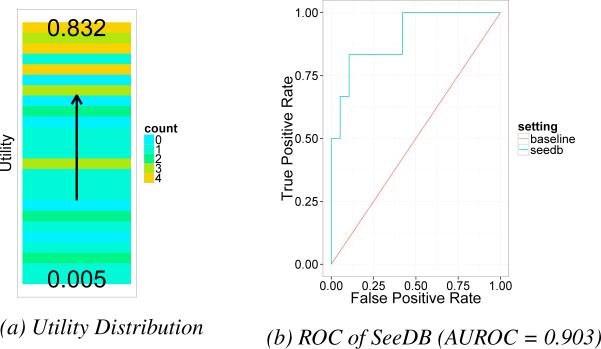
Figure 15a shows a heatmap of the number of times a visualization was classified as interesting (yellow = popular, blue = not popular), sorted in descending order of our utility metric. We notice that the majority of yellow bands fall at the top of the heatmap, indicating, qualitatively, that popular visualizations have higher utility. To evaluate the accuracy of SeeDB's recommendations over the Census data, we ran SeeDB for the study task, varying k between 0 . . . 48, and measured the agreement between SeeDB recommendations and ground truth. As is common in data mining, we computed the “receiver operating curve” or ROC curve for SeeDB (Figure 15b) depicting the relationship between the true positive rate (TPR) on the y-axis and false positive rate (FPR) on the x-axis for different values of k. TPR is the number of interesting visualizations returned as a fraction of the total number of interesting visualizations, while FPR is the number of recommendations that were incorrectly returned as interesting, as a fraction of the number of non-interesting visualizations. ROC curves for highly accurate classifiers are skewed towards the upper left corner of the graph. The red line indicates the random baseline (every example is classified randomly). As can be seen in the figure, SeeDB performs significantly better than the baseline. For example, for k=3, all 3 visualizations recommended by SeeDB are interesting, giving TPR = 0.5 and FPR = 0; for k=5, four of the 5 recommended visualizations are interesting, giving TPR = 4/6 = 0.667 and FPR = 0.05. The area under ROC (AUROC) for SeeDB (the typical measure of classifier quality) is 0.903, indicating that accuracy of SeeDB recommendations is very high.2
Figure 15.
Performance of Deviation metric for Census data
While ROC curves on different datasets and tasks will vary, this user study shows that SeeDB recommendations have high quality and coverage, despite focusing on a simple deviation-based utility metric. We expect that taking into account other aspects of interestingness would improve SeeDB recommendations even more.
6.2 SeeDB vs. Manual Visualization Tool
In this section, we describe results from a controlled user study comparing SeeDB to a manual visualization tool for performing visual analysis. We hypothesized that: (i) when using SeeDB, analysts would find interesting visualizations faster than when using the manual tool, (ii) analysts would find more interesting visualizations when using SeeDB vs. the manual tool, and (iii) analysts would prefer using SeeDB to a manual tool.
Participants and Datasets
We recruited 16 participants (5 female, 11 male), all graduate students with prior data analysis experience and visualization experience (e.g. R, matplotlib or Excel). Our study used the Housing and Movies datasets from Table 1. These datasets were chosen because they were easy to understand and comparable in size and number of potential visualizations. None of the participants had previously worked with the study datasets.
Study Protocol
Our study used a 2 (visualization tool) X 2 (dataset) within-subjects design. The visualizations tools used were SeeDB and MANUAL, a manual chart construction-only version of SeeDB (i.e., SeeDB with the recommendations bar, component “D” in Figure 2, removed). Using the same underlying tool in both modes allowed us to control for tool functionality and user interface. We used a within-subjects design to compensate for per-participant differences in data analysis expertise, and used counterbalancing to remove any effects related to order and the test dataset.
Our study began with a short tutorial on the two study tools. Following the tutorial, participants were asked to perform two visual analysis tasks, one with SeeDB, and one with MANUAL. In either case, we introduced participants to the test dataset and the analytical task using written instructions. Each analytical task asked participants to use the specified tool to find visualizations supporting or disproving a specific hypothesis. Participants were asked to use the bookmark button (in component “C” in Figure 2) to flag any visualizations they deemed interesting in context of the task. Participants were also encouraged to think aloud during the study. Since the analytical tasks were open-ended, we capped each analysis session at 8 minutes. Participants filled out a tool-specific survey at the end of each task and an exit survey at the end of the study. Most survey questions were answered on a 5-point Likert scale. The study lasted ~45 minutes and participants were compensated with a $15 gift card. All studies were conducted in a lab setting using Google Chrome on a 15-inch Macbook Pro.
Methods and Metrics
Over the course of each study session, we collected data by three means: interaction logs from each tool, responses to surveys, and exit interview notes. The interaction logs capture the number of visualizations constructed, the number of visualizations bookmarked, bookmark rate, and interaction traces. SeeDB and MANUAL both support the construction of different types of charts such as bar charts, scatterplots etc. Since SeeDB can only recommend aggregate visualizations shown as bar charts, we report results for aggregate visualizations. We evaluate statistical significance of our results using ANOVA, and supplement interaction analysis with qualitative observations.
Results
Over the course of our study, participants built over 220 visualizations and bookmarked 70 visualizations (32% bookmark rate). We next describe our key findings and observations.
1. SeeDB enables fast visual analysis
Table 2 shows an overview of the bookmarking behavior for each tool focusing on total number of visualizations generated, number of bookmarks and bookmarking rate. First, we observe that the total number of (aggregate) visualizations created in the SeeDB condition is higher than that for MANUAL. While not statistically significant, this difference suggests that analysts are exposed to more views of the data with SeeDB than MANUAL, possibly aiding in a more thorough exploration of the data. Next, we find that the number of aggregate visualizations bookmarked in SeeDB is much higher (3X more) than that for MANUAL. In fact, the two-factor analysis of variance shows a significant effect of tool on the number of bookmarks, F(1,1) = 18.609, p < 0.001. We find no significant effect of dataset, F(1, 1) = 4.16. p > 0.05, or significant interaction between tool and dataset. While this result indicates that analysts bookmark more visualizations in SeeDB, we note that the number of bookmarks for a tool may be affected by the total number of visualizations built with the tool. Therefore, to account for variance in the total number of visualizations, we also examine bookmark_rate for the two tools defined as the fraction of created visualizations that are bookmarked (). We find, once again, that the bookmark_rate for SeeDB (0.42) is 3X larger than the bookmark_rate for MANUAL (0.14). The two-factor analysis of variance shows a significant effect of tool on bookmark rate, F(1,1) = 10.034, p < 0.01. As before, we find no significant effect of dataset on bookmark rate, F(1, 1) = 3.125. p > 0.05, or significant interaction between tool and dataset. Together the two results above indicate that there is a significant effect of tool on both the number of bookmarks as well as the bookmark rate. SeeDB-recommended visualizations are 3 times more likely to be interesting compared to manually constructed visualizations. Finally, 87% of participants indicated that SeeDB recommendations sped up their visual analysis, many alluding to the ability of SeeDB to “. . . quickly deciding what correlations are relevant” and “[analyze]...a new dataset quickly”.
Table 2.
Aggregate Visualizations: Bookmarking Behavior Overview
| total_viz | num_bookmarks | bookmark_rate | |
|---|---|---|---|
| MANUAL | 6.3 ± 3.8 | 1.1 ± 1.45 | 0.14 ± 0.16 |
| SeeDB | 10.8 ± 4.41 | 3.5 ± 1.35 | 0.43 ± 0.23 |
2. All participants preferred SeeDB to MANUAL
100% of all users preferred SeeDB to MANUAL for visual analysis, i.e., all users preferred to have recommendation support during analysis. 79% of participants found the recommendations “Helpful” or “Very Helpful” and thought that they showed interesting trends. In addition, a majority of users found SeeDB a powerful means to get an overview of interesting trends and starting points for further analysis. One participant noted that SeeDB was “. . . great tool for proposing a set of initial queries for a dataset”. 79% of participants also indicated that SeeDB visualizations showed unexpected trends (e.g., the difference in capital gain in Figure 14a), and indicated that SeeDB suggested visualizations they wouldn't have created, e.g., although users did not manually generate Figure 1a, it was identified as an interesting visualization in the ground truth.
7. UTILITY METRICS: DISCUSSION
Our current system uses a particular class of metrics for defining visualization utility, namely, metrics based on deviation. There are other metrics and dimensions that can capture the interestingness of a visualization. For example, data-driven metrics that can reliably identify outliers, correlations, similarity between visualizations, the presence of clusters, etc. would lead to visualizations that may be interesting to users. In addition to data, many other aspects determine the interestingess of a visualization. We can identify attributes relevant to the task using metrics based on metadata (e.g. schema) and semantics. Similarly, aesthetics play a big role in determining whether a visualization is easy to understand, making visual design important in visualization recommendation. Finally, user preference, whether based on history of multiple users or a single user in a specific session, or based on explicit user input and domain knowledge, can provide insight into which visualizations are most interesting. A full-fledged visualization recommendation system would take into account a combination of these aspects to make recommendations. In our technical report [37], we discuss how we can design a generalized utility metric to incorporate other dimensions of visualization quality such as those discussed above. We also include results that demonstrate the generality of our optimization strategies to support a diverse set of metrics.
8. RELATED WORK
SeeDB draws on related work from multiple areas; we review papers in each of the areas, and describe how they relate to SeeDB.
Visualization Tools
The visualization research community has introduced a number of visualization toolkits and tools, including Spotfire and Tableau [35, 3], that enable users to build visualizations with different levels of sophistication. Similar visual specification tools have been introduced by the database community as well, e.g., Fusion Tables [8]. Some of these tools provide features that use heuristics to suggest chart types for a given set of variables. All of these tools, however, require the user to manually specify visualizations, leading to a tedious trial-and-error process to find visualizations that are interesting or useful. In contrast, SeeDB seeks to automatically identify and recommend interesting visualizations based on a utility metric.
Recommending Visualizations
There has been work such as [19, 20] on recommending visual encodings for different types of data. Tools like VISO [25] use semantic ontologies to recommend visualizations, while those like Voyager [39] focus on the interface design aspects for exploratory data analysis. Another type of visualization recommendation is performed by systems like Profiler and Scorpion [15, 40] which detect specific patterns (e.g. outliers) in data. VizDeck [16] depicts all possible 2-D visualizations of a dataset on a dashboard. While a dashboard with all 2-D visualizations can provide an overview of the data, this approach can quickly become intractable as the number of attributes increases.
Scalable Visualizations
There has been some recent work on scalable visualizations that employ in-memory caching, sampling, and pre-fetching to improve the interactivity of visualization systems backed by databases (e.g., [6, 17]). Such techniques could be employed in our setting to further improve response times (although some of these techniques, such as in-memory caching, can only work with small datasets).
Data Cube Materialization
Computations on data cubes [9] involve aggregation across multiple dimensions. Even when the number of attributes and number of distinct values of each attribute is relatively small, the space required to materialize the entire cube can be prohibitive, meaning that only a few dimensions can be pre-aggregated. There has been some work on identifying, given a query workload, which cubes to materialize within a certain storage budget, so as to minimize the amount of work to be performed at run time [2, 10]. While the optimization techniques underlying cube materialization are similar in spirit to our sharing optimizations (Section 4.1), they focus on offline computation of views to minimize storage rather than efficient online optimization.
Browsing Data Cubes
There has been some work on using data mining techniques to aid in the exploration of data cubes [29, 32, 30, 23]. Sarawagi et al. [31, 30] explored the question of finding “interesting” cells in a cube. The interestingness of a cell is defined by how surprising its value is given the other values in the cube: [31] uses techniques based on a table analysis method while [30] uses techniques based on entropy to find interesting cells. These techniques generally identify sub-cubes of a cube that have the most deviation amongst all sub-cubes, analogous to SeeDB finding dimension attributes that show the greatest variation in a given aggregation query. Instead of identifying interesting sub-cubes within a cube, SeeDB focuses on finding variation vis-a-vis a reference data set, recommending multiple views over a large set of possible visualizations.
In [29], Sarawagi proposes techniques to explain an increase or decrease in a specific aggregate by drilling down into that aggregate. In contrast, SeeDB seeks to find interesting differences between two datasets that have not yet been aggregated along any dimension. Wu et al [40] tackle a similar problem in Scorpion, and differ for similar reasons.
Multi-Query Optimization
Our batching optimizations draw on related techniques from literature on shared scans [7] and multi-query optimization (e.g. [33]). Our problem is simpler, however, since we don't have to wait for a batch of queries to arrive and all our queries are aggregations. The goal of choosing only the top visualizations also enables us to use pruning techniques to terminate evaluation of low utility visualizations, something other multi-query schemes cannot do.
Query Recommendation Systems
There is related work on recommending queries in databases (see [21]). Such systems are designed to help users pose users relevant queries over a database, typically by consulting historical query workloads and using statistical similarity or recommender algorithms to refine user inputs. While these techniques focus on recommending SQL queries instead of visualizations (and hence don't focus on visually relevant utility metrics), we believe they could be integrated into a generalized utility metric inside SeeDB.
9. CONCLUSIONS
Finding the right visualization given a query of interest is a laborious and time-consuming task. In this paper, we presented SeeDB, a visualization recommendation engine to help users rapidly identify interesting and useful visualizations using a deviation-based metric. Our implementation of SeeDB runs on top of a relational engine, and employs two types of optimization techniques, sharing-based and pruning-based, to obtain near-interactive performance. These techniques reduce latency by over 100X, with the optimizations combining in a multiplicative way. Furthermore, our user study shows that our deviation-based metric can, in fact, capture interestingness of a visualization, and that SeeDB enables users to find interesting visualizations faster. In conclusion, SeeDB is an important first step in our exploration of visualization recommendation tools, paving the way towards rapid visual data analysis.
Acknowledgements
We thank the anonymous reviewers for their valuable feedback. We acknowledge support from grants IIS-1513407 and IIS-1513443 awarded by the National Science Foundation, funds from the Intel Science and Technology Center in Big Data, grant 1U54GM114838 awarded by NIGMS through funds provided by the trans-NIH Big Data to Knowledge (BD2K) initiative (www.bd2k.nih.gov), and funds provided by Google and Intel. The content is solely the responsibility of the authors and does not represent the official views of the funding agencies and organizations.
Footnotes
The different memory budgets can be explained based on the different internal parameteres and implementations of the two systems.
AUROC's above 0.8 are considered very good, while those above 0.9 are excellent
REFERENCES
- 1. [3-March-2014];Tableau public. www.tableaupublic.com.
- 2.Agarwal S, Agrawal R, Deshpande P, Gupta A, Naughton JF, Ramakrishnan R, Sarawagi S. On the computation of multidimensional aggregates. VLDB '96. 1996:506–521. [Google Scholar]
- 3.Ahlberg C. Spotfire: An information exploration environment. SIGMOD Rec. 1996 Dec;25(4):25–29. [Google Scholar]
- 4.Audibert J-Y, Bubeck S, et al. Best arm identification in multi-armed bandits. COLT 2010-Proceedings. 2010 [Google Scholar]
- 5.Bubeck S, Wang T, Viswanathan N. Multiple identifications in multi-armed bandits. In Proceedings of the Thirtieth International Conference on Machine Learning. JMLR. 13:2013. [Google Scholar]
- 6.Doshi PR, Rundensteiner EA, Ward MO. DASFAA 2003. IEEE; 2003. Prefetching for visual data exploration. pp. 195–202. [Google Scholar]
- 7.Fernandez PM. Red brick warehouse: A read-mostly rdbms for open smp platforms. SIGMOD Rec. 1994 May;23(2):492. [Google Scholar]
- 8.Gonzalez H, et al. Google fusion tables: web-centered data management and collaboration. SIGMOD Conference. 2010:1061–1066. [Google Scholar]
- 9.Gray J, Chaudhuri S, Bosworth A, Layman A, Reichart D, Venkatrao M, Pellow F, Pirahesh H. Data cube: A relational aggregation operator generalizing group-by, cross-tab, and sub-totals. Data Min. Knowl. Discov. 1997 Jan;1(1):29–53. [Google Scholar]
- 10.Harinarayan V, Rajaraman A, Ullman JD. Implementing data cubes efficiently. SIGMOD '96. 1996:205–216. [Google Scholar]
- 11.Hoeffding W. Probability inequalities for sums of bounded random variables. Journal of the American statistical association. 1963;58(301):13–30. [Google Scholar]
- 12.Horvitz E. CHI'99. ACM; 1999. Principles of mixed-initiative user interfaces. pp. 159–166. [Google Scholar]
- 13.Ilyas IF, Aref WG, Elmagarmid AK. Supporting top-k join queries in relational databases. The VLDB Journal. 2004 Sep;13(3):207–221. [Google Scholar]
- 14.Johnson DS, Demers A, Ullman JD, Garey MR, Graham RL. Worst-case performance bounds for simple one-dimensional packing algorithms. SIAM Journal on Computing. 1974;3(4):299–325. [Google Scholar]
- 15.Kandel S, et al. Profiler: integrated statistical analysis and visualization for data quality assessment. AVI. 2012:547–554. [Google Scholar]
- 16.Key A, Howe B, Perry D, Aragon C. Vizdeck: Self-organizing dashboards for visual analytics. SIGMOD '12. 2012:681–684. [Google Scholar]
- 17.Kim A, Blais E, Parameswaran AG, Indyk P, Madden S, Rubinfeld R. Rapid sampling for visualizations with ordering guarantees. CoRR. 2014 doi: 10.14778/2735479.2735485. abs/1412.3040. [DOI] [PMC free article] [PubMed] [Google Scholar]
- 18.Garey et M. Computers and Intractability; A Guide to the Theory of NP-Completeness. W. H. Freeman & Co.; 1990. [Google Scholar]
- 19.Mackinlay J. Automating the design of graphical presentations of relational information. ACM Trans. Graph. 1986 Apr.5(2):110–141. [Google Scholar]
- 20.Mackinlay JD, et al. Show me: Automatic presentation for visual analysis. IEEE Trans. Vis. Comput. Graph. 2007;13(6):1137–1144. doi: 10.1109/TVCG.2007.70594. [DOI] [PubMed] [Google Scholar]
- 21.Marcel P, Negre E. A survey of query recommendation techniques for data warehouse exploration. EDA. 2011:119–134. [Google Scholar]
- 22.Morton K, Balazinska M, Grossman D, Mackinlay JD. Support the data enthusiast: Challenges for next-generation data-analysis systems. PVLDB. 2014;7(6):453–456. [Google Scholar]
- 23.Ordonez C, Chen Z. Exploration and visualization of olap cubes with statistical tests. VAKD '09. 2009:46–55. [Google Scholar]
- 24.Parameswaran A, Polyzotis N, Garcia-Molina H. Seedb: Visualizing database queries efficiently. PVLDB. 7(4):2013. [Google Scholar]
- 25.Polowinski J, Voigt M. CHI'13 Extended Abstracts on Human Factors in Computing Systems. ACM; 2013. Viso: a shared, formal knowledge base as a foundation for semi-automatic infovis systems. pp. 1791–1796. [Google Scholar]
- 26.Postgresql.org [20-May-2014];Postgresql: Number of database connections. 2014 [Google Scholar]
- 27.Re C, Dalvi N, Suciu D. Efficient top-k query evaluation on probabilistic data. in ICDE. 2007:886–895. [Google Scholar]
- 28.Repository UML. [29-June-2015];Uci machine learning repository. 2015 [Google Scholar]
- 29.Sarawagi S. Explaining differences in multidimensional aggregates. VLDB. 1999:42–53. [Google Scholar]
- 30.Sarawagi S. User-adaptive exploration of multidimensional data. VLDB. 2000:307–316. [Google Scholar]
- 31.Sarawagi S, Agrawal R, Megiddo N. Discovery-driven exploration of olap data cubes. EDBT '98. 1998:168–182. [Google Scholar]
- 32.Sathe G, Sarawagi S. Intelligent rollups in multidimensional olap data. VLDB. 2001:531–540. [Google Scholar]
- 33.Sellis TK. Multiple-query optimization. ACM TODS. 1988;13(1):23–52. [Google Scholar]
- 34.Serfling RJ, et al. Probability inequalities for the sum in sampling without replacement. The Annals of Statistics. 1974;2(1):39–48. [Google Scholar]
- 35.Stolte C, et al. Polaris: a system for query, analysis, and visualization of multidimensional databases. CACM. 2008;51(11):75–84. [Google Scholar]
- 36.Vartak M, Madden S, Parameswaran AG, Polyzotis N. SEEDB: automatically generating query visualizations. PVLDB. 2014;7(13):1581–1584. [Google Scholar]
- 37.Vartak M, Rahman S, Madden S, Parameswaran AG, Polyzotis N. Seedb: Efficient data-driven visualization recommendations to support visual analytics. Technical Report. data-people.cs.illinois.edu/seedb-tr.pdf. [PMC free article] [PubMed]
- 38.Vermorel J, Mohri M. Multi-armed bandit algorithms and empirical evaluation. ECML. 2005:437–448. [Google Scholar]
- 39.Wongsuphasawat K, Moritz D, Anand A, Mackinlay J, Howe B, Heer J. Voyager: Exploratory analysis via faceted browsing of visualization recommendations. IEEE Trans. Visualization & Comp. Graphics. 2015 doi: 10.1109/TVCG.2015.2467191. [DOI] [PubMed] [Google Scholar]
- 40.Wu E, Madden S. Scorpion: Explaining away outliers in aggregate queries. Proc. VLDB Endow. 2013 Jun;6(8):553–564. [Google Scholar]


