Abstract
Although application of statistical methods to biomedical research began only some 150 years ago, statistics is now an integral part of medical research. A knowledge of statistics is also becoming mandatory to understand most medical literature. Data constitute the raw material for statistical work. They are records of measurement or observations or simply counts. A variable refers to a particular character on which a set of data are recorded. Data are thus the values of a variable. It is important to understand the different types of data and their mutual interconversion. Biostatistics begins with descriptive statistics that implies summarizing a collection of data from a sample or population. Categorical data are described in terms of percentages or proportions. With numerical data, individual observations within a sample or population tend to cluster about a central location, with more extreme observations being less frequent. The extent to which observations cluster is summarized by measures of central tendency while the spread can be described by measures of dispersion. The confidence interval (CI) is an increasingly important measure of precision. When we observe samples, there is no way of assessing true population parameters. We can, however, obtain a standard error and use it to define a range in which the true population value is likely to lie with a certain acceptable level of uncertainty. This range is the CI while its two terminal values are the confidence limits. Conventionally, the 95% CI is used. Patterns in data sets or data distributions are important, albeit not so obvious, component of descriptive statistics. The most common distribution is the normal distribution which is depicted as the well-known symmetrical bell-shaped Gaussian curve. Familiarity with other distributions such as the binomial and Poisson distributions is also helpful. Various graphs and plots have been devised to summarize data and trends visually. Some plots, such as the box-and-whiskers plot and the stem-and-leaf plot are used less often but provide useful summaries in select situations.
Keywords: Boxplot, confidence interval, data, descriptive statistics, measures of central tendency, measures of dispersion, normal distribution, stem-and-leaf plot, variable
Basics of Biostatistics
Application of statistical methods in biomedical research began more than 150 years ago. One of the early pioneers, Florence Nightingale, the icon of nursing, worked during the Crimean war of the 1850s to improve the methods of constructing mortality tables. The conclusions from her tables helped to change the practices in Army hospitals around the world. At the same time, John Snow in England applied simple statistical methods to support his theory that contaminated water from a single hand pump was the source of the London cholera epidemic in 1854. Today, statistics is an integral part of conducting biomedical research. In addition, knowledge of statistics is becoming mandatory to read and understand most biomedical literature.
But why is this so? Broadly speaking, statistics is the science of analyzing data and drawing conclusions thereby in the face of variability and uncertainty. Biomedical researchers carry out studies in various settings: In the laboratory, in the clinic, in the field or simply with data already archived in databases. Whatever the source, data tend to exhibit substantial variability. For instance, patients given the same antimicrobial drug may respond somewhat differently, laboratory rats maintained under identical condition may develop behavioral variations, individuals residing as neighbors in the same locality may differ greatly in their perception of stigma associated with a common skin disease like vitiligo. Often the degree of variability is substantial even when observational or interventional conditions are held as uniform and constant as possible. The challenge for the biomedical researcher is to unearth the patterns that are being obscured by the variability of responses in living systems. Further, the researcher is often interested in small differences or changes. For instance, if we give you two antibiotics and say that drug A has 10% cure rate in folliculitis with 7 days of treatment while drug B has 90% cure rate in the same situation, and ask you to choose one for your patient; the choice would be obvious. However, if we were to say that the cure rates for drugs A and B are 95% and 97% respectively, then your choice will not be so obvious. Very likely, you will be wondering whether the difference of 2% is worth changing practice if you are accustomed to using drug A or maybe you will look at other factors such as the toxicity profile, cost or ease of use. Statistics, gives us the tools, albeit mathematical, to make an appropriate choice by judging the “significance” of such small observed differences or changes.
Furthermore, it is important to remember that statistics is the science of generalization. We are generally not in a position to carry out “census” type of studies that cover entire populations. Therefore, we usually study subsets or samples of a population and hope that the conclusions drawn from studying such a subset can be generalized to the population as a whole. This process is fraught with errors, and we require statistical techniques to make the generalizations tenable.
Before the advent of computers and statistical software, researchers and others dealing with statistics had to do most of their analysis by hand, taking recourse to books of statistical formulas and statistical tables. This required one to be proficient in the mathematics underlying statistics. This is no longer mandatory since increasingly user-friendly software takes the drudgery out of calculations and obviates the need for looking up statistical tables. Therefore, today, understanding the applied aspects of statistics suffices for the majority of researchers and we seldom require to dig into the mathematical depths of statistics, to make sense of the data that we generate or scrutinize.
The applications of biostatistics broadly covers three domains – description of patterns in data sets through various descriptive measures (descriptive statistics), drawing conclusions regarding populations through various statistical tests applied to sample data (inferential statistics) and application of modeling techniques to understand relationship between variables (statistical modeling), sometimes with the goal of prediction. In this series, we will look at the applied uses of statistics without delving into mathematical depths. This is not to deny the mathematical underpinnings of statistics – these can be found in statistics textbooks. Our goal here is to present the concepts and look at the applications from the point of view of the applied user of biostatistics.
Data and Variables
Data constitute the raw material for statistical work. They are records of measurement or observations or simply counts. A variable refers to a particular character on which a set of data are recorded. Data are thus the values of a variable. Before a study is undertaken it is important to consider the nature of the variables that are to be recorded. This will influence the manner in which observations are undertaken, the way in which they are summarized and the choice of statistical tests that will be used.
At the most basic level, it is important to distinguish between two types of data or variables. The first type includes those measured on a suitable scale using an appropriate measuring device and is called quantitative variable. Since quantitative variables always have values expressed as numbers, and the differences between values have numerical meaning, they are also referred to as numerical variables. The second type includes those which are defined by some characteristic, or quality, and is referred to as qualitative variable. Because qualitative data are best summarized by grouping the observations into categories and counting the numbers in each, they are often referred to as categorical variables.
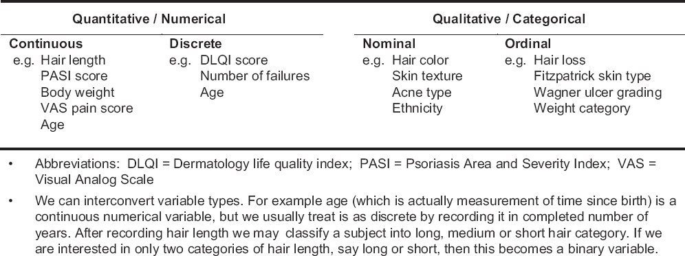
A quantitative variable can be continuous or discrete. A continuous variable can, in theory at least, take on any value within a given range, including fractional values. A discrete variable can take on only certain discrete values within a given range – often these values are integers. Sometimes variables (e.g., age of adults) are treated as discrete variables although strictly speaking they are continuous. A qualitative variable can be a nominal variable or an ordinal variable. A nominal variable covers categories that cannot be ranked, and no category is more important than another. The data is generated simply by naming, on the basis of a qualitative attribute, the appropriate category to which the observation belongs. An ordinal variable has categories that follow a logical hierarchy and hence can be ranked. We can assign numbers (scores) to nominal and ordinal categories; although, the differences among those numbers do not have numerical meaning. However, category counts do have numerical significance. A special case may exist for both categorical or numerical variables when the variable in question can take on only one of two numerical values or belong to only one of two categories; these are known as binary or dichotomous variables [Table 1].
Table 1.
Examples of the basic variable types
Numerical data can be recorded on an interval scale or a ratio scale. On an interval scale, the differences between two consecutive numbers carry equal significance in any part of the scale, unlike the scoring of an ordinal variable (“ordinal scale”). For example, when measuring height, the difference between 100 and 102 cm is the same as the difference between 176 and 178 cm. Ratio scale is a special case of recording interval data. With interval scale data the 0 value can be arbitrary, such as the position of 0 on some temperature scales – the Fahrenheit 0 is at a different position to that of the Celsius scale. With ratio scale, 0 actually indicates the point where nothing is scored on the scale (“true 0”), such as 0 on the absolute or Kelvin scale of temperature. Thus, we can say that an interval scale of measurement has the properties of identity, magnitude, and equal intervals while the ratio scale has the additional property of a true 0. Only on a ratio scale, can differences be judged in the form of ratios. 0°C is not 0 heat, nor is 26°C twice as hot as 13°C; whereas these value judgments hold with the Kelvin scale. In practice, this distinction is not tremendously important so far as the handling of numerical data in statistical tests is concerned.
Changing data scales is possible so that numerical data may become ordinal, and ordinal data may become nominal (even dichotomous). This may be done when the researcher is not confident about the accuracy of the measuring instrument, is unconcerned about the loss of fine detail, or where group numbers are not large enough to adequately represent a variable of interest. It may also make clinical interpretation easier. For example, the Dermatology Life Quality Index (DLQI) is used to assess how much of an adult subject's skin problem is affecting his or her quality of life. A DLQI score <6 indicates that the skin problem is hardly affecting the quality of life, score of 6-20 indicates moderate to large effect on quality while score >20 indicates that the problem is severely degrading the quality of life. This categorization may be more relevant to the clinician than the actual DLQI score achieved. In contrast, converting from categorical to numerical will not be feasible without having actual measurements.
When exploring the relationship between variables, some can be considered as dependent (dependent variable) on others (independent variables). For instance, when exploring the relationship between height and age, it is obvious that height depends on age, at least until a certain age. Thus, age is the independent variable, which influences the value of the dependent variable height. When exploring the relationship between multiple variables, usually in a modeling situation, the value of the outcome (response) variable depends on the value of one or more predictor (explanatory) variables. In this situation, some variables may be identified that cannot be accurately measured or controlled and only serve to confuse the results. They are called confounding variables or confounders. Thus, in a study of the protective effect of a sunscreen in preventing skin cancer, the amount of time spent in outdoor activity could be a major confounder. The extent of skin pigmentation would be another confounder. There could even be confounders whose existence is unknown or effects unsuspected, for instance, undeclared consumption of antioxidants by the subjects which is quite possible because the study would go on for a long time. Such unsuspected confounders have been called lurking variables.
Numerical or categorical variables may sometimes need to be ranked, that is arranged in ascending order and new values assigned to them serially. Values that tie are each assigned average of the ranks they encompass. Thus, a data series 2, 3, 3, 10, 23, 35, 37, 39, 45 can be ranked as 1, 2.5, 2.5, 4, 5, 6, 7, 8, 9 since the 2, 3s encompass ranks 2 and 3, giving an average rank value of 2.5. Note that when a numerical variable is ranked, it gets converted to an ordinal variable. Ranking obviously does not apply to nominal variables because their values do not follow any order.
Descriptive Statistics
Descriptive statistics implies summarizing a raw data set obtained from a sample or population. Traditionally, summaries of sample data (“statistics”) have been denoted by Roman letters (e.g., x̄ for mean, standard deviation [SD], etc.) while summaries of population data (“parameters”) have been denoted by Greek letters (e.g., μ for mean, σ for SD, etc.). The description serves to identify patterns or distributions in data sets from which important conclusions may be drawn.
Categorical data are described in terms of percentages or proportions. With numerical data, individual observations within a sample or population tend to cluster about a central location, with more extreme observations being less frequent. The extent to which observations cluster is summarized by measures of central tendency while the spread can be described by measures of dispersion.
Measures of Central Tendency
The mean (or more correctly, the arithmetic mean) is calculated as the sum of the individual values in a data series, divided by the number of observations. The mean is the most commonly used measure of central tendency to summarize a set of numerical observations. It is usually reliable unless there are extreme values (outliers) that can distort the mean. It should not, ordinarily be used, in describing categorical variables because of the arbitrary nature of category scoring. It may, however, be used to summarize category counts.
The geometric mean of a series of n observations is the nth root of the product of all the observations. It is always equal to or less than the arithmetic mean. It is not often used but is a more appropriate measure of central location when data recorded span several orders of magnitude, e.g. bacterial colony counts from a culture of clinical specimens. Interestingly, the logarithm of the geometric mean is the arithmetic mean of the logarithms of the observations. As such, the geometric mean may be calculated by taking the antilog of the arithmetic mean of the log values of the observations. The harmonic mean of a set of non-zero positive numbers is obtained as the reciprocal of the arithmetic mean of the reciprocals of these numbers. It is seldom used in biostatistics. Unlike the arithmetic mean, neither geometric nor harmonic mean can be applied to negative numbers.
Often data are presented as a frequency table. If the original data values are not available, a weighted average can be estimated from the frequency table by multiplying each data value by the number of cases in which that value occurs, summing up the products and dividing the sum by the total number of observations. A frequency table of numerical data may report the frequencies for class intervals (the entire range covered being broken up into a convenient number of classes) rather than for individual data values. In such cases, we can calculate the weighted average by using the mid-point of the class intervals. However, in this instance, the weighted mean may vary slightly from the arithmetic mean of all the raw observations. Apart from counts, there may be other ways of ascribing weights to observations before calculating a weighted average.
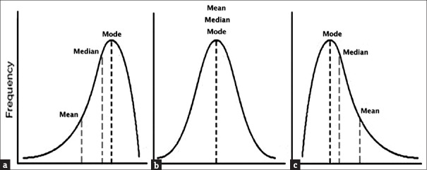
For data sets with extreme values, the median is a more appropriate measure of central tendency. If the values in a data series are arranged in order, the median denotes the middle value (for an odd number of observations) or the average of the two middle values (for an even number of observations). The median denotes the point in a data series at which half the observations are larger and half are smaller. As such it is identical to the 50th percentile value. If the distribution of the data is perfectly symmetrical (as in the case of a normal distribution that we discuss later), the values of the median and mean coincide. If the distribution has a long tail to the right (a positive skew), the mean exceeds the median; if the long tail is to the left (a negative skew), the median exceeds the mean. Thus, the relationship of the two gives an idea of the symmetry or asymmetry (skewness) of the distribution of data.
Mode is the most frequently occurring value in a data series. It is not often used, for the simple reason that it is difficult to pinpoint a mode if no value occurs with a frequency markedly greater than the rest. Furthermore, two or more values may occur with equal frequency, making the data series bimodal or multimodal [Box 1].
Box 1.
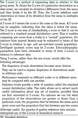
The Z-score
Measures of Dispersion
The spread, or variability, of a data series can be readily described by the range, that is the interval between minimum and maximum values. However, the range does not provide much information about the overall distribution of observations and is obviously affected by extreme values.
A more useful estimate of the spread can be obtained by arranging the values in ascending order and then grouping them into 100 equal parts (in terms of the number of values) that are called centiles or percentiles. It is then possible to state the value at any given percentile, such as the 5th or the 95th percentile and to calculate the range of values between any two percentiles, such as the 10th and 90th or the 25th and the 75th percentiles. The median represents the 50th percentile. Quartiles divide ordered data set into four equal parts, with the upper boundaries of the first, second, and third quartiles often denoted as Q1, Q2, and Q3, respectively. Note the relationship between quartiles and percentiles. Q1 corresponds to 25th percentile while Q3 corresponds to 75th percentile. Q2 is the median value in the set. If we estimate the range of the middle 50% of the observations about the median (i.e., Q1–Q3), we have the interquartile range. If the dispersion in the data series is less, we can use the 10th to 90th percentile value to denote spread.
A still better method of measuring variability about the central location is to estimate how closely the individual observations cluster about it. This leads to the mean square deviation or variance, which is calculated as the sum of the squares of individual deviations from the mean, divided by one less than the number of observations. The SD of a data series is simply the square root of the variance. Note that the variance is expressed in squared units, which is difficult to comprehend, but the SD retains the basic unit of observation.
The formulae for the variance (and SD) for a population has the value “n” as the denominator. However, the expression (n − 1) is used when calculating the variance (and SD) of a sample. The quantity (n − 1) denotes the degrees of freedom, which is the number of independent observations or choices available. For instance if a series of four numbers is to add up to 100, we can assign different values to the first three, but the value of the last is fixed by the first three choices and the condition imposed that the total must be 100. Thus, in this example, the degrees of freedom can be stated to be 3. The degrees of freedom is used when calculating the variance (and SD) of a sample because the sample mean is a predetermined estimate of the population mean, and, in the sample, each observation is free to vary except the last one that must be a defined value.
The coefficient of variation (CV) of a data series denotes the SD expressed as a percentage of the mean. Thus, it denotes the relative size of the SD with respect to the mean. CV can be conveniently used to compare variability between studies, since, unlike SD, its magnitude is independent of the units employed.
Measures of Precision
An important source of variability in biological observations is measurement imprecision and CV is often used to quantify this imprecision. It is thus commonly used to describe variability of measuring instruments and laboratory assays, and it is generally taken that a CV of <5% is acceptable reproducibility.
Another measure of precision for a data series is the standard error of the mean (SEM), which is simply calculated as the SD divided by the square root of the number of observations. Since, SEM is a much smaller numerical value than SD, it is often presented in place of SD as a measure of the spread of data. However, this is erroneous since SD is meant to summarize the spread of data, while SEM is a measure of precision and is meant to provide an estimate of a population parameter from a sample statistic in terms of the confidence interval (CI).
It is self-evident that when we make observations on a sample, and calculate the sample mean, this will not be identical to the population (“true”) mean. However, if our sample is sufficiently large and representative of the population, and we have made our observations or measurements carefully, and then the sample mean would be close to the true mean. If we keep taking repeated samples and calculate a sample mean in each case, the different sample means would have their own distribution, and this would be expected to have less dispersion than that of all the individual observations in the samples. In fact, it can be shown that the different sample means would have a symmetrical distribution, with the true population mean at its central location, and the SD of this distribution would be nearly identical to the SEM calculated from individual samples.
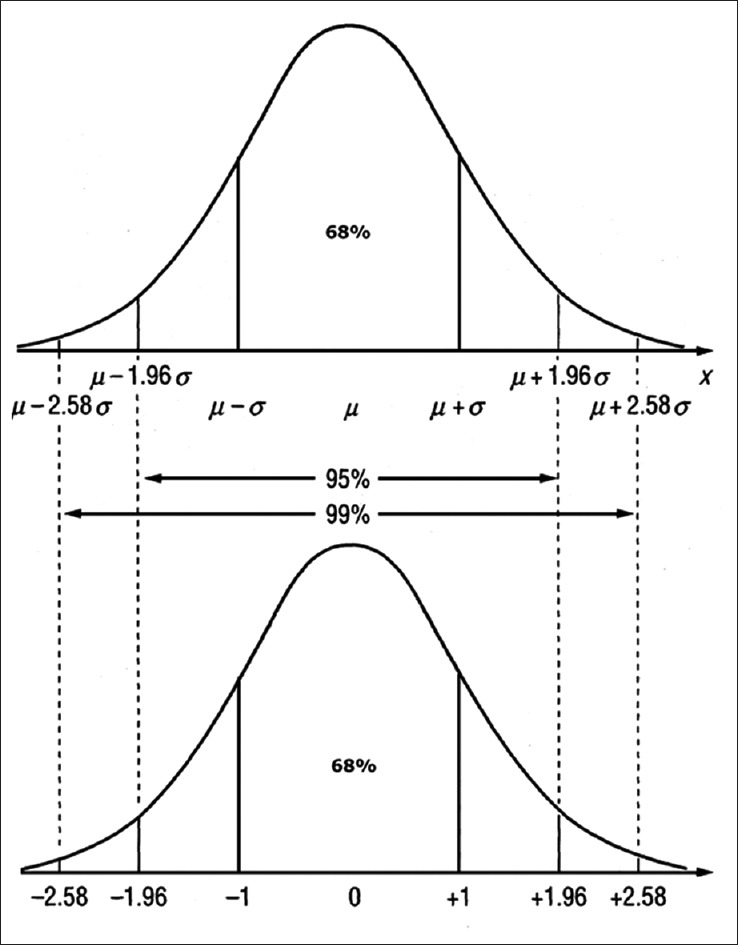
In general, however, we are not interested in drawing multiple samples, but rather how reliable our one sample is in describing the population. We use standard error to define a range in which the true population value is likely to lie, and this range is the CI while its two terminal values are the confidence limits. The width of the CI depends on the standard error and the degree of confidence required. Conventionally, the 95% CI (95% CI) is most commonly used. From the properties of a normal distribution curve (see below) it can be shown that the 95% CI of the mean would cover a range 1.96 standard errors either side of the sample mean, and will have a 95% probability of including the population mean; while 99% CI will span 2.58 standard errors either side of the sample mean and will have 99% probability of including the population mean. Thus, a fundamental relation that needs to be remembered is:
95% CI of mean = Sample mean ± 1.96 × SEM.
It is evident that the CI would be narrower if SEM is smaller. Thus if a sample is larger, SEM would be smaller and the CI would be correspondingly narrower and thus more “focused” on the true mean. Large samples therefore increase precision. It is interesting to note that although increasing sample size improves precision, it is a somewhat costly approach to increasing precision, since halving of SEM requires a 4-fold increase in sample size.
CIs can be used to estimate most population parameters from sample statistics (means, proportions, correlation coefficients, regression coefficients, odds ratios, relative risks, etc.). In all cases, the principles and the general pattern of estimating the CI remains the same, that is: 95% CI of a parameter = Sample statistic ± 1.96 × standard error for that statistic.
The formulae for estimating standard error however varies for different statistics, and in some instances is quite elaborate. Fortunately, we generally rely on computer software to do the calculations.
Frequency Distributions
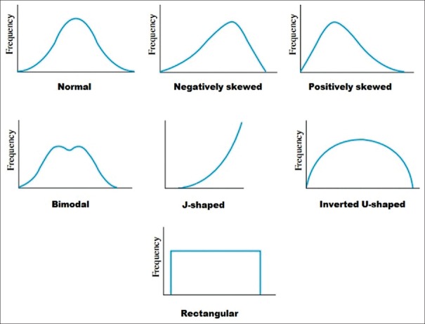
It is useful to summarize a set of raw numbers with a frequency distribution. The summary may be in the form of a table or a graph (plot). Many frequency distributions are encountered in medical literature [Figure 1] and it is important to be familiar with commonly encountered ones.
Figure 1.
Examples of frequency distribution shapes. Note that the normal distribution is symmetrical but there can be distributions that are symmetrical but not normal
Majority of distributions that quantitative clinical data follow are unimodal, that is the data have a single peak (mode) with a tail on either side. The most common of these unimodal distributions is the bell-shaped symmetrical distribution called the normal distribution or the Gaussian distribution [Figure 2]. In this distribution, the values of mean, median and mode will coincide. However, some distributions are skewed with a substantially longer tail on one side. The type of skew is determined by the direction of the longer tail. A positively skewed distribution has a longer tail to the right. In this case, the mean will be greater than the median because the mean is strongly influenced by the extreme values in the right-hand tail. On the other hand, a negatively skewed distribution has a longer tail to the left; in this instance, the mean will be smaller than the median. Thus, the relationship between mean and median gives an idea of the distribution of numerical data.
Figure 2.
Relation between the measures of central tendency for commonly encountered frequency distributions
It is possible that datasets may have more than one peak (mode). Such data can be difficult to manage and it may be the case that neither the mean nor the median is a representative measure. However, it is important to remember that bimodal or multimodal distributions are rare and may even be artifactual. A distribution with two peaks may actually be reflecting a combination of two unimodal distributions, for instance, one for each gender or different age groups. In such cases, appropriate subdivision, categorization, or even recollection of the data may be required to eliminate multiple peaks.
Probability Distributions
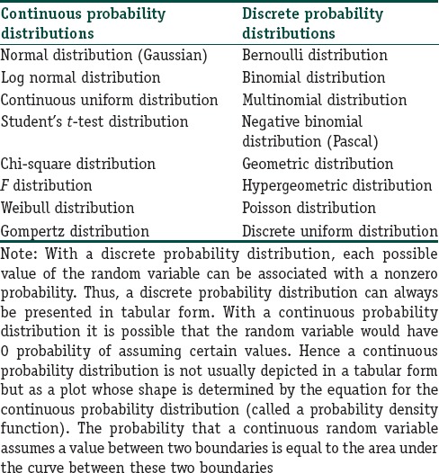
A random variable is a numerical quantity whose values are determined by the outcomes of a random experiment. The possible values of a random variable and the associated probabilities constitute a statistical probability distribution. The concept of probability distributions and frequency distributions are similar in that each associates a number with the possible values of a variable. However, for a frequency distribution, the number is a frequency, while for a probability distribution, this number is a probability. A frequency distribution describes a set of data that has been observed; it is thus empirical. A probability distribution describes data that might be observed under certain specified conditions; hence it is theoretical. Probability distributions are part of descriptive statistics, and they can be used to predict how random variables are expected to behave under certain conditions. If the empirical data deviate considerably from the predictions of a probability distribution model, the correctness of the model or its assumptions can be questioned, and we may look for alternative models to fit the empirical data. Table 2 provides examples of statistical probability distributions. Note that, they are broadly classified as continuous or discrete probability distributions depending on whether the random variable in question is a continuous or a discrete variable.
Table 2.
Examples of probability distributions used in biomedical research
Of the many probability distributions that can be used to model biological events or observations, the most common is the normal distribution. In such a distribution, the values of the random variable tend to cluster around a central value, with a symmetrical positive and negative dispersion about this point. The more extreme values become less frequent the further they lie from the central point [Figure 3]. The term “normal” relates to the sense of ‘standard’ against which other distributions may be compared. It is also referred to as a Gaussian distribution after the German mathematician, Karl Friedrich Gauss (1777–1855), although Gauss was not the first person to describe such a distribution. The bell curve was named ‘normal curve’ by the great Karl Pearson. Important properties of a normal distribution are:
Figure 3.
Normal distribution of a variable x with mean μ and SD σ. The bottom panel shows Z-score transformation of x to derive the standard normal curve (Z distribution) with mean 0 and SD 1. SD: Standard deviation (a) Negatively skewed, (b) Normal, (c) Positively skewed
Unimodal bell-shaped distribution
Symmetric about the mean
Flattens symmetrically as the variance is increased
Kurtosis is 0 (“kurtosis” refers to how peaked a distribution is)
The tails may extend toward infinity, but the total area is taken as 1.
In a normal distribution curve, the mean, median, and mode coincide. The area delimited by one SD either side of the mean includes 68% of the total area, two SDs 95.4%, and three SDs 99.7%; 95% of the values lie within 1.96 SDs on either side of the mean. It is for this reason that the interval denoted by mean ± 1.96 × SD is often taken as the normal range or reference range for many physiological variables.
If we look at the equation for the normal distribution, it is evident that there are two parameters that define the curve, namely μ (the mean) and σ (the SD):

The standard normal distribution curve is a special case of the normal distribution for which probabilities have been calculated. It is a symmetrical bell-shaped curve with a mean of 0 and a variance (or SD) of 1. The random variable of a standard normal distribution is the Z-score of the corresponding value of the variable for the normal distribution. A standard normal distribution table shows cumulative probability associated with particular Z-scores and can be used to estimate probabilities of particular values of a normally distributed variable.
In all biomedical research where samples are used to learn about populations, some random procedure is essential for subject selection to avoid many kinds of bias. This takes the form of random sampling from a population or randomized allocation of participants to interventional groups. Randomness is a property of the procedure rather than of the sample and ensures that every potential subject has a fair and equal chance of getting selected. The resulting sample is called a random sample. As the number of observations increases (say, n > 100), the shape of a random sampling distribution will approximate a normal distribution curve even if the distribution of the variable in question is not normal. This is explained by the central limit theorem and is one reason why the normal distribution is so important in biomedical research.
Many statistical techniques require the assumption of normality of the dataset. It is not mandatory for the sample data to be normally distributed, but it should represent a population that is normally distributed.
Presenting Data
Once summary measures of data have been calculated, they need to be presented in tables and graphs. Appropriate data presentation summarizes the data in a compact and meaningful manner without burdening the reader with a surfeit of information, enables conclusions to be drawn simply by looking at the summarized data and, of course, helps in further statistical analysis where necessary.
Regarding data presentation in tables, it is helpful to remember the following:
Tables should be numbered
Each table must have a concise and self-explanatory title
Tables must be formatted with an appropriate number of rows and columns but should not be too large. Larger tables can usually be split into multiple simpler tables
Column headings and row classifiers must be clear and concise
For tables showing frequency distributions, it must be clear whether the frequencies depicted in each class or class interval represent absolute frequency, relative frequency (i.e., the percentage of the total) or the cumulative frequency
For tables depicting percentages, it must be clear whether the percentages represent percentages with respect to the row (row percentage) or the column (column percentage) in which the cell is located
The mean is to be used for numerical data and symmetric (nonskewed) distributions
The median should be used for ordinal data or for numerical data if the distribution is skewed
The mode is generally used only for examining bimodal or multimodal distributions
The range may be used for numerical data to emphasize extreme values
The SD is to be used along with the mean
Interquartile range or percentiles should be used along with the median
SDs and percentiles may also be used when the objective is to depict a set of norms (“normative data”)
The CV may be used if the intent is to compare variability between datasets measured on different numerical scales
95% CIs should be used whenever the intent is to draw inferences about populations from samples
Additional information required to interpret the table (e.g., explanation of column headings, other abbreviations, explanatory remarks) can be appended as footnotes.
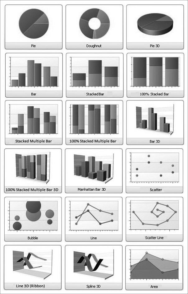
For presenting data graphically, it is usually necessary to obtain the summary measures, counts or percentages of the data. These can then be utilized to draw different types of graphs (or charts or plots or diagrams). The more common types with some of their variants are summarized in Table 3 and Figure 4. Although charts are visually appealing, they should not replace tabulation of important summary data. Further, if not constructed or scaled appropriately, charts can be misleading.
Table 3.
Examples of data representation strategies
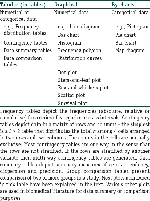
Figure 4.
Some common chart types used in presenting data
A pictogram represents quantity by presenting stylized pictures or icons of the variable being depicted – the number or size of the icon being proportional to the frequency. When comparing between groups using a pictogram, it is preferable that same-sized icons be used across groups (with their numbers varying) – otherwise the picture may be misleading. Pictograms are more often used in mass media presentations than in serious biomedical literature.
Pie chart depicts frequency distribution of categorical data in a circle (the “pie”), with the sectors of the circle proportional in size to the frequencies in the respective categories. A particular category can be emphasized by pulling out that sector. All sectors are pulled out in an “exploded” pie chart. Pie charts can be made highly attractive, by using color and three-dimensional design enhancements, but become cumbersome if there are too many categories.
Bar chart (also called column chart) depicts categorical or numerical data as a series of vertical (or horizontal) bars, with the bar heights (lengths) being proportional to the frequencies or the means. The bar widths and separation between bars should be uniform but are of little significance other than to indicate that the bars denote separate series or categories. Bars depicting subcategories can be stacked one on top of another (stacked or segmented or component bar chart). The frequencies can be converted to percentages so that the total numbers in each category add up to 100% giving 100% stacked bar chart where all the bars are of equal height. Two or more data series or subcategories can be depicted on the same bar chart by placing corresponding bars side by side – different patterns or colors are used to distinguish the different series or subcategories (compound or multiple or cluster bar chart).
The histogram is similar to bar chart in appearance but is used for summarizing continuous numerical data and hence there should not be any gaps between the bars. The bar widths correspond to the class intervals. The alignment of the bars is usually horizontal with the class intervals along the horizontal axis and the frequencies along the vertical axis. A histogram is popularly used to depict the frequency distribution in a large data series. Accordingly, the class intervals should be so chosen that the bars are narrow enough to illustrate patterns in the data but not so narrow that they become too large in number. A histogram must be labeled carefully to depict clearly where the boundaries lie.
A frequency polygon is a line diagram representation of the frequency distribution depicted by the histogram and is obtained by joining the midpoints of the upper boundary of the histogram blocks. As such it depicts the frequency distribution of numerical data as a curve.
Dot plot [Figure 5] depicts frequency distribution of numerical variables like histograms but with the advantage of depicting individual values as well. Instead of bars, it has a series of dots for each value or class interval – each dot representing one observation. The alignment can be vertical or horizontal. They are useful in highlighting clusters and gaps in data sets as well as outliers. Dot plots are conceptually simple but become cumbersome for large data sets. Scatter plots (sometimes erroneously called dot plots) are used for depicting association between two variables with the X and Y coordinates of each dot representing the corresponding values of the two variables. A bubble plot is an extension of the scatter plot to depict the relation between three variables – here each dot is expanded into a bubble with the diameter of the bubble being proportional to the value of the third variable. This is preferable to depicting the third variable on a Z axis since it is difficult to comprehend depth on a two-dimensional surface.
Figure 5.
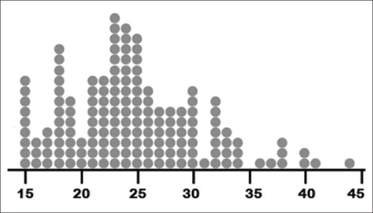
A dot plot depicting age of 156 women in reproductive age group enrolled in a study. Note that individual values are conserved while distribution, gaps and clusters are evident
Stem-and-leaf plot or stem plot [Figure 6] is a sort of mixture of a diagram and a table. It has been devised to depict frequency distribution, as well as individual values for numerical data. The data values are examined to determine their last significant digit (the “leaf” item), and this is attached to the previous digits (the “stem” item). The stem items are usually arranged in ascending or descending order vertically, and a vertical line is usually drawn to separate the stem from the leaf. The number of leaf items should total up to the number of observations. However, it becomes cumbersome with large data sets.
Figure 6.
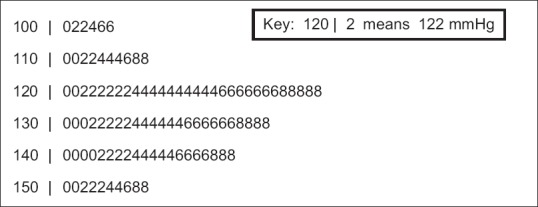
A stem-and-leaf plot depicting systolic blood pressure recordings (recorded as even values only) in 100 individuals. Note that the plot gives an idea of the underlying distribution while retaining all the individual values
Box-and-whiskers plot (or box plot) is a graphical representation of numerical data based on the five-number summary – minimum value, 25th percentile, median (50th percentile), 75th percentile and maximum value [Figure 7]. A rectangle is drawn extending from the lower quartile to the upper quartile, with the median dividing this “box” but not necessarily equally. Lines (“whiskers”) are drawn from the ends of the box to the extreme values. Outliers may be indicated beyond the extreme values by dots or asterisks – in such “modified” 0 or “refined” box plots, the whiskers have lengths not exceeding 1.5 times the box length. The whole plot may be aligned vertically or horizontally. Box plots are ideal for summarizing large samples and are being increasingly used. Multiple box plots, arranged side by side, allow ready comparison of data sets.
Figure 7.
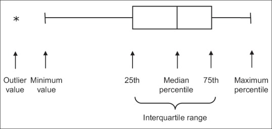
A horizontal box plot depicting the five number summary of numerical data. Note that this particular dataset is not symmetrical but is skewed to the left
We have looked at the commonly used plots used for summarizing data and depicting underlying patterns. Many other plots are used in biostatistics for depicting data distributions, time trends in observations, relationships between two or more variables, exploring goodness-of-fit to hypothesized data distributions and drawing inferences by comparing data sets. We will get introduced to select other plots in subsequent modules in this series.
Financial support and sponsorship
Nil.
Conflicts of interest
There are no conflicts of interest.
Futher Reading
- 1.Samuels ML, Witmer JA, Schaffner AA, editors. Statistics for the Life Sciences. 4th ed. Boston: Pearson Education; 2012. Description of samples and populations; pp. 26–80. [Google Scholar]
- 2.Kirk RE, editor. Statistics: An Introduction. 5th ed. Belmont: Thomson Wadsworth; 2008. Random variables and probability distributions; pp. 207–27. [Google Scholar]
- 3.Kirk RE, editor. Statistics: An Introduction. 5th ed. Belmont: Thomson Wadsworth; 2008. Normal distribution and sampling distributions; pp. 229–55. [Google Scholar]
- 4.Dawson B, Trapp RG, editors. Basic & Clinical Biostatistics. 4th ed. New York: McGraw-Hill; 2004. Summarizing data & presenting data in tables and graphs; pp. 23–60. [Google Scholar]


