

Abstract
Introduction:
Currently used error grids for assessing clinical accuracy of blood glucose monitors are based on out-of-date medical practices. Error grids have not been widely embraced by regulatory agencies for clearance of monitors, but this type of tool could be useful for surveillance of the performance of cleared products. Diabetes Technology Society together with representatives from the Food and Drug Administration, the American Diabetes Association, the Endocrine Society, and the Association for the Advancement of Medical Instrumentation, and representatives of academia, industry, and government, have developed a new error grid, called the surveillance error grid (SEG) as a tool to assess the degree of clinical risk from inaccurate blood glucose (BG) monitors.
Methods:
A total of 206 diabetes clinicians were surveyed about the clinical risk of errors of measured BG levels by a monitor. The impact of such errors on 4 patient scenarios was surveyed. Each monitor/reference data pair was scored and color-coded on a graph per its average risk rating. Using modeled data representative of the accuracy of contemporary meters, the relationships between clinical risk and monitor error were calculated for the Clarke error grid (CEG), Parkes error grid (PEG), and SEG.
Results:
SEG action boundaries were consistent across scenarios, regardless of whether the patient was type 1 or type 2 or using insulin or not. No significant differences were noted between responses of adult/pediatric or 4 types of clinicians. Although small specific differences in risk boundaries between US and non-US clinicians were noted, the panel felt they did not justify separate grids for these 2 types of clinicians. The data points of the SEG were classified in 15 zones according to their assigned level of risk, which allowed for comparisons with the classic CEG and PEG. Modeled glucose monitor data with realistic self-monitoring of blood glucose errors derived from meter testing experiments plotted on the SEG when compared to the data plotted on the CEG and PEG produced risk estimates that were more granular and reflective of a continuously increasing risk scale.
Discussion:
The SEG is a modern metric for clinical risk assessments of BG monitor errors that assigns a unique risk score to each monitor data point when compared to a reference value. The SEG allows the clinical accuracy of a BG monitor to be portrayed in many ways, including as the percentages of data points falling into custom-defined risk zones. For modeled data the SEG, compared with the CEG and PEG, allows greater precision for quantifying risk, especially when the risks are low. This tool will be useful to allow regulators and manufacturers to monitor and evaluate glucose monitor performance in their surveillance programs.
Keywords: error grid, blood glucose, monitor, surveillance, accuracy
Blood glucose (BG) monitor performance can be described based on analytical accuracy or clinical accuracy.1 Analytical accuracy is a quantitative method for describing how closely the result of a measurement by a device being evaluated compares with a measurement by a reference method. Clinical accuracy is a qualitative method for describing the clinical outcome of making a treatment decision using the result of a measurement from a device being evaluated.2 Analytical accuracy is measured by a variety of statistical metrics, including precision and bias. For the purpose of this article, clinical accuracy is evaluated by plotting paired results from both the subject device and a reference method on a grid, known as an error grid.3
On an error grid for determining clinical accuracy of a BG monitor, data points (representing the BG monitor value on the y-axis and the reference value on the x-axis) are mapped on a 2-dimensional graph. Typically, a set of risk zones are then superimposed on the graph such that each zone represents a degree of risk of an adverse outcome due to the error in the measured glucose value. The borders of the risk zone are typically determined from the opinions of clinicians who treat diabetes and are familiar with the range of clinical outcomes that can occur due to measurement errors from BG monitors. Error grids permit data sets to be defined on the basis of the percentage of data points that fall into each zone or category of clinical outcome.
A classical error grid comparing a test method with a comparison method contains at least 3 zones. Zone A is the allowable total error region usually associated with no harm. Error grids for BG monitors have typically specified at least 95% of the sample results should fall within the established zone A,4 which is also known as the allowable total error zone, but other distributions are also permissible. Zone C is the limits of erroneous region where no data should be found, usually associated with serious harm. Zone B is in between zones A and C where some data (the percentage of data that were not in zone A) can be found depending on the purpose of the analysis. This zone contains a small amount of data that are slightly outside the no harm zone but that is not so inaccurate as to cause significant harm.5 The 2 most widely used error grids for BG monitors were first-authored by William Clarke and by Joan Lee Parkes and were developed and published in 19876 and in 1994 and 2000,7 respectively. The Clarke error grid (CEG) contains 9 risk zones and the Parkes error grid (PEG) contains 8 risk zones. Clarke and colleagues established a single error grid for all patients using insulin. Parkes and colleagues established 2 separate grids for insulin users—one for patients with type 1 and one for patients with type 2. The accuracy limits were slightly more stringent for the type 1 patients.8 The type 2 grid was eventually dropped by most grid users and what is typically referred to as the PEG is the type 1 grid by that team.
The 2 most widely used error grids for determining clinical accuracy of BG monitors, CEG and PEG, are no longer up to date.6,7 Four differences in the practice of diabetes between the era when the CEG and PEG metrics were developed (late 1980s and early 1990s) and the present time have resulted in expectations of greater clinical accuracy from BG monitoring systems. First, the survey that generated the SEG occurred in an environment where the results of the Diabetes Control and Complications Trial (DCCT), have become part of standard care and have influenced goals of standard therapy. DCCT which was published in 1993,8 appeared after the CEG was developed and less than one year prior to the survey that generated the PEG. Second, over the past 20 years new analog insulins (first available in 1996) have become established9 and insulin delivery pumps have become more widely used.10 Third, when the prior error grids were developed, self-monitoring of blood glucose (SMBG) was a relatively new method and delivered far less analytical accuracy, leading to lower performance expectations than many clinicians have today for the clinical accuracy of BG monitors.11 Fourth, the clinical community has recently become more aware of the high frequency and adverse consequences of hypo- and hyperglycemia in both type 1 and type 2 diabetes12-15 and which appears to have made their judgment about risk more conservative. For these reasons, clinicians, patients, and regulators are currently more concerned than in the past about inaccurate BG monitoring systems and want systems with increasingly better performance to achieve near normal levels of glycemia.
In addition to concerns that the perceived risks of BG measurement errors have changed since the older error grids were developed, concerns have also been raised about the methods that were used for creating these 2 classical metrics. These error grids might not have represented a consensus of the diabetes clinical community because input was sought from only a small number of clinicians or from clinicians whose demographics were not documented. The 2 classical metrics assign data points with different risks into the same risk zone, and there is no way to detect differences in risks for points within the same risk zone. For all these reasons there is a need for a new error grid that reflects modern ideas about clinical risk of BG monitor error and presents the risk in a way that allows for granular analysis of individual data points.
The purpose of error grids initially was to educate patients and clinicians about the clinical accuracy of BG monitors. Data from error grids more recently have been proposed by some manufacturers to support regulatory clearance of BG monitors; however, the use of error grids for this purpose has not been widely embraced by regulatory agencies. A modern consensus error grid could be useful as a tool for assessing the clinical performance of BG monitors for the purposes of postmarket surveillance.
In the United States, the FDA and BG monitor manufacturers perform surveillance to monitor the performance of glucose monitors in use by patients and health care providers. Adverse event data are collected and investigations are performed when devices malfunction and/or when patients or device users are injured. Postmarket BG monitor problems are varied and can include, for example, monitor systems that provide erroneous results due to test strip manufacturing errors, design deficiencies that result in unanticipated but significant user errors, or component failures that result in shorter than expected expiration of strip reagents. Sometimes, the root cause of device problems is not definitively identified. When these postmarket issues occur, the FDA and manufacturers must work together to assess the potential health impact of the problem. For BG monitor systems, the health impact generally relates to the likelihood that the monitor will generate erroneous results, and that patients or health care providers will act on those results. Therefore, the frequency and magnitude of the error is evaluated to try to assess the overall risks to the public. A new error grid that can better indicate the clinical risk of device errors can facilitate decision making for manufacturers and the FDA to allow for efficient and appropriate postmarket actions.
Diabetes Technology Society (DTS) in association with representatives of the Food and Drug Administration (FDA), the American Diabetes Association (ADA), the Endocrine Society (TES), and Association for the Advancement of Medical Instrumentation (AAMI), convened a series of 3 meetings in 2012 and 2013 with representatives of the FDA, National Institutes of Health, US Army, academia, and industry to develop a new error grid as a metric of clinical accuracy for BG Monitors. The panel of experts decided that (1) the greatest need for an error grid would be for surveillance and postmarket assessment of cleared devices and (2) a modern error grid would provide a metric for use by FDA, BG monitor manufacturers, and other regulatory bodies to assess the degree of clinical risk from clinically inaccurate BG monitors for postmarket decision making. This grid was not developed as a tool for assessing the clinical performance of BG monitors for the purpose of supporting premarket regulatory clearance or approval of a new device. This article describes the development, features, and performance of the new surveillance error grid (SEG).
Methods
The panel surveyed diabetes clinicians to develop a consensus metric of clinical accuracy based on the clinicians’ assessments of clinical risk resulting from various errors in measured BG levels by a monitor. The impact of such errors on 4 types of archetypal patient scenarios was surveyed.
Respondents were selected by invitation if they were included in one of 3 databases: (1) member of the ADA, self-declared as a clinician; (2) attendee, speaker, or Planning Committee of a DTS meeting between April 2009 and April 2013; (3) clinician colleague of a member of the Error Grid Panel (whose names are listed either as being among the authors of this article or as being among the panel, which is identified on the list of authors of this article). If a survey respondent requested permission to pass the survey website to another clinician, then this request was granted.
Respondents who agreed to take the online error grid survey were initially asked 4 demographic questions under the heading, “Tell us about yourself.” These questions and the permitted responses in parentheses following each question are listed in Table 1. Respondents were required to answer all 4 of these demographic questions before they could progress to see the patient scenarios or the questions about clinical accuracy. Data from nonclinicians were not used for the purpose of creating this error grid.
Table 1.
Error Grid Survey Demographic Questions.
| 1. Are you a clinician who typically sees each week at least 10 diabetes patients who perform SMBG? | Yes | No | ||
| 2. How would you describe yourself most closely? | Diabetes specialist physician | Primary care physician | Nonphysician diabetes health care professional | Other |
| 3. Where do you mainly see patients? | In the US | Outside of the US | ||
| 4. What type of patients do you usually see? | Adults only | Some or all pediatric |
Respondents were randomly presented 2 scenarios out of 4 possible fictitious scenarios. We elected to ask respondents to rate only 2 scenarios to not overly burden them and promote more clearly reasoned responses. There were 6 possible pairs of scenarios that could be presented to a respondent. The pair that was presented to each respondent was selected with software for random number generation. The 4 archetypal patient scenarios included scenario 1 (type 1 diabetes mellitus [DM] patient using an insulin pump), scenario 2 (type 2 DM patient using insulin), scenario 3 (type 2 DM patient not using insulin), and scenario 4 (type 1 DM patient using multiple doses of insulin [MDI] and a real-time continuous glucose monitor [CGM]). The description of each patient is in Table 2. The patient histories were constructed to reflect 4 types of patients where errors by BG monitors would have clinical impact.
Table 2.
Four Patient Scenarios.
| Scenario 1: Type 1 DM patient using an insulin pump | This patient is an 18-year old man with type 1 diabetes who uses an insulin pump that delivers fast-acting insulin analog. He has hypoglycemia unawareness. He was hospitalized last year for ketoacidosis. Most days he drives his motorcycle 50 miles to get to school, work after school, sports practices, and social commitments. He has received 2 speeding tickets in the past 2 years. He is monitoring himself to try to avoid running glucose levels that are too high or too low. His BMI is 25. |
| Scenario 2: Type 2 DM patient using insulin | This 62-year old man with type 2 diabetes uses fast-acting insulin analog 3 times daily with meals and also uses basal insulin. He has mild peripheral neuropathy and mild hypoglycemia unawareness. He had a myocardial infarction 4 years ago. His BMI is 30. |
| Scenario 3: Type 2 DM patient not using insulin | This 57-year old woman with type 2 diabetes uses metformin and a sulfonylurea. She tries to watch what she eats and exercises occasionally. She is being treated for hypertension and hyperlipidemia. Her BMI is 35. |
| Scenario 4: Type 1 DM patient using MDI and CGM | This 35-year old woman with type 1 diabetes uses fast-acting insulin analog 3 times daily with meals along with basal insulin. She uses a CGM every day. The patient works at home and lives alone. She uses a home BG monitor to calibrate the CGM and to calculate her mealtime insulin doses. She depends on the CGM’s alarms to protect her from overnight hypoglycemia and hyperglycemia, as well as to provide her with real-time information. Her BMI is 24. |
For both patient scenarios, respondents were asked to complete a table with the minimum and maximum end of the range of BG levels that would correspond to one of 5 types of actions: (A) emergency treatment for low BG; (B) take oral glucose; (C) no action needed; (D) take insulin; and (E) emergency treatment for high BG. Scenario 3, which was a non-insulin-using patient, had a different action for action D, which was exercise and eat less. For each patient the respondent was then asked to assess the clinical risk (ranging from severe hypoglycemia to severe hyperglycemia) that could result from taking action (or not taking action) based on various monitor errors. Each respondent was asked to compare monitor measurements from each of the 5 possible BG ranges A-E above to actual BG concentrations from each of the same 5 possible glucose ranges. Each respondent used their own glucose ranges for A-E which they had previously defined. Respondents were asked to choose 1 of 9 magnitudes of clinical risk for each possible combination. The 9 possible clinical impacts or levels of performance that could be selected are presented in Table 3. If the measured BG and the actual BG were in the same range, then that square was prefilled as a no-risk outcome.
Table 3.
Nine Risk Zones of Clinical Impact each with their Magnitude of Risk for 5 Measured Zones of BG Levels by SMBG Combined With 5 Reference BG Levels (Both Within the Range of 0 to 600 mg).
| Name of the clinical impact zone | Magnitude of risk |
|---|---|
| 0 | No risk |
| Hypo 1 | Slight risk of hypoglycemia |
| Hypo 2 | Moderate risk of hypoglycemia |
| Hypo 3 | Great risk of hypoglycemia |
| Hypo 4 | Extreme risk of hypoglycemia |
| Hyper 1 | Slight risk of hyperglycemia |
| Hyper 2 | Moderate risk of hyperglycemia |
| Hyper 3 | Great risk of hyperglycemia |
| Hyper 4 | Extreme risk of hyperglycemia |
Calculation of Clinical Risk for Each Combination of Measured and Reference BG Levels
The degree of risk for hypo- or hyperglycemia identified by the survey responders was later coded according to the ranges in Table 4. The risk ratings in zones defined by SMBG and actual values were calculated and presented in a 5 × 5 table for each of the 4 scenarios. These tables presented the mean action boundaries for each of the 5 actions for each of the 4 scenarios.
Table 4.
Scoring System for Degree of Risk for Any Pair of Data Points of Measured BG and Reference BG.
| Clinical impact/degree of risk | Hypoglycemia | Hyperglycemia |
|---|---|---|
| None | 0 | 0 |
| Slight | −1 | 1 |
| Moderate | −2 | 2 |
| Great | −3 | 3 |
| Extreme | −4 | 4 |
A grid was created for each respondent, such that each point on the grid represented a data pair consisting of reference glucose on the x-axis and measured glucose on the y-axis. Each data point was then integrated and averaged for the entire set of respondents such that for the overall consensus error grid each data point could be assigned a unique mean score according to the mean perception of clinical risk for that data pair. This calculation created a gradual spectrum of risk within each risk zone that was defined by a range of risk scores (rather than a set of risk zones whose data points all contained the same risk). The spectrum of risk fanned out from no risk whatsoever (the identity line between measured and reference measurements) toward the greatest risk where the 2 measurements were maximally divergent. The average risk scores for each data point were plotted out in color using a spectrum presented in Figure 1.
Figure 1.
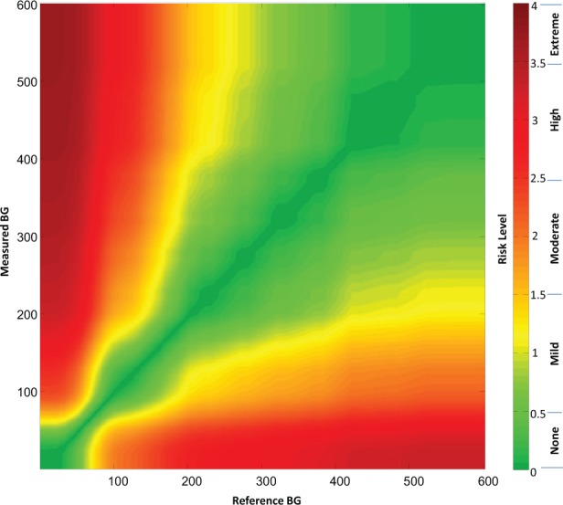
(a) Color-coded continuous surveillance error grid and (b) key to color-coded risk levels.
Each surveyed clinician identified 9 risk zones ranging from extreme risk for hypoglycemia, to no-risk, to extreme risk for hyperglycemia (Table 3). Across all surveyed clinicians these ratings produced a nearly continuous risk estimate for each reference-SMBG data pair. These risk estimates range from −4 to +4, with zero corresponding to no risk (Table 4). Figure 1 presents the risk level map that is color-coded by absolute risk value (Figure 1). The risk estimates were further divided into 15 risk zones with risk increments of 0.5 resulting in 1 “no risk,” 7 hypoglycemic, and 7 hyperglycemic risk zones. The risk ranges associated with each risk zone and a name for each zone are presented in Table 5.
Table 5.
The Degree of Risk and Range of Risk Scores of the 15 Risk Zones of the SEG and the 9 Magnitudes of Risk of the Clinician Survey From Which the 15 SEG Risk Zones Were Derived.
| Degree of risk | Range of risk scores | Risk zone coding |
|---|---|---|
| None | −0.5 to +0.5 | 0 |
| Slight for hypoglycemia, lower | < −0.5 and ≥ −1.0 | −1 |
| Slight for hypoglycemia, higher | < −1.0 and ≥ −1.5 | −2 |
| Moderate for hypoglycemia, lower | < −1.5 and ≥ −2.0 | −3 |
| Moderate for hypoglycemia, higher | < −2.0 and ≥ −2.5 | −4 |
| Great for hypoglycemia, lower | < −2.5 and ≥ −3.0 | −5 |
| Great for hypoglycemia, higher | < −3.0 and ≥ −3.5 | −6 |
| Extreme for hypoglycemia | < −3.5 and ≥ −4 | −7 |
| Slight for hyperglycemia, lower | > 0.5 and ≤ 1.0 | 1 |
| Slight for hyperglycemia, higher | > 1.0 and ≤ 1.5 | 2 |
| Moderate for hyperglycemia, lower | > 1.5 and ≤ 2.0 | 3 |
| Moderate for hyperglycemia, higher | > 2.0 and ≤ 2.5 | 4 |
| Great for hyperglycemia, lower | > 2.5 and ≤ 3.0 | 5 |
| Great for hyperglycemia, higher | > 3.0 and ≤ 3.5 | 6 |
| Extreme for hyperglycemia | > 3.5 and ≤ 4 | 7 |
Comparison of the Clarke, Parkes, and Surveillance Error Grids With Modeled Data
To compare the risk sensitivity scoring of the 2 prior error grids (CEG and PEG), to the new SEG we generated a set of simulated reference-monitor data pairs corresponding to the accuracy of an “average meter” as tested in recent survey of 43 SMBG devices by Freckmann et al.16 In this article, the devices were tested for compliance with ISO 15197-2013, which specifies that 95% of the data pairs should be within ±15 mg/dl from reference for reference glucose levels < 100 mg/dl, or within ±15% from reference for reference glucose levels ≥100 mg/dl. In addition, Tables 3 and 4 in Freckmann et al16 present data for the percentage readings yielded by the tested devices within ±10 mg/dl and ±5 mg/dl from reference when BG is below 100 mg/dl, and within ±10% and ±5% from reference when BG is above 100 mg/dL. These data allow the analytical reconstruction of the distribution of meter errors observed during this testing, thereby allowing this distribution to be computer-simulated for testing of the association between SEG and CEG/PEG as follows: First, the error distribution of the average meter was approximated by a 4-parameter Johnson distribution that had characteristics approximating these observed by Freckmann et al, on average 91%, 81%, and 55% of all readings within ±15 mg/dl, ±10 mg/dl, and ±5 mg/dl from reference for reference glucose levels < 100 mg/dl, and 93%, 80%, and 50% of all readings within ±15%, ±10%, and ±5% from reference for reference glucose levels ≥100 mg/dl. Then, 10 000 data pairs spanning the glucose range as required by ISO 15197-2013 were generated, which yielded simulated data that were 92.5% accurate according to the ISO 15197-2013 accuracy criteria. This degree of accuracy of the simulated data corresponded to the average accuracy observed by Freckmann et al in real devices. After a realistic meter error distribution was generated, the resulting 10 000 data pairs were sent through the SEG to compute the risk values corresponding to each data pair and through the CEG and PEG to compute the percentage pairs falling in lower or upper zones A, B, C, D, and E (and zones ≥B were defined by us as regions where measurement errors are likely to affect the clinical outcome). To assess numerically the agreement between SEG and the CEG and PEG we computed Spearman’s rho (correlation) and Kendall’s tau-b—standard measures of association between ordered values.
Results
Descriptive Statistics
There were a total of 234 respondents to the error grid survey. The professional distribution of the 234 error grid survey respondents was 206 clinicians (88% of total respondents) and 28 nonclinicians (12% of total respondents). The demographic distribution of the 206 error grid survey clinician respondents is presented in Table 6. Each clinician evaluated 2 scenarios. The number of responses by clinicians for each of the 4 patient scenarios is presented in Table 7. The distribution of error grid action boundaries for all 4 patient scenarios is presented in Table 8. We performed 4 comparisons of the responders’ opinions about the boundaries for the 5 treatment actions according to (1) clinicians versus nonclinicians, (2) clinicians across types of professionals, (3) adult versus child endocrinologists, and (4) US versus non-US clinicians. We also compared the opinions of all the clinicians for boundaries between risk zones across all 4 patient scenarios.
Table 6.
The Demographic Distribution of the 206 Error Grid Survey Clinician Respondents.
| Frequency | Percentage | |
|---|---|---|
| Professional distribution | ||
| Diabetes specialist physician | 114 | 55.3 |
| Primary care physician | 5 | 2.4 |
| Nonphysician diabetes health care professional | 72 | 35.0 |
| Other | 15 | 7.3 |
| Total | 206 | 100.0 |
| Patient type treated | ||
| Adults only | 157 | 76.2 |
| Some or all pediatric | 49 | 23.8 |
| Total | 206 | 100.0 |
| Geographic distribution | ||
| In the US | 161 | 78.2 |
| Outside of the US | 45 | 21.8 |
| Total | 206 | 100.0 |
Table 7.
The Number of Responses by Clinicians for Each of the 4 Patient Scenarios.
| Responses to each of 4 patient scenarios | Frequency | Percentage |
|---|---|---|
| Scenario 1—patient 1 | 101 | 24.5 |
| Scenario 2—patient 2 | 102 | 24.8 |
| Scenario 3—patient 3 | 105 | 25.5 |
| Scenario 4—patient 4 | 104 | 25.2 |
| Total | 412 | 100.0 |
Comparing the Opinions of Clinicians Versus Nonclinicians
F test (ANOVA) comparison reveals no “distance” between the 2 types of professional (clinician and nonclinician) for any of the variables in Tables 8a and 8b: all F values < 2.0, all P values > 0.15. The selection of clinician responses only for use in creation of the error grid was felt to be justified by the scope of the study and by the lack of differences between these 2 types of professionals.
Table 8a.
The Type 1 Patients of Scenario 1 and Scenario 4.
| Type 1 diabetes |
Scenario 1 |
Scenario 4 |
||
|---|---|---|---|---|
| Action | Min BG (Mean, SD) | Max BG (Mean, SD) | Min BG (Mean, SD) | Max BG (Mean, SD) |
| A: Emergency RX for low BG | — | 54.6 (14.6) | — | 50.1 (13.6) |
| B: Take oral glucose | 55.6 (14.6) | 81.7 (15.7) | 51.1 (13.6) | 75.2 (10.5) |
| C: No action needed | 82.7 (15.7) | 153.5 (35.2) | 76.2 (10.5) | 147.2 (32.5) |
| D: Take insulin | 154.5 (35.2) | 335.3 (118.0) | 148.2 (32.5) | 321.3 (123.3) |
| E: Emergency RX for high BG | 336.3 (118.0) | — | 322.3 (123.3) | — |
Table 8b.
The Type 2 Patients of Scenario 2 and Scenario 3.
| Type 2 diabetes |
Scenario 2 |
Scenario 3 |
||
|---|---|---|---|---|
| Action | Min BG (Mean, SD) | Max BG (Mean, SD) | Min BG (Mean, SD) | Max BG (Mean, SD) |
| A: Emergency RX for low BG | — | 54.5 (13.6) | — | 51.1 (11.9) |
| B: Take oral glucose | 55.5 (13.6) | 79.9 (12.9) | 52.1 (11.9) | 74.7 (10.7) |
| C: No action needed | 80.9 (12.9) | 152.7 (43.3) | 75.7 (10.7) | 149.8 (32.3) |
| D: Take insulin (scenario 2) exercise/eat less (scenario 3) | 153.6 (43.3) | 330.2 (109.3) | 150.8 (32.3) | 281.2 (86.7) |
| E: Emergency RX for high BG | 331.2 (109.3) | — | 282.2 (86.7) | — |
Comparing the Opinions of Clinicians across Types of Professionals
F test reveals no significant distance between the types of clinicians for the boundaries between A-B, B-C, and D-E zones. However, the boundary between C (no action) and D (either take insulin, or exercise and eat less) zones was judged differently by different clinicians: diabetes specialist physicians set this boundary higher (158 mg/dl) in all 4 scenarios (F = 7.1, P < .005) than primary care physicians (132 mg/dl), nonphysician diabetes health care professionals (143 mg/dl), and other clinicians (139 mg/dl). There were no significant differences between the 4 scenarios.
Comparing the Opinions of Adult Versus Child Endocrinologists
F test (ANOVA) comparison reveals no “distance” between the boundaries for different treatment actions in Tables 8a and 8b set by clinicians who see only adults and those who see some or all children. All F values were < 2.0 and all P values were > 0.2.
Comparing the Opinions of US Versus Non-US Clinicians
The opinions of US versus non-US clinicians differed significantly in the determination of A-B, C-D, and D-E boundaries as presented in Table 9. These differences were consistent across all scenarios—there was no significant “interaction” between US–non-US choices and any specific scenario. Thus, separate US versus non-US boundaries of the grid was considered, particularly at the C-D and D-E boundaries, which would be lower according to US clinicians. Based on the fairly small specific differences in risk boundaries, however, the panel decided that creating a US error grid and a non-US error grid is not justified.
Table 9.
Risk Boundaries for Blood Glucose Levels (mg/dl) Set by US and Non-US Clinicians.
| Risk boundary | US vs non-US blood glucose level (mg/dl) | Probability |
|---|---|---|
| A-B | 53.5 vs 48.9 | F = 8.3, P < .005 |
| B-C | 78.1 vs 76.7 | P = nonsignificant |
| C-D | 147.0 vs 164.3 | F = 17.0, P < .001 |
| D-E | 310.0 vs 340.8 | F = 5.0, P < .05 |
Comparing the Opinions of All the Clinicians for Boundaries Between Risk Zones Across All 4 Scenarios
There were some statistically significant differences between the boundaries determined for the 4 scenarios: the B-C boundaries were significantly lower for scenarios 3 and 4 compared to scenarios 1 and 2 (F = 7.7, P < .05). The numerical difference, however, was only 3-4 mg/dl, which is not clinically significant. The only statistically and clinically significant difference was observed for the D-E boundary, determined to be lower in scenario 3 (type 2 not on insulin), F = 5.2, P < .05. However, the panel concluded that creation of 2 separate error grids because of these 2 separate lower boundaries just for this single case is not justified. Combining all 4 scenarios together and then averaging the boundaries for this mean scenario generated mean boundaries across all 4 scenarios. The average ranges and average boundaries (rounded to the nearest integer) of glycemia for the treatment actions across all 4 scenarios are presented in Table 10. The average cutoff points suggested by this analysis for the boundaries between various action zones are then given in the rightmost column of Table 10.
Table 10.
Average Zone Boundaries (Mean Across All 4 Scenarios Combined Together).
| Treatment action | Range (mg/dl) | Average upper boundary | Cutoff points of boundaries from the top of one zone to the next zone (mg/dl) |
|---|---|---|---|
| A: Emergency RX for low BG | 0-52.5 | A-B | 52-53 |
| B: Take oral glucose | 53.5-77.8 | B-C | 77-78 |
| C: No action needed | 78.8-150.8 | C-D | 150-151 |
| D: Take insulin (scenarios 1, 2, 4), exercise/eat less (scenario 3) | 151.8-316.7 | D-E | 316-317 |
| E: Emergency RX for high BG | 317.7 and higher |
Continuous Color-Coded Error Grid
For each degree of risk for hypoglycemia or hyperglycemia identified by the survey responders a score was assigned as presented in Table 11 For each data point a color was assigned from a continuous palette ranging from green in the lowest risk zone through yellow, orange, and red and finally to brown in the highest risk zones according to the following system presented in Table 11. The degrees of risk are each linked to a range of scores that could be awarded by clinicians for this much risk. For each degree of risk a dominant color (or a color family) was used but the individual data points within each range were each assigned a unique color within the color family according to their exact score. The exact risk scores that were calculated for all the pairs of monitor measurements and reference measurements are presented in Appendix A.
Table 11.
Absolute Values and Actual Values of 5 Hypoglycemia and 5 Hyperglycemia Risk Zones Assigned by Clinician Survey Respondents, as Well as Color Family for Each Risk Zone in the Surveillance Error Grid.
| Degree of risk | Abs value of the range of scores | Range of hypoglycemia risk scores | Range of hyperglycemia risk scores | Color family |
|---|---|---|---|---|
| None | 0 to 0.5 | 0 to −0.5 | 0 to 0.5 | Green |
| Slight | > 0.5 to ≤ 1.5 | < −0.5 to −1.5 | > 0.5 to 1.5 | Yellow |
| Moderate | > 1.5 to ≤ 2.5 | < −1.5 to −2.5 | > 1.5 to 2.5 | Orange |
| Great | > 2.5 to ≤ 3.5 | < −2.5 to −3.5 | > 2.5 to 3.5 | Red |
| Extreme | > 3.5 to ≤ 4 | < −3.5 to −4.0 | > 3.5 to 4.0 | Brown |
During the data review, outliers were identified that affected 6.6% of all data entries. Typically, these outliers involved lower risk rating in a higher risk zone. For example, a sequence of increasing hypoglycemia risks A-B = −2, A-C = −3, A-D = −4 was followed by a rating of A-E = 0 (no risk). These sequences are further analyzed in Appendix B and were removed using a data cleaning procedure described in Appendix B. The cleaning resulted in slightly “steeper” risk ratings at the edges of the risk table—see Appendix B for details. All results below reflect cleaned risk ratings. We believe these were likely errors in filling out the survey rather than intended answers.
Each data pair (actual BG value, meter value) plotted on the SEG graph, received a weight that is proportional to the average risk rating for that point. The average risk rating was computed for all clinician respondents and represents the mean group opinion associated with this specific data pair. Different respondents endorsed different boundaries between the risk zones of the survey. Each point on the grid received an average value, which was color coded as presented in Figure 1. The boundaries between risk zones in this grid were blurred, unlike in a traditional error grid, because each data point can have a unique score and therefore a different color than its neighbor. Figure 1 presents the continuous error grid which contains no demarcated risk zones, because the user can select whichever boundaries for risk that they wish. Figure 1a contains the color-coded risk zones and Figure 1b contains a key to the color-coded risk zones.
The limits of some of the risk levels in Figure 1a had a corrugated rather than a smooth boundary. These notched boundaries were present because many respondents used the same boundary levels for taking an action. Because the boundary levels were not selected randomly, there was a tendency for risk zones to sometimes be distributed in quantum packets rather than always in gradually distributed patterns. Because the grid was a consensus of experts, we elected to use actual risk indices for every data point, rather than use a smoothing calculation to alter empirically collected data points.
It should be noted that the SEG is not symmetrical with respect to risks for data pairs that are above/left compared to below/right of the identity line. This means that clinical significance of risk zones above/left of the identity line (hypoglycemia risk) is different from the clinical significance of risk zones below/right of the identity line. Using a continuous gradient error grid, a BG monitor rating can be defined as the percentage of data points above or below any particular score or between any pair of scores. The upper limit of the SEG was set at a BG value of BG = 600 mg/dl because this is the upper limit of measurement of most SMBG devices.
Comparison of the Clarke, Parkes, and Surveillance Error Grids With Modeled Data
The modeled data had the following descriptive statistics:
Reference BG: mean = 171.9, SD = 109.2, min = 25, max = 594, 30% of all readings below 100 mg/dl
SMBG: mean = 171.6, SD = 109.9, min = 20, max = 599
SMBG reference: mean = 0, SD = 16.8, min = −140, max = 122
In other words, the simulated SMBG did not have bias, but could overestimate or underestimate the reference by more than 100 mg/dl. Figure 2 presents the distribution of the error of the modeled data. It is seen that the distribution is not normal (Gaussian)—it has higher accumulation of mass in the middle and heavier tails—properties that are governed by the meter accuracy data reported by Freckmann et al.16 Based on the generated N = 10 000 (reference, SMBG) data pairs, we computed the zones of SEG, CEG, and PEG. Figures 2a, 2b, and 2c present histograms (in log scale) of these zones. The 5 zones of the CEG (Figure 3a) and the 5 zones of the PEG (Figure 3b) are presented superimposed over the continuous zones of the SEG to pictorially compare the 3 error grids.
Figure 2.

Distributions of the modeled data across the zones of the (a) Surveillance Error Grid, (b) Clarke Error Grid, and (c) Parkes Error Grid.
Figure 3.

Comparison of the 3 error grids by presenting the (a) Clarke Error Grid and the (b) Parkes Error Grid each superimposed over the Surveillance Error Grid.
In Table 12, the modeled data are classified according to the percentages in the 5 zones of the CEG (Table 12a) and the PEG (Table 12b) and the clinical risk zones of the SEG. The statistical comparisons between the 3 frequency distributions yield the following results:
Table 12a.
Association Between Clarke Error Grid and Surveillance Error Grid.
| CEG zone | SEG risk zone |
||||||||
|---|---|---|---|---|---|---|---|---|---|
| < −2 | −2 - −1.5 | −1.5 - −1 | −1 - −0.5 | −0.5 - 0.5 | 0.5 - 1 | 1 - 1.5 | 1.5 - 2 | > 2 | |
| Hypo D, E | 2 | 18 | 36 | 2 | 0 | 0 | 0 | 0 | 0 |
| Hypo C | 0 | 0 | 0 | 0 | 0 | 0 | 0 | 0 | 0 |
| Hypo B | 0 | 0 | 17 | 96 | 19 | 0 | 0 | 0 | 0 |
| A | 0 | 0 | 20 | 1149 | 7587 | 885 | 16 | 0 | 0 |
| Hyper B | 0 | 0 | 0 | 0 | 14 | 71 | 58 | 8 | 0 |
| Hyper C | 0 | 0 | 0 | 0 | 0 | 0 | 0 | 0 | 0 |
| Hyper D, E | 0 | 0 | 0 | 0 | 0 | 1 | 1 | 0 | 0 |
Table 12b.
Association between Parkes Error Grid and Surveillance Error Grid.
| PEG zone | SEG risk zone |
||||||||
|---|---|---|---|---|---|---|---|---|---|
| < −2 | −2 - −1.5 | −1.5 - −1 | −1 - −0.5 | −0.5 - 0.5 | 0.5 - 1 | 1 - 1.5 | 1.5 - 2 | > 2 | |
| Hypo D, E | 0 | 0 | 0 | 0 | 0 | 0 | 0 | 0 | 0 |
| Hypo C | 2 | 3 | 2 | 0 | 0 | 0 | 0 | 0 | 0 |
| Hypo B | 0 | 14 | 15 | 18 | 0 | 0 | 0 | 0 | 0 |
| A | 0 | 1 | 56 | 1229 | 7604 | 834 | 38 | 0 | 0 |
| Hyper B | 0 | 0 | 0 | 0 | 16 | 123 | 37 | 8 | 0 |
| Hyper C | 0 | 0 | 0 | 0 | 0 | 0 | 0 | 0 | 0 |
| Hyper D | 0 | 0 | 0 | 0 | 0 | 0 | 0 | 0 | 0 |
CEG versus SEG: Spearman correlation = .36, Kendall’s tau-b = .35, P < .001 (Table 12a)
PEG versus SEG: Spearman correlation = .31, Kendall’s tau-b = .30, P < .001 (Table 12b)
CEG versus PEG: Spearman correlation = .58, Kendall’s tau-b = .58, P < .001 (Table 12c)
Table 12c.
Association Between Clarke Error Grid and Parkes Error Grid.
| CEG zone | PEG zone |
||||||
|---|---|---|---|---|---|---|---|
| Hypo D, E | Hypo C | Hypo B | A | Hyper B | Hyper C | Hyper D | |
| Hypo D, E | 0 | 5 | 15 | 38 | 0 | 0 | 0 |
| Hypo C | 0 | 0 | 0 | 0 | 0 | 0 | 0 |
| Hypo B | 0 | 2 | 29 | 101 | 0 | 0 | 0 |
| A | 0 | 0 | 3 | 9583 | 71 | 0 | 0 |
| Hyper B | 0 | 0 | 0 | 40 | 111 | 0 | 0 |
| Hyper C | 0 | 0 | 0 | 0 | 0 | 0 | 0 |
| Hyper D, E | 0 | 0 | 0 | 0 | 2 | 0 | 0 |
While all these associations are statistically significant (partly because of the large amount of modeled data), the association between the classic CEG and PEG is much stronger than the association between these 2 classic analyses and the new SEG.
SEG correlates to a moderate extent with the two classic error grids (indicating that a similar effect is being measured) but not to an extremely strong extent (indicating that SEG is measuring a different effect than the two classic error grids). The strength of the associations of SEG with CEG and PEG demonstrates the SEG to be in the so called “sweet spot” for a new metric, in that it is different but not too different from prior metrics.
Discussion
Consensus Process
The surveillance grid is based on a consensus of 206 international clinicians whose responses were analyzed and processed into a continuous risk error grid. They provided input about the clinical risks of inaccurate BG monitors in 4 specific archetypal patient scenarios (Table 2). Data from nonclinicians were not used for the purpose of creating this error grid. Based on the similarity of risks reported by various types of clinicians and for contrasting scenarios, the Error Grid Panel decided that a single grid would suffice for type 1 and type 2 as well as for various types of health care professionals working in the United States and outside of the United States. When we initiated the project we did not know whether different types of clinical situations would result in significantly different grids or whether a single grid would suffice for all types of patients and all types of clinicians in all types of locations. The continuous error grid that we developed is an unweighted composite of all the risks scores for all the patient scenarios that were submitted by the clinical experts. Additional archetypal scenarios could have also been considered, but (unlike the Clarke grid that specified one scenario and the Parkes grids that specified 2 scenarios), the panel thought the 4 scenarios in this report represented the vast majority of patients with diabetes, and a larger number of scenarios would have been unwieldy to work with.
Our survey indicated that diabetes clinicians believe that BG monitor errors leading to hypoglycemia or hyperglycemia present equivalent risks regardless of the type of diabetes or the treatment modality. The finding that the survey respondents found no significant difference in risks of inaccuracy for insulin treated and non-insulin-treated patients is relevant for the current debate as to whether payers are justified in providing less accurate (and presumably less costly) monitors to diabetes patients who are not using insulin than to patients who are using insulin, which is an occasionally expressed payer position.17 Our data indicate that diabetes experts strongly believe that both groups are at similar risks of acute complications with inaccurate monitors and that both groups need similarly accurate BG monitors. A prior survey about accuracy of BG monitors of multiple physicians from multiple specialties (family practice, internal medicine, and endocrinology) noted no significant differences between the opinions of these 3 types of practitioners related to: 1) upper and lower (respectively) limits of hypoglycemia, and hyperglycemia; 2) the upper and lower limits of acceptable blood glucose for patients.18 To our knowledge this article presents the first survey of health care professionals which addresses the inadequacy of 2-tiered accuracy levels of BG monitors based on patients’ use of insulin.
Using the Surveillance Error Grid
The survey compared the results of a test method to a reference method. In some cases where the SEG will be used, the so-called gold standard reference method could actually be a routine laboratory method, known then as a comparison method.
It should be noted that in any SEG, data points that are above or below a risk threshold or between 2 isobars of risk do not necessarily have the same risk. There is a spectrum of risk for the data points within any risk zone that can be constructed to lie between a pair of risk scores. As discussed in Appendix A, there are 360 000 risk values defining the SEG on a 600 × 600 nearly continuous grid. Although the use of risk isobars produces an approximation of average risk within a zone, only a calculation and summation of the risk for each data point produces the average risk of a particular set of data points. With the CEG and PEG, every point within 8-9 discrete risk zones has the same degree of risk. What distinguishes the present SEG from the 2 prior grids is that in the present grid it is not necessary to combine groups of data points into discrete risk zones (although this can be done). The SEG, which uses risk scores to individually account for each data point, will produce a more granular analysis of BG monitor clinical performance data than has been possible previously. Using the continuous scoring feature of this grid, it is also possible to define any risk score that the user wishes to specify to determine the percentage of data points falling above and below this risk level.
The SEG permits the user to select risk ranges in several ways, including ranges based on (1) user-selected risk score cutoffs, leading to either binary pass-fail outcomes (based on the percentage of data points above or below a single cutoff risk score) or nonbinary outcomes (based on sets of percentages of data points above or below multiple cutoff risk scores); (2) actual risk scores assigned by the survey respondents divided into 9 wide risk zones (per Table 3), where the clinical significance of hypoglycemia and hyperglycemia scenarios with the same magnitude of risk are distinguished from each other, or divided into 15 narrow risk zones (per Table 5) in increments whose absolute value is 0.5 units of risk score; and (3) absolute values of the risk scores assigned by survey respondents, where the clinical significance of hypoglycemia and hyperglycemia scenarios with the same magnitude of risk are not distinguished, leading to 5 (per Table 4) or 8 (per Table 5) risk zones. Part of the value of this grid is that it is so versatile in how it can be used. Because each data point in the SEG has a unique clinical risk score, there is an important difference between assigning data points into zones with the SEG compared to the 2 classical error grids.
Comparison of the Surveillance Error Grid With the Clarke Error Grid and the Parkes Error Grid
The 2 error grids that are currently widely used for describing the clinical accuracy of BG monitors are known as the CEG and the PEG. The CEG was developed by 5 diabetes experts from the University of Virginia and published in 1987 and was adapted to evaluate the clinical accuracy of BG monitors at that time6 and also to evaluate the clinical significance of errors by patients in estimating BG levels.19 The PEG refers to 2 grids (also known as the consensus error grids) for evaluating the clinical accuracy of BG measurements, which were intended for type 1 diabetes and type 2 diabetes.20 They were developed by 4 diabetes experts from Becton Dickinson, Inc and Albert Einstein College of Medicine. These 2 error grids were developed in 1994 through a survey of 100 physicians who treat patients with diabetes and who were attending the 1994 American Diabetes Association Meeting. Their identities, specialties, and location were not recorded. These error grids were published 6 years later in 2000.
The CEG presented 9 risk zones corresponding to the degree to which a decision that was made based on one zone would be clinically acceptable or unacceptable. The zones were called A, B, C, D, and E. Zones B, C, D, and E appeared twice on the grid depending on whether a clinically inappropriate response to an inaccurate BG level would lead to either overtreatment or undertreatment. The A zone was not repeated because data points in this range were clinically acceptable and only one clinical outcome (acceptable) was associated with points in this zone.
The PEG presented 8 risk zones corresponding to the degree to which a decision that was made based on one zone would be clinically acceptable or unacceptable. The zones were also called A, B, C, D, and E. Zones B, C, D, and appeared twice on the grid depending on whether a clinically inappropriate response to an inaccurate BG level would lead to either overtreatment or undertreatment. The A zone was not repeated because data points in this range were clinically acceptable and only one clinical outcome (acceptable) was associated with points in this zone. The E zone was also not repeated. This is because the outcome defined by the E zone (an altered clinical action, which could have dangerous consequences) was only defined to occur for a risk of administering glucose-lowering therapy excessively (ie, overtreating) in cases of true hypoglycemia but not for a risk of administering such therapy inadequately (ie, undertreating) in cases of true hyperglycemia.
Compared to CEG and PEG, the new SEG is continuous, that is, each point of the grid has its own risk value. A classic error grid maps risk zones on a two-dimensional graph, whereas the SEG is a three-dimensional graph plotted on two dimensions, with the third dimension being color. The SEG can accommodate contour lines of equal risk which appear similar to the contour lines of equal elevation found on a topographical map. When split into zones at 0.5 risk increments, the SEG results, compared to the CEG and PEG results, are more granular, including 15 risk zones as presented in Figure 2a. The SEG results better follow the distribution of the difference between SMBG and reference glucose presented in Figures 2b and 2c. The use of the SEG with 15 risk zones is justified because many contemporary meters (particularly those meeting the ISO 15197-2013 standard) would have all of their data points in the Clarke’s or Parkes’ A-zones, which would make these meters virtually indistinguishable in terms of accuracy. With the SEG, a difference could still be noted because of the continuity and the greater granularity of the analysis. Nevertheless, the SEG is in good agreement with both CEG and PEG as evidenced by the modeled data presented in Tables 12a and 12b. However, the agreement between the classic CEG and PEG is still better (Table 12c) mainly because with these modeled data over 95% of the data points fall within the A zones of both of these analyses. We have to note, however, that the modeled data are representative of the average meter accuracy observed during testing of 43 different devices. Therefore, using CEG and PEG to assess the accuracy of contemporary meters is no longer justified—most new devices would yield primarily A-zone readings in both CEG and PEG. The sequestration of data into 15 risk zones in the SEG, rather than 8 or 9 zones as were specified by the 2 earlier error grids, allows greater precision for quantifying risk, especially when the risks are low.
In addition to presenting data in 15 narrow zones (with a range of 0.5 risk units) or in nine wide zones (with a range of mostly 1.0 risk units), the risks can also be segmented into scales of absolute risk irrespective of whether the risk is for hypoglycemia or hyperglycemia. The 15 risk zones can be condensed into 8 zones of severity irrespective of the direction of risk and the 9 zones can be condensed into five zones of severity irrespective of the direction of risk. We expect that for regulatory purposes the 15-zone distribution will be used.
How the SEG Can be Used to Express Clinical Performance
An error grid traditionally assigns each data point a risk zone, which is based on whether there is a risk and how much risk there is of an adverse clinical outcome from the clinical action that would be taken in response to the BG reading. The present SEG is the first one to our knowledge that can not only use specific risk zones to assess each data point, but can also calculate and then assign a unique, clinician-assigned risk score (from the lowest risk to highest risk of an adverse outcome) for each data point. A traditional error grid presents only risk zones that contain data points with a variety of risks (some higher than the mean risk score of the zone and some lower than the mean risk score of the zone), but the data points for each zone are all lumped together into a single risk zone. For our SEG the calculated outcome is not limited to the percentage of data points falling between a predefined set of defined performance isobars of risk. By presenting data with continuous risk scores, the SEG allows continuous gradient to be created with a rating of a BG monitor that can be defined as the percentage of data points above or below any particular score or between any pair of scores. Each user can create a unique scoring system with this method. For users who want the option of working with the same risk levels that were defined by the clinician respondents, and who want to calculate the percentage of data points that exceed or fall below a specific target risk level, the risk scores that each clinician used for their own clinical risk zones are located in a legend on the right margin of the continuous grid (Figure 1b). The data points in our error grid within each zone do not all have the same risk and are intended to be presented so that the percentage of data points exceeding a risk threshold can be calculated.
Example of How the Surveillance Error Grid Can be Used by Regulatory Agencies
When postmarket BG monitor issues occur, such as malfunctions causing injuries or potential injuries, regulatory agencies, such as FDA, and manufacturers must work together to assess the potential health impact of the problem. For BG monitor systems, the health impact generally relates to the likelihood that the monitor will generate undetected, erroneous results, and that patients or health care providers will act on those results. As demonstrated by the modeled data example described here, the SEG has the capability to provide an assessment of the clinical risk of device errors in a more granular way than other tools (such as prior error grids). In addition, the SEG risk score for each data point plotted directly relates to the surveyed opinions of a large group of clinicians about the risk of that error for people with diabetes. This tool can help regulatory agencies, such as FDA, and manufacturers assess the risk of the malfunction, as illustrated by the following example.
Hypothetically, a test strip manufacturing error causing a defect in approximately 2% of strips in each lot produced, occurred during the manufacture of 17 lots of 1 million strips each, and the defect in this subset of test strip causes falsely low BG readings. Lot release testing would not be likely to detect this defect, and control testing by the user would also not detect this relatively infrequent occurrence. Once on the market, the manufacturer becomes aware of this problem due to user complaints, and performs an investigation. The SEG can be used to assess data sets generated during the investigation by the manufacturer, modeled data based on the root cause analysis of the problem, and/or actual data reported by users compared to repeat test results on unaffected strips from the same vial. The clinical impact of the underestimation of BG caused by the defect can be evaluated, and the regulatory authorities and the manufacturer can use the SEG risk estimation as a platform to communicate with each other about the overall risk to the public due to the defect. This may lead to more efficient decision making and risk communication toward resolution of postmarket problems.
Summary
The SEG is intended to assist regulatory authorities and manufacturers in assessing the risks resulting from BG monitoring systems that are on the market but encounter problems in the postmarket environment (eg, monitors that are reported to have contributed to adverse events, or are under recall). The incorporation of input from over 200 diabetes clinicians and the analysis of the clinicians’ survey results by the 33 authors of this article render this new tool to be a timely and credible consensus metric for assessing the clinical accuracy of BG monitors. We expect that if the application of this consensus surveillance grid proves to be useful for assessing BG monitors, then this approach can be applied in the future to other measuring devices.
Acknowledgments
Dan Shilstone assisted in designing the survey website. Matt Petersen and Jill Kadish assisted in communicating with survey respondents.
Appendix A
Risk Scores for Each Data Pair of Monitor and Reference Glucose
The table comprising the surveillance grid risk values contains 337 561 numbers, which define a 581 × 581 grid of risks for every reference-meter data pair within the SEG range. Presenting the entire table in this would be cumbersome. Therefore, we are providing an Excel spreadsheet with all 337 561 risk scores, which is available for downloading at www.diabetestechnology.org/SEGsoftware.
Appendix B
Data Cleaning Procedure and Results
Risk Zone Renumbering
The original risk zones in the survey, which were numbered from 1-5, were renumbered as 0-4 after the survey was completed so that the risk scores could conform more closely to the risk zones. The zone numbers in this article all represent the renumbered zones.
Identified Outliers
As noted in the section on the continuous color-coded error grid, during the data review, outliers were identified that affected approximately 6.6% of all data entries (543 out of 8240 entries) made by the clinicians participating in the study. Typically, these outliers involved lower risk rating in a higher risk zone. For example, a sequence of increasing hypoglycemia risks A-B = −2, A-C = −3, A-D = −4 was followed by a rating of A-E = 0 (no risk) in each of 9 defined risk levels that were defined by the surveyed clinicians.
Data Cleaning Procedure
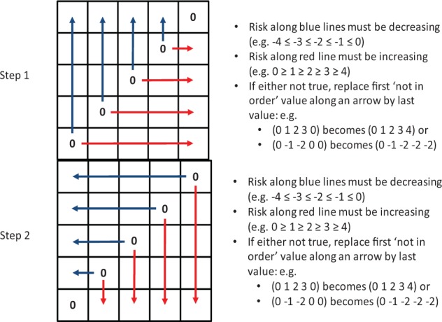
These inconsistent sequences were removed using a 2-step data cleaning procedure illustrated in Figure B1.
Figure B1.
Action of the data cleaning procedure.
At step 1, the data cleaning procedure identified sequences of risk ratings that were not increasing with increased risk (decreasing for hypoglycemia due to the inverse coding with negative numbers). If an out-of-order value was encountered, it was replaced by a value that preserved the risk-increase order. Similarly, at step 2 the procedure looked for out-of-order sequences in reverse and made appropriate replacements.
Impact of the Data Cleaning
As noted above, the data cleaning affected 543 values (6.6% of all entries). However, the effect on the average risk across the error grid cells ratings was minimal. If we compute the average risk in each zone of risk without activation of the data cleaning procedure, then we will obtain the following risk ratings presented in Table B1.
Table B1.
Average Risk Ratings in Zones Across All 4 Scenarios Defined by Reference and SMBG Values Computed Without Data Cleaning.
| SMBG value in zone | E | −3.42 | −3.32 | −2.73 | −1.67 | 0 |
| D | −3.04 | −2.61 | −1.62 | 0 | 1.33 | |
| C | −2.2 | −1.34 | 0 | 1.26 | 1.94 | |
| B | −1.31 | 0 | 1.24 | 1.88 | 2.51 | |
| A | 0 | 1.04 | 1.8 | 2.47 | 3.02 | |
| A | B | C | D | E | ||
| Reference BG value in zone | ||||||
If we recompute Table B1 with activation of the data cleaning procedure, we will obtain the following risk ratings presented in Table B2.
Table B2.
Average Risk Ratings in Zones Across All 4 Scenarios Defined by Reference and SMBG Values Computed With Data Cleaning.
| SMBG value in zone | E | −3.65 | −3.47 | −2.84 | −1.67 | 0a |
| D | −3.18 | −2.67 | −1.62 | 0a | 1.33 | |
| C | −2.35 | −1.34 | 0a | 1.26 | 2.11 | |
| B | −1.31 | 0a | 1.24 | 1.98 | 2.69 | |
| A | 0a | 1.04 | 1.98 | 2.66 | 3.25 | |
| A | B | C | D | E | ||
| Reference BG value in zone | ||||||
Risk ratings were not asked for reference BG and SMBG in the same zone; thus 0 on the diagonal is implied value.
The difference between the “cleaned” and “noncleaned” results (Tables B1 and B2) is presented in Table B3.
Table B3.
Difference in Risk Ratings Due to Data Cleaning.
| SMBG value in zone | E | 0.23 | 0.15 | 0.11 | 0 | — |
| D | 0.14 | 0.06 | 0 | — | 0 | |
| C | 0.15 | 0 | — | 0 | 0.17 | |
| B | 0 | — | 0 | 0.1 | 0.18 | |
| A | — | 0 | 0.18 | 0.19 | 0.23 | |
| A | B | C | D | E | ||
| Reference BG value in zone | ||||||
It is evident that the differences introduced by the data cleaning are minimal (average = 0.095) and affect predominantly the outer edges of the table; that is, the extreme ratings are slightly amplified by the cleaning.
To illustrate this effect further, Figure B2 presents a recomputed error grid, with color-coded risk levels based on noncleaned data. Careful comparison with Figure 1 would reveal slight “discoloration,” or lower intensity colors along the extreme edges of the figure.
Figure B2.
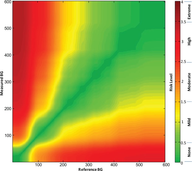
Color-coded Surveillance Error Grid based on noncleaned data with a key to color-coded risk levels.
Footnotes
Abbreviations: AAMI, Association for the Advancement of Medical Instrumentation; ADA, American Diabetes Association; BG, blood glucose; CEG, Clarke Error Grid; CGM, continuous glucose monitor; DCCT, Diabetes Control and Complications Trial; DM, diabetes mellitus; DTS, Diabetes Technology Society; FDA, Food and Drug Administration; MDI, multiple doses of insulin; PEG, Parkes Error Grid; SEG, Surveillance Error Grid; SMBG, self-monitoring of blood glucose; TES, the Endocrine Society
Authors’ Note: The opinions expressed in this article reflect the personal views of the authors and not the official views of the Food and Drug Administration, the United States Army, or the Department of Defense.
Declaration of Conflicting Interests: The authors declared the following potential conflicts of interest with respect to the research, authorship, and/or publication of this article: DCK is a consultant to Google, Insuline, LifeCare, Roche, Sanofi, and Voluntis. JLP was a full-time employee of Bayer Healthcare Diabetes Care during much of the development of this project. BK is on the advisory board at Animas and Sanofi-Aventis and has received research grant/study material support from Animas, BD, DexCom, Roche Diagnostics, Sanofi-Aventis, and Tandem.
Funding: The authors disclosed receipt of the following financial support for the research, authorship, and/or publication of this article: This study was funded in part by the Intramural Research Program of the National Institutes of Health (to DBS); funds from Diabetes Technology Society and the American Diabetes Association; and grants from Abbott, Bayer, Dexcom, LifeScan, Medtronic, Roche, and Sanofi.
Contributor Information
Collaborators: Lisa Aurand, Carol Benson, Patricia Bernhardt, Lawrence Blonde, Mark Breton, Bruce Buckingham, Alan Cariski, Scott Colburn, Frank Flacke, Bern Harrison, Carol Herman, Rolf Hinzmann, Denise Johnson-Lyles, Shridhara Alva Karinka, Leslie Landree, Tessa Lebinger, Scott Lee, John Mastrototaro, Tom Peyser, Stephen Phillips, Arleen Pinkos, David Price, Steve Scott, Katherine Serrano, and David Simmons
References
- 1. Krouwer JS, Cembrowski GS. A review of standards and statistics used to describe blood glucose monitor performance. J Diabetes Sci Technol. 2010;4(1):75-83. [DOI] [PMC free article] [PubMed] [Google Scholar]
- 2. Boren SA, Clarke WL. Analytical and clinical performance of blood glucose monitors. J Diabetes Sci Technol. 2010;4(1):84-97. [DOI] [PMC free article] [PubMed] [Google Scholar]
- 3. Klonoff DC. The need for clinical accuracy guidelines for blood glucose monitors. J Diabetes Sci Technol 2012;6(1):1-4. [DOI] [PMC free article] [PubMed] [Google Scholar]
- 4. US Food and Drug Administration. Guidance for industry and FDA staff: recommendations: clinical laboratory improvement amendments of 1988 (CLIA) waiver applications for manufacturers of in vitro diagnostic devices. Available at: http://www.fda.gov/MedicalDevices/DeviceRegulationandGuidance/GuidanceDocuments/ucm079632.htm. Accessed December 1, 2013.
- 5. Krouwer J. Why manufacturers should embrace error grids. Available at: http://www.ivdtechnology.com/article/why-manufacturers-should-embrace-error-grids. Accessed October 29, 2013.
- 6. Clarke WL, Cox D, Gonder-Frederick LA, Carter W, Pohl SL. Evaluating clinical accuracy of systems for self-monitoring of blood glucose. Diabetes Care. 1987;10(5):622-628. [DOI] [PubMed] [Google Scholar]
- 7. Parkes JL, Slatin SL, Pardo S, Ginsberg BH. A new consensus error grid to evaluate the clinical significance of inaccuracies in the measurement of blood glucose. Diabetes Care. 2000;23:1143-1148. [DOI] [PubMed] [Google Scholar]
- 8. Diabetes Control and Complications Research Group. The effect of intensive treatment of diabetes on the development and progression of long-term complications in insulin-dependent diabetes mellitus. N Engl J Med. 1993;329:977-986. [DOI] [PubMed] [Google Scholar]
- 9. Rapid-acting insulin approved for marketing. Am J Health Syst Pharm. 1996;53(19):2250. [DOI] [PubMed] [Google Scholar]
- 10. Johnson SR, Cooper MN, Jones TW, Davis EA. Long-term outcome of insulin pump therapy in children with type 1 diabetes assessed in a large population-based case-control study. Diabetologia. 2013;56:2392-2400. [DOI] [PubMed] [Google Scholar]
- 11. Klonoff DC. The Food and Drug Administration is now preparing to establish tighter performance requirements for blood glucose monitors. J Diabetes Sci Technol. 2010;4:499-504. [DOI] [PMC free article] [PubMed] [Google Scholar]
- 12. Seaquist ER, Anderson J, Childs B, et al. Hypoglycemia and diabetes: a report of a workgroup of the American Diabetes Association and the Endocrine Society. Diabetes Care. 2013;36(5):1384-1395. doi: 10.2337/dc12-2480. [DOI] [PMC free article] [PubMed] [Google Scholar]
- 13. Ostenson CG, Geelhoed-Duijvestijn P, Lahtela J, et al. Self-reported non-severe hypoglycaemic events in Europe. Diabetes Med. 2014;31(1):92-101. [DOI] [PMC free article] [PubMed] [Google Scholar]
- 14. Floyd B, Chandra P, Hall S, et al. Comparative analysis of the efficacy of continuous glucose monitoring and self-monitoring of blood glucose in type 1 diabetes mellitus. J Diabetes Sci Technol. 2012;6(5):1094-1102. [DOI] [PMC free article] [PubMed] [Google Scholar]
- 15. Vigersky RA, Fonda SJ, Chellappa M, Walker MS, Ehrhardt NM. Short- and long-term effects of real-time continuous glucose monitoring in patients with type 2 diabetes. Diabetes Care. 2012;35(1):32-38. [DOI] [PMC free article] [PubMed] [Google Scholar]
- 16. Freckmann G, Schmid C, Baumstark A, Pleus S, Link M, Haug C. System accuracy evaluation of 43 blood glucose monitoring systems for self-monitoring of blood glucose according to DIN EN ISO 15197. J Diabetes Sci Technol. 2012;6(5):1060-1075. [DOI] [PMC free article] [PubMed] [Google Scholar]
- 17. Klonoff DC, Reyes J. Do currently available blood glucose monitors meet regulatory standards? 1-day public meeting in Arlington, Virginia. J Diabetes Sci Technol. 2013;7(4):1071-1083. [DOI] [PMC free article] [PubMed] [Google Scholar]
- 18. Weiss SL, Cembrowski GS, Mazze RS. Patient and physician analytic goals for self-monitoring blood glucose instruments. Am J Clin Pathol. 1994;102(5):611-615. [DOI] [PubMed] [Google Scholar]
- 19. Cox DJ, Clarke WL, Gonder-Frederick L, et al. Accuracy of perceiving blood glucose in IDDM. Diabetes Care. 1985;8:529-536. [DOI] [PubMed] [Google Scholar]
- 20. Pfützner A, Klonoff DC, Pardo S, Parkes JL. Technical aspects of the Parkes error grid. J Diabetes Sci Technol. 2013;7:1275-1281. [DOI] [PMC free article] [PubMed] [Google Scholar]