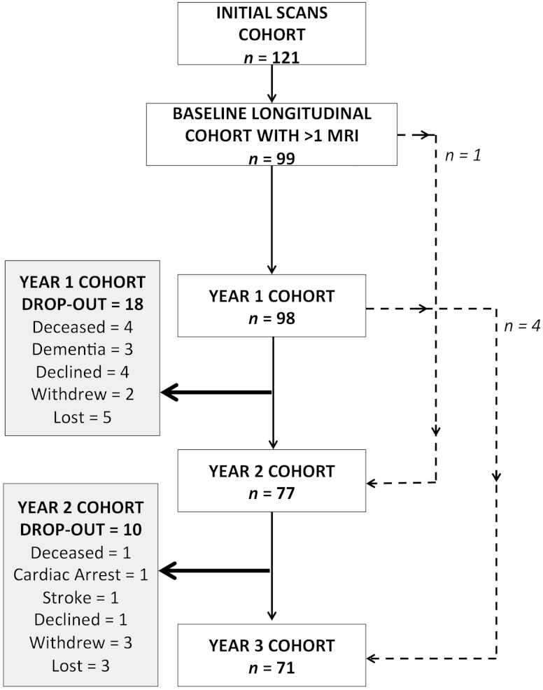
Figure 1.
Longitudinal cohort flow chart. Flow chart demonstrating the changes in annual cohorts and reasons for subject dropout at each time point. Dashed lines: one subject attended the baseline, missed the Year 1 scan but attended Year 2 onwards. Four subjects missed their Year 2 follow-up but attended all other time points (baseline, Years 1 and 3).

